Infographics: communications on steroids
I am eager to share with you some of the challenges my team faced in the last few months and how infographics helped us to solve them, optimize our internal communications, and ultimately increase our productivity.
My name is Andrea Angella and I am a Software Engineer in the Redgate Monitor team in Redgate Software. It's a really exciting time for us! We have just released Redgate Monitor 5 after months of hard work and we are getting tremendous interest among SQL Server professionals.
One of the new features we added in Redgate Monitor 5 is availability group monitoring. Availability Groups is a complex and advanced topic full of new and overlapping terminology like clusters, nodes, primary and secondary replicas, synchronous and asynchronous commit modes, failover cluster instances, listeners, and so on.
The main challenge when we started working on availability groups was that building a shared knowledge was critical for the success of the project. Unfortunately only a few members of the development team knew something about the topic.
We created a sub-team with the goal of researching and learning more about availability groups. The outcome was a document of about ten pages describing the main technical concepts. We distributed it inside the team and to relevant stakeholders.
The document was a great start but we realized pretty soon that something was not quite working.
Here are some of the problems we had:
- Engineers spent a lot of time revisiting definitions and scenarios during technical conversations
- Sales and marketing teams struggled to understand availability group features during sprint reviews
- The CEO and the executive team had no idea what we were talking about :)
This was frustrating.
So, what did we do to overcome the problems?
We created infographics to describe availability groups!
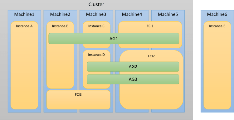
This might seem surprisingly obvious, but you should never underestimate what a picture can do and the short-cut it creates during meetings and technical discussions.
It was literally a game changer for us!
The development team created infographics to define various testing scenarios. We attached them to our whiteboard and used them all the time during technical discussions. The ability to point to a picture, write on top of it and easily describe the flow of information with a gesture has been tremendously useful. This also helped us to discover scenarios we hadn't considered at the beginning.
During sprint reviews, infographics were used to explain to non-technical stakeholders the goal of new features and how they helped our customers.
Finally, during what we call whiteboard tours, infographics enabled us to explain in a very easy and high level way what availability groups are and the main value Redgate Monitor 5 can offer to our customers. It was great to read a few hours later in a company email feedback from our CEO who appreciated our ability to summarize complex concepts for the senior management team.
In summary, when you find yourself or your team in a situation where it's difficult to convey a message, consider creating and using infographics. You will be surprised by their power.
Infographics can boost your communication because they help you to make complex subjects easier to understand, create a short-cut in communications and it's a great tool for presenting concepts at different levels of abstractions.
The Redgate Monitor team surely learnt by experience the truth of the classic idiom:
A picture is worth a thousand words
So what are you waiting for?
Looks at your communication challenges, identify your pain points and try to leverage the power of infographics. You can even go a step further and incorporate them directly into your product. This will certainly delight your customers and make their lives better.
Tools in this post
Redgate Monitor
Real-time multi-platform performance monitoring, with alerts and diagnostics



Loading comments...