

Please stop! The 2 biggest mistakes when applying for a UX role
There’s no doubt about it - hiring can be a long and difficult process. Of all the applications you receive for a role, only a small percentage might actually be considered seriously for an interview. The reasons often range from the rather mundane (e.g. lack the required skills or experience) to those who seem to think that a deluge of spelling mistakes and inability to write a sentence will impress.
I’ve become more aware of two major blockers that surface frequently when considering applicants for a UX role, which I think can be summed up as:
In the same way you should be thinking about your users when researching or designing a product, you should also think about who will be reading and assessing your CV and UX portfolio.
In an industry where human factors and design are core principles, your CV and portfolio are likely to be judged even more along these dimensions. That’s not to say those same elements are of no significance or effect for applicants from different industries. I simply believe that they have more significance in the area of UX when you’re being evaluated for the job, and and when an evaluator with a UX background is deciding whether to proceed with your application. (Whilst the following points might be slanted more towards visual design, they are applicable to anyone involved in UX, whether it’s a user research based role or more design related).
So, what is it specifically that goes so wrong for many UX applications?
Blocker 1: Not designing your CV appropriately!
You are applying for a job that will most likely require you to produce work showing an appreciation of how colour, fonts, and the use of space and structure (to name just a few elements) can lead to a demonstrably simple and elegant solution. So why would you send in a CV that looks like you have put it together in the dark with a crayon? How does this reflect that you have a good appreciation of how to present things in a clean and simple manner?

You are applying for a position involving large aspects of design! Start off on the right foot and show you can actually walk the walk, and do more than fill your CV with industry buzz words. Espousing that you are a great designer while simultaneously demonstrating the exact opposite just doesn’t work. Your credibility takes a huge hit from the moment someone looks at it.
Blocker 2: Not presenting your portfolio appropriately!
This actually breaks down into three problems or themes that a typical poor portfolio will exhibit:
- Ambiguous content: I’ve become frustrated by the sight of portfolios that leave me completely in the dark as to what I’m actually looking at. You have to remember – the person looking at your portfolio doesn’t know the context in which your designs were created.There’s often zero - and I really do mean zero - context as to what someone is attempting to demonstrate. The content will be bereft of titles, notes, captions and no rationale as to how or why this solution was decided upon. I don’t even know what the original problem was. It’s equivalent to a user seeing an application for the first time but having to deduce its purpose due to the lack of labels and poor design. Even Sherlock Holmes would struggle to figure out the thinking behind some portfolios.
- Poor design: Much like the issues with the CV, many portfolios can border on impenetrable. There can be content crammed in like there was some sort of 10 page restriction on the pdf. Likewise, a 50 page portfolio is too much – especially when some of the content might not be of the highest quality. I’ve seen many portfolios with blurred pictures of what I have to assume is some design work they have done.
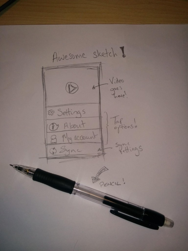
- Irrelevant content: You can often be left with the feeling of a lack of substance after reviewing some portfolios. For example, showing just a photograph of a simple, half-drawn sketch on a piece of paper isn’t particularly impressive. Anyone - and I mean anyone - could produce that. What is this type of content supposed to demonstrate? You can’t rely on photos of sketches to tell your story. They should be used to reinforce the points you are making or the story you are communicating.The argument that UX people should be sketching first is something that comes up a lot, and there is some value to that when you’re first starting a project. However, the reality is that it doesn’t require a great amount of skill to pick up a pencil, scribble out and simply copy some standard piece of UI (that often looks like every other generic mobile app out there) and then include it in your portfolio as some of your greatest work. They lack any real substance when presented in isolation, and feel like they’ve been included to tick a box.
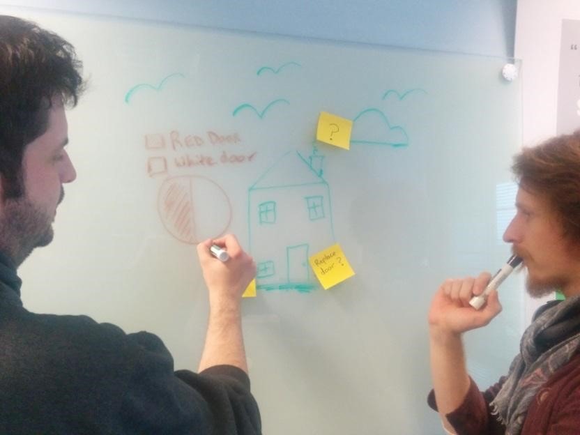
Another growing favourite is to include a picture of unreadable post-it notes on a whiteboard with people stood around looking thoughtful at a random UI design. It’s as if someone is trying to communicate that they have discovered post-it notes can go on a wall and that they can adequately confuse people with their design choices. Don’t waste your time - communication and team fit will be considered in the interview.
The Medium Matters, but Content Matters More
A recent article argued that the standard portfolio format itself is actually the real problem and a very poor way of demonstrating your ability. I agreed with many of the points, but there’s still the chance to impress with the traditional document-based application. I’ve reviewed quite a few that impressed the hell out of me.
Irrespective of the medium with which you present yourself and your work (your own website, 3rd party portfolio builder, traditional documents or other means), the problems mentioned above can affect any and all of them to varying degrees. A poorly designed portfolio will immediately stand out, and it doesn’t matter which format it comes in. Take a more modern approach and add in the ability to create dynamic content and interactions, and the problem can actually be made worse than simply presenting the information using a static portfolio document!
So, before you hit the send button that delivers your CV and portfolio for consideration to a company - consider the above points first. Think about these documents as the product of your UX skillset, and then decide if you are about to hit a major blocker that affects your chances of being considered for a potentially great job.
