

Understand analytics in esProc SPL with this comprehensive guide covering time series analysis, text processing, statistical methods, custom functions, machine learning integration, and interactive dashboards. Part of the “Moving from Python to esProc SPL” series.
Data analytics has evolved from simple reporting to complex predictive modeling, and your choice of tools significantly impacts your analytical capabilities. Whether you’re analyzing sales trends, processing customer feedback, or building predictive models, esProc SPL provides the tools you need to transform raw data into actionable insights.
What makes esProc SPL stand out is its focus on data analysis. Unlike general-purpose languages where you might write dozens of lines of code for basic data manipulation, esProc SPL offers specialized syntax designed specifically for analytical tasks. This means you can accomplish complex analyses with concise, readable code.
How time-series analysis works in esProc SPL
Time series data is everywhere, from stock prices and sales figures to website traffic and sensor readings. Analyzing this data effectively requires specialized techniques, and that’s exactly where esProc SPL comes in.
How to resample time-series data in esProc SPL
Let’s start with a common challenge: you have daily sales data but need to analyze monthly or quarterly trends. This process of changing the frequency of your time series data is called resampling. Here’s how SPL handles it:
| 1 | =file(“document/sales.csv”).import@tc(OrderDate,Amount) |
First, I’m importing our sales data from a CSV file, selecting just the order dates and amounts, and sorting everything chronologically. This gives us a clean dataset to work with. The sorting step is crucial for time series analysis because it ensures that our data points are in the correct temporal sequence.
Now, let’s transform this daily data into monthly aggregates:
| 2 | =A1.groups(month@y(OrderDate):month;sum(Amount): sum_amount) | Group by month and calculate the sum of amounts, it aggregates daily data into monthly totals. |
In the first line, I’m creating a new column called “month” by extracting and combining the year and month from each order date. The `year()` function extracts the year (like “2021”) and the `month()` function extracts the month number (like “1” for January). By combining them with a hyphen, we get identifiers like “2021-1” for January 2021.
Then, I’m grouping all records by this new month column and calculating the sum of all amounts within each month. The `groups()` function is powerful because it automatically handles the aggregation process, similar to a GROUP BY in SQL but with more flexibility.
Now we can clearly see the total sales for each month – but what if we want to look at quarterly data instead? Well, we can do that too:
| 3 | =A1.groups(year(OrderDate)/”-Q”/ceil(month(OrderDate)/3):quarter;sum(Amount): sum_amount,avg(Amount): avg_amount:) | Group by quarter and calculate multiple aggregates |
How to concatenate different data types (such as integers and strings)
When concatenating different data types such as integers and strings, use the / operator. The + operator can only be used for string-to-string concatenation. Here, I’m creating a quarter label by taking the year and adding “Q” plus the quarter number. The quarter number is calculated by dividing the month by 3 and rounding up using the `ceiling()` function. For example:
- January (month 1): 1/3 = 0.33, ceil(0.33) = 1, so it’s Q1
- April (month 4): 4/3 = 1.33, ceil(1.33) = 2, so it’s Q2
- December (month 12): 12/3 = 4, ceil(4) = 4, so it’s Q4
I’m then grouping by quarter and calculating both the sum and average of amounts. This gives us two different perspectives: the total sales volume and the typical order size for each quarter.
This quarterly view might reveal seasonal patterns that weren’t obvious in the monthly data. It might indicate a seasonal peak in your business, perhaps due to holidays or industry-specific cycles.
Moving averages and trend analysis, explained
Raw time series data often contains noise and short-term fluctuations that can obscure the underlying trend. Moving averages help smooth out these fluctuations. Let’s calculate a 3-month moving average:
| 4 | =A3.derive(sum_amount[-1:1].avg():moving_avg_3m) |
The result of the grouping in A4 is already automatically sorted by the grouping field, so no need to sort again. sum_amount[-1:1] means a collection of three values: the previous, current, and next row’s sum_amount. Likewise, to calculate a 5-month moving average, you can use sum_amount[-2:2].avg().
In esProc SPL, you don’t need a special function for moving average. Just use expressions for full flexibility.
For example, to compute a moving sum instead, use sum_amount[-1:1].sum(). Since the number of built-in functions is limited, writing custom expressions allows for much greater flexibility to meet various needs.
Another trend analysis technique: exponential smoothing
For more trend analysis, let’s implement exponential smoothing, which gives more weight to recent observations:
In SPL, you can use colname[-1] to get the previous row’s value directly, so there’s no need for a for loop in this case – just compute the exponential smoothing directly within derive.
| A | |
| 5 | =A4.derive(if(#==1, sum_amount, exp_smooth[-1]*0.7+sum_amount*0.3):exp_smooth) |
This code implements single exponential smoothing using a smoothing factor of 0.3 to smooth time series data. It begins by creating a new column, ‘exp_smooth`, initialized with zeros. A cursor is then used to iterate through each row of the dataset. The first row’s actual value is assigned as the initial smoothed value, serving as a baseline.
As the loop progresses through the remaining rows, each new smoothed value is computed by taking 70% of the previous smoothed value and adding 30% of the current actual value. This iterative process ensures that each row is updated with its corresponding smoothed value, gradually adjusting the trend while reducing short-term fluctuations.
The output will show how exponential smoothing responds more quickly to recent changes than a simple moving average. The advantage of exponential smoothing is that it gives more weight to recent observations while still considering the entire history of the data. This makes it more responsive to recent changes in the trend compared to a simple moving average.
Seasonal decomposition and forecasting, explained
Many time series have seasonal patterns: retail sales spike during holidays, ice cream sales increase in summer, etc. To identify these patterns, we can decompose a time series into trend, seasonal, and residual components:
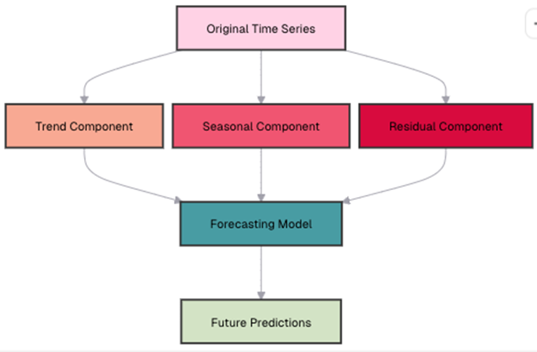
Let’s implement a simple seasonal decomposition in esProc SPL:
| A | |
| 6 | =A4.avg(sum_amount) |
| 7 | =A4.groups(month%100:season;avg(sum_amount)/A21:seasonal_factor).keys@i(season) |
| 8 | =A4.derive((month\100-2021)*12+month%100:period_num, sum_amount/A22.find(month%100).seasonal_factor:deseasonalized) |
A6: First, calculate the overall average.
A7: In A4, the month field is an integer in yyyyMM format. The % symbol is the modulo operator, so month % 100extracts the month component. Group by month, and compute each month’s seasonal average / overall average to obtain the seasonal factor.
A8: Divide each month’s total sales amount in A4 by the corresponding seasonal factor to get the seasonally adjusted sales amount.
Now we can use the deseasonalized data to forecast future values using a simple linear regression:
| 9 | =linefit(A6.(period_num),A6.(deseasonalized)) | Fit a linear regression model, this finds the line of best fit through our deseasonalized data. |
| 10 | =A10*13 | Predict the deseasonalized value for period 13 |
| 11 | =A11*A7.find(13%12).seasonal_factor | Re-seasonalize the prediction |
This forecasting approach begins by setting up a regression model, where the period number serves as the independent variable (x), and the deseasonalized amount as the dependent variable (y).
A guide to text analysis and natural language processing capabilities in esProc SPL
Numbers tell only part of the story. Text data (such as customer reviews, support tickets, and social media posts), contain valuable insights that can drive business decisions. esProc SPL then provides powerful tools for extracting meaning from text.
Text preprocessing in esProc SPL
Let’s assume we have customer feedback data in our sales dataset:
| 1 | =file(“document/sales.csv”).import@ct(CustomerID,Feedback) | Import the dataset and select relevant columns |
Word frequency analysis in esProc SPL
One of the simplest yet most informative text analyses is counting word frequencies. Let’s see which words appear most often in our customer feedback:
| 2 | =A1.derive(Feedback.words():words) | |
| 3 | =A2.conj(words).groups(~:value;count(1): count) | Group by word value and count occurrences |
| 4 | =A3.sort(count:-1) | Sort by frequency in descending order |
The output will show the most frequent words. You might notice that common words like “the” dominate the results. These “stop words” don’t add much meaning, so let’s filter them out:
| 5 | =[“the”,”and”,”is”,”to”,”a”,”of”,”for”,”in”,”that”,”this”] | Define a list of common stop words to filter out. |
| 6 | =A3.select(!A5.contain(value)) | Filter out stop words from our frequency analysis |
The `!A5.contain(value)` condition selects only words that are NOT in our stop words list. The tilde ! is the logical NOT operator in esProc SPL. Our word frequency analysis now focuses on meaningful content words, giving us better insights into what customers are talking about.
This cleaner view immediately highlights the topics that matter to customers – product, quality, service, and delivery. You can use this information to identify what aspects of your business customers mention most frequently.
Sentiment analysis in esProc SPL
Are customers happy or unhappy with your product? Sentiment analysis can help answer this question. Let’s implement a simple lexicon-based approach:
| 1 | =file(“document/sentiment_lexicon.csv”).import@ct() | |
| 2 | =A1.groups(word;avg(score):score) | Match words in each feedback to words in the lexicon |
| 3 | =A1.derive(A2.align(words:~,word).avg(score):sentiment_score) | |
| 4 | =A3.derive(if(sentiment_score>0.2:”positive”, sentiment_score<-0.2:”negative”; “neutral”): sentiment) |
The sentiment analysis process begins with importing a sentiment lexicon that assigns numerical scores to words, where positive words receive positive values (e.g., “excellent” might be +0.8), and negative words receive negative values (e.g., “terrible” might be -0.9). Since some words may appear multiple times with different scores, their values are aggregated by averaging them.
Next, the `align()` function is used to match words in each feedback entry with those in the lexicon, creating a table of sentiment words for each piece of feedback. Once matched, the average sentiment score is calculated by averaging the scores of all matched words.
Finally, the feedback is classified based on predefined thresholds: entries with an average score above 0.2 are categorized as positive, those below -0.2 as negative, and those between -0.2 and 0.2 as neutral.
Why is sentiment analysis important?
This analysis gives you a quick overview of customer sentiment. For example, you might discover that:
- Certain products have more negative feedback than others
- Feedback from specific regions
- Sentiment has been improving over time
These insights can help you identify areas for improvement and track the impact of changes to your products or services.
Topic modeling in esProc SPL
Beyond sentiment, you might want to know what topics customers are discussing. Let’s implement a simple keyword-based topic classification:
| 5 | =[[“price”,”cost”,”expensive”,”cheap”,”affordable”], [“quality”,”durable”,”broke”,”lasting”,”sturdy”], [“service”,”support”,”help”,”response”,”staff”]] | Define keyword lists for different topics |
| 6 | =[“price”,”quality”,”service”] | Associate each keyword list with a topic name |
| 7 | =A5.conj(~.new(~:words, A6(A5.#):topics)) | |
| 8 | =A1.derive(A7.align(words:~,words):topic_matches) | |
| 9 | =A8.derive(topic_matches.groups(topics;count(1):c).maxp@a(c).(topics):main_topic) |
This topic modeling approach begins with defining topics by creating lists of keywords for different aspects of the business, such as price, quality, and service. Each inner array contains words relevant to a specific category. To map these keywords efficiently, I use `conj()` to flatten the nested arrays and `align()` to associate each keyword with its corresponding topic.
Next, I group keywords by topic to form a lookup table for easy reference. When analyzing feedback, I match words in each entry against the topic keywords using `align()`, ensuring all relevant matches are captured rather than just the first occurrence. Finally, I determine the main topic for each feedback entry by identifying the most frequently mentioned topic using the `A8.derive()` function. If no keywords match, the feedback remains unclassified with a null value.
The results classify feedback by main topic, helping you understand which aspects of your business customers are commenting on. For example, you might discover that 40% of feedback relates to product quality, 30% to price, and another 30% to service. Analyzing sentiment could show that price-related feedback is generally more negative than quality-related feedback, while customers who mention service are more likely to be repeat buyers.
Why are these insights important?
These insights allow you to focus on the areas that matter most to customers – helping you to guide product improvements, refine customer service strategies, and tailor marketing messages.
Basic statistical analysis and hypothesis testing in esProc SPL
Statistics help us understand patterns and relationships in data. esProc SPL provides comprehensive tools for both descriptive and inferential statistics.
How to work with descriptive statistics in esProc SPL
Let’s calculate basic descriptive statistics for our sales data:
| 10 | =file(“document/sales.csv”).import@ct(ProductID,Amount) |
| 11 | =A10.groups(ProductID; count(Amount): count, Number of sales sum(Amount): sum, Total revenue avg(Amount): avg, Average sale amount median(Amount): median, Median sale amount var@r(Amount): std, Standard deviation (variability) min(Amount): min, Minimum sale amount max(Amount): max, Maximum sale amount max(Amount)-min(Amount): range) Range of sale amounts |
This single grouping operation calculates eight different statistics for each product:
- Count: The number of sales transactions for each product
- Sum: The total revenue generated by each product
- Average: The mean sale amount (calculated as sum/count)
- Median: The middle value when all amounts are sorted
- Standard Deviation: A measure of how spread out the amounts are
- Minimum: The smallest sale amount
- Maximum: The largest sale amount
- Range: The difference between max and min, showing the spread
These statistics provide valuable insights into your data. The count reveals which products are sold most frequently (indicating their popularity), while the sum highlights the highest revenue-generating items, even if they don’t sell often. The average and median help you understand typical order sizes; a significant difference between them suggests the presence of outliers.
The standard deviation measures variability, with higher values indicating a wider range of transaction amounts (possibly due to discounts or multiple product variations). Meanwhile, the min, max, and range showcase the spread of sales, where a large range may signal special promotions or bulk discounts.
Enjoying this article? Subscribe to the Simple Talk newsletter
Correlation analysis in esProc SPL
Are sales quantities related to discounts? Do larger orders get bigger discounts? Correlation analysis can answer these questions:
| 12 | =file(“document/sales.csv”).import@ct(Amount,Quantity,Discount) |
| 13 | =new(pearson(A12.(Amount),A12.(Quantity)):Amount_Quantity, pearson (A12.(Discount),A12.(Quantity)):Discount_Quantity, pearson (A12.(Amount),A12.(Discount)):Amount_Discount) |
To compute correlation coefficients in esProc SPL, use pearson() and spearman() functions respectively. The correlation analysis reveals key relationships between sales variables. These insights can help refine pricing strategies, while the current discounting approach appears to boost sales, businesses might consider optimizing volume discounts to encourage larger purchases without eroding profitability.
Remember that correlation doesn’t imply causation. A strong correlation between two variables doesn’t necessarily mean that one causes the other. There might be other factors influencing both variables.
Hypothesis testing in esProc SPL
Do sales amounts differ significantly between regions? Let’s use a t-test to find out:
| 14 | =file(“document/sales.csv”).import@ct(Region,Amount) |
| 15 | =A14.select(Region==”west” || Region==”east”) |
| 16 | =ttest_p(A15.(if(Region==”east”:0;1)),A15.(Amount)) |
In esProc SPL, use the ttest_p function for t-tests. First, convert values like “east” and “west” into 0 and 1.
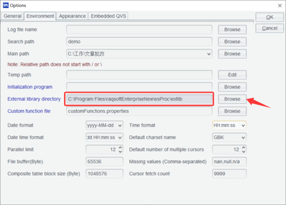
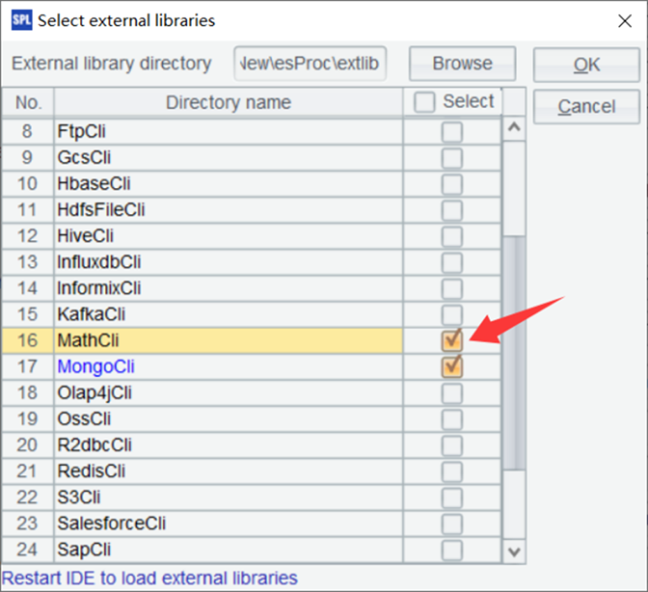
Then, pass the combined dataset into ttest_p directly – the function will automatically separate it into two groups based on the binary variable. Note: ttest_p is in an external library, so make sure to load the library before use.
What if we want to compare all regions at once? For that, we use ANOVA (Analysis of Variance):
| 1 | =file(“document/sales.csv”).import@ct(Region,Amount) |
| 2 | =fisher_p(A1.(Region),A1.(Amount)) |
For multiple-group t-tests, use the fisher_p function in esProc SPL. You don’t need to manually split the dataset – simply pass the grouping field sequence and the value sequence to fisher_p, and it’ll automatically compare across groups. These statistical tests are powerful tools for data-driven decision making. For example, if you find significant differences between regions, you might:
- Investigate what successful regions are doing differently
- Allocate more resources to underperforming regions
- Adjust regional marketing strategies
- Set different sales targets for different regions based on their potential
How to create custom functions for calculations in esProc SPL
As your analyses become complex, you’ll want to create reusable functions for complex calculations. SPL’s programming capabilities make this easy.
How to define reusable functions in esProc SPL
Let’s create a function to calculate the Recency, Frequency, Monetary (RFM) score for customer segmentation:
| A | B | |
| 1 | =file(“document/sales.csv”).import@ct(CustomerID,OrderDate,Amount) | |
| 2 | func rfm_score(data,current_date,r_weight,f_weight,m_weight) | |
| 3 | =data.groups(CustomerID; interval(max(OrderDate),current_date):recency, count(1):frequency, sum(Amount):monetary) | |
| 4 | =B3.len() | |
| 5 | =B3.derive(:r_score,: f_score,:m_score,:rfm_score) | |
| 6 | =B5.sort(recency:-1).run(r_score=rank(recency)/B4*5) | |
| 7 | =B5.sort(frequency).run(f_score=rank(frequency)/B4*5) | |
| 8 | =B5.sort(monetary).run(m_score=rank(monetary)/B4*5) | |
| 9 | =B5.derive((r_score*r_weight + f_score*f_weight + m_score*m_weight)/(r_weight+f_weight+m_weight):rfm_score) | |
| 10 | return B9 | |
| 11 | =rfm_score(A1,now(),1,2,3) | |
This function processes customer transaction data to generate an RFM analysis by evaluating customer purchasing behavior. It takes three inputs: the transaction data, a reference date, and the weights assigned to each RFM component. Recency is calculated as the number of days since a customer’s last purchase, with lower values being better. Frequency represents the total number of purchases, where higher values indicate more engagement. Monetary value is the total amount spent, with higher spending signifying a more valuable customer.
To standardize these metrics, each component is ranked and converted into a score between 0 and 5. Recency is ranked from lowest to highest since recent transactions are preferable, while frequency and monetary value are ranked from highest to lowest, as more purchases and higher spending are better.
The transformation formula `rank()/count()*5` ensures that scores are proportionally distributed, maintaining consistency across different dataset sizes. Finally, the function calculates a weighted average RFM score based on the assigned importance of each component.
For instance, if monetary value has the highest weight (3), frequency is moderately weighted (2), and recency has the least weight (1), customers with higher spending will be prioritized over those who shop frequently but spend less. This method allows businesses to segment customers effectively, identifying their most valuable customers and optimizing marketing strategies accordingly.
RFM analysis in summary
RFM analysis is a common technique for customer segmentation, helping you understand purchasing behavior and tailor marketing strategies accordingly. By evaluating recency, frequency, and monetary value, you can identify your best customers, those who buy frequently, spend significantly, and have made recent purchases, allowing you to focus on retention and special treatment.
Similarly, recent customers with high recency but low frequency may have the potential to become loyal, making them ideal candidates for onboarding efforts and second-purchase incentives. At-risk customers (those who once bought frequently but haven’t returned in a while) require targeted win-back campaigns to re-engage them. Meanwhile, loyal but low-value customers who purchase often but spend little, could benefit from upselling and cross-selling strategies to increase their overall value.
By creating a reusable function in SPL, you can automate RFM analysis and adjust parameters to fit different business models or seasonal trends. This flexibility allows you to refine segmentation over time, ensuring your marketing efforts remain relevant and data-driven.
How to implement algorithms in esProc SPL
Let’s implement a k-means clustering algorithm for customer segmentation:
| A | B | C | D | E | |
| 1 | func myKmeans(data, k, max_iterations) | ||||
| 2 | =data.group@b(rand(k);~:d,~.avg():avgV) | ||||
| 3 | =0 | ||||
| 4 | for max_iterations | ||||
| 5 | for B2 | for C5.d | =B2.pmin(power(D5-avgV,2)) | ||
| 6 | >B2(#C5).d=B2(#C5).d\D5 | ||||
| 7 | >B2(E5).d=B2(E5).d|D5 | ||||
| 8 | >B2(#C5).avgV=B2(#C5).d.avg() | ||||
| 9 | >B2(E5).avgV=B2(E5).d.avg() | ||||
| 10 | =B2.sum(d.sum(power(d.~-avgV,2))) | ||||
| 11 | if(abs(C10-B6)<0.000001) | ||||
| 12 | break | ||||
| 13 | else | >B6=C10 | |||
| 14 | return B2 | ||||
| 15 | =myKmeans(A2.(r_score)|A2.(f_score)|A2.(m_score),100,1000) | ||||
A1: Define the k-means clustering function.
B2: Randomly split the data into k clusters. d holds the data for each cluster, and avgV stores the average (centroid) of each cluster.
B3: Initialize the total distance between all data points and their respective cluster centers to 0.
B4: Loop through a maximum number of iterations.
C5–D5: Iterate over each data point:
E5: Calculate the distance between the current data point and all cluster centers, and find the index of the cluster with the minimum distance.
E6–E9: Move the current data point to the cluster with the minimum distance and recalculate the averages (centroids) for both the original and the new cluster.
C10: Recalculate the total distance between all data points and their updated cluster centers.
C11: If the difference between the new total distance and the previous one is less than 0.000001, it indicates convergence, so exit the loop.
A note on the Euclidean distance
In the above code, the Euclidean distance is calculated without applying the square root. This is intentional, as only the difference compared to the previous value is needed, and an extra square root seems unnecessary.
A note on esProc SPL’s kmeans function
In an earlier example, the esProc SPL math external library was loaded, which already contains a built-in function named kmeans. So, if you define your own function named kmeans, be sure to rename it to avoid conflicts.
These clusters represent natural groupings in your customer base. For example:
- Cluster 1 might be “high-value loyal customers” with high scores across all dimensions
- Cluster 2 might be “recent high-potential customers” with high recency but moderate frequency and monetary values
- Cluster 3 might be “occasional shoppers” with lower scores overall
The power of clustering is that it finds patterns that might not be obvious from manual inspection. Unlike the predefined segments in RFM analysis, k-means discovers natural groupings based on the data itself.
You can use these clusters to:
- Develop targeted marketing campaigns for each segment
- Customize product recommendations based on cluster behavior
- Set different service levels for different customer groups
- Track customer movement between clusters over time
By implementing these algorithms as reusable functions, you create a toolkit for analytics that you can apply to various business problems.
How to use esProc SPL as a data preprocessing tool
While esProc SPL isn’t primarily a machine learning platform, it excels at data preprocessing – often the most time-consuming part of the ML workflow.
How to prepare data for machine learning
Let’s prepare a dataset for a sales prediction model:
| A | |
| 1 | =file(“document/sales.csv”).import@ct(OrderDate,ProductID,Region,CustomerID,Quantity,Discount,Amount) |
| 2 | =A1.groups(;min(Quantity):min_Quantity,max(Quantity):max_Quantity) |
| 3 | =A2.derive(max_Quantity-min_Quantity:range_Quantity) |
| 4 | =A1.derive((Quantity-A3.min_Quantity)/A3.range_Quantity:Quantity_norm).sort(rand()) |
| 5 | =A4.to(int(A4.len()*0.8)) |
| 6 | =A4\A5 |
A1: Specify the fields to read when importing the data.
A2: Calculate the maximum and minimum values of the Quantity field.
A3: Compute the value range of Quantity.
A4: Normalize the Quantity values and shuffle the data order.
A5: Take the first 80% of the data as the training set.
A6: The remaining 20% is used as the test set.
Effective data preparation is essential for building accurate machine learning models. It involves several key steps:
Feature engineering helps extract meaningful patterns from date-related data by breaking it down into components like year, month, day, day of the week, and a weekend flag.
Data normalization ensures that all features operate on the same scale, preventing features with larger ranges from disproportionately influencing the model. For example, if Quantity ranges from 1 to 100 while Discount only varies from 0 to 0.5, normalization scales them to a uniform range, typically between 0 and 1, using the formula: (value – min) / (max – min).
Lastly, splitting the dataset into training and testing sets (commonly 80% for training and 20% for testing) ensures that the model is evaluated on data it hasn’t seen before, preventing overfitting and allowing for a more reliable assessment of performance.
Why is data preprocessing important?
Without these preprocessing steps, even the most sophisticated algorithms may misinterpret data. This leads to poor results, such as assuming ordinal relationships between categorical values or allowing large-scale features to dominate the model. Proper preprocessing lays the foundation for an effective and unbiased machine learning pipeline.
Compliance without Compromise
How to export data for external machine learning tools
esProc SPL can export prepared data to formats compatible with machine learning frameworks:
| A | |
| 7 | =file(“training_data.csv”).export@tc(A4) |
| 8 | =file(“testing_data.csv”).export@tc(A5) |
These simple export commands allow you to save your prepared datasets as CSV files, making them compatible with specialized machine learning tools like scikit-learn, TensorFlow, or other ML frameworks. The typical workflow involves using esProc SPL for data cleaning, feature engineering and preprocessing, before exporting the refined data. Once saved in a structured format, you can import it into an ML framework to build, train, and evaluate models.
After selecting the best-performing model, you can deploy it for real-world predictions. This hybrid approach takes advantage of esProc SPL’s efficient data manipulation capabilities while leveraging the advanced algorithms provided by dedicated ML frameworks.
How to implement simple machine learning algorithms in esProc SPL
esProc SPL can implement basic machine learning algorithms directly. Let’s create a simple linear regression model:
| A | B | |
| 9 | =linefit@1(transpose([A5.(Quantity_norm),A5.(1)]),A5.(Amount)) | |
| 10 | =A6.derive(A9(1)*Quantity_norm+A9(2):predicted,abs(Amount-predicted):error) | |
| 11 | =A10.avg(error) | |
A9: Call the linear regression function to compute the regression model using the training set.
A10: Use the regression result to calculate predicted values for the test set, and compute the difference between predicted and actual values.
A11: Calculate the average of the differences.
linefit function explanation: The first argument consists of two series: the first is Quantity_norm, the second is 1.
The function returns two values: the first is the slope, the second is the intercept.
Using the @1 option, the return value is a sequence, so use A9(1) to get the slope and A9(2) to get the intercept.
A guide to interactive dashboards with esProc SPL’s visualization capabilities
Data analysis isn’t complete until you communicate your findings effectively. esProc SPL can prepare data for visualization tools, enabling you to create interactive dashboards.
How to create basic visualizations in esProc SPL
esProc SPL can generate data for various chart types:
| A | |
| 1 | =file(“document/sales.csv”).import@ct(OrderDate,Region,Amount) |
| 2 | =A108.groups(month@y(OrderDate):month,Region;sum(Amount):total) |
| 3 | =A109.pivot(month;Region,total) |
This data preparation extracts month information from order dates, groups data by month and region (summing the amounts in the process), and then pivots the data to create a table with months as rows and regions as columns. This format makes it easy to generate a line chart that visualizes sales trends by region over time, allowing you to quickly identify performance patterns.
By structuring the data in a pivoted format, it becomes readily compatible with visualization tools like Excel, Tableau and Power BI. Most of these platforms prefer a “wide” format for multi-series charts, making it easier to compare trends across regions and gain actionable insights.
How to build a sales dashboard in esProc SPL
Let’s create a comprehensive sales dashboard with multiple components:
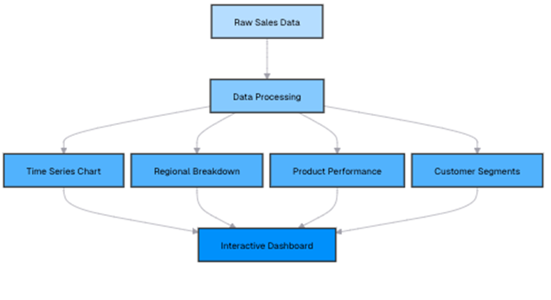
First, let’s prepare the data for each dashboard component:
| A | |
| 1 | =file(“document/sales.csv”).import@ct(OrderDate,Region,ProductID,CustomerID,Amount) |
| 2 | =A1.sum(Amount) |
| 3 | =A1.groups(month@y(OrderDate):month;sum(Amount):sales) |
| 4 | =A3.sort(month) |
| 5 | =A1.groups(Region;sum(Amount):sales) |
| 6 | =A5.derive(sales/A113*100:percentage) |
| 7 | =A1.groups(ProductID;sum(Amount):sales,count(OrderDate):orders, avg(Amount):avg_order) |
| 8 | =A7.sort(sales:-1) |
| 9 | =A1.groups(CustomerID;sum(Amount):total_spent,count(OrderDate):order_count, avg(Amount):avg_order) |
| 10 | =A9.derive(if(total_spent>=10000:”High Value”, total_spent>=5000:”Medium Value”; “Low Value”):segment) |
| 11 | =A10.groups(segment;count(CustomerID):customers,sum(total_spent):revenue,avg(total_spent):avg_spent) |
The queries behind each dashboard component ensure that critical business insights are easily accessible. The time series component tracks monthly sales trends, helping you identify growth patterns and seasonal fluctuations, with chronological sorting ensuring accurate trend visualization. The regional breakdown provides a clear view of sales distribution across different regions, showing each area’s contribution as a percentage of total revenue for proportional comparison. The product performance analysis ranks items based on sales volume, order count, and average order value, allowing you to pinpoint best-selling products and those that may need a strategic push.
Meanwhile, the customer segmentation component categorizes buyers based on their spending habits, providing a summary of each group’s size and contribution to revenue. By leveraging these insights, your dashboard offers a comprehensive view of business performance, supporting data-driven decision-making.
For instance, your analysis might reveal that sales have grown by 15% year-over-year, indicating a strong upward trajectory. These insights empower businesses to make informed decisions on resource allocation, marketing focus, product development, and customer relationship management, ensuring that strategies are backed by data rather than intuition.
In summary: data analysis in esProc SPL
Throughout this journey into analytics with esProc SPL, you’ve explored how this versatile language enables you to transform raw data into meaningful insights.
From handling time series data to performing text analysis, statistical testing, and even integrating with machine learning models, esProc SPL provides a flexible environment for data processing. Its intuitive approach simplifies complex analytical tasks, allowing you to focus on uncovering patterns and making data-driven decisions.
You’ve also seen how esProc SPL can handle time series analysis efficiently – resampling data, calculating moving averages, and forecasting trends to reveal valuable insights from temporal datasets. Text analysis techniques such as preprocessing, sentiment analysis, and topic modeling have additionally demonstrated how esProc SPL can extract meaning from unstructured data.
Meanwhile, statistical analysis tools – including correlation analysis and hypothesis testing – allow you to explore relationships within datasets and validate findings.
While esProc SPL is not a machine learning framework, you’ve learned how to use it for preprocessing and simple model implementations. Additionally, esProc SPL’s visualization capabilities provide a way to present insights clearly through interactive dashboards.
Simple Talk is brought to you by Redgate Software
FAQs: Data analytics with esProc SPL
1. What is esProc SPL used for?
esProc SPL is a data analysis tool designed for efficient data processing, time-series analysis, statistical modeling, and text analytics with concise, readable syntax.
2. How is esProc SPL different from other data analysis tools?
Unlike general-purpose programming languages, esProc SPL uses specialized syntax for analytics, reducing code complexity and speeding up data manipulation tasks.
3. What is time-series analysis in esProc SPL?
Time-series analysis in esProc SPL involves analyzing data points over time, such as sales or traffic trends, using tools like resampling, moving averages, and forecasting.
4. How do you resample time-series data in esProc SPL?
You can resample data by grouping it into different time intervals (e.g., monthly or quarterly) using the groups() function to aggregate values like sums or averages.
5. Can esProc SPL calculate moving averages?
Yes, esProc SPL supports moving averages using simple expressions, allowing flexible calculations like 3-month or 5-month averages without dedicated functions.
6. Does esProc SPL support forecasting?
Yes, it supports forecasting through techniques like exponential smoothing and linear regression on deseasonalized data.
7. What text analysis features are available in esProc SPL?
esProc SPL includes word frequency analysis, sentiment analysis, and topic modeling to extract insights from customer feedback and text data.
8. How does esProc SPL handle sentiment analysis?
It uses a lexicon-based approach to assign sentiment scores to words and classify feedback as positive, negative, or neutral.
9. Can esProc SPL perform statistical analysis?
Yes, it supports descriptive statistics, correlation analysis, and hypothesis testing (e.g., t-tests and ANOVA).
10. Is esProc SPL suitable for machine learning?
While not a full ML platform, esProc SPL excels in data preprocessing, feature engineering, and exporting datasets for tools like TensorFlow or scikit-learn.
11. What is RFM analysis in esProc SPL?
RFM (Recency, Frequency, Monetary) analysis helps segment customers based on purchasing behavior using custom functions in SPL.
12. Can you build dashboards with esProc SPL?
Yes, esProc SPL prepares structured data for visualization tools like Excel, Tableau, and Power BI, enabling interactive dashboards.
This document contains proprietary information and is protected by copyright law.
Copyright © 2026 Red Gate Software Limited. All rights reserved


Load comments