Creating .NET 3 Applications with XAML
Microsoft’s .NET 3 introduces the option of using markup to create Windows applications, much as we’ve used HTML and related markup to create web applications for the past decade. This is a major break-through and a distinct step on the path towards merging the development process of creating web and desktop applications.
This new markup language is called eXtensible Application Markup Language, or XAML (pronounced /’zæmÉl/ to rhyme with camel). Every XAML object represents a CLR object, and every CLR object may be created declaratively in XAML.
In this article we’ll create a meaningful, working XAML application. We’ll take you through the creation process, with the goal of demonstrating the flexibility of the language and acquainting you with the fundamentals of creating a working Windows application declaratively.
Getting Started With XAML
Every Window is declared as a panel and every property is declared as an element, or an attribute of an element. In its simplest form, this looks very similar to HTML:
|
1 |
<Button Width="20" Height="10">OK Button</Button> |
In fact, XAML is an XML-based superset of HTML, combining the power of HTML to define content, with that of CSS to define layout (carefully separating the two, to the relief of experienced CSS programmers).
Core XAML Elements
While we won’t even try to cover everything in XAML in this article, we will cover some core elements, both to give you a feel for how XAML applications work and to lay the ground work for walking you through a robust sample application.
A panel element is a container. Panels come in several different shapes and sizes. Depending on their features they are useful for containing other elements.
Root elements are special derivations of panel elements and serve as the fundamental container for the page. Each page will have exactly one root element.
Control elements are user-manipulated objects that help with data or user interactions.
The PelotonShack Project
With these elements, we are going to build a data-bound page that will offer a catalog of bicycle parts from the AdventureWorks2000 database. On the left, there will be a scrolling display of images taken from the database. As the user scrolls over each image, it (that is, the image, not the user) will grow slightly and come into focus. If the user clicks on the image, it will be highlighted in the larger area on the right and its details will be displayed in text, as shown in Figure 1.
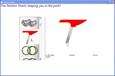
Figure 1: in which the selected image (not the user) is shown in detail in the right hand panel
Creating the Web Application
To create this application, begin by opening Visual Studio and creating a new Project. Choose the Windows Application (WPF) template, set your directory and set the solution name to PelotonShack, as shown in Figure 2.
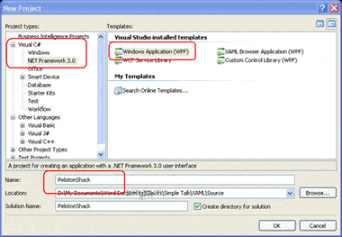
Figure 2: creating the web application
Windows will create a development environment and establish your first window, which it will also name for you:
|
1 |
<Window x:Class="PelotonShack.Window1" xmlns="http://schemas.microsoft.com/winfx/2006/xaml/presentation" xmlns:x="http://schemas.microsoft.com/winfx/2006/xaml" Title="PelotonShack" Height="300" Width="300"> <Grid> ... </Grid></Window> |
While there will certainly come a time (and soon) when Visual Studio will offer a complete and working toolkit for building WPF applications, for now we’re going to have the most success and least frustration if we write directly in XAML, in the lower markup window.
Start by setting the height of Window1 to 600 and the width to 900 (you can fine-tune these numbers later).
Within the Grid, we’ll want to add Grid.Resources (to manage styles, GradientBrushes, etc.) and we’ll want to add column definitions.
The Header
An easy place to start is by adding the header, as shown in Figure 3:
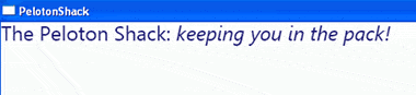
Figure 3: adding the header
To create this, we’ll use a text block and style it. The text block is pretty straightforward:
|
1 |
<TextBlock Style="{DynamicResource TitleText}"> <Span>The Peloton Shack: </Span> <Span FontStyle="Italic"> keeping you in the pack!</Span></TextBlock> |
Notice, however, that the TextBlock element is marked with a style reference to the DynamicResource ‘TitleText‘. Resources are separated out in their own section, so the complete XAML at this point looks as shown in example 1:
|
1 |
Example 1<Window x:Class="PelotonShack.Window1" xmlns="http://schemas.microsoft.com/winfx/2006/xaml/presentation" xmlns:x="http://schemas.microsoft.com/winfx/2006/xaml" Title="PelotonShack" Height="600" Width="900"> <Grid> <Grid.Resources> <Style x:Key="TitleText" TargetType="{x:Type TextBlock}" > <Setter Property="FontFamily" Value="Segoe Black" /> <Setter Property="FontSize" Value="24px" /> <Setter Property="Foreground" Value="MidnightBlue" /> </Style> </Grid.Resources> <TextBlock Style="{DynamicResource TitleText}"> <Span>The Peloton Shack: </Span> <Span FontStyle="Italic"> keeping you in the pack!</Span> </TextBlock> </Grid></Window> |
From such humble beginnings, all the rest will follow in just a few easy steps.
Adding the List Box
To add the list box of products, we need to accomplish a few tasks all at the same time.
1. Add a panel to hold the list box in a specific place in our window.
2. Add a list box to hold the images.
3. Include style information to tell the list box how to render the data (as images).
4. Bind the list box to a query of the images from the database.
The panel we’ll use to hold the list box will, ultimately, have the list box on the left, the larger image on the right and text below. That is, it needs to have two columns and a row. A stack panel can hold items one above the other or one next to another, but when you need to have both rows and columns, the panel you need is a grid:
|
1 |
<Grid x:Name="MainGrid" Margin="125,99,127,118" Width="Auto" Height="Auto" RenderTransformOrigin="0.5,0.5"> <Grid.ColumnDefinitions> <ColumnDefinition Width="0.33*"/> <ColumnDefinition Width="0.66*"/> </Grid.ColumnDefinitions> <Grid.RowDefinitions> <RowDefinition/> </Grid.RowDefinitions> <ContentControl x:Name="MasterPane" HorizontalAlignment="Center" VerticalAlignment="Stretch" RenderTransformOrigin="0.5,0.5"> <ListBox x:Name="MasterList" Width="Auto" Height="Auto" RenderTransformOrigin="0.5,0.5" ItemsSource="{Binding Mode=Default}" ItemTemplate="{DynamicResource ProductDataTemplate}" ItemContainerStyle="{DynamicResource ProductTemplateItemStyle}" HorizontalAlignment="Center" SelectedIndex="0" IsSynchronizedWithCurrentItem="True" ScrollViewer.VerticalScrollBarVisibility="Visible" > </ListBox> </ContentControl> <ContentControl x:Name="DetailsPane" Grid.Column="1" /> </Grid> |
The first two lines set up the grid’s attributes (margin, width, etc.). This is followed by the Grid column definitions, in which we define two columns: one will occupy 1/3 of the grid’s width, while the second will occupy the remaining 2/3 of the grid’s width. One row is defined in the Row definitions.
Following the Row and Column definitions are two content controls: MasterPane and DetailsPane. The second content control, DetailsPane, is left empty for now. The first content control holds the list box. The key attribute for the list box is that the ItemSource is set to bind using the default mode. Since this is placed within a window where the DataContext was set to ‘theTable‘, the list box will use ‘theTable‘ as its binding context. The style for binding is set by the ItemTemplate.
|
1 |
ItemsSource="{Binding Mode=Default}" ItemTemplate="{DynamicResource ProductDataTemplate}"The ProductDataTemplate must be defined up in the Grid.Resources section. <DataTemplate x:Key="ProductDataTemplate"> <StackPanel HorizontalAlignment="Center" Background="{DynamicResource ListBoxGradient}" Height="Auto" Width="150"> <Image Source="{Binding Path=ThumbNailPhotoFilePath}" ContextMenuService.IsEnabled="True" ContextMenuService.ContextMenu="{Binding Path=Name}" HorizontalAlignment="Center" /> </StackPanel></DataTemplate> |
It consists of a stack panel whose horizontal alignment is set to center the items and whose image will be retrieved from the binding where the path is set to ThumbNailPhotoFilePath . This is a column that will be retrieved for every row as a result of the select statement that will generate the DataTable we’ll be using as the DataContext for this list box.
All of the work for generating the DataTable, and associating it with the context, is accomplished in the code-behind file, the constructor for the Window class:
|
1 |
public partial class Window1 : System.Windows.Window{ DataTable theTable = new DataTable(); public Window1() { InitializeComponent(); String connString = @"Data Source=<Your Server>;Initial Catalog=AdventureWorks2000;Integrated Security=True"; String query = @"SELECT Product.ProductID, Product.Name, Product.ProductNumber, Product.ListPrice, Product.Color, Product.Size, Product.Style, ProductPhoto.ThumbNailPhotoFilePath, ProductPhoto.LargePhotoFilePath FROM Product INNER JOIN ProductPhoto ON Product.ProductPhotoID = ProductPhoto.ProductPhotoID WHERE (Product.ProductPhotoID = ProductPhoto.ProductPhotoID AND Product.ListPrice < 100)"; using ( SqlConnection conn = new SqlConnection( connString ) ) { SqlDataAdapter da = new SqlDataAdapter( query, conn ); da.Fill( theTable ); } DataContext = theTable; } |
The net result is a scrollable list of images extracted from the database, as demonstrated in Figure 4:
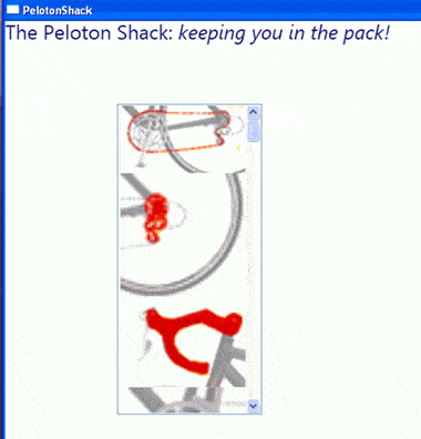
Figure 4: a scrollable list of images
Adding Events
We’d like to be able to mouse over the list and make the image currently highlighted by the mouse stand out more than the others. We’ll do this by reducing the opacity of the images to 60% and then increasing that to 100% when the mouse hovers over the image. To accomplish this effect, we add animation, using a story board.
We’ll indicate that the starting opacity is .60 (60%); and we’ll designate that over the course of two tenths of a second that opacity should increase to 100% when the event MouseEnter is registered. This opacity will also return to 60% when the MouseLeave event is raised. We declare these requirements by creating a ProductTemplateItemStyle for the ItemContainer and then creating that style within the Resources section:
|
1 |
<Style x:Key="ProductTemplateItemStyle" TargetType="{x:Type ListBoxItem}"> <Setter Property="Opacity" Value=".60" /> <Style.Triggers> <EventTrigger RoutedEvent="Mouse.MouseEnter"> <EventTrigger.Actions> <BeginStoryboard> <Storyboard> <DoubleAnimation Duration="0:0:0.2" Storyboard.TargetProperty="Opacity" To="1.0" /> </Storyboard> </BeginStoryboard> </EventTrigger.Actions> </EventTrigger> <EventTrigger RoutedEvent="Mouse.MouseLeave"> <EventTrigger.Actions> <BeginStoryboard> <Storyboard> <DoubleAnimation Duration="0:0:0.2" Storyboard.TargetProperty="Opacity" /> </Storyboard> </BeginStoryboard> </EventTrigger.Actions> </EventTrigger> </Style.Triggers></Style> |
The effect is powerful: As you mouse over each item, it appears to light up.
Creating the Detail View
We can now add the second container control to hold the larger image of the selected item and its description. The most interesting thing we’ll do here is add a ‘reflection’:
|
1 |
<ContentControl x:Name="DetailsPane" Grid.Column="1" Margin="15,0,0,0" Width="Auto" Height="Auto" RenderTransformOrigin="0.5,0.5"> <Grid x:Name="DetailsGrid" Width="Auto" Height="Auto" RenderTransformOrigin="0.5,0.5"> <Grid.ColumnDefinitions> <ColumnDefinition/> </Grid.ColumnDefinitions> <Grid.RowDefinitions> <RowDefinition/> </Grid.RowDefinitions> <StackPanel> <Image x:Name="ProductImage" RenderTransformOrigin="0.5,0.5" Width="Auto" Height="200" Source="{Binding Path=LargePhotoFilePath}"/> <Rectangle Fill="{DynamicResource ReflectionBrush}" Margin="0,0,0,0" Stroke="{x:Null}" Width="{Binding Path=ActualWidth, ElementName=ProductImage, Mode=Default}" Height="200" RenderTransformOrigin="0.5,0.5"> <Rectangle.LayoutTransform> <TransformGroup> <ScaleTransform ScaleX="1" ScaleY="-1"/> <SkewTransform AngleX="0" AngleY="0"/> <RotateTransform Angle="0"/> <TranslateTransform X="0" Y="0"/> </TransformGroup> </Rectangle.LayoutTransform> <Rectangle.OpacityMask> <LinearGradientBrush StartPoint="0.5,1.5" EndPoint="0.5,-0.5"> <GradientStop Color="#7FFFFFFF" Offset="0.21"/> <GradientStop Color="#00FFFFFF" Offset="0.392"/> </LinearGradientBrush> </Rectangle.OpacityMask> </Rectangle> </StackPanel> <TextBlock x:Name="Name" Margin="0,0,2,19" HorizontalAlignment="Left" VerticalAlignment="Bottom" Width="64" Height="26" RenderTransformOrigin="0.5,0.5" TextWrapping="Wrap" Text="{Binding Path=Name}" TextAlignment="Left"/> <TextBlock x:Name="ProductNumber" Margin="0,0,2,19" HorizontalAlignment="Center" VerticalAlignment="Bottom" Width="64" Height="26" RenderTransformOrigin="0.5,0.5" TextAlignment="Center" Text="{Binding Path=ProductNumber}"/> <TextBlock x:Name="ListPrice" Margin="0,0,2,19" HorizontalAlignment="Right" VerticalAlignment="Bottom" Width="64" Height="26" RenderTransformOrigin="0.5,0.5" TextAlignment="Right" Text="{Binding Path=ListPrice, Converter={StaticResource myNumberFormatter}, ConverterParameter='$#,###.00'}"/> </Grid></ContentControl> |
Creating the Reflection
The reflection is created by adding a grid within the content control. Within that grid we will add a stack panel. The image is stacked on top of a rectangle that uses a LayoutTransform to flip the image upside down (ScaleY = -1). The rectangle then uses an OpacityMask with a LinearGradientBrush that starts out at 0.5,1.5 and ends at 0.5, -0.5; that is, the image appears to fade away quickly:
|
1 |
<Rectangle.LayoutTransform> <TransformGroup> <ScaleTransform ScaleX="1" ScaleY="-1"/> <SkewTransform AngleX="0" AngleY="0"/> <RotateTransform Angle="0"/> <TranslateTransform X="0" Y="0"/> </TransformGroup></Rectangle.LayoutTransform><Rectangle.OpacityMask> <LinearGradientBrush StartPoint="0.5,1.5" EndPoint="0.5,-0.5"> <GradientStop Color="#7FFFFFFF" Offset="0.21"/> <GradientStop Color="#00FFFFFF" Offset="0.392"/> </LinearGradientBrush></Rectangle.OpacityMask> |
The effect can be seen in this close-up of the rendered image in Figure 5:
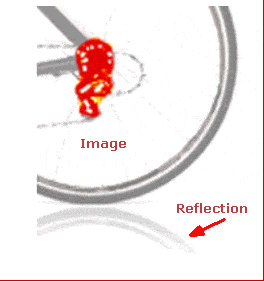
Figure 5: reflection
To finish up, we’ll add a GridSplitter, telling it which column we want to split. This will allow the user to reallocate the relative space between the list box and the details:
|
1 |
<GridSplitter x:Name="GridSplitter1" Grid.Column="1" Margin="1.5,1.5,0,3" HorizontalAlignment="Left" Width="11.5" Height="Auto" RenderTransformOrigin="0.5,0.5"/> |
The effect is shown in Figure 6:
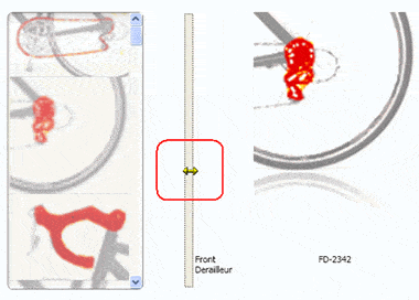
Figure 6: the gridsplitter
Complete Source
The complete source can be downloaded with this article.
Load comments