
Foundation is a CSS framework (originally by ZURB) that pre-dates Bootstrap and pioneered the responsive-first mobile-optimized twelve-column grid approach. This article covers integrating Foundation with ASP.NET MVC, including installation via NuGet package, grid basics, mobile.css breakpoints, the _Foundation.cshtml bundle structure, and a ten-step tutorial on how to build a complete responsive site, from scratch, in Visual Studio.
Update (May 2026): Foundation is still maintained but its share of the CSS-framework ecosystem has declined significantly since this article was written – Bootstrap became dominant, then Tailwind CSS emerged. This article remains useful for teams working with existing Foundation-based projects, maintaining legacy ASP.NET MVC applications, or specifically preferring Foundation’s mobile-first philosophy. For new projects in 2024+, teams typically evaluate Bootstrap 5 and Tailwind CSS first.
Responsive design is a technique for creating a website or web application that can adapt to a client’s screen or interface. In responsive design a flexible layout, together with flexible content and media queries, is used to change how the page is rendered on the client’s screen. Although the basics of responsive design on the surface are simple, there are many design challenges. By using a framework, you can enter the design process better prepared to meet these challenges.
One framework that I prefer to use is Foundation Framework by Zurb. Not only is Foundation a great asset, but it’s also an excellent learning tool because many of the problems of responsive design are solved in an organized and well thought-out manner. It is free to use under an MIT license.
Foundation, as the name suggests, provides a base for starting a new responsive design project. Simply put, Foundation lacks opinion: It provides a responsive grid and the basic CSS that is required to get started; then it stays out of the way. This allows your creative process to work independently of the framework and lets the end-product remain unique. Heavily opinionated frameworks can run the risk making web applications looking “cloned”, where the end product looks and feels much like the framework that was used to build it.
Foundation is independent of the platform, but because I use ASP.NET MVC, I have, as a community contribution, created an ASP.Net MVC package that can be used together with this article. This is feature-for-feature identical to the source, but I have adapted it for easy installation using NuGet, and added a basic template for getting started with Foundation in MVC.
Foundation basics
Installing Foundation in .Net MVC
Foundation is available as a NuGet package in order to make the setup process quick and simple. In a new ASP.Net MVC project, use the NuGet package manager to search for “Zurb”, next click “Install”. Once the package downloads, there are a few manual steps to complete the install. The entire process takes about two minutes to complete.
Step 1 – Install NuGet package (screenshot)
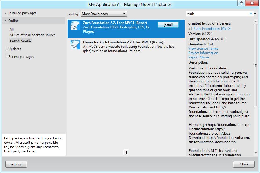
Installing Foundation with NuGet
Step 2 – Update the layout
- Open the /Views/_ViewStart.cshtml
- Change the Layout to _Foundation.cshtml like the example below:
|
1 2 3 4 5 6 7 |
@{ //This is the default MVC template //Layout = "~/Views/Shared/_Layout.cshtml"; //This is the Foundation MVC template Layout = "~/Views/Shared/_Foundation.cshtml"; } |
Step 3 – Remove the default theme
Once the ViewStart has been updated, replace the default Index.cshtml.
- Rename ~/Views/Home/Index.cshtml to Index.cshtml.exclude (or delete the file)
- Rename ~/Views/Home/Foundation_Index.cshtml to Index.cshtml
- Rename ~/Content/Site.css to Site.css.exclude (or delete the file)
Step 4 – Add bundling and minifaction
Add this to Application_Start in Global.asax:
|
1 2 3 4 5 |
#if !DEBUG //TODO: Add your favorite bootstrap framework Bundles_Startup.BundleCss(); Bundles_Startup.BundleJs(); #endif |
Step 5 – Run the project
You are now ready to begin building your MVC project using Foundation.
Core files
The core CSS files that are installed provide the basics for any web project. A flexible grid provides the layout, basic typography, CSS resets, and default media styles that support responsive content.
With Foundation additional UI elements such as a rotator called Orbit, a tab control, and modal popup are included as jQuery plugins. Each UI element is able to adapt to the users screen size. It’s important to note, that these UI elements are very minimal and easily styled using CSS.
The grid
Foundation uses a twelve column grid system. The grid system is much like other CSS frameworks, but contains some additional key features. First and foremost the grid is fluid, which is necessary for responsive design. Additionally the grid has preset breakpoints that allow the columns to reorder and adapt to various screen sizes. Another important key feature is nesting. Nesting allows any column to contain additional rows and columns, also divisible by twelve. To round things off, we are also given the ability to define source ordering. Source ordering is a feature that gives us the option of defining columns out of order via code different than the display order. Source ordering has many uses, from SEO, to giving the framework hints as to how we want our breakpoints to handle our content.
Grid construction
There are three primary classes used to build a grid layout. The outermost element of the grid will be the “container” class. The container is a simple wrapper that provides padding around the grid; this ensures that the content doesn’t ride the edge of the screen at lower resolutions. The container is not a required element.
Example:
|
1 2 |
<!-- Container element --> <div class="container"></div> |
Inside of the container we can add any number of “row” elements needed. A “row” defines a group of content that can be divided in to a maximum twelve columns. While twelve columns may sound restrictive, nested columns are supported by Foundation in order to allow maximum customization.
Example:
|
1 2 3 4 5 |
<div class="container"> <div class="row"> <!-- define columns here --> </div> </div> |
Once a “row” has been defined we need to determine how the row will be divided. To create columns within a row we’ll use the “columns” class. When defining columns in Foundation we write the column’s width out as they would be spoken, for example: “six columns”. Using this syntax we can create any combination of columns as long they are evenly divisible by twelve. If our design requires additional columns, we can add a nested row giving us up to twelve additional columns.
Example:
|
1 2 3 4 5 6 7 |
<!-- Two elements of equal width --> <div class="container"> <div class="row"> <div class="six columns">Left column</div> <div class="six columns">Right column</div> </div> </div> |
Example:
|
1 2 3 4 5 6 7 8 9 10 11 12 13 14 15 |
<!-- Two columns of equal width --> <div class="container"> <div class="row"> <div class="six columns"> <div class="row"> <!-- four elements, nested--> <div class="two columns">Small</div> <div class="four columns">Big</div> <div class="two columns">Small</div> <div class="four columns">Big</div> </div> </div> <div class="six columns">Right column</div> </div> </div> |
Examining mobile.css
The mobile.css file in Foundation is a small, but important one. The mobile.css contains all of the media query break points used by the grid layout. The breakpoints are designed to turn the rows and columns of the grid into a stacked single column layout. Stacking columns is one method of reorganizing content in a responsive design. Since small resolution devices normally have a longer vertical axis, the best experience can be achieved by stacking the content in to a single column. This method allows the content to be presented in a way that eliminates the need to zoom, while only requiring the user to scroll along the longest axis.
Responsive design
A simplified excerpt from mobile.css
|
1 2 3 4 5 6 7 8 9 10 |
/* media query */ @media only screen and (max-width: 767px) { .row { width: 100%; /* max the width */ } .columns { width: auto !important; /* fill the width */ float: none; /* stack the columns */ } } |
In Foundation another relevant UI element is the button. A media query for the button element provides the best way of widening the buttons on small resolution devices. This is done to provide an easier target for users with a touch interface. All of this is done using a very simple media query that sets the button to “display: block”. By adding “display: block” the browser is told to make the element occupy the entire horizontal space.
This simple code makes for a better UX
|
1 2 3 4 |
@media only screen and (max-width: 767px) .button { display: block; } |
Foundation in .Net MVC
_Foundation.cshtml and Bundling
_Foundation.cshtml replaces the default MVC template _Layout.cshtml. In this file the CSS and JavaScript necessary to use Foundation are loaded. Methods are included in the template to further optimize the project through bundling. When debugging is disabled, the methods in Bundles_Startup are called and the core CSS and JavaScript files are replaced with a single URL request.
A simplified excerpt from _Foundation.cshtml
|
1 2 3 4 5 6 7 8 9 10 11 12 13 14 15 16 17 18 19 20 21 22 23 24 25 26 27 28 29 30 31 32 |
<!-- Included CSS Files --> <!-- Combine and Compress These CSS Files --> @if (HttpContext.Current.IsDebuggingEnabled) { <link href="@Url.Content("~/Content/core/grid.css")" rel="stylesheet" type="text/css" /> <link href="@Url.Content("~/Content/core/ui.css")" rel="stylesheet" type="text/css" /> ... <link href="@Url.Content("~/Content/core/reveal.css")" rel="stylesheet" type="text/css" /> } else { <link href="@Url.Content("~/Content/core/min.css")" rel="stylesheet" type="text/css" /> } A simplified excerpt from Bundles_Startup.cs public static class Bundles_Startup { ... public static void BundleCss() { Bundle cssBundle = new Bundle("~/Content/core/min.css", typeof(CssMinify)); ... cssBundle.AddFile("~/Content/core/grid.css"); cssBundle.AddFile("~/Content/core/ui.css"); ... cssBundle.AddFile("~/Content/core/reveal.css"); BundleTable.Bundles.Add(cssBundle); } } |
Default Index.cshtml
The Foundation NuGet package ships with a full-featured example page “Index.cshtml” which demonstrates most of the elements that Foundation supports. The index page is a tool for learning about Foundation and how features are implemented. Tabs, buttons, modal dialogs and the grid are all showcased and should be experimented with.
Ready to build
Once Foundation has been installed your project is ready to be built and ran. As a final check, the Index page should be loaded and checked to validate the installation. At this point the project is ready to be customized to meet your needs.
Tutorial: A single page responsive design
Introduction
Let’s get a firm understanding of Foundation by building a demo site. This site will be a single page site focused on advertising a single product. The page will have header and footer navigation and be broken in to sections: A showcase which will catch the users attention, a features section where we highlight the products main selling points, a benefits section which further explains our product, and a media section for videos.
In this tutorial we’ll learn how to prototype a page using Foundation and apply CSS overrides to create a custom style. The end result will be a single page responsive design that will no longer resemble the default look and feel of Foundation, but will encompass all of the responsive characteristics of the framework.
To get a full understanding of how Foundation works try resizing your browser after each step in the tutorial.
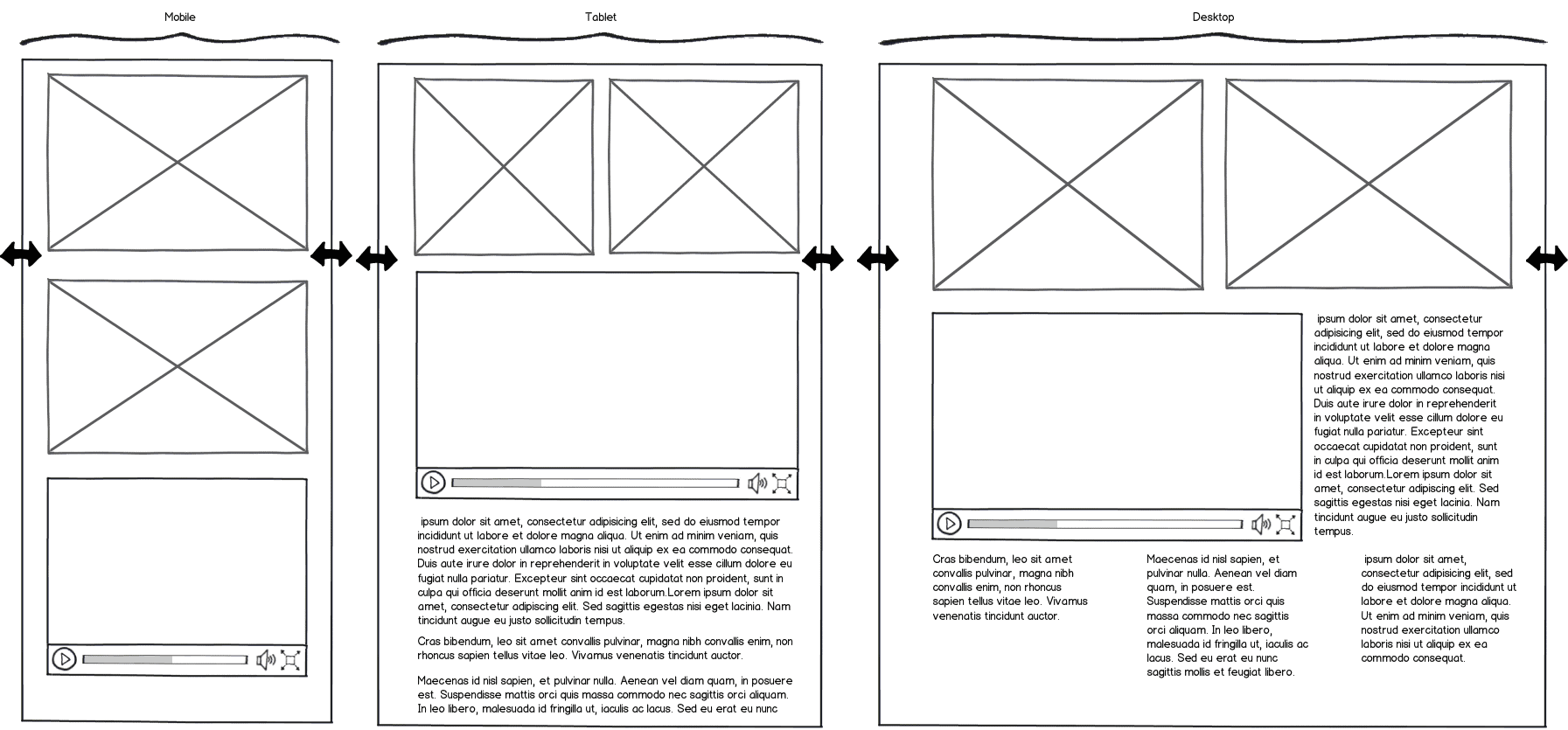
Completed project – full resolution
Completed project – mobile
Step 1: File, new project
Begin by opening Visual Studio and starting a new ASP.NET MVC project. Any MVC 3 project template may be used with Foundation, in this example we’ll choose the Empty template since we won’t be using any of the additional code provided in the other project templates.
A completed project for this tutorial is available on GitHub. The commits in the GitHub project follow the tutorial steps given below. If you are not a GitHub user, you may download the completed project from this page by clicking download as a zip.
- File > New > Project
- Visual C# > Web
- Select ASP.NET MVC 3 Web Application
- Name the project
- Ok
- Select Empty > OK
- At this point you may remove any preinstalled packages that you may not use. This is optional. In the example all packages are removed, everything we need will be installed by Foundation:
- Manage NuGet Packages > Installed packages
- For each package choose > Uninstall
Step 2: Install Foundation
We are now ready to install Foundation.
- *Manage NuGet Packages > Online
- Search Online: Zurb
- Select Zurb_Foundation MVC3 > Install
- Follow the instructions provided in the ReadMe.txt, also available at the beginning of this article “Foundation Basics: Installing Foundation in ASP.NET MVC”
*Optional: install with package manager console: PM> Install-Package Zurb_Foundation_MVC3
Step 3: Run the project
If you’re following along using the Empty template, create new home controller. Then test the project to ensure we have installed everything correctly.
- *Right click Controllers > Add > Controller
- Controller name HomeController
- Template EmptyController
- Build and run the project
- Test the page by resizing the browser
- Verify there are no broken resource links
*Internet and Intranet project templates have a default home controller.
Step 4: Install prototyping helper
In this step we will install a package that will help us to quickly prototype our design. This package is not required by Foundation but will reduce the amount of markup needed to create our example page. The Prototyping for MVC package provides a fluent API that creates Lorem Ipsum text and placeholder images at runtime using simple helper extension methods. I created the Prototyping package for MVC specifically for reducing prototyping markup.
- *Manage NuGet Packages > Online
- Search Online: Prototyping
- Select Prototyping_MVC > Install
*Optional: install with package manager console: PM> Install-Package Prototyping_MVC
Step 5: Set the viewport
Since mobile users shouldn’t need to pinch and zoom to view our site, we should set the initial scale to 1. This will ensure that users see the site at their native resolution. Setting the “initial-scale” does not prevent the user from zooming if they need to.
- Open _Foundation.aspx
- Locate the viewport meta tag
- Add, “initial-scale=1.0” to the content attribute.
|
1 |
<meta id="viewport"" content="width=device-width, initial-scale=1.0" /> |
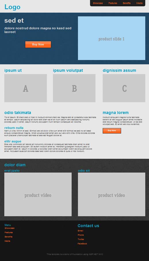
Step 6: Create a page header partial
Let’s start our template by creating a reusable header. Even though this example will result in a single page design, using partials will help us organize our code and make our code more readable and reusable.
The header will contain several elements. First, we’ll add a container that will wrap our content. Next we define a row and divide it up using the Foundation columns class to define each elements width. Since this will be our header, the first element will contain our logo and the second will contain our main navigation. The navigation will be constructed of list items and will use Foundation CSS classes for styling.
- Right click Views / Shared > Add > View
- Check the “Create as a partial box”
- Name the partial “_Header”
- In the newly created _Header.cshtml file:
|
1 2 3 4 5 6 7 8 9 10 11 12 13 14 15 |
<div id="siteHeader"" class="container"> <div class="row"> <div class="four columns"> <h1>Logo</h1> </div> <div class="eight columns"> <ul class="nav-bar"> <li><a href="#showcase" class="main">Showcase</a></li> <li><a href="#features" class="main">Features</a></li> <li><a href="#benefits" class="main">Benefits</a></li> <li><a href="#media" class="main">Media</a></li> </ul> </div> </div> </div> |
Step 7: Add the header
We’ll add the header to our page using render partial.
- Open _Foundation.cshtml
- Above RenderBody, display the partial using @Html.Partial(“_Header”)
|
1 2 3 4 |
@Html.Partial("_Header") <!-- container --> <div class="container"> @RenderBody() |
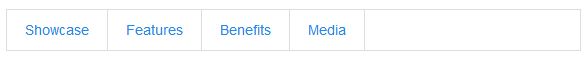
Standard menu
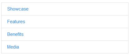
Mobile menu
Step 8: Update the index
Our installation has provided us with a default index page Home/Index.cshtml. We’ll be creating all new content here, we’ll clear out the example code and begin adding our own layout.
Using
At the top of the page we need to reference our Prototyping package that was installed in step 4.
- Open Index.cshtml
- Select all and delete the contents
- Reference the Prototyping helper with:
@using Prototyping.Ipsum
@using Prototyping.Placeholdit
@*The prototyping helper allows us to build fast demo code*@
@using Prototyping.Ipsum
@using Prototyping.Placeholdit
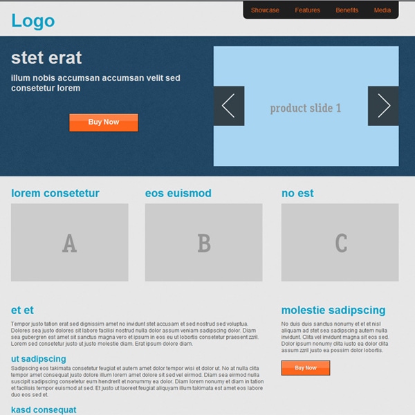
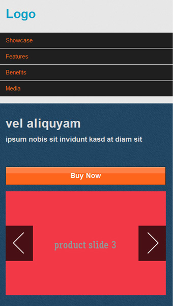
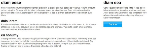
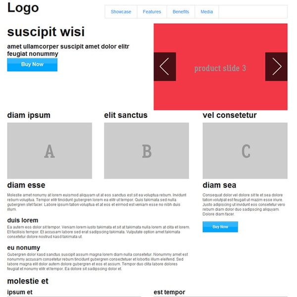
Showcase
Next we create our showcase element. The showcase element will contain two elements of equal width. The first showcase element will describe our product and provide a button to “Buy Now”, the second showcase element will be an image, later on we’ll replace this image with a rotator.
|
1 2 3 4 5 6 7 8 9 10 11 12 13 |
<div id="showcase""> <div class="row"> <div class="six columns">@Html.Ipsum().h1().h4(wordCount: 8) <p class="action"> <a href="#" class="nice large orange button">Buy Now</a> </p> </div> <div class="six columns"> @Html.Placehold(width: 468, height: 304, text: "product slide 1", backgroundColor:"A7D5F2") </div> </div> </div> |
Features
Let’s add our feature section below the showcase. The feature section will be a simple three up display. Three equally spaced elements will occupy the row.
|
1 2 3 4 5 6 7 8 9 10 |
<div id="features""> <div class="row"> <div class="four columns">@Html.Ipsum().h3() @Html.Placehold(width: 300, height: 200, text: "A")</div> <div class="four columns">@Html.Ipsum().h3() @Html.Placehold(width: 300, height: 200, text: "B")</div> <div class="four columns">@Html.Ipsum().h3() @Html.Placehold(width: 300, height: 200, text: "C")</div> </div> </div> |
Features – standard
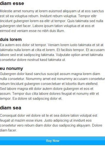
Features – Mobile
Benefits
Following the feature section, add the benefits section. The benefits section will be divided in to two elements. The width of these elements will be eight and four columns. The first will be used to explain the benefits of buying our product, the second element will instruct us on how to buy.
|
1 2 3 4 5 6 7 8 9 10 11 12 13 |
<div id="benefits""> <div class="row"> <div class="eight columns"> @Html.Ipsum().h3().p().h4().p().h4().p() </div> <div class="four columns"> @Html.Ipsum().h3().p(paragraphCount: 1, sentenceCount: 3) <p> <a href="#" class="nice orange button">Buy Now</a> </p> </div> </div> </div> |
Media
The media section will be our final section on the page before the footer. This section will contain two rows. The first row will span the full width of the page, we do this by making it twelve columns wide. The second row will divided into two equal parts and will be used to display two videos. For simplicity we’ll use placeholder images, however flexible videos are supported in Foundation.
|
1 2 3 4 5 6 7 8 9 10 11 12 13 14 15 16 17 |
<div id="media""> <div class="row"> <div class="twelve columns"> @Html.Ipsum().h3() </div> </div> <div class="row"> <div class="six columns"> @Html.Ipsum().h4() @Html.Placehold(width: 468, height: 304, text: "product video") </div> <div class="six columns"> @Html.Ipsum().h4() @Html.Placehold(width: 468, height: 304, text: "product video") </div> </div> </div> |
Step 9: Create and add a footer
In the same manner we created the Header we’ll create a footer. In the footer we’ll define two sections. The first will contain a row of two equal elements, one for contact information and the second we’ll use for navigation. The second section will be used for copyright information and span the full width of the page.
On the ‘contact us’ and ‘menu’ elements we’ll add source ordering using the “push” and “pull” classes provided by Foundation. By using source ordering we can change the order in which these elements are rendered in the browser. Take a moment to resize the browser and see how elements with source ordering react at different resolutions. This can be helpful tool to instruct the browser of our elements visual order.
- Right click Views / Shared > Add > View
- Check the “Create as a partial box”
- Name the partial “_Footer”
- In the newly created _Footer.cshtml file:
|
1 2 3 4 5 6 7 8 9 10 11 12 13 14 15 16 17 18 19 20 21 22 23 24 25 26 27 28 29 30 31 32 33 |
<div id="siteFooter"" class="container"> <div class="row"> <div class="six columns push-six"> <h3> Contact us</h3> <ul> <li><a href="#">Email</a></li> <li><a href="#">Phone</a></li> <li><a href="#">Twitter</a></li> <li><a href="#">FaceBook</a></li> </ul> </div> <div class="six columns pull-six"> <h5> Menu</h5> <ul> <li><a href="#showcase">Showcase</a></li> <li><a href="#features">Features</a></li> <li><a href="#benefits">Benefits</a></li> <li><a href="#media">Media</a></li> </ul> </div> </div> </div> <div id="copyright"" class="container"> <div class="row"> <div class="twelve columns"> <p> This template is a demo of Foundation using ASP.NET MVC</p> </div> </div> </div> |
- Open _Foundation.cshtml
- Below RenderBody, display the partial using @Html.Partial(“_Footer”)
Wireframe prototype
Step 10: Style the page
One of the key features of Foundation is how easy it is to style. By overriding the default Foundation CSS styles we can create a design that no longer resembles the framework but still benefits from the responsive design features.
Base style
First we create a base style for the bulk of the page, these are non-Foundation elements. The body element will serve as a backdrop for our entire site. A patterned background* used and our sections will overlay transparent colors on top to create a uniform look while breaking up the content. Vertical whitespace is added by giving each section some padding.
*The background pattern can be downloaded from http://subtlepatterns.com/?p=944
- Open app.css and add the following:
|
1 2 3 4 5 6 7 8 9 10 11 12 13 14 15 16 17 18 19 20 21 22 23 24 25 26 27 28 29 30 31 32 33 34 35 36 37 38 39 40 41 42 43 44 45 46 |
body { /*background pattern attrib: http://subtlepatterns.com/?p=944 */ background: url('./images/irongrip.png'); } h1, h2, h3, h4, h5, h6 { color: #0CA0C6; } #siteHeader { padding-top: 20px; background: #fff; border-top: 3px solid #1f1f1f; } #showcase, #features, #benefits, #media { padding: 2em 20px; } #showcase { background: #003366; background: rgba(0, 96, 168, 0.4); } #showcase .action { text-align: center; margin-top: 4em; } #showcase h1, #showcase h4 { color: #ddd; } #siteHeader, #features, #benefits { background: #DDD; /*fallback*/ background: rgba(255, 255, 255, 0.88); } #siteFooter, #copyright { padding: 20px; background: #1f1f1f; /*fallback*/ background: rgba(0, 0, 0, 0.60); } #copyright p { text-align: center; } |
- Open _Foundation.cshtml and remove the container element from round the RenderBody. We no longer need this element since we provide padding in our CSS.
Customize buttons
Now we’ll customize the style of the buttons. Foundation has provided some nice styles for buttons. By overriding their styles we can change the color without affecting the behavior of the element. In this example, we’ll override the default “button” class and “nice” class. Let’s create a new “orange button” class.
- Open app.css and add the following:
|
1 2 3 4 5 6 7 8 9 10 11 12 13 14 15 16 17 18 19 20 21 22 23 24 25 |
/* ----------------------------------------- ::Custom button style Creating a custom button style is easy thanks to CSS overrides ----------------------------------------- */ .orange.button { background-color: #FD651C; } .nice.orange.button { border: 1px solid #1f1f1f; } .orange.button:hover, .orange.button:focus { background-color: #E6340E; } /* style anchors to match */ a { color: #FD651C; } a:hover { color: #E6340E; } |
Customize navigation
Now we’ll create a custom navigation style. The CSS for navigation is a bit more complex than the button we styled in the last step. Since the navigation adapts quite differently at mobile resolutions we’ll need to write some media queries to adjust the style for mobile.
- Open app.css and add the following:
|
1 2 3 4 5 6 7 8 9 10 11 12 13 14 15 16 17 18 19 20 21 22 23 24 |
/* ----------------------------------------- ::Override navbar style Using CSS overrides we can customize the nav bar ----------------------------------------- */ .nav-bar { float: right; background-color: transparent; border: 0; margin-top: -20px; } .nav-bar > li { border: 0; background-color: #1F1F1F; } .nav-bar > li:first-child { border-bottom-left-radius: 10px; } .nav-bar > li:last-child { border-bottom-right-radius: 10px; } |
- View these changes in the browser, note the visual errors when the browser resizes
- Add the following media query to the style
|
1 2 3 4 5 6 7 8 9 10 11 12 13 14 15 16 17 |
@media only screen and (max-width: 767px) { .nav-bar { float: none; margin: 20px -20px; } .nav-bar > li:first-child { border-bottom-left-radius: 0; } .nav-bar > li:last-child { border-bottom-right-radius: 0; } } |
Create a slider
Creating a slider or image rotator in Foundation requires a few changes to our markup and some minimal JavaScript. To wrap up this tutorial we’ll replace our showcase image with the Orbit slider from Foundation.
- Locate the static product image: @Html.Placehold(width: 468, height: 304, text: “product rotator”)
- Replace image with the following code:
|
1 2 3 4 5 6 7 8 9 10 |
<div class="six columns"> <div id="rotator""> @Html.Placehold(width: 468, height: 304, text: "product slide 1", backgroundColor:"A7D5F2") @Html.Placehold(width: 468, height: 304, text: "product slide 2", backgroundColor:"F2B807") @Html.Placehold(width: 468, height: 304, text: "product slide 3", backgroundColor:"F23847") </div> </div> |
- Add the following JavaScript to the end of the page to activate the element:
|
1 2 3 4 5 6 7 8 |
@section scripts { <script type="text/javascript"> $(window).load(function() { $('#rotator').orbit(); }); </script> } |
Conclusion
Learning responsive design can be a daunting task, but finding the right tools can make all the difference. Foundation with ASP.NET MVC can accelerate responsive design projects. Foundation’s flexible and configurable grid allows for clean and organized markup, whilst leaving the design up to you.
For more information about responsive design and how to apply it to your workflow, see my previous article “A Foundation for the web“.
Completed project – Using Foundation and ASP.NET MVC
The demo that is built in the tutorial of this article is now a web page. http://edcharbeneau.github.com/FoundationSinglePageRWD/
Simple Talk is brought to you by Redgate Software
This document contains proprietary information and is protected by copyright law.
Copyright © 2026 Red Gate Software Limited. All rights reserved
Load comments