
“Give me Mobile BI!” is a cry that has been coming from the executive suite for some years now. Yet until SQL Server 2012 SP1 was released, all a Microsoft Reporting Services specialist could do in answer to this demand was to shuffle their feet and look sheepish while they tried to implement a third-party add-on or learned to love SharePoint.
Now, however, the landscape has changed fundamentally. With SQL Server 2012 SP1, and later versions, you can now output native SSRS reports to a host of mobile devices, including iPads and iPhones as well as Windows Surface devices, Windows phones and Windows tablets. What is more, nothing has fundamentally changed as far as Reporting Services is concerned. You still develop reports much as you did before, except that you will need to tailor the way that information is delivered to tablet or phone. If you have an existing report, then you will probably have to adapt it for optimum effect on a mobile device.
In this article, I’ll describe a set of techniques that you can apply when designing or adapting SSRS reports for smartphones and tablets. These approaches will help you both to save space and to use the available screen real estate to greatest effect, and to make navigation and interaction easier. I’ll cover:
- Masking the parameter pane – this can take up a disproportionate area of screen real estate on a mobile device and can be clunky to use. I’ll demonstrate a “parameter postback” technique that will hide the pane and allow users to change parameter values and refresh reports with a single stab of a well-aimed finger.
- Creating tabbed or multi-page reports for tablets – breaking down large reports into digestible chinks is very important for mobile devices. I’ll show some ideas for separating report elements onto specific pages and using bookmarks to flip around inside a report or between multiple tabs.
- Designing reports for smartphones – I show how to apply the “less is more” principle, choosing the visual report elements, such as gauges, very carefully, and removing any element that adds clutter to a screen.
- Establishing a report delivery hierarchy – using menu-style access, and a clear report hierarchy, when presenting a suite of reports
When designing for mobile devices, simplicity is paramount. If you adopt some of the principles and techniques in this article, your mobile reports will be easier to use and your key BI metrics will be visible, instantly and recognizably, for your users.
The Art and Science of Designing Mobile Reports
There is an art to designing tablet and smartphone reports. Equally, there is probably no one “right” way of doing things. Most designers, developers and users will probably disagree as to what is the best approach to take. There are nonetheless a few essential guidelines:
- Design your output as a function of the size of the phone or tablet’s screen – taking account of the height to width (aspect ratio) of the output device’s screen
- Don‘t overload the screen. It is too easy to think “the user only has to zoom in”. The result is that you create a report that is hard to read. The user will probably want to view their data immediately and clearly, without having to use pinch movements to read the data.
- Hide toolbars and mask report elements, such as parameter panes, using a custom interface. Users of mobile devices are accustomed to slick apps with state of the art interfaces.
- Segment reports and make it easy for users to jump from one section of a report to another. Alternatively you can mask certain report elements so that only certain parts of a report are visible at any one time.
- Develop a clear interface hierarchy. On tablets, and especially smartphones, you may need several reports to do the work of one report designed for a large laptop screen. Be prepared to break up existing reports into separate reports and to drill through from report to report.
- Don‘t force the same report to appear on a multitude of output devices – start by building “widgets” that display the data, and then reuse the widgets in several different reports, with each report is tailored to the size and aspect ratio of each device.
- Allow users to view reports with the device held either vertically or horizontally for optimum viewing
- Use shared data sets so that your initial development efforts can be reused more easily – in both mobile reports and PC-based reports.
At a minimum, you will need to do some redesign work, at most you could have to rewrite a whole set of reports. However, this is likely to be true for any suite of reports that has to be reworked for mobile output, regardless of the tool that is used to create them. The constraints come from the output device and good mobile reports are the ones that have been designed with the specific mobile device in mind.
Designing Mobile SSRS Reports
In many ways, we develop SSRS reports for mobile devices in the same way we develop them for laptops and PCs. as long as we connect to the report using an URL rather than using the Report Manager, then we can view it on most mobile devices. Security does not change, nor does data access; after all, these are handled by the Report Server independently of the smartphone or tablet clutched manically in your CFO’s hand.
Furthermore, most of the standard SSRS report interactivity is automatically available even on touch-screen iPads or Windows tablets:
- Sorting columns – by tapping on a column header (if sorting has been enabled).
- Collapsing and expanding report items, and rows and columns that are associated with groups – by tapping the plus (+) sign to collapse an item and the minus (-) sign to expand it.
- Selecting parameter values – by tapping the box or control next to the parameter. You will need to tap the View Report button to apply the parameter value to the report and redisplay the report data just as you are used to doing with a classic browser-based report.
- Navigating the report pages – by tapping the navigation buttons, or tapping the text box next to the buttons and typing the page number using the tablet’s on-screen keypad.
However, if we simply make available to mobile devices the same report that we designed for PC or laptop, then the user experience will be a frustrating and unhappy one. We need to design or adapt our SSRS reports for the specific device, following the general design principles described in the previous section. We also need to think carefully about the most effective visual report elements to use for the target mobile device, and how the user navigates smoothly through each report, and between reports if necessary. While Reporting Services might never attain the highest levels of swish user interfaces that some apps deliver, there are many techniques that can make user interaction smoother.
Over the coming sections, I’ll illustrate with example reports a few of the approaches that you can take to both adapt and create reports for mobile delivery. I do not have room in this articled to explain how to create all the reports in minute detail. However, in the shaded box to the right of the article title, you will find download links to both a sample database backup file (CarSales_Reports_ST.bak) and an SSDT project (MobileBIWithSSRS_ReportsSSDTApp.zip) that you can install and explore in order to understand the finer technical details of how these reports were created
Of course, if you really want a fully detailed description of how to create these, and many other, reports for Business Intelligence using SSRS, then feel free to take a look at my book Business Intelligence with SQL Server Reporting Services (Apress, February 2015).
Masking the Parameters Pane
The kindest thing that anyone can say about the Reporting Services interface is that it is showing its age. Parameter selection can be more than a little laborious. Having to confirm your choices to refresh the report just seems downright old-fashioned. On mobile devices, built-in interface elements such as the parameter pane of a report can be intrusive and annoyingly clunky to use, as space constraints mean that you nearly always have to mask the parameters pane in normal use and then tap to make it appear each time that you want to change a parameter.
Fortunately help is at hand. With a little applied ingenuity you can replace access to most (and hopefully all) of the parameters in a report with more intuitive interface elements. While there is not space in a single article to explain all the ways of revamping the SSRS interface, I want to show you one core technique that will allow you to avoid using the Parameters Pane to a greater or lesser extent. I describe it as parameterpostback for want of a better term. In its purest form it consists of:
- Hiding the report parameter
- Using the Action property of a report element (be it a textbox, chart series or even map viewport) to refresh the current report and “post back” the parameter with a new value, and all other parameters with their current value. I used the term “refresh” here, but in fact SSRS actually jumps to the report and opens it anew.
This technique is quite hard to visualize without an example, so let’s see it in action.
Parameter Postback in action
Suppose that you have a report that displays a chart of sales to date. Users have expressed a clear opinion that the Reporting Services user interface is too boring and clunky, and they are tired of clicking on the View Report button – or even forgetting to click it. They complain that changing the choice of month in Excel or even (horror of horrors) a rival BI tool updates a chart or table without needing any further effort. Consequently they want to have this level of interactivity in Reporting Services Mobile BI reports.
No problem! In this example we will replace the year and month parameters with an interactive and visual selection of the parameters. A single tap will update the report and refresh all the data.
To see where we are going, take a look at the following two images. Figure 1 shows the classic (not to say old-fashioned) parameter pane that has been an old friend for the last fifteen years or so.
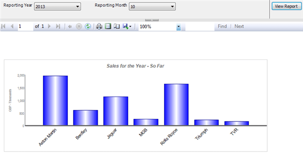
Figure 1 – A classic SSRS report
Figure 2 shows an example of a revamped year and month selector that lets you select the variables in a way better adapted to mobile BI. You can find this report in the sample solution as Tablet_YearAndMonthSelector.rdl.
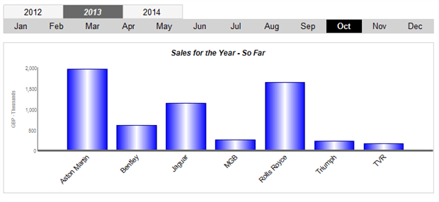
Figure 2 – The report after interface revamping
As you can see, a table now displays the choice of year and month inside the report. What is more, the action properties of the textboxes (or “cells” if you prefer) in the tables allow the user to choose another parameter with a single click or tap on the screen. Moreover, the report parameters are no longer visible at the top of the report as they would be normally, and you can see what the selected parameters are. Just to compare figures for a month, you no longer have to:
- Display the parameters pane
- Display the contents of a popup list
- Select the required element in the popup list
- Click or tap the View Report button
- Hide the parameters pane
In this report, the chart is the focal point. For each make of car, it shows the year-to-date sales, as set by the parameters ReportingYear and ReportingMonth. What is interesting is how we set these two parameters.
We have one table that displays the last three years, and another table that displays a hard-coded list of months. The values displayed in the table containing the years are set dynamically using a query to return the last three years in the data set. The table containing the twelve months is hard-coded as the months will always be the same (unless there is a major event such as the revolution in France in 1789 that decides to redefine the months of the year – in which case refactoring the code may be the least of your worries).
Tapping on a year or a month in either of the tables triggers action property of the cell (the text box) that has been selected. This, in turn, passes the value in the cell to the appropriate report parameter. The report then “refreshes” by hyperlinking to itself as the destination report – only with a changed parameter.
Figure 3 shows the Action property for the text box that contains the first year in the selector (2012, in the current example).
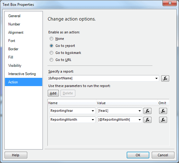
Figure 3 – Setting the action properties to “postback” parameters
There are three interesting things to note here:
- The
ReportingYearparameter is set as an expression to=Fields!Year1.Value. The dialog will show[Year1]after you click OK in the Expression dialog. This will set theReportingYearparameter to whatever is displayed in this text box. - The
ReportingMonthparameter is set as an expression to=Parameters!ReportingMonth.Value. The dialog will display[@ReportingMonth]after you click OK in the Expression dialog. This feeds back the existing value of the parameter to the report when it is refreshed. - In the Specify a report popup I did not select the name of the report, but entered
=Globals!ReportNameas the report to jump to. This causes the report to close and open – itself! The dialog will display[&ReportName]. You can enter the full report name – but this is, in effect, hard-coding the report with the immediate consequence that if the report is renamed the “postback” will no longer work.
You can see from Figure 1 that the selected year and month are in a different color so that the user can see instantly the chosen parameters. Setting the colors is a simple tweak, which involves setting the BackgroundColor and Color properties for each textbox using a function like:
|
1 2 |
=IIF(Parameters!ReportingMonth.Value = 1, "Black", "Grey") =IIF(Parameters!ReportingMonth.Value = 1, "Black", "White") |
You then have to do the same for the other eleven text boxes, only replacing Value = 1 in the expression with Value = 2 (for February), Value = 3 (for March) etc.
Potential Drawbacks to the Parameter Postback technique
This simplified overview of the technique masks the fact that this approach can have its downsides:
- All hidden parameters – and not just the one whose value you are changing – have to be defined as part of the Action property which you are setting. In other words, there is no “viewstate” in Reporting Services, and unless you want a parameter to revert to its default value, you will have to pass its current value to the refreshed report in every action property.
- As all the hidden parameters have to be posted back to the report when it is refreshed as a part of every action property it follows that the more the interface is revamped to allow for multiple interactive selections – the more you will be setting multiple parameters to return their existing value. If you do not pass back the current value of a parameter it will be reset to its default value. This can rapidly lead to a lot of time spent tweaking action properties when you add new parameters to a report.
- You no longer have the option to refresh a report once all parameters are set, as the report will refresh every time a single parameter is changed.
- Refreshing a report is not instantaneous. Consequently you may have to pay attention to the size of the dataset(s) used and the best way to optimize and/or cache your reports.
I do not want for a moment to suggest that this approach is difficult or laborious, only that it is not a magic bullet, and that a little work can be required. Fortunately, most users and most report developers seem to find that the result is well worth the effort.
Tablet Reports
I am prepared to bet that tablets are the most frequently-used output platform for mobile Business Intelligence. They combine portability, ease of use and a practical screen size, and can become an extremely efficient medium for BI using Reporting Services.
This is not to say, however, that the transition from laptop or PC to tablet will always be instantaneous. You will almost certainly find that you will need to adapt reports to tablet display for at least some of the following of reasons:
- The screen is smaller than most laptops – and despite often extremely high resolution, cannot physically show all that a desktop monitor is capable of displaying
- Even if you can fit all of a report that was designed for a large desktop screen onto a tablet, users soon get tired of zooming in and out to make the data readable
With this in mind, here are a couple of techniques that you can easily apply to adapt reports and dashboards that were originally designed for PCs for viewing on tablets.
Multi-Page Reports
A classic way to make large report easier to use is to separate different report elements on to separate “pages”. Obviously, in Reporting Services, pages are a display rather than a design concept. Yet we can use paging effectively when creating or adapting reports for tablet devices. As an example, consider the dashboard shown in Figure 4 (Dashboard_Monthly.rdl in the sample project).
Figure 4 – An SSRS dashboard designed for a PC
A dashboard designed for a large high-resolution monitor like this one would be unreadable if squeezed into a 9 inch tablet screen. Yet if we separate out its component elements, and adjust the layout a little, we end up with a presentation that is both appealing and easy to read, as shown in Figure 5 (Tablet_Dashboard_Monthly.rdl in the sample application).
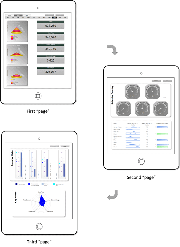
Figure 5 – The same dashboard revamped for tablet viewing
This is still a single SSRS report, but it uses page breaks to separate the elements into three parts. Buttons to the top of each “page” allow the user to jump to bookmarks inside the report. This makes flipping from page to page possible with a single tap. To make the point, Figure 6 shows the design view of the report.
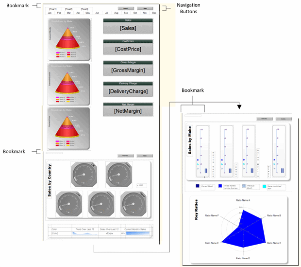
Figure 6 – The tablet report in design view
As you can see, the three “pages” are nothing more than a vertical report layout, with each vertical part displayed as a separate page. A rectangle, which although technically not hidden, is not visible as it has no border or fill, is used to force the page breaks. The same rectangles serve to act as bookmarks, except for the top of the page, where using the year selector is more appropriate. A series of images, buttons in this case, at the top of each “page” enable the action which jumps to the appropriate bookmark when the user clicks or taps on the image.
Quite possibly the hardest part is designing or revamping a dashboard for a mobile device is deciding how best to reuse, and how to group, the existing visualizations. In reality, you might find yourself re-tweaking an original dashboard more than we did here. Do not be afraid to remove objects or add other elements if it suits the purpose of the report.
This report avoids using the standard SSRS interface to select parameters, and instead uses objects inside the report to choose the year or month, as I described in the section “masking the parameter pane”. Hopefully this illustrates how you can combine various revamping techniques in different types of report. These techniques are applied in the sample files, so that you can see how to use them, and are examined in detail in “Business Intelligence with SQL Server Reporting Services”, if you need a fuller description.
Tabbed Reports
Sometimes when transferring a report dashboard to a mobile device can make for an extremely long report, even if you have added navigation buttons as we saw in the previous section. In practice the user will start scrolling around the report and will get lost in it at some stage. The solution can be to control the user experience even more tightly to focus the reader’s attention on a clearly delineated set of visualizations that combine to convey a unified message. This is when a tabbed report can prove extremely useful.
An effective way to compensate for the reduction in available screen space is to make clearly defined sections of the report available to the user as “tabs”. One click on the tab displays the chosen subset of data. To all intents and purposes this the closest SSRS equivalent of having an Excel file with multiple worksheets. It avoids an unnecessarily complex navigation path through a set of reports, and lets the user focus on a specific area of information. This approach is useful when you need to present information in a series of separate areas which are nonetheless part of a whole.
A tabbed report is simply a single report consisting of two or more sections, laid out vertically in SSRS, one above the other, but where it is impossible to scroll between the sections as you can in a multi-page report. The trick is to make visible at any time only the elements that make up one section. The final report appears to the user as shown in figure 7 (Tablet_TabbedReport.rdl).
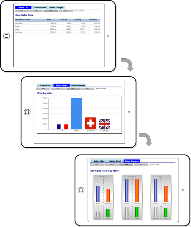
Figure 7 – A tabbed report
This report has three “tabs”, as visual indicators, at the top of the report. The sections of the report are implemented as three sets of elements (charts, tables, text boxes etc.) one above the other in the actual report design. The key trick is to handle the Hidden property of each element so that it is set by clicking on the appropriate “tab”.
The report looks somewhat different in Report Designer, as you can see in Figure 8, where it becomes clear that the three tabbed screens are, in effect, a single report.
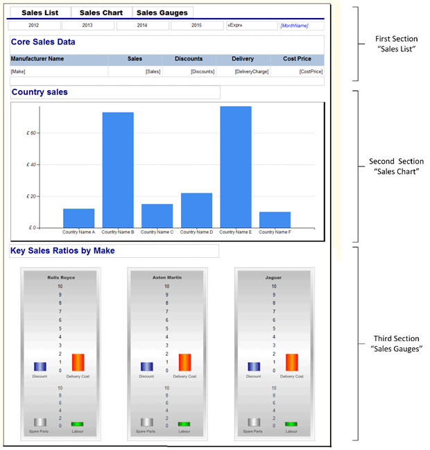
Figure 8 – A tabbed report in design view
This report is nothing more than a series of objects whose visibility is controlled by the Action properties of the text boxes that we use to give a “tabbed” appearance.
As we have three groups of report items that have to be made visible or invisible as coherent units, I have used parameters to contain the state of the visibility of items in the report. In this report the three parameters are:
TabSalesList– This controls the visibility of the first section “Sales List”.TabSalesChart– This controls the visibility of the second section “Sales Chart”.TabSalesGauge– This controls the visibility of the third section “Sales Gauges”.
All are defined as Boolean and with the Hidden property set to True. As a text box is tapped, its action property will set the value for the parameters that control visibility and cause the report to be redisplayed with a different set of visible items.
To give you an idea of how simple this is to apply, take a look at Figure 9 which shows the Action property for the Sales List button:
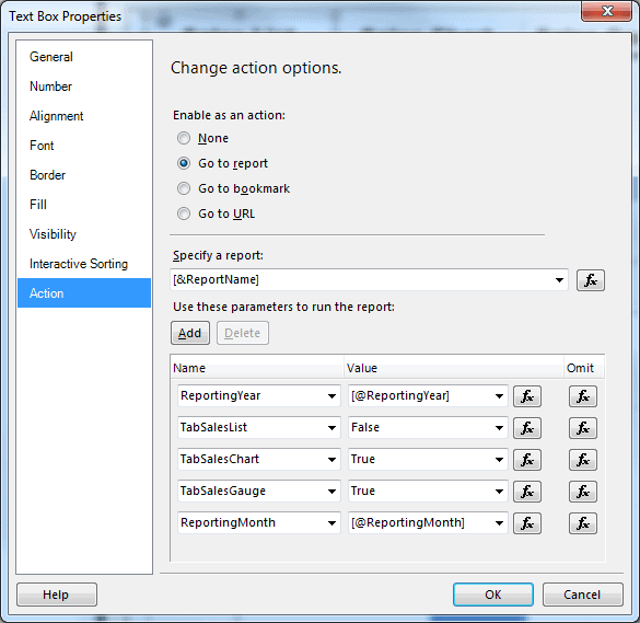
Figure 9 – Passing back multiple parameters
Any “standard” parameters are passed through to the report with their current values, when the report is redisplayed, just as was explained earlier in the article. The three parameters that define the visibility of all the variable report elements are set manually, depending on the text box that will be tapped.All the variable elements on the report then need their Hidden property setting using a function similar to the following:
|
1 |
=Parameters!TabSalesChart.Value |
Of course, for each object in the report you will have to decide which parameter controls its visibility to ensure that clicking on one of the text boxes that gives the tabbed appearance will only display the items that you want the user to see.
Smartphone Reports
There is probably one word that defines the recipe for successful smartphone reports -simplicity. As in most areas, simplicity in report design is often harder than complexity. While we all have our opinions about design, a few tips that you should nearly always bear in mind are:
- Isolate truly key elements – remove anything not essential from the report
- Create single-focus screens – ideally the information should be “bite-sized”
- Deliver key data higher in the sequence of reports – give less detail at higher levels and reserve granularity for further reports lower in the hierarchy
- Limit the number of metrics that you deliver on each screen
- Consider providing data or titles as tooltips – it can save screen real estate
With these ideas in mind, let’s take a look at a few smartphone reports.
Multiple Gauges
A user looking at their phone for business intelligence will be a busy person and their attention span will be limited. After all, many other distractions are jostling for their time and focus. So you need to give them the information that they want as simply and effectively as possible. Gauges can be an ideal way to achieve this objective.
Inevitably you will have to limit the information which can be displayed efficiently. This will depend on the size of the screen which you are targeting, so there are no definite limits. In this example, I use six gauges to show car sales for the current month. Moreover, I deliberately break down the display into:
- Five specific makes of car sold
- One gauge for all the others
This could require tweaking the source data to suit the desired output, but this is all too often what you end up doing when designing BI for smartphones. In this example the query that the report is based on returns only six records – one for each gauge.
This final output will look like Figure 10 (SmartPhone_CarSalesGauges.rdl). In this particular visualization there is no facility for selecting the year and month; the report displays automatically the sales for the current year and month.
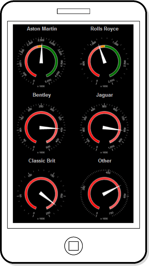
Figure 10 – A mobile phone report
This report uses a table as a placeholder to contain the six gauges. A filter is applied to each gauge so that it displays only the data for a specific make of vehicle. The big advantage of gauges here is that we can resize them easily, and they will even resize if we simply adjust the height or width of the row and column in which they are placed.
Slider Gauges
A type of presentation that is extremely well suited to smartphones is the lateral gauge. These gauges have been popularized by certain web sites, and are sometimes called “slider” gauges. An example is shown in Figure 11 (SmartPhone_SalesAndTargetWithPreviousMonthAndPreviousPeriod.rdl).
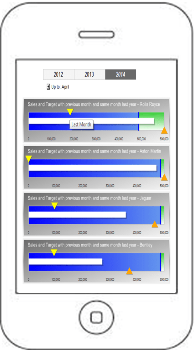
Figure 11 – A complex mobile phone dashboard
This gauge uses three different pointer styles as well as pointer placement to add a lot of information to a single gauge. The “main” pointer is the central bar (which contains the data for sales to the selected month in the year) while the budget is a bar across the gauge that lets the user see how sales relate to budget. As they are ancillary data, the pointers for last month’s sales and the sales up until the same month for the previous year are shown as pointers above and below the main pointer.
The budget is then reflected in the two ranges (the blue and green backgrounds), to indicate more clearly how sales relate to budget. Finally tooltips are added for all the pointers so that the user can see which pointer represents which value. This gauge is embedded in a table, which means that the actual number of gauges can vary according to the number of makes of vehicle sold. However, as this table can scroll downward, this kind of visualization lends itself rather neatly to smartphone display.
Note: Every time a new user sees this gauge they ask how they can move the “slider” pointers to change the data. You have been warned!
Text-based Metrics
I would never advise creating BI visualizations for smartphones that rely on lots of text. Users will simply not read reams of prose on a tiny mobile device. Instead, think of some of the apps that you currently use. They probably have simple screens and large buttons. Smartphone BI must try to emulate this approach. As an example, consider the list of sales by make of car, in Figure 12 (SmartPhone_TextBased.rdl).
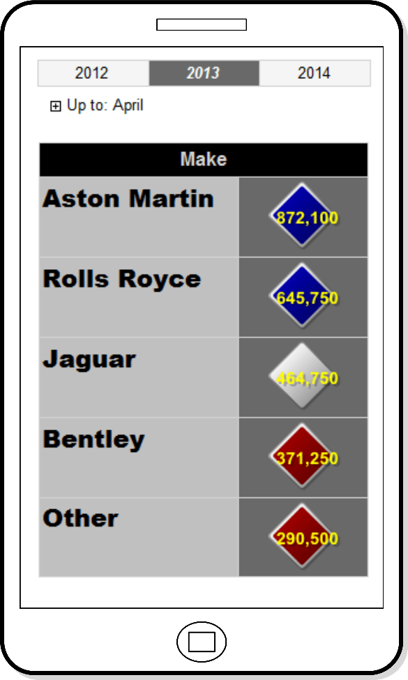
Figure 12 – A text-based mobile phone report with KPIs
This visualization uses a table structure to show the records from the source data where the sales data is used not only to define the indicator color, but is also shown inside the indicator as text. Using a table also makes the result list “scrollable”. So if the output contains more rows than can comfortably be shoehorned into a smartphone screen, the user can flip down to the next set of information with a simple gesture. The only trick that you need to know is that when text is added to an indicator you must use an expression to display it, along with some simple Visual Basic to format the numbers. One advantage of using a table here is that you can resize the indicator simply by adjusting the height and width of the column within which it is contained. The text will resize automatically as well. This makes it far easier to control the aesthetics of the table, if you need to add or remove rows.
With smartphone delivery, the color scheme is deliberately brash. You may to prefer more moderate pastel shades but be aware that this environment has little respect for subtlety or discretion.
Smartphone and Tablet Reports in Practice
Be warned! Delivering mobile BI with SSRS 2012 SP1 and SQL Server 2014 to most mobile devices means forgetting about Report Manager. This is not merely a question of design. An iPad cannot display a report accessed using Report Manager. All you get is a largely and disconcertingly blank screen. All reports have to be accessed using the web services interface. While not a major technological change, the look and feel of this early 90’s screen will destroy any latent goodwill on the part of your users. Also, delivering access to reports using complex URLs, which the MS documentation helpfully says should be sent by email will not endear you, or your lovingly crafted mobile BI report suite, to your user base.
So, in essence, the final touch for mobile BI with SSRS is to find ways to replace the Report Manager. This boils down to creating your own interface and report delivery hierarchy. While this is a little extra work, it is not intrinsically difficult. In any case, you could find that the way in which you present the hierarchy of reports for smartphones and tablets needs to be different from a reporting suite designed for PCs and laptops. This is because mobile device users are more used to simpler, more “bite-sized” chunks of information. So you will need to consider developing a menu-style access to a report suite to navigate down and up a hierarchy of reports
Access to a Report Hierarchy
To hide the web services interface all you have to do is to set up a report that is nothing more than a Home page for your suite of reports. Then you send this URL to your users. They can add it to the favorites menu in their browser, and use it as the starting point for accessing the set of tablet-oriented BI that you have lovingly crafted. A simple example is given below in Figure 13. Note that this report is not in the sample solution as it is too dependent on the intricacies of the report deployment.
Imagine, then, that you have deployed your reports to a SQL Server Reporting Services Instance, and that you have structured the reports into a set of subfolders.
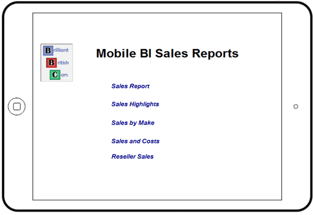
Figure 13 – Menus for mobile reports
This “menu” is simply a set of text boxes where the Action property is defined as “Go to URL” and contains a link something like:
http://localhost/ReportServer/Pages/ReportViewer.aspx?%2fCarSalesReports%2fTablet%2fTablet_TabbedReport&rs:Command=Render
Structuring the Report Hierarchy
Now that you have seen the principles of creating an interface to replace the report manager you should be able to extend this to as many sub-levels as you need. One extra point is that you might find it useful to add a small text box to each of the “sub” reports. This text box uses the URL of the home menu in its Action property. This way you can flip back from any report at a sub-level to the home page, or directly to another sub-level.
If you are thinking “yes, but I have the browser’s back button for that”, then remember that your developers could be using the report refresh techniques to mask parameter access. If these techniques have been applied then the back button displays the same report, but using the previous set of parameters. So you could need direct and simple links across reports and back to the menu pages in your BI application.
This technique can also be used to break down existing reports into multiple separate reports. In the case of both the tabbed report and the bookmark report that we saw earlier you could “cut” a report into separate .rdl files and use action properties to switch to another report. If you prefer, you could also drill through from one report to another by setting the Action property of a textbox, chart, chart element (such as a pie slice or point on a line chart), map area or a gauge pointer to display another report.
To Conclude
In practice, one part of SSRS that you may want to spend some time on, when designing or adapting reports for mobile devices, is revamping the interface to avoid using the parameters pane. There are several reasons for wanting to do this:
- The parameters pane takes up a proportionally vast area of the limited screen real estate.
- It is horrendously un-aesthetic.
At the very least you will probably want to minimize the parameters pane in your mobile reports, and this works on iPhones and iPads too, fortunately.
Another key design technique we discussed was how to break down reports into smaller elements, and establish a clear report hierarchy so that readers can navigate around the different report elements smoothly. Specifically, we looked at some examples of tabbed and multi-page reports and enabling menu-style access to a suite of reports.
Refining and adapting reports for mobile output in SSRS requires time and effort, but almost certainly less time, effort and money than if you have to buy, configure, develop and deploy mobile reports using a completely separate product. Most of the techniques that you need to apply are simple and can easily be applied to existing reports. With a little time and some applied ingenuity you could open up a new delivery channel for your existing collection of Reporting Services reports – and enjoy being creative at the same time.
Business Intelligence with SQL Server Reporting Services
If you like what you read in this article and want to learn more about Business Intelligence reporting using SSRS, then please take a look at my book, Business Intelligence with SQL Server Reporting Services (Apress, February 2015)
Load comments