
The series so far:
- Text Mining and Sentiment Analysis: Introduction
- Text Mining and Sentiment Analysis: Power BI Visualizations
- Text Mining and Sentiment Analysis: Analysis with R
- Text Mining and Sentiment Analysis: Oracle Text
- Text Mining and Sentiment Analysis: Data Visualization in Tableau
- Sentiment Analysis with Python
The first article of this three-part series introduced Azure cognitive services Text Analytics API and Power BI. With a team health survey use-case, I demonstrated:
- Creating Azure Cognitive services resource
- Loading the survey data into Power BI
- Creating and Invoking Custom Functions in Power BI, to extract key phrases and generate sentiment scores from raw text
- Saving the Key phrases and sentiment scores as new columns, into the data table loaded in Power BI
After completing the steps demonstrated in the first article, the data table in Power BI Desktop has six fields. The fields Period, Manager, Team and Response come from the raw data file, while fields KeyPhrases and SentimentScore are added and populated by invoking the Text Analytics API.
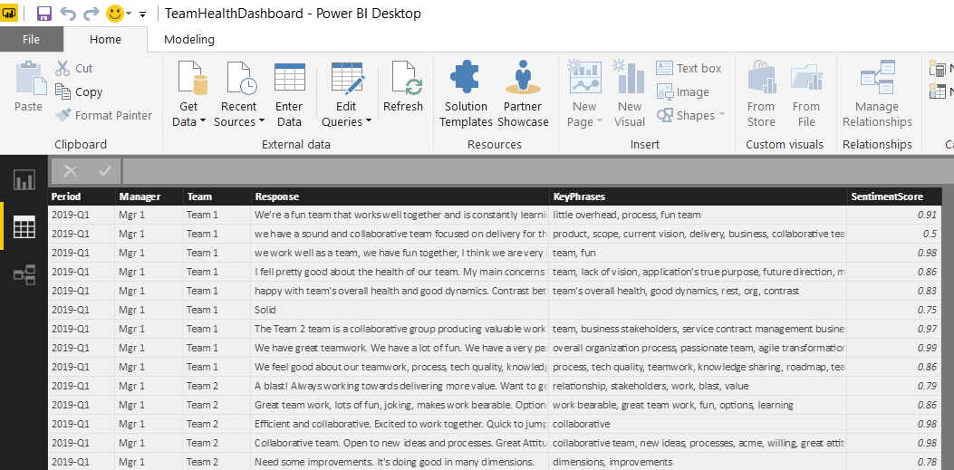
Figure 1. Power BI Desktop Data Pane – data tables with six fields
In this article, I will demonstrate how to apply various analytical and visualization techniques in Power BI to the qualitative (Key Phrases) & quantitative (Sentiment Scores) data extracted from the survey responses, using word cloud, charts and filters.
Visualization Page One – Word Cloud & Slicers
A Word cloud is one of the most popular ways to visualize and analyze qualitative data. It’s an image composed of key words found within a body of text, where the size of each word indicates its frequency in that body of text. I will use the new KeyPhrases field to generate a word cloud, because it has only the important words. This will help ensure the word sizing in the resulting cloud isn’t skewed by the frequent use of common but trivial words in the response text.
Click on the Reports pane from the left menu of Power BI desktop, then expand the Visualizations pane on the right side. If you don’t already have the Word Cloud custom visual installed, import the Custom Visual from the Store. In the Visualizations panel to the right of the workspace, click the ellipses (…) and choose Import from AppSource. (In some older versions, you may see Import from marketplace).
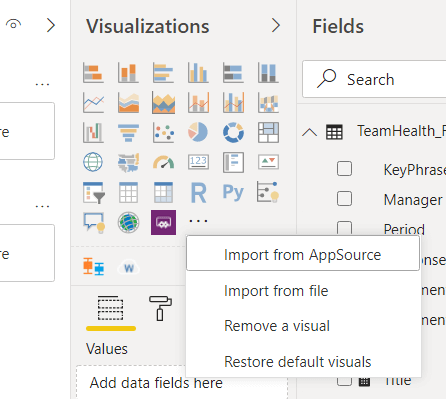
Figure 2. Import Custom Power BI Visuals from AppSource/Marketplace
Then search for word cloud and click the Add button next to the Word Cloud visual to install it. (Please do your due diligence when installing add-ins from the online marketplace, as they may pose a potential security / privacy risk)
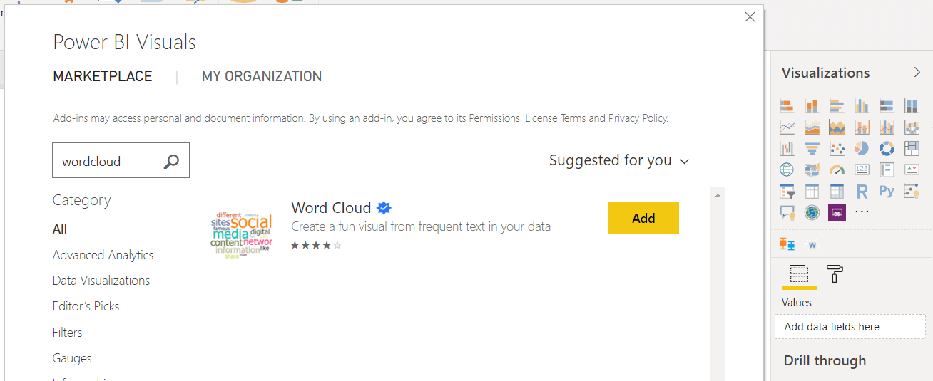
Figure 3. Import Word Cloud Custom Visual from the Marketplace.
Once installed successfully, click on the visual (look for a w under the main visualizations section) in the Visualizations pane and a new report will appear on your page.
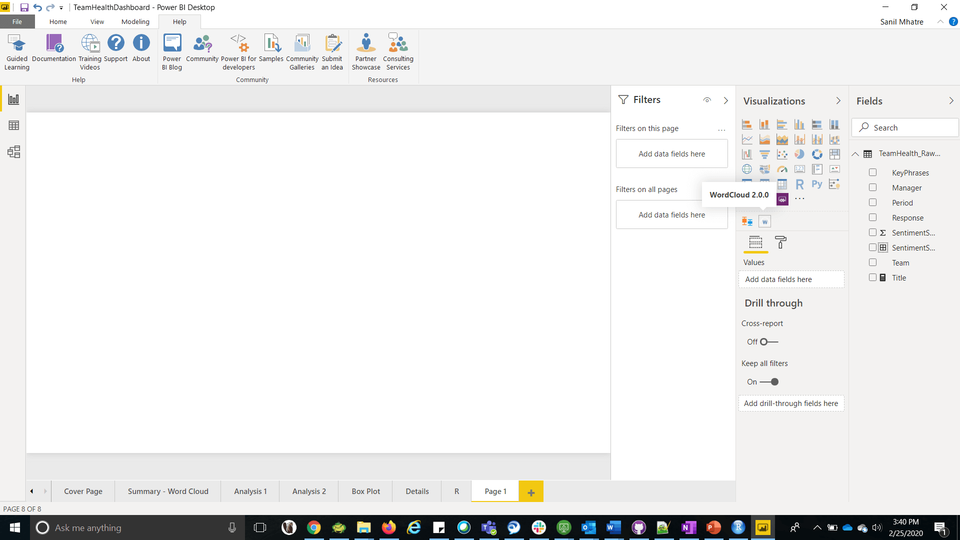
Figure 4. WordCloud custom visual in the Visualization Pane
Then drag the KeyPhrases field from the Fields panel into Category field of the Visualizations panel, which creates a basic word cloud in your report.
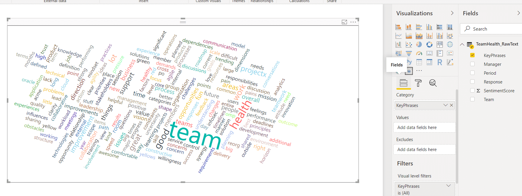
Figure 5. The basic word cloud
The basic word cloud looks a bit clumsy with the default settings. I will walk through some clean up steps and tweaks to the default settings, giving it a more polished look.
From the Visualization Pane for the Word Cloud, switch to the Format section and expand the General menu. Enter the number 5 in the field Minimum number of repetitions to display, which only eliminates words appearing less than five times (you can tweak this setting anytime to suit your needs).
Next, expand the Stop words menu and turn on Default Stop words, which will eliminate the most commonly used but low value words from appearing. For additional reading about stop words in the context of Natural Language Processing, please follow this link. You can also add custom stop words (each word separated by a space), in the Words field of this section. For example, I have added health, team and s to the list of custom stop words
Lastly, switch off Rotate text and switch on Title and set it to Word Cloud.
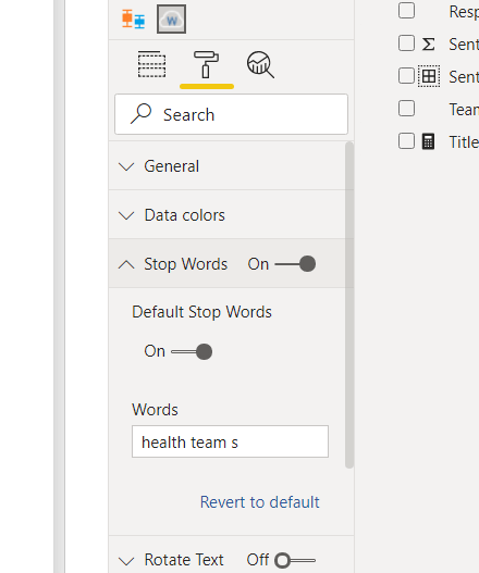
Figure 6. Custom stop words
The word cloud now looks much cleaner.
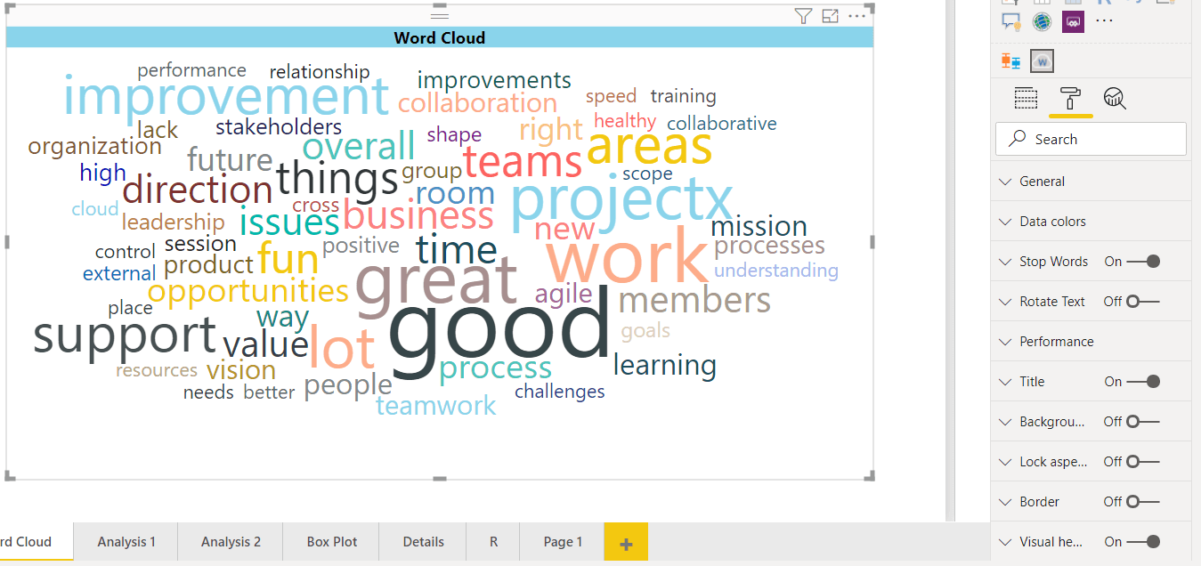
Figure 7. The polished word cloud
This word cloud covers responses from all periods, teams and managers in your data. Wouldn’t it be great if you could focus on identifying popular topics by period, team, manager or any combination of thereof? You can easily implement this with filters, or with slicer visualizations;
- Visual level filters are applicable only to the visualization they are set up for
- Page level filters apply to all visualizations on the page
- Report level filters apply to all visualization on the report, across all pages
- Slicers are visualizations used as filters on the report canvas for easier access
To add a slicer to your report, click on the Slicer icon in the Visualization pane. Then drop the period field into it. Then, at the top right of the slicer, select Dropdown as the Slicer Type.
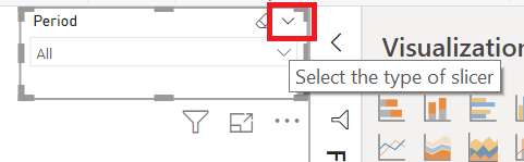
Figure 8. Type of slicer
Next, repeat these steps to add slicers for Team and Manager fields. Your users can now use these slicers to filter the word cloud.
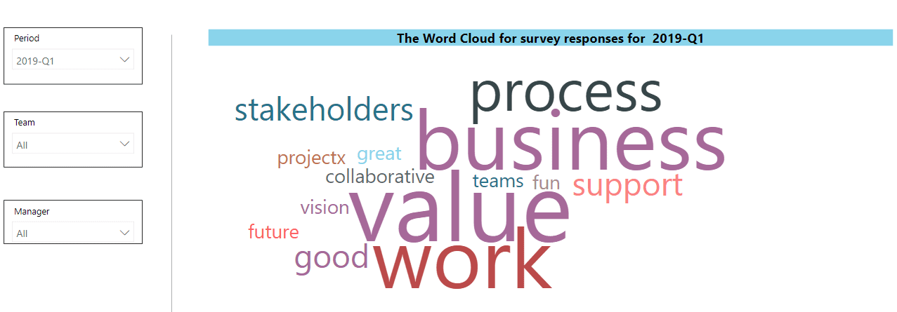
Figure 9. The polished word cloud with Slicers for Period, Team and Manager
Visualization Page Two – Line, Column and Bar Charts
The Sentiment score is a numeric value that lends itself to quantitative analysis. This section will demonstrate:
- A Line Chart, to see how Sentiment Scores are Trending over a period of four quarters
- A Column Chart, to compare Sentiment Scores for teams rolling up to different managers
- A Bar Chart, to compare Sentiment Scores rolling up to different teams
Add a New Page, then add the following three visualizations to this page.
Visualization One – Line Chart: A line chart is a type of chart which displays information as a series of data points called markers connected by straight line segments. A line chart is typically used to visualize a trend in data over a period of time. Click on the Line Chart in the Visualizations pane, to add it to the page. Next, add the period field into Axis, which sets the X-axis. Then add SentimentScore field into Values and set the aggregation to Average. Set title to Average of SentimentScore by Period.
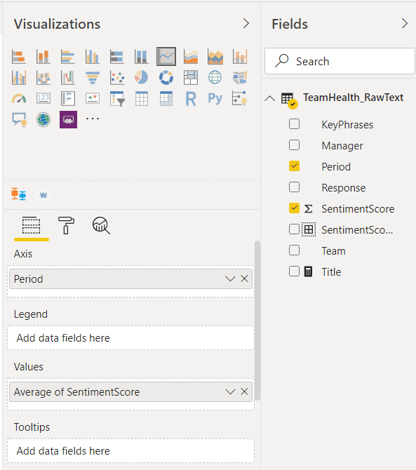
Figure 10. Visualization settings for a line chart
Lastly, click the ellipses on the top right corner of the report, to expand More Options, then select Sort ascending and Sort by Period. This will sort the Periods on the X-axis in an ascending sequence, showing the trend of average sentiment score over time.
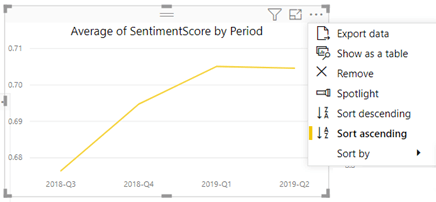
Figure 11. Sorting the chart by Period
Visualization Two – Column Chart: A column/bar chart is a type of chart where each category is represented by a column/bar and the height of the column/length of the bar is proportional to the value being plotted. Click on the Stacked Column Chart in the Visualizations pane, to add it to the page. Next, add Manager field into Axis, which sets the X-axis. Then add SentimentScore field into Values and set the aggregation to Average. Set title to Average of SentimentScore by Manager. Lastly, set this chart to Sort Ascending and Sort by Manager.
Visualization Three – Bar Chart: Click on the Stacked Bar Chart in the Visualizations pane, to add it to the page. Next, add Team field into Axis, which sets the Y-axis. Then add SentimentScore field into Values and set the aggregation to Average. Set the title to Average of SentimentScore by Team. Lastly, set this chart to Sort Descending and Sort by Average of Sentiment Score. This sorting is useful in visually ranking the teams from the highest to lowest values of their Average Sentiment Score.
Adjust the placement of the three visualizations on your page if necessary. You can always add filters as you see fit, to allow further in-depth analysis on each chart (for e.g., it might be valuable to add Team as a filter to the line chart, which allows users to see how average sentiment Scores are trending over four quarters for each team).
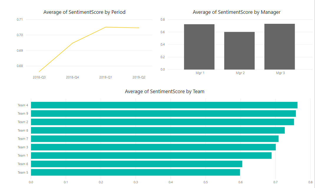
Figure 12. Line, Column and Bar Chart visualizations on single page
These three visualizations help to infer the following:
The line chart shows the Average Sentiment score went up for the first three quarters and the gains leveled off in the fourth quarter.
- The column chart shows that Average Sentiment scores rolling up to all three managers are close.
- The Bar chart indicates that Team 4 has the highest sentiment score, whereas Team 5 has the lowest.
Visualization Page Three – Histogram
A Histogram is a representation of the distribution of numerical data. To construct a histogram, the first step is to bin (or bucket) the range of values into a series of intervals , then count how many values fall into each interval. The bins are usually specified as consecutive, non-overlapping intervals of a variable. The bins (intervals) must be adjacent and are often (but not necessarily) of equal size. In the team health survey scenario, the sentiment score bin will form the x axis, and the frequency (count of responses) belonging to that bin will be on the y axis.
There are two ways to plot a histogram in Power BI – either use the custom histogram visualization or use a regular bar chart by binning the data beforehand. I will demonstrate the regular bar chart method in this article.
To Bin the data, right click on SentimentScore and select New Group. On the Groups page, change Bin Type to Number of Bins and set Bin Count to 10, then click OK. This will create ten equal sized bins for the range of sentiment score values.
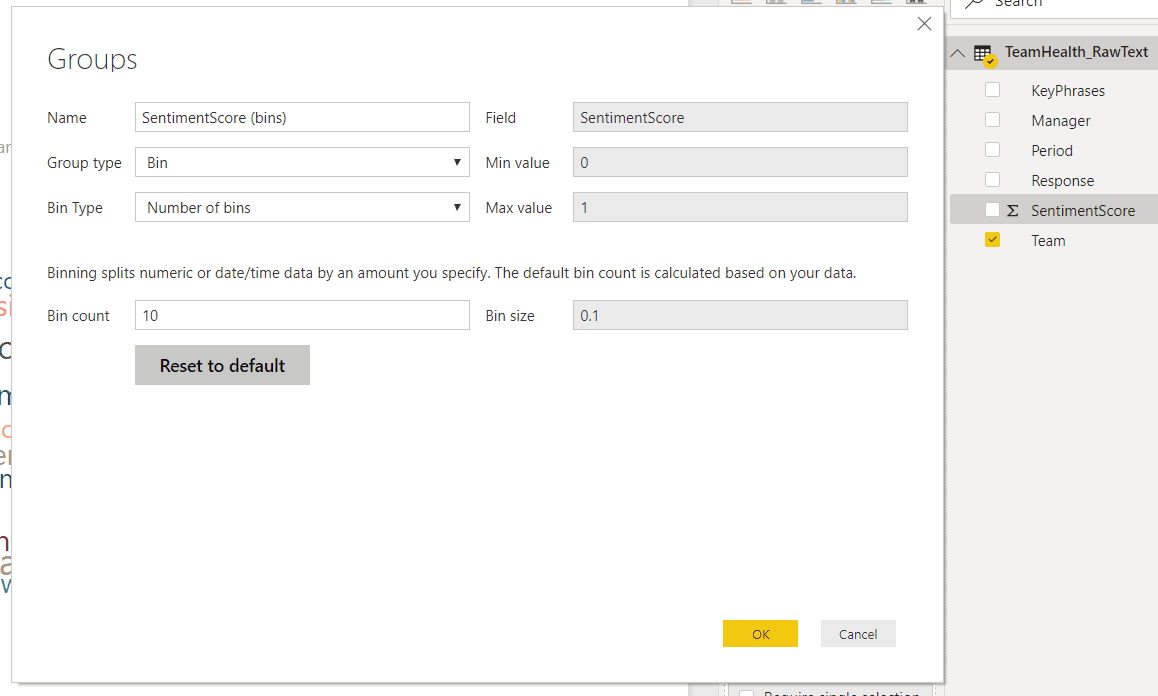
Figure 13. Bin Sentiment Score for Histogram
Next, create a new page and
- Pull the stacked column chart visualization on this page
- Drag and drop SentimentScore(bins) field into Axis
- Drag and drop Response field into Value and set aggregation to Count
- In the Formats tab, expand X axis (should be set to ON by default) and set Title to ON. This will display title Sentiment Score (bins) for the X axis. Do the same for Y axis, which will display title Count of Response for the Y axis
- In the Formats tab, set Data Labels to ON
- In the Formats tab, set Title to ON and enter text Histogram – Distribution of number of Responses Over SentimentScore (bins) in the Title field
- Add slicers for Period, Team and Manager as demonstrated earlier, which will allow users to filter the Histogram using these dimensions
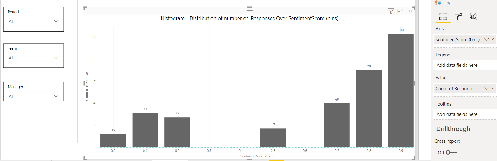
Figure 14. Histogram with slicers
This Histogram shows an almost bimodal data distribution, indicating there is some degree of polarization in terms of how team members feel about their team’s health. Many team members (200+ responses clustered towards the right) feel strongly positive about their team’s health, while some (about 100 responses clustered towards the left) feel strongly negative. Very few (only 17 responses in the middle) are in the neutral score range. Users can filter the histogram by period, team or manager for further analysis.
Visualization Page Four – Box and Whiskers Plot
A box plot is a method of graphically depicting groups of numerical data through their quartiles. Box plots may also have lines extending from the boxes (whiskers) indicating variability outside the upper and lower quartiles, hence the terms box-and-whisker plot. It is commonly used in descriptive statistics and is efficient way of visually displaying data distribution through their quartiles. They take up less space and are very useful when comparing data distribution between groups.
To build a box plot, create a new page and import the box and whiskers chart custom visual from the marketplace and add it to the page. Since I find value in comparing distribution of sentiment score data between various teams, drag the Team field into Category. Next, drag the Sentiment Score field into Values and select Average for aggregation. Lastly, drag the Period field into Sampling.
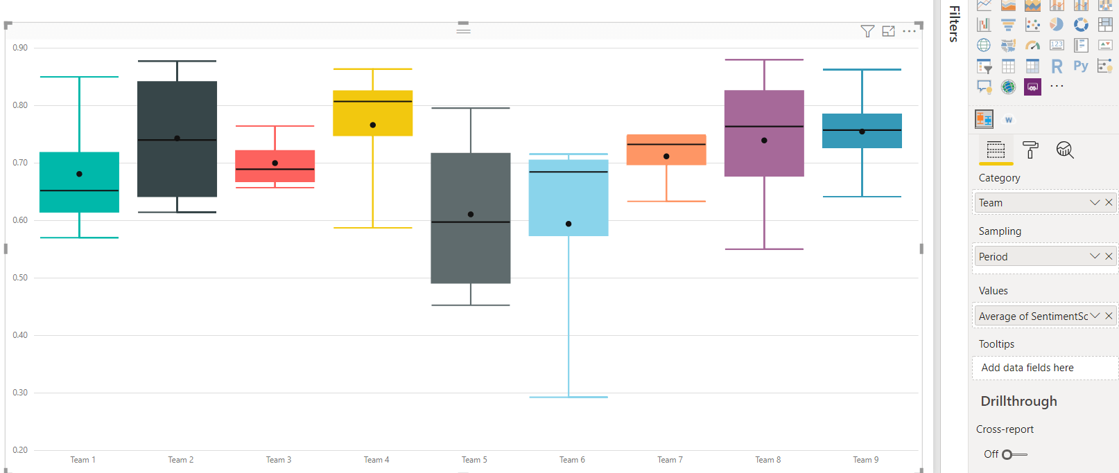
Figure 15. Box and Whiskers plot
This box and whiskers plot reveals some interesting insights. Without any background in statistics, just focusing on just the height of each box and its position along the vertical axis, one can interpret:
- For Team 9, the box is short, and the whiskers are short, too. The distribution of their response sentiment scores is grouped tightly around the median value of 0.76. I would interpret it as most team members agree about their team’s health. The placement of the box is high on the vertical axis, which indicates they feel quite positive about their team’s health as well. The short whiskers indicate the outliers are not too far away from the upper and lower quartile boundaries.
- For Team 5, the box is taller, but the whiskers are not too long. The distribution of their sentiment scores is spread wider (not as tightly grouped together) around the median score of 0.60. It means several team members feel negatively about their team’s health, compared to others on the same team. This could indicate a disconnect between how different team members feel about their team’s health. The placement of the box is lower on the vertical axis. I would interpret it a Team 5 feels less positive about their team’s health, relative to Team 9.
Visualization Page Five – Focus on Targeted Responses
The first four pages of visualizations have helped with analyzing:
- What are the trending topics for each team, across various periods and managers?
- Which teams have the highest sentiment scores, versus teams that might need help?
- How do the team’s sentiment score trend over time?
- How do the aggregated sentiment scores stack up across all managers?
- How does the distribution of sentiment scores look like within the team and how does it compare across teams?
After this analysis, it’s appropriate to guide your users towards viewing the actual responses that match their criteria of interest. Some users might be interested in reading the most negative responses for a period, while the most positive responses from a particular team might interest other users. In this section, I will demonstrate a set of visualizations for serving up this detailed information in an easy to consume format.
Create a new page and add the table visualization to it. Drag and drop the fields Period, Team, Manager, Sentiment Score and Response onto to table visualization. In the Format section of the Visualizations pane, expand Totals and set it to off.
I will add four slicers to the left side of the table, for easy filtering of the table:
- Add the slicer visualization to the left side of the page, then drag and drop the Period field on it
- Add the slicer visualization to the left side of the page, then drag and drop the Team field on it
- Add the slicer visualization to the left side of the page, then drag and drop the Manager field on it
- Add the slicer visualization to the left side of the page, then drag and drop the SentimentScore(bin) field on it.
Change the Slicer type for all four slicers to List. Last, add text box at the top of the page, with a helpful message to guide your users Select a Period, Team, Manager, and Sentiment Score Bin, to review the Response Text for the select combination of slicers.
Say one of your users is interested in reviewing the most positive responses for Team 9, in the latest quarter. The would simply need to select 2019-Q2 from the Periods slicer, Team 9 from the Team slicer and 0.90 from the SentimentScore(Bin) slicer.
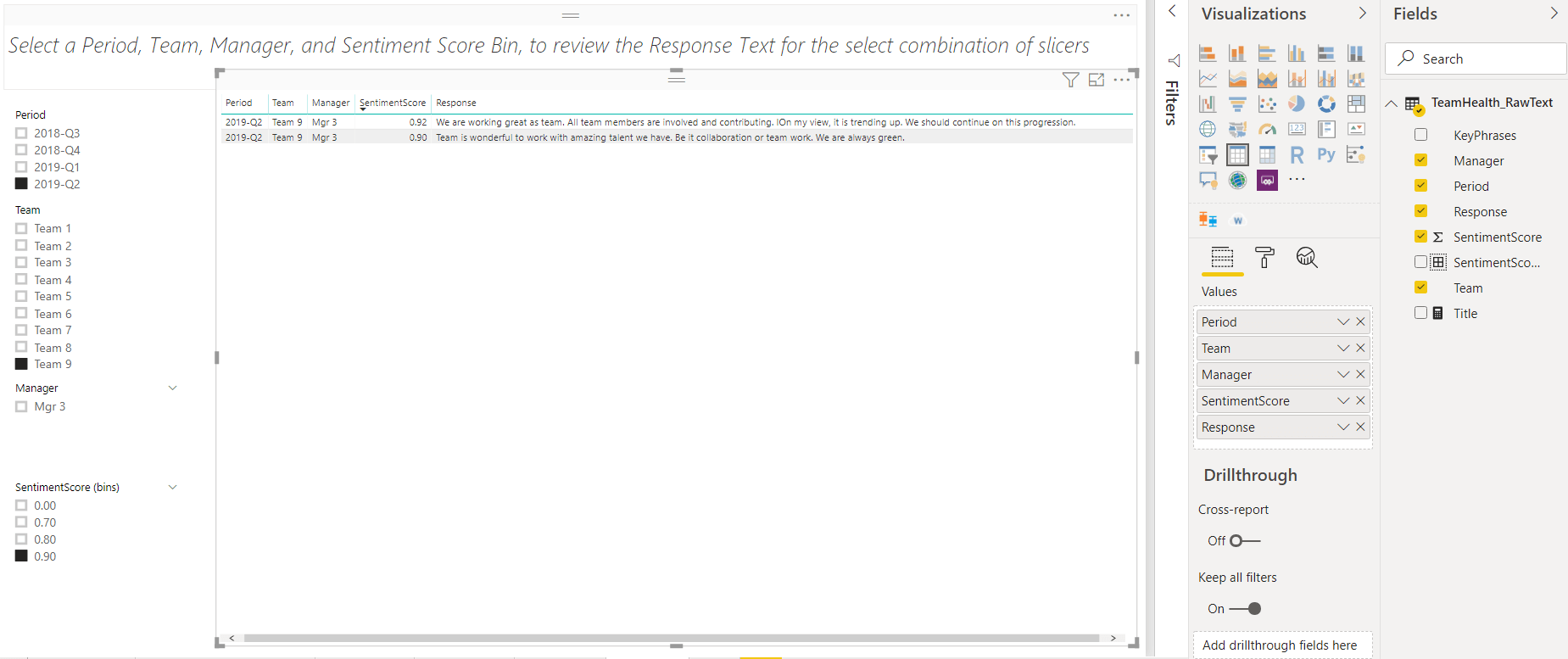
Figure 16. Table Visualization with slicers for filtering responses
The visualizations demonstrated so far have helped to analyze the team health data.
- The word cloud identifies popular topics/themes and allows drill down by Period, Team and Manager
- The line chart shows how the average sentiment scores are trending over a period.
- The column chart shows how the average sentiment scores compare across all managers.
- The bar chart enables easy comparison of average sentiment scores across teams. It helps to identify which teams have the highest/lowest average scores and if they changed over time.
- The histogram visualizes the distribution of responses across the range of sentiment scores. It helps with identifying clusters/groupings in the positive, neutral or negative ranges.
- The box plot enables a quick and efficient visualization of how the distribution of scores for one team compares to others. It is useful to interpret if the team members are tightly aligned with each other or not.
- The table visualization with slicers, allows for review of the actual response text, based on the selection of Sentiment Score Bin, Team, Period and Manager.
This analysis enables you to identify which teams are doing great, which ones may need some help to improve their team’s health and what areas deserve further in-depth conversations with Team managers.
Conclusion
This article demonstrated how to do a visualize Key Phrases & Sentiment Scores in Power BI and interpret them to gain insights. The word cloud and several statistical charts helped with analyzing data, extracting business value and narrating a meaningful story from the team health survey. The last article in this three-part series will explore R for texting mining and sentiment analysis.
References:
- Qualitative and Quantitative Data – https://cyfar.org/qualitative-or-quantitative-data
- Quantitative Data Analysis – https://cyfar.org/analysis-quantitative-data
- Word cloud – https://en.wikipedia.org/wiki/Tag_cloud
- Power BI Slicer – https://docs.microsoft.com/en-us/power-bi/visuals/power-bi-visualization-slicers
- Line Charts – https://en.wikipedia.org/wiki/Line_chart
- Bar charts – https://en.wikipedia.org/wiki/Bar_chart
- Histogram – https://en.wikipedia.org/wiki/Histogram
- Box and whiskers plot – https://en.wikipedia.org/wiki/Box_plot
- Sorting within Charts in Power BI – https://docs.microsoft.com/en-us/power-bi/consumer/end-user-change-sort
This document contains proprietary information and is protected by copyright law.
Copyright © 2026 Red Gate Software Limited. All rights reserved
Load comments