
The series so far:
- Power BI Introduction: Tour of Power BI — Part 1
- Power BI Introduction: Working with Power BI Desktop — Part 2
- Power BI Introduction: Working with R Scripts in Power BI Desktop — Part 3
- Power BI Introduction: Working with Parameters in Power BI Desktop — Part 4
- Power BI Introduction: Working with SQL Server data in Power BI Desktop — Part 5
- Power BI Introduction: Power Query M Formula Language in Power BI Desktop — Part 6
- Power BI Introduction: Building Reports in Power BI Desktop — Part 7
- Power BI Introduction: Publishing Reports to the Power BI Service — Part 8
- Power BI Introduction: Visualizing SQL Server Audit Data — Part 9
Until now, this series has focused primarily on building datasets in Power BI Desktop, with the understanding that the data would ultimately be used to create visualizations that provide insights into the underlying information. The visualizations would be included in one or more reports that could then be published to the Power BI service for wider distribution.
This article switches focus from building datasets to creating reports that rely on those datasets, using the tools within Power BI Desktop for visualizing the data. The article offers several examples of how to add visualizations to a report to provide different perspectives of the data. The visualizations are based on a single dataset, created from data in the AdventureWorks2017 sample database in SQL Server 2017.
If you plan to try out the examples for yourself, you can use the following T-SQL statement to add a dataset to Power BI Desktop:
|
1 2 3 4 5 6 7 8 9 10 11 12 13 14 15 16 17 |
SELECT h.SalesPersonID AS RepID, CONCAT(p.LastName, ', ', p.FirstName) AS FullName, a.City, sp.Name AS StateProvince, cr.Name AS Country, h.OrderDate, h.SubTotal FROM Sales.SalesOrderHeader h INNER JOIN Person.Person p ON h.SalesPersonID = p.BusinessEntityID INNER JOIN Person.BusinessEntityAddress ba ON p.BusinessEntityID = ba.BusinessEntityID INNER JOIN Person.Address a ON ba.AddressID = a.AddressID INNER JOIN Person.StateProvince sp ON a.StateProvinceID = sp.StateProvinceID INNER JOIN Person.CountryRegion cr ON sp.CountryRegionCode = cr.CountryRegionCode WHERE h.SalesPersonID IS NOT NULL ORDER BY FullName ASC; |
For information about using a T-SQL query to create a dataset, refer to Part 5 of this series.
After you import the data into Power BI Desktop, change the name of the dataset to Sales, update the format of the OrderDate column to show only the dates (not the times), and update the SubTotal column to show whole number currency values.
To update for the OrderDate column, select the dataset in Data view and then select the OrderDate column. On the Modeling ribbon, select Date from the Date type drop-down list. Next, click the Format drop-down list, point to Date Time, and click the format 2001-03-14 (yyyy-MM-dd).
To update the SubTotal column, select the column in Data view and then select Whole Number from the Data type drop-down list. You should receive a warning message about the loss of data precision. Click Yes to continue. In the Currency format drop-down list, click $ English (United States). In the Decimal places box, set the number of decimal places to 0.
Getting started with Power BI Desktop Reports
With the dataset in place, you’re ready to start adding visualizations to the report. But before you do, save the file if you haven’t already done so. The file provides the structure necessary for publishing the report—along with its visualizations and datasets—to the Power BI service. Each file is associated with a single report made up of one or more pages, with each page containing the actual visualizations.
To add a visualization to a report, go to Report view, where you’re presented with a design surface and the Visualizations and Fields panes, as shown in the following figure. The design surface contains the report pages, with Page 1 already added to the report.
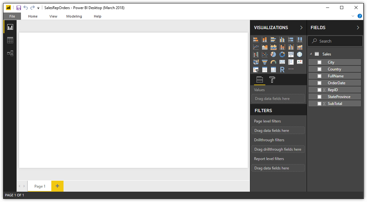
The Visualizations pane provides the tools necessary for adding and configuring the visualizations. The Fields pane includes a list of the defined datasets, with access to each dataset column. The above figure indicates that the Sales dataset is the only visible dataset included in this report file. (In Power BI Desktop, you can configure a dataset to be hidden in Report view.)
Most of the tasks you carry out in Report view are point-and-click or drag-and-drop operations. For example, to add a visualization to a report page, you simply click the visualization’s button at the top of the Visualizations pane. Power BI Desktop will add the visualization to the design surface, where you can drag it to a different position or resize its window. You can then specify what data to add to the visualization by selecting columns from the Fields pane.
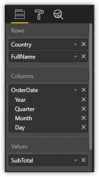
When a visualization is selected on the design surface, Power BI Desktop updates the Visualizations pane to include configuration options specific to that visualization. For example, the following figure shows the Visualizations pane with a Matrix visual selected on the design surface. In this case, the Country and FullName columns have been added to the Rows section and the OrderDate column has been added to the Columns section, with the date hierarchy expanded. (We’ll be getting into the details of how to add columns in just a bit.)
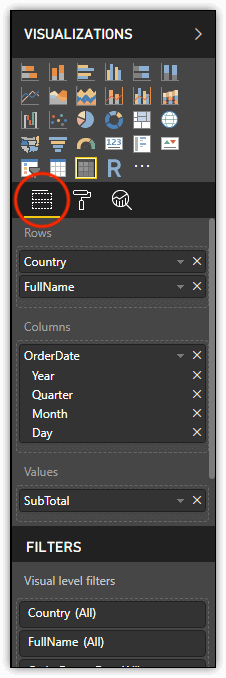
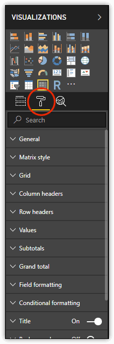
The top of the Visualizations pane contains the icon buttons you use to add visualizations to a report. The rest of the pane is specific to configurating the selected visualization. This part of the pane is divided into three tabs: Fields, Format, and Analytics. In the above figure, the Fields tab is selected, as indicated by the red circle. The options on this tab are used to apply data to the visualization.
The second tab, Format, provides options for configuring how the selected visualization appears. The options are separated into categories, which are specific to the selected visualization. The following figure shows the Format categories for the Matrix visual.
The Analytics tab lets you add dynamic reference lines to certain types of visualizations. Later in the article, we’ll be discussing this tab in more detail.
Creating a Matrix Visual
The best way to understand how to work with visualizations is to set them up for yourself. In this way, you get hands-on experience with the tools, while seeing how all the pieces fit together. For the first example, you’ll add and configure a Matrix visual and two Slicer visuals. The following figure shows what they’ll look like after you’ve set them up. The visualization on the left is the Matrix visual and the two on the right are the Slicer visuals. The Matrix visual is selected in the figure, as indicated by the menu across the top of the visualization and the frame that surrounds it.
The Matrix visual aggregates measure data across both columns and rows, while supporting extensive drill-down capabilities, depending on the data and how you’ve configured the matrix.
To add the Matrix shown in the previous figure, take the following steps:
- Click the Matrix button in the top section of the Visualizations pane. This adds a placeholder object to the design surface, which is already selected.
- Drag the Country column from the Fields pane to the Rows section on the Visualizations pane.
- Drag the FullName column from the Fields pane to the Rows section on the Visualizations pane, directly beneath the Country column. By adding the FullName column after the Country column, you make it possible for users to drill down into the country to view data about the sales reps in that country.
- Drag the OrderDate column from the Fields pane to the Columns section on the Visualizations pane. Because the OrderDate column contains date values, Power BI Desktop automatically defines hierarchical levels that can be used to drill down into the data based on dates.
- Drag the SubTotal column from the Fields pane to the Values section on the Visualizations pane. The SubTotal column provides the measure on which the aggregations are based.
The Fields tab on the Visualizations pane should now look like the one in the following figure.
After you add the data you need, you can configure the visual’s settings on the Format tab to ensure it looks just the way you want, and the data can be easily understood. To make your matrix look similar to the one shown in the above figure, take the following steps:
- Expand the Matrix style section and select Minimal from the Style drop-down list.
- Expand the Grid section and set the Vert grid option to On, and then select the lightest yellow color for the Vert grid color option.
- Expand the Column headers section and set the Text size option to 12.
- Expand the Row headers section and set the Text size option to 12.
- Expand the Values section and set the Text size option to 10.
- Expand the Subtotals section and set the Text size option to 10.
- Expand the Grand total section and set the Text size option to 10.
- Expand the Title section and set the Title option to On. In the Title Text box, type Sales by Country, and set the Font color option to the darkest aquamarine. In the Alignment subsection, click the Center option, and then set the Text size option to 17.
- In the Border section, set the option to On.
Your Matrix visual should now be in fairly good shape. Going forward, I’ll leave it up to you to decide how to configure the settings on the Format tab, based on your own preferences. The main thing to keep in mind when formatting a visualization is to make sure it’s selected on the design surface.
When you select a Matrix visual on the design surface, drop-down list is available for choosing whether drill-down operations are based on columns or rows, as shown in the following figure.
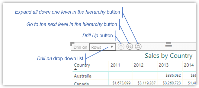
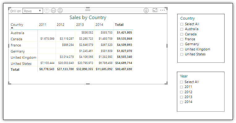
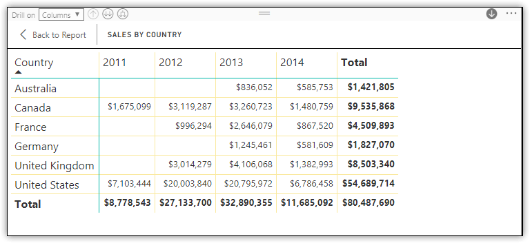
To test this out, select Columns from the Drill on drop-down list, and then click the button Expand all down one level in the hierarchy (third button to the right of the drop-down list). When you click the button, the matrix provides a breakdown of the aggregated data based on quarters as well as years, as shown in the following figure.
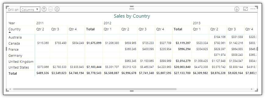
To return to the previous view, click the Drill Up button just to the right of the Drill on drop-down list. Next, click the button Click to turn on Drill Down near the top right corner to turn on drill-down capabilities directly within the matrix. When this button is selected, its shading is reversed.
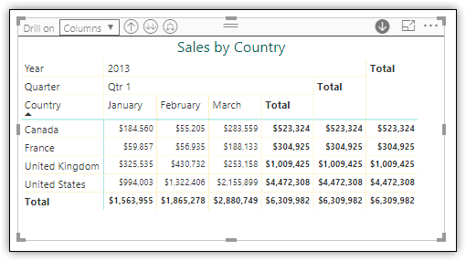
With drill-down enabled, click the 2013 column header. The matrix will now display data specific to that year, as shown in the following figure.
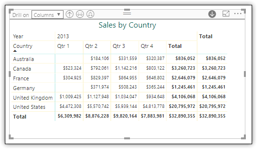
As already noted, Power BI Desktop automatically creates a hierarchy based on the date values, with years at the top, then quarters, next months, and finally days. You can drill down into all levels within a Matrix visual. For example, to drill into the first quarter, click the Qtr 1 column header, which allows you to view sales data at the month level, as shown in the following figure.
If you select the Rows option in the Drill on drop-down list, instead of the Columns option, you will see different results when drilling into the data. For example, if you click the name of a country in the Country column, the matrix will display a list of sales reps for that country, along with their sales totals. Give it a try and see how to goes.
You can also view a visualization in Focus mode, which enlarges the visualization so that it uses the entire design surface. To view a visual in focus mode, click the Focus mode button near the top right corner. Your Matrix visual should now look similar to the one in the following figure. To return back to the regular view of the design surface, click the Back to Report button.
You can also add slicers to your reports that provide a way for users to filter the data within the visualization. For this exercise, you will add two slicers, one for countries and one for years.
To add the Country slicer, verify that no visualizations are selected on the design surface, and then click the Slicer button at the top of the Visualizations pane, as shown in the following figure. The Slicer button is outlined in yellow to indicate that it is the selected visual type.
Next, drag the Country column from the Fields pane to the Field section in the Visualizations pane. You can then move and resize the slicer, as well as apply formatting. Power BI Desktop will automatically link the slicer to any related visualizations on that page. You might also need to change the slicer type from a dropdown list to a regular list of items so the slicer is more readable. To change the type, click the down arrow within the slicer visual itself, near the top right corner, and then select List.
To add the Year slicer, take the same steps as you did for the Country slicer, only this time, add the OrderDate column. Next, click the column’s down arrow (on the Visualizations pane), and click Date Hierarchy. Power BI Desktop adds only the Year level to the slicer. Again, you might need to change the slicer type from Dropdown to List.
When formatting the two slicers, you can add a Select All value to the list of available values. To add the value, go to the Format tab on the Visualizations pane, expand the Selection Controls category, and set the Show “Select All” option to On.
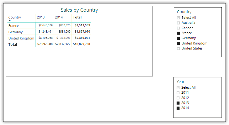
To test the new slicers, select France, Germany, and United Kingdom in the Country slicer, and select 2013 and 2014 in the Year slicer. To select multiple values in a slicer, select the first value, press Control, and select the remaining values. Your visualizations should now look like those shown in the following figure.
Once you’ve mastered how to add and configure a Matrix visual, you’ll find that many of the concepts introduced here will apply to other visualizations. Just be certain to save your report file regularly to ensure that none of your changes get lost.
Creating Table and Card Visuals
When you add columns to a visualization, Power BI Desktop will often summarize the data to provide a big-picture perspective of the information. You saw this with the Matrix visual in the previous section, in which the SubTotal column (the measure) was aggregated across the Country and OrderDate columns to provide subtotals for each discrete group.
In some cases, you might not want the data automatically aggregated. For example, you might want to add a Table visual that lists individual Canadian sales only. To add this table, click the Plus button at the bottom of the design surface to insert a second page. Next, click the Table button on the Visualizations pane, and then add the RepID, FullName, OrderDate, and SubTotal columns to the Values section of the Visualizations tab.
Power BI Desktop will automatically try to summarize the RepID and SubTotal columns because they contain numerical values, using the Count and Sum aggregate functions, respectively. For each of these two columns, click the column’s down arrow (in the Visualizations pane), and select Don’t summarize, as shown in the following figure. Power BI Desktop will update the data to include individual rows.
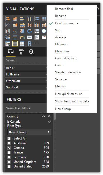
When you add a date column to the Table visual, Power BI Desktop automatically breaks the dates into hierarchical levels, which results in four columns (Year, Quarter, Month, and Day). If you want a single date column instead, you must reset the OrderDate column. In the Visualizations pane, click the column’s down-arrow and select OrderDate. Power BI Desktop will update the table so the entire OrderDate value is listed in a single column.
The last step is to filter out all rows except the Canadian sales. To filter the data, drag the Country column from the Fields pane to the Visual level filters subsection in the Filters section of the Visualizations pane. Expand the Country section if not already expanded and select the Canada checkbox, as shown in the following figure.
Once you’ve set up the data, position and resize the Table visual and apply the necessary formatting. Your table should now look similar to the one shown in the following figure but formatted according to your preferences.
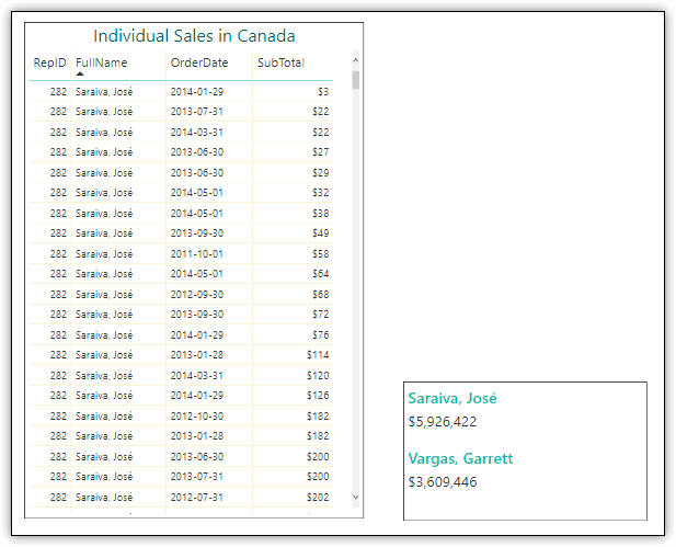
The figure also shows a second visual, which is a Multi-row card. In this case, the card displays the name of each Canadian sales rep, along with the total sales for that rep.
To add this card, verify that the Table visual is not selected and then click the Multi-row card button on the Visualizations pane. Next, drag the FullName column from the Fields pane to the Fields section of the Visualizations pane, and then do the same for the SubTotal column. Finally, set up the same filter you set up for the Table visual so that only Canadian sales reps are listed. Position, resize, and format the card as necessary, and be sure to save the report file.
Creating Pie, Donut, and Treemap Charts
In the next example, you’ll add a page to the report and then add three visuals: Pie chart, Donut chart, and Treemap. The visualizations will display sales information for all countries except the United States. Although you’ll be creating three different types of visualizations, you’ll configure them exactly the same.
To add the Pie chart visual, take the following steps:
- Click the Plus button to add a new page, and then click the Pie chart button on the Visualizations pane.
- Drag the Country column from the Fields pane to the Details section of the Visualizations pane.
- Drag the Subtotal column from the Fields pane to the Values section of the Visualizations pane.
- Expand the Country column in the Filters section and select all countries except the US.
- Position, resize, and format the visualization as necessary.
Once you have the first visualization exactly as you want to, you can create the next one, using the following steps:
- Ensure that the Pie chart visual is selected.
- Click Copy on the Home ribbon, and then click Paste. A copy of the original visualization is added to the design surface.
- Drag the copied visual to its new position.
- Click the Donut chart button on the Visualizations pane.
When you click one of the visualization buttons and a visualization is already selected, Power BI Desktop tries to apply the newly selected visual to the original configuration. This means that the visuals need to compatible with each other for this to work, like the two you just added.
The next step is to add the Treemap visual, taking the same approach as with the Donut chart visual. Copy and paste one of the other visuals and then click the Treemap button at the top of the Visualizations pane. When you’re finished, you should end up with three visuals similar to those shown in the following figure.
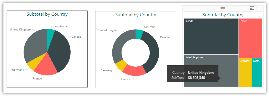
The visuals are positioned in the order they were created: Pie chart, Donut chart, and Treemap. Normally, you would not add such similar visuals to the same page unless you had a compelling reason, but what we’ve done here demonstrates how easy it is to copy a visualization and change it to a different type.
In the figure above, the Treemap visual also shows a pop-up message, which appears when you hover over a section of the visual. In this case, the pop-up is showing the total sales for the United Kingdom, but you can get information for any category on any of the three visualizations. In fact, most visualizations in Power BI Desktop support this feature.
Creating a Clustered Column Chart
The next visualization you will add is a Clustered column chart that shows US sales information for each sales rep with over $1 million in annual sales. The following steps walk you through the process of adding the visualization:
- Click the Plus button to add a new page to the report, and then click the Clustered column chart button on the Visualizations pane.
- Drag the FullName column from the Fields pane to the Axis section of the Visualizations pane. The axis provides the foundation on which the chart is built.
- Drag the OrderDate column from the Fields pane to the Legend section of the Visualizations pane. The legend determines how data will be clustered.
- In the Visualizations pane, click the OrderDate column’s down arrow, and then select Date Hierarchy. Power BI Desktop automatically limits the hierarchy to the Year level.
- Drag the SubTotal column from the Fields pane to the Value section of the Visualizations pane. The value serves as the measure used for aggregating the data.
- Drag the Country column from the Fields pane to the Visual level filters subsection in the Filters section of the Visualizations pane. Expand the Country section and select United States to include only that country.
- In the Filters section of the Visualizations pane, expand the SubTotal section, select is greater than from the first drop-down list, type 1000000 in the text box directly below the list, and click Apply filter. By applying this filter, only sales totals greater than $1 million will be included in the visualization.
- Position, resize, and format the visualization as necessary.
Your visualization should now look similar to the one shown in the following figure, except that it won’t include the red analytics line. You’ll be adding that shortly.
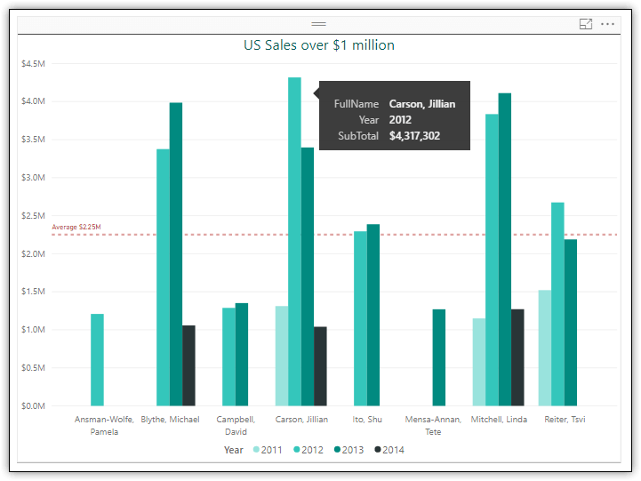
Analytics is a feature in Power BI Desktop that lets you add dynamic reference lines to a visual to provide additional insights into the data or reflect important trends. The analytic in the above figure shows the average sales amount based on values in the SubTotal column. To add this analytic, take the following steps:
- Ensure that the Clustered column chart visual is still selected on the design surface.
- In the Visualizations pane, go to the Analytics tab, expand the Average Line section, and click Add.
- In the text box at the top of the Average Line section, change the default name to Average.
- From the Measure drop-down list, select SubTotal if it’s not already selected.
- Configure the formatting settings as desired. You format the analytic directly on the Analytics tab when adding the analytic. For example, you can configure the analytic’s color, percentage of transparency, and line style.
The following figure shows how I configured the analytic on my system.
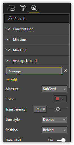
You can add whatever analytics you think will be serve your purpose. Note, however, that not all visualizations support analytics.
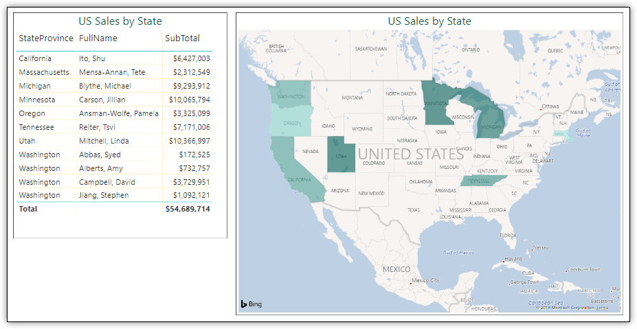
Creating a Filled Map
In this last example, you’ll add a Filled map visual and then a Table visual that contains data corresponding to the map. The Filled map visual uses patterns or shading to show how values differ across geographic regions. The visual relies on Microsoft’s Bing service to provide default map longitude and latitude coordinates. As a result, you must be online when working with the Filled map visual for the map to fully render on the design surface.
To add a Filled map visual based on the Sales dataset, take the following steps:
- Click the Plus button to add a new page to the report, and then click the Filled map button on the Visualizations pane.
- Drag the StateProvince column from the Fields pane to the Location section of the Visualizations pane. Power BI Desktop will automatically use these values to come up with their coordinates, leveraging the Bing service.
- Drag the SubTotal column from the Fields pane to the Color saturation section of the Visualizations pane. The column serves as the measure used for aggregating totals and arriving at the state shading.
- Drag the Country column from the Fields pane to the Visual level filters subsection in the Filters section of the Visualizations pane. Expand the Country section and select United States..
- Position, resize, and format the visualization as necessary.
That’s all there is to adding the Filled map visual. You can then add the Table visual, using the following steps:
- Ensure that the Filled map visual is not selected on the design surface, and then click the Table button on the Visualizations pane.
- Drag the StateProvince, FullName, and SubTotal columns from the Fields pane to the Values section of the Visualizations pane.
- Drag the Country column from the Fields pane to the Visual level filters subsection in the Filters section of the Visualizations pane. Expand the Country section and select United States.
- Position, resize, and format the visualization as necessary.
Your visualizations should now look similar to those shown in the following figure.
Power BI Desktop automatically links visualizations located on the same report page. As a result, when you select an item in one visualization, the data is updated in the other visualizations. For example, in the following figure, Washington state is selected in the Filled map visual. As a result, the Table visual now includes only data about sales in Washington state.
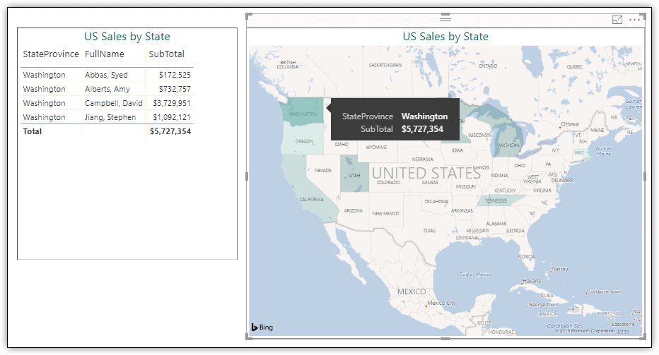
Linked visuals can be a handy way to allow users to gain quick insights into the same data from different perspectives, without having to create lots of extra visualizations. This also works for slicers as well, which are added at the page level, again providing a simple way to offer different perspectives into the data.
Lots More Where That Came From
Power BI Desktop supports a number of visualizations in addition to what we’ve covered here. For most of those visualizations, you can apply many of the same concepts that were demonstrated in this article. Power BI Desktop also supports the ability to use R scripts to create visualizations or to import R-based custom visualizations, as described in the Part 3 of this series.
Regardless of the visualization type, the best way to learn how to build reports in Power BI Desktop is to experiment with the visualizations themselves, trying out different ones against the same data or different data. The more time you spend working directly with these features, the better you’ll understand their capabilities and the quicker you’ll be able to create visualizations that provide meaningful insights into the data. Power BI Desktop offers a solid foundation for building effective business intelligence reports, but it’s up to you to figure out what it takes to get there.
This document contains proprietary information and is protected by copyright law.
Copyright © 2026 Red Gate Software Limited. All rights reserved


Load comments