
In a recent mini-series, I pointed out the pros and cons of Responsive Web Design (RWD). The advantages of RWD are widely known, especially to marketing people who just love to go to customers and praise the way that their product displays nicely across all possible devices of today or the near future. While the promises of RWD are neither bogus nor fictitious, there’s a lot more to it that must be taken into careful account. In this article, I focus on the impact of the RWD approach on website performance and the role that JavaScript plays in influencing performance.
Popular RWD Sites and Actual Performance
If you google for something like “best RWD sites”, one of the first links you get is to http://www.awwwards.com/websites/responsive-design. Once there, you can then find a reference to the Van Gogh Museum web site available at http://www.vangoghmuseum.nl/en. The site has been voted by AWWWards experts as a great example of RWD. It’s clearly a great site that deals with a lot of content and still manages to make it usable regardless of screen width; yet its home page takes almost 3MB of data download to fully work on a smartphone and a tablet and a bit over 3MB on a desktop.
It is difficult to describe this design as being optimized for the device. It’s optimized, instead, for small screens. But a small screen doesn’t relate to a type of device: it can be anything from a resized desktop browser window to a smartphone: the underlying devices can be quite different. RWD developed as a design tool rather than a development strategy and it works best when it is used on the desktop to make web sites usable even when restricted to a small segment of the available screen.
The most pressing difficulty with this technique is that you have to download sufficient data for rendering the content on the largest screen in current usage. It is not unusual that a well-designed RWD web site takes as much as ten seconds to become fully usable on a smartphone and even more when the smartphone is connected over possibly slow 3G networks. Prolonged wait times are killers of rate conversions and can make visits to your web site become less productive by some percentage points. You may not be losing traffic, but you lose conversions into real business and lose on your reputation.
This said, RWD remains the first-aid option, and the first technique to try when building a mobile experience for users.
The More General Topic of Web Performance
RWD as a design approach makes a point of ignoring the actual device. Instead, it focuses on content and finds a layout that makes it suitable to display nicely on a variety of screen sizes. For the most part, you have a single template with a bunch of optional parts that may display or not, or display in different positions, depending on the available space.
‘Mobile-first’ is another methodology that goes hand-in-hand with RWD. All it says is that you should start building your web layout from the lowest common denominator of smartphones and move on up the scale, adding more and more stuff until you reach the high-definition browsers. The number of stops along the way is up to you and the RWD methodology refers to these steps as visual breakpoints.
Mobile-first has no impact on the performance of the site and its load time. Mobile-first merely prescribes that you focus on the smallest amount of content that can fit nicely in the space usually available on a smartphone-typically less than 480 pixels of width. Next, in a pure onion style, you add more and more content until you reach the canonical 1200 pixels of width of desktop screens.
The problems is, of course that an RWD solution always downloads the same HTML content (including images) irrespective of the current window, and applies different CSS style sheets to obtain different rendering effects. All devices get the same treatment irrespective of the actual device features and capabilities. This can cause obvious problems: When the amount to download grows beyond 1 or 2 megabytes it doesn’t pass unnoticed on smartphones over 3G connections. It takes many seconds for the page to render and become usable. Worse yet, because of the onion structure and mobile-first design a large part of the content downloaded on smartphones is just hidden from view!
This is what it means doing RWD and it’s not at all about performance.
Minimize, Minimize, Minimize
The essence of fast web performance is the art of minimizing requests and the amount of downloaded data. That is all there is to it. There are a lot of resources out there that list commonsense contrivances to improve the overall performance of web pages-most notably bundling and minifying CSS and script files. An excellent summary can be found here: http://stevesouders.com/hpws/rules.php. These commonsense tricks to speed up performance of web sites are less important than restricting the data you download according to the device. A smartphone-much more than a tablet-is not the same as a desktop computer. Either your total amount of downloadable content (script, themes, and markup) is tolerably small or you’d better think of a radically different approach to serving the content for smartphones, at least.
Let’s Talk JavaScript
Twitter Bootstrap is, these days, generally accepted to be a standard way to achieve design responsiveness in web sites. Twitter Bootstrap, though, doesn’t come for free. The full edition minified and counting both CSS and JavaScript, takes more than 100K; a bit less if you don’t include all of the JavaScript modules.
When it comes to RWD, a way to improve performance is to eliminate the need to download data that you’re not going to use. This can be done by using more JavaScript so that you can write some logic that downloads only what’s strictly required given the current screen width. In this case, each page of the application is controlled by some script code that downloads HTML directly from some remote endpoints or just extends the available DOM with extra things that might be required given the current screen width.
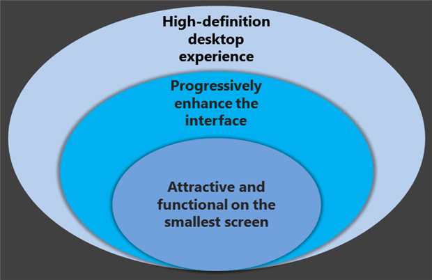
If you use a mobile-first logic, you can render each view as a core block of markup that works nicely on small devices and then use JavaScript to make additional calls to the server to get additional layers as shown in the onion graphics of Figure 1.
How much JavaScript do you need in order to achieve this? The jQuery library may not be strictly needed for downloading data but it can quite useful to model the DOM according to expectations. The more attractive you want the user interface to be on high-end devices with larger screens the more JavaScript code you likely want to use-whether AngularJS, KnockoutJS, maybe even WinJS and likely a long list of jQuery plugins and HTML5 polyfills and extensions for quick animations and effects.
The experience on simpler and smaller devices is probably improved as downloads are contained, but you end up moving most of the logic you can simply hard-code in HTML and CSS to JavaScript and client-side logic. Furthermore, the more JavaScript you have, the more you end up charging the browser. The more interactive the application becomes, the more events end up being generated by parts of the user interface. Beyond a threshold, the more that events grow because of the complexity of the user interface, the more that the rendering performance of the browser degrades. The JavaScript runtime is, after all, mono-threaded.
When too many events slow down the rendering performance, the best you can do, other than radically changing the structure of the pages, is to consider a reactive framework. In a nutshell, a reactive framework compacts within a single stream all the events of a given type from a given element (for example, all focus events). All these events are concatenated in the same stream as they arrive but are not handled one by one by a callback handler. When you need the value of processing all events in the stream, you process them and get final result. This simple trick, summarized in the acronym FRP for Functional Reactive Programming, can save pages the burden of handling and processing tons of UI events. The local performance of the page improves greatly. For more information on FRP have a look at http://blog.flowdock.com/2013/01/22/functional-reactive-programming-with-bacon-js.
The Perverse Dynamics of RWD and Performance
When it comes to performance, I think that it makes sense these days to distinguish between classic web sites and web sites that claim to be device-friendly or responsive. For the latter, performance improvement necessarily pass for the step of optimizing on the server-side what’s being returned. To keep workload on the client side as small as possible, you should minimize work that is not just mere interaction with the user.
On one hand, RWD claims it can give you a great experience without focusing on the device being used; on the other hand, when you run into performance issues, the only safe way out is getting to know the actual device and returning ad hoc content. RWD is great for desktops and it is so great that can work also on small devices; except that on these small devices it hurts overall performance. This invalidates the commercial message-our site offers a unique experience. Experience (and subsequently) performance must be fine-tuned to the device.
Additional Rules for Mobile Performance
In the end, I think that all classic rules of Web performance optimization that we know are still valid; but some more rules should be added that specifically target the special characteristics of the device. Some two or three years ago as mobile ramped up, developers started with best intentions and were distinguishing use-cases and content for a mobile audience. It was quite easy at the time because a device was either mobile or it was not. That changed quite soon, and RWD was at the same time heralding and pioneering this change towards device independence and oversimplifying the whole matter. Focus on RWD means less focus on actual performance; particularly where performance is critical-that is, smartphone and small devices used more frequently on the go and under 3G connectivity.
As I see things, these days awareness of mobile performance is at the beginning and best practices are to be consolidated and evangelized to contribute to building more and more success stories. One thing, though, is certain: speed will be the major differentiator for the device web. But the device web is the only web we’re going to have from now onward. To make speed a differentiator for site is not the mere developer’s love for performance; it’s a strict business demand. And no signs exist that this demand will decrease anytime soon.
In the end, here are three basic patterns to adopt in order to make your web site usable where “usable” today means enjoyable, device-friendly and as fast as users expect it to be. Mobile should not be a different dimension of an existing site where some high-priority content is shoehorned to look nice on iPads and iPhones. Mobile (read, devices of any size and shape) is just a constituent and indivisible part of the web. You don’t have to address mobile differently; you have just to address web in a newer way.
Rule #1. Mobile first
Whatever content you’re going to put on a web site, it must look nice on small screen devices. Unless you’re creating ad hoc content for certain classes of devices, you must be doing mobile-first design.
Rule #2. Prioritized content
Not all content is the same. The golden rule of mobile is 80-20 ratio between content that you would have on a full desktop site and a small screen site. This means that it should be clear which content has higher priority and so must appear regardless of the device. The way (read, template and layout) in which it appears depends on rule #1.
Rule #3. Intelligent markup
Some refer to this as the extreme ratio of mobile site development; others, instead, see it as the primary option to consider for optimal rendering. The fact is that an extreme performance improvement on specific classes of devices and scenarios-primarily, smartphone over 3G connections-can come only via server-side intelligent services that just return ad hoc content and logic for ad hoc use-cases.
Magic doesn’t exist in software; and mobile web sites are no exception. RWD is not magic and if you care about devices, well, you can’t just ignore devices!
Load comments