
When you begin development on a new or existing application, it is important to understand the sum of its parts. It is just as important to establish the visual style of the application, and the way it is intended to operate, as it is for its other architectural components such as the database, business logic and platform technology. A style guide can be a useful way of communicating how the application’s interface should look and function.
Style Guide overview
A style guide is a collection of colors, components and other user interface (UI) elements used throughout the application. The style guide is a living document that can be created as early as the initial wire-framing or prototyping phase of the development cycle and continue to evolve with the application and its design.
Development and Usage
Style guide development should be driven by the front end development team and/or design team but should not be exclusive to these teams. For a product to have great design sense, all team members need to be aware of the product’s design. A style guide is a great tool to communicate and promote visual consistency throughout an application. Designers and developers should work together to create a quick reference document that defines how visual elements appear and also how they are coded. It is essential to collaborate, and aim for a consensus, when you are creating a style guide that communicates to, and is to be adopted by, all team members.
Choosing a layout
The type of layout and style will, of course, vary from project to project in order to be appropriate to the particular needs of the users, the content, the goals and the type of application. Even a well-designed style guide may work for one application but not for others. There are however, fundamental principles that are shared by all projects.
To create a successful style guide, it’s important to “lead by example”. A style guide should follow the same layout and navigation patterns as the rest of the application. Applying the style guide upon itself reinforces the layout and navigation conventions while providing a use case. Navigation to components of the style guide should be included. This will help other users find resources quickly within the guide. Navigation stops can include colors, typography, forms, and application specific widgets.
Defining components
Some components for your style guide will be specific to your application whereas others will be common to all or many style guides. It is best to start with the common components for your style guide. The guide can continue to grow with your application. Whenever additional components are required for the project, the style guide should be updated to be sure that the guide stays current.
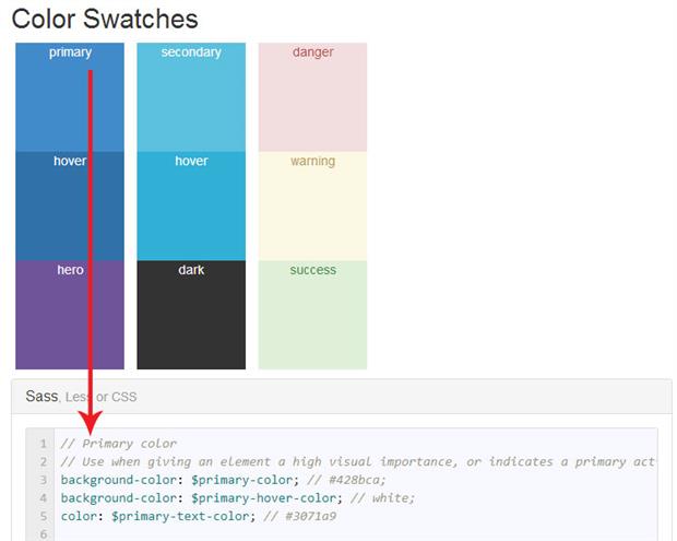
Colors and usage
Colors are important to every application. Colors can be listed with a swatch, color codes and their intended use. Because colors are more than decoration, they can greatly affect the user experience of the application by communicating a component’s intended use. Colors can signify an action such as: a form submission, navigation, or something destructive like a delete. Using the style guide to communicating these actions and their respective colors is ideal.
|
1 2 3 4 5 |
// Primary color // Use when giving an element a high visual importance, or indicates a primary action background-color: $primary-color; // #428bca; background-color: $primary-hover-color; // white; color: $primary-text-color; // #3071a9 |
Typography
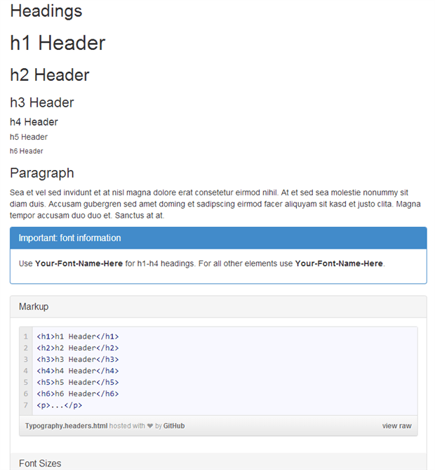
The style guide is an excellent place to show examples of typography used in an application. Much like colors, communicating the intentions of an element may determine type properties like: font, size and weight (boldness). Documenting the different typography used and the situation they are used in is ideal. Simple elements like headings (<h1> - <h6>), paragraphs (<p>), and lists (<ul>, <ol>) are excellent starting points.
Using “lorem ipsum” placeholder text is common practice for filling in typography examples. This can be done quickly in MVC by installing the Ipsum helper from the Prototyping MVC nuget package. The Ipsum helper will generate “lorem ipsum” placeholder elements while keeping the CSHTML file clean and readable.
|
1 |
PM> Install-Package Prototyping_MVC |
Installing the prototyping helpers via NuGet command line
|
1 |
@Html.Ipsum().p() |
Generating a paragraph <p> filled with placeholder text.
Other components: panels, forms, buttons
The style guide is an excellent place to demonstrate how panels, forms, buttons and other components are used in an application. If you show components with variations of styles and configurations, it will help others to understand how the components can, and should, be used in the application. For instance, panels may have multiple variations such as alert or information styles that can be added to a basic panel component. Buttons may have pairings like submit and cancel, and a style for delete. By showing a few example uses, you can help future developers understand quickly how these components are used in the application.
Important Details
A style guide is a single resource for understanding how to properly create components in an application. When working with an MVC view, for example, there are several pieces that may make up a component and no detail should be left out. The HTML markup, CSS classes, HTML helpers and any JavaScript requirements need to be properly outlined in the style guide.
The source code of your style guide is, in itself, an excellent resource for learning about not only the design of the components in your application, but also of how to implement them. If, for example, your application requires a novel or more complex component, you can add retractable panels, or dialog boxes containing source code, in order to provide a quick reference for how to build the component.
 In this example a gist file is displayed in a collapsible panel in the style guide to give developers a concise code snippet to learn from.
HTML
When writing the markup for your components, make sure to keep the HTML consistent with the way it will be used in the application. Remember that JavaScript can sometimes change HTML structure at runtime and, if so, you’d need to document how the HTML should be initially. In addition to the HTML tags, be sure to include any data attributes or other attributes required.
CSS
A style guide wouldn’t be complete without proper documentation of the CSS classes used in the application. For components that have optional style classes, make sure to include examples. If too many variations exist for a component, then simply include them in the documentation.
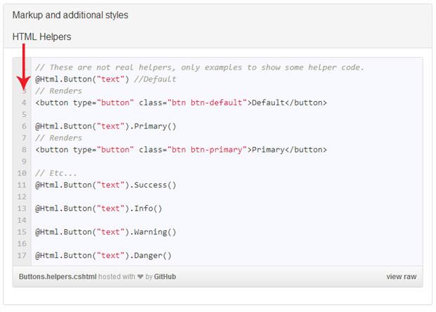
HTML Helpers
HTML helpers make components easier to use. Less information about the component needs to be remembered and Visual Studio will provide added help via Intellisense. If your application has complex components, then create HTML helpers and add them to your style guide. Document any HTML helpers available and be sure to mention API parameters that can affect the output of the HTML.
For more information about creating custom HTML helpers see the article Writing Custom HTML Helpers for ASP.NET MVC
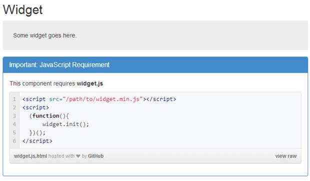
JavaScript requirements
In some cases, JavaScript is essential for components to render or operate correctly. Including documentation about JavaScript requirements will help developers get started quickly and avoid unnecessary troubleshooting. Wherever possible, include references to full API documentation.
Getting started
Creating a new style guide is as easy as using NuGet. I’ve added the examples used in this article to a NuGet package tailored to MVC’s default HTML and CSS framework, Bootstrap. Simply run the NuGet installer and a style guide starter kit will be added to your project.
|
1 |
PM> Install-Package StyleGuideKit |
Application structure
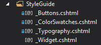
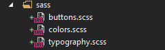
The style guide is broken down into groups of components. Each group has its own partial containing an example and documentation. Partials are used because they compartmentalize each section and make it easy for future developers to find a resource when it needs to be updated or studied. Be sure to name the partials after the components they represent. If you’re using Sass or Less the partials can even match the name of the applicable .scss or .less files.
|
1 2 3 4 5 6 7 8 9 10 |
<div class="col-sm-8"> @Html.Partial("~/Views/Shared/StyleGuide/_ColorSwatches.cshtml") <hr /> @Html.Partial("~/Views/Shared/StyleGuide/_Typography.cshtml") <hr /> @Html.Partial("~/Views/Shared/StyleGuide/_Buttons.cshtml") <hr /> @Html.Partial("~/Views/Shared/StyleGuide/_Widget.cshtml") <hr /> </div> |
Excerpt from StyleGuide.cshtml
File structure
Sometimes it is necessary to add CSS styles that are used only on the style guide. One example is displaying color swatches on the style guide, since swatches are not part of the application these CSS styles should be kept separate from the applications styles. Since there won’t likely be many of these styles, they can be placed in a general StyleGuide.css file and referenced only by the style guide.
|
1 2 3 4 5 6 7 8 9 10 11 |
/* * Style guide specific styles only */ /* Swatches */ .swatches div { height: 120px; width: 120px; display: block; text-align: center; } |
Excerpt from StyleGuide.css
Conclusion & resources
Communicating an application’s design can be as simple as sitting down and working out a style guide with your team. It is a good way of displaying an application’s UI components and their intended uses. It will help your team understand when and how to use the components in an application. Good origination using partials makes a style guide that is easily read and keep updated. It is important to create a style guide that leads by example and is tailored to the application’s unique theme.
Load comments