
Part Two: “Avoid missing ball for high score”
You haven’t got time to digest complicated instructions
To begin, here is a multiple-choice question.
‘I’ve just bought a new video game for my Wii console. It’s the latest instalment of a very popular fantasy-themed action adventure franchise that has been receiving rave reviews from every quarter. Finally, after a long day at work, I arrive home, excitedly tear off the cellophane wrapper and pop the disk into the glowing blue slit of my Wii. I point my remote to Start and the game loads up with jaunty music and an enticing title screen.
What do I do now?
- read the instruction booklet from cover to cover to find out what I need to do in the game and how to do it
- click on the Training option to practise some basic moves
- start my quest (I’ll figure out what to do as I go)’
No prizes for guessing that the answer is c). Like most people who play videogames, I don’t read the manual first. I want to start playing immediately. And in this game, there isn’t even a b) available to offer me any learning activities.
So I just start the game. I start the game with a number of subconscious but clear expectations:
- The game will start gently. It won’t land me straight into the middle of a battle against a horde of ferocious goblins, who stab me to death while I’m still figuring out which button to press to run or jump.
- In fact, I assume that nothing too harmful to my character’s health will happen at all for a while. I will be able to roam at leisure developing my skills, encountering only the mildest of mild perils (slightly angry plants that spit nuts, for example).
- I trust the game to teach me what I need to know before I need to know it. So, by the time I do face the goblin army, I will have learned how to fight. When I need to negotiate underwater passages, I will know how to swim. When I need to traverse a ravine, I can press the right button to swing on a rope. And so on. I will also learn really important skills such as healing myself, and running away like a coward… Maybe even fishing.
- I expect to be taught these new skills in a sensible order, and face new and fair challenges one at a time, that only test skills I have already mastered.
In summary, the game understands that when I first start to play it, I’m stupid. I am a new-born infant wailing and flailing helplessly in a dark and vicious universe, and need to be nurtured, guided and educated to survive. I begin the game with every faith that this will happen.
This is the problem that videogames have been facing for a number of years, since they evolved into epic, sprawling affairs with a vast array of possible user interactions:
How do users learn what they are supposed to do, and how to do it?
And, even more importantly:
How can we avoid making this feel like a chore?
In the beginning, games were simple, and their rules were simple. “Avoid missing ball for high score” was the only instruction printed on the side of Pong arcade machines. (Actually there were three instructions: DEPOSIT QUARTER, BALL WILL SERVE AUTOMATICALLY, AVOID MISSING BALL FOR HIGH SCORE. Note that the really important instruction “Deposit quarter” came first.) Pac Man required the user only to move a joystick in one of four directions. In Donkey Kong, ‘Jump Man’ (the first incarnation of Mario) jumped over barrels and climbed ladders to advance upwards. Space Invaders – move left and right, and fire. Asteroids – rotate, thrust, fire.
These primitive, naively enjoyable games didn’t need any rules. For one thing, if you have to deposit a quarter (or 10 pence in proper money) you haven’t got time to digest complicated instructions. If the mechanics of the game aren’t intuitive, then you’re just going to get confused and die very quickly; and sulk that the machine ‘stole’ your money. A modern console game, on the other hand, can take fifty or sixty hours to complete, and requires a substantial investment of time and patience to learn its many and varied mechanics – its settings, subtleties and secrets.
Contemporary video game designers must accept a couple of harsh realities:
One – their games are often vast and complicated, with a spectrum of player inputs that would make the eyes water of an arcade junkie from 1975 who had time travelled to the present day.
Two – players rarely read the game manual before playing.
On the surface it seems like there are two obvious solutions to these problems. Developers could make their games simpler, so there is less to learn. In a richly immersive virtual world offering hours of exploration and varied missions and battles, this is not really an option, though. Or, they could produce a detailed user guide describing all possible moves and require the user to have studied it; the game would make no concessions to players who hadn’t done their homework first, and learned how to handle themselves.
The manual remains inside the case, unopened
Game producers aren’t stupid. They operate in a fiercely competitive market, and they know that either of these solutions will lose them money and probably kill their business. There is no point complaining about either the inherent complexity of games or the widespread reluctance of players to read instructions. This is just how things are. These two truths need to be reconciled.
Clearly, the resolution is to incorporate learning activities directly into the game itself, as seamlessly and as invisibly as possible. If successful, the player doesn’t consciously differentiate ‘learning’ from ‘playing’, as both activities feel like part of the overall game experience. The player does not feel his progression is being interrupted or his enjoyment delayed by separate training activities.
I start my game. (The manual remains inside the case, unopened).
After ten minutes, I encounter a broken bridge across a river I need to cross. There’s a farmer or somebody on the other side who wants me to help him with his chickens. On screen, I’m shown which key to press to jump across it. If I fail, I fall harmlessly into the river and float back to where I started, where I am once again shown how to jump. Once safely across, I’m shown how to grab and hold on to a squawking chicken by a hyperactive Japanese farm child. After half an hour, I’m in front of a small tunnel leading to an area I must visit next. A message pops up telling me what key to press to crawl. A while later, I’m standing in front of a ladder. On screen, the key to use for climbing is displayed….
After several hours, I’ve amassed a surprisingly diverse range of skills, and practised each of them numerous times in different contexts. At no point did I feel like the game had been temporarily suspended while I was taught something. Each training activity was deftly woven into the overall game experience, and became something fun and enjoyable.
Avoiding the annoying little brother I wish I never had
And so, the big question. What has any of this got to do with Red Gate software?
Users of practical applications such as Word or iTunes or SQL Compare aren’t that different from video games players. If developers imagine the typical user of these tools has more patience and is more willing to learn than the average gamer then they may be labouring under a costly misapprehension. For one thing, the intersection between developers or DBAs (Red Gate’s target market) and video gamers is probably rather large. Someone who spends all day in the office using SQL Server Management Studio or SQL Backup may go home and play Mario or Grand Theft Auto. Do they approach the video game with a different mindset from the tool they use for their day job? Almost certainly. One is supposed to be fun and the other is, well, just work.
When they install a new application, however, isn’t their initial approach instinctively the same? They just dive in and start using it straight away, without studying the documentation or seeking out training content. Maybe the more cautious or diligent user will work through some tutorials, or view a demo; the majority will start using the tool immediately and hope to pick it up as they go.
So, perhaps in the majority of cases, the way we approach any new piece of software is actually the same, regardless of whether it’s a video game or a practical application we use at work. The difference is our expectations. We assume the video game will guide us gently, naturally, creatively through the required learning process, and that this aspect of the game has been as carefully designed as every other; if it fails in this regard, we ‘blame the game’ and bin it as a bad purchase. In contrast, we expect to have to figure out how to use the business application more or less by ourselves; if we struggle to use it, we tend to blame our own incompetence.
Why? Why do we expect less from the applications we use in our working life than we tolerate from videogames? Our basic requirements are the same, to acquire the skills we need to succeed, and our behaviour isn’t all that different when confronting something new and unfamiliar.
Perhaps one reason is that unlike video game designers, software developers like to tell users to “RTFM”. Even the more enlightened developers, the type we hire at Red Gate, still tend to think in terms of users either ‘figuring it out eventually’ or ‘reading the help’. Having spent many months or even years building their applications, software developers spend comparatively little time thinking about how to introduce or explain their new product to users; beyond the traditional deliverables of a printed manual, online set of PDF files or a help system, there doesn’t seem to be any design requirement to embed a painless learning experience into the tool itself. Software manufacturers just don’t commit resources to this aspect of their product in the way that videogame producers do. And they get away with it because users don’t expect or demand it, and struggle on without it.
But, wait a minute. Hasn’t this approach already been attempted….?
“It looks like you’re writing a letter”.
Ah, of course, Clippit, the friendly “assistant” that Microsoft included in its suite of Office tools to “help” users accomplish various tasks.
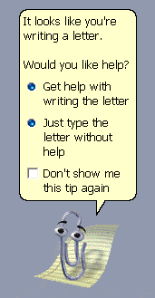
Clippit was finally bumped off at Office 2007, prompting one commentator on a forum to mourn his passing with this obituary – “RIP Clippit – he was like the annoying little brother I wish I never had.”
It would take an even longer article than this to detail the many, many failings of the Office Assistant. Ill-conceived, conceptually flawed, poorly executed, and just plain annoying, the Office Assistant was the wrong answer to a question most people weren’t asking. Perhaps it’s harsh on Microsoft to suggest that Clippit and his buddies (the equally annoying Dot, Merlin, Mother Nature, Links the cat, Rocky the dog et al) set back the cause of integrated user assistance ten years or more, but surely it discouraged developers from attempting to integrate a learning experience into their products. “That stuff doesn’t work,” they could say, “Just look at the irritating paperclip thing.”
I think the failure of the Office Assistant only proved that it’s extremely difficult to incorporate a seamless learning experience into the kind of tools Microsoft produces. Users want to be helped, but they hate being interrupted. The Office Assistant managed the impressive double-whammy of interrupting frequently and helping little.
Perhaps Clippit was a rather crass attempt to charm users into obtaining help, like the over-eager but socially awkward loner who corners you at a party to deliver a boring monologue on sports or traffic jams. It lacked subtlety and finesse. Did users really want the option to be harrassed by a dozen different ‘characters’, and was the “Animate” option really anything other than some coders at MS having too much spare time on their hands?
At this point, it’s only fair to acknowledge that there are some critical differences between an application such as Word, and a videogame like The Legend of Zelda. One is a hugely time-consuming experience set in an unrecognisable landscape with increasingly fiendish puzzles and challenging problems… and the other is Zelda. OK, so that’s a lame joke, but it’s important to emphasize that I’m not suggesting applications should be ‘more like games’. I’m not advocating that software should be made more fun, or borrow game conventions wholesale – just that the same attention should be paid to the needs of first-time users, especially in complex products.
‘…we wouldn’t need to
interview thousands of users
to discover that the majority
don’t read the manual. Many
don’t even read text that is on
screen directly in front of them…’
It’s also important to recognise that not all video games offer particularly exemplary experiences; conversely there are ‘serious’ applications that do make a decent attempt to induct beginners. In general, however, supporting documentation for an application is aimed at users who get stuck. It’s there to try and resolve an issue after the event. There isn’t an incentive for developers to design a rewarding learning experience because the ideology surrounding software design is that those who struggle are given sufficient avenues for resolution – manuals, help systems, product forums, support engineers at the end of a telephone, and so on. If we can limit the frequency and intensity of that struggle, then all well and good, but it’s accepted as a normal part of user interaction. This is the “RTFM” philosophy. However, we wouldn’t need to interview thousands of users to discover that the majority don’t read the manual. Many don’t even read text that is on screen directly in front of them…
Seducing users into learning how wonderful our tools are.
At Red Gate, we don’t have any brilliant innovations to offer to illuminate the way forward. Our approach is to focus on designing a truly intuitive interface that requires as little assistance and training as possible. This is a way around, rather than a solution to, the problem. We accept as reality, however, that users want to dive in to our products and start using them straight away. So we design with this in mind. The next evolution in the usability of our tools is to accommodate somehow the needs of new, impatient or task-focused users. That’s all of them.
One story illustrates the problem we’re up against. Last week at Red Gate towers, we were demoing the new version of one of our tools to a user in a usability session. In the newer version, we’ve slightly shifted the location of one of the features, and modernised its design. It’s the Column Picker feature in SQL Prompt (allowing you to specify multiple columns to insert into your code). This is what it used to look like:
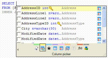
As you can see, it’s a small icon second from the left along the bottom.
This is what it now looks like:
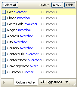
So, it’s been given a lick of paint, and its very own tab, but it’s essentially doing the same job in the same way.
Not one of our usability testers recognised this as an existing feature. Even those who had been using SQL Prompt for ages thought it was entirely new functionality in the latest version. When they played with it for a while, they thought that it was a potentially useful part of the application, and could possibly save them time writing certain types of query. They were impressed with the ‘new feature’.
A useful, time-saving feature exists, but no-one knows it’s there. The proverbial tree falling in an empty forest comes to mind. The Column Picker is, of course, documented in various places in our support material but as I’ve suggested, users only refer to ‘help’ information when they’re stuck, with a specific issue, and as a last resort.
‘…”I see you’re writing a SQL table.
Would you like me to help?”
popping up from an animated
Brad McGeehee is probably
not going to endear us to our users’
How can we anticipate this kind of situation, and tackle it – so that new users learn of the existence of this and other features in a seamless, non-intrusive way? In the same way that I learn how to jump, grab, crawl, swing and swim in the context of a harmless chicken encounter in my fantasy video game, how can we educate users about various useful parts of an application early enough so they feel confident to instinctively use them from then on? An intuitive interface is one thing, but it doesn’t pro-actively address the issue of simply not knowing where features live or how they can help you. And “I see you’re writing a SQL table. Would you like me to help?” popping up from an animated Brad McGeehee is probably not going to endear us to our users.
Ultimately, our aim is to seduce users into learning how wonderful our tools are without them even realising it. We want to inveigle them into a gentle pedagogical experience so that they fully exploit the potential of the software they buy. The only question is how…. I’m off to play more video games to get some ideas.
To see Part 1 of this article, go to ‘What can Software Designers learn from video Games’
This document contains proprietary information and is protected by copyright law.
Copyright © 2026 Red Gate Software Limited. All rights reserved
Load comments