
Application developers waste too much of their time playing video games, right?
Wrong.
I can remember the moment when I was struck by the thought that we application developers could learn a lot from video games.
I was playing Tomb Raider. As usual, I was stuck. Lara was falling to her death over and over again: Every strategy I tried in order to make progress in the game ended in a lifeless clump of young, shattered limbs. It was like a scene from Groundhog Day.
I was in a large, vertiginous chamber, decorated with hieroglyphs (my expert knowledge of ancient civilisations leads me to suspect this was perhaps the ‘Egyptian’ section of the game) and I was trying to find a way out of it. I wanted to go from this room to another room, and eventually locate a final chamber containing some kind of ancient artefact. I understand the basic principle of the game, so that wasn’t the problem. I’ve played with Lara before. Now, I didn’t actually know the way out of this room, but I’d guessed that it involved climbing up various ledges, jumping across several platforms, pulling a switch, swinging on a rope…. and then…? I didn’t have a clue. I was baffled. I was somewhere near the roof, but there was no way out!
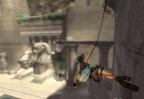
Not the exact point at which I got stuck, but you get the idea…
I reckon I spend at least 70% of my time in Tomb Raider stuck in this manner. In my frustration I tend to repeat the exact same sequence of events that just led to Lara’s doom. It didn’t work last time, but that doesn’t stop me…. maybe this time, she’ll find her escape. Oh.. no.. there she goes again. Clump!
“He … knew what he wanted to do, but he couldn’t find a way to do it.”
Being stuck isn’t just something that happens in videogames…
Earlier that afternoon, I’d been involved in a usability session with one of our users, who had kindly agreed to play with a BETA version of a Red Gate application. He had installed the software, and via the magic of a remote connection, we were watching on the big screen as he moved the mouse pointer around the interface and attempted to accomplish a number of tasks we’d set for him. He was in the US somewhere, and we were four developers in Cambridge, but we could follow every movement he made and every thought that he voiced.
This guy was also stuck. He too knew what he wanted to do, but he couldn’t find a way to do it. We watched in stoic anguish as this chap repeatedly failed to accomplish his task.
In this particular case, we were testing a new version of SQL Prompt, our code completion and layout tool due for release in a few months time. We asked our test candidate to carry out a straightforward task – “imagine a new employee has joined your company, and you want to share your SQL Prompt code format settings with the new joiner.”

Our volunteer understood perfectly what he was being asked to do. Straight away, he brought up the Options dialog from the SQL Prompt menu. So far so good. He clicked on a couple of pages. Then a few more pages. Then he closed the dialog. Then he studied the menu again. Then there was an ominous pause.
“What are you looking for?” asked Alice, the designer leading the session.
“Well I want to export my settings as a file and then email them to the colleague. So I’m looking for something like Import/Export.”
“Ah.” Alice didn’t offer any help or hints. We’re interested to see if users can figure out how to accomplish their task, even if it takes them a while, without any input from us.
For the next minute or so, we watched our victim thrash helplessly around the interface, desperately seeking the words “Import” or “Export”. He clicked every page, studied every part of the interface, but still wasn’t making any headway.
By now, it was painfully obvious this guy was stuck. In a real situation, he would probably have given up long ago, and either asked a colleague, searched the online help, contacted the support desk, or just bought another tool.
Eventually, Alice stepped in to put him out of his misery. “If I could just draw your attention to the Styles page,” she hinted.
Sure enough, there, in the Format section of the Options dialog was a Styles page, and on the Styles page lived an Export button. Now our test subject was on his way, and completed the exercise a few seconds later.
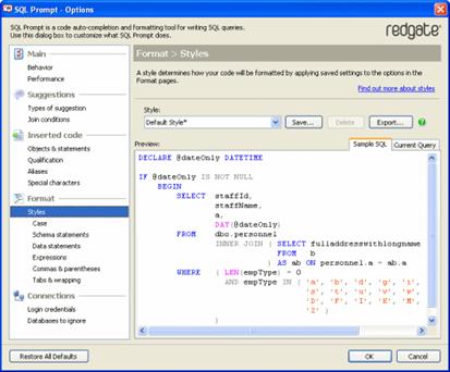
Easy when you know where to look…
“On a scale of 1 to 5, how easy would you rate doing that task?” asked Alice.
We didn’t need to wait for the answer….
“It’s intended to be immediate and obvious and simple”
Playing Tomb Raider later in the evening made me think about what happened in the usability test. Of course the crucial difference between our software and a video game is that sometimes the game is designed to be difficult. It provides puzzles and situations that require lateral thinking or experimentation; the path through the game is deliberately hidden because that is an essential part of the experience. Were it blindingly obvious what to do next in each room, then it wouldn’t be much of a game.
But Red Gate’s software is the opposite. It isn’t designed as a puzzle to be solved through trial-and-error or creative thinking or a flash of inspiration. It’s intended to be immediate and obvious and simple. It has to be this way because it’s developed to help users perform a task. The detailed process of how to perform that task shouldn’t really matter; the mechanics of the interface must be simple enough to allow the user to focus only on “getting the job done”, whatever that job is.
“I’d Failed”
I must confess at this point that I am not a developer, nor an interface designer, not even a tester. I’m a technical author, and it’s my responsibility to name parts of the application so that they are immediately obvious and understandable. Clearly, in this instance, I’d failed.
With hindsight, it was a glaringly obvious mistake. Why would anyone think to look at the Styles page when they wanted to export, or copy, or duplicate, or share their format settings? Styles doesn’t mean any of those things; it doesn’t suggest any action of the kind.
So, sometimes the design of the interface is only as good as the text that appears within it. Every aspect of the design of a product contributes to its success, which is why at Red Gate technical authors are involved in the development process from the very beginning. Someone has to look at each and every word that appears before a user’s eyes, and decide whether they make sense, just as someone else has to determine the size and shape and location of the buttons and drop-down lists and grid controls.
“Metaphorically, he was… falling to his death over and over again”
The interface had become for him a place of death and misery.
Sadly, the usability candidate’s experience of SQL Prompt was a bit too much like mine in Tomb Raider. He too knew what he wanted to achieve. The task itself was straightforward; he just couldn’t find the way to achieve it. Metaphorically, he was also leaping from ledge to ledge, across platforms and poles, and falling to his death over and over again in a vain effort to escape. The interface had become for him like my Egyptian tomb, a place of death and misery.
There will always be occasions when users are ‘stuck’, even if just for a moment. However, our objective in developing software should be to make it blindingly obvious what to do and where to go next. We need the equivalent of a door labelled “EXIT” (in flashing letters) somewhere unmissable inside the Egyptian chamber, or a lever that flashes with an arrow pointing at it and a sign saying “PULL ME”. We need to be sure the user doesn’t have to think hard about how exactly to do the task at hand.
“What is the user actually attempting to do at this point?”
The lesson is, users care far more about ‘doing things’ than about ‘using software’.
They perform tasks, they don’t ‘use features’ or ‘explore functions’ – that’s the perspective of an application, not of a human being. The software most of us use isn’t a game or a cryptic crossword puzzle that we enjoy solving, it’s simply a medium through which we can perform a job, the simpler and quicker the better. Every thing we can do as developers to make user tasks simpler and quicker to perform improves our tool.
If we’re not questioning, for every single element in our interface, “what is the user actually attempting to do at this point?” then we’re not asking the right question.
Being stuck in Tomb Raider wasn’t a waste of my time. It helped me to:
-
empathise with users who get frustrated by less than obvious interfaces
-
realise that what’s obvious to an application developer isn’t automatically obvious to a user
-
think harder about what users actually do, not what we imagine them to do or hope that they’ll do
The disconnect between how we developers see our application and how a user navigates through it can sometimes be as wide as the gaps Lara has to jump across. Stopping users falling to their death. That’s our mission statement at Red Gate. We don’t even want grazed knees.
Part 2 of this article is Avoid Missing Ball for High Score’
This document contains proprietary information and is protected by copyright law.
Copyright © 2026 Red Gate Software Limited. All rights reserved
Load comments