
SASS and Compass have become a mainstream alternative to writing standard CSS code. However since SASS and Compass are a relatively new, open source, superset of the CSS language there is no native support in Visual Studio. Through the use of a third party tool, Web Workbench by Mindscape, SASS and Compass can be integrated in to our normal Visual Studio workflow.
What is SASS?
SASS (Syntactically Awesome Style Sheets) is a superset of CSS that compiles to standard CSS code using a command line tool or IDE plugin. Because the SASS language is a superset of CSS3, this means that any valid CSS is also valid SASS.
SASS is an open source project that is coded in Ruby. SASS was created in order to simplify CSS development by providing a richer syntax, and implementing various features that advocate DRY principals.
Introduction to SASS features
SASS introduces features to writing CSS that are currently unavailable in CSS3. Features such as variables, mixins and selector inheritance make it possible to write modular and re-useable code. The readability of code is improved by the nesting syntax improves code. I’ll be explaining these features in this article.
Variables
SASS makes it possible to include variables in your code. Variables have been a long awaited feature for CSS developers, but have yet to be added to the CSS specification. Variables allow us to reuse common values and enable math functions.
Variables are defined by using the dollar sign $ and value assignments are made using the same syntax as CSS.
|
1 2 3 4 5 6 7 8 |
//$variableName: value; $themeColor: #003399; $maxWidth: 800px; .article { Width: $maxWidth - 200px; Background-color:$themeColor; Border-color: darken($themeColor, 10%); } |
Example: Assigning and using variables in SASS
Nesting
In CSS we must define each rule on a separate line, however with SASS this process is simplified through nesting. Each child selector of a rule can be nested right within the parent. The result is more legible and organized code with less effort. When nesting code the parent element often needs to be included in the selector, in this case the ampersand & is used as a shortcut to reference the parent.
|
1 2 3 4 5 6 7 8 9 10 11 12 13 14 15 16 17 18 19 20 21 22 23 24 25 26 27 28 29 30 31 32 33 34 35 36 37 |
/* scss */ ul.widget { li { font: { size:1.2em; weight:italic; } a { display:block; padding:1em; background-color: #003366; color: #FFF; //the & below produces the selector a.error &.error { background-color: #c00c00; font: { size:1.2em; weight:italic; } } } } /* Compiled CSS */ ul.widget li { font-size: 1.2em; font-weight: italic; } ul.widget li a { display: block; padding: 1em; background-color: #003366; color: #FFF; } ul.widget li a.error { background-color: #c00c00; font-size: 1.2em; font-weight: italic; } |
Example: Nesting with SASS
Selector Inheritance (@extend)
Selector inheritance is helpful when building modular elements. Inheritance gives us the ability to reuse all of the properties from another selector. Once we extend a selector, we can then modify or add more properties to it. The @extend function is called from within the selector and points to another selector you wish to extend. You can use inheritance multiple times within a selector if you need to.
|
1 2 3 4 5 6 7 8 9 10 11 12 13 14 15 16 17 18 19 20 21 22 23 24 25 26 27 |
/* scss */ a.button { display:block; width: 50px; padding: 10px; border-radius:5px; background-color:#003366; color:#FFF; } a.submit { @extend a.button; background-color: #5da423; } /* Compiled CSS */ a.button, a.submit { display: block; width: 50px; padding: 10px; border-radius: 5px; background-color: #003366; color: #FFF; } a.submit { background-color: #5da423; } |
Example: Selector inheritance with SASS
Mixins
A mixin could be described as a function that returns one or more CSS styles. Mixins are ideal for defining styles that will be reused throughout the style sheet. Mixins can accept arguments to further enhance their functionality and increase reusability.
|
1 2 3 4 5 6 7 8 9 10 11 12 13 14 15 16 17 18 |
//A common mixin for applying border radius @mixin border-radius ( $value: 10px ) { //use all vendor prefixes -webkit-border-radius: $value; -moz-border-radius: $value; border-radius: $value; //make sure background stays inside box -webkit-background-clip: padding-box; -moz-background-clip: padding; background-clip: padding-box; } //application of the mixin renders an image inside of a complete circle img.circle { @include border-radius(50%); } |
Example: Simplifiying vendor prefixes using SASS mixins
SASS integration with Visual Studio
The most common way to use SASS is by installing the SASS gem and running SASS as a Ruby application. The SASS application is then configured via command line to watch for changes to an .scss file or files in a directory. Once configured, SASS will detect when a file is changed and automatically compile the SASS code in to native CSS.
Because SASS is relatively new and is native to the Ruby platform it isn’t supported in Visual Studio by default. While it is possible to install SASS using the common approach described above, much of the functionality expected from Visual Studio is lost when editing SASS code. SASS code will be treated as plain text in Visual Studio, features including: Intellisense, syntax highlighting and document formatting are not available.
Introduction to Web Workbench
Web Workbench is a third-party plugin created by Mindscape that aims to seamlessly integrate SASS development into Visual Studio. With Web Workbench SASS is no longer treated as plain text, and all of the functionalities expected from Visual Studio’s code editor are available. In addition to adding code editor support Web Workbench goes a step further by simplifying SASS installation, automating SASS compilation, and more.
Web Workbench also adds support for LESS, and Coffee Script, however only SASS will be covered in this article.
Installation
Web Workbench is installed by downloading and installing a Visual Studio extension (.vsix) The Web Workbench installation includes all of the dependencies required for SASS. Web Workbench includes its own copy of Ruby and SASS so they are not a prerequisite for installing and using the plugin.
The installation adds SASS support including:
- New File dialog template
- Syntax highlighting
- Intellisense
- Warnings of syntax errors
- Warnings of unknown variables and mixins
- Go to variable or mixin definition
- CSS file generation
- CSS file minification – pro edition only
- Convert CSS > SCSS – pro edition only
Some of the features discussed throughout this article may only be available in the “pro” version of the software.
Using SASS
Adding a new .scss file to your project is done in the same way you would add a normal .css file in Visual Studio, by using the new file dialog. Web Workbench also adds a “New Scss File” context menu to Visual Studio for quick access.
With a traditional SASS installation, you would be required to configure the SASS compiler to listen for changes in your project, however Web Workbench does this automatically for you. Any .scss file you create will be compiled automatically each time you make an edit. The .css and minified .min.css files are nested conveniently beneath the .scss file in your solution tree.
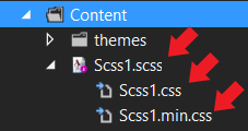
Web Workbench SASS: scss and the compiled css & minified css
Once the code has been compiled the .css is ready to be referenced in your HTML. No additional work needs to be done, Web Workbench will compile and update the .css whenever the .scss is saved.
Let’s look at an example of using SASS in ASP.NET MVC.
In a new MVC project, begin by adding a new .scss file to the project. To do this, right-click on the Content folder and choose “New Scss File” from the context menu. For this example, we’ll use the default file name Scss1.scss.
Let’s create a style that uses variables that we can use to create a color theme. In the file Scss1.scss, we’ll add a few variables to hold our color values. These variables will be available throughout our code and we can use them to theme elements. By using variables we’ll be able to make color changes to the entire project by simply changing the defined value.
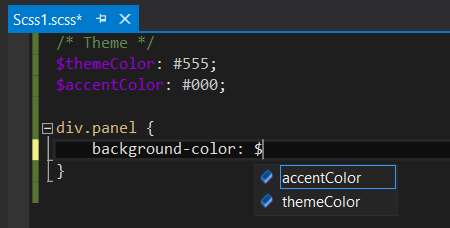
Intellisense
|
1 2 3 4 5 6 7 8 9 10 11 12 13 14 15 16 17 18 19 20 21 22 23 24 25 |
/* Theme */ $primaryColor: #7ac0da; //light blue $alternateColor: #777; //gray $accentColor: #000; //white $foreColor: #000; //white a.button { display: block; padding: 10px; border-radius:5px; margin-top:10px; width:250px; background-color: $primaryColor; border: 1px solid $accentColor; text-align:center; } div.panel { background-color: $primaryColor; color: $foreColor; border: 1px solid $accentColor; padding:20px; a.button { background-color: $alternateColor; } } |
Example: Using SASS variables to create a color theme
Saving Scss1.scss will trigger the compilation of the CSS and minified CSS files; Scss1.css and Scss1.min.css. The .css or min.css file can now be referenced in the project as you would any static CSS file. Further changes to Scss1.scss will update the compiled .css files.
|
1 2 3 4 5 |
//In MVC4 we reference the file in the BundleConfig.cs bundles.Add(new StyleBundle("~/Content/css").Include( "~/Content/site.css", "~/Content/Scss1.css" )); |
BundleConfig.cs
|
1 2 3 4 5 6 7 8 9 10 11 12 13 14 15 |
<head> ... @Styles.Render("~/Content/css") <!-- If you're not using the bundler, use the method below --> <!-- <link href="~/Content/Scss1.css" rel="stylesheet" /> --> </head> <div class="panel"> <p> Text </p> <!-- Button inside of a panel --> <a href="#" class="button">Button</a> </div> <!-- Button outside of a panel --> <a href="#" class="button">Button</a> |
_Layout.cshtml
What is Compass?
Compass is an open source Ruby application that extends the features of SASS. Compass simplifies the use of popular CSS design patterns through its extensible framework of mixins, functions, CSS resets, and other best practices. Compass is a powerful tool which assists developers in building reusable CSS code including widgets, webpages or even CSS frameworks.
Compass features
- CSS3 – A library of CSS3 related mixins that provides cross browser support for CSS properties introduced by CSS3. This module includes support for features like Font face, Box Shadow, Text Shadow, Opacity and Border Radius. When using a mixin from this module, the vendor prefixes are automatically added to the compiled.
- Helpers – The helpers module extends the functions provided by SASS. The helpers are a variable collection of functions that short cut many CSS operations, streamline browser compatibility, or do mathematical calculations.
- Layout – The layout module assists with building layouts, grids and element positioning.
- Reset – A simple implementation of best practices for doing CSS resets.
- Typography – This module includes helpful mixins dedicated to typography related tasks including: text placement, white space wrapping, vertical rhythm and more.
- Utilities – The utilities module is a collection of mixins that streamlines the styling of common elements. Familiar practices like styling links, lists, tables and text are broken down into common patterns.
Setting up a Compass project
Compass, like SASS, is traditionally installed using Ruby from the command line. Much like SASS, Visual Studio support for Compass is provided by Web Workbench. To add Compass to a Visual Studio project, select the project from the solution explorer and use the “Setup Compass Project” context menu provided by Web Workbench. When the “Setup Compass Project” command is used, the Compass specific folders: sass and stylesheets are added to the project. In addition to the folders, a Compass configuration file config.rb is added. The config.rb is used to change default behaviors such as input & output folders and minification.
Since Compass requires a few conventions that we must follow, it is important to understand how Compass integrates with a project before we begin.
The workflow used with Compass is slightly different from using SASS. Compass has its own conventions that may require you to reorganize your project somewhat. This is especially true with ASP.NET MVC because adding Compass to your project will change the folder structure. When you add Compass to your project a sass folder and stylesheets folder will be added to the root folder of the project. All SASS files should reside in the sass folder and files compiled by SASS will be placed in the stylesheets folder by default. Any SASS files which are not stored in the SASS directory may be compiled incorrectly and the output will not be placed in the correct folder.
There are two choices to ensure Compass works with your ASP.NET MVC project. The first method is to follow Compass conventions and change the bundlesConfig.csfile to accommodate the new directory structure.
|
1 2 3 4 5 6 7 |
//With MVC Conventions bundles.Add(new StyleBundle("~/Content/css").Include( "~/Content/site.css")); //With Compass Conventions bundles.Add(new StyleBundle("~/stylesheets/css").Include( "~/stylesheets/site.css)); |
bundleConfig.cs
The second method is to modify the config.rb file that was added during the installation of Compass. This will tell Compass to output the compiled CSS to the Content folder used by ASP.NET MVC. This will be the method used in later examples.
|
1 2 3 4 5 6 7 8 9 10 11 |
# With Compass Conventions # Set this to the root of your project when deployed: http_path = "/" css_dir = "stylesheets" sass_dir = "sass" # With MVC Conventions # Set this to the root of your project when deployed: http_path = "/" css_dir = "Content" sass_dir = "sass" |
Using Compass: Grid layout example
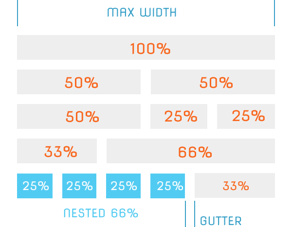
To demonstrate using Compass we’ll be developing a re-useable grid layout framework that can be the basis for many projects. Our goal is to use Compass to create a configurable grid system that we can use to layout web applications. The grid will be designed so that can be split in to multiple columns. The width of the columns will be defined by the way that they break up the grid: halves, quarters and thirds. The grid will use variables to determine its overall width, vertical, and horizontal spacing so we can easily adjust the layout.
To complete the feature set, we will also make the grid a mobile responsive design by adding a media query which will allow the grid to adapt to mobile devices
We’ll start by creating a new MVC project and using Web Workbench to configure the project with Compass. In this example, we’ll be using the screen.css file which will be output to the Content directory. Let’s make sure the compiled CSS is added to the bundle config by changing the parameter defined in the BundleConfig.cs. Replace the Site.css reference with screen.css.
|
1 2 3 |
//screen.css will be generated when screen.scss is saved & compiled bundles.Add(new StyleBundle("~/Content/css").Include( "~/Content/screen.css")); |
Changing the bundle target in BundleConfig.cs
Next, we’ll need to tell Compass where we would like to output the compiled CSS. By default the output folder is the stylesheetsfolder. To change the output directory, open config.rb and change the css_dir from stylesheets to Content.
|
1 |
css_dir = "Content" |
Changing the Compass output directory in config.rb
Open the screen.scss file in the scss folder. By default, the screen.scss file is created during the compass installation and already has a small line of code included. The code @import "compass/reset"; is a unique reference in Compass: Unlike other import references, referencing reset applies the global reset style sheet. This is not the normal behavior of an imported reference and was implemented this way for simplicity. To examine how this works, save the file. Saving the file will tell Compass to compile, and then we can view the output by opening screen.css in the Content folder. The screen.css will now have about 60 lines of CSS code. The reset code is commonly used as a best practice for resetting the default styles imposed by web browsers.
Now that we have added a reset to our style sheet, we’ll need to add a reference to Compass. Open the screen.scss file and add a reference to Compass to the top of the file. This reference will give us access to all of the features of Compass.
|
1 2 |
@import "compass"; @import "compass/reset"; |
Now we can begin write code for our grid layout. Let’s start by applying the border-box model to our style sheet. The border-box model will allow us to use percentage-based widths without having to worry about margins and padding affecting our overall element width. The border-box model will need to be applied to all of the elements on the page, to do this we’ll select all elements with the * selector. Inside of this rule we will use a Compass mixin that will create border-box settings that ensures cross browser compatibility.
|
1 2 3 |
* { @include box-sizing(border-box); } |
Screen.scss
|
1 2 3 4 5 |
* { -webkit-box-sizing: border-box; -moz-box-sizing: border-box; box-sizing: border-box; } |
Screen.css output
We would like to be able to control the maximum width of our grid and the vertical spacing so that it is easily customizable. We can make these values easily accessible by using variables that we can reference in our style sheet. We’ll add these variables at the top of our style sheet.
|
1 2 |
$layout-width: 1400px; $vertical-spacing: 20px; |
Let’s begin creating our grid. The grid will be used as a container for the column elements that will make up our layout. Start by adding a new .grid class with a max-width of the variable $layout-width. Also add a margin to the grid that has a top of 0, left and right values set to auto, and a bottom of $vertical-spacing.
|
1 2 3 4 |
.grid { max-width:$layout-width; margin: 0 auto $vertical-spacing; } |
Next we’ll use the pie-clearfix compass mixin to implement a “clearfix”. A clearfix will extend the bottom of the element to enclose any floated elements it contains. The clearfix will ensure that the floated elements within our grid will line up properly. Apply the pie-clearfix mixin by adding it to the grid class. Save the changes and examine the css output to see how the mixin has generated the clearfix.
|
1 2 3 4 5 |
.grid { max-width:$layout-width; margin: 0 auto $vertical-spacing ; @include pie-clearfix; } |
Screen.scss
|
1 2 3 4 5 6 7 8 9 10 |
.grid { margin: 0 auto 20px; max-width: 1400px; *zoom: 1; /*pie-clearfix*/ } .grid:after { content: ""; /*pie-clearfix*/ display: table; /*pie-clearfix*/ clear: both; /*pie-clearfix*/ } |
Screen.css output (the /*pie-clearfix*/ comments above were added for demonstration purposes)
Our grid is now complete and we are ready to create the styles for the columns which will be added to the grid. The columns will be defined by how much of the grid’s width they occupy. We will start by breaking the grid down in to full and half width sections. Each column will be floated and given a horizontal spacing white space or gutter. To continue with the customizable nature of our grid layout, we’ll give our gutter a variable so it can be easily changed.
Let’s begin by adding the gutter variable to the top of our style sheet with a value of 24px.
|
1 |
$gutter: 24px; |
Now that we have our gutter value, we can apply it to all of the columns. Within the grid, nest a column class called .col and set it’s float value to left. Set the top and bottom padding of the .col to 0 and the left and right padding to $gutter.
|
1 2 3 4 5 6 7 8 9 |
.grid { max-width:$layout-width; margin: 0 auto $vertical-spacing ; @include pie-clearfix; .col { float: left; padding: 0 $gutter; } } |
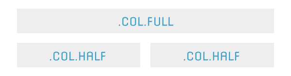
Next, we’ll define the column widths, we’ll use the & parent selector to describe how the .col style should be inherited. Add a full width column to the grid style and give it a width value of 100%. Continue by adding a half width column that has a width value of 50%.
|
1 2 3 4 5 6 7 8 9 10 11 |
.col { float: left; padding: 0 $gutter; &.full { width:100%; } &.half { width: 50%; } } } |
Screen.scss
|
1 2 3 4 5 6 7 8 9 10 |
.grid .col { float: left; padding: 0 24px; } .grid .col.full { width: 100%; } .grid .col.half { width: 50%; } |
Screen.css output
The grid is now complete enough that we can apply it to some HTML. Let’s add a style that will help us visualize the grid and then write the markup to demonstrate how the grid will work. In the screen.scss we’ll add styles for the h1, h2 and h3 elements, we’ll use these to show the columns. Give the h tags a background color of #eeeand a padding of 20px.
|
1 2 3 4 5 |
h1, h2, h3 { //for debugging our grid padding:20px; background-color:#eee; } |
Screen.scss
We’ll be replacing the HTML provided in the MVC template and displaying our grid. Open the _layout.cshtml file and remove any the template code from the body section, leaving only the @RenderBody method.
|
1 2 3 |
<body> @RenderBody() </body> |
_layout.cshtml
Next, open the index.cshtml file and clear out all of the code. We’ll place our grid code here so we can view our progress. In the index.cshtml file add a new div element with the class set to grid, this will be our container. Inside the grid add a div and make it a full width column by adding applying the col full class. Add an h1 to the column and give it the text “Full Width”. Run the project to view the demo.
|
1 2 3 4 5 |
<div class="grid"> <div class="col full"> <h1>Full Width</h1> </div> </div> |
Index.cshtml
Let’s continue by adding a two column grid to our demo. Append another grid and inside create two div elements with the class col half. Include an h2 tag in each column with the text “Half Width”.
|
1 2 3 4 5 6 7 8 |
<div class="grid"> <div class="col half"> <h2>Half Width</h2> </div> <div class="col half"> <h2>Half Width</h2> </div> </div> |
Index.cshtml
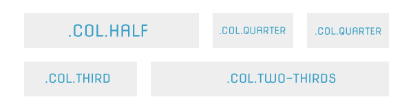
Let’s complete give our grid layout more column options by adding quarter, one thirds, and two thirds with columns. Continuing from the &.half column class add three new classes, &.quarter, &.third and &.two-thirds. Set the width to 25%, 33.33% and 66.66% respectively.
|
1 2 3 4 5 6 7 8 9 10 11 12 13 14 15 16 17 18 19 |
.col { float: left; padding: 0 $gutter; &.full { width:100%; } &.half { width: 50%; } &.quarter { width: 25%; } &.third { width: 33.33%; } &.two-thirds { width: 66.66%; } } |
Screen.scss
Using the same conventions as before, we’ll add the new column classes to our demo and show how they can be used together. Create a new grid that has one half width column and two quarter width columns. Below, create a grid with a third and two thirds columns.
|
1 2 3 4 5 6 7 8 9 10 11 12 13 14 15 16 17 18 19 |
<div class="grid"> <div class="col half"> <h2>Half Width</h2> </div> <div class="col quarter"> <h2>Quarter Width</h2> </div> <div class="col quarter"> <h2>Quarter Width</h2> </div> </div> <div class="grid"> <div class="col third"> <h2>Third Width</h2> </div> <div class="col two-thirds"> <h2>Two Thirds Width</h2> </div> </div> |
Index.cshtml
To further extend the control over our columns, it is now time to add the ability to nest grids within each other. To do this we’ll need to offset the gutters and vertical spacing when it is nested within another grid. Since we already have our gutter value stored in a variable we can reuse it when defining our offset. Inside of the .col class add a .grid class with a vertical margin of 0 and horizontal margin of negative $gutter.
|
1 2 3 4 5 6 7 8 9 10 |
.grid { ...//grid code .col { ...//columns code } // nested grid .grid { margin: 0 (-($gutter)); } } |
Screen.scss Truncated to save space
|
1 2 3 |
.grid .col .grid { margin: 0 -24px; } |
Screen.css output
Let’s display this new feature by adding to our existing grid demo. Create a new grid with two columns; the first column will be two thirds width and a second column one third. Inside the first column, add a new grid that contains four quarter width columns. In each of the quarter width columns add an h3 with the text “Quarter Width” and in the one thirds width column add an h3 with the text “Third Width”.
|
1 2 3 4 5 6 7 8 9 10 11 12 13 14 15 16 17 18 19 20 21 22 |
<div class="grid "> <div class="col two-thirds"> <div class="grid "> <div class="col quarter"> <h3>Quarter Width</h3> </div> <div class="col quarter"> <h3>Quarter Width</h3> </div> <div class="col quarter"> <h3>Quarter Width</h3> </div> <div class="col quarter"> <h3>Quarter Width</h3> </div> </div> </div> <div class="col third"> <div class="display"> <h3>Third Width</h3> </div> </div> |

Index.cshtml
To wrap up our list of features, let’s convert our layout to a responsive web design. Continuing with our goal of making the layout configurable, we’ll provide a variable which will determine the screen size at which the layout becomes responsive.
For small screen mobile devices we’ll stack the columns top to bottom instead of side by side. We can accomplish this by adding a media query and overriding the floats, padding and margins on our grid and columns. We’ll use the variable as the breakpoint for our media query.
At the top of the style sheet add the variable $small-device-width and give it a value of 767px.
|
1 |
$small-device-width:767px; |
Screen.scss
Append a media query to the bottom of the style sheet. Inside the media query set the columns to float to none !important,width to auto important! and padding to 0. In addition, set the nested grid margin to 0. Placement of the media query is important because if it does not appear at the end of the file it may get overridden and it will not be applied.
|
1 2 3 4 5 6 7 8 9 10 11 12 |
@media only screen and (max-width: $small-device-width) { /* Small Device Styles here */ .grid .col { float:none; width: auto !important; padding: 0 !important; // nested grid .grid { margin: 0; } } } |
Screen.scss
Wrap up
SASS and Compass are great tools for writing CSS code. Currently there is only third party support through the use of Web Workbench. SASS provides useful functionality currently unavailable in standard CSS. Variables, mixins and functions promote DRY methodologies when writing CSS code. Compass extends SASS even further through the use of convention and its wide array of mixins. We demonstrated how these tools come together by creating a customizable grid layout.
The grid layout example is available on GitHub. Web Workbench is required to run the code.
https://github.com/EdCharbeneau/SimpleCompassMVCExample
Resources
This document contains proprietary information and is protected by copyright law.
Copyright © 2026 Red Gate Software Limited. All rights reserved
Load comments