
In the first two parts of this series of articles, I set the groundwork for a solution that used ASP.NET MVC to create a simple site for a fictitious company called NorthWind Traders with a SQL Server database and which used R for the analytics and visualisation. Now, in the third part of the series, I’ll build on this by introducing two new R libraries that widen the analytical power of the application that we began developing in part 1 and 2. These libraries are called lattice and googleVis.
The name of the latter one leaves few doubts about its nature, whereas the former name sounds a bit peculiar (at least for some people whose first language is not a Germanic one). The word lattice has many meanings that can be found in Wikipedia but it is better to give you a quote from the book ‘Lattice: Multivariate Data Visualisation with R‘ by Deepayan Sarkar. Here it is “The lattice package is software that extends the R language and environment for statistical computing by providing a coherent set of tools to produce statistical graphics with an emphasis on multivariate data“.
Only a relatively small number of people in history could abstract a complex physical phenomenon such as that falling apple into a mathematical model expressed by a simple algebraic equation. “Simplicity is the ultimate sophistication.” (da Vinci). In our context it is a unique ability or/and talent to cut unimportant variables to make a simple equation. The less fortunate of us have to deal with multiple variables, build statistical model and use computer simulation. Because I am going to focus on graphics of multivariate data in this article, the lattice package is a logical choice to unravel those relationships.
An animated, interactive, visualisation can provide an additional insight into relationship between variables in a data set. This approach was effectively popularised by Professor Hans Rosling in his TED Talks in 2007 when he presented Trendanalyser – a software package that converts data into animated, interactive charts. It was developed by the Gapminder Foundation that he co-founded earlier.
One year later Google released Motion Chart (currently known as Google Charts) – a flash based charting library to plot animated charts. The googleVis package provides an interface between R and the Google Charts as well as makes use of the internal R HTTP server to display the output locally. We will try to integrate an output from the R HTTP server into our application.
Implementing the Category Performance Report
Let me remind you that the Parts 1 and 2 of the series demonstrated a process of building the first page (see Figure 1) of a web based business intelligence application for a fictitious wholesale company Northwind Traders that sells exotic food.
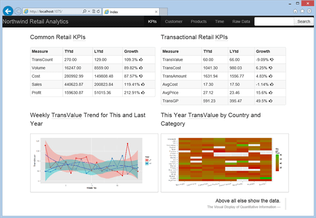
Figure 1. The dashboard landing page.
In its current state the application uses four R libraries: RODBC, R2HTML, PLYR, and GGPLOT2. All R routines were collated into a batch file which could accept parameters and the results of its scheduled execution (two HTML fragments and two images) are hosted by the ASP.NET MVC 4 page above which is styled using Twitter Bootstrap (bootstrap). The navigation toolbar and page layout were also developed with bootstrap.
The next page we will add to the dashboard is a Products page and the first report on this page – the Category Performance report. This report is displayed on the Figure 2 below. It shows sales volume and profit as a percentage of their total values for 1998. You might have noticed that the height of the magenta portion of the volume bar is nearly twice that of its profit counterpart. This might indicate that the seafood profit is inadequate to the cost of sales in comparison to other categories and that the performance of the seafood category requires some improvement.
Let me be more specific on this. Every product requires some effort to sell it. Let’s assume we have two products x and y that belong to the same category. The product x contribution into the overall volume is 20% and product y – 10%. It means that the effort to sell product x is about two times more than the effort to sell the product y. On the other hand the product y contribution into the overall profit is 20%, and the product x – 10%. This is why we call the product x – a poorly performing one. This conclusion also applies to the Confections category.
The Listing 1 shows the R procedure that was used to create the Category Performance report below.
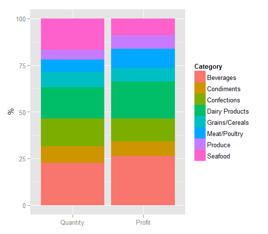
Figure 2. Product categories performance in 1998.
|
1 2 3 4 5 6 7 8 9 10 11 12 13 14 15 16 17 18 19 20 |
library(RODBC) library(R2HTML) library(ggplot2) cn<-odbcConnect('NW') ctgGP <- sqlFetch(cn,'Ch2_Category_PmfGP_vw') ctgQty <- sqlFetch(cn,'Ch2_Category_PmfQty_vw') odbcClose(cn) ctgGP$MeasureValue <- 100.0*ctgGP$MeasureValue/sum(ctgGP$MeasureValue) ctgQty$MeasureValue <- 100.0*ctgQty$MeasureValue/sum(ctgQty$MeasureValue) ctgPmf <- rbind(ctgQty,ctgGP) q <- ggplot(ctgPmf,aes(x=MeasureName,y=MeasureValue,fill=Category)) q <- q + geom_bar(stat="identity") + theme(axis.title.x=element_blank())+ylab("%") wd <- getwd() imagedir <- "C:\\DoBIwithR\\Code\\R-2-ASP\\Reporting\\Content\\" setwd(imagedir) filename <- 'ctgPmf.png' if(file.exists(filename)) file.remove(filename) ggsave(q,file=filename,width=5,height=4) setwd(wd) |
Listing 1. plotCategoryPerformance.r procedure.
Most of the code in the Listing 1 is similar to the analogous procedures from parts 1 and 2 of the series with just a couple of exceptions. This 100 * ctgGP$MeasureValue / sum(ctgGP$MeasureValue ) statement converts the absolute value into the percentage of total for each category and rbind(ctgQty, ctgGP) combines (like T-SQL UNION operator) two data frames, ctgQty and ctgGP by rows to produce a new data frame ctgPmf showed below.
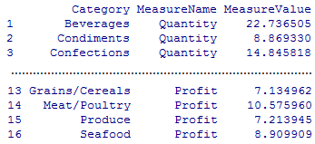
Figure 3. ctgPmf data frame.
The following T-SQL view was used by sqlFetch() function from the RODBC library to populate the ctgGP data frame
|
1 2 3 4 5 6 7 8 9 10 11 |
SELECT dbo.Categories.CategoryName AS Category, 'Profit' AS MeasureName, SUM(((1.0 - dbo.[Order Details].Discount) * dbo.[Order Details].UnitPrice - dbo.[Order Details].UnitCost) * dbo.[Order Details].Quantity)AS MeasureValue FROM dbo.[Order Details]INNER JOIN dbo.Orders ON dbo.[Order Details].OrderID = dbo.Orders.OrderID INNER JOIN dbo.Products ON dbo.[Order Details].ProductID = dbo.Products.ProductID INNER JOIN dbo.Categories ON dbo.Products.CategoryID = dbo.Categories.CategoryID WHERE (YEAR(dbo.Orders.OrderDate)= 1998) GROUP BY dbo.Categories.CategoryName |
Listing 2. T-SQL view Ch2_Category_PmfGP_vw
It won’t be difficult to figure out what changes to the above view are required to make it deliver Quantity instead of the Profit figures and then use the updated view to populate the ctgQty data frame.
Now that we know that some categories have inadequate performance, we will create the next report that should shed some light on whether there is a chance of improving their performance.
Implementing the Product Category Demand Report
What is a demand graph? According to Wikipedia “… the demand curve is the graph depicting the relationship between the price of a certain commodity and the amount of it that consumers are willing and able to purchase at that given price.” And “Demand curves are used to estimate behaviours in competitive markets… “.
If we look at the graph of Seafood demand in 1998 (Fig. 5) we notice that Northwind customers bought much more at lower prices than they did when prices were higher. The relationship between price and quantity that is depicted in Figure 4 shows the responsiveness, or elasticity, of the quantity of seafood purchased as its price changed.
Using statistical modelling, we could infer a mathematical relationship (simply speaking – a formula) between profit, price, cost, and quantity. This formula would show whether the volume increase due to the price decrease can compensate for the losses (or even often uplift profit) due to the price reduction. This concept of nonlinear relationship between various factors is not uncommon in science or/and business and is illustrated by the graph below (Fig. 4), where Po – optimal price, Pcur – current price.
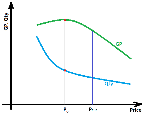
Figure 4. Relationship between price, volume, and profit for a price elastic product.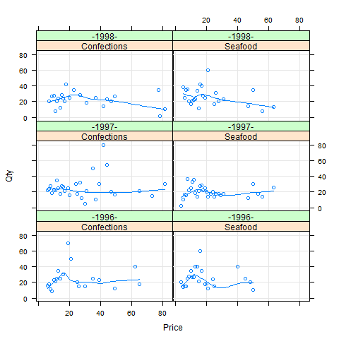
Figure 5. Confections and Seafood products demand.
The R procedure that was used to create the above report is shown below.
|
1 2 3 4 5 6 7 8 9 10 11 12 13 14 15 16 17 |
library(RODBC) library(lattice) cn <- odbcConnect('NW') #no user id and password as we use trusted connection ctgDmd <- sqlFetch(cn,'Ch2_Category_Demand_vw') odbcClose(cn) plotn <- xyplot(Qty ~ Price | Category + Year, data = ctgDmd,type = c("g", "p", "smooth")) wd <- getwd() imagedir <- "C:\\DoBIwithR\\Code\\R-2-ASP\\Reporting\\Content\\" setwd(imagedir) filename <- 'demand.png' if(file.exists(filename)) file.remove(filename) trellis.device(device="png", filename=filename) print(plot) dev.off() setwd(wd) |
Listing 3. R routine plotCtgDemand.r
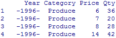
We can use the RODBC package just as we did in Parts 1 and 2 of the series in order to connect to the database, retrieve the data and save it in the data frame ctgDmd. A few first and last rows of the data frame shown below.
…………………………………………………………
Figure 6. ctgDmd data frame from Listing 3.
The lattice function xyplot(), that charts the data frame ctgDmd, has a signature common with other lattice functions, i.e. function_name ( y ~ x | A + B, data = , … ). It says ‘display the relationship between variables y and x for every combination of factors A and B‘. In our case of xyplo (Qty ~ Price | Category + Year, data = ctgDmd type = c(“g”, “p”, “smooth”)) x and y are Qty and Price, and A and B are factors Category and Year respectively. The second argument specifies the data frame that holds those variables and factors. In the formula y ~ x | A + B you can interchangeably use symbol * instead of the +.
An ability to see relationship between two variables simultaneously in the context of available business dimensions (e.g. Category and Calendar as we’ve just seen) is a very valuable characteristic of a visualisation package.
Finally, here is the T-SQL view that populates the ctgDmd data frame.
|
1 2 3 4 5 6 7 8 9 10 11 12 13 |
SELECT TOP (100) PERCENT '-' + DATENAME(yy, dbo.Orders.OrderDate)+ '-' AS Year, dbo.Categories.CategoryName AS Category, CAST((1 - dbo.[Order Details].Discount)* dbo.[Order Details].UnitPrice + 0.5 ASint)AS Price, AVG(dbo.[Order Details].Quantity)AS Qty FROM dbo.Products INNER JOIN dbo.Categories ON dbo.Products.CategoryID = dbo.Categories.CategoryID INNER JOIN dbo.[Order Details]ON dbo.Products.ProductID = dbo.[Order Details].ProductID INNER JOIN dbo.Orders ON dbo.[Order Details].OrderID = dbo.Orders.OrderID GROUP BY '-' + DATENAME(yy, dbo.Orders.OrderDate)+ '-', dbo.Categories.CategoryName, CAST((1 - dbo.[Order Details].Discount)* dbo.[Order Details].UnitPrice + 0.5 AS int) HAVING (dbo.Categories.CategoryName IN ('Confections', 'Seafood')) ORDER BYYear, Category, Price, Qty |
Listing 4. Ch2_Category_Demand_vw T-SQL view.
The transformation CAST((1 – dbo.[Order Details].Discount) * dbo.[Order Details].UnitPrice + 0.5 AS int) was used to merge price points within the same dollar into one point and then to convert the price value to the integer. It was done to reduce the visual clutter when scatter points have close prices.
Finding Price Elastic Products
Now as we know product categories that need some sales performance adjustment, let’s drill down into individual products and find those which are sensitive (‘price-elastic’) to price changes. An R routine that identifies such products is shown below
|
1 2 3 4 5 6 7 8 9 10 11 12 13 14 15 16 17 18 19 20 21 22 23 24 |
library(plyr) library(RODBC) library(lattice) cn <- odbcConnect('NW') sfProd <- sqlFetch(cn,'Ch2_Seafood_Products_vw') odbcClose(cn) sfProd <- sfProd[order(sfProd$Product,sfProd$Price),] sfPQCor <-ddply(sfProd,"Product",function(x) cor(x$Price,x$Qty)) names(sfPQCor) <- c("Product","Elasticity") sfPQCor <- subset(sfPQCor,Elasticity <= -0.6) sfEP <- subset(sfProd , sfProd$Product %in% sfPQCor$Product) ep.plot <- xyplot(Qty ~ Price | Product, data = sfEP,type = c("p","g","r"),xlim=c(0,70),ylim=c(0,50)) wd <- getwd() imagedir <- "C:\\DoBIwithR\\Code\\R-2-ASP\\Reporting\\Content\\" setwd(imagedir) filename <- 'elc_products.png' if(file.exists(filename)) file.remove(filename) trellis.device(device="png", filename=filename) print(ep.plot) dev.off() setwd(wd) |
Listing 5. findElasticSeafoodProducts.r procedure.
As we have used similar constructs in other procedures, most of the code above is probably understandable, but I’d like to draw your attention to the 7th line. The ddply function applies the user-defined function function(x) { cor(x$Price, x$Qty) } to its x argument (data frame sfProd) that returns the correlation (this is our elasticity) between Price and Qty for each product in the category. The result of this calculation is displayed in the table below
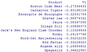
Table 1. Elasticity of the Seafood Products.
The purpose of the following two lines after the 7th line is to change the column names and extract only products that have high negative correlation between their price and quantity (–0.6 or less). In other words we take only highly elastic products and then use their names to filter the original data frame sfProd and draw Price ~ Qty scatter plot for each product (see below) using the xyplot() lattice function.
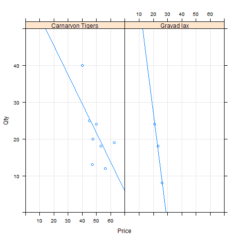
Figure 7. Highly elastic seafood products.
Please bear in mind that we are dealing with a demo database and do not have enough data to fully justify word ‘highly’, but this concept can be helpful in real life.
The T-SQL view that feeds the findElasticSeafoodProducts.r procedure follows.
|
1 2 3 4 5 6 7 8 9 |
SELECT ProductName AS Product, Price, AVG(Quantity)AS Qty FROM (SELECT dbo.Products.ProductName, ROUND((1.0 - dbo.[Order Details].Discount)* dbo.[Order Details].UnitPrice, 1) AS Price, dbo.[Order Details].Quantity FROM dbo.Products INNER JOIN dbo.Categories ON dbo.Products.CategoryID = dbo.Categories.CategoryID INNER JOIN dbo.[Order Details]ON dbo.Products.ProductID = dbo.[Order Details].ProductID WHERE(dbo.Categories.CategoryName = 'Seafood'))AS p GROUP BY ProductName, Price |
Listing 6. Ch2_Seafood_Products_vw T-SQL view.
This ROUND( (1.0 – dbo.[Order Details].Discount) * dbo.[Order Details].UnitPrice, 1) is done to make price points such as 14.72 and 14.70 indistinguishable and to reduce the noise.
So, what is the Carnarvon Tiger optimal price? Let’s assume that our goal is to get the maxim profit, which is
Profit = Quantity * (Price – Cost)
The linear regression line for the Carnarvon Tigers can be written as
Quantity = a * Price + b
After the substitution into Profit formula we have
Profit = a * Price2 + (b – a * Cost) * Price – b * Cost
If we use the liner regression model represented by the blue line on Figure 7, then the optimal price is ~ $60. If the Northwind Trades were found a supplier that providers the same product for $19.99 then the optimal price would be ~ $50.
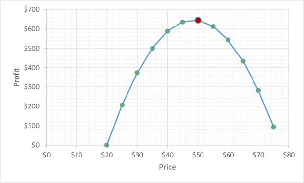
Figure 8. Carnarvon Tigers Profit vs. Price when Cost = $19.99
If our goal was to get rid of the excessive inventory (it’s a perishable product with a ‘best before date’ after all), then we would calculate the optimal price differently. It will be covered in one the following parts of the series.
I leave it for you as an exercise to find the equation of the blue regression line on Figure 8. Hint: use the subset() and lm() functions.
Assembling all the pieces together including the report that we are going to build in the next section gives us the Product page shown on Figure 9.
Implementing the ‘Profit by Country’ Report Using googleVis Library
The report we are going to build is displayed in the top right corner on Figure 9. The R procedure that generates this report is as follows
|
1 2 3 4 5 6 7 8 9 10 11 12 13 14 15 16 |
library(RODBC) library(googleVis) suppressPackageStartupMessages(library(googleVis)) cn <- odbcConnect('NW') ctgGP <- sqlFetch(cn,'Ch2_Profit_by_Country_vw') odbcClose(cn) gvPlot <- gvisMotionChart(ctgGP,idvar='Country',timevar='Year',xvar='AvgPrice',yvar='Qty',options=list(width=460, height=400)) wd <- getwd() htmldir <- "C:\\DoBIwithR\\Code\\R-2-ASP\\Reporting\\Content\\html\\" setwd(htmldir) filename <- 'googleVis.html' if(file.exists(filename)) file.remove(filename) print(gvPlot,"chart",file="googleVis.html")setwd(wd) |
Listing 7. Ch2_plotCategoriesProfitByCountry.r procedure
This procedure produces the html fragment displayed below with some lines (comments and data) removed to shorten the Listing 7. Although this code fragment is rather long to be included in the article, it explains clearly how the gvisMotionChart (see Listing 6) function works.
|
1 2 3 4 5 6 7 8 9 10 11 12 13 14 15 16 17 18 19 20 21 22 23 24 25 26 27 28 29 30 31 32 33 34 35 36 37 38 39 40 41 42 43 44 45 46 47 48 49 50 51 52 53 54 55 56 57 58 59 60 61 |
<script type="text/javascript"> function gvisDataMotionChartID23047e685bae (){ var data = new google.visualization.DataTable(); var datajson =[["Norway",1997,33.33333333,21,249.5999889], ..............removed data elements............. ["USA",1996,30.96551739,1539,16499.50122]]; data.addColumn('string','Country'); data.addColumn('number','Year'); data.addColumn('number','AvgPrice'); data.addColumn('number','Qty'); data.addColumn('number','Profit'); data.addRows(datajson); return(data); } function drawChartMotionChartID23047e685bae(){ var data = gvisDataMotionChartID23047e685bae(); var options ={}; options["width"]= 460; options["height"]= 400; var chart =new google.visualization.MotionChart( document.getElementById('MotionChartID23047e685bae') ); chart.draw(data,options); } (function(){ var pkgs = window.__gvisPackages = window.__gvisPackages ||[]; var callbacks = window.__gvisCallbacks= window.__gvisCallbacks ||[]; var chartid = "motionchart"; var i, newPackage =true; for(i = 0; newPackage && i < pkgs.length; i++){ if(pkgs[i]=== chartid) newPackage =false; } if(newPackage) pkgs.push(chartid); callbacks.push(drawChartMotionChartID23047e685bae); })(); function displayChartMotionChartID23047e685bae(){ var pkgs = window.__gvisPackages = window.__gvisPackages ||[]; var callbacks = window.__gvisCallbacks = window.__gvisCallbacks ||[]; window.clearTimeout(window.__gvisLoad); window.__gvisLoad = setTimeout(function(){ var pkgCount = pkgs.length; google.load("visualization", "1",{ packages:pkgs, callback:function(){ if(pkgCount != pkgs.length){ return; } while(callbacks.length > 0) callbacks.shift()(); }}); }, 100); } </script> <script type="text/javascript" src="https://www.google.com/jsapi?callback=displayChartMotionChartID23047e685bae"> </script> <div id="strong">"MotionChartID23047e685bae" style="width: 460px; height: 400px;"> </div> |
Listing 8. The html fragment made by the gvisMotionChart() function
It converts the R data frame ctgGP that is returned by the sqlFetch() function into a JavaScript array and then into a googleVis DataTable, which is passed to the MotionChart() that plots an animated interactive chart.
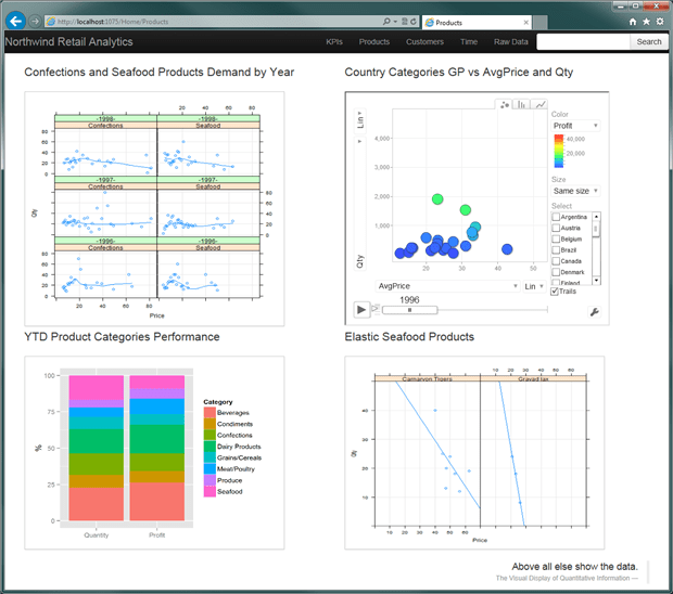
Figure 9. Product page
Here is the T-SQL Ch2_Profit_by_Country_vw view that is used to extract data for the googleVis chart
|
1 2 3 4 5 6 7 8 9 |
SELECT dbo.Customers.Country, YEAR(dbo.Orders.OrderDate)ASYear, SUM(dbo.[Order Details].Quantity)AS Qty, AVG((1 - dbo.[Order Details].Discount)*dbo.[Order Details].UnitPrice)AS AvgPrice, SUM(dbo.[Order Details].Quantity *((1 - dbo.[Order Details].Discount)*dbo.[Order Details].UnitPrice - dbo.[Order Details].UnitCost)) AS GP FROM dbo.Orders INNER JOIN dbo.Customers ON dbo.Orders.CustomerID = dbo.Customers.CustomerID INNER JOIN dbo.[Order Details]ON dbo.Orders.OrderID = dbo.[Order Details].OrderID GROUP BY dbo.Customers.Country, YEAR(dbo.Orders.OrderDate) |
Summary
This part adds some analytical elements and an improved user experience (animated, interactive chart) to what was previously, in parts 1 and 2, just BI reporting. It shows how to detect poorly-performing product categories and estimate their demand over time. Once we know the poor-performing categories and the demand, we can then drill down to the product level and find those products which have a sales volume that is sensitive to price changes. This information can be used to improve the category’s performance or to reduce the inventory levels.
In the following parts I will demonstrate how the inferred relationship between product prices and sales volume for price elastic products can be integrated into the sales forecast.
This document contains proprietary information and is protected by copyright law.
Copyright © 2026 Red Gate Software Limited. All rights reserved
Load comments