
In my previous article, I began a demonstration of how to build a Business Intelligence (BI) application using R, Visual Studio 2012 and Twitter Bootstrap. The aim of this series is to leave you at the end of each article with a working system, adding functionality in each article as we go. In that first article, R was used only for data extraction and transformation supported by its two libraries, RODBC and R2HTML. With this article, part 2, we will add two more R libraries into the mix. These are GGPLOT2 and PLYR. The first one is “…a plotting system for R, based on the grammar of graphics“, whereas the second one is “… a set of tools that solves a common set of problems”. Those “common set of problems” include data transformation; and so PLYR significantly reduces not only the R coding effort, but also implicitly simplifies the development of T-SQL views or stored procedures.
Part 1 of this article showed the step-by-step process of developing the two reports in the top row of the dashboard, as you can see in the image below.
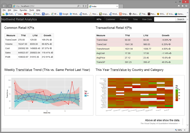
Figure 1. The dashboard landing page.
These reports contain a set of Key Performance Indicators (KPIs) evaluated for parallel periods in 1998 and 1997 as well as the period-to-period percentage growth.
Usually KPIs are calculated by management information systems and they help to evaluate an organisation’s success by determining with some precision what is important to the organization, and then measuring it over time. It is important for any business to select and manage these KPIs to ensure that they measure performance. I came across a good example of the importance of KPI just a couple of months ago whilst watching a BBC documentary called ‘The Concorde Story’.
Among many fascinating episodes that were shown in the documentary, there was one that is directly related to KPIs. This episode describes how John King turned around the business of British Airways, that was losing £140m a year, into a company making £268 pre-tax profit. One of his most successful management decisions was to select a proper KPI. Astonishingly it was a single KPI: the timely departure and arrival of BA aeroplanes. Find more here.
From my point of view, a selection of KPIs and their values should, ideally, indicate clearly which reports to then look at for explanations of the performance of the KPI. For example, the above dashboard tells us that all the Common Retail KPIs are in a very good shape, but despite the 109.3% growth in the number of transactions in 1998 compared to the same period in 1997, the TransValue (average sales volume per transaction) growth dropped by 9.1%. This “strange” behaviour must be understood, its root causes identified, and some actions taken in order to reduce the potential negative impact of the reduction of the TransValue in the future.
The Transaction Retail KPIs report gives us a few hints as to what to do next. The first one is to look at the TransValue changes over time and across the available business dimensions, such as Product and Customer
Implementing the TransValue Trend and Heat Map Reports
The first report is displayed in the left-bottom corner of Figure 1 above. The R procedure below does almost all the job. All that is required on the SQL Server side is to create the Ch1_QtyWk_Trend_vw view (see Listing 2).
|
1 2 3 4 5 6 7 8 9 10 11 12 13 14 15 16 17 18 19 |
library(RODBC) library(ggplot2) library(plyr) cn <- odbcConnect('NW',uid='******',pwd='******') trend <- sqlFetch(cn,'Ch1_QtyWk_Trend_vw') odbcClose(cn) vol <-ddply(trend,c("Year","Week"),TransValue=mean(Qty)) q <- ggplot(vol, aes(x=Week, y=TransValue, colour=Year,fill=Year,shape=Year)) q <- q + geom_point(size=3)+ geom_line(size=1) q <- q + scale_colour_brewer(palette="Set1") q <- q + geom_smooth(colour="#0000c0",stat="smooth") q <- q + xlab("Week No") + ylab("TransValue") wd<-getwd() imagedir <- paste(Sys.getenv("HOME"), "\\R Analytics\\R-2-ASP\\Reporting\\Content\\", sep="") setwd(imagedir) filename <- 'wktrend.png' if(file.exists(filename)) file.remove(filename) ggsave(q,file=filename,width=9,height=4) setwd(wd) |
Listing1. QtyTrend.r procedure.
|
1 2 3 4 5 6 |
SELECT CASE WHEN YEAR(dbo.Orders.OrderDate) = 1997 THEN 'LY' ELSE 'TY' END AS Year, DATEPART(ww, dbo.Orders.OrderDate) AS Week, CAST(SUM(dbo.[Order Details].Quantity) AS numeric) / CAST(COUNT(DISTINCT dbo.Orders.OrderID) AS numeric) AS TransValue FROM dbo.Orders INNER JOIN dbo.[Order Details] ON dbo.Orders.OrderID = dbo.[Order Details].OrderID WHERE (dbo.Orders.OrderDate BETWEEN '19970101' AND '19970506') OR (dbo.Orders.OrderDate BETWEEN '19980101' AND '19980506') GROUP BY CASE WHEN YEAR(dbo.Orders.OrderDate) = 1997 THEN 'LY' ELSE 'TY' END, DATEPART(ww, dbo.Orders.OrderDate) |
Listing 2. Ch1_QtyWk_Trend_vw T-SQL view.
The sqlFetch() function reads the data that is required for the report and saves it in the data frame variable trend. A few of the initial and final lines of the data frame are shown below.
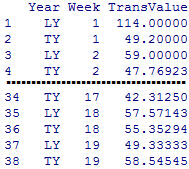
Figure 2. The trend data frame as it is defines by the T-SQL view.
After closing the ODBC connection, the ddply() function is used to apply the mean () function to each row in the subset which is defined by the second input argument, c("Year"," Week"). The mean() function does not do anything in this case as the data frame has only one value per row and it is provided just to demonstrate what can be done. Instead of the mean(), we could use any other R or custom defined functions. I hope you are beginning to appreciate the power of R by now.
This simple transformation is enough to make the new data frame vol compatible with the plotting function ggplot(). The remaining code creates the weekly trend lines for two parallel periods, saves it as the wktrend.png image in the Content directory of the ASP.NET MVC project and resets the R environment to the initial state.
Next we deal with the last report that shows TransValue per Category and Country as a heat map. The following R procedure (see Listing 4) is very similar to the trendQty.r although it uses a new function that we have not used so far. This function is commandArgs().
|
1 2 3 4 5 6 7 8 9 10 11 12 13 14 15 16 17 18 19 20 21 |
library(RODBC) library(ggplot2) args <- commandArgs(TRUE) cn<-odbcConnect('NW',uid='******',pwd='******') view <- ifelse(args[1] == 1998,'Ch1_TranValue_by_Country_Categoty98_vw', 'Ch1_TranValue_by_Country_Categoty97_vw') qtyNatCat<-sqlFetch(cn,view) odbcClose(cn) q <-ggplot(qtyNatCat, aes(x=Category, y=Country, fill=TransValue)) q <- q + geom_tile() q <- q + geom_raster() q <- q + scale_fill_gradient(low="#c00000",high="#00c000",na.value="white") q <- q + xlab('') + ylab('') q <- q + theme(axis.text.x = element_text(angle=10, hjust=1, vjust=1)) q <- q + labs(fill="Qty\nper\nTran") wd <- getwd() imagedir <- paste(Sys.getenv("HOME"), "\\R Analytics\\R-2-ASP\\Reporting\\Content\\", sep="") setwd(imagedir) filename <- ifelse(args[1] == 1998,'heatmap98.png', 'heatmap97.png') if(file.exists(filename)) file.remove(filename) ggsave(q,file=filename,width=9,height=4) setwd(wd) |
Listing 4. heatMap.r procedure.
The commandArgs() provides access to a copy of the command line arguments when heatMap.r is called from within the batch file shown below (it contains only one line)
|
1 |
>"C:\Program Files\R\R-3.0.1\bin\x64\RScript.exe" C:\\path-to-heatmap.r1998 |
The literal 1998 above is a parameter available to heatMap.r as a first element of the vector args (see 3rd line in Listing 4).
Apart from allowing a parameter to be passed to it, heatMap.r is similar to the qtyTrend.r in Listing 1 although the ggplot() called from the heatMap.r plots a heat map.
The T-SQL view that supplies 1998 data to the heatMap.r is displayed below.
|
1 2 3 4 5 6 7 8 9 |
SELECT dbo.Customers.Country, dbo.Categories.CategoryName AS Category, CAST(SUM(dbo.[Order Details].Quantity) AS numeric) / CAST(COUNT(DISTINCT dbo.Orders.OrderID) AS numeric) AS TransValue FROM dbo.[Order Details] INNER JOIN dbo.Orders ON dbo.[Order Details].OrderID = dbo.Orders.OrderID INNER JOIN dbo.Products ON dbo.[Order Details].ProductID = dbo.Products.ProductID INNER JOIN dbo.Categories ON dbo.Products.CategoryID = dbo.Categories.CategoryID INNER JOIN dbo.Customers ON dbo.Orders.CustomerID = dbo.Customers.CustomerID WHERE (dbo.Orders.OrderDate BETWEEN '19980101' AND '19980506') GROUP BY dbo.Customers.Country, dbo.Categories.CategoryName |
Listing 5. Ch1_TranValue_by_Country_Categoty98_vw T-SQL view.
The heatMap.r creates a PNG image heatmap98.png that is written into the Content folder of the ASP.NET MVC project. Having an option of creating two heat map images for 1997 and 1998 allows for developing ‘drill up / down’ and compare heat map reports for two parallel periods.
Updating the Presentation Layer
Open the Notepad and create a DAL.bat file of the following content
|
1 2 3 4 5 |
"C:\Program Files\R\R-3.0.0\bin\x64\RScript.exe" C:\\DoBIwithR\\Code\\RCode\\coreKPI.r "C:\Program Files\R\R-3.0.0\bin\x64\RScript.exe" C:\\DoBIwithR\\Code\\RCode\\transKPI.r "C:\Program Files\R\R-3.0.0\bin\x64\RScript.exe" C:\\DoBIwithR\\Code\\RCode\\qtyTrend.r "C:\Program Files\R\R-3.0.0\bin\x64\RScript.exe" C:\\DoBIwithR\\Code\\RCode\\heatMap.r 1997 "C:\Program Files\R\R-3.0.0\bin\x64\RScript.exe" C:\\DoBIwithR\\Code\\RCode\\heatMap.r 1998 |
Listing 6. DAL.bat file.
Note that the path C:\\DoBIwithR\\Code\\RCode\\ to the directory where you keep the R procedures as well as the location of the RScript.exe will be different on your computer. So please edit the DAT.bat according to your installation.
The DAL.bat generates content of all four reports on the dashboard page (Figure 1) and the heatmap97.png for 1997.
Open the ASP.NET MVC project we created in the Part 1 and make changes to the Index View shown highlighted in the Listing 7 below.
|
1 2 3 4 5 6 7 8 9 10 11 12 13 14 15 16 17 18 19 20 21 22 23 24 25 26 27 28 29 30 31 32 33 34 35 36 37 38 39 40 41 42 43 44 45 46 47 48 49 50 51 52 53 54 55 56 57 58 59 60 61 62 63 64 65 66 67 68 |
@using Reporting.Helpers @{ ViewBag.Title = "Index"; } <link href="~/Content/jquery.ui.all.css" rel="stylesheet" /> <script src="~/scripts/jquery-1.9.1.js"></script> <script src="~/scripts/jquery.ui.core.js"></script> <script src="~/scripts/jquery.ui.widget.js"></script> <script src="~/scripts/jquery.ui.position.js"></script> <script src="~/scripts/jquery.ui.tooltip.js"></script> <script> $(function () { $(document).tooltip(); }); function drillOnHeatMapClick() { var img = document.getElementById("heatMap"); var title = document.getElementById("hmTitle"); var imgUrl = img.src; if (imgUrl.indexOf("97") === -1) { imgUrl = imgUrl.replace('98', '97'); img.title = img.title.replace('97', '98'); title.innerText = title.innerText.replace("This", "Last"); } else { imgUrl = imgUrl.replace('97', '98'); img.title = img.title.replace('98', '97'); title.innerText = title.innerText.replace("Last", "This"); } img.src = imgUrl; } </script> <div class="container-fluid"> <div class="row-fluid"> <div class="span6"> <p class="lead">Common Retail<abbr title="key performance indicators">KPIs</abbr></p> @Html.LoadHtml("~/Content/html/coreKPI.html") </div> <div class="span6"> <p class="lead">Transactional Retail<abbr title="key performance indicators">KPIs</abbr></p> @Html.LoadHtml("~/Content/html/transKPI.html") </div> </div> <div class="row-fluid"> <div class="span6"> <p class="lead">Weekly<abbr title="Quantity Sold per Transaction">TransValue</abbr>Trend for This and Last Year</p> <img class="img-polaroid" src="~/Content/wktrend.png" /> </div> <div class="span6"> <p id="hmTitle" class="lead">This Year<abbr title="Quantity Sold per Transaction">TransValue</abbr>by Country and Category</p> <img id="heatMap" onclick='drillOnHeatMapClick()' class="img-polaroid" title="Click on the image to see the 1997 report" src="~/Content/heatmap98.png" /> </div> </div> <div class="row-fluid"> <div class="span12"> <br /> <blockquote class="pull-right"> <p>Above all else show the data.</p> <small><cite title="Edward Tufte">The Visual Display of Quantitative Information</cite></small> </blockquote> </div> </div> </div> |
Listing 7. Index View code.
If you compare this code with the code we used for the Index View in part 1 (Listing 12) , you would find that I’ve added three new blocks of code highlighted in yellow.
The first block contains references to jQuery and jQuery UI libraries. If you like to follow along you have to download them and copy the libraries into the same folders of the ASP.NET MVC project as in the references tags of the first highlighted block.
The second block includes two JavaScript functions. The first function is to display tooltips when the user hovers mouse over the heat map image, and the second function is required to allow the user to drill down or drill up on the heat map click, so as to view and compare reports for the parallel periods. The second function also updates the report title and tooltip text in order to coordinate them with the displayed report. The next two pictures illustrate this functionality
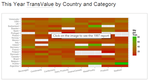
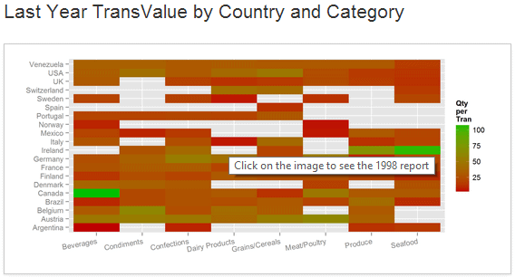
Figure 2. The heat map report before (above image) and after the drillOnHeatMapClick() function was executed.
The new (compare to Part 1) bootstrap CSS class img-polaroid is used to style images in the last row of the grid (see Figure 1).
Finally, we have to make some changes to the navigation bar. Open the _BootstapLayout.basic.cshtml layout view, comment out the current navigation bar mark-up and add the new one as follows.
The updated toolbar contains links to four other pages that are not implemented yet, so stay tuned, as there is more to come.
|
1 2 3 4 5 6 7 8 9 10 11 12 13 14 15 16 17 18 19 20 21 22 23 24 25 26 27 28 29 30 31 32 33 |
@*<div class="navbar navbar-inverse navbar-fixed-top"> <div class="navbar-inner"> <div class="container"> <a class="btn btn-navbar" data-toggle="collapse" data-target=".nav-collapse"> <span class="icon-bar"></span> <span class="icon-bar"></span> <span class="icon-bar"></span> </a> <a class="brand" href="#" title="change in _bootstrapLayout.basic.cshtml">Application Name</a> <div class="nav-collapse collapse"> <ul class="nav"> @Html.Navigation() </ul> </div> </div> </div> </div>*@ <nav class="navbar navbar-inverse navbar-fixed-top"> <div class="navbar-inner"> <a class="brand" href="/">Northwind Retail Analytics</a> <form class="navbar-search pull-right input-append"> <input class="span2" id="appendedInputButtons" type="search" /> <button class="btn" type="button">Search</button> </form> <ul class="nav pull-right"> <li class="active"><a href="#">KPIs</a></li> <li><a href="#">Customer</a></li> <li><a href="#">Products</a></li> <li><a href="#">Time</a></li> <li><a href="#">Raw Data</a></li> </ul> </div> </nav> |
Listing 8. Changes to the application’s navigation bar.
This makes the navigation bar look like the one that is shown below.
![]()
Figure 3. Updated navigation bar.
Summary
We made a significant step towards making our application more practical.
- As opposed to developing each reports separately (see the Part 1 of the article), all of them can now be generated simultaneously by executing the batch file DAL.bat that accepts parameters. Its execution can either be scheduled to run immediately after an ETL updates the data source or it can be integrated into an SSIS package that manages updates using the SQL Server Engine change-tracking feature.
- We introduced two new R libraries, PLYR and GGPLOT2. The PLYR streamlines data preparation for visualisation that was accomplished by the versatile GGPLOT2 library functions.
- Lastly, jQuery and jQuery UI libraries were employed for developing the application’s interactivity (drill down, drill up) and keeping the user interface coordinated when the user drills down or drills up.
There is more to be done: passing parameters from R procedures to SQL server procedures, multiple drill-down paths, etc. We’ll tackle all this in subsequent articles.
The R code for this article, for which you’ll have to provide ODBC uid and password, and change the batch file extension from txt to bat, is provided in the ZIP file at the bottom of the article. The T-SQL code for parts 1 and 2 is already in the database image supplied with part 1. Please remember that this is sample code provided only to illustrate the points being made about the design of the application
This document contains proprietary information and is protected by copyright law.
Copyright © 2026 Red Gate Software Limited. All rights reserved
Load comments