
You can expand the analytical potential of a BI tool by embedding, or providing a seamless interface to advanced analytics engines such as R. It is not a new idea: some BI vendors such as Tableau have already tried to boost the analytical capabilities of their BI tools through integration with R, but the way Tableau has done it is far from perfect because they connect to R through calculated fields. The R calculations have to be wrapped into some Tableau functions that are designed to support the integration and which, in turn, pass values to R via the Rserve package. To put it simply, Tableau Desktop relies on having an extra software layer between it and R.
This article demonstrates a contrasting approach. It shows how to develop a Power BI Dashboard that uses an R machine-learning script as its data source. Despite of the simplicity of the example and of the data sources, it shows most of the typical phases of the BI dashboard development. It connects to off-premises data sources over the Internet, does data cleansing, transformation and enrichment through the use of analytical datasets returned by the R script and also develops a dashboard design that allows you to share the dashboard with your colleagues.
It is fairly simple and straightforward to use R as a Power BI Desktop data source. The R code should first be developed and tested in R Studio, or another R IDE, and then copied into the Power BI Desktop.
Power BI Desktop (formerly known as Power BI Designer) was released in the first half of 2015. In spite of its relative infancy, Power BI Desktop is rapidly gaining the attention of BI and analytic professionals. It was developed by Microsoft in collaboration with Pyramid Analytics – an international company headquartered in The Netherlands with offices across USA, UK and EMEA.
Although Power BI Desktop is positioned as ‘a reports-authoring tool’, it is really much more than that. By combining the online Power BI Designer, developer APIs, integration with R, direct connectivity to on-premise data sources, a native mobile BI app and custom visuals it becomes a BI platform.
Currently Power BI Desktop supports the almost all popular data source sources, as well as R, MS Azure HD Insight, Apache Spark, and Apache HDInsight Spark (as of today R data source the R data source has pass its Beta testing). Here is the complete list.
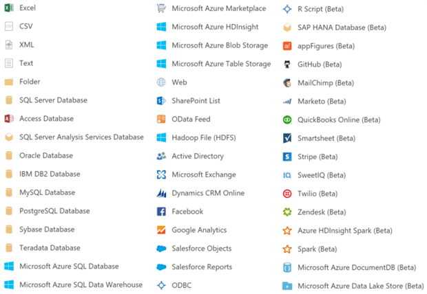
Figure 1. Current Power BI Desktop data sources.
Some of the above sources, such as R, Spark, ODBC, can deliver data that was processed by the corresponding analytical engines (I call these datasets – analytical datasets).
This capability significantly increases the analytical potential of Power BI Desktop and does not require bringing in the analytical engines visualisation although it can be done.
According to the recent review of G2 Crowd, Microsoft Power BI and Tableau are running neck to neck already. See the detailed review including pricing of both products here.
Setting up R Script as a Data Source
Let’s assume that our goal is to develop an active dashboard, shown below, that
- categories/clusters US States into two of more groups based on their cost of living, crime rate, health care quality, state and local tax burden, personal well-being for seniors and weather,
- allows to compare two or more clusters,
- visualises the above measures on the map,
- displays clusters’ medoids.
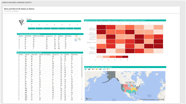
Figure 3. Dashboard of the US Retirement Statistics.
The selection of this data source was inspired by the “Getting Started with Power BI Desktop” tutorial. That data is located in two HTML tables. The first one, “Rank of States for Retirement”, is provided by the Bankrate, Inc. – the Web’s aggregator of financial rate information. To learn more on how they ranked the states read here. The second table, “List of U.S. state abbreviations”, is required for geocoding of the data from the first table. We get it from this Wikipedia page.
The R code that does all we need to produce the dashboard we’ve just shown is displayed in Figure 3. I will walk you through the code to explain what the blocks of code do.
- The zero block loads the required libraries and defines the factToNumeric function that is used to convert from factor to numeric type.
- Block 1 defines the URLs of those two tables and validates them. Block 2 ‘scrapes’ the first table and reshapes it.
|
1 2 3 4 5 6 7 8 9 10 11 12 13 14 15 16 17 18 19 20 21 22 23 24 25 26 27 28 29 30 31 32 33 34 35 36 37 38 39 40 41 42 |
#============ block 0 ============= suppressWarnings(suppressPackageStartupMessages(library(fpc))) suppressWarnings(suppressPackageStartupMessages(library(XML))) suppressWarnings(suppressPackageStartupMessages(library(RCurl))) suppressWarnings(suppressPackageStartupMessages(library(stringr))) # factorToNumeric <- function(f) as.integer(levels(f))[as.integer(f)] #============ block 1 ============= # dataurl <- "http://www.bankrate.com/finance/retirement/best-places-retire-how-state-ranks.aspx" stateurl <- "https://en.wikipedia.org/wiki/List_of_U.S._state_abbreviations" # if(url.exists(dataurl) && url.exists(stateurl)) { #============ block 2 ============= # doc <- htmlParse(dataurl) ndx <- getNodeSet(doc, "//table") retstat <- readHTMLTable(ndx[[1]]) retstat$`Health care quality` <- as.factor(str_replace_all(retstat$`Health care quality`, "[ (tie)]", "")) #============ block 3 ============= # statecodes <- readHTMLTable(getURL(stateurl))[[1]] statecodes <- statecodes[-c(1:2,11,54:79), -c(2,3,5:10)] colnames(statecodes) <- c("State", "State Code") dataset <- merge(retstat,statecodes,by = "State")[,-c(1:2)] # dataset <- dataset[,c(7,1,2,3,4,5,6)] colnames(dataset) <- c("State","Living Cost","Crime Rate","Well-being","Health-care Quality","Tax","Weather") cols = c(2:7) dataset[,cols] <- lapply(dataset[, cols], factorToNumeric) #============ block 4 ============= # fpc <- pamk(dataset[,-1]) dataset$Clusters <- as.factor(fpc$pamobject$clustering) dataset <- dataset[,c(8,1,2,3,4,5,6,7)] dataset <- dataset[order(dataset$Cluster,dataset$State),] medoids <- as.data.frame(fpc$pamobject$medoids) medoids$Cluster <- 1:nrow(medoids) medoids <- medoids[,c(7,1,2,3,4,5,6)] # rm(retstat,statecodes) } |
Figure 4. R script that does the web scraping, clustering and returns the data frame.
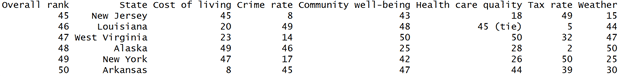
Here is the last six records from the first data source.
Some values in the Health care quality column have a ” (tie)” tail. The last statement in the block 1 cuts that tail off and converts the column’s character values to factors.
- The code block 3 scrapes the second table from the HTML page, removes unwanted columns and rows, renames the remaining columns, joins this data source to the previously processed first table on State column, reorders columns of the merged data frame, renames them and converts the factor values to numbers.
- The code in block 4 groups the combined data frame into seven clusters using the k-medoid method, a partitioning technique of clustering that is more robust to noise and outliers than k-means. It minimizes a sum of pairwise dissimilarities instead of a sum of squared Euclidean distances as the k-mean does. Note that the optimal number of clusters is also calculated by the pamk() function and saved in the fpc$nc variable. The Last two statements of the block reorder the dataframe columns and sort its rows by the cluster number and the state code.This block also calculates the cluster medoids, dataframe elements whose dissimilarity to the members of the corresponding cluster is minimal. They are similar to centroids, but are always members of the dataset. The set of the medoids returned by the pamk() as a matrix that has to be converted into a dataframe to make it accessible from Power BI Desktop. In order to link the medoids to the dataset of the retirement statistics, a cluster id column is added to the medoids dataframe. The last statement of the code in Figure 4 removes the dataframes that are not used for reporting.
Building the Dashboard
We have prepared the R script that delivers two dataframes which are required to build the dashboard in Figure 3. If you want to follow along you need to install the Power BI Desktop.
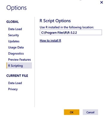
After the installation, check that the Power BI Desktop R Scripting configuration option points to the correct R installation location
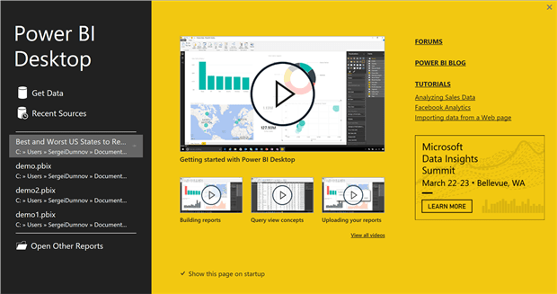
Open the Power BI Desktop and on the Welcome Screen …
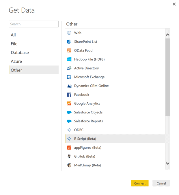
… click on the Get Data link and then select the “R Script (Beta)” data source option (see below).
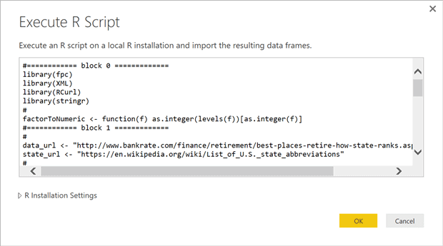
Copy the tested R script from R Studio, paste it into the text box of the “Execute R Script” dialog box and hit the ‘OK’ button.
Next you will see the Navigator form from where you can preview the two dataframes (see the picture below). Click on the Load button. After the Loading progress window goes away you should see the Power BI Desktop window as in Figure 5.
Click on the “Manage Relationships” button (select the Modelling ribbon, if you don’t see the button). On the Manage Relationships screen click on the Edit button to replace the auto detected relationship (Figure 6). Choose the Cluster column on both sides of the join (Figure 7), hit the OK button and close the “Manage Relationship” window.
Our data source is ready, so let’s build the dashboard tiles. To create the dashboard slicer click on the last icon in the 4th row of the Visualisations panel and set the slicer properties as shown in Figure 8. After that the slicer control should look like the one in Figure 3 (without the image on the left of the control).
Setting up the table controls is quite simple and I leave it for you to do it independently.
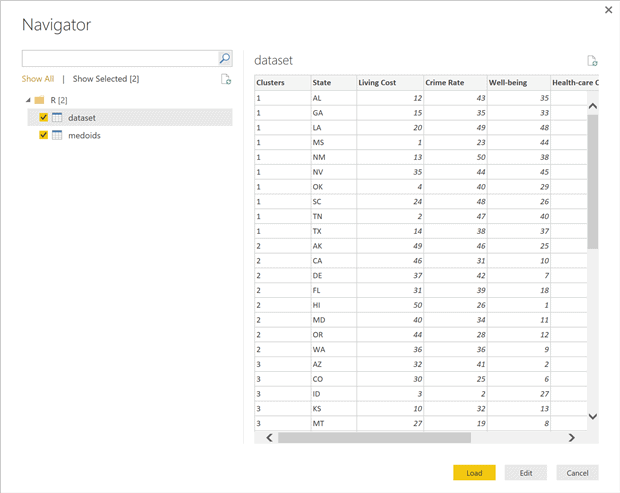
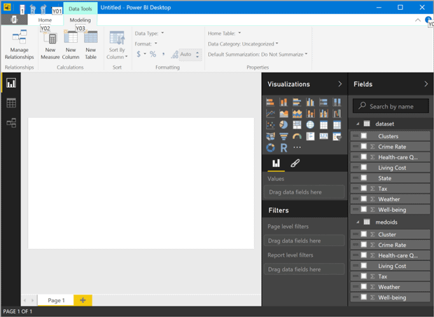
Figure 5. Power BI Desktop with two R dataframes loaded.
The Table Heatmap control in the right top corner of the dashboard is a custom visual that should be downloaded from https://app.powerbi.com/visuals/. To import the downloaded “Table Heatmap” visual, click on the last button (ellipses) in the Visualisation panel and navigate to where you saved the TableHeatMap.pbiviz file.
Next click on the Table Heatmap button in the Visualization panel and set up the control’s properties as shown on the Figure 9. You can find all the possible values for the Colorbrewer attribute here.
Configuration of the Filled Map visual is shown in Figure 10. After adjusting position of the controls on the page canvas and, if you like, adding images, you should be able to see a dashboard similar to the one in Figure 3.
Change the page name from Page 1 to State Clusters, save the file as Best and Worst US States to Retire and click on the Publish button. After the publishing process is complete click on the Open Best and Worst US States to Retire.pbix in Power BI link.
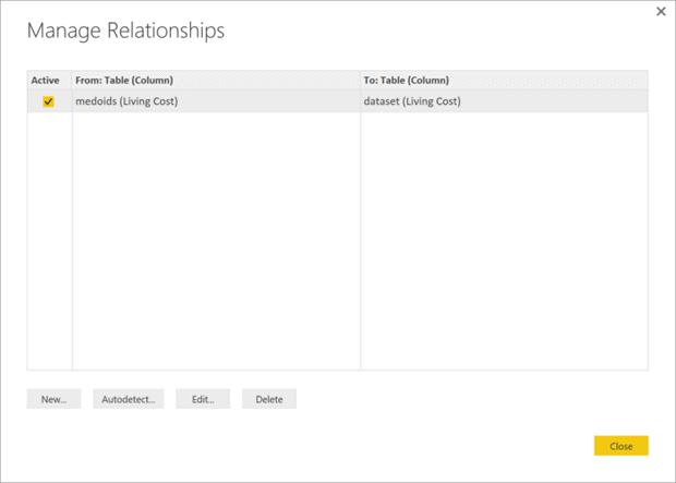
Figure 6. Click on the Edit button to replace the autodetected relationship.
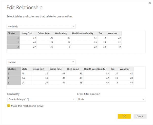
Figure 7. Edit the relationship between the dataframes.
It will take you to the on-line version of the newly developed States Clusters page at (in our case) https://app.powerbi.com/groups/me/reports/e0c990a8-bdc0-43d5-8265-f63da5d08e1d/ReportSection.
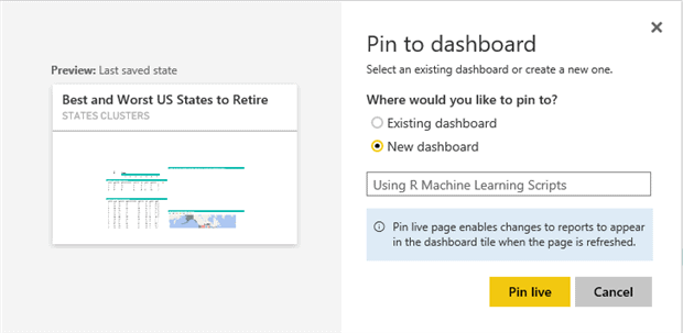
The end of the URL indicates that it is a report section. Next we add this section to the dashboard by clicking on the toolbar’s Pin Live Page button. Select the “New Dashboard” option (see Figure 11), name it as “Using R Machine Learning Scripts” and click on the Pin Live button to view the dashboard.
The created dashboard is fully interactive. You can filter the reports on the page using the slicer, map legend, by selecting state(s) on the map and sort tables’ rows by clicking on the columns headers.
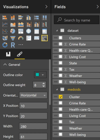
Figure 8. Dashboard slicer configuration.
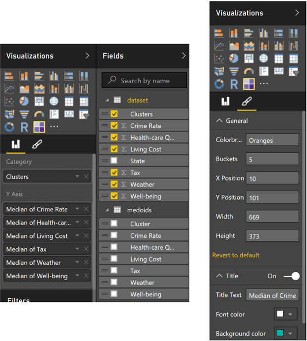
Figure 9. Configuration of the Table Heatmap.
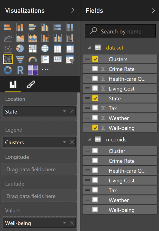
Figure 10. Configuration of the Filled Map control.
R Scripts: Recommendations and Limitation
Here is a list of recommendations regarding R scripts usage extracted from the Power Bi documentation:
- Create the script in your local R development environment, and make sure it runs successfully.
- Note: all packages and dependencies must be explicitly loaded and run. You can use source() function to run dependent scripts.
- Only data frames can be used as the data sources.
- Any R script that runs longer than 30 minutes – times out.
- Interactive calls in the R script, such as waiting for user input, halts the script’s execution
- When setting the working directory within the R script, you must define a full path to the working directory.
- You can refresh an R script in Power BI Desktop. When you refresh an R script, Power BI Desktop runs the R script again in the Power BI Desktop environment. You can also enable refresh, and scheduled refresh, for R script reports published to the Power BI service.
Power BI personal gateway is required to refresh data published to the Power BI service. It should be installed on the computer running the R script and configured for the account that has access to the data being refreshed.
Conclusions
I have, in this article, described the process of developing a Power BI Dashboard that uses an R machine learning script as its data source and custom visuals. In spite of the simplicity of both the example and the data sources, this article demonstrates most of the typical phases of developing a typical BI dashboard. These phases include connecting to off-premises data sources over the Internet, doing the data-cleansing, transformation and enrichment through the use analytical datasets returned by the R script, the design of the dashboard and finally sharing the dashboard with your colleagues. I hope I’ve encouraged you to try it yourself.
This document contains proprietary information and is protected by copyright law.
Copyright © 2026 Red Gate Software Limited. All rights reserved
Load comments