
There exists a vast body of research into readability to understand what factors affect the ease with which a reader can understand a written text. This encompasses several different disciplines including typography and visual psychology. A lot of this research has its origin in World War II and the Army. Yet, in spite of all the research, people still think that their choices for displaying program code or matter of personal taste. Nope, sorry. There is a lot of science about this, spreading back over seventy years.
A lot of the reasons for our current habits in displaying code are based on the devices that we use for coding. This is always been true for any writing; a quill pen is not the same as handset type. So let us take a little trip down memory lane and start with to punch cards before leaping back to Gutenberg..
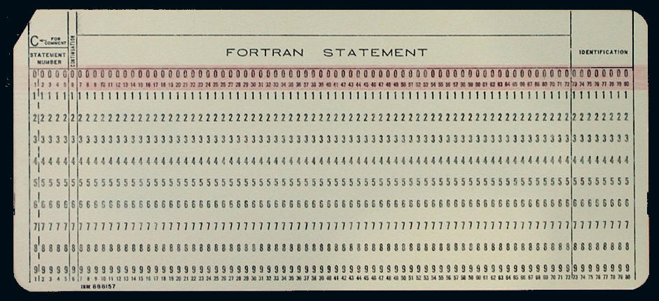
The standard punch card (or IBM card. If you are loyal to the brand) has 80 columns. The original encoding used on it was EBCDIC pronounced “ehb-suh-dik” (Expanded Binary Coded Decimal Information Code), which sounds somewhat like a social disease. The important thing with this encoding is that it has only uppercase letters, digits, and some simple punctuation marks. It also meant that the type font has to be monospaced to fit in a single column on a card.

Monospaced fonts were something of a novelty, introduced with the typewriter; proportional fonts actually go back to Gutenberg! In those days, the writing of text was a highly-appreciated art. To emulate the finer aspects, Gutenberg crated fonts where each letter was a different width, and even the individual character sometimes came in different widths to allow text to be justified more accurately. He would cast several different versions of a single letter in varying widths (without the corners or ‘noses’) , then assemble a ‘justified’ line with a range of different ‘space’ between words, and then fine-tune the effect with different-widths of the characters to make sure it was more accurately justified (this means that the text fits exactly into left and right limits. Today, we know that` “ragged right” text is easier to both read and typeset.
The restricted character set of the first computers meant that it was not physically possible to design a programming language that was case-sensitive. This subset of printable characters lives on today in the ISO standards for encoding schemes for just that reason. Every printable human language that uses Unicode has to include this subset so it can express ISO standards.
When ASCII came along the technology was getting better. We had CRT screens and lower case letters. Lowercase letters are rather important for readability. This is why your books and newspapers are not in ‘all-uppercase’
Because of the physical limits of a punch card, we had a lot of really weird formatting tricks. With only 80 columns to use and some of these already reserved for sequential numbering of the deck of cards, we squeezed code. If you did not need to have a space between any of the math symbols (=, +, -,/,*, parentheses, etc) and punctuation marks, (comma, semi-colon, colon, etc) you squeezed them out. In fact, FORTRAN originally did not use spaces! You could put them in, but the compiler would strip them out. This led to lots of problems, which I will not go into here. Language design has, in general, gotten much better over the following decades.
Early programming languages such as FORTRAN, Assembler and BASIC put one statement per line because that is how you would put them in the punch card. When a single statement ran over one line (punch card), you needed special continuation symbols in the language, or termination symbols.
Another one of our tricks was to put a comma at the front of each element of a list and one element per card. We also would put one keyword on a card. So we formatted our card decks to be more like Lego blocks. There were no video editor terminals! We were a simple tribe with primitive traditions and tools Go ask somebody who is old about how hard it was for programmers to find time on a keypunch machine.
Today we know that this is an awful way to format code. Punctuation marks in a programming language should follow the same rules as they would in a natural language because that is how you are trained to read. In particular, we like to see groupings of related words. This means that instead of putting things like {first_name, middle_name, last_name} each on its own card, it was better to put them all on one line as a unit. In typography, this is called the Law of Proximity. Typographical elements that are physically close together are read as a unit. Look at http://www.illusions.org/dp/1-5.htm; you read “Paris in the the springtime” and missed the double “the” when the phrase is broken into three lines.
We read left to right, top to bottom, but we see several lines of text above and below the line that our eyes are currently on. You can get vertical white spaces across multiple lines of text; these are called “Rivers” by typesetters and they are considered to be very undesirable in text. They make your eyes move up or down the river, instead of following the current line of text. This can happen with proportional fonts, but it is a real problem with monospaced fonts. Rivers simply happen more often with monospaced fonts.
However, program text is not literary text. The early languages were statement and line oriented. But in 1960 got a wonderful language called Algol-60. The outstanding features of this language were 1) it was the first language to have a formal BNF definition. 2) this was the first block structured language 3) It was better than any language that can that came subsequently for a few decades. This block structure proved to be the groundbreaking feature.
The block structure requires a different way of reading the programs. Suddenly, indentation and rivers become important for exposing structure of the language. Programs in this family of languages can be written as a continuous stream of text. No indentation. No line breaks. Absolutely minimal spacing. Statements are generally separated by semicolons (I trust the reader is starting to use the semicolons in his T-SQL. They have always been optional, but are now required in certain statements).
Algol-60 was adopted by the ACM (Association for Computing Machinery; www.acm.org) as the language for publishing algorithms. This led to typographical specifications for program text in the Journal of the ACM, the British Computer Journal and other academic publications. As far as I know, this was the first time that our trade had a specification for formatting program text.
The publication conventions for Algol-60 used boldface for the reserved words and then by convention, rather than by specification, began the habit of aligning clauses in Algol-60 statements by editors. These conventions then became part of the folklore for other block structured languages, such as C, PL/1, Pascal, Ada, and so forth.
The Typesetter’s Tools
As computers got better, it became possible to provide displays, software and printers for rendering program text that started to look more and more like the tools that typographers had had for literary text. Laser printers are a lot easier to read than dot matrix printers. High-resolution screens, good text editors and immediate syntax error corrections while typing, beat the heck out of punchcards and green bar paper. Let us make a list of our basic tools and look at them one at a time.
Fonts
Mono-spaced font characters have to be as clear as possible. Punctuation such as commas, colons, semi-colons, and brackets need to be more prominent and distinct than for text. The problematic characters are the digit 1, capital ‘i’, lowercase ‘L’ and ‘|’ (pipe). The capital ‘O’ and zero, which look nearly the same in many fonts. Most typefaces designed for coding typically either use a slashed or a dotted zero.
![]()
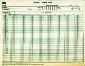
This convention goes back to the days of punch cards. We had forms called coding sheets, which had pre-printed guidelines for particular languages that required certain columns for certain purposes. They had several lines of blocks, one for each column on the punch card. We hand-printed our code into the coding sheets, gave the coding sheets to the keypunch girls (this is not sexist; it is a statement of how we did EDP in the 1950-1960 time frame). They would punch your cards; programmers were not allowed to touch keypunch machines in production.
Imagine a large open space filled with keypunch machines, with women sitting at them and people running around with carts full of coding sheets and decks of punch cards in specially designed metal trays. The company could not afford the loss of throughput that would be the result of giving programmers access to keypunch machines. From the ethological perspective, the gatherers (key punchers) provided more of the food (revenue and daily operations) of the tribe (Corporation) than the hunters (programmers). 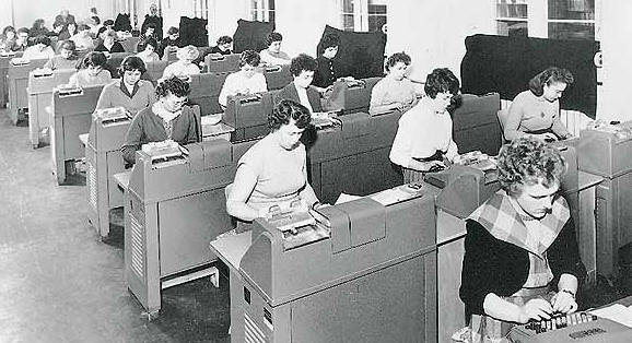
This has to sound so primitive to a kid (programmer under 50 years of age) who is coding on his cell phone today. But this is how we did it. In fairness, our trade quickly moved out of living in trees and eating our own children to living in caves and eating other people’s children.
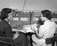
Your card deck would then be passed to a verifier; this “keypunch girl” would take your card deck, loaded into a specialized card punch, and retype the code. If her keystrokes matched what was in the card, then the card got a semicircular notch on the top edge, otherwise there was no notch. This let someone look at the deck and see if there were problematic cards. The programmer then got his deck back. The programmers had one shared keypunch machine in the shop and you went to the queue to re-punch the bad cards.
Yes, this was slow and we were a very primitive tribe. The reason for all of this levels of verification was simple. The cost of the programmers and keypunch people were much less than the cost of the machines. Recompiles cost money. This is why large mainframe computers were run as close to 24 hours per day as possible. If your company did not have the workload for this, you sold the extra time to someone. In the 1960s, programmers and machine operators (yes, just running the computer was a separate job skill) spent a lot of time at all-night diners. In the 1960s, this is how I got to meet a lot of cops, drunks and prostitutes at one coffee shop in downtown Atlanta.
We really did not want to try to wait for the one keypunch machine reserved for programmers to do corrections. So we invented very clear block printing conventions, like the slashed zero, distinct uppercase ‘I’ (remember we only had uppercase), and so forth. We also formatted our cards so that we could reuse them. This is why we put commas at the front of the line (punch card), and save them for reuse. This is why we put one data element on a card. This is why we put one keyword on a card. Again, think of Lego blocks.
Today, we have video terminals. There is absolutely no reason to continue with these archaic coding practices. Most of the programmers doing this style of coding have no idea why they are doing it. Video terminal displays are not things that can be physically reused! Duh!
References:
- http://www.fastcodesign.com/3033983/theres-finally-a-modern-typeface-for-programmers
- http://typecast.com/blog/10-fonts-for-code
Colors
In theory, we could have used color printers to output our code. Nobody does this, but a lot of people like to do what I call “neon vomit” on video terminals. It really does not work; and the research confirms this. The things that work against it are that some people are colorblind and some people cannot switch between reading text and seeing color quickly. This is called the Stroop effect (https://en.wikipedia.org/wiki/Stroop_effect) and it was used to test concussions in athletes. The basic idea is that we print the names of colors in ink of a different color (the word “red” in green ink, etc), then ask people to read either the word or tell us the color. If you have a concussion, the hemispheres of your brain cannot switch and communicate at the same speed as they did before the concussion. Since this is easy to test, it became a popular science fair project a few years back (http://www.education.com/science-fair/article/does-text-color-affect-readability/).
If you want to see just how bad colored text can be for readability, get early issues of WIRED magazine. The designers went berserk with colored ink and made the text unreadable.
Spacing
One of the major things the computers did for people was make them think of the space as being a character. This is the string equivalent of realizing that zero is actually a number. Originally, manuscript text was written as a solid stream of letters, and it was up to the reader to break it apart into words. This can work for some languages, especially those that use characters or syllabary symbols (Chinese, Japanese, Korean, APL, OS/JCL and math), but languages that depend on words made from an alphabet, not so much. Did you mean to say “therapist” or “the rapist” is a subject of your sentence? Later, we started putting a raised dot between words as a separator in hand written manuscripts. Finally, we got metal type in the 1400’s, and simply put in the familiar space.
Uniform word-spacing is desirable for reading. This is the Law of Proximity again. The converse is that typographical elements that are spaced far apart are not easily seen as part of a single unit or flow. The classic examples are sentences split over a page or column break that have funny or ambiguous readings.
When we were testing program readability in the late 1970 – early 1980’s, we found that the way to hide an error was to put it over a physical page break under a fold on green bar paper (if you do not know what “green bar paper” is, please find an old person and ask them). This could literally increase the time to find a simple bug by twofold or threefold.
When we started putting things on display screens, we found the rule of thumb that a module of code should not be bigger than one page or screen. In the SQL Server community, this was translated into the heuristic “a stored procedure should not be more than 50 lines of code” in the folklore. It is actually pretty good advice still.
We also found something else. It is best to use one space between words, and when you need to physically separate something from the rest of the body of the code you do not need to use more than three spaces. This is important because the traditional tab function on teletypes (still got that old person around? Ask them what a teletype is; it was the standard input device for all early minicomputers where SQL Server started), was based on a stop every eight spaces.
Oh, before you ask, two spaces was the typewriter convention for separating sentences. This means that anyone used to reading monospaced-font in the past 100 years barely notice a mere two spaces. Two spaces is a simple pause. Three spaces is enough that it is seen as significant; more spacing than that; makes the eye do extra work.
Uppercase, Lowercase and Bouma
You learn to read words in the Latin alphabet in a particular way; left to right; top to bottom. Originally, there was no spacing between words in text, but after a few centuries we got over that and expect a single space between words. Notice that I said “single space” and not a huge gap or a tab. This is an example of the second Law of Proximity; typographical elements that are far apart are not seen as part of the same unit. We also expect words will be aligned on a baseline. Originally, this was literally a line drawn with a piece of lead on parchment to help the scribes align their words. When we moved from quills to metal type, this was implied on each piece of type.
There are four alphabets that have cases; Latin, Cyrillic, Greek, and Arabic (the latter has initial, middle, terminal and standalone forms). Programming languages use Latin, and in particular a subset of the Unicode Latin letters, digits and symbols.
In some programming languages, capitalization matters. We have something like this in English, with words that are pronounced differently and have different meanings depending on their capitalization (“job” which means a task and “Job” who is an Old Testament prophet). Ideally, we would like to use exactly the same name for the same data element everywhere in the universe. This makes consistency important.
Uppercase letters do special things for Latin alphabet users. They announce the beginning of the sentence or paragraph, or “special words” in many languages. For example, in English, proper nouns and sentences begin with an uppercase letter.
Writing the word in all uppercase gives us what is called a Bouma. This is a word that is read as a unit by its shape, without looking at the letters inside it. Here is an example of a sentence written with scrambled words which is still readable because we can see the first and last letter of each word.
it deosn’t mttaer in waht oredr the ltteers in a wrod are, the olny iprmoetnt tihng is that the frist and lsat ltteer be at the rghit pclae…
it doesn’t matter in what order the letters in a word are, the only important thing is that the first and last letter be at the right place.
This is why signs are written in uppercase. This is also why you should uppercase reserved words in a programming language. It separates them from user-defined data element names and variables. Unlike natural languages, programming languages have to go through a parser and follow a very strict grammar. We know immediately for misspelled a keyword in the language, so it is that Bouma works really well for us.
Summary
We now have principles and basic tools for correctly formatting our code. A lot of this research was done during the “structured programming revolution” when we were inventing software engineering as a discipline. We have also retained bad habits that were necessary to transcend the limitations of the punch card, but which have now regressed into unthinking ritual. In part two, we will apply all of this stuff to SQL code. Stay tuned for the next exciting episode.


Load comments