
Executive Summary
This article demonstrates text mining and sentiment analysis in R using a team health survey dataset. The R packages covered are: tm (text cleaning and corpus management), ggplot2 (visualisation), wordcloud (word cloud generation), and syuzhet (sentiment scoring and NRC emotion classification). The workflow follows five steps: installing and loading packages; reading text file data into R; cleaning the text (removing punctuation, numbers, stop words, whitespace); building a term-document matrix to count word frequencies; and generating visualisations – word clouds, word association charts, sentiment score plots, and emotion classification bar charts. All code examples use the R base functions and the packages above.
The series so far:
- Text Mining and Sentiment Analysis: Introduction
- Text Mining and Sentiment Analysis: Power BI Visualizations
- Text Mining and Sentiment Analysis: Analysis with R
- Text Mining and Sentiment Analysis: Oracle Text
- Text Mining and Sentiment Analysis: Data Visualization in Tableau
- Sentiment Analysis with Python
This is the third article of the “Text Mining and Sentiment Analysis” Series. The first article introduced Azure Cognitive Services and demonstrated the setup and use of Text Analytics APIs for extracting key Phrases & Sentiment Scores from text data. The second article demonstrated Power BI visualizations for analyzing Key Phrases & Sentiment Scores and interpreting them to gain insights. This article explores R for text mining and sentiment analysis. I will demonstrate several common text analytics techniques and visualizations in R.
Note: This article assumes basic familiarity with R and RStudio. Please jump to the References section for more information on installing R and RStudio. The Demo data raw text file and R script are available for download from my GitHub repository; please find the link in the References section.
R is a language and environment for statistical computing and graphics. It provides a wide variety of statistical and graphical techniques and is highly extensible. R is available as free software. It’s easy to learn
and use and can produce well designed publication-quality plots. For the demos in this article, I am using R version 3.5.3 (2019-03-11), RStudio Version 1.1.456
The input file for this article has only one column, the “Raw text” of survey responses and is a text file.
A sample of the first few rows are shown in Notepad++ (showing all characters) in Figure 1.
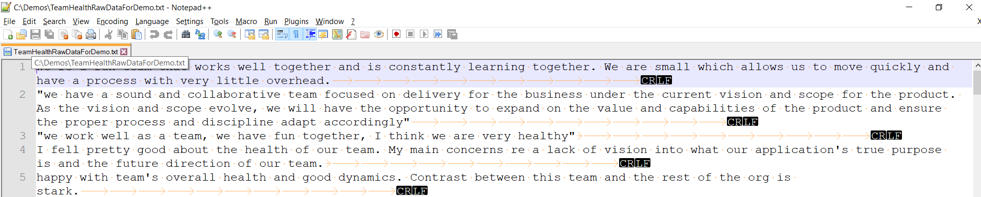
Figure 1. Sample of the input text file
The demo R script and demo input text file are available on my GitHub repo (please find the link in the References section).
R has a rich set of packages for Natural Language Processing (NLP) and generating plots. The foundational steps involve loading the text file into an R Corpus, then cleaning and stemming the data before performing analysis. I will demonstrate these steps and analysis like Word Frequency, Word Cloud, Word Association, Sentiment Scores and Emotion Classification using various plots and charts.
Installing and loading R packages
The following packages are used in the examples in this article:
- tm for text mining operations like removing numbers, special characters, punctuations and stop words (Stop words in any language are the most commonly occurring words that have very little value for NLP and should be filtered out. Examples of stop words in English are “the”, “is”, “are”.)
- snowballc for stemming, which is the process of reducing words to their base or root form. For example, a stemming algorithm would reduce the words “fishing”, “fished” and “fisher” to the stem “fish”.
- wordcloud for generating the word cloud plot.
- RColorBrewer for color palettes used in various plots
- syuzhet for sentiment scores and emotion classification
- ggplot2 for plotting graphs
Open RStudio and create a new R Script. Use the following code to install and load these packages.
|
1 2 3 4 5 6 7 8 9 10 11 12 13 14 |
# Install install.packages("tm") # for text mining install.packages("SnowballC") # for text stemming install.packages("wordcloud") # word-cloud generator install.packages("RColorBrewer") # color palettes install.packages("syuzhet") # for sentiment analysis install.packages("ggplot2") # for plotting graphs # Load library("tm") library("SnowballC") library("wordcloud") library("RColorBrewer") library("syuzhet") library("ggplot2") |
Reading file data into R
The R base function read.table() is generally used to read a file in table format and imports data as a data frame. Several variants of this function are available, for importing different file formats;
- read.csv() is used for reading comma-separated value (csv) files, where a comma “,” is used a field separator
- read.delim() is used for reading tab-separated values (.txt) files
The input file has multiple lines of text and no columns/fields (data is not tabular), so you will use the readLines function. This function takes a file (or URL) as input and returns a vector containing as many elements as the number of lines in the file. The readLines function simply extracts the text from its input source and returns each line as a character string. The n= argument is useful to read a limited number (subset) of lines from the input source (Its default value is -1, which reads all lines from the input source). When using the filename in this function’s argument, R assumes the file is in your current working directory (you can use the getwd() function in R console to find your current working directory). You can also choose the input file interactively, using the file.choose() function within the argument. The next step is to load that Vector as a Corpus. In R, a Corpus is a collection of text document(s) to apply text mining or NLP routines on. Details of using the readLines function are sourced from: https://www.stat.berkeley.edu/~spector/s133/Read.html .
In your R script, add the following code to load the data into a corpus.
|
1 2 3 4 |
# Read the text file from local machine , choose file interactively text <- readLines(file.choose()) # Load the data as a corpus TextDoc <- Corpus(VectorSource(text)) |
Upon running this, you will be prompted to select the input file. Navigate to your file and click Open as shown in Figure 2.
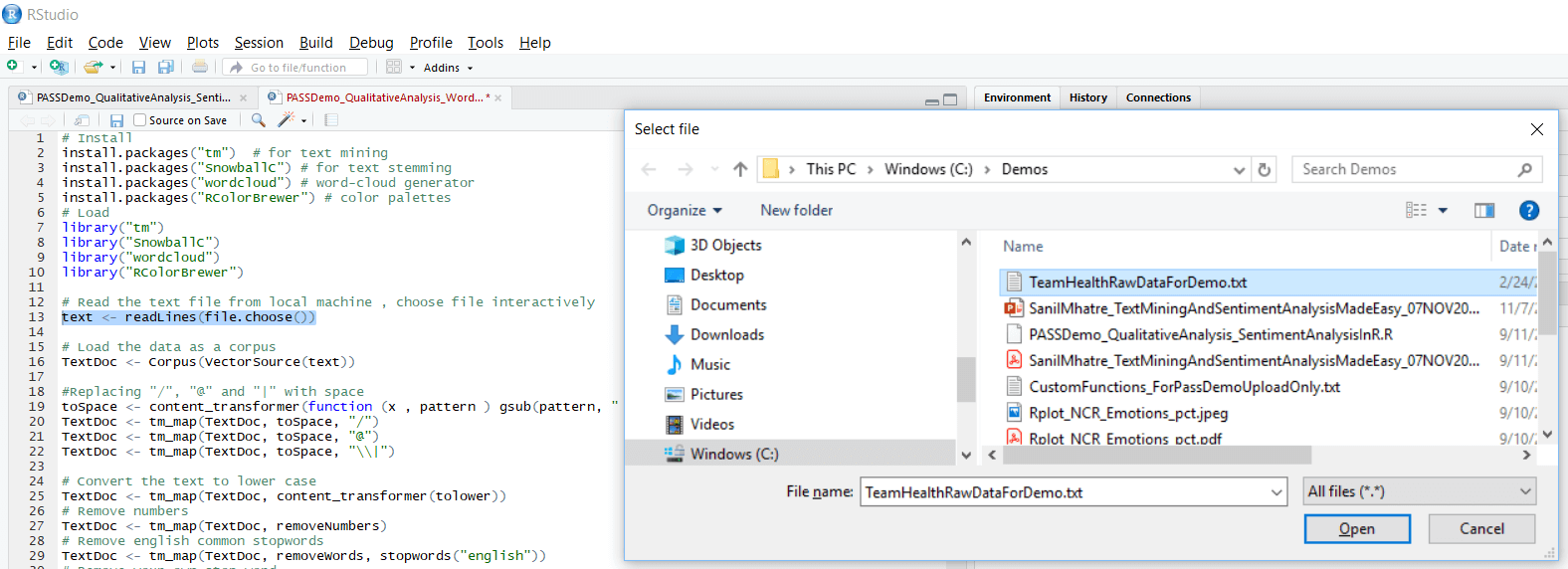
Figure 2. Select input file
Cleaning up Text Data
Cleaning the text data starts with making transformations like removing special characters from the text. This is done using the tm_map() function to replace special characters like /, @ and | with a space. The next step is to remove the unnecessary whitespace and convert the text to lower case.
Then remove the stopwords. They are the most commonly occurring words in a language and have very little value in terms of gaining useful information. They should be removed before performing further analysis. Examples of stopwords in English are “the, is, at, on”. There is no single universal list of stop words used by all NLP tools. stopwords in the tm_map() function supports several languages like English, French, German, Italian, and Spanish. Please note the language names are case sensitive. I will also demonstrate how to add your own list of stopwords, which is useful in this Team Health example for removing non-default stop words like “team”, “company”, “health”. Next, remove numbers and punctuation.
The last step is text stemming. It is the process of reducing the word to its root form. The stemming process simplifies the word to its common origin. For example, the stemming process reduces the words “fishing”, “fished” and “fisher” to its stem “fish”. Please note stemming uses the SnowballC package. (You may want to skip the text stemming step if your users indicate a preference to see the original “unstemmed” words in the word cloud plot)
In your R script, add the following code to transform and run to clean-up the text data.
|
1 2 3 4 5 6 7 8 9 10 11 12 13 14 15 16 17 18 19 20 |
#Replacing "/", "@" and "|" with space toSpace <- content_transformer(function (x , pattern ) gsub(pattern, " ", x)) TextDoc <- tm_map(TextDoc, toSpace, "/") TextDoc <- tm_map(TextDoc, toSpace, "@") TextDoc <- tm_map(TextDoc, toSpace, "\\|") # Convert the text to lower case TextDoc <- tm_map(TextDoc, content_transformer(tolower)) # Remove numbers TextDoc <- tm_map(TextDoc, removeNumbers) # Remove english common stopwords TextDoc <- tm_map(TextDoc, removeWords, stopwords("english")) # Remove your own stop word # specify your custom stopwords as a character vector TextDoc <- tm_map(TextDoc, removeWords, c("s", "company", "team")) # Remove punctuations TextDoc <- tm_map(TextDoc, removePunctuation) # Eliminate extra white spaces TextDoc <- tm_map(TextDoc, stripWhitespace) # Text stemming - which reduces words to their root form TextDoc <- tm_map(TextDoc, stemDocument) |
Building the term document matrix
After cleaning the text data, the next step is to count the occurrence of each word, to identify popular or trending topics. Using the function TermDocumentMatrix() from the text mining package, you can build a Document Matrix – a table containing the frequency of words.
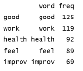
In your R script, add the following code and run it to see the top 5 most frequently found words in your text.
|
1 2 3 4 5 6 7 8 |
# Build a term-document matrix TextDoc_dtm <- TermDocumentMatrix(TextDoc) dtm_m <- as.matrix(TextDoc_dtm) # Sort by descearing value of frequency dtm_v <- sort(rowSums(dtm_m),decreasing=TRUE) dtm_d <- data.frame(word = names(dtm_v),freq=dtm_v) # Display the top 5 most frequent words head(dtm_d, 5) |
The following table of word frequency is the expected output of the head command on RStudio Console.
Plotting the top 5 most frequent words using a bar chart is a good basic way to visualize this word frequent data. In your R script, add the following code and run it to generate a bar chart, which will display in the Plots sections of RStudio.
|
1 2 3 4 |
# Plot the most frequent words barplot(dtm_d[1:5,]$freq, las = 2, names.arg = dtm_d[1:5,]$word, col ="lightgreen", main ="Top 5 most frequent words", ylab = "Word frequencies") |
The plot can be seen in Figure 3.
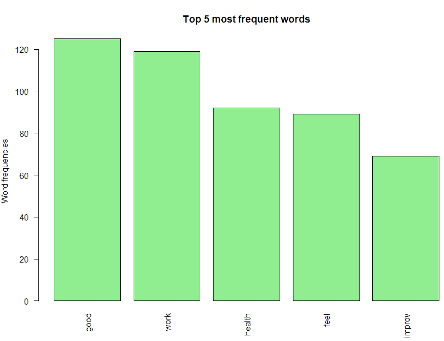
Figure 3. Bar chart of the top 5 most frequent words
One could interpret the following from this bar chart:
- The most frequently occurring word is “good”. Also notice that negative words like “not” don’t feature in the bar chart, which indicates there are no negative prefixes to change the context or meaning of the word “good” ( In short, this indicates most responses don’t mention negative phrases like “not good”).
- “work”, “health” and “feel” are the next three most frequently occurring words, which indicate that most people feel good about their work and their team’s health.
- Finally, the root “improv” for words like “improve”, “improvement”, “improving”, etc. is also on the chart, and you need further analysis to infer if its context is positive or negative
Generate the Word Cloud
A word cloud is one of the most popular ways to visualize and analyze qualitative data. It’s an image composed of keywords found within a body of text, where the size of each word indicates its frequency in that body of text. Use the word frequency data frame (table) created previously to generate the word cloud. In your R script, add the following code and run it to generate the word cloud and display it in the Plots section of RStudio.
|
1 2 3 4 5 |
#generate word cloud set.seed(1234) wordcloud(words = dtm_d$word, freq = dtm_d$freq, min.freq = 5, max.words=100, random.order=FALSE, rot.per=0.40, colors=brewer.pal(8, "Dark2")) |
Below is a brief description of the arguments used in the word cloud function;
- words – words to be plotted
- freq – frequencies of words
- min.freq – words whose frequency is at or above this threshold value is plotted (in this case, I have set it to 5)
- max.words – the maximum number of words to display on the plot (in the code above, I have set it 100)
- random.order – I have set it to FALSE, so the words are plotted in order of decreasing frequency
- rot.per – the percentage of words that are displayed as vertical text (with 90-degree rotation). I have set it 0.40 (40 %), please feel free to adjust this setting to suit your preferences
- colors – changes word colors going from lowest to highest frequencies
You can see the resulting word cloud in Figure 4.
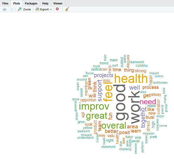
Figure 4. Word cloud plot
The word cloud shows additional words that occur frequently and could be of interest for further analysis. Words like “need”, “support”, “issu” (root for “issue(s)”, etc. could provide more context around the most frequently occurring words and help to gain a better understanding of the main themes.
Word Association
Correlation is a statistical technique that can demonstrate whether, and how strongly, pairs of variables are related. This technique can be used effectively to analyze which words occur most often in association with the most frequently occurring words in the survey responses, which helps to see the context around these words
In your R script, add the following code and run it.
|
1 2 |
# Find associations findAssocs(TextDoc_dtm, terms = c("good","work","health"), corlimit = 0.25) |
You should see the results as shown in Figure 5.
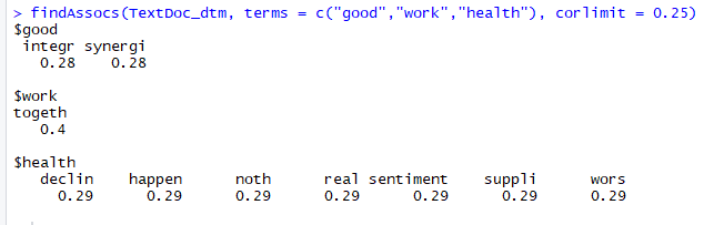
Figure 5. Word association analysis for the top three most frequent terms
This script shows which words are most frequently associated with the top three terms (corlimit = 0.25 is the lower limit/threshold I have set. You can set it lower to see more words, or higher to see less). The output indicates that “integr” (which is the root for word “integrity”) and “synergi” (which is the root for words “synergy”, “synergies”, etc.) and occur 28% of the time with the word “good”. You can interpret this as the context around the most frequently occurring word (“good”) is positive. Similarly, the root of the word “together” is highly correlated with the word “work”. This indicates that most responses are saying that teams “work together” and can be interpreted in a positive context.
You can modify the above script to find terms associated with words that occur at least 50 times or more, instead of having to hard code the terms in your script.
|
1 2 |
# Find associations for words that occur at least 50 times findAssocs(TextDoc_dtm, terms = findFreqTerms(TextDoc_dtm, lowfreq = 50), corlimit = 0.25) |
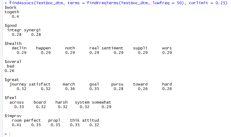
Figure 6: Word association output for terms occurring at least 50 times
Sentiment Scores
Sentiments can be classified as positive, neutral or negative. They can also be represented on a numeric scale, to better express the degree of positive or negative strength of the sentiment contained in a body of text.
You may also be interested in:
SQL Server Machine Learning Services Python for data analysis alongside R
This example uses the Syuzhet package for generating sentiment scores, which has four sentiment dictionaries and offers a method for accessing the sentiment extraction tool developed in the NLP group at Stanford. The get_sentiment function accepts two arguments: a character vector (of sentences or words) and a method. The selected method determines which of the four available sentiment extraction methods will be used. The four methods are syuzhet (this is the default), bing, afinn and nrc. Each method uses a different scale and hence returns slightly different results. Please note the outcome of nrc method is more than just a numeric score, requires additional interpretations and is out of scope for this article. The descriptions of the get_sentiment function has been sourced from : https://cran.r-project.org/web/packages/syuzhet/vignettes/syuzhet-vignette.html?
Add the following code to the R script and run it.
|
1 2 3 4 5 6 7 |
# regular sentiment score using get_sentiment() function and method of your choice # please note that different methods may have different scales syuzhet_vector <- get_sentiment(text, method="syuzhet") # see the first row of the vector head(syuzhet_vector) # see summary statistics of the vector summary(syuzhet_vector) |
Your results should look similar to Figure 7.
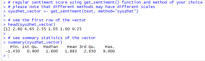
Figure 7. Syuzhet vector
An inspection of the Syuzhet vector shows the first element has the value of 2.60. It means the sum of the sentiment scores of all meaningful words in the first response(line) in the text file, adds up to 2.60. The scale for sentiment scores using the syuzhet method is decimal and ranges from -1(indicating most negative) to +1(indicating most positive). Note that the summary statistics of the suyzhet vector show a median value of 1.6, which is above zero and can be interpreted as the overall average sentiment across all the responses is positive.
Next, run the same analysis for the remaining two methods and inspect their respective vectors. Add the following code to the R script and run it.
|
1 2 3 4 5 6 7 8 |
# bing bing_vector <- get_sentiment(text, method="bing") head(bing_vector) summary(bing_vector) #affin afinn_vector <- get_sentiment(text, method="afinn") head(afinn_vector) summary(afinn_vector) |
Your results should resemble Figure 8.
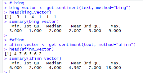
Figure 8. bing and afinn vectors
Please note the scale of sentiment scores generated by:
- bing – binary scale with -1 indicating negative and +1 indicating positive sentiment
- afinn – integer scale ranging from -5 to +5
The summary statistics of bing and afinn vectors also show that the Median value of Sentiment scores is above 0 and can be interpreted as the overall average sentiment across the all the responses is positive.
Because these different methods use different scales, it’s better to convert their output to a common scale before comparing them. This basic scale conversion can be done easily using R’s built-in sign function, which converts all positive number to 1, all negative numbers to -1 and all zeros remain 0.
Add the following code to your R script and run it.
|
1 2 3 4 5 6 |
#compare the first row of each vector using sign function rbind( sign(head(syuzhet_vector)), sign(head(bing_vector)), sign(head(afinn_vector)) ) |
Figure 9 shows the results.
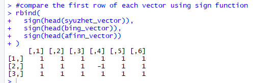
Figure 9. Normalize scale and compare three vectors
Note the first element of each row (vector) is 1, indicating that all three methods have calculated a positive sentiment score, for the first response (line) in the text.
Emotion Classification
Emotion classification is built on the NRC Word-Emotion Association Lexicon (aka EmoLex). The definition of “NRC Emotion Lexicon”, sourced from http://saifmohammad.com/WebPages/NRC-Emotion-Lexicon.htm is “The NRC Emotion Lexicon is a list of English words and their associations with eight basic emotions (anger, fear, anticipation, trust, surprise, sadness, joy, and disgust) and two sentiments (negative and positive). The annotations were manually done by crowdsourcing.”
To understand this, explore the get_nrc_sentiments function, which returns a data frame with each row representing a sentence from the original file. The data frame has ten columns (one column for each of the eight emotions, one column for positive sentiment valence and one for negative sentiment valence). The data in the columns (anger, anticipation, disgust, fear, joy, sadness, surprise, trust, negative, positive) can be accessed individually or in sets. The definition of get_nrc_sentiments has been sourced from: https://cran.r-project.org/web/packages/syuzhet/vignettes/syuzhet-vignette.html?
Add the following line to your R script and run it, to see the data frame generated from the previous execution of the get_nrc_sentiment function.
|
1 2 3 4 5 6 7 |
# run nrc sentiment analysis to return data frame with each row classified as one of the following # emotions, rather than a score: # anger, anticipation, disgust, fear, joy, sadness, surprise, trust # It also counts the number of positive and negative emotions found in each row d<-get_nrc_sentiment(text) # head(d,10) - to see top 10 lines of the get_nrc_sentiment dataframe head (d,10) |
The results should look like Figure 10.
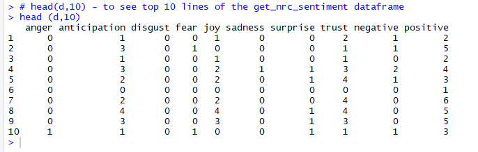
Figure 10. Data frame returned by get_nrc_sentiment function
The output shows that the first line of text has;
- Zero occurrences of words associated with emotions of anger, disgust, fear, sadness and surprise
- One occurrence each of words associated with emotions of anticipation and joy
- Two occurrences of words associated with emotions of trust
- Total of one occurrence of words associated with negative emotions
- Total of two occurrences of words associated with positive emotions
The next step is to create two plots charts to help visually analyze the emotions in this survey text. First, perform some data transformation and clean-up steps before plotting charts. The first plot shows the total number of instances of words in the text, associated with each of the eight emotions. Add the following code to your R script and run it.
|
1 2 3 4 5 6 7 8 9 10 11 |
#transpose td<-data.frame(t(d)) #The function rowSums computes column sums across rows for each level of a grouping variable. td_new <- data.frame(rowSums(td[2:253])) #Transformation and cleaning names(td_new)[1] <- "count" td_new <- cbind("sentiment" = rownames(td_new), td_new) rownames(td_new) <- NULL td_new2<-td_new[1:8,] #Plot One - count of words associated with each sentiment quickplot(sentiment, data=td_new2, weight=count, geom="bar", fill=sentiment, ylab="count")+ggtitle("Survey sentiments") |
You can see the bar plot in Figure 11.
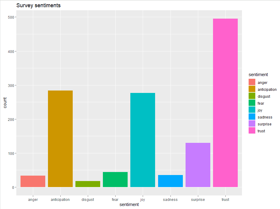
Figure 11. Bar Plot showing the count of words in the text, associated with each emotion
This bar chart demonstrates that words associated with the positive emotion of “trust” occurred about five hundred times in the text, whereas words associated with the negative emotion of “disgust” occurred less than 25 times. A deeper understanding of the overall emotions occurring in the survey response can be gained by comparing these number as a percentage of the total number of meaningful words. Add the following code to your R script and run it.
|
1 2 3 4 5 6 7 8 |
#Plot two - count of words associated with each sentiment, expressed as a percentage barplot( sort(colSums(prop.table(d[, 1:8]))), horiz = TRUE, cex.names = 0.7, las = 1, main = "Emotions in Text", xlab="Percentage" ) |
The Emotions bar plot can be seen in figure 12.
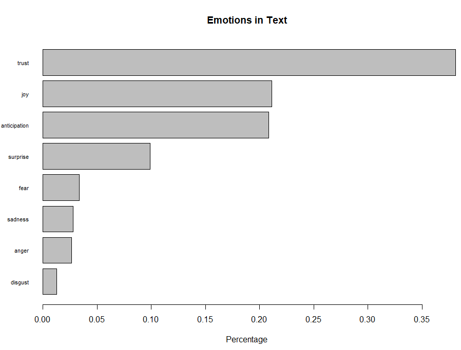
Figure 12. Bar Plot showing the count of words associated with each sentiment expressed as a percentage
This bar plot allows for a quick and easy comparison of the proportion of words associated with each emotion in the text. The emotion “trust” has the longest bar and shows that words associated with this positive emotion constitute just over 35% of all the meaningful words in this text. On the other hand, the emotion of “disgust” has the shortest bar and shows that words associated with this negative emotion constitute less than 2% of all the meaningful words in this text. Overall, words associated with the positive emotions of “trust” and “joy” account for almost 60% of the meaningful words in the text, which can be interpreted as a good sign of team health.
Conclusion
This article demonstrated reading text data into R, data cleaning and transformations. It demonstrated how to create a word frequency table and plot a word cloud, to identify prominent themes occurring in the text. Word association analysis using correlation, helped gain context around the prominent themes. It explored four methods to generate sentiment scores, which proved useful in assigning a numeric value to strength (of positivity or negativity) of sentiments in the text and allowed interpreting that the average sentiment through the text is trending positive. Lastly, it demonstrated how to implement an emotion classification with NRC sentiment and created two plots to analyze and interpret emotions found in the text.
You may also be interested in:
Text Mining and Sentiment Analysis Introduction: Azure Text Analytics with Power BI
References:
- R – https://www.r-project.org/
- Download and install R for windows – https://cran.r-project.org/bin/windows/base/
- Download and install RStudio – https://rstudio.com/products/rstudio/download/
- Reading data into R – https://www.stat.berkeley.edu/~spector/s133/Read.html
- Power BI visuals using R – https://docs.microsoft.com/en-us/power-bi/desktop-r-visuals
- Natural Language Processing (NLP) – https://en.wikipedia.org/wiki/Natural_language_processing
- Stop words – https://en.wikipedia.org/wiki/Stop_words
- Stemming – https://en.wikipedia.org/wiki/Stemming
- Word cloud in R – http://www.sthda.com/english/wiki/text-mining-and-word-cloud-fundamentals-in-r-5-simple-steps-you-should-know
- Correlation – https://en.wikipedia.org/wiki/Correlation_and_dependence
- R Syuzhet Package – https://cran.r-project.org/web/packages/syuzhet/vignettes/syuzhet-vignette.html
- NRC Emotion lexicon – http://saifmohammad.com/WebPages/NRC-Emotion-Lexicon.htm
- Sanil Mhatre’s GitHub Repo for R Script and Demo data file – https://github.com/SQLSuperGuru/SimpleTalkDemo_R
FAQs: Text Mining and Sentiment Analysis: Analysis with R
1. How do I do sentiment analysis in R?
Install the syuzhet package (install.packages(‘syuzhet’)). Load a text vector into R, then call get_sentiment(text_vector, method = ‘afinn’) for a numeric sentiment score per sentence (positive = positive, negative = negative), or get_nrc_sentiment(text_vector) for NRC emotion classification (joy, trust, fear, surprise, sadness, disgust, anger, anticipation). For a corpus of documents, use the tm package to clean the text first, then apply syuzhet to the cleaned data. The result is a data frame of sentiment scores that can be visualised with ggplot2.
2. What R packages do I need for text mining?
Core text mining packages: tm (Corpus creation, text cleaning – removes punctuation, numbers, stop words, whitespace); SnowballC (word stemming to reduce words to their root form); RColorBrewer and wordcloud (word cloud visualisation); ggplot2 (sentiment and frequency bar charts); syuzhet (sentiment scores and NRC emotion classification). Install all with: install.packages(c(‘tm’, ‘SnowballC’, ‘wordcloud’, ‘RColorBrewer’, ‘ggplot2’, ‘syuzhet’)). For reading various file formats: readr for CSV, readtext for Word documents and PDFs.
3. What is the NRC Word-Emotion Association Lexicon?
The NRC Emotion Lexicon (EmoLex) is a crowd-sourced lexicon of English words and their associations with eight basic emotions (anger, fear, anticipation, trust, surprise, sadness, joy, disgust) and two sentiments (positive, negative). Each word is tagged with 0 or 1 for each emotion/sentiment category. In R, the syuzhet package’s get_nrc_sentiment() function looks up each word in the text against the NRC lexicon and returns counts for each emotion category. It provides richer analysis than positive/negative scoring alone – useful for understanding the emotional tenor of customer feedback or survey responses.
4. How do I generate a word cloud in R from text data?
Load the wordcloud and tm packages. Create a Corpus from your text data, clean it (tm_map for punctuation, stop words, whitespace), build a TermDocumentMatrix, and convert to a matrix. Sort words by frequency: word_freq = sort(rowSums(as.matrix(tdm)), decreasing = TRUE). Call wordcloud(words = names(word_freq), freq = word_freq, min.freq = 3, random.order = FALSE, colors = brewer.pal(8, ‘Dark2’)). Adjust min.freq to control how many words appear and scale for size parameters based on your dataset size.
This document contains proprietary information and is protected by copyright law.
Copyright © 2026 Red Gate Software Limited. All rights reserved
Load comments