
The Challenge
Until recently, we have assumed that everyone who browses the web does so using a desktop PC. This has allowed developers and designers to create an informal standard of using 960 pixels as a base with for their creations. This practice has, so far, been widely accepted: However the market has changed and our perceptions have moved with the market. This is because people are now just as inclined to use mobile devices or tablets to access the Web.
The mobile market is growing and evolving rapidly, and so are the expectations of the user. Currently, mobile users are often forced to zoom in and out of content that was originally designed for the desktop. While this is not ideal, it is considered necessary and generally tolerated, but not for much longer.
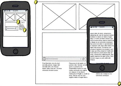
Figure 1 What is acceptable.
Millions of tablets and web-enabled smart phones, feature phones, tablets, TVs, game consoles, appliances, vehicle dashboards and more, running on one of several operating systems, have made their way into consumer’s hands. In just the fourth quarter of 2011 alone, Apple sold 15 million iPads, while Amazon saw 6 million sales of its Kindle. This means that the next generation of the web will need to be more flexible in order to accommodate the increasing range of devices.
It is becoming necessary to build websites for devices whose dimensions are as yet unknown, and we must define a strategy to do so. To simplify our process, we need a wide-range, patterned, approach to building any website or web based application. In order to cover such a broad base of contexts and devices, it has become essential to deploy content in a progressive manner. First by focusing on the needs of the user, then further improving the experience by adding features based on what we know about the users software, hardware and conditions.
The Strategy
We start by looking at the focus of our project, the content. Next, we aim to accommodate the largest platform available, the web. Continuing with the web presentation, we can enhance behaviors based on the user’s context. Finally, for users that expect more, native apps provide a premium experience.
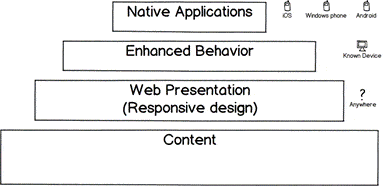
Figure 2 A foundation for the web, a multi-tier approach to web development
Content
Having a content strategy should be the first priority. Whether you’re developing a website or a web application, there will be content. If the content is completely unknown, then it is futile to worry about the method of delivery. Working with a design-first approach will only lead you to forcing content into predefined containers. Instead, define your content up front and allow your user-experience to deliver the content. Having a content-driven plan will help prioritize the information you want your visitors to see first, key products, the latest story, or a mission statement. For websites this may mean having site copies drafted. For web applications, having a feature-set defined and mock data available, will allow you plan a proper presentation.
Web presentation: Responsive Design
Responsive design is the process of creating the architecture of a website or application so it can adapt to the client’s screen and interface. Responsive design aims to eliminate the need to create a design for every platform, and maintain separate software builds for all unique device-types filling the gap between native desktop and mobile applications.
On the surface, responsive design comes down to three techniques: Flexible layout, Flexible content, and media queries.
Flexible Layout
Having a flexible layout allows our design to adapt and fit the user’s screen. It makes sense to use layouts that can change in size and reorganize content accordingly. Where much about the client is unknown, it becomes essential.
Flexible Content
If layouts can change to work on a particular device, then our content must be able to change as well. For example, an image with embedded text may look fine at full resolution but not when scaled. User interface elements that are touchable as well as clickable should be used. Remember that users on touch devices aren’t able to use hover menus and other mouse-centric controls.
Media Queries
CSS media queries help us tie everything together by allowing us to find information about the user’s context, mainly their screen size. Once we know the users screen size, we can begin to tailor the interface to meet their needs. Targeting a specific range of screen sizes using media queries is often referred to as a “break point”, a point in which your layout adapts to the users viewport.
Media queries can be used to adapt a layout in many ways. For devices that have smaller or narrower viewports it may be beneficial to have the data presented in a single column format, eliminating the need for the user to zoom. Inversely, when our screen is larger this allows more room for the layout to flow giving us opportunity to add more columns. Column stacking isn’t only one method of supporting multiple devices either, any layout element, font size, navigation, and other elements can be adapted to better suit the user’s needs.
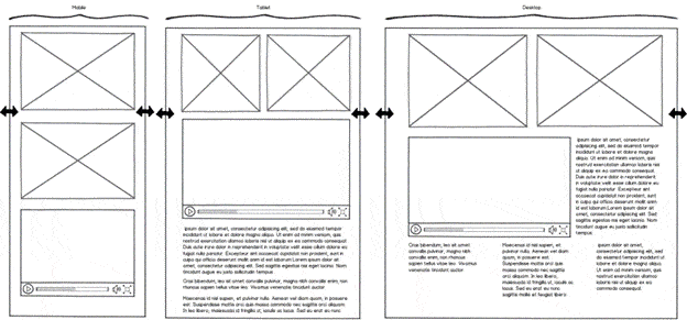
Figure 3 Responsive design example
The following media query shows an example of column stacking. By setting float to “none” the columns element no longer allows other elements to wrap around it. Next, the row element is set to “100%” filling the maximum width of the page.
|
1 2 3 4 5 6 7 8 9 10 11 |
/* media query */ @media only screen and (max-width: 767px) { .columns { width: auto !important; /* fill the width */ float: none; /* stack the columns */ } .row { width: 100%; /* max the width */ } } |
If you’re interested in more examples Mediaqueri.es is an excellent gallery where you can see media queries in action.
Responsive design frameworks
It can be difficult to start a new project using new and unfamiliar techniques. Finding a framework that is easy to use can not only help kick start a project, but can also be a great learning tool. For responsive design, there are several frameworks available such as Foundation Framework, Twitter Bootstrap, Skeleton, and ‘320 and Up’.
Responsive design vs. ___
I often am asked “Should responsive design be used instead of…” some technology or native application. My point of view is that responsive design is not a replacement technology. Responsive design shouldn’t be perceived as a competitive solution, instead it is a tool that should be used with other techniques like polyfills, user agent detection and server side customization.
The same goes for native applications. Native applications are in no way obsolete because of the requirement for responsive design. Responsive apps are complementary to native applications. By having a responsive web application, you gain a broad base that can be accessed by all users regardless of platform. Native applications can provide enhanced experiences that current web technologies can’t provide.
Enhancing behavior
We can continue to enhance our responsive design by using technologies that can detect the user’s context and capabilities. Some technologies that can be used to accomplish this are User Agent detection and JavaScript libraries like Modernizr.
Some examples of progressive enhancement:
- Adding enhanced images or UI elements if the user has a large screen
- Detecting the users location if geo-location is available
- Providing UI animations if they are supported by the browser
- Allowing drag and drop functionality if it is supported
Native applications
You’ll need to consider the tradeoffs when developing native applications; native applications generally use device-specific code for both logic and presentation. This means that a separate codebase must be developed and maintained for your project. While native applications come with the added benefit of distribution platforms such as the Windows Phone Marketplace, Android’s Market and Apple’s App Store, your application will need to be approved before being sold.
Native applications should be reserved for a device that can provide a unique experience that cannot be done using the browser. This might include such things as customizable content, augmented reality, integrated social experiences, enhanced content, or enhanced content interaction. However, each project will have its own pros and cons for making a final decision.
Conclusion
We can no longer assume much, if anything, about the size of the browser, or the nature of the device it is running on. Websites and applications must now be designed to dynamically take the best advantage of the space afforded by the browser. By covering the broad range of devices with a single application, we than can achieve the most comprehensive delivery of our content. Having a plan that we can use across multiple projects will help us make better decisions without repeating common strategy elements. Keep in mind that different techniques, technologies and approaches to development shouldn’t be seen in a competitive manner but instead as complementary. Using all of the building blocks that technology today provides us, we can build a foundation for the web.
Load comments