
Let’s start from the very beginning. What does ‘modal dialog’ mean actually? A modal dialog is a window (sometimes just referred to as a ‘box’) that forces the user to interact. In other words, a modal dialog box has the precise purpose of interrupting the ongoing workflow until its content is reviewed or interacted with. There are many cases in which a modal dialog is helpful—for example, when you wish to get confirmation from the user about the operation just being started. A modal dialog box is often used to show optional information about an item being displayed on screen or to let users perform optional operations. A common example is the following.
Suppose you are going to add a booking in the name of a user that doesn’t exist yet in the system. The operator is in the add-booking workflow but needs to take a diversion and temporarily switch to the add-user workflow. Once finished, she needs to go back to the original workflow. In a web scenario, without a modal dialog box, the entire flow is fairly convoluted as the operator needs to navigate to a different page, post its content, and then find a link to return back where she was. It’s clearly doable, but sometimes we developers love shortcuts and users love shortcuts too.
This is just a common use-case where modal dialog boxes may, or may not, be really helpful. It all depends on the details of the flow being interrupted and the diversion flow to inject. It all depends also on the amount of information being interacted in the diversion flow. Finally, there are users that love modals and users who just hate them because they’re too intrusive. There are no certain rules and facts about modals and this is enough to raise a flag whenever their use is considered or advocated during development. If I have to summarize my personal position about modals, it would be: if it’s not simple and short then it can’t go into a modal. A second rule I apply to modals is: if the content is read-only and doesn’t require a strict acknowledgement from the user, then consider using a drop-down element instead.
In any version of Bootstrap, drop-down elements are not limited to menus, though the documentation up until version 3.x seems to suggest just that. In Bootstrap 4, instead, there’s plenty of documentation on how to use drop-down classes to display just any content that can fit into a DIV container. Having said that, let’s just see what it takes to create a modal dialog box in Bootstrap 4.
How to Create Modal Dialogs in Bootstrap 4
Modal dialog boxes have been made a lot more configurable in Bootstrap 4 but the core HTML layout and the programming model around it has not changed much. Here’s the core HTML template you need.
|
1 2 3 4 5 6 7 8 9 10 11 12 13 14 15 16 17 18 19 20 |
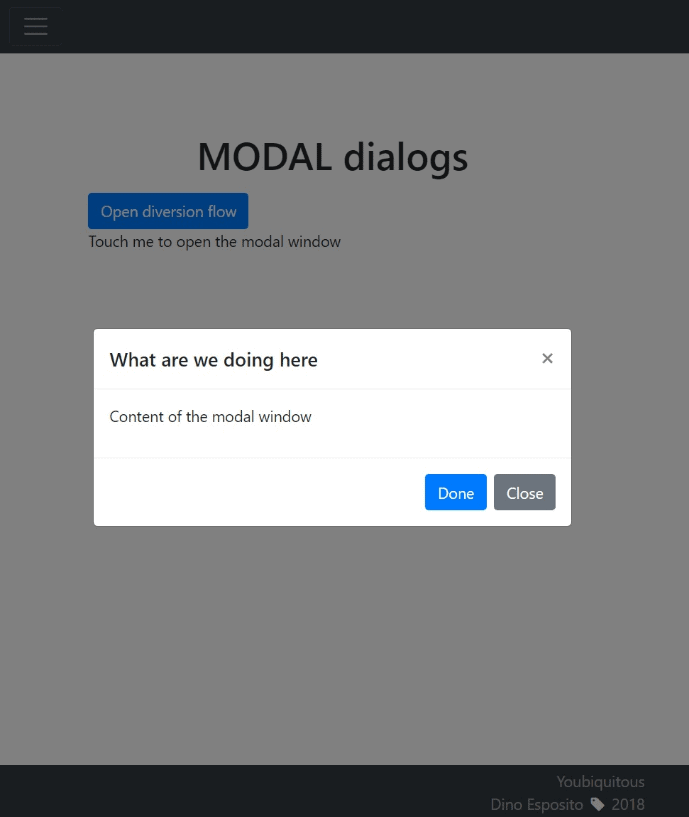
<div class="modal" id="modalDialog"> <div class="modal-dialog"> <div class="modal-content"> <div class="modal-header"> <h5 class="modal-title">What are we doing here</h5> <button type="button" class="close" data-dismiss="modal"> <span>×</span> </button> </div> <div class="modal-body"> <p>Content of the modal window</p> </div> <div class="modal-footer"> <button type="button" class="btn btn-primary">Done</button> <button type="button" class="btn btn-secondary" data-dismiss="modal">Close</button> </div> </div> </div> </div> |
It’s not different from previous versions of Bootstrap, but a quick look at its main characteristics is in order. A modal window is fully contained in a DIV element styled as modal. The ID of this element is the ID of the entire modal window. The outermost container incorporates another DIV layer styled as modal-dialog which in turn includes another DIV container styled as modal-content. This is the actual repository of the content presented to the user. The modal-content DIV is articulated in three parts each styled with a different Bootstrap class: modal-header, modal-body and modal-footer.
Any areas of the modal window can contain anything that is HTML compliant. However, some conventions apply. For example, the header typically contains the title of the dialog that Bootstrap styles through the modal-title class. The footer conventionally contains the list of buttons to finalize the interaction between the user and the content. The data-dismiss custom attribute marks those buttons and links that cause the dialog to close after click.
A Bootstrap modal dialog box is initially hidden and pops up when some ad hoc JavaScript code is invoked.
|
1 2 3 |
<script> $('#modalDialog').modal('show') </script> |
Most of the time, you don’t write that JavaScript code yourself but just have it silently run when the user clicks a launcher button or link. A launcher element is any HTML element that reacts to any DOM events with the above code or that is decorated with the attributes data-toggle and data-target, as below.
|
1 2 3 |
<div data-toggle="modal" data-target="#modalDialog"> Touch me <a id="post-79701-gjdgxs"></a>to open the modal window </div> |
Most commonly, however, the launcher is a button or a link. The launcher also supports the data-backdrop attribute which impacts the dismissal process of the dialog box. By default, the attribute is set to true meaning that the modal appears on top of a dark overlay (as if the underlying content is grayed out) and clicking outside the dialog automatically dismisses it. If you change the value to static then the dark overlay remains but to dismiss the dialog users must explicitly click on buttons. Finally, the value of false doesn’t gray out the underlying content but still requires button clicking to dismiss the dialog. The data-keyboard attribute instead controls what happens when the ESC key is pressed. By default (value of true) the dialog is dismissed. With a value of false, pressing the ESC key has no effect.
Improvements in Bootstrap 4
Modal dialogs are plain artifacts of HTML, CSS, and JavaScript placed on top of everything else in the page. Intelligently, a modal dialog hooks up scrolling events so that if the content to show is too long for the vertical screen real estate the dialog scrolls instead of the browser window. This happens by design in Bootstrap 4 and requires no additional code or markup than what showed earlier. Be aware that when dealing with dialogs Bootstrap sets the position CSS element to a value of fixed. It is recommended that you avoid mixing up Bootstrap modals with other elements in the same page styled with a fixed position.
The use of fixed positioning is problematic on some mobile devices too because of the way that some mobile browsers on some OS versions implement it. The Bootstrap web site contains plenty of known facts in this regard. To ensure you’re on the safe side anyway, though, I do recommend you don’t use modal dialogs on mobile devices. As for desktop browsers, it is worth noting that Bootstrap 4 does not support versions of Internet Explorer earlier than 10.
By default, the dialog box appears near the top of the available screen and horizontally centered. However, at the cost of adding the modal-dialog-centered class to the modal-dialog container, you can have it displayed right at the center of the screen centered both vertically and horizontally.
|
1 2 3 4 5 |
<div class="modal" id="modalDialog"> <div class="modal-dialog modal-dialog-centered"> ... </div> </div> |
Note that this feature doesn’t work on Internet Explorer, even in the latest version 11.
The content of the modal dialog can use Bootstrap’s grids as well as more sophisticated elements such as tooltips and popovers. In Bootstrap 4, though, it is guaranteed that tooltips and popovers that might be visible are automatically dismissed as the dialog is dismissed. If you use grids to lay out the content of the dialog box, then it is advisable that you opt for the container-fluid class rather than container. The difference is that the class container has one fixed width for each supported screen size whereas container-fluid expands to fill the available width. The container-fluid style therefore ensures a better and more uniform placement of elements in the available space.
The width of the modal dialog is calculated internally but you can influence it by adding the modal-lg or modal-sm classes to the modal-content container, as shown below.
|
1 2 3 4 5 |
<div class="modal" id="modalDialog"> <div class="modal-dialog modal-lg"> ... </div> </div> |
Note that if you set modal-lg then the size is automatically adapted as the browser is resized to a smaller viewport.
As mentioned, the content of the dialog is articulated in three nested DIV layers. What if you add some content outside those layers? If you add DIV elements within the modal-content container but outside header, body and footer you just achieve the effect of adding separators, as shown below.
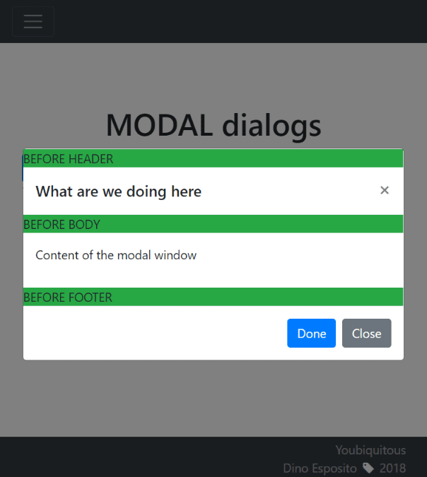
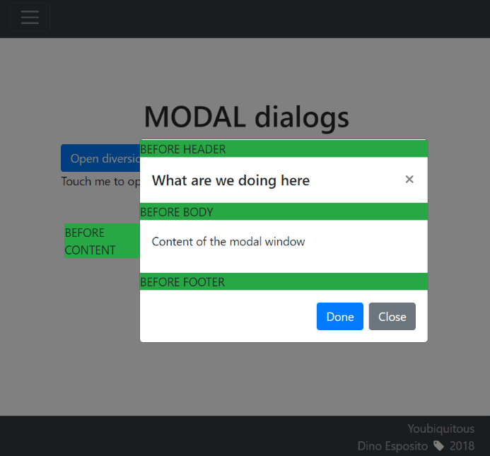
Even more interesting, if you place a DIV element before the modal-content container then the content appears outside the dialog producing a nice tab effect, as in the figure below.
|
1 2 3 4 5 6 7 8 9 |
<div class="modal" id="modalDialog"> <div class="modal-dialog"> <div class="bg-success">BEFORE CONTENT</div> <div class="modal-content"> <div class="bg-success">BEFORE HEADER</div> ... </div> </div> </div> |
Initializing a Dialog Box
Most of the time a modal dialog box is only a template to be filled with information that depends on the context. As an example, imagine the scenario in which you use a modal dialog to edit the profile of the currently logged user. Your HTML template will likely contain a form but actual values are to be provided on the fly. You can customize the content of the modal dialog by intercepting the show.bs.modal event. The event is fired as soon as the show method on the modal is invoked, whether programmatically or as the effect of clicking a launcher button. All the changes you apply to the template are performed before the modal is displayed. The shown.bs.modal event, instead, is fired right after the modal is turned on in the screen. An analogous pair of events exist for when the dialog box is hidden. Events are hide.bs.modal and hidden.bs.modal.
As an example of the other approach, let’s consider another common use-case: playing a YouTube video. In this case, the HTML template of the dialog may look like below:
|
1 2 3 4 5 6 7 8 9 10 11 12 13 14 15 16 |
<div id="ytModal" class="modal fade"> ... <div class="modal-header"> <h5 class="modal-title">All for a block in the chain</h5> <button type="button" class="close" data-dismiss="modal">×</button> </div> <div class="modal-body"> <div class="text-center"> <iframe height="315" width="560" frameborder="0" allow="autoplay; encrypted-media" allowfullscreen> </iframe> </div> </div> ... </div> |
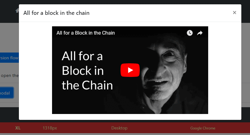
The IFRAME is preconfigured with the default parameters of YouTube shared videos. You can obtain those parameters by simply clicking the button Share in the YouTube page of the video and selecting the tab for embedding the video in a HTML page.
|
1 2 3 4 5 6 7 |
<script> $("#ytModal").on("show.bs.modal", function(e) { var src = "https://www.youtube.com/embed/uaYfD6_xX30"; $("#ytModal iframe").attr("src", src); }); </script> |
The full source code is on Github.
In the specific scenario of playing a video I anyway prefer opting for a dedicated jQuery plugin rather than a handmade Bootstrap modal dialog as the plugin would automatically handle the resize of the element to fit the video size. My favorite modal video plugin can be found here.
A Brief UX Analysis of Modal Dialogs
As mentioned, modal dialogs are a bit controversial and should be used only with the full approval of the client. In any case, though, there are a few guidelines to keep in mind as far as user experience is concerned.
First and foremost, it should always be obvious for users how to escape the dialog. It can be done in a number of ways, for example through a button in the header. This is probably the most common and expected way of doing it. Another relatively familiar way of dismissing a dialog is by hitting the ESC key. As mentioned, support for the ESC key is enabled by default but can be disabled through the data-keyboard attribute on the launcher button. The keyboard-based way of dismissing the dialog should never be disabled though as it represents a powerful tool to keep accessibility higher.
As far as clicking outside the element to dismiss it, that’s enabled by default but sometimes it can be confusing for users, especially inexpert users. You might want to consider using a static backdrop and add perhaps a second bigger button in the footer to escape the dialog without performing any action.
Bootstrap doesn’t support nested modals and nested modals, however, should not be planned even using alternate plugins and frameworks. I prefer to always make my modals large and have them resize as the viewport reduces. At any rate, you should always keep the content to a minimum and avoid richly populated dialogs with complex and sophisticated forms.
Finally, bear in mind that modal dialogs and mobile devices usually don’t go that well together. The primary reason is screen space. If the content includes input fields then you should also consider the space needed for the device keyboard and possibly the internal scrollbar. As a result of a poorly displaying modal, users might be left zooming, scrolling and panning the screen in order to enter the input they’re expected to enter. In general, unless you have a proven way to lay out elements in such a way the whole dialog displays nicely on small mobile devices, you should just look up for alternatives. The issue is that alternatives for mobile devices lead to reconsidering the entire workflow for example redirecting users to distinct pages for each content that would go on a modal. If this is too complicated, some middle ground can be using full-screen containers ad hoc for mobile sizes of the viewport. There’s no easy way out and the old saying “it depends” is truer than ever.
This document contains proprietary information and is protected by copyright law.
Copyright © 2026 Red Gate Software Limited. All rights reserved
Load comments