
Web development has evolved, grown and become increasingly complex; so has CSS code. This means that we have to adapt our tools and techniques for developing on the platform. We can improve existing CSS code if we use refactoring techniques with the help of new tools such as Sass (Syntactically Awesome Style Sheets) and Compass.
Reasons to Refactor
CSS provides a simple language for defining the style properties for rendering HTML objects. Because the CSS language is so simple, even well written CSS is generally difficult to change, in that the same information about such aspects as font, color or alignment has to be repeated in several places. Through refactoring into modules, we can reduce this repetitiveness.
CSS code needs to be refactored for similar reasons that languages like C#, VB, or JavaScript need to be refactored, but there are some reasons that are specific to CSS:
Maintainability and readability
In all our code, we need to make it easier for others to read, and to understand the intention behind it. Sass and Compass are preprocessors, and we can use them with CSS to provide semantic naming conventions for values (eg: $base-color) and dividing code into smaller, more concise, chunks. Sass allows us to use variables in place of literals to hold values, while Compass encapsulates common coding patterns. By using them, there is less code to maintain.
Extensibility
Familiar software development practices like OOP (object oriented programming) and DRY (don’t repeat yourself) are made possible by using Sass mixins. Mixins can be used to define styles of common UI elements with a modular approach so that they are portable within a project as well as in other projects.
Improving performance by reducing requests
You can certainly achieve better performance in page-loading by refactoring your CSS code but, unlike refactoring C#, VB, or JavaScript, the benefits are more likely from decreasing the load time of the code rather than from increasing the execution (rendering) speed.
Using semantic markup
We will use refactoring to define a clear SoC (Separation of Concerns). HTML is responsible for describing the document, while the role of CSS is to provide a visual style. We can create a clear separation between HTML and CSS by writing styles that can be applied directly to HTML elements rather than through class attributes.
Sample Project
Throughout the remaining topics in this article we’ll refer to a sample project that represents a blog built using common HTML and CSS practices. With this sample we’ll illustrate how to take an existing project and work through the refactoring process.
The sample project for this article can be found on GitHub. You can view each step in the process by switching to the branch associated with the heading in the article. https://github.com/EdCharbeneau/RefactoringCSS/
The sample project uses ASP.NET MVC 4, and consists of a web page and several style sheets:
- Index.cshtml – A sample HTML5 blog, using ASP.NET MVC
- Reset.css – A best practice for fixing inconsistent CSS values implied by the browser
- Grid.css – provides the layout for the web page
- Typography.css – typical heading, paragraph and font styles
- Screen.css – Site specific theme and styles
- BundleConfig.cs – CSS bundling configuration
Converting CSS to Sass & Compass
For an in depth review of using Sass and Compass with Visual Studio see my previous article “Using SASS and Compass in ASP.NET MVC with Web Workbench“.
The first steps in refactoring CSS is to add Compass to the project and convert existing code to Sass. Let’s begin prepping our project by installing Compass. Compass can be installed using Web Workbench, or through the command line.
Compass mixins will be used to replace parts of our style sheets that are common industry best practices, like: vendor prefixes, resets, and clear-fixes. Once Compass is installed we will remove any boilerplate content the installer created. To complete the Compass setup, ensure that the output folder is set to ‘Content‘ so that the CSS references remain valid.
|
1 2 |
#css_dir = "stylesheets" #Default css_dir = "Content" #MVC convention |
config.rb: By default, Compass outputs compiled css to the ‘stylesheets‘ folder: However, MVC conventions normally store css files in the ‘Content‘ folder.
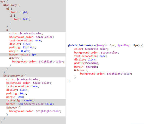
Next we’ll convert our .css files to .scss (Sass). Because any CSS is also valid Sass code, this is a simple task. You can also convert CSS Code by using Web Workbench. Right-click and select “Convert to Sass” from the context menu. Web Workbench will transform the CSS to Sass and nest the code appropriately. To complete the process, move the .scss files to the sass folder and delete the .css files. The .css files are no longer needed and will be regenerated at compile time. There are also online converters that will do this.
An alternative method is to copy CSS code to the sass folder and rename the extension to scss. Using this method the code will remain “as-is” and no Sass nesting will be applied to the existing code.
The sass directory after each css file has been converted.
Cleaning up with variables
After the style sheets are converted to Sass, we can begin cleaning up the code with variables. Variables are one of the easiest ways to make code more legible and extensible. A great start point for refactoring is by reworking the style sheets’ color pallet. In our sample project, we’ll take the existing colors and replace them with variables. It’s important to avoid using the actual names of colors we can make changes to the value without causing confusion. A variable called #red would be misleading if subsequently held ‘blue’.
In the screen.scss file, find and replace the following values with its corresponding variable.
|
1 2 3 4 5 |
// Color variables $base-color: #d0d0d0; $accent-color: #0ca0c6; $highlight-color: #FFF; $contrast-color: #1e1e1e; |
The variable names are semantic but do not identify the color value. This will make maintaining the code much easier when an update is necessary.
Sass has built-in functions that act on these variables. These come into their own particularly with colors because of the way that color and shades inter-relate. By using functions, one change to a base color can be made to alter all colors that depend on this base color, or need to be compatible with it, as well as propagating the change to all elements that use it.
Writing reusable modules with mixins
Now that we have removed many common values and replaced them with variables, it will be easier to spot patterns in the code. With mixins we can take common patterns and replace them with reusable modules. The mixins that we create can then, potentially, be reused in this and other projects.
Let’s begin by looking at some repeating patterns in our code. One place to look for repetition is in common UI elements. By refactoring UI elements, we can apply OOP principals and make generic reusable modules.
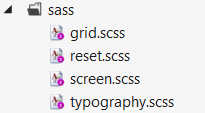
Looking at the web page, we can see two navigation styles that use buttons. If we examine the style sheet we can see that both navigation styles use a similar construction to define their button types. By using abstraction, we can redefine a base button style to replace those styles that are shared by the two button types.
We’ll create a Sass mixin to define a base button object using the common properties from each button type. Begin by writing the mixin directly in the screen.scssabove the navigation code. Once the mixin has been defined, we can replace the common styles with our mixin.
The original code (left), refactored mixin (right)
|
1 2 3 4 5 6 7 8 9 10 11 |
@mixin button-base($margin: 2px, $padding: 10px) { color: $contrast-color; background-color: $base-color; text-decoration: none; display: block; padding:$padding; margin: $margin; &:hover { background-color: $highlight-color; } } |
Mixin code
|
1 2 3 4 5 6 7 8 9 10 11 12 13 14 15 16 17 18 19 |
nav { &#primary { ul { float: right; li { float: left; } } a { @include button-base(0 4px, 12px 6px); border-radius: 3px; } } &#secondary a { @include button-base; text-align: center; border: 1px $accent-color solid; } } |
Refactored style – first pass
The buttons have been refactored, but there is still room for improvement. We can further extend our mixin by creating some specific button types. Let’s define two more mixins, a rounded button and square button, each of which extend the button-base. The new mixins are more of a semantic wrapper that gives a more explicit meaning to the button types.
|
1 2 3 4 5 6 7 8 9 10 11 12 13 14 15 16 17 18 19 20 21 22 23 24 25 26 27 |
@mixin square-button($margin: 2px, $padding: 10px) { @include button-base($margin, $padding); text-align: center; border: 1px $accent-color solid; } @mixin round-button($margin, $padding, $radius: 3px) { @include button-base($margin,$padding); border-radius: $radius; } nav { &#primary { ul { float: right; li { float: left; } } a { @include round-button(0 4px,12px 6px); } } &#secondary a { @include square-button(); } } |
The button code is now more legible than it was before. The code clearly states that we have a primary navigation with round buttons and a secondary navigation with square buttons. In addition to readability the button mixins can be used anywhere in our code where we would like to add a button style without having to repeat the code.
|
1 2 3 4 5 6 |
$action-color: #66CD00; a.submit-button { @include round-button(0 8px,12px 6px); background-color: $action-color; } |
Example: A green submit button.
Cleaning up your HTML with semantic styles
Separation of concerns (SoC), or decoupling of CSS and HTML can be achieved through refactoring. SoC can also lead to cleaner HTML though the use of semantic styles. In a well-structured document or object, we can use the markup to describe the visual style naturally and reduce the need for additional style selectors.
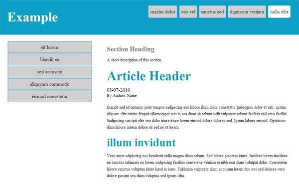
In the example, a simple grid system provides the layout styles for the page. The grid consists of a .grid class that acts as a wrapper whose child elements can be divided into thirds using the .thirds or .two-thirds classes. The grid styles are used specifically for visual layout and do not describe the content itself. Since CSS is responsible for applying visual style, we can rewrite our styles and apply them directly to the HTML element, then class attributes that don’t give meaning to the content can be removed.
To refactor the HTML and CSS, we will use mixins based on the current grid system and apply the mixins directly to the semantic elements (header, footer, article and nav). We can use this practice anywhere we know the HTML will remain consistent.
|
1 2 3 4 5 6 7 8 |
<header id="master-header"""> <div class="grid"> <h1 class="col third">Example</h1> <nav class="col two-thirds" id="primary"""> Content... </nav> </div> </header> |
The main header element of the document. (grid classes are bold)
|
1 2 3 4 5 6 7 8 9 10 11 12 13 14 15 16 17 18 19 20 21 22 23 24 25 26 27 28 29 30 31 32 33 34 35 36 37 38 39 40 41 42 43 44 |
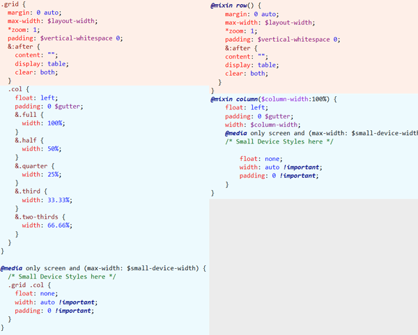
* { -webkit-box-sizing: border-box; -moz-box-sizing: border-box; box-sizing: border-box; } .grid { margin: 0 auto; max-width: 980px; *zoom: 1; padding: 20px 0; &:after { content: ""; display: table; clear: both; } .col { float: left; padding: 0 24px; &.full { width: 100%; } &.half { width: 50%; } &.quarter { width: 25%; } &.third { width: 33.33%; } &.two-thirds { width: 66.66%; } } } @media only screen and (max-width: 767px) { /* Small Device Styles here */ .grid .col { float: none; width: auto !important; padding: 0 !important; } } |
grid.scss prior to refactoring
We will use refactoring techniques to rewrite the grid styles as mixins. To begin, let’s replace some of the static values with variables, so as to make the code easier to read, and allow changes to be easily made subsequently.
|
1 2 3 4 5 6 7 8 9 10 11 12 13 14 15 16 17 18 19 20 21 22 23 24 25 26 27 28 29 30 31 32 33 34 35 36 37 38 39 40 41 42 43 44 45 46 47 48 49 |
$layout-width: 980px; $gutter:24px; $small-device-width: 767px; $vertical-whitespace: 20px; * { -webkit-box-sizing: border-box; -moz-box-sizing: border-box; box-sizing: border-box; } .grid { margin: 0 auto; max-width: $layout-width; *zoom: 1; padding: $vertical-whitespace 0; &:after { content: ""; display: table; clear: both; } .col { float: left; padding: 0 $gutter; &.full { width: 100%; } &.half { width: 50%; } &.quarter { width: 25%; } &.third { width: 33.33%; } &.two-thirds { width: 66.66%; } } } @media only screen and (max-width: $small-device-width) { /* Small Device Styles here */ .grid .col { float: none; width: auto !important; padding: 0 !important; } } |
Variable names give meaning to the values.
The next step is to replace code with a reusable mixin. If we convert the grid styles to mixins, then we can apply the style directly to any HTML from the style sheet instead of using an inline class attribute. We’ll create a new mixin called row which replaces the .grid styles. A second mixin called column will take an argument of column-width, and replaces all of the preset column styles.
The original code (left), refactored mixin (right)
Now that we’ve defined the row and column mixins, we can remove the inline class attributes from the HTML and declare the layout from our style sheet instead. For each group of .grid and .col elements in our HTML we will need to write a CSS selector and apply the mixin.
|
1 2 3 4 5 6 7 8 |
<header id="master-header"""> <div class="grid"> <h1 class="col third">Example</h1> <nav class="col two-thirds" id="primary"""> Content... </nav> </div> </header> |
The attributes class=”grid” and class=”col [size]” can be removed
|
1 2 3 4 5 6 7 8 9 10 11 12 13 14 15 16 17 18 19 20 21 22 23 24 25 26 |
//Page layout #master-header > div { @include row; h1 { @include column($third); } nav#primary { @include column($two-thirds); } } #main-content { @include row; nav#secondary { @include column($third); } > section { @include column($two-thirds); } } #master-footer > div { @include row; > section { @include column; } } |
Applying the layout directly from CSS
By using a semantic markup and sass mixins, we have created a clear separation of concerns between our document and its visual representation. As a result, the refactored code and markup are much easier to read and understand.
Modularization and Compass
Finally we’ll look organizational ways to improve our project. Sass provides conventions to reorganize our files and also gives module separation through the use of partials and imports. In addition, we will apply Compass to eliminate boilerplate code from our project
Partials and imports
We can make our code more modular by using ‘partials’ and imports in order to separate code by its responsibilities. By modularizing the code, we can restructure our files so they are portable and easier to locate within a project.
Partials are a naming convention that tells Sass that we do not wish to generate a .cssfile from the Sass code. Instead of generating a .css file for each module in our project, we will instead use the @import method. Using @import tells Sass to place the target file’s inline where the import was declared. In addition, any mixins and variables contained in the imported file become available in the file that it was imported to. An additional benefit of using partials is that all of the CSS required by the project will be output to a single .cssfile thereby reducing the number of resource requests on page load.
It’s worth mentioning that other utilities such as YUI compressor or Microsoft bundling can achieve similar results, but Microsoft bundling requires that you compile the project.
Our project currently has several scss files which are compiled to produce a corresponding .css file. These files are as follows:
- Reset.scss > Reset.css – A best practice for fixing inconsistent CSS values implied by the browser
- Grid.scss > Grid.css – provides the layout for the web page
- Typography.scss > Typography.css – typical heading, paragraph and font styles
- Screen.scss > Screen.css – Site specific theme and styles
|
1 2 3 4 |
<link href="/Content/reset.css" rel="stylesheet"> <link href="/Content/grid.css" rel="stylesheet"> <link href="/Content/typography.css" rel="stylesheet"> <link href="/Content/screen.css" rel="stylesheet"> |
CSS requests made in the head of the document
We will need to convert our modules to partials and import them in to screen.scss, this will make screen.scss a central location for organizing our dependencies. Start by creating a new folder under the sass directory called “modules” and move all of the .scss files inside the modules folder except for screen.scss. Now convert the files in the modules folder to partials by prefixing an underscore to the file name. The modules will no longer generate their respective .css outputs. Finally, open screen.scss and import the modules. The compiled CSS files are no longer needed, so delete them from the Content folder. Note: When using @import the underscore can be omitted as it is understood by the Sass compiler.
|
1 2 3 |
@import "modules/reset"; @import "modules/typography"; @import "modules/grid"; |
Importing the modules to the top of screen.scss
|
1 |
<link href="/Content/screen.css" rel="stylesheet"> |
CSS requests made in the head of the document after using partials and imports
Further modularization
Our project structure is taking shape but we can make further improvements. There are still several places throughout the code where we can extract modules because responsibilities overlap. Each module should be able to stand freely on its own while screen.scss maintain styles specific to the project instance. Let’s revisit the button and grid code to see what can be cleaned up.
Earlier in screen.scss we created button mixins from the site’s navigation elements. The button mixins can stand alone and don’t contain any code unique to the site itself so we can move the code to its own module.
|
1 2 3 4 5 6 7 8 9 10 11 12 13 14 15 16 17 18 19 20 |
@mixin button-base($margin: 2px, $padding: 10px) { color: $contrast-color; background-color: $base-color; text-decoration: none; display: block; padding:$padding; margin: $margin; &:hover { background-color: $highlight-color; } } @mixin square-button($margin: 2px, $padding: 10px) { @include button-base($margin, $padding); text-align: center; border: 1px $accent-color solid; } @mixin round-button($margin, $padding, $radius: 3px) { @include button-base($margin,12px 6px); border-radius: $radius; } |
The button mixin contains no specific class or id or tag identifying it with the site and can be moved outside the screen.scss file.
Create a new file called buttons.scss in the modules directory, and remove the button mixins from screen.scss and place them in the new file. Next we’ll need to import the button mixins in to screen.scss so they can be referenced. Since the buttons require the color variables that we defined, we’ll place the import directly below the variable declarations.
|
1 2 3 4 5 6 7 |
// Color variables $base-color: #d0d0d0; $accent-color: #0ca0c6; $highlight-color: #FFF; $contrast-color: #1e1e1e; @import "modules/buttons"; |
Importing the buttons module makes the mixins available to screen.scss
With the button module complete, we’ll move on to _grid.scss where we earlier used mixins to separate the layout from the HTML markup. Currently grid.scss has styles that are directly dependent on the HTML for the site. We’ll move the site specific code out of _grid.scss to a new partial maintaining a clear separation of concerns.
|
1 2 3 4 5 6 7 8 9 10 11 12 13 14 15 16 17 18 19 20 21 22 23 24 25 |
//Page layout #master-header > div { @include row; h1 { @include column($third); } nav#primary { @include column($two-thirds); } } #main-content { @include row; nav#secondary { @include column($third); } > section { @include column($two-thirds); } } #master-footer > div { @include row; > section { @include column; } } |
The page layout code creates a dependency on the HTML of the project, it should be separated from the grid module.
Create a new file named _layout.scss in the sass folder and move the page layout code from _grid.scss to the new file. We’ll tell the compiler to write the layout to screen.scss by importing the partial. We’ll need to make sure the import is declared beneath the import for the grid because it makes use of the grid mixins.
|
1 2 |
@import "modules/grid"; @import "layout"; |
In screen.scss, be sure to import the layout after the grid.
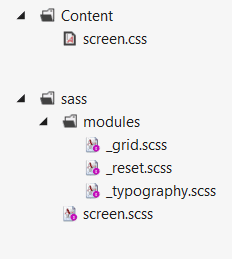
Directory structure after reorganizing modules with partials.
Replace standards with Compass
Now that the project is cleanly organized, we can look for additional opportunities to simplify the code by replacing standard boilerplate markup with Compass mixins. By using Compass’s collection of common reusable patterns, we will further reduce the amount of code that will need to be maintained.
One pattern that is common among many web projects is the “css reset”. We’ll use Compass to completely replace the need for the CSS-reset in our project by importing the reset mixin. In screen.scss replace the reset.scss module with the Compass reset and delete the reset.scss file.
|
1 2 |
//removed @import "modules/reset"; @import "compass/reset"; |
Using compass instead of maintaing our own css reset code.
Another common use for Compass is for removing vendor prefixes. Vendor-prefixes often cause unnecessary repetition and room for error. In the grid code the CSS3 border-box model is used, but due to browser support concerns, vendor-prefixes have been added. We can eliminate the need to write out each prefixed setting by replacing it with the Compass box-sizing mixin.
|
1 2 3 4 5 |
* { -webkit-box-sizing: border-box; -moz-box-sizing: border-box; box-sizing: border-box; } |
Setting the box model in CSS3 with vendor prefixes.
|
1 2 3 4 |
@import "compass"; * { @include box-sizing(border-box); } |
Setting the box model with Compass
Finalizing the project
With the refactoring process complete, it is time to wrap things up. When the project is ready to “go live” we can optimize our code one final time by enabling minification. Minifying the code will remove unnecessary whitespace from the compiled .css file resulting in a slightly smaller file size. To enable minification, open the config.rb file and set the output_style to :compressed.
|
1 |
output_style = :compressed |
Minification enabled
Conclusion
We can achieve clean, organized, and efficient code in front-end development by using techniques more normally associated with backend development. Tools like Sass and Compass are vital to the process as they provide features that do not exist in native CSS.
Some projects may be too large or complex to justify refactoring. By practicing the techniques of refactoring with Sass on a smaller project first, you’ll learn a disciplined approach to writing DRY Sass code and understand better when modular code can be abstracted.
The sample project for this article can be found on GitHub. You can view each step in the process by switching to the branch associated with the heading in the article.
This document contains proprietary information and is protected by copyright law.
Copyright © 2026 Red Gate Software Limited. All rights reserved
Load comments