
As part of our ongoing discussions comparing SQL Server to Oracle, Jonathan Lewis and I are going to be talking about statistics next. As usual with these talks, I don’t have a clue how things work in Oracle, so I’m looking forward to the education. But, I have something of a handle on how statistics work in SQL Server. As a touch stone for those attending or for future reference, here’s some information about statistics within SQL Server.
What are Statistics?
SQL Server’s query optimizer uses distribution statistics to determine how it’s going to satisfy your SQL query. These statistics represent the distribution of the data within a column, or columns. The Query Optimizer uses them to estimate how many rows will be returned from a query plan. With no statistics to show how the data is distributed, the optimizer has no way it can compare the efficiency of different plans and so will be frequently forced to simply scan the table or index. Without statistics, it can’t possibly know if the column has the data you’re looking for without stepping through it. With statistics about the column, the optimizer can make much better choices about how it will access your data and use your indexes.
Distribution statistics are created automatically when you create an index. If you have enabled the automatic creation of statistics (the default setting of the AUTO_CREATE_STATISTICS database setting ) you’ll also get statistics created any time a column is referenced in a query as part of a filtering clause or JOIN criteria.
Data is measured two different ways within a single set of statistics, by density and by distribution.
Density
Density is the easiest of the two to understand. Density is a ratio that shows just how many unique values there are within a given column, or set of columns. The formula is quite easy:
Density = 1 / Number of distinct values for column(s)
…which allows you to query your table to see exactly what the density might be:
|
1 2 |
SELECT 1.0 / COUNT(DISTINCT MyColumn) FROM dbo.MyTable; |
You can see the density for compound columns too. You just have to modify the query to get a distinct listing of your columns first:
|
1 2 3 4 |
SELECT 1.0 / COUNT(*) FROM (SELECT DISTINCT FirstColumn, SecondColumn FROM dbo.MyTable) AS DistinctRows; |
…and of course you can add columns to reflect the columns in your index so that you can see the density for yourself.
Density matters because the amount of selectivity of a given index, as determined by its density, is one of the best ways of measuring how effective it will be with your query. A high density (low selectivity, few unique values) will be of less use to the optimizer because it might not be the most efficient way of getting at your data. For example, if you have a column that shows up as a bit, a true or false statement such as, has a customer signed up for you mailing list, then for a million rows, you’re only ever going to see one of two values. That means that using an index or statistics to try to find data within the table based on two values is going to result in scans where more selective data, such as an email address, will result in more efficient data access.
The next measure is a bit more complex, the data distribution.
Data Distribution
The data distribution represents a statistical analysis of the kind of data that is in the first column available for statistics. That’s right, even with a compound index, you only get a single column of data for data distribution. This is one of the reasons why it’s frequently suggested that the most selective column should be the leading edge, or first, column in an index. Remember, this is just a suggestion and there are lots of exceptions, such as if the first column sorts the data in a more efficient fashion even though it’s not as selective. However, on to data distribution. The name of the storage mechanism for this distribution information is a histogram. Now a histogram, by statistician definition, is a visual representation of the distribution of the data; but distribution statistics use the more general mathematical sense of the word.
A histogram is a function that counts the number of occurences of data that fall into each of a number of categories (also known as bins) and in distribution statistics these categories are chosen so as to represent the distribution of the data. It’s this information that the optimizer can use to estimate the number of rows returned by a given value.
The SQL Server histogram consists of up to 200 distinct steps, or ‘bins’. Why 200? 1) it’s statistically significant or so I’m told, 2) it’s small, 3) it works for most data distributions below several hundred million rows, after that, you’ll need to look at stuff like filtered statistics, partitioned tables and other architectural constructs. These 200 steps are represented as rows in a table. The rows represent the way the data is distributed within the column by showing a pieces of data describing that distribution:
| RANGE_HI_KEY | This is the top value of the step represented by this row within the histogram. |
| RANGE_ROWS | This number shows the number of rows within the step that are greater than the previous top value and the current top value, but not equal to either. |
| EQ_ROWS | This number shows the number of rows within the step that are greater than the previous top value and the current top value, but not equal to either. |
| DISTINCT_RANGE_ROWS | These are the distinct count of rows within a step. If all the rows are unique, then the RANGE_ROWS and the DISTINCT_RANGE_ROWS will be equal. |
| AVG_RANGE_ROWS | This represents the average number of rows equal to a key value within the step. |
This data is built one of two ways, sampled or a full scan. When indexes are created or rebuilt, you’ll get statistics created by a full scan by default. When statistics are automatically updated, SQL Server uses the sampled mechanism to build the histogram. The sampled approach makes the generation and updates of statistics very fast, but, can cause them to be inaccurate. This is because the sampling mechanism randomly reads data through the table and then does calculations to arrive at the values for the statistics. This is accurate enough for most data set, but otherwise you’re going to need to make the statistics as accurate as possible by manually update, or create, the statistics with a full scan.
Statistics are updated automatically by default, and these are the three thresholds that automatically cause an update:
- If you have zero rows in the table, when you add a row(or rows), you’ll get an automatic update of statistics
- If you have less than 500 rows in a table, when you add more than 500, and this means if you’re 499, you’d have to add rows to 999, you’ll get an automatic update.
- Once you’re over 500 rows you will have to add 500 additional rows + 20% of the size of the table before you’ll see an automatic update on the stats.
That’s the default behavior. You get variations with filtered indexes and filtered statistics. Also, with SQL Server 2008R2 SP1 and in SQL Server 2012, you can set traceflag 2371 to ‘on’ in order to get a dynamic value instead of the fixed 20%. This will help larger databases get a more frequent update of statistics.
You can also update statistics manually. SQL Server provides two mechanisms for doing this. The first is sp_updatestats. This procedure uses a cursor to walk through all the statistics in a given database. It looks at the row modifier count and if any changes have been made, rowmodctr > 0, and then updates the statistics. It does this using a scanned update. You can also target individual statistics by using UPDATE STATISTICS and providing a name. With this, you can specify that the update use a FULL SCAN to ensure that the statistics are completely up to date, but using this requires that you write your own maintenance code to make this a permanent change.
Enough talking about what statistics are, let’s see how you can look at them and understand the data contained within them.
DBCC SHOW_STATISTICS
To see the current status of your statistics you use the DBCC statement SHOW_STATISTICS. The output is in three parts:
- Header: which contains meta-data about the set of statistics
- Density: Which shows the density values for the column or columns that define the set of statistics
- Histogram: The table that defines the histogram laid out above
You can pull individual pieces of this data out by modifying the DBCC statement.
The information in the header can be quite useful (click through to enlarge):

The most interesting information is found in the columns:
- Updated: when was this set of statistics last updated. This is how you can get some idea of the age of a set of statistics. If you know that a table gets thousands of rows of inserts on any given day, but the statistics are from last week, you may need to manually update the statistics.
- Rows and Rows Sampled: When these values match, you’re looking at a set of statistics that are the result of a full scan. When they’re different, you’re probably looking at a sampled set of statistics.
The rest of the data is nice to have and useful for a quick look at the statistics, but these are the really interesting ones.
The second set of data is the density measures. This set shows the density from a compound index:
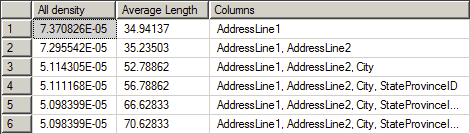
The information is fairly self-explanatory. The All density column shows the density value as provided by the formula quoted above. You can see that the value gets smaller and smaller for each column. The most selective column is clearly the first. You can also see the Average Length of the values that make up the column and finally the list of Columns that define each level of the density.
Finally, this graphic shows a section of the histogram:
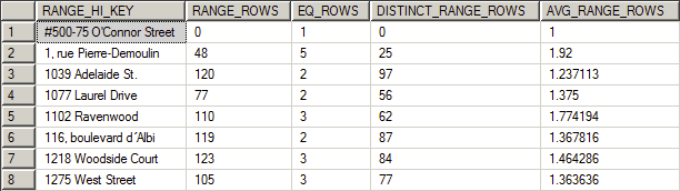
You can see how the data is distributed between each of the steps. With this you can see how well SQL Server is distributing your information. Since all the row counts here, except the average, are full numbers, this is another indication that this set of statistics is the result of a full scan. If the range rows are estimates they will include a number of decimal values.
You’re going to look at the histogram when you’re trying to understand why you’re seeing scans or seeks within SQL Server when you expected something else. The way that the data is distributed, showing the average number of rows for a given value within a particular range for example, gives you a good indication of how well this data can be used by the optimizer. If you’re seeing lots of variation between the range rows or the distinct range rows, you may have old or sampled statistics. Further, if the range and distinct rows are wildly divergent but you have up to date and accurate statistics, you may have serious data skew which could require different approaches to indexes and statistics such as filtered statistics.
Conclusion
As you can see there’s a lot to statistics within SQL Server. They are an absolutely vital part of getting the best performance possible out of the system. Understanding how they work, how they’re created and maintained, and how to look at them will help you understand the value of your own statistics.


Load comments