In the past, when watching the % Processor Time counter in Performance Monitor on my live production SQL Servers, I would occasionally see sudden spikes in CPU utilization, to 50, 70 or even 80%. These spikes might last several minutes or more, then disappear. In some extreme cases I would see spikes that lasted 30, or even 60 minutes. I always wanted to know which SQL Server activity was causing the spike, but the problem was that I had no way of correlating a specific statement running in SQL Server to a specific resource usage spike.
With SQL Server 2005 Profiler, I now have the tools to identify the causes of such spikes. I can import Performance Monitor log data and compare it directly with Profiler activity. If I see a spike in CPU utilization, I can identify which statement or statements were running at the same time, and diagnose potential problems.
In this article, I will describe how to perform a correlation analysis using Profiler and Performance Monitor, covering:
- How to collect Profiler data for correlation analysis
- How to collect Performance Monitor data for correlation analysis
- How to capture Profiler traces and Performance Monitor logs
- How to correlate SQL Server 2005 Profiler data with Performance Monitor data
- How to analyze correlated data
I assume you have a basic working knowledge of Performance Monitor (sometimes called System Monitor) as well as Profiler, in order to focus on how to use the two tools together. If you need further information on the basics of using Performance Monitor, check out Books Online.
How to Collect Profiler Data for Correlation Analysis
While it is possible to correlate most Profiler events to most Performance Monitor counters, the area of greatest correlation is between Profiler Transact-SQL events and Performance Monitor counters that indicate resource bottlenecks.
This is where I focus my efforts, and the following sections describe how I collect Profiler data for correlation with Performance Monitor. As always, feel free to modify my suggestions to suit your own needs. The key, as always when using Profiler, is to capture only those events and data columns you really need in order to minimize the workload on your production server when the trace is running.
Events and Data Columns
My favorite Profiler template, when correlating Profiler trace data with Performance Monitor counter data, is the one I outlined in How to Identify Slow Running Queries. This template collects data on the following events:
- RPC:Completed
- SP:StmtCompleted
- SQL:BatchStarting
- SQL:BatchCompleted
- Showplan XML
In addition, I include these data columns:
- Duration
- ObjectName
- TextData
- CPU
- Reads
- Writes
- IntegerData
- DatabaseName
- ApplicationName
- StartTime
- EndTime
- SPID
- LoginName
- EventSequence
- BinaryData
Note that in order to perform an accurate correlation between Profiler and Performance Monitor data, you need to capture both the StartTime and EndTime data columns as part of your trace.
Filters
The only filter I create is based on Duration, because I want to focus my efforts on those SQL Statements that are causing the most problems. Selecting the ideal Duration for the filter is not always easy. Generally, I might initially capture only those events that are longer than 1000 milliseconds in duration. If I find that there are just too many events to easily work with, I might “raise the bar” to 5000 or 10000 milliseconds. You will need to experiment with different durations to see what works best for you.
In the example for this article, I use 1000 milliseconds. I don’t filter on DatabaseName, or any other data column, because I want to see every statement for the entire SQL Server instance. Performance Monitor counters measure the load on an instance as a whole, not just the load on a single database.
Ordering and Grouping Columns
I don’t do any grouping, but I generally order the data columns in an order that works well for me. You can perform any grouping or aggregation you want, but it won’t affect the correlation analysis, and so I generally omit it.
How to Collect Performance Monitor Data for Correlation Analysis
I assume you know the basics of using Performance Monitor, but in case you don’t know how to create logs, I will describe in this section how to set up a Performance Monitor log to capture counter activity, which can then be correlated with Profiler trace events.
NOTE:
Performance Monitor comes in different versions, depending on the operating system, and the way logs are created differs from version to version. In this example, I am using the version of Performance Monitor that is included with Windows Vista and Windows 2008.
The activity data collected by Performance Monitor can be displayed “live” on a graph, or you can store it in a log file, using what is called a user defined data collector set. In order to correlate Performance Monitor data with Profiler trace data, you must store the activity data in a log file. This log file can then be imported into Profiler for the correlation analysis.
Performance monitor provides a wizard to help you do this, which entails three main steps:
- Creating a new Log file definition
- Selecting Performance Counters
- Creating and saving the Log file
Defining a new Performance Monitor Log File
On starting Performance Monitor, you will see a screen similar to the one shown in Figure 1-1. By default, Performance Monitor operates in “live graphing” mode, which shows the graph being created on the screen in real time.
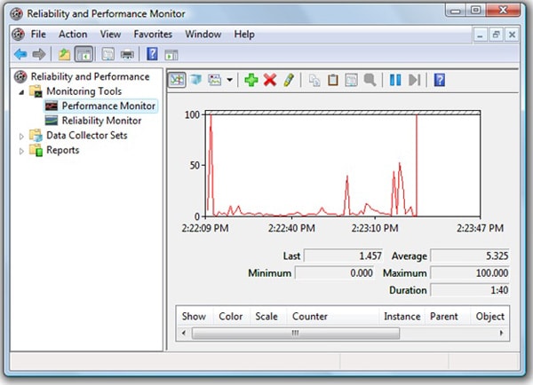
Figure 1-1: Start Performance Monitor. The appearance of the screen will vary somewhat from OS to OS.
In Vista and SQL Server 2008, a Performance Monitor log is referred to as a Data Collector Set. To set up a new data collector set (i.e. log file), double-click on “Data Collector Sets” then right-click on “User Defined” and select “New | Data Collector Set”, as shown in Figure 1-2:
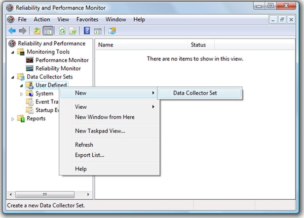
Figure 1-2: You need to create a new “Data Collector Set.”
You will be presented with the “Create a new Data Collector Set” screen, as shown in Figure 1-3:
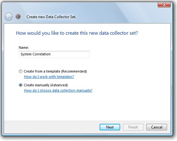
Figure 1-3: Give the Data Collector Set its own name.
Assign the Data Collector Set a name, such as “System Correlation”. At the bottom of the screen, select “Create Manually” and click “Next”. I recommend that you use the manual option over the template option because you have more flexibility when selecting the events you want to collect. The screen shown in Figure 1-4 appears:
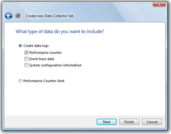
Figure 1-4: You want to create a “Performance Counter” data collector set.
To create our Performance Monitor log, check the box next to “Performance Counter” and click “Next”. The other events that can be collected are of no use to us when performing our correlation analysis.
Selecting Performance Counters for the Log File
The next screen in the wizard, shown in Figure 1-5, allows you to select the counters you’d like to record and save in the log file.
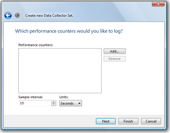
Figure 1-5: You now need to select the Performance Monitor counters you want to capture as part of your log file.
Performance Monitor offers several hundred counters, many more than there are Profiler events. However, you don’t want to select more counters than you need, as it will just make correlation analysis that much more difficult. My goal is to select only those Performance Monitor counters I need to identify key CPU, disk I/O, and memory bottlenecks within SQL Server. With this is mind, I generally track two different counters for each of the three key bottleneck areas:
- LogicalDisk: % Disk Time – Indicates the activity level of a particular logical disk. The higher the number, the more likely there is an I/O bottleneck. Be sure to select those counters for the logical drives that contain your mdf and ldf files. If you have these separated on different logical disks, then you will need to add this counter for each logical disk.
- LogicalDisk: Avg. Disk Queue Length – If a logical disk gets very busy, then I/O requests have to be queued. The longer the queue, the more likely there is an I/O bottleneck. Again, be sure to select those counters for each logical drive that contains your mdf and ldf files.
- Memory: Available Mbytes – Measures how much RAM is currently unused, and so available for use by SQL Server and the OS. Generally speaking, if this drops below 5mb, this is a possible indication of a memory bottleneck.
- Memory: Pages/sec – Measures how much paging the OS is performing. A high number may indicate a potential memory bottleneck.
- Processor: % Processor Time: _Total – Measures the percentage of available CPUs in the computer that are busy. Generally speaking, if this number exceeds 80% for long periods of time, this may be an indication of a CPU bottleneck.
- System: Processor Queue Length – If the CPUs get very busy, then CPU requests have to be queued, waiting their turn to execute. The longer the queue, the more likely there is a CPU bottleneck.
The first two are for LogicalDisk, the second two are for Memory, and the last two (although they have different instance names) are for the Processor. I find that using two counters per area, rather than one, provides just enough information to identify the cause of most bottlenecks. You will probably want to modify the above list to suit your own needs and environment, but it’s a good starting point.
Having selected your performance counters, the screen will look similar to Figure 1-6:
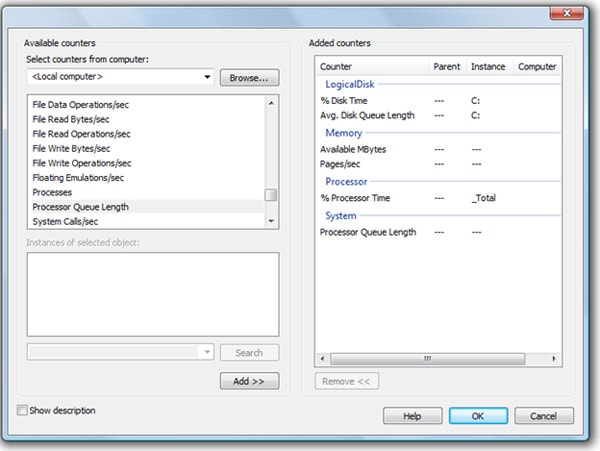
Figure 1-6: Select those counters that best meet your needs.
Click “OK” to proceed, and the screen shown in Figure 1-7 returns:
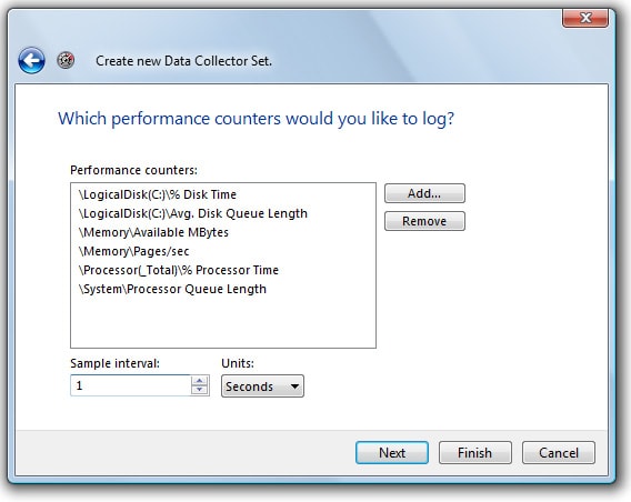
Figure 1-7: Set the “Sample Interval.”
The next step is to choose how often Performance Monitor counter data is to be collected. The default value is once every 15 seconds. However, when it comes to performing a Profiler and Performance Monitor correlation analysis, accurate timing is important, so I highly recommend that you select a sample interval of 1 second.
The upside to this is that a 1-second interval will help you to better see the correlation between Profiler events and Performance Monitor counters. The downside is that you will collect a lot of data very quickly. Generally, this is not a problem if you capture a minimum number of counters and don’t run your trace for hours at a time.
Creating and Saving the Log File
Once you have entered the sample interval, click “Next”, and the screen shown in Figure 1-8 appears:
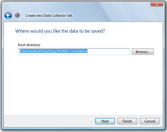
Figure 1-8: Specify where you want Performance Monitor logs to be stored.
Specify where you would like to store the Performance Monitor log. Any place will work, but you don’t want to forget this location as you will need to be able to retrieve the log file for importing into Profiler later. Once you have specified the log location, click “Next” to continue and the screen shown in Figure 1-9 appears:
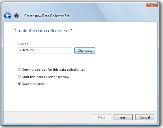
Figure 1-9: You can specify if this data collector set is to be the default set or not.
If this is the only data collector set you have, then it will be set to the default data collector set. If you have other data collector sets, you can choose one of those to be the default. From the perspective of this analysis, the default setting is irrelevant. Either way, make sure that “Save and Close” is selected, and then click “Finish” to save your work. The wizard will close, returning you to the Performance Monitor.
You will see your new Log file, Profiler Correlation, listed under Data Collector sets, as shown in Figure 1-10:
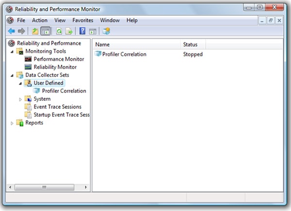
Figure 1-10: Once you are done, your screen should look similar to this.
Collecting Performance Monitor Data
We are now done with the hard work. The only thing left to do is to start collecting the “Profiler Correlation” data. To do this, right-click on the “Profiler Correlation” data collection set and select “Start”, as shown in Figure 1-11:
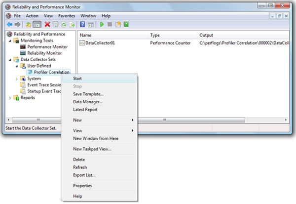
Figure 1-11: Right-click on the name of the Data Collector Set to start and stop it.
To stop collecting activity data, right-click on the “Profiler Correlation” data collection set and click “Stop”. You can also schedule Data Collection Sets to start and stop automatically, using the Vista-based Performance Monitor main menu.
In the next section, we will look at the best ways to start and stop both Profiler traces and Performance Monitor data collection sets.
How to Capture Profiler Traces and Performance Monitor Logs
Now that we’ve created both a Profiler trace and a Performance Monitor Data Collector Set, we are ready to start both the tools and begin collecting the data that we will later correlate. Here are some points to keep in mind when running these tools to capture data:
- Run your copy of Profiler and Performance Monitor on a computer other than the SQL Server you are monitoring.
- Both the Profiler trace and the Performance Monitor logs should be started and stopped at about the same time. For example, if you decide to run an analysis for a two-hour period, start both tools at the 8:00 AM and end them at 10:00 AM. If the traces don’t occur at the same time, they cannot be correlated.
- Be sure that the SQL Server instance that you are monitoring, and the computer on which you are running Profiler and Performance Monitor, are in the same time zones. If they are not, the data cannot be correlated correctly.
- Make sure that the physical server running your SQL Server instance is not doing other work that could interfere with the analysis, such as running a different program or performing a backup. The only way to perform an accurate correlation analysis is to ensure the SQL Server is performing only regular production activity.
- As I have said many times, be sure that you only collect the minimum necessary number of events, data columns, and counters that you need for your analysis, especially when collecting data every second. We want to minimize the impact that Profiler and Performance Monitor have on the system.
- Run your trace and log files at a “representative” time of day. For example, if you find that your server’s resources are peaking almost every morning between 9:00 AM and 11:00 AM, then this is the best time to capture your data.
- Monitor the size of the Profiler trace file and Performance Monitor log file during the capture, to ensure that not too much data is being collected. If the file sizes get too big, you may have to stop your data capture sooner than you planned.
Once you have completed capturing the data for both tools, you are ready to perform the correlation analysis.
How to Correlate SQL Server 2005 Profiler Data with Performance Monitor Data
Correlating Performance Monitor and Profiler data is a straightforward process that simply involves importing both sets of data into Profiler. Start Profiler and load the trace file you want to correlate. It should be displayed on the screen, as shown in Figure 1-12, just as for any other trace:
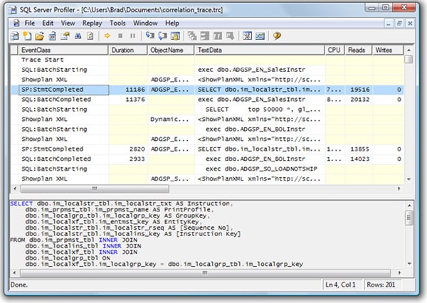
Figure 1-12: Start Profiler and load the trace file.
From the main menu of Profiler, select File | Import Performance Data, as shown in Figure 1-13:
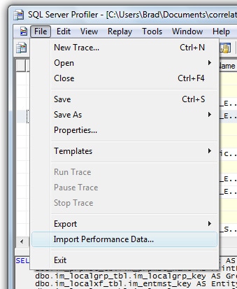
Figure 1-13: Select File|Import Performance Data
NOTE:
If the “Import Performance Data” option is grayed out, exit Profiler, then restart it, reload the trace data, and try again.
The screen shown in Figure 1-14 appears:
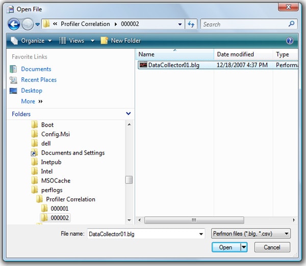
Figure 1-14: Select the Performance Monitor log you want to correlate with your Profiler data.
Locate your Performance Monitor log file and then click “Open”:
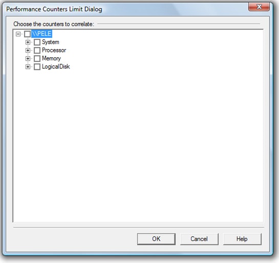
Figure 1-15: You must select the counters you want to correlate with your Profiler data.
The screen shown in Figure 1-15 allows you to select which counters to display as part of the correlation analysis. Ideally, you should include no more than about six, or the analysis screen (shown in Figure 1-17) will get too busy and be hard to read.
In this example, only six counters were collected, so import them all by clicking on the checkbox next to the server’s name, as shown in Figure 1-16:
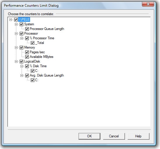
Figure 1-16: This is what the screen looks like if you select all the counters.
Once you have selected the counters you want to include, click on “OK.” The correlation analysis screen appears, as shown in Figure 1-17:
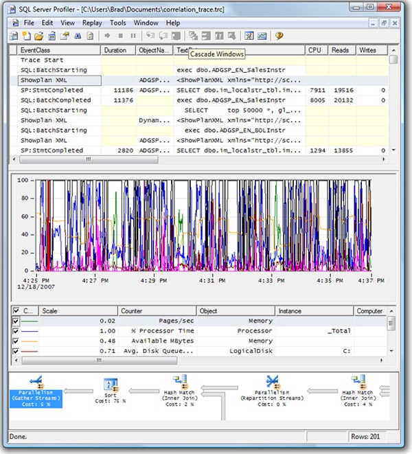
Figure 1-17: The correlation analysis screen can be hard to read unless it is displayed on a big screen.
As you can see, despite the fact that we limited ourselves to six performance counters, the screen is still very busy (although I did have to shrink the screen to fit this page). The next section discusses how to read and analyze this correlated data.
How to Analyze Correlated Data
Before we analyze the data, let’s take a closer look at the screen in Figure 1-17. It’s divided into four sections. The top section of the screen (see figure 1-18) is one that we are already very familiar with. It lists all the captured Profiler events in the order they occurred, and data columns are ordered the way you specified when you created the trace:
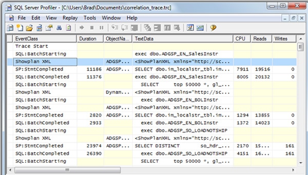
Figure 1-18: We have seen this Profiler screen many times before.
You should also be familiar with the bottom section of the screen (figure 1-19). It displays the contents of the TextData column for the event selected in Figure 1-18. In this case, a ShowPlan XML event was selected, so we see a graphical execution plan for the query following this event:

Figure 1-19: The bottom screen displays the value of the TextData data column of the event selected in the top screen.
So far, so good. Now let’s examine the middle section of the screen, shown in Figure 1-20:
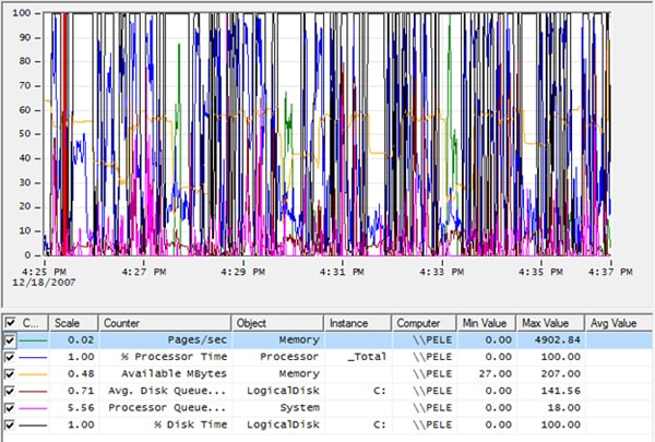
Figure 1-20: The second and third screens are show above.
It shows a line graph of all the counter activity for the duration of the trace, below which is a table showing each of the counters used in the graph. This table includes lots of valuable information, such as minimum, maximum, and average values for each counter.
If the line graph becomes too busy, you can deselect some of the counters, making the screen easier to read. For example, if I remove all the counters except for % Processor Time, the screen looks as shown in Figure 1-21:
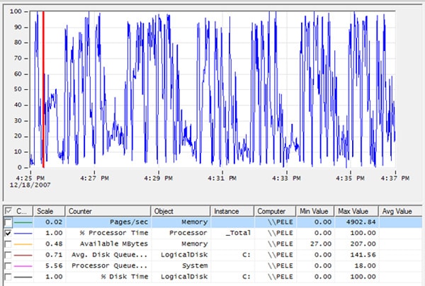
Figure 1-21: It is much easier to view only one counter at a time.
It is much easier to view the graph one counter at a time, but bear in mind that you may then miss out some valuable information, such as how one counter relates to another.
Another way to make it easier to view the line graph activity is to zoom in on the data, using a hidden zoom option. For example, consider the original graph, shown again in Figure 1-23, which is very difficult to read:
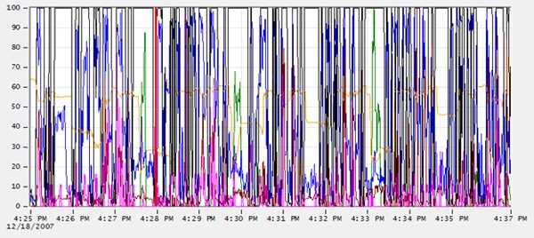
Figure 1-22: This screen is impossible to read.
If we zoom in on a particular time range, it becomes much easier to see what is going on. To zoom in, click on the graph at a start point, say 4:29 PM. Holding down the left mouse button, drag the mouse pointer to an end point, such as 4:30 PM and then release the mouse button. The screen will zoom in, displaying the time range you specified and making the screen much more readable, as you can see in Figure 1-23:
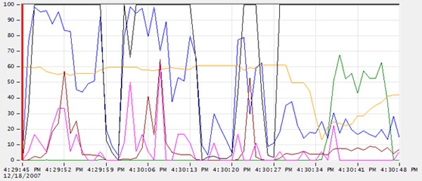
Figure 1-23: This line graph is much easier to read.
If you want to zoom back out again, right-click on the line graph and choose “Zoom Out”. As you can probably tell, correlation analysis is a manual process. There is nothing automated about it.
There are two different ways to approach a correlation analysis:
- Start from Performance Monitor – identify time periods where a certain resource has become a bottleneck, and then look for corresponding Profiler events in that period.
- Start from Profiler – identify a long running event and then examine the performance counter data to see if this event has caused a resource issue
We’ll examine each technique in turn.
Correlation Analysis Part One: Starting from Performance Monitor
Of the different ways you can correlate data, I find the simplest is to identify long period of excess resource activity and then drill down until you identify the statement or statements that are causing the problem.
So, let’s say we want to start out reviewing Performance Monitor data, looking for areas where one or more server resources have became a bottleneck for an extended time period. Having done this, we can then identify those Profiler events that occurred during the same time period, and so try to locate the cause of the stress on those server resources.
The first step I take is to maximize the screen size, in order to view the data in a much more readable fashion. Next, I select a single performance counter at a time and look for periods of time where that resource is maxed out (or close). In this example, I am going to focus on % Disk Time because I want to identify statements that have a significant impact on disk I/O. Having deselected all counters other than %Disk Time, and zoomed in to a short, 2-minute time period, the line graph looks as shown in Figure 1-24:
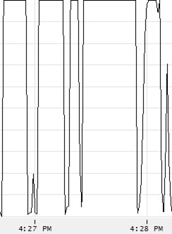
Figure 1-24: In this small amount of time, disk I/O reached 100% six times.
As you can see, there is a period of about a minute and a half where % Disk Time reached 100%. Obviously, whenever a disk is operating at 100% of capacity, this is a very strong indication of a disk I/O bottleneck. Of the six times the line chart reaches 100% disk activity, the fourth has the longest duration.
Our next job is to find out what Profiler events were running during this time period. To do this, click on the line at the left of the fourth spike. A red line should appear where you clicked, and the event that was executing at the time indicated by the red line should be highlighted, as shown in Figure 1-25:
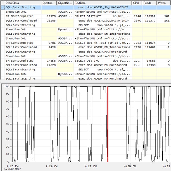
Figure 1-25: When I click on the left hand side of the line graph, it turns red and also highlights the Profiler event in the top of the screen.
Now click on the right side of the spike, and a red line should appear, indicating when the resource spike ended, as shown in Figure 1-26:
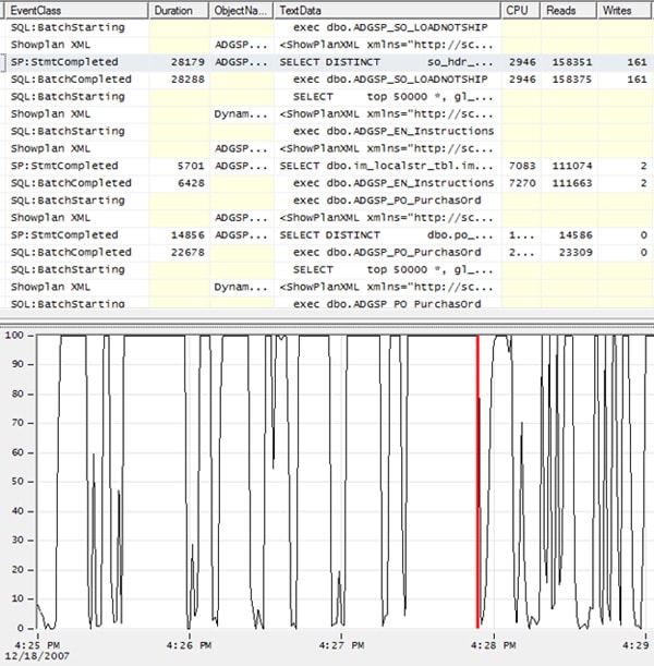
Figure 1-26: The red line is now at the right side, or the end of, the peak.
Notice also that the highlighted line at the top of the screen is now reflecting a different event (or row) on the Profiler screen. This indicates the event that was running when the spike ended. To make this clearer, Figure 1-27 shows an expanded section of the Profiler trace, with the events that mark the start and end of the resource spike highlighted in blue:

Figure 1-27: The two rows highlighted in blue indicate the top and bottom boundaries of the events that were running during the spike in % Disk Time. Using Profiler, you can only see one blue line at a time. I have cheated here to make my point more obvious.
By selecting the beginning and ending points of our resource spike on the line graph, we have identified the events that occurred during this time period. Hopefully these events will look familiar to you, as we have seen them before in this book. Essentially, we see four events that represent the execution of a single statement within a stored procedure:
- Row one is a SQL:BatchStarting event and indicates that a stored procedure is about to execute
- Row two shows the execution plan for the statement within the stored procedure.
- Row three is the execution of the statement within the stored procedure. This is where the actual work takes place.
- Row four, while shown to be outside the time line, is actually a part of this single query. The SQL:BatchCompleted event indicates that the stored procedure has completed.
As you can see with this example, the timing correlation may not always be 100% perfect, but it will be close.
So what did this exercise tell us? Essentially, we now know why the %Disk Time spiked as it did. Not only can we see that the statement within the stored procedure was the cause of the spike, we can also see from the Profiler data that the statement had to read a total of 158,375 pages total and make 161 page writes, in order to return 85 rows of data. In addition, we can look at the graphical execution plan for the statement, and consider ways to rewrite the query so that it is more efficient.
Although this is not a dramatic example, it shows you how you can correlate a spike in server resource activity in the line graph, with specific events running inside SQL Server.
Correlation Analysis Part Two: Starting from Profiler
For this analysis, we’ll start from the Profiler data then drill down into the Performance Monitor activity. For example, let’s say that you are reviewing the Profiler trace data and find an event that takes 11190 milliseconds to run. Eleven seconds is a long time for a query to run, so you want to find out if running this particular query harms Server performance.
The first step is to identify the beginning and ending events that comprise the statement. In this example, the events are shown in Figure 1-28:

Figure 1-28: To begin this analysis, first identify all the events that comprise a single statement.
We see that a stored procedure has executed a single statement and that this is encapsulated within four events. We can also see that the statement executed within the stored procedure took 14,623 page reads to return 72,023 rows of data. Now let’s see how this particular statement affected server resource usage, as indicated by our Performance Monitor counters.
The process is simply the “reverse” of that described in the previous section. When you click on the first event, SQL:batchStarting, a red line will appear on the line graph, indicating the point in time where that event occurred, as shown in Figure 1-29:
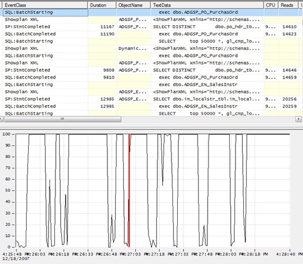
Figure 1-29: I have zoomed in on the line graph to make it easier for you to see where the statement starts.
You can immediately see that this Profiler event preceded a spike in disk I/O activity. When you click of the fourth of the four events, SQL:BatchCompleted, a red line appears at the point in time this event occurred (i.e. when the statement completed executing), as shown in Figure 1-30:
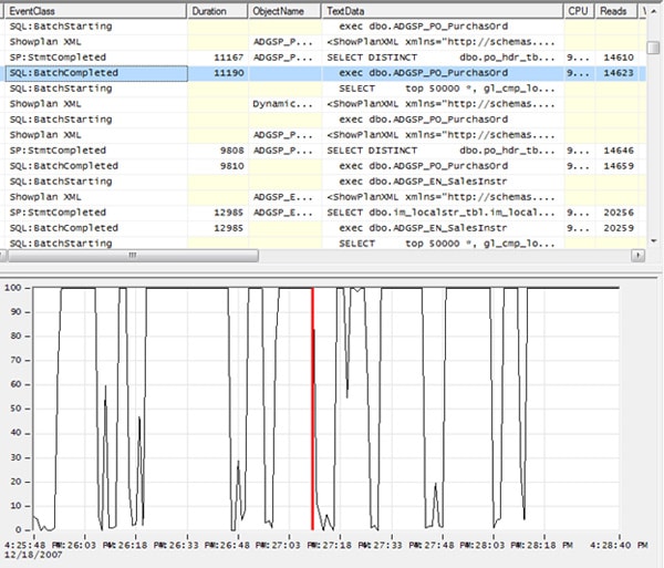
Figure 1-30: By looking at figure 1-29 and 1-30, you can see the activity that occurred when the statement executed.
You can see that the completion of execution of the statement marks the end of the 100% spike in disk activity. This is strong evidence that this statement is having an impact on server resources. Now it is up to you to decide if the impact is big enough to merit action and, if so, what steps you will take to fix the query so that is runs more efficiently in the future.
Summary
In this article, you learned how to correlate Profiler events with Performance Monitor activity. This gives you the ability to find out what statement might be causing a spike in server resource usage, or to examine a single statement and find out how running it affects resource utilization.
Correlation analysis is a manual process, so it can be time-consuming and needs practice. However, once you master it, you will find it an invaluable tool for identifying relationships between Profiler events and actual physical server activity.
This article is adapted from an extract of Brad’s book ‘Mastering SQL Server Profiler’. Since the book was published, Red Gate have released SQL Monitor, a monitoring and alerting tool for SQL Server. Click here to get a free copy of Brad’s book and download a free trial of SQL Monitor.


Load comments