
The series so far:
- SQL Server R Services: The Basics
- SQL Server R Services: Digging into the R Language
- SQL Server R Services: Working with ggplot2 Statistical Graphics
- SQL Server R Services: Working with Data Frames
- SQL Server R Services: Generating Sparklines and Other Types of Spark Graphs
- SQL Server R Services: Working with Multiple Data Sets
Just about anything you can do with the R language you can do in SQL Server R Services. You can transform data, import R packages, and perform a wide range of analytics. You can even generate statistical visualizations that make the data easier to understand, as we discussed in the third article in this series, in which we used the ggplot2 package to create several types of charts.
In this article, we continue our discussion on visualizations, but switch the focus to sparklines and other spark graphs. As with many aspects of the R language, there are multiple options for generating spark graphs. For this article, we’ll focus on using the sparkTable package, which allows us to create spark graphs and build tables that incorporate those graphs directly, a common use case when working with spark images.
In the examples to follow, we’ll import the sparkTable package and generate several graphs, based on data retrieved from the AdventureWorks2014 sample database. We’ll also build a table that incorporates the SQL Server data along with the spark graphs. Note, however, that this article focuses specifically on working with the sparkTable package. If you are not familiar with how to build R scripts that incorporate SQL Server data, refer to the previous articles in this series. You should understand how to use the sp_execute_external_script stored procedure to retrieve SQL Server data and run R scripts before diving into this article.
Creating the sparklines and other spark graphs
Spark graphs are small images embedded directly in text, lists, or tables to provide quick insight into related data. The sparkTable package supports four graph types: sparklines, sparkbars, sparkboxes, and sparkhists (histograms). Although the process for generating them is similar, each graph takes a different approach to representing the target data.
The best way to understand how the graph types differ from one another is to see them in action. The following T-SQL code includes an R script that imports the sparkTable package, retrieves the SQL Server data, creates the four types of graphs, and exports each one to a .pdf file:
|
1 2 3 4 5 6 7 8 9 10 11 12 13 14 15 16 17 18 19 20 21 22 23 24 25 26 27 28 29 30 31 32 33 34 35 36 |
DECLARE @rscript NVARCHAR(MAX); SET @rscript = N' # import sparkTable package library(sparkTable) # retrieve SQL Server data salesdf <- InputDataSet # define spark objects sline <- newSparkLine(values = salesdf$Sales, height = .8, width = 3, lineWidth = .4, pointWidth = 3, showIQR = TRUE, allColors = c("red3", "green4", "cyan3", "white", "blue", "gray75")) sbar <- newSparkBar(values = salesdf$Sales, height = .8, width = 3, barCol = rep("blue", 3)) sbox <- newSparkBox(values = salesdf$Sales, height = .8, width = 2, boxCol = c("black", "green")) shist <- newSparkHist(values = salesdf$Sales, height = .8, width = 2, barCol = c("green", "green", "black")) # export spark objects export(object = sline, outputType = "pdf", filename = file.path("C:\\DataFiles", "SparkLine")) export(object = sbar, outputType = "pdf", filename = file.path("C:\\DataFiles", "SparkBar")) export(object = sbox, outputType = "pdf", filename = file.path("C:\\DataFiles", "SparkBox")) export(object = shist, outputType = "pdf", filename = file.path("C:\\DataFiles", "SparkHist"))'; DECLARE @sqlscript NVARCHAR(MAX); SET @sqlscript = N' SELECT t.Name AS Territories, h.Subtotal AS Sales FROM Sales.SalesOrderHeader h INNER JOIN Sales.SalesTerritory t ON h.TerritoryID = t.TerritoryID WHERE t.[Group] = ''North America'' AND h.Subtotal > 20000;'; EXEC sp_execute_external_script @language = N'R', @script = @rscript, @input_data_1 = @sqlscript; GO |
Again, you should refer to the previous articles in this series to understand how the sp_execute_external_script stored procedure works and how to import R packages and SQL Server data into the R script. With that in mind, let’s jump to the first graph definition in the R script, in which we define is a sparkline graph:
|
1 2 3 |
sline <- newSparkLine(values = salesdf$Sales, height = .8, width = 3, lineWidth = .4, pointWidth = 3, showIQR = TRUE, allColors = c("red3", "green4", "cyan3", "white", "blue", "gray75")) |
To create the sparkline, we use the newSparkLine function, providing several arguments that define the graph. The first argument, values, specifies the data on which to base the sparkline, which in this case, is the Sales column in the salesdf data set. The remaining arguments determine how to format the sparkline:
- height: The graph’s total height in inches.
- width: The graph’s total width in inches.
- lineWidth: The point width of the graph line.
- pointWidth: The point width of the dots used to represent the minimum, maximum, and last values.
- showIQR: An on/off toggle that determines whether the interquartile range (IQR) is included in the graph.
- allColors: The color to use for each of the graph’s components.
The allColors property takes six values, concatenated using the c function. The values must be specified in the following order:
- Minimal value dot
- Maximum value dot
- Last value dot
- Background
- Graph line
- IQR range
After defining the sparkline and assigning it to the sline variable, we then define the remaining graphs. But before we get into those, let’s skip ahead to the first instance of the export function:
|
1 2 |
export(object = sline, outputType = "pdf", filename = file.path("C:\\DataFiles", "SparkLine")) |
The export function lets us save our graph as a .pdf, .eps, .png, or .svg file. The object argument specifies the object to be exported, in this case, our sparkline graph, sline. The outputType argument indicates that the sparkline should be saved to a .pdf file. We then use the file.path function to provide the path and filename value for the filename argument.
When we run the T-SQL code, the R engine generates a .pdf file, which contains the sparkline shown in the following figure.
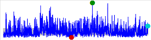
This image is, of course, much larger than what a typical sparkline would be, but it helps to illustrate how such graphs work. The sparkline plots the values in the Sales column, indicating the maximum level (green4), minimal level (red3), and last value (cyan3). The gray bar across the bottom of the graph indicates the IQR range (the data’s midrange).
Now let’s return to the other graph definitions. The next on the list is a sparkbar, which we create by using the newSparkBar function:
|
1 2 |
sbar <- newSparkBar(values = salesdf$Sales, height = .8, width = 3, barCol = rep("blue", 3)) |
As with the sparkline, our sparkbar definition includes the values, height, and width arguments. The fourth argument, barCol, defines the sparkbar’s colors. The argument takes three values, specified in the following order:
- Negative-valued bars
- Positive-valued bars
- Bar outlines
Given that we’re working only with positive numeric values and there are many of them, we’ll assign the same color to all settings to avoid unnecessary clutter and to keep things simple. The rep function provides an easy way to repeat the value blue three times.
After we define our sparkbar, we can use the export function to save the sparkbar to a .pdf file. We call the function just as we do for the sparkline, only this time, specifying the sparkbar graph, sbar. When we run the T-SQL code, the R engine generates a .pdf file that contains the following graph.
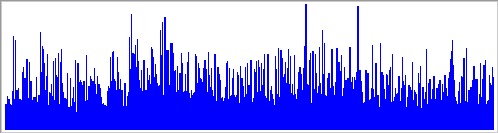
The sparkbar plots a vertical line for each value in the Sales column, providing quick insight into the range of values that make up the data set.
Next, we use the newSparkBox function to define a sparkbox, taking a similar approach to how we defined the sparkline and sparkbar:
|
1 2 |
sbox <- newSparkBox(values = salesdf$Sales, height = .8, width = 2, boxCol = c("black", "green")) |
In this case, the boxCol argument takes only two values: the box outline color and the box fill color. When we run the T-SQL code, the export function creates a .pdf file that contains the following graph.
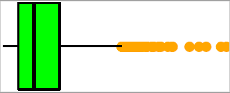
The graph shows the distribution of data based on five values: minimum, first quartile, median, third quartile, and maximum. The orange dots are the outliers that fall outside the typical range of data.
Next, we use the newSparkHist function to create a sparkhist:
|
1 2 |
shist <- newSparkHist(values = salesdf$Sales, height = .8, width = 2, barCol = c("green", "green", "black")) |
The barCol argument works just like it does for sparkbar. In this case, however, we’re specifying that the bars are green and the outlines are black, giving us the following graph.

The sparkhist displays a histogram that provides us with a breakdown of data ranges (in bins) based on the distribution of values. As with the other graphs, the sparkhist offers yet another glimpse into the nature of our data.
Creating the graphical table
Creating spark graphs individually can be handy for certain applications, but you might also want to construct tables that incorporate those graphs directly. The sparkTable package lets you build graphical tables that include both data values and spark graphs, which we can then export to either an HTML file or a LaTeX file.
To create a graphical table, we can take the following steps:
- Define the spark graphs.
- Define the table’s column structure and column names.
- Specify the source data to use for the graphical table’s columns.
- Prepare the source dataset for generating the table.
- Generate the table.
- Export the table to an HTML or LaTeX file.
The following R script uses these steps to generate an HTML file that contains a graphical table:
|
1 2 3 4 5 6 7 8 9 10 11 12 13 14 15 16 17 18 19 20 21 22 23 24 25 26 27 28 29 30 31 32 33 34 35 36 37 38 39 40 41 42 43 |
DECLARE @rscript NVARCHAR(MAX); SET @rscript = N' # import sparkTable package library(sparkTable) # retrieve SQL Server data salesdf <- InputDataSet # define spark objects sline <- newSparkLine(height = .8, width = 3, lineWidth = .4, pointWidth = 3, showIQR = TRUE, allColors = c("red3", "green4", "cyan3", "white", "blue", "gray75")) sbar <- newSparkBar(height = .8, width = 3, barCol = rep("blue", 3)) sbox <- newSparkBox(height = .8, width = 2, boxCol = c("black", "green")) shist <- newSparkHist(height = .8, width = 2, barCol = c("green", "green", "black")) # define table output content <- list( function(x) {round(mean(x), 1)}, sline, sbar, sbox, shist ) names(content) <- c("Sales Mean", "Spark Line", "Spark Bar", "Spark Box", "Spark Histogram") # point columns to source data cols <- rep("Sales", 5) # transform data to long format and create spark table reshape <- reshapeExt(salesdf, varying=list(2)) stable <- newSparkTable(dataObj = reshape, tableContent = content, varType = cols) # export table to HTML file export(stable, outputType = "html", filename=file.path("C:\\DataFiles", "SalesReport"), graphNames = file.path("C:\\DataFiles", "SalesReport"))'; DECLARE @sqlscript NVARCHAR(MAX); SET @sqlscript = N' SELECT t.Name AS Territories, h.Subtotal AS Sales FROM Sales.SalesOrderHeader h INNER JOIN Sales.SalesTerritory t ON h.TerritoryID = t.TerritoryID WHERE t.[Group] = ''North America'' AND h.Subtotal > 20000;'; EXEC sp_execute_external_script @language = N'R', @script = @rscript, @input_data_1 = @sqlscript; GO |
We’ll review the R script one element at a time to better understand what’s going on, starting with the spark graph definitions. To define the graphs, we take an approach similar to the one we followed when creating them individually, except that we don’t include the values argument, as shown in the following sparkline definition:
|
1 2 3 |
sline <- newSparkLine(height = .8, width = 3, lineWidth = .4, pointWidth = 3, showIQR = TRUE, allColors = c("red3", "green4", "cyan3", "white", "blue", "gray75")) |
As you can see, the only argument missing from the newSparkLine function is values. We associate the source data with the sparkline later in the script, so we don’t need to do it here. To define the other spark graphs, we take the same approach.
Next, we must define the structure of our graphical table. We do this by creating a list that includes one element for each of the table’s columns:
|
1 2 3 4 5 |
content <- list( function(x) {round(mean(x), 1)}, sline, sbar, sbox, shist ) names(content) <- c("Sales Mean", "Spark Line", "Spark Bar", "Spark Box", "Spark Histogram") |
The list can include user-defined function definitions or any of the four types of spark graphs. In this case, the first column is a simple function that finds the mean aggregate of the specified data. Ultimately, this column will be used for the aggregated data in the Sales column in the source dataset. The remaining four columns are the spark graphs: sparkline (sline), sparkbar (sbar), sparkbox (sbox), and sparkhist (shist).
After we define the content list, we use that names function to assign a name to each value in the list. These will serve as the column names in our graphical table.
The next step is to specify the columns in the salesdf dataset that map to the five columns in the graphical table. Because we’ll be using the data from the Sales column for each column in the graphical table, we can use the rep function to create the list:
|
1 |
cols <- rep("Sales", 5) |
With our structure in place, we’re just about ready to define the graphical table. But first we must use the reshapeExt function to transform the Sales column to long format:
|
1 |
reshape <- reshapeExt(salesdf, varying = list(2)) |
When calling the reshapeExt function, we first specify the source dataset, salesdf, and then provide a value for the varying argument, which is a list of the columns to be transformed. Because the Sales column is the second column in the dataset and is the only column that we need to transform, the list contains only the value 2.
After we reshape the Sales column, we can use the newSparkTable function to create a graphical table based on the reshape dataset, the content table structure, and the cols data mapping:
|
1 2 |
stable <- newSparkTable(dataObj = reshape, tableContent = content, varType = cols) |
You might have noticed that the table structure does not include the Territories column that’s in the reshape and salesdf data sets. That’s because the newSparkTable function automatically uses the first column in the source dataset as the bases for aggregating the data and generating the subsequent graphs. As a result, the graphical table will also include a unique list of territories in its first column.
With our table definition in place, we can export it to an .html file, using the same export function we used for spark graphs, but taking a slightly different approach:
|
1 2 3 |
export(stable, outputType = "html", filename=file.path("C:\\DataFiles", "SalesReport"), graphNames = file.path("C:\\DataFiles", "SalesReport"))'; |
When calling the export function, we specify the graphical table (stable) and the output type (html). We then provide the path and file name for the .html file and the individual graph files, which will be numbered sequentially, using the specified name as a prefix. When we run our T-SQL code, the R engine creates an .html file that contains the following markup.
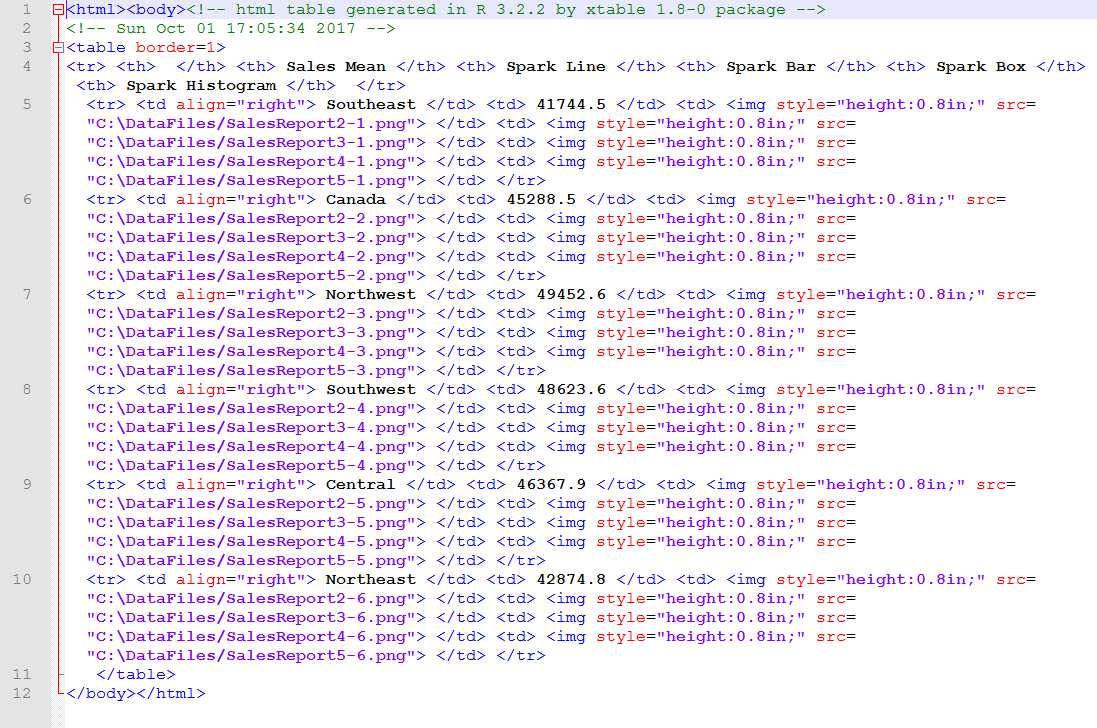
You should be able to view the .html file in any browser so you can see for yourself what the table will look like when rendered in HTML. The following figure shows how it appeared on my system when I opened the file in Chrome.
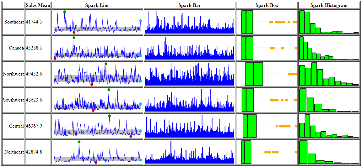
The table is shown with the default styles being used. No doubt you’ll want to apply specific styles to your tables, whether through style sheets or other mechanisms, as well as format and size the graphs specific to your needs and data. In the meantime, this should give you a taste of what you can do with the sparkTable package. Once you get the hang of how to use it, the process is actually fairly straightforward.
Exporting to a .tex file
You can also export your graphical table to a .tex file. A .tex file is a plain-text document that conforms to the formatting standards defined by the LaTeX document preparation system, which is used for typesetting technical and scientific documentation.
To create a .tex file for your graphical table, rather than an .html file, you simply change the value of the outputType argument in the export function from html to tex:
|
1 2 3 |
export(stable, outputType = "tex", filename=file.path("C:\\DataFiles", "SalesReport"), graphNames = file.path("C:\\DataFiles", "SalesReport"))'; |
As expected, the export statement generates the specified .tex file, which includes our graphical table. Because the file is in plain text, we can open it in any text editor. For example, the following figure shows the file opened in Notepad++, complete with the LaTeX markup.
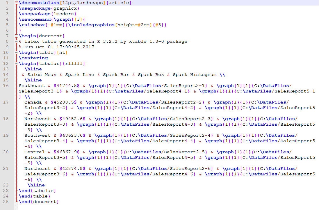
This is as far as we can go with the .tex file for now. LaTeX is a much broader and involved conversation than what we can cover here. However, if you’re familiar with the LaTeX ecosystem, you can use the .tex files you generate through R Services to produce documents that contain graphical tables.
Working with the sparkTable package
Not surprisingly, there’s a lot more to the sparkTable package than what we’ve just touched upon (and a lot more complex analytics that we can perform in R), but these examples should give you a good sense of how you can use the package to create spark graphs and the graphical tables to contain them. The best part is that we can do all this within the context of R Services, making it possible to easily incorporate SQL Server data into our spark graphs and graphical tables. To learn more about working with the sparkTable package, check out the article sparkTable: Generating Graphical Tables for Websites and Documents with R.
You can also use other R packages and approaches to create spark graphs and graphical tables. I encourage you to dig around to see what options are out there. Keep in mind, however, that one of the biggest challenges with the R language is that the documentation is often inadequate or geared toward advanced developers and analysts, without the careful explanations necessary to fully understand each language element.
SQL Server developers new to R can have a tough time making sense of an R package or particular R logic. Often their best recourse is basic trial-and-error. Perhaps with the R language now integrated into SQL Server, we’ll start seeing more useful information about R that makes the prospects of diving into the language more palatable for beginners.
This document contains proprietary information and is protected by copyright law.
Copyright © 2026 Red Gate Software Limited. All rights reserved


Load comments