
The series so far:
- SQL Server R Services: The Basics
- SQL Server R Services: Digging into the R Language
- SQL Server R Services: Working with ggplot2 Statistical Graphics
- SQL Server R Services: Working with Data Frames
- SQL Server R Services: Generating Sparklines and Other Types of Spark Graphs
- SQL Server R Services: Working with Multiple Data Sets
In SQL Server 2016, Microsoft added support for the R language in two different forms: SQL Server R Server, a stand-alone product that provides parallel processing and other performance enhancements, and SQL Server R Services, an integrated service that lets you run R scripts directly within the SQL Server environment and incorporate SQL Server data within those scripts.
This article is the second in a series about SQL Server R Services. In the first article, I explained how to use R Services to run R scripts within the SQL Server environment. To do so, you must use the sp_execute_external_script system stored procedure to run the script, including it as a parameter value when calling the procedure. The first article provides a number of examples of how to go about doing this.
In this article, I focus on the R script itself, using a single example that demonstrates how to generate a bar chart (also known as a bar plot in R lingo). The article walks you through the script one element at a time so you can better understand the various elements that make up the script, while gaining a foundation in many important concepts related to R scripting.
When calling the sp_execute_external_script stored procedure, we’ll take the same approach as in the first article; that is, we’ll save the R script and T-SQL SELECT statement to variables (@rscript and @sqlscript, respectively). We’ll then use those variables as parameter values when calling the procedure. We’ll also be running the procedure within the context of the AdventureWorks2014 database because it will provide our source data.
With that in mind, take a look at the following T-SQL code, which includes all the elements necessary to generate a bar chart based on data extracted from the Sales.SalesOrderHeader and Sales.Territory tables in the AdventureWorks2014 database:
|
1 2 3 4 5 6 7 8 9 10 11 12 13 14 15 16 17 18 19 20 21 22 23 24 25 26 27 28 29 30 31 32 33 34 35 36 37 38 39 40 41 42 43 44 |
USE AdventureWorks2014; GO DECLARE @rscript NVARCHAR(MAX); SET @rscript = N' # import scales and ggplot2 packages library(scales) library(ggplot2) # set up report file for chart reportfile <- "C:\\DataFiles\\SalesReport.png" png(filename=reportfile, width=1000, height=600) # construct data frame sales <- InputDataSet c1 <- levels(sales$SalesTerritories) c2 <- round(tapply(sales$Subtotal, sales$SalesTerritories, sum)) salesdf <- data.frame(c1, c2) names(salesdf) <- c("Territories", "Sales") # generate bar chart barchart <- ggplot(salesdf, aes(x=Territories, y=Sales)) + labs(title="Total Sales per Territory", x="Sales Territories \n (with country code)", y="Sales Amounts") + geom_bar(stat="identity", color="green", size=1, fill="lightgreen") + coord_flip() + xlim(rev(levels(sales$SalesTerritories))) + scale_y_continuous(labels=function(x) format(x, big.mark=",", scientific=FALSE)) + geom_text(aes(label=comma(Sales), ymax=100, ymin=0), size=4, hjust=0, position=position_fill()) print(barchart) dev.off()'; DECLARE @sqlscript NVARCHAR(MAX); SET @sqlscript = N' SELECT h.Subtotal, t.Name + '' ('' + t.CountryRegionCode + '')'' AS SalesTerritories FROM Sales.SalesOrderHeader h INNER JOIN Sales.SalesTerritory t ON h.TerritoryID = t.TerritoryID;'; EXEC sp_execute_external_script @language = N'R', @script = @rscript, @input_data_1 = @sqlscript WITH RESULT SETS NONE; GO |
If you read the first article in this series, the components of the procedure call should be familiar to you. We start by defining the R script and assigning it to the @rscript variable. Next, we define the SELECT statement and assign it to the @sqlscript variable. Finally, we call the sp_execute_external_script stored procedure, specifying the @language value as R, the @rscript value as @rscript, and the @input_date_1 value as @sqlscript. We also specify that no result set be returned. Instead, we’ll be generating a .png file that contains our bar chart.
The remainder of the article walks you through each section of the R script: importing R packages, setting up the report file, constructing a data frame, and generating the bar chart. If you have any questions about the non-R elements in the example, be sure to refer back to the first article.
Importing R packages
The first part of our code imports two R packages from the local SQL Server library into the scripting environment. Packages are collections of functions or data sets in the SQL Server R Services library. When you install R Services, SQL Server setup adds a number of common R packages; however, you can install additional packages at any time.
Once a package has been installed in the library, you can import it into your scripting environment in order to use its functions or data sets within your R script.
In our example, we’ll be importing the scales and ggplot2 packages. Before we can do that, however, we must install them into the SQL Server R Services library. Any package we import must exist in the library. Fortunately, we can get both packages by installing the ggplot2 package. When you install this package, R Services installs several additional packages, including scales.
If the machine on which SQL Server is running can connect to the Internet, one of the simplest ways to install a package is to use the RGui utility available in the following folder (on a default installation):
|
1 |
C:\Program Files\MSSQL13.MSSQLSERVER\R_SERVICES\bin\ |
If you’re working with a named SQL Server instance, simply replace MSSQLSERVER with the name of that instance.
From this folder, launch the RGui utility as an administrator and run the following two commands (again replacing the default instance with the named instance, if applicable):
|
1 2 3 |
lib.SQL <- "C:\\Program Files\\Microsoft SQL Server\\MSSQL13.MSSQLSERVER\\R_SERVICES\\library" install.packages("ggplot2", lib = lib.SQL) |
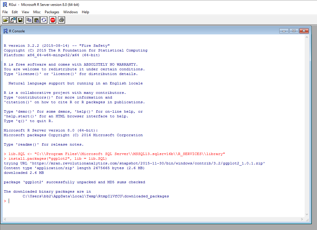
All you’re doing here is specifying where the target SQL Server library is located and then using that location when running the install.packages function. R Services takes care of the rest, checking for an available download server, pulling the files from that server, and installing the package into the library. The following figure shows the RGui utility after running the install.packages function. Your results might be different, depending on the download server used.
That’s all there is to installing a package in the SQL Server library, assuming you can connect to the Internet. If you can’t, you’ll have to take a different approach. For more information, see the Microsoft article Install Additional R Packages on SQL Server.
With the packages in place, we can import them into the scripting environment. To do so, you need only run the library function for each package, specifying the package name when calling the function, as shown in the following code:
|
1 2 |
library(scales) library(ggplot2) |
Once we’ve imported the packages, we can use their functions in our script, which we’ll be doing later in the script, when we define the bar chart.
Setting up the image file
The next step is to set up the image file that will hold our bar chart. We do this by including the following two lines of code:
|
1 2 |
reportfile <- "C:\\DataFiles\\SalesReport.png" png(filename=reportfile, width=1000, height=600) |
First, we define a string variable to hold the folder and file name of the target image file and then use the back-arrow assignment operator (<-) to assign the value to the reportfile variable. Notice that we must escape the backslashes in the file path by doubling them. (The folder and file names specified here are just for the example. You can specify any folder or .png file name you want. Just substitute them within the code.)
Next, we call the png device, which is used to create the .png file for our bar chart. The R language provides devices such as png, bmp, and tiff for creating plots and image files in various formats. In this case, when calling the png device, we specify the reportfile variable for the folder and file names and then provide a width and height for the file, in pixels.
That’s all there is to setting up our graphic file. After we add the bar chart, we’ll need to close the png device, using the dev.off() function, but we’ll get to that later in the article, after we define our bar chart.
Constructing the data frame
Before we can create the bar chart, we must get the data we want to visualize into a data frame. A data frame is similar to a database table. Strictly speaking, it is a list of vectors of equal length that are assigned the data.frame type, but to keep in simple, we can think of the data set in terms of rows and columns.
To construct the data frame, we need to retrieve the SQL Server data, transform the data, and build the data frame, as shown in the following code:
|
1 2 3 4 5 |
sales <- InputDataSet c1 <- levels(sales$SalesTerritories) c2 <- round(tapply(sales$Subtotal, sales$SalesTerritories, sum)) salesdf <- data.frame(c1, c2) names(salesdf) <- c("Territories", "Sales") |
First, we use the following statement to assign the SQL Server data to the sales variable:
|
1 |
sales <- InputDataSet |
The SQL Server data is represented by the InputDataSet variable, which is the default variable used to reference the data returned by the SELECT statement. We must use the InputDataSet variable to pull the SQL Server data into our R script, unless we specify a different name for the data set variable. (We would do this in the stored procedure call. If you’re not sure how this works, refer to the first article in this series.)
Once we have the data set stored in the sales variable, we can start working with that data. Our final data frame will contain two columns. The first will include the list of territories, and the second will include the aggregated sales for each territory, as defined in the following code:
|
1 2 |
c1 <- levels(sales$SalesTerritories) c2 <- round(tapply(sales$Subtotal, sales$SalesTerritories, sum)) |
We start by assigning the values for the first column to the c1 variable. To get the values, we use the levels function to retrieve a distinct list of values from the SalesTerritories column in the sales data set. Notice that we must first specify the sales variable, then a dollar sign ($), and finally the SalesTerritories column.
Next, we assign the values for the second column to the c2 variable. This time, we use the tapply function to return the aggregated subtotals for each territory. The function takes three arguments. The first is the Subtotal column in the sales data set.
The second argument, sales$SalesTerritories, contains the factors used for aggregating the subtotals specified in the first argument. In other words, the second column provides the basis (territories) for how the values in the first column (subtotals) will be grouped together and aggregated.
The third argument, sum, is an aggregate function that adds together the subtotals in each territory to produce a total for each group. Notice that we also use the round function to round the aggregated totals to integers.
Once we’ve defined the two columns, we can put them together into a data frame and assign names to the columns, as shown the following code:
|
1 2 |
salesdf <- data.frame(c1, c2) names(salesdf) <- c("Territories", "Sales") |
In the first line of code, we use the data.frame function to merge the two columns into a data frame, which we assign to the salesdf variable.
In the second line, we use the names function to assign names to the salesdf data frame. To do so, we use the c function to concatenate the column names, Territories and Sales, and then assign the results to the data frame.
That’s all there is to creating our data frame. As you become more adept at the R language, you’ll be able to perform far more sophisticated calculations. But for now, let’s see what we can do with the data.
Generating the bar chart
One of the most powerful aspects of the R language is its ability to plot data and generate meaningful visualizations. In this case, we’re using the following code to create a bar chart based on the data in the salesdf data frame:
|
1 2 3 4 5 6 7 8 |
barchart <- ggplot(salesdf, aes(x=Territories, y=Sales)) + labs(title="Total Sales per Territory", x="Sales Territories \n (with country code)", y="Sales Amounts") + geom_bar(stat="identity", color="green", size=1, fill="lightgreen") + coord_flip() + xlim(rev(levels(sales$SalesTerritories))) + scale_y_continuous(labels=function(x) format(x, big.mark=",", scientific=FALSE)) + geom_text(aes(label=comma(Sales), ymax=100, ymin=0), size=4, hjust=0, position=position_fill()) print(barchart) dev.off()'; |
In this section of code, we use several functions from the scales and ggplot2 packages. (Prior to this section, all the functions we used were part of default packages included with the R Services installation.)
The bulk of the code in this section is related the bar chart definition, which we assign to the barchart variable. The definition is made up of seven elements, connected together with plus (+) signs. In the first element, we use the ggplot function to create the base layer for our bar chart:
|
1 |
ggplot(salesdf, aes(x=Territories, y=Sales)) |
The function’s first argument, salesdf, is the data frame that provides the data for the bar chart. The second argument uses the aes function to define the default aesthetics used by all layers in the chart, unless specifically overridden within a layer. In this case, the aes function merely defines the chart’s X-axis and Y-axis (Territories and Sales, respectively), which coincide with the columns in the salesdf data set.
In the next element in the bar chart definition, we use the labs function to provide labels for the title and each axis:
|
1 |
labs(title="Total Sales per Territory", x="Sales Territories \n (with country code)", y="Sales Amounts") |
All we’re doing here is passing three arguments into the function, one for each label. One thing worth noting, however, is the \n in the X-axis label. This inserts a line break into the text. By using the labs function, we can override the default labels that would normally be used, as specified in the ggplot function.
Now we get to the third element, which uses the geom_bar function to specify that a bar plot be created, as opposed to another type of visualization:
|
1 |
geom_bar(stat="identity", color="green", size=1, fill="lightgreen") |
The function takes four arguments. The stat="identity" argument ensures that data values map correctly to the plot points. The color argument sets the bar outlines to green, the size argument sets the bar outlines to 1 point, and the fill argument sets the main color of the bars to light green.
Next, we call the coord_flip function to flip how the X-axis and Y-axis are displayed in order to make it easier to read the axis labels:
|
1 |
coord_flip() |
After we rotate the chart, we need to modify the order of the territory names to ensure that they’re listed alphabetically, starting at the top:
|
1 |
xlim(rev(levels(sales$SalesTerritories))) |
We’re taking this approach because flipping the X-axis and Y-axis resulted in the territory names being listed in reverse order (from down to up). To fix this, we first use the levels function to retrieve a distinct list of the territory names, and then use the rev function to reverse their order. We then wrap all this within the xlim function to ensure that the values are correctly mapped to the reversed labels.
Next, we use the scale_y_continuous function to ensure that the numeric labels use integers rather than scientific notation:
|
1 |
scale_y_continuous(labels=function(x) format(x, big.mark=",", scientific=FALSE)) |
The scale_y_continuous function lets us refine the labels used for the Y-axis aesthetics. In this case, we’re creating the x function as the value for the labels argument, and then using the format function to modify the x function, adding commas to the numerical values and ensuring they’re not rendered as scientific notation.
The format function takes three arguments. The first specifies the x function as the object being formatted. The second argument (big.mark) specifies that a comma be used for large numerical numbers. The third argument, scientific, specifies FALSE to prevent scientific notation from being displayed.
The next step is to add the sales totals to the bars themselves so they appear on top of the bars. For this, we must use the geom_text function:
|
1 |
geom_text(aes(label=comma(Sales), ymax=100, ymin=0), size=4, hjust=0, position=position_fill())) |
The function takes four arguments. The first argument, label, uses the aes function, which itself takes three arguments. The first specifies that the Sales values be displayed, using the comma function to add commas to the numeric vales. The ymax and ymin settings specify the upper and lower pointwise limits of the displayed value. You must include these two arguments, but you can experiment with their settings, particularly ymax.
The size argument of the geom_text function specifies 4, which sets the font size to 4 points, and the hjust argument specifies 0, which left-justifies the labels. Finally, the position argument uses the position_fill function to ensure that the labels appear on top of the bar, rather than off to the right.
This completes our bar chart definition, we can now use the print function to send the bar plot to the .png file and the dev.off function to close the png device:
|
1 2 |
print(barchart) dev.off() |
If you were to now run the script, calling the sp_execute_external_script stored procedure as defined in our example, the SalesReport.png file will be created in the designated folder. When you open file, you should see an image similar to the one shown in the following figure.
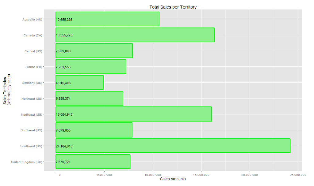
As you can see, the SQL Server data has been aggregated and rendered in the chart, providing us with the total sales for each territory. Notice that all the numerical values are rounded and include commas to make them more readable.
Working with R Services
Not surprisingly, we can do a lot more with both the data and the visualization in our example. We can modify the bar chart to change how data is displayed, or we can try different types of visualizations. Because it’s so easy to generate a graphic file, we can play around with the code as much as we want to see what we can come up with. In fact, this is often the best approach to learn R because much of the documentation is very unclear. Sometimes the only way to understand how a language element works is to try it out.
Although the example we’ve been working here is very basic, it should help you better understand some of the language elements that go into analyzing and visualizing data. In future articles in this series, we’ll dig deeper into both the analytics side and the visualization side. Until then, you have plenty here you can play with, so dive in and start having some fun.


Load comments