
The series so far:
- SQL Server Machine Learning Services – Part 1: Python Basics
- SQL Server Machine Learning Services – Part 2: Python Data Frames
- SQL Server Machine Learning Services – Part 3: Plotting Data with Python
- SQL Server Machine Learning Services – Part 4: Finding Data Anomalies with Python
- SQL Server Machine Learning Services – Part 5: Generating multiple plots in Python
- SQL Server Machine Learning Services – Part 6: Merging Data Frames in Python
SQL Server Machine Learning Services (MLS) offers a wide range of options for working with the Python language within the context of a SQL Server database. This series has covered a number of those options, with the goal of familiarizing you with some of Python’s many capabilities. One of the most important of these capabilities, along with analyzing data, is being able to visualize data. You were introduced to many of these concepts in the third article, which focused on how to generate individual charts. This article takes that discussion a step further by demonstrating how to generate multiple charts that together provide a complete picture of the underlying data.
The examples in this article are based on data from the Titanic dataset, available as a .csv file from the site https://vincentarelbundock.github.io/Rdatasets/datasets.html. There you can find an assortment of sample datasets, available in both .csv and .doc formats. This is a great resource to keep in mind as you’re trying out various MLS features, whether using the R language or Python.
The Titanic dataset includes a passenger list from the Titanic’s infamous voyage. For each passenger, the data includes the individual’s name, age, gender, service class and whether the passenger survived. The following figure shows a sample of the data.
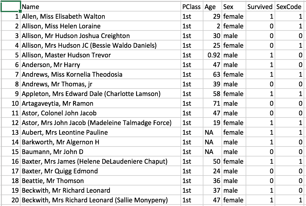
A value of 1 in the Survived column indicates that the passenger survived the voyage. A value of 0 indicates that the passenger did not. The SexCode column is merely a binary duplicate of the Sex column. A value of 0 indicates that the passenger was male, and a value of 1 indicates that the passenger was female.
I created the examples for this article in SQL Server Management Studio (SSMS). Each example retrieves data from a locally saved file named titanic.csv, which contains the Titanic dataset. In most cases, if you’re running a Python script within the context of the SQL Server databases, you’ll likely want to use data from that database, either instead of or in addition to a .csv data, but the principles covered in this article apply regardless of where the data originates, and using a .csv file helps to keep things simple, while demonstrating several important concepts, including how to retrieve data from that file.
Retrieving data from a .csv file
Python, with the help of the pandas module, makes it easy to retrieve data from a .csv file and save the data to a DataFrame object. The pandas module contains a variety of tools for creating and working with data frames, including the read_csv function, which does exactly what the name suggests, reads data from a .csv file.
The Python script in following example uses the function to first retrieve data from the titanic.csv file and then to update the resulting dataset in preparation for grouping the data for the visualizations:
|
1 2 3 4 5 6 7 8 9 10 11 12 13 14 15 16 |
DECLARE @pscript NVARCHAR(MAX); SET @pscript = N' # import pandas module import pandas as pd # define the titanic data frame titanic = pd.read_csv("c:\\datafiles\\titanic.csv", index_col=0) titanic = titanic[titanic["Age"].notnull()] titanic["Survived"] = titanic["Survived"].map({0:"deceased", 1:"survived"}) for i, row in titanic.iterrows(): if (row["Age"].is_integer() == False): titanic.drop(i, inplace=True) print(titanic)'; EXEC sp_execute_external_script @language = N'Python', @script = @pscript; GO |
The sp_execute_external_script stored procedure, which is used to run Python and R scripts, should be well familiar to you by now. If you have any questions about the procedure works, refer to the first article in this series. In this article, we focus exclusively on the Python script.
The first statement in the script imports the pandas module and assigns the pd alias:
|
1 |
import pandas as pd |
You can then use the pd alias to call the read_csv function, passing in the full path to the titanic.csv file as the first parameter value:
|
1 |
titanic = pd.read_csv("c:\\datafiles\\titanic.csv", index_col=0) |
On my system, the titanic.csv file is saved to the c:\datafiles\ folder. Be sure to update the path as necessary if you plan to try out this example or those that follow.
The second function parameter is index_col, which tells the function to use the specified column as the index for the outputted data frame. The value 0 refers to the first column, which is unnamed in the Titanic dataset. Without this parameter, the data frame’s index would be auto-generated.
When the read_csv function runs, it retrieves the data from the file and saves it to a DataFrame object, which, in this case, is assigned to the titanic variable. You can then use this variable to modify the data frame or access its data. For example, the original dataset includes a number of passengers whose ages were unknown, listed as NA in the .csv file. You might choose to remove those rows from the dataset, which you can do by using the notnull function:
|
1 |
titanic = titanic[titanic["Age"].notnull()] |
To use the notnull function, you merely append it to the column name. Notice, however, that you must first call the dataset and then, within brackets, reference the dataset again, along with the column name in its own set of brackets.
Perhaps the bigger issue here is whether it’s even necessary remove these rows. It turns out that over 500 rows have unknown ages, a significant portion of the dataset. (The original dataset includes over 1300 rows.) The examples later in article will use the groupby function to group the data and find the average ages in each group, along with the number of passengers. When aggregating grouped data, the groupby function automatically excludes null values, so in this case, the aggregated results will be the same whether or not you include the preceding statement.
I’ve included the statement here primarily to demonstrate how to remove rows that contain null values. (The subsequent examples also include this statement so they’re consistent as you build on them from one example to the next.) One advantage to removing the rows with null values is that the resulting dataset is smaller, which can be beneficial when working with large datasets. Keep in mind, however, that modifying datasets can sometimes impact the analytics or visualizations based on those datasets. Always be wary of how you manipulate data.
The next statement in the example replaces the numeric values in the Survived column with the values deceased and survived:
|
1 |
titanic["Survived"] = titanic["Survived"].map({0:"deceased", 1:"survived"}) |
To change values in this way, use the map function to specify the old and new values. You must enclose the assignments in curly braces, separating each set with a comma. For the assignments themselves, you separate the old value from the new value with a colon.
The next part of the Python script includes a for statement block that removes rows containing Age values that are not whole numbers:
|
1 2 3 |
for i, row in titanic.iterrows(): if (row["Age"].is_integer() == False): titanic.drop(i, inplace=True) |
The Titanic dataset uses fractions for infant ages, and you might decide not to include these rows in your data. As with the notnull function, I’ve included this logic primarily to demonstrate a useful concept, in this case, how you can loop through the rows in a dataset to take an action on each row.
The initial for statement specifies the i and row variables, which represent the current index value and dataset row in each of the loop’s iterations. The statement also calls the iterrows function on the titanic data frame for iterating through the rows.
For each iteration, the for statement block runs an if statement, which evaluates whether the Age value for the current row is an integer, using the is_integer function. If the function evaluates to False, the value is not an integer, in which case the drop function is used to remove that row identified by the current i value. When using the drop function in this way, be sure to include the inplace parameter, set to True, to ensure that the data frame is updated in place, rather than copied.
Once again, you should determine whether you do, in fact, want to remove these rows. In this case, the aggregated passenger totals will be impacted by their removal because there will be eight fewer rows, so be sure to tread carefully when making these sorts of changes.
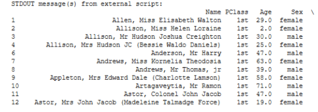
The final statement in the Python script uses the print function to return the titanic data to the SSMS console:
|
1 |
print(titanic) |
The following figure shows a portion of the results. Note that, when returning a dataset that is considered wide, Python wraps the columns, as indicated by the backslash to the right of the column names. As a result, only the index and the first four columns are included in this particular view.
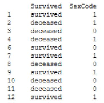
If you scroll down the results, you’ll find the remaining columns, similar to those shown in the following figure.
Notice that the index value for the first row is 1. This is the first value from the first column from the original dataset. If the index for the titanic data frame had been auto-generated, the first value would be 0.
Grouping and aggregating the data
Once you get the titanic data frame where you want it, you can use the groupby function to group and aggregate the data. The following example uses the function to group the data first by the PClass column, then the Sex column, and finally the Survived column:
|
1 2 3 4 5 6 7 8 9 10 11 12 13 14 15 16 17 18 19 20 21 |
DECLARE @pscript NVARCHAR(MAX); SET @pscript = N' # import pandas module import pandas as pd # define the titanic data frame titanic = pd.read_csv("c:\\datafiles\\titanic.csv", index_col=0) titanic = titanic[titanic["Age"].notnull()] titanic["Survived"] = titanic["Survived"].map({0:"deceased", 1:"survived"}) for i, row in titanic.iterrows(): if (row["Age"].is_integer() == False): titanic.drop(i, inplace=True) # define the df data frame based on titanic data df = titanic.groupby(["PClass", "Sex", "Survived"], as_index=False).agg({"Age": ["mean", "count"]}) df["Age"] = df["Age"].round(2) df.columns = ["class", "gender", "status", "age", "count"] print(df)'; EXEC sp_execute_external_script @language = N'Python', @script = @pscript; GO |
You call the groupby function by tagging it onto the titanic data frame, specifying the three columns on which to base the grouping (in the order that grouping should occur):
|
1 2 |
df = titanic.groupby(["PClass", "Sex", "Survived"], as_index=False).agg({"Age": ["mean", "count"]}) |
After specifying the grouped columns and as_index parameter, you add the agg function, which allows you to find the mean and count of the Age column values. (The groupby function is covered extensively in the first three articles of this series, so refer to them for more details about the function’s use.)
The groupby function results are assigned to the df variable. From there, you can use the variable to call the Age column in order to round the column’s values to two decimal points:
|
1 |
df["Age"] = df["Age"].round(2) |
As you can see, you need only call the round function and pass in 2 as the parameter argument. You can then assign names to the columns in the df data frame:
|
1 |
df.columns = ["class", "gender", "status", "age", "count"] |
That’s all you need to do to prepare the data for generating visualizations. The last statement in the example again uses the print function to return the data from the df data frame to the SSMS console. The following figure shows the results.
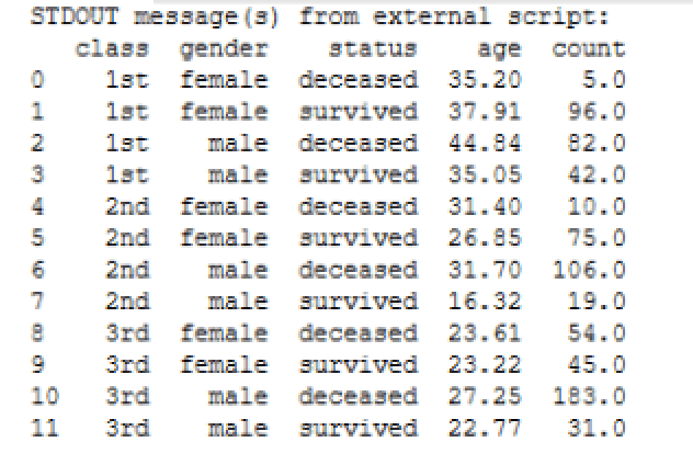
You now have a dataset that is grouped first by class, then by gender, and finally by the survival status. If the rows with fractional Age values had not been removed, the passenger counts would be slightly different.
Generating a bar chart
From the df data frame you can create multiple charts that provide different insights into the data, but before we dive into those, let’s start with a single chart. The following example creates a bar chart specific to the first-class passengers, showing the average age of the males and females who survived and who did not:
|
1 2 3 4 5 6 7 8 9 10 11 12 13 14 15 16 17 18 19 20 21 22 23 24 25 26 27 28 29 30 31 32 33 34 35 36 37 38 39 40 41 |
DECLARE @pscript NVARCHAR(MAX); SET @pscript = N' # import Python modules import matplotlib matplotlib.use("PDF") import matplotlib.pyplot as plt import matplotlib.patches as ptch import pandas as pd # define the titanic data frame titanic = pd.read_csv("c:\\datafiles\\titanic.csv", index_col=0) titanic = titanic[titanic["Age"].notnull()] titanic["Survived"] = titanic["Survived"].map({0:"deceased", 1:"survived"}) for i, row in titanic.iterrows(): if (row["Age"].is_integer() == False): titanic.drop(i, inplace=True) # define the df data frame based on titanic data df = titanic.groupby(["PClass", "Sex", "Survived"], as_index=False).agg({"Age": ["mean", "count"]}) df["Age"] = df["Age"].round(2) df.columns = ["class", "gender", "status", "age", "count"] # define the subplot data frame based on df data df1 = df.loc[(df["class"] == "1st"), ["gender", "status", "age"]] # define variables for the legend dc = ptch.Patch(color="navy", label="deceased") sv = ptch.Patch(color="darkgreen", label="survived") # define the ax1 bar chart ax1 = df1.plot.bar(x="gender", y="age", alpha=.8, color=df1.status.map({"deceased":"navy", "survived":"darkgreen"})) ax1.set_title(label="First-class passengers", y=1.02) ax1.set_xticklabels(labels=df1["gender"], fontsize=9, rotation=0) ax1.xaxis.label.set_visible(False) ax1.set_ylabel("Average ages", labelpad=10, fontsize=12) ax1.grid(color="slategray", alpha=.5, linestyle="dotted", linewidth=.5) ax1.legend(handles=[dc, sv], loc="best") # save the bar chart to PDF file plt.savefig("c:\\datafiles\\titanic1.pdf", bbox_inches="tight", pad_inches=.5)'; EXEC sp_execute_external_script @language = N'Python', @script = @pscript; GO |
The Python script starts with several new import statements related to the matplotlib module, along with the use function, which sets PDF as the backend:
|
1 2 3 4 |
import matplotlib matplotlib.use("PDF") import matplotlib.pyplot as plt import matplotlib.patches as ptch |
The first three statements should be familiar to you. If they’re not, refer back to the third article. The fourth statement is new. It imports the patches package that is included with the matplotlib module. The patches package contains tools for refining the various charts. In this case, you’ll be using it to customize the chart’s legend.
The next step is to create a data subset based on the df data frame:
|
1 |
df1 = df.loc[(df["class"] == "1st"), ["gender", "status", "age"]] |
The df1 data frame filters out all rows except those specific to first-class passengers. It also filters out all but the gender, status, and age columns. Filtering out the data in advance helps to simplify the code used to create the actual plot.
The next step is to define the property values for the legend. For this, you use the Patch function that is part of the patches package:
|
1 2 |
dc = ptch.Patch(color="navy", label="deceased") sv = ptch.Patch(color="darkgreen", label="survived") |
The goal is to provide a legend that is consistent with the colors of the chart’s bars, which will be color-coded to reflect whether a group represents passengers that survived or passengers that did not. You’ll use the dc and sv variables when you define your chart’s properties.
Once you have all the pieces in place, you can create your bar chart, using the plot.bar function available to the df1 data frame:
|
1 2 |
ax1 = df1.plot.bar(x="gender", y="age", alpha=.8, color=df1.status.map({"deceased":"navy", "survived":"darkgreen"})) |
You’ve seen most of these components before. The chart uses the gender column for the X-axis and the age column for the Y-axis. The alpha parameter sets the transparency to 80%. What’s different here is the color parameter. The value uses the map function, called from the status column, to set the bar’s color to navy if the value is deceased and to dark green if the value is survived.
From here, you can configure the other chart’s properties, using the ax1 variable to reference the chart object:
|
1 2 3 4 5 |
ax1.set_title(label="First-class passengers", y=1.02) ax1.set_xticklabels(labels=df1["gender"], fontsize=9, rotation=0) ax1.xaxis.label.set_visible(False) ax1.set_ylabel("Average ages", labelpad=10, fontsize=12) ax1.grid(color="slategray", alpha=.5, linestyle="dotted", linewidth=.5) |
Most of this should be familiar to you as well. The only new statement is the third one, which uses the set_visible function to set the visibility of the X-axis label to False. This prevents the label from being displayed.
The next step is to configure the legend. For this, you call the legend function, passing in the dc and sv variables as values to the handles parameter:
|
1 |
ax1.legend(handles=[dc, sv], loc="best") |
Notice that the loc parameter is set to best. This setting lets Python determine the best location for the legend, based on how the bars are rendered.
The final step is to use the savefig function to save the chart to a .pdf file:
|
1 2 |
plt.savefig("c:\\datafiles\\titanic1.pdf", bbox_inches="tight", pad_inches=.5)'; |
When you run the Python script, it should generate a chart similar to the one shown in the following figure.
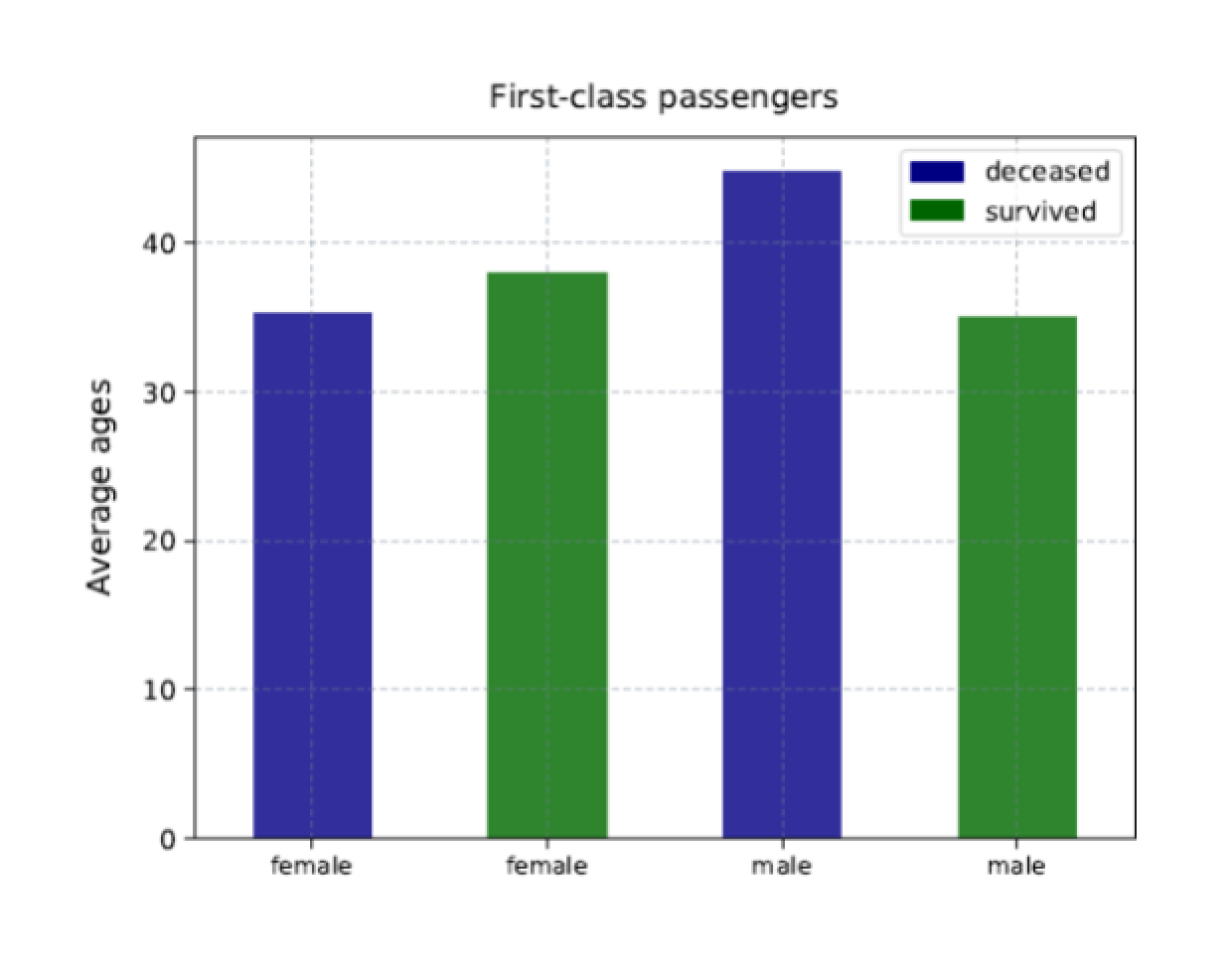
The chart includes a bar for each first-class group, sized according to the average age of that group. In addition, each bar is color-coded to match the group’s status, with a legend that provides a key for how the colors are used.
Generating multiple bar charts
The bar chart above provides a straightforward, easy-to-understand visualization of the underlying data. Restricting the results to the first-class group makes it clear how the data is distributed. We could have incorporated all the data from the df dataset into the chart, but that might have made the results less clear, although in this case, one chart might have been okay, given that the df dataset includes only 12 rows.
However, another approach that can be extremely effective when visualizing data is to generate multiple related charts, as shown in the following example:
|
1 2 3 4 5 6 7 8 9 10 11 12 13 14 15 16 17 18 19 20 21 22 23 24 25 26 27 28 29 30 31 32 33 34 35 36 37 38 39 40 41 42 43 44 45 46 47 48 49 50 51 52 53 54 55 56 57 58 59 60 61 62 |
DECLARE @pscript NVARCHAR(MAX); SET @pscript = N' # import Python modules import matplotlib matplotlib.use("PDF") import matplotlib.pyplot as plt import matplotlib.patches as ptch import pandas as pd # define the titanic data frame titanic = pd.read_csv("c:\\datafiles\\titanic.csv", index_col=0) titanic = titanic[titanic["Age"].notnull()] titanic["Survived"] = titanic["Survived"].map({0:"deceased", 1:"survived"}) for i, row in titanic.iterrows(): if (row["Age"].is_integer() == False): titanic.drop(i, inplace=True) # define the df data frame based on titanic data df = titanic.groupby(["PClass", "Sex", "Survived"], as_index=False).agg({"Age": ["mean", "count"]}) df["Age"] = df["Age"].round(2) df.columns = ["class", "gender", "status", "age", "count"] # define the subplot data frames based on df data df1 = df.loc[(df["class"] == "1st"), ["gender", "status", "age"]] df2 = df.loc[(df["class"] == "2nd"), ["gender", "status", "age"]] df3 = df.loc[(df["class"] == "3rd"), ["gender", "status", "age"]] # define variables for the legend dc = ptch.Patch(color="navy", label="deceased") sv = ptch.Patch(color="darkgreen", label="survived") # set up the subplot structure fig, (ax1, ax2, ax3) = plt.subplots(nrows=1, ncols=3, sharey=True, figsize=(12,6)) # define the ax1 subplot ax1 = df1.plot.bar(x="gender", y="age", alpha=.8, ax=ax1, color=df1.status.map({"deceased":"navy", "survived":"darkgreen"})) ax1.set_title(label="First-class passengers", y=1.02) ax1.set_xticklabels(labels=df1["gender"], fontsize=9, rotation=0) ax1.xaxis.label.set_visible(False) ax1.set_ylabel("Average ages", labelpad=10, fontsize=12) ax1.grid(color="slategray", alpha=.5, linestyle="dotted", linewidth=.5) ax1.legend(handles=[dc, sv], loc="best") # define the ax2 subplot ax2 = df2.plot.bar(x="gender", y="age", alpha=.8, ax=ax2, color=df2.status.map({"deceased":"navy", "survived":"darkgreen"})) ax2.set_title(label="Second-class passengers", y=1.02) ax2.set_xticklabels(labels=df1["gender"], fontsize=9, rotation=0) ax2.xaxis.label.set_visible(False) ax2.grid(color="slategray", alpha=.5, linestyle="dotted", linewidth=.5) ax2.legend(handles=[dc, sv], loc="best") # define the ax3 subplot ax3 = df3.plot.bar(x="gender", y="age", alpha=.8, ax=ax3, color=df3.status.map({"deceased":"navy", "survived":"darkgreen"})) ax3.set_title(label="Third-class passengers", y=1.02) ax3.set_xticklabels(labels=df1["gender"], fontsize=9, rotation=0) ax3.xaxis.label.set_visible(False) ax3.grid(color="slategray", alpha=.5, linestyle="dotted", linewidth=.5) ax3.legend(handles=[dc, sv], loc="best") # save the bar chart to PDF file plt.savefig("c:\\datafiles\\titanic2.pdf", bbox_inches="tight", pad_inches=.5)'; EXEC sp_execute_external_script @language = N'Python', @script = @pscript; GO |
Much of the code in the Python script is the same as the preceding example, with a few notable exceptions. The first is that the script now defines three subsets of data, one for each service class:
|
1 2 3 |
df1 = df.loc[(df["class"] == "1st"), ["gender", "status", "age"]] df2 = df.loc[(df["class"] == "2nd"), ["gender", "status", "age"]] df3 = df.loc[(df["class"] == "3rd"), ["gender", "status", "age"]] |
The next addition to the script is a statement that creates the structure necessary for rendering multiple charts:
|
1 2 |
fig, (ax1, ax2, ax3) = plt.subplots(nrows=1, ncols=3, sharey=True, figsize=(12,6)) |
The statement uses the subplots function that is part of the matplotlib.pyplot package to define a structure that includes three charts, positioned in one row with three columns. The nrows parameter determines the number of rows, and the ncols parameter determines the number of columns, resulting in a total of three charts. This will cause the function to generate three AxesSubplot objects, which are saved to the ax1, ax2, and ax3 variables. The function also generates a Figure object, which is saved to the fig variable, although you don’t need to do anything specific with that variable going forward.
The third parameter in the subplots function is sharey, which is set to True. This will cause the Y-axis labels associated with the first chart to be shared across the row with all charts, rather than displaying the same labels for each chart. This is followed with the figsize parameter, which sets this figure’s width and height in inches.
The next step is to define each of three charts. The first definition is similar to the preceding example, with one important difference in the plot.bar function:
|
1 2 |
ax1 = df1.plot.bar(x="gender", y="age", alpha=.8, ax=ax1, color=df1.status.map({"deceased":"navy", "survived":"darkgreen"})) |
The function now includes the ax parameter, which instructs Python to assign this plot to the ax1 AxesSubplot object. This ensures that the plot definition is incorporated into the single fig object.
The remaining chart definitions take the same approach, except that ax1 is swapped out for ax2 and ax3, respectively, and the df1 data frame is swapped out for df2 and df3. The two remaining chart definitions also do not define a Y-axis label. The following figure shows the resulting charts.
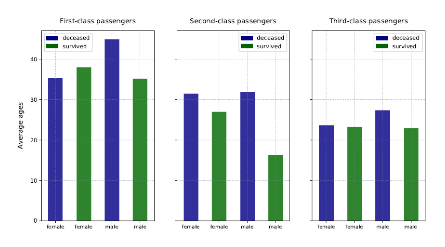
Notice that only the first chart includes the Y-axis labels and that each chart is specific to the class of service. In addition, the legend is positioned differently within the charts, according to how the bars are rendered.
Breaking data into smaller charts can make the groups easier to grasp and to compare. You can do the same thing with the passenger counts, as shown in the following example:
|
1 2 3 4 5 6 7 8 9 10 11 12 13 14 15 16 17 18 19 20 21 22 23 24 25 26 27 28 29 30 31 32 33 34 35 36 37 38 39 40 41 42 43 44 45 46 47 48 49 50 51 52 53 54 55 56 57 58 59 60 61 62 |
DECLARE @pscript NVARCHAR(MAX); SET @pscript = N' # import Python modules import matplotlib matplotlib.use("PDF") import matplotlib.pyplot as plt import matplotlib.patches as ptch import pandas as pd # define the titanic data frame titanic = pd.read_csv("c:\\datafiles\\titanic.csv", index_col=0) titanic = titanic[titanic["Age"].notnull()] titanic["Survived"] = titanic["Survived"].map({0:"deceased", 1:"survived"}) for i, row in titanic.iterrows(): if (row["Age"].is_integer() == False): titanic.drop(i, inplace=True) # define the df data frame based on titanic data df = titanic.groupby(["PClass", "Sex", "Survived"], as_index=False).agg({"Age": ["mean", "count"]}) df["Age"] = df["Age"].round(2) df.columns = ["class", "gender", "status", "age", "count"] # define the subplot data frames based on df data df1 = df.loc[(df["class"] == "1st"), ["gender", "status", "count"]] df2 = df.loc[(df["class"] == "2nd"), ["gender", "status", "count"]] df3 = df.loc[(df["class"] == "3rd"), ["gender", "status", "count"]] # define variables for the legend dc = ptch.Patch(color="navy", label="deceased") sv = ptch.Patch(color="darkgreen", label="survived") # set up the subplot structure fig, (ax1, ax2, ax3) = plt.subplots(nrows=1, ncols=3, sharey=True, figsize=(12,6)) # define the ax1 subplot ax1 = df1.plot.bar(x="gender", y="count", alpha=.8, ax=ax1, color=df1.status.map({"deceased":"navy", "survived":"darkgreen"})) ax1.set_title(label="First-class passengers", y=1.02) ax1.set_xticklabels(labels=df1["gender"], fontsize=9, rotation=0) ax1.xaxis.label.set_visible(False) ax1.set_ylabel("Total passenger count", labelpad=10, fontsize=12) ax1.grid(color="slategray", alpha=.5, linestyle="dotted", linewidth=.5) ax1.legend(handles=[dc, sv], loc="best") # define the ax2 subplot ax2 = df2.plot.bar(x="gender", y="count", alpha=.8, ax=ax2, color=df2.status.map({"deceased":"navy", "survived":"darkgreen"})) ax2.set_title(label="Second-class passengers", y=1.02) ax2.set_xticklabels(labels=df1["gender"], fontsize=9, rotation=0) ax2.xaxis.label.set_visible(False) ax2.grid(color="slategray", alpha=.5, linestyle="dotted", linewidth=.5) ax2.legend(handles=[dc, sv], loc="best") # define the ax3 subplot ax3 = df3.plot.bar(x="gender", y="count", alpha=.8, ax=ax3, color=df3.status.map({"deceased":"navy", "survived":"darkgreen"})) ax3.set_title(label="Third-class passengers", y=1.02) ax3.set_xticklabels(labels=df1["gender"], fontsize=9, rotation=0) ax3.xaxis.label.set_visible(False) ax3.grid(color="slategray", alpha=.5, linestyle="dotted", linewidth=.5) ax3.legend(handles=[dc, sv], loc="best") # save the bar chart to PDF file plt.savefig("c:\\datafiles\\titanic3.pdf", bbox_inches="tight", pad_inches=.5)'; EXEC sp_execute_external_script @language = N'Python', @script = @pscript; GO |
This example is very similar to the preceding one, except that the data subsets have been updated to return the count column, rather than the age column:
|
1 2 3 |
df1 = df.loc[(df["class"] == "1st"), ["gender", "status", "count"]] df2 = df.loc[(df["class"] == "2nd"), ["gender", "status", "count"]] df3 = df.loc[(df["class"] == "3rd"), ["gender", "status", "count"]] |
You must also update the plot.bar function calls that defines the subplots to reflect that the count column should be used for Y-axis:
|
1 2 |
ax1 = df1.plot.bar(x="gender", y="count", alpha=.8, ax=ax1, color=df1.status.map({"deceased":"navy", "survived":"darkgreen"})) |
Also, be sure to update the Y-axis labels:
|
1 |
ax1.set_ylabel("Total passenger count", labelpad=10, fontsize=12) |
Other than these changes, the rest of the script is the same. Your charts should now look like those shown in the following figure:
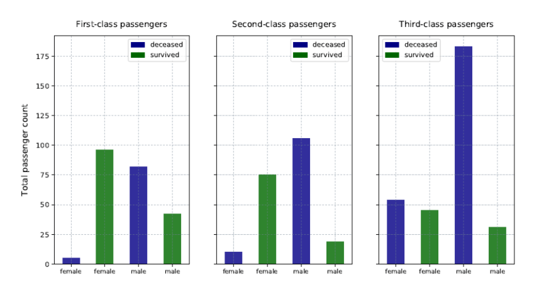
Although the charts are similar to those in the preceding example, the data is much different. However, you can still easily find meaning in that data.
Generating multiple types of bar charts
You can also mix things up, providing charts that reflect both the average ages and passenger counts within one figure. You need only do some rearranging and make some additions, as shown in the following example:
|
1 2 3 4 5 6 7 8 9 10 11 12 13 14 15 16 17 18 19 20 21 22 23 24 25 26 27 28 29 30 31 32 33 34 35 36 37 38 39 40 41 42 43 44 45 46 47 48 49 50 51 52 53 54 55 56 57 58 59 60 61 62 63 64 65 66 67 68 69 70 71 72 73 74 75 76 77 78 79 80 81 82 83 84 85 86 87 88 89 90 91 92 93 94 |
DECLARE @pscript NVARCHAR(MAX); SET @pscript = N' # import Python modules import matplotlib matplotlib.use("PDF") import matplotlib.pyplot as plt import matplotlib.patches as ptch import pandas as pd # define the titanic data frame titanic = pd.read_csv("c:\\datafiles\\titanic.csv", index_col=0) # 1313 rows titanic = titanic[titanic["Age"].notnull()] # 756 rows titanic["Survived"] = titanic["Survived"].map({0:"deceased", 1:"survived"}) for i, row in titanic.iterrows(): if (row["Age"].is_integer() == False): titanic.drop(i, inplace=True) # 748 rows # define the df data frame based on titanic data df = titanic.groupby(["PClass", "Sex", "Survived"], as_index=False).agg({"Age": ["mean", "count"]}) df["Age"] = df["Age"].round(2) df.columns = ["class", "gender", "status", "age", "count"] # define the subplot data frames based on df data df1 = df.loc[(df["class"] == "1st"), ["gender", "status", "age"]] df2 = df.loc[(df["class"] == "1st"), ["gender", "status", "count"]] df3 = df.loc[(df["class"] == "2nd"), ["gender", "status", "age"]] df4 = df.loc[(df["class"] == "2nd"), ["gender", "status", "count"]] df5 = df.loc[(df["class"] == "3rd"), ["gender", "status", "age"]] df6 = df.loc[(df["class"] == "3rd"), ["gender", "status", "count"]] # define variables for the legend dc = ptch.Patch(color="navy", label="deceased") sv = ptch.Patch(color="darkgreen", label="survived") # set up the subplot structure fig, ((ax1, ax2), (ax3, ax4), (ax5, ax6)) = plt.subplots(nrows=3, ncols=2, sharex=True, figsize=(14,12)) # define the ax1 subplot ax1 = df1.plot.bar(x="gender", y="age", alpha=.8, ax=ax1, color=df1.status.map({"deceased":"navy", "survived":"darkgreen"})) ax1.set_title(label="First-class passengers", y=1.02) ax1.set_xticklabels(labels=df1["gender"], fontsize=9, rotation=0) ax1.xaxis.label.set_visible(False) ax1.set_ylabel("Average ages", labelpad=5, fontsize=12) ax1.grid(color="slategray", alpha=.5, linestyle="dotted", linewidth=.5) ax1.legend(handles=[dc, sv], loc="best") # define the ax2 subplot ax2 = df2.plot.bar(x="gender", y="count", alpha=.8, ax=ax2, color=df2.status.map({"deceased":"navy", "survived":"darkgreen"})) ax2.set_title(label="First-class passengers", y=1.02) ax2.set_xticklabels(labels=df1["gender"], fontsize=9, rotation=0) ax2.xaxis.label.set_visible(False) ax2.set_ylabel("Total passenger count", labelpad=5, fontsize=12) ax2.grid(color="slategray", alpha=.5, linestyle="dotted", linewidth=.5) ax2.legend(handles=[dc, sv], loc="best") # define the ax3 subplot ax3 = df3.plot.bar(x="gender", y="age", alpha=.8, ax=ax3, color=df3.status.map({"deceased":"navy", "survived":"darkgreen"})) ax3.set_title(label="Second-class passengers", y=1.02) ax3.set_xticklabels(labels=df1["gender"], fontsize=9, rotation=0) ax3.xaxis.label.set_visible(False) ax3.set_ylabel("Average ages", labelpad=5, fontsize=12) ax3.grid(color="slategray", alpha=.5, linestyle="dotted", linewidth=.5) ax3.legend(handles=[dc, sv], loc="best") # define the ax4 subplot ax4 = df4.plot.bar(x="gender", y="count", alpha=.8, ax=ax4, color=df4.status.map({"deceased":"navy", "survived":"darkgreen"})) ax4.set_title(label="Second-class passengers", y=1.02) ax4.set_xticklabels(labels=df1["gender"], fontsize=9, rotation=0) ax4.xaxis.label.set_visible(False) ax4.set_ylabel("Total passenger count", labelpad=5, fontsize=12) ax4.grid(color="slategray", alpha=.5, linestyle="dotted", linewidth=.5) ax4.legend(handles=[dc, sv], loc="best") # define the ax5 subplot ax5 = df5.plot.bar(x="gender", y="age", alpha=.8, ax=ax5, color=df5.status.map({"deceased":"navy", "survived":"darkgreen"})) ax5.set_title(label="Third-class passengers", y=1.02) ax5.set_xticklabels(labels=df1["gender"], fontsize=9, rotation=0) ax5.xaxis.label.set_visible(False) ax5.set_ylabel("Average ages", labelpad=5, fontsize=12) ax5.grid(color="slategray", alpha=.5, linestyle="dotted", linewidth=.5) ax5.legend(handles=[dc, sv], loc="best") # define the ax6 subplot ax6 = df6.plot.bar(x="gender", y="count", alpha=.8, ax=ax6, color=df6.status.map({"deceased":"navy", "survived":"darkgreen"})) ax6.set_title(label="Third-class passengers", y=1.02) ax6.set_xticklabels(labels=df1["gender"], fontsize=9, rotation=0) ax6.xaxis.label.set_visible(False) ax6.set_ylabel("Total passenger count", labelpad=5, fontsize=12) ax6.grid(color="slategray", alpha=.5, linestyle="dotted", linewidth=.5) ax6.legend(handles=[dc, sv], loc="best") # save the bar chart to PDF file plt.savefig("c:\\datafiles\\titanic4.pdf", bbox_inches="tight", pad_inches=.5)'; EXEC sp_execute_external_script @language = N'Python', @script = @pscript; GO |
This time around, the script includes six subsets of data, three specific to age and three specific to passenger count:
|
1 2 3 4 5 6 |
df1 = df.loc[(df["class"] == "1st"), ["gender", "status", "age"]] df2 = df.loc[(df["class"] == "1st"), ["gender", "status", "count"]] df3 = df.loc[(df["class"] == "2nd"), ["gender", "status", "age"]] df4 = df.loc[(df["class"] == "2nd"), ["gender", "status", "count"]] df5 = df.loc[(df["class"] == "3rd"), ["gender", "status", "age"]] df6 = df.loc[(df["class"] == "3rd"), ["gender", "status", "count"]] |
The idea here is to include each class of service in its own row, giving us a figure with three rows and two columns. To achieve this, you must update the subplots function call to reflect the new structure:
|
1 2 |
fig, ((ax1, ax2), (ax3, ax4), (ax5, ax6)) = plt.subplots(nrows=3, ncols=2, sharex=True, figsize=(14,12)) |
In addition to the updated nrows and ncols parameter values, the statement also includes six subplot variables, rather than three, with the variables grouped together by row. In addition, the sharey parameter has been replaced with the sharex parameter and the figure size increased.
The next step is to define the six subplots, following the same structure as before, but providing the correct data subsets, subplot variables, column names and labels. The result is a single .pdf file with six charts, as shown in the following figure.
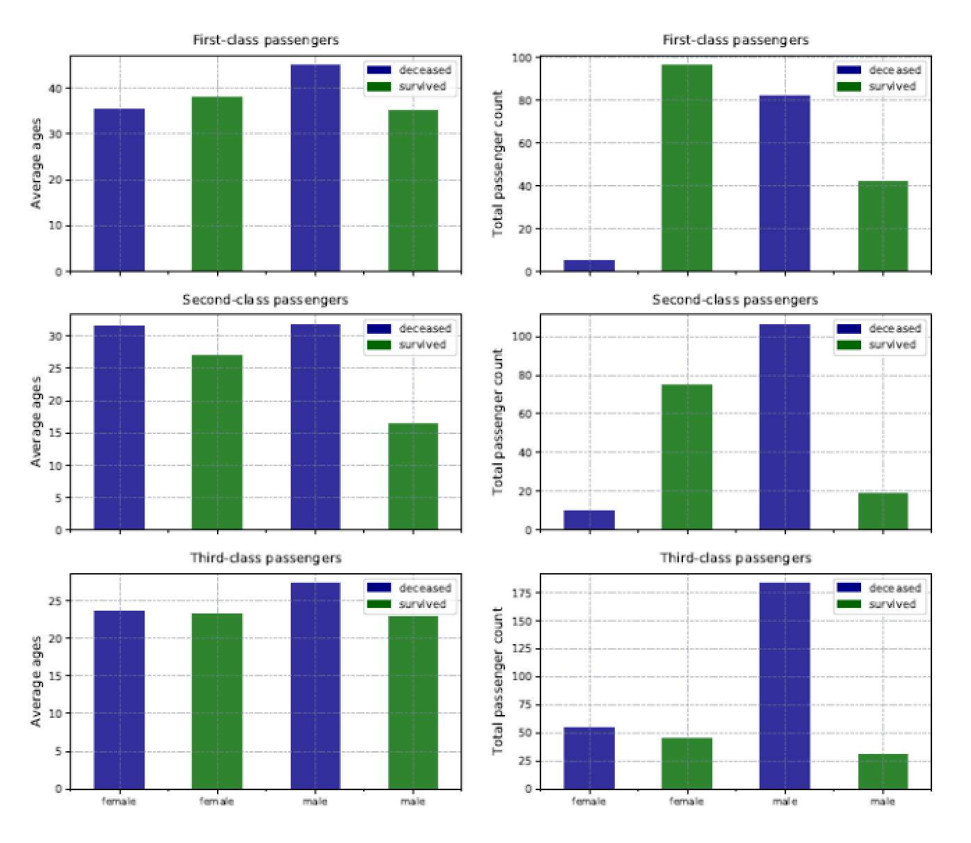
The challenge with this approach is that each chart scales differently. Mixing charts in this way can make it difficult to achieve matching scales. On the plus side, you’re able to visualize a great number of details within a collected set of charts, while still making it possible to quickly compare and understand the data.
The approach taken in this example is not the only way to create these charts. For instance, you might be able to set up a looping structure or use variables for repeated parameter values to simplify the subplot creation, but this approach allows you to see the logic behind each step in the chart-creation process. Like any other aspect of Python, there are often several ways to achieve the same results.
Python’s expansive world
As datasets become larger and more complex, the need is greater than ever for tools that can present the data to various stakeholders in ways that are both meaningful and easy to understand. SQL Server’s support for Python and the R language, along with the analytic and visualization capabilities they bring, could prove an invaluable addition to your arsenal for working with SQL Server data.
When it comes to visualizations in particular, Python has a great deal to offer, and what we’ve covered so far barely scratches the surface. Of course, we could say the same thing about most aspects of Python. It is a surprisingly extensive language that is both intuitive and flexible, and can be useful in a wide range of circumstances. Being able to work with Python within the context of a SQL Server database makes it all the better.
This document contains proprietary information and is protected by copyright law.
Copyright © 2026 Red Gate Software Limited. All rights reserved


Load comments