
DAX (Data Analysis Expressions) calculated columns in Power BI and Tabular models add derived columns computed from existing column values using DAX formulas – the computation happens at data refresh/load time, the results are materialized and stored in the model, and the columns participate in relationships, slicers, and visuals like any other column. This article walks through calculated column creation.
This includes:
- DAX expression syntax;
- Handling data types (numeric, text, date, logical);
- Row context behavior (each row’s columns are accessible by name);
- Filter context implications;
- RELATED for cross-table single-row lookups;
- RELATEDTABLE for cross-table many-row references;
- Iterator functions (SUMX, AVERAGEX, MAXX, MINX) that apply per-row DAX expressions inside an aggregation.
Additionally, many common patterns are covered in this article, including: derived columns for categorization, time-intelligence columns, ranking columns, and cross-table denormalization.
Keep calculated columns to a minimum – each one adds to model size and refresh time; prefer measures where aggregation is the goal.
Crucial distinction: DAX measures (also written in DAX) compute at query time based on the current filter context – they’re aggregations that change with user interaction. Calculated columns compute once per row and persist. Rule of thumb: use calculated columns when you need a row-level derived value (ProductCategory = IF(Price > 100, ‘Premium’, ‘Standard’)); use measures when you need aggregation that responds to user filters (Total Sales = SUM(Sales[Amount])).
The series so far:
- Creating Calculated Columns Using DAX
- Creating Measures Using DAX
- Using the DAX Calculate and Values Functions
- Using the FILTER Function in DAX
- Cracking DAX – the EARLIER and RANKX Functions
- Using Calendars and Dates in Power BI
- Creating Time-Intelligence Functions in DAX
Introduction
DAX is Microsoft’s new(ish) language which allows you to return results from data stored using the xVelocity database engine, which, unlike for most databases, stores data in columns rather than rows. You can program in DAX within Power BI (Microsoft’s flagship BI tool), PowerPivot (an Excel add-in which allows you to create pivot tables based on multiple tables) and Analysis Services Tabular Model (the successor to SSAS Multi-Dimensional, which allows you to share data models and implement security).
As the demand for these technologies increases, I have been teaching these topics (Power BI, PowerPivot and SSAS Tabular, as well as in DAX) to countless students in the UK. In the hopes that I can reach even more students, I decided to write this series of articles for the great readers of Simple-Talk.
This article shows how to create a calculated column using DAX. If you’re not sure what I mean by this, here’s an example from Power BI:

I’ve used Power BI for all my examples, but the methods and formulae used would be identical in PowerPivot or SSAS Tabular.
The Underlying Database for this Series of Articles
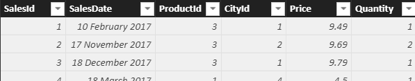
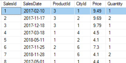
The examples in this article are based on this simple database, containing sales of fluffy toys:

You can follow all the examples on your computer – just download this Excel workbook containing these four tables or run this SQL Server script to generate the database. You’ll then need to import the tables into a Power BI report, PowerPivot data model, or SSAS Tabular model.
Creating a Basic Calculated Column
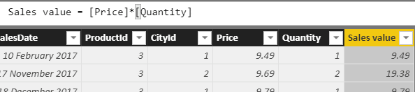
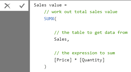
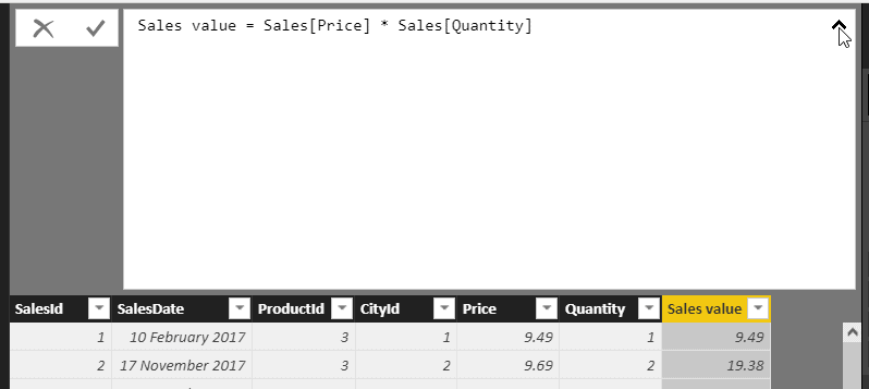
Let’s start with the basics. Suppose you want to calculate the value of each sale in the database by multiplying the price times the quantity. For the first item in the Sales table, this should give 9.49 since someone bought 1 item on 10th February 2017, at a price of 9.49.
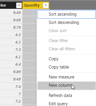
To do this, create a formula which multiplies the price by the quantity for each row. Start by adding a column. Here’s how to do this in Power BI:
Now rename the column. Call it Sales value. You don’t need to be afraid of using spaces in column names in Power BI; they work perfectly:
You can now either click on the first column to which you want to refer or type in a square bracket ( [ ) symbol to bring up a list of columns:
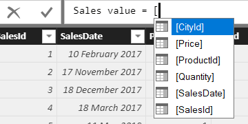
It’s enough to type in a single P in this instance:
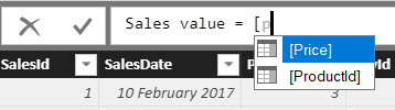
You can now press the TAB key to add the selected item into your formula, then continue typing to complete your formula:
Alternatives to Calculated Columns
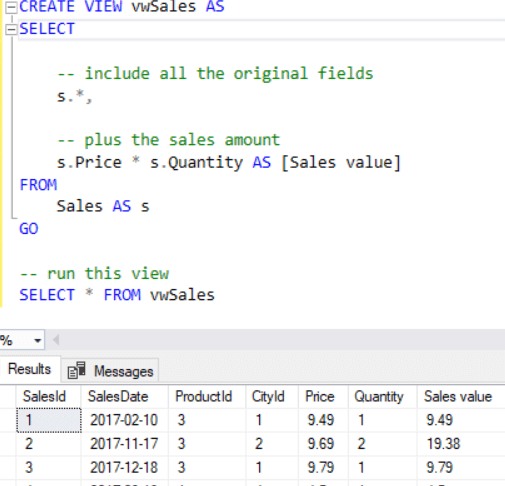
Calculated columns aren’t the only way to show the sales value for each transaction. There are at least three possible alternative ways to get at the sales value for each row in the example. Firstly, you could add the column to the underlying data source, for example, by creating a view in SQL like the one below:
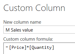
A second way to avoid using calculated columns would be to do the calculation using the M formula language in the Query Editor (for SSAS Tabular this is only possible for SQL Server 2017 and later):
And a third way is not to add the column at all, but to create it on the fly in a measure. Here’s an example of a measure to do this. I’ll cover measures in a later article in this series, but the comments should make it reasonably obvious what this is doing:
The obvious question is which of these three methods is the best one? I think it’s easiest to create the calculated column in DAX, but it will slow up processing data and eat up memory. How so? When you refresh your data in a data model, Power BI, PowerPivot or SSAS Tabular divides the process (forgive the pun) into two steps:
- Processing — loading a fresh copy of the data from the underlying data source into the data model.
- Recalculating — updating all the relationships and hierarchies in your model and recalculating all the calculated columns.
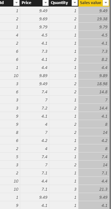
The more calculated columns you have, the slower processing may be. The column will also have a significant effect on the memory you use since it has much higher cardinality than either of the two columns it references. Here are the values for the price, quantity and sales amount columns for every sales transaction in the database:
The number of unique values in the three columns are as follows:
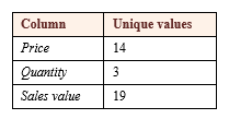
All programs using DAX store information in columns, not rows, an important point which I’ll keep coming back to in this series of articles. When importing the data, Power BI will construct a dictionary of unique values for each column, and the above table shows that the dictionary for the sales value column will occupy more space than the dictionary for the other two columns put together. This won’t be a problem with 25 rows, or even with 25,000, but with 25 million or even 25 billion rows, it might start using up valuable memory. Weighed against this is the fact that it will be convenient to have access to a ready-calculated sales column.
If you’re interested in how DAX stores data in columns I’ve included some more detailed examples at the end of this article.
Enjoying this article? Subscribe to the Simple Talk newsletter
Referring to Table Names in DAX Formulae
In general, it’s best practice in DAX to refer to columns using the TableName[ColumnName] syntax – so the formula would become:
|
1 |
Sales value = Sales[Price] * Sales[Quantity] |
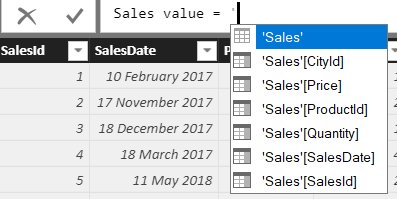
It’s helpful sometimes to type in a single apostrophe character to bring up a list of all the table names in a data model:
The apostrophes are essential for any table which has a name which is also a reserved word in Power BI, PowerPivot or SSAS Tabular. The following calculated column wouldn’t work without the apostrophes since Product is a reserved word in Power BI:
|
1 |
Discounted list price = 0.90 * 'Product'[ListPrice] |
Using Different DAX Editors
The Power BI, PowerPivot, and SSAS Tabular editors have all improved greatly over the years and versions (they needed to), but they can still be annoying at times. I have two particular bugbears:
- To put a carriage return into a formula, you need to hold down the SHIFT or ALT key and press ENTER. If you forget to hold down the SHIFT or ALT key, Power BI tries to validate the formula you’re editing, which invariably fails and wastes precious seconds of your life.
- There’s no easy way that I’ve ever found in Power BI to make the font bigger. You can click on the chevron shown below to make the editing window single-line or multi-line, but you can’t use CTRL and the mouse wheel to zoom in and out:
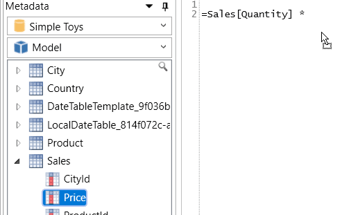
Because of these inconveniences, I often write my DAX formula in DAX Studio, a standalone editor which you can download here. It’s reasonably intuitive to use as the main thing to do when you run the application is to connect to a data model:
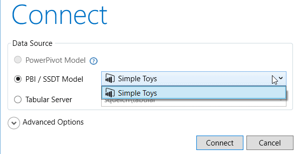
You can choose the Power BI or SSAS Tabular model you want to connect to, provided that you have a Power BI file or SSAS Tabular model open. To use DAX with PowerPivot, you must install the DAX Studio add-in, and then run this from within Excel.
You can now type in your DAX formulae, including dragging field or table names from the metadata shown on the left into your formula:
Eventually, you’ll have to copy this formula into Power BI, but at least it gives you a nice editing environment.
Testing Conditions Using IF
DAX contains the same IF function as Excel, which allows you to test whether a condition is true or not, and return different values in either case:
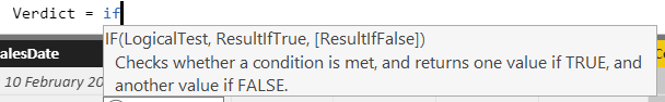
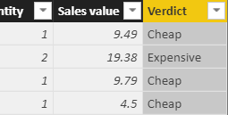
Suppose that you want to deliver a verdict on each sale – if it costs more than 10 units (let’s say they’re dollars, for the sake of argument), you’ll call it expensive. Otherwise you’ll call it cheap. Here’s a formula which would do this:
|
1 2 3 4 5 6 7 8 9 10 11 |
Verdict = IF( // if the sales amount is more than 10 ... [Sales value] > 10, // ... then show EXPENSIVE ... "Expensive", // ... otherwise, show CHEAP "Cheap" ) |
This new column would correctly distinguish between sales of more than or less than 10 dollars:
Testing Conditions Using SWITCH
It’s time now to complicate things – what happens if you want to show a verdict on each sale with the following criteria?
- Up to 5 dollars is Cheap.
- Between 5 and 10 dollars is Cheapish.
- From 10 to 15 dollars is Middling.
- Anything above 15 dollars is Expensive.
You could do this by nesting IF functions within each other, but the results would be difficult to read. A better solution is to use the SWITCH function, a version of which also exists in the latest versions of Excel, although many people aren’t aware of this.
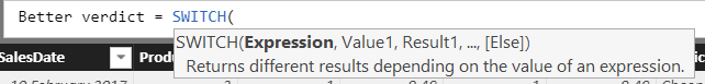
The first argument (the first bit of information the function asks for) is an expression. This can be anything, but typically is True(), showing that it will keep trying to evaluate possibilities until it finds something which is true. Once true is found, it will immediately stop. This is easier to understand if you look at the suggested formula:
|
1 2 3 4 5 6 7 8 9 10 11 12 13 14 15 16 17 18 19 20 21 22 23 |
Better Verdict = SWITCH( // we're looking for something which is true TRUE(), // start at the bottom - is this item's sales less // than or equal to 5? If so, it's cheap [Sales value] <= 5, "Cheap", // if we reach here, it wasn't less than 5, so // maybe it was greater than 5 but less than 10? [Sales value] < 10, "Cheapish", // OK, that failed too - maybe it was between 10 // and 15? [Sales value] < 15, "Middling", // if we get here, the sales value must be 15 or more "Expensive" ) |
You can have as many pairs of conditions and values as you like. You don’t have to have the ELSE value at the end, although, it’s highly recommended, as you may have inadvertently omitted some values from the tests.
Linking Tables Together Using RELATED
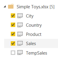
So far Excel users are probably wondering what’s different about DAX. You are about to find out! Suppose that you import all the worksheets in the supplied Excel workbook apart from the last one called TempSales:
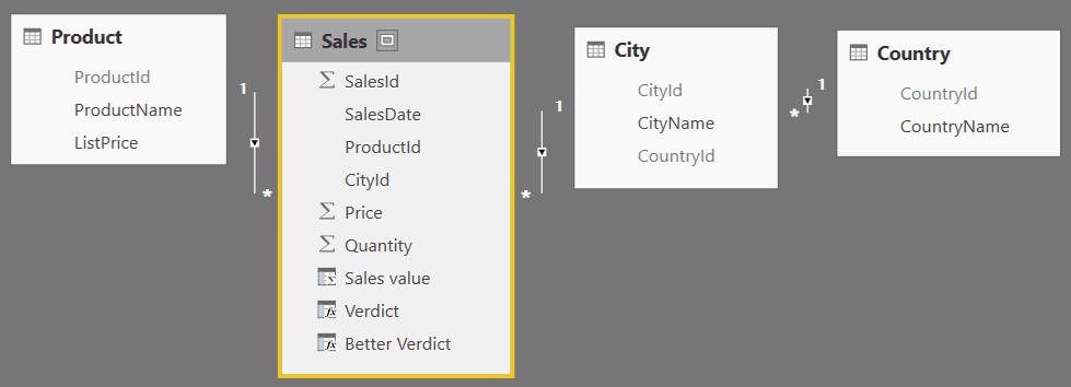
Your data model should now look like this:
This makes for a messy interface, as a user must figure out from which table to get fields:
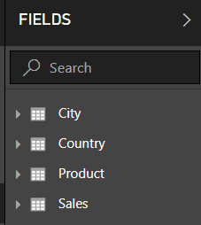
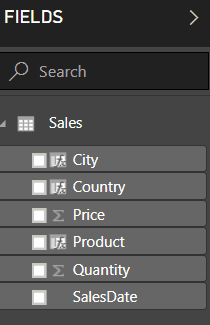
It would be better for the user if you could combine the fields into a single table like this:
There are two steps to accomplish this. The first is to hide tables and columns from report view, which you can do by right-clicking on them. This doesn’t remove them from the data, however.
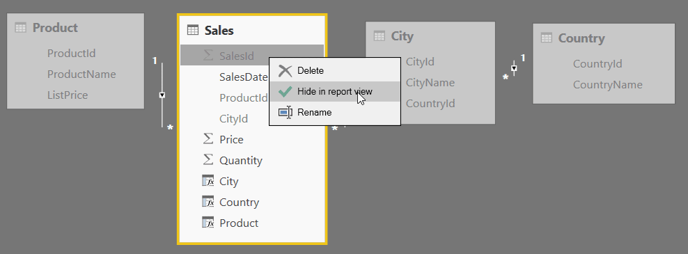
The other part of the magic is to add calculated columns to show the city, country, and product for each sale:
To do this, use the RELATED function:
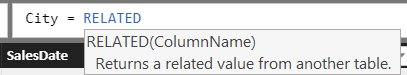
The RELATED function will look up the value of any other column in any other table, providing that there is a direct path between the two tables and that the question makes sense. For example, you could look up for any sale the name of the country in which it took place because each sale belongs to a single city, and each city belongs to a single country. It doesn’t make sense to go the other direction, to look up a sale for each country, because this wouldn’t be uniquely defined. The question doesn’t make sense.
Another way to look at this, is to check for each relationship whether it is one-to-many or many-to-one. I’ll cover the special case of one-to-one relationships later in this series of articles.
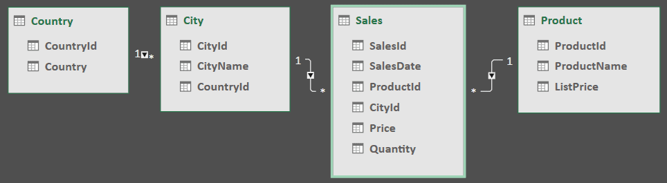
Using the above relationship diagram, you can see that one country has many cities and one city has many sales, so it’s legitimate to show the country where each sales transaction took place. The RELATED function is like the VLOOKUP function in Excel, with the difference being that you can daisy-chain between tables provided that they are joined by the correct type of relationship.
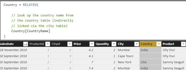
Here, for example, is the formula to show the country for each sale:
|
1 2 3 4 5 6 7 |
Country = RELATED( // look up the country name from // the country table (indirectly // linked via the city table) Country[CountryName] ) |
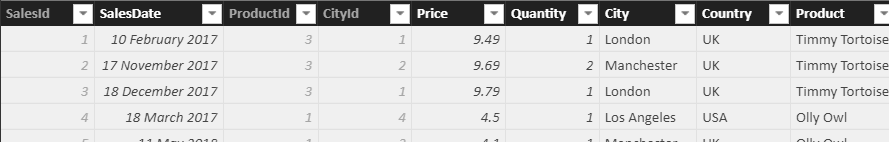
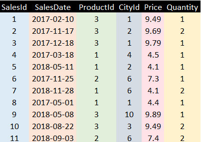
And here’s what the final sales table might look like after adding the Product and City columns as well with the same technique:
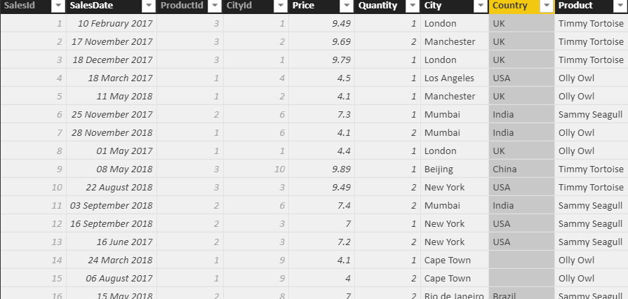
Note that there’s a problem with sales in Cape Town, which don’t seem to belong to any country – I’ll show how to resolve this further down in this article.
Simple Talk is brought to you by Redgate Software
Linking Tables Together Using RELATEDTABLE
The previous calculated columns show the parent for any child; the RELATEDTABLE function allows you to show the children for any parent. The difference is that whereas the RELATED function will always return a single value, the RELATEDTABLE function will always return a table of data.
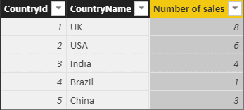
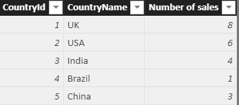
Here’s an example to show, for each country, how many sales took place within it:
|
1 2 3 4 5 6 |
Number of sales = COUNTROWS( // count how many rows there are in the // table of sales for this country RELATEDTABLE(Sales) ) |
The formula would return these values in this example:
Dealing with Blanks
If you’re a SQL programmer, you’ll be familiar with the perils of including null values in your formula since any formula which has a null value as one of its inputs tends to spit out a null value as its result. The equivalent to a null value in DAX is BLANK. You can test whether a column equals blank in one of two ways – either by comparing it directly with BLANK or by using the ISBLANK function.
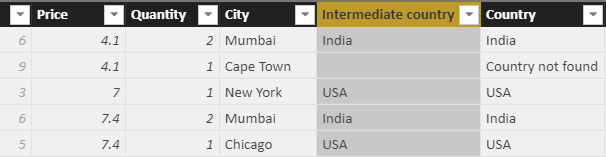
Review the example showing the country in which each sale took place. The results show a blank next to any sale in Cape Town:
Cape Town belongs to country number 6:
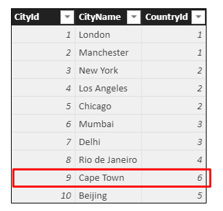
There is no country number 6 in the database which has caused the problem with Cape Town:
It’s not very good database design practice, but it is a very convenient way to illustrate how blanks work. The problem is that the RELATED function looks across to the country table and returns the country in which each sale takes place. For sales in Cape Town, the function can’t find a related country, and so just shows a blank.
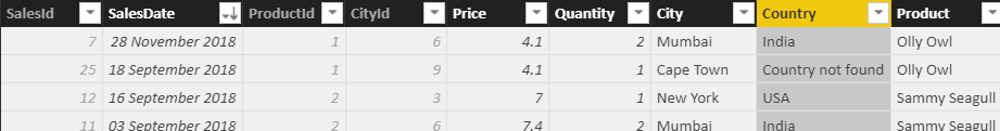
This looks suspicious, so change it to show the message “Country not found.” One way to do this is by testing to see whether the value returned from the RELATED function is a blank:
|
1 2 3 4 5 6 7 8 9 10 11 |
Country = IF( // if there's no country found for this sale ... RELATED(Country[CountryName]) = BLANK(), // ... show blank, or otherwise ... "Country not found", // ... show the country found RELATED(Country[CountryName]) ) |
Alternatively, you could use the ISBLANK function:
|
1 2 3 4 5 6 7 8 9 10 |
CountryISBLANK = IF( // if there's no country found for this sale ... ISBLANK(RELATED(Country[CountryName])), // ... show blank, or otherwise ... "Country not found", // ... show the country found RELATED(Country[CountryName]) ) |
In either case, the results are much better!
Perhaps an even better way to solve this problem is to create an intermediate column which you can then hide from view:
This will make the formula simpler since you won’t need to repeat the RELATED function. The formula for the intermediate country column above could be:
|
1 2 3 4 |
Intermediate country = // ... show the country found (may be blank) RELATED(Country[CountryName]) |
The formula for the final country column could then refer to the intermediate column:
|
1 2 3 4 5 6 7 8 9 10 11 |
Country = IF( // if the country returned is blank ... ISBLANK([Intermediate country]), // ... show suitable message ... "Country not found", // ... otherwise, show country name [Intermediate country] ) |
Dealing with Errors
The files referenced at the top of this article also include a separate table called TempSales which looks like this:
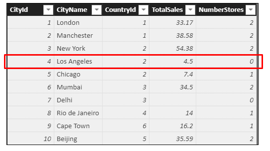
For some reason, Los Angeles has managed to record sales despite having no stores. How this happened is beyond the scope of this article (although it looks suspiciously like an attempt to create an example illustrating error-handling in DAX).
If you create a calculated column showing sales-per-store within this table, you will get an error:
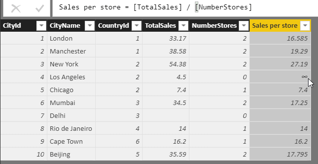
The reason there’s an infinity sign next to Los Angeles is that this row contains a divide-by-zero error. If you divide total sales for Los Angeles of 4.5 by the number of stores, 0, you get infinity. There are several possible solutions to this: don’t let the error happen in the first place, let it happen but trap it, or specifically watch out for divide-by-zero errors and handle them where they occur.
You could use the IF function to test if the denominator is zero, therefore, preventing the error in the first place. For those who have forgotten their schooldays:
- The numerator is the number on the top of a fraction; and
- The denominator is the number at the bottom.
In the equation 22/7, 22 is the numerator and 7 the denominator.
Using this method would give a calculated column like this:
|
1 2 3 4 5 6 7 8 9 10 |
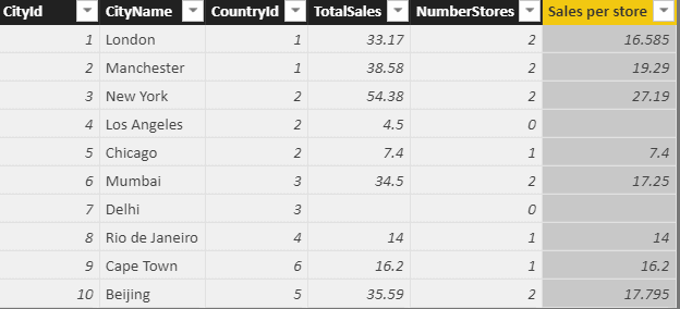
Sales per store = IF( // if no stores, show blank [NumberStores] = 0, BLANK(), // otherwise, do the division [TotalSales] / [NumberStores] ) |
This method would give the following results (as would the other two methods used below):
The second method for solving this problem is to use the IFERROR function, which works in the same way as it does in Excel. The first argument is the thing which may contain an error, and the second one is what you want to display if it does:
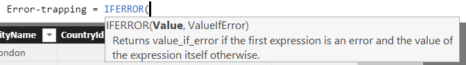
For this case, you could enter the following DAX formula for the calculated column:
|
1 2 3 4 5 6 7 8 |
Error-trapping = IFERROR( // try dividing sales by number of stores [TotalSales]/[NumberStores], // if this fails, show blank BLANK() ) |
The final method you could use is the DIVIDE function, which, as its name suggests, divides one number by another. The difference is that it automatically returns a value that you specify if this division returns a divide-by-zero error. The syntax of the function is:
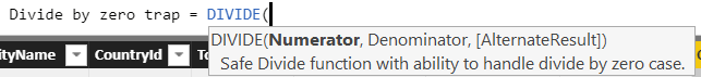
In this case, you could use the following formula:
|
1 2 3 4 5 6 7 8 9 10 |
Divide by zero trap = DIVIDE( // divide the sales by the number of stores [TotalSales], [NumberStores] // could specify what to return if denominator // is zero, but this will default to blank, // which is what we want ) |
Which of the three methods is best? I think a purist would answer the first one because it prevents the error from happening in the first place, but I’d go with the last one. If you’re going to trap for an error, it’s good to be as specific as possible about the nature of the error you’re trapping; IFERROR is a bit vague.
Finally: How DAX Stores Data
To end this article, I’d like to expand a bit on how DAX stores data in columns, not rows. Understanding this will help you make sense of DAX formulae when they get more complicated (which they certainly will!).
To explain column storage, I’m going to take a quick digression into image compression. As my youngest daughter says: “Bear with!”.
Here’s a picture of a house (and a very nice one it is too):

Notice how the sky is the same shade of blue nearly everywhere. To store this image, you wouldn’t have to store every pixel; instead, you could use an image compression algorithm to condense everything down, using the fact that lots of adjacent pixels share the same colour. An image which compresses down to a small size tends to be one which would be hard to do as a jigsaw!
The above example is a bit complicated, so here’s an easier one:
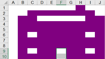
Not quite as nice a house, but much easier to use for an explanation! Here’s how to store this as a compressed image. First, build a dictionary of colours:
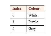
Now (starting from the top left) create a table showing how the colours are used:
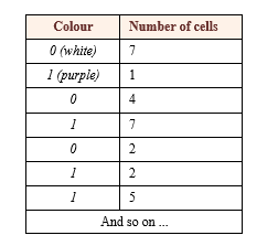
By my calculation, this table will have 34 rows. Instead of storing 100 different cell/colour combinations, I’m storing three colours and 34 rows, reducing the size of the image by a factor of three. Real image compression algorithms are much more sophisticated than this, but the principle is the same.
What has all this got to do with column storage? Well, the principle is identical. Here’s what you might think the sales table would look like when storing each row as a separate entity:
Here’s what the table actually looks like to DAX. Each column is stored separately, although not necessarily using different colours!
The engine which stores data for PowerPivot, Power BI and SSAS Tabular is called the xVelocity engine (at least, it has been called that since SQL Server 2012). This database engine would store each column above separately. To show how this works, consider the ProductId column, which starts like this:
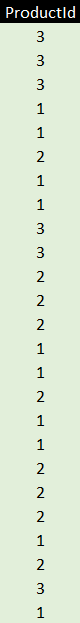
The first thing the database engine would do is to build a dictionary of unique values:
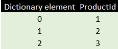
There are only three rows because, although there are 25 sales, these are all for one or another of the same three products. The engine would then store for each product its dictionary entry.
This storage method allows the xVelocity engine to compress data so that it takes up less memory. The storage method also allows DAX to access all the values in a column more quickly. It’s one reason why aggregating data over a column is so quick in DAX: all the figures you’re aggregating are stored in the same place. It’s worth bearing all of this in mind when you’re writing DAX formulae and reading the rest of this series.
A Footnote: Efficient Storage
One of the consequences of the above storage algorithm is that the database engine will store columns with low granularity (i.e., with lots of repeated values) much more efficiently. In the diagram below, I’ve changed the colours to reflect how expensive each column is to store:
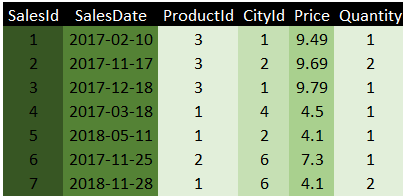
The SalesId column is the most expensive item to store because it has no duplicate values at all. It’s the primary key in the Sales table, so that’s unique by definition. The best thing to do to the data model would be to delete this column since it’s not used in any reports, and it’s not needed for any of the relationships.
Unfortunately, you probably do need all the other columns in this table. Product id and city id fields are needed to link tables together. The price and quantity are needed to create measures, and the sales date are used to report figures by month, quarter and year.
Conclusion
This article has shown that you can create formulae to calculate columns within a table in Power BI, PowerPivot or SSAS Tabular. Although these formulae use the DAX language, they look remarkably similar to formulae used within Excel. You’ve also seen that DAX stores data in columns rather than rows, which has important implications. Every calculated column that you create will need to be stored separately in memory. The next article in this series will look at the flip-side to calculated columns – measures – and explain the two most important concepts in DAX, which are row context and filter context.
This document contains proprietary information and is protected by copyright law.
Copyright © 2026 Red Gate Software Limited. All rights reserved


Load comments