The series so far:
- Statistics in SQL: Pearson’s Correlation
- Statistics in SQL: Kendall’s Tau Rank Correlation
- Statistics in SQL: Simple Linear Regressions
- Statistics in SQL: The Kruskal–Wallis Test
- Statistics in SQL: The Mann–Whitney U Test
- Statistics in SQL: Student's T Test
Let’s imagine that we have two variables, X and Y which we then plot using scatter graph.
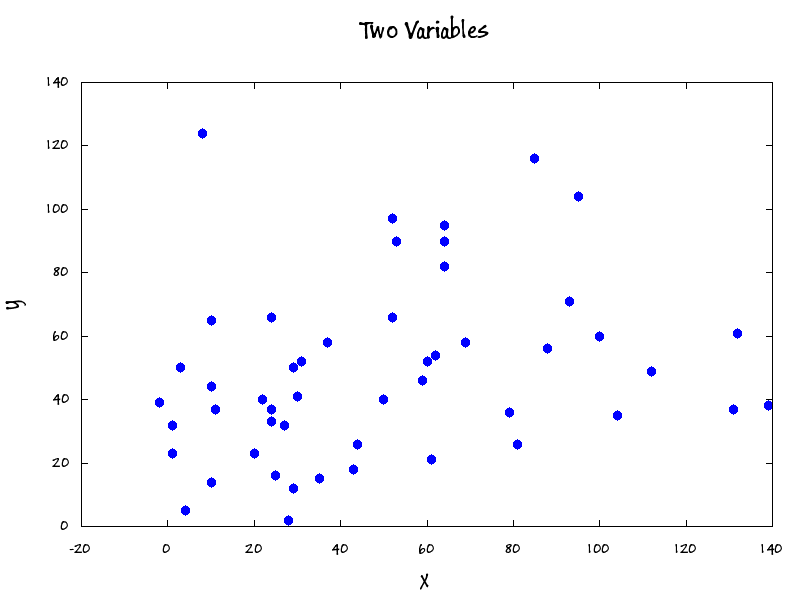
It looks a bit like someone has fired a shotgun at a wall but is there a relationship between the two variables? If so, what is it? There seems to be a weak positive linear relationship between the two variables here so we can be fairly confident of plotting a trendline.
Here is the data, and we will proceed to calculate the slope and intercept. We will also calculate the correlation.
|
1 2 3 4 5 6 7 8 9 10 11 12 13 14 15 16 17 18 19 20 21 22 23 24 25 26 27 28 29 30 31 32 33 34 35 36 37 |
SET ARITHABORT ON; DECLARE @OurData TABLE ( x NUMERIC(18,6) NOT NULL, y NUMERIC(18,6) NOT NULL ); INSERT INTO @OurData (x, y) SELECT x,y FROM (VALUES (1,32),(1,23),(3,50),(11,37),(-2,39),(10,44),(27,32),(25,16),(20,23), (4,5),(30,41),(28,2),(31,52),(29,12),(50,40),(43,18),(10,65),(44,26), (35,15),(24,37),(52,66),(59,46),(64,95),(79,36),(24,66),(69,58),(88,56), (61,21),(100,60),(62,54),(10,14),(22,40),(52,97),(81,26),(37,58),(93,71), (64,82),(24,33),(112,49),(64,90),(53,90),(132,61),(104,35),(60,52), (29,50),(85,116),(95,104),(131,37),(139,38),(8,124) )f(x,y) SELECT ((Sy * Sxx) - (Sx * Sxy)) / ((N * (Sxx)) - (Sx * Sx)) AS a, ((N * Sxy) - (Sx * Sy)) / ((N * Sxx) - (Sx * Sx)) AS b, ((N * Sxy) - (Sx * Sy)) / SQRT( (((N * Sxx) - (Sx * Sx)) * ((N * Syy - (Sy * Sy))))) AS r FROM ( SELECT SUM([@OurData].x) AS Sx, SUM([@OurData].y) AS Sy, SUM([@OurData].x * [@OurData].x) AS Sxx, SUM([@OurData].x * [@OurData].y) AS Sxy, SUM([@OurData].y * [@OurData].y) AS Syy, COUNT(*) AS N FROM @OurData ) sums; |
It gives the result…
![]()
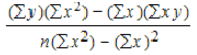
Alpha was calculated by this expression, …
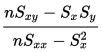
… Beta was calculated thus.
… and Rho by this
The Pearson’s Product Moment correlation can be used to calculate the probability of this being a significant correlation via the Fisher Transformation.
The slope (beta) and intercept (alpha) can be used to calculate any point on the trendline.
We can, for example calculate the value of Y when X is 100 by the equation
y’ = a + bx
Is, in our example
|
1 |
SELECT 38.656537+(0.202330*100) AS y |
We can calculate the trendline X,Y points by slightly altering the SQL
|
1 2 3 4 5 6 7 8 9 10 11 12 13 14 15 16 17 18 19 20 21 22 23 24 25 26 27 |
SELECT alpha, beta, rho, Minx AS xLineMin, alpha + (beta * Minx) AS yLineMin, Maxx AS xLineMax, alpha + (beta * Maxx) AS yLineMax FROM ( SELECT --Sx,Sy,Sxx,Sxy,Syy,N, Maxx, Minx, Maxy, Miny, ((Sy * Sxx) - (Sx * Sxy)) / ((N * (Sxx)) - (Sx * Sx)) AS alpha, ((N * Sxy) - (Sx * Sy)) / ((N * Sxx) - (Sx * Sx)) AS beta, ((N * Sxy) - (Sx * Sy)) / SQRT((((N * Sxx) - (Sx * Sx)) * ((N * Syy - (Sy * Sy))) ) ) AS rho FROM ( SELECT SUM([@OurData].x) AS Sx, SUM([@OurData].y) AS Sy, SUM([@OurData].x * [@OurData].x) AS Sxx, SUM([@OurData].x * [@OurData].y) AS Sxy, SUM([@OurData].y * [@OurData].y) AS Syy, COUNT(*) AS N, MAX([@OurData].x) AS Maxx, MIN([@OurData].x) AS Minx, MAX([@OurData].y) AS Maxy, MIN([@OurData].y) AS Miny FROM @OurData ) sums ) AlphaBetaRho; |
We can then plot a trend line
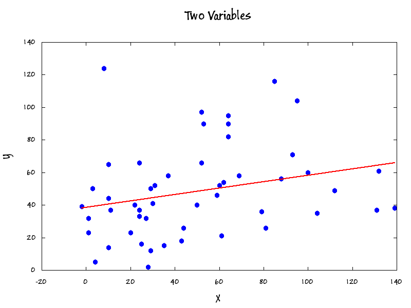
We are, of course, assuming a linear relationship and parametric data. With Pearson’s Rho and the number of X-Y pairs, we can go on to estimate the fisher transformation (t= 1.912) and probability of 0.061825.
The PowerShell to do the Gnuplot graphs is here
|
1 2 3 4 5 6 7 8 9 10 11 12 13 14 15 16 17 18 19 20 21 22 23 24 25 26 27 28 29 30 31 32 33 34 35 36 37 38 39 40 41 42 43 44 45 46 47 48 49 50 51 52 53 54 55 56 57 58 59 60 61 62 63 64 65 66 67 68 69 70 71 72 73 74 75 76 77 78 79 80 81 82 83 84 |
Set-Alias GnuPlot 'C:\Program Files\gnuplot\bin\gnuplot.exe' -Scope Script $gpscriptsPath='PathToMyScripts' $ScriptName='currentScript.gp' $PlotPath='PathToMyGraphsAndPlots $PlotFilename="$plotPath\scatterPlot.gif" #here is the gnuplot script. note that a dollars sign in the script #has to be escaped because we want to add PowerShell variables $TheScript=@" set termoption enhanced set terminal gif font 'Buxton Sketch-bold' size 800,600 set output '$PlotFilename' save_encoding = GPVAL_ENCODING set encoding utf8 set title 'Two Variables' font ',20' set xlabel 'X' font ',14' set ylabel 'Y' font ',14' `$grid << EOD 1 32 1 23 3 50 11 37 -2 39 10 44 27 32 25 16 20 23 4 5 30 41 28 2 31 52 29 12 50 40 43 18 10 65 44 26 35 15 24 37 52 66 59 46 64 95 79 36 24 66 69 58 88 56 61 21 100 60 62 54 10 14 22 40 52 97 81 26 37 58 93 71 64 82 24 33 112 49 64 90 53 90 132 61 104 35 60 52 29 50 85 116 95 104 131 37 139 38 8 124 EOD `$line << EOD -2 38.2 139 66 EOD plot '`$grid' using 1:2 pt 7 ps 1.5 lc rgb "blue" title '', \ '`$line' using 1:2 with line lw 2 lc rgb "red" title '' "@ #we are using UTF8- usually a good idea with these applications. [System.IO.File]::WriteAllLines("$gpscriptsPath\$ScriptName",$TheScript, (New-Object System.Text.UTF8Encoding $False)) #now we simply execute it and admire the gif file containing the plot gnuplot "$gpscriptsPath\$ScriptName" [System.IO.File]::WriteAllLines("$gpscriptsPath\$ScriptName",$TheScript, (New-Object System.Text.UTF8Encoding $False)) |


Load comments