
Data analysis is the process by which data becomes understanding, knowledge and insight
In writing this article, I aim to show how you can explore data by analysis, using R to investigate data stored in flat files. In doing so, I’ll compare how some of these tasks are done in T-SQL and in R, as a way of introducing some of the basics of R for T-SQL developers.
Let’s assume that we are doing some preliminary investigation of some fairly structured data, and we want to perform a rudimentary analysis just to see if we can get value from it. This can of course be done with the tools of the trade in any RDBMS system, however with the R environment this is significantly more valuable because, even if we don’t take advantage of its unique ability to do parametric statistical analysis, it is free, takes little time compared to RDBMS systems and the data modelling part is fairly easy to do.
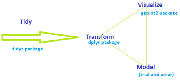
Here is what the data exploration process looks like:
This concept is not new, and it is applied similarly in the RDBMS world. The main contrast is that in ordinary RDBMS systems, the data gets persisted in several stages whereas in R the operations are done in memory as soon as the data is read into it. You can, of course, persist the data at any point with R, though without the resilience of a database. An additional contrast is that there is no need for a physical model layer in R, whereas the RDBMS heavily relies on it.
It is essential to tidy the data and have a manageable convention for it: In an RDBMS, every column refers to an attribute and every row denotes an entity. In R every column is called a variable, and every row is called an observation. The purpose of tidying the data is to form properly the variables and the observations, so it is easier to model, transform and visualize later on.
After the data is tidy, we get into the loop of modelling, transformation and visualization. This is an iterative task, which has the purpose of modeling and transforming the data until the best visualization can be produced. There are many ways to do the separate steps of modelling, transformation and visualization steps: However, in this article I have chosen to use dplyr and ggplot2 packages. I tried to be flippant by writing that the modelling is done by ‘trial and error’ – there are many packages which perform modelling and the most suitable choice depends on what our goal is: Are we doing regression? Are we doing predictive analysis? In this case I will do just a rudimentary exploration analysis, just to see if there is anything even worth extracting from the data. In the real world, this would be done first, and later on a modelling tool would be used to do a deeper analysis, depending on the findings of the exploratory analysis.
For this article, we will be using aircraft performance data as sample data. As a side note: I do not have deep knowledge about aircraft, but my curiosity about the field started early, after my first flight on a Tupolev-134.
The tidying process will be omitted, since the data I found on the net is very well structured, it is in a csv format already. You can download the datasets from the top of this article.
The tools of the trade
We will be using the R language environment for the purpose of data exploration: RStudio and two packages: dplyr and ggplot2. Dplyr is a powerful package for managing and transforming datasets and ggplot2 is a comprehensive package which is used to visualize the data.
Here are the most important commands in dplyr which we will be using in this article:
- Filter – filters rows that match certain criteria (in T-SQL this is achieved by the WHERE clause)
- Select – pick only certain columns from the dataset (in T-SQL this is done by selecting only certain columns to be returned)
- Arrange – reorder rows (in T-SQL this is done with the ORDER BY clause)
- Mutate – add new variables (columns, computed or not) (In DBMS this is done in variety of ways – either as computed columns in the schema layer, or as T-SQL expressions ’on the fly’ in the SELECT statements)
- Summarize – reduce variables to values (in T_SQL this is achieved with different aggregate functions called on the selected dataset and by performing some GROUP BY, if needed)
The basic construction of these commands is that the first argument is a dataframe, and subsequent arguments say what to do with the dataframe. The output is always a dataframe. Think of a dataframe as a structured table in a database or as a spreadsheet in Excel.
Here are some examples:
Create a dataset:
|
1 2 3 |
data <- data.frame( name = c("Alan", "Joe", "Tina", "Alan", "Suzan"), value = 1:5) |
Filter:
|
1 |
filter(data, name == "Alan") |
Note: just like in T-SQL there are many operators: !=, ==, %in%, etc
Select:
|
1 2 |
select(data, name) select(data, -name) |
Arrange:
|
1 2 |
arrange(data, name) arrange(data, desc(value)) |
Mutate:
|
1 2 |
mutate(data, double = 2 * value) mutate(data, double = 2 * value,quadruple = 2 * double) |
Summarize:
|
1 2 3 |
summarise(data, total = sum(value)) by_name <- group_by(data, name) summarise(by_name, total = sum(value)) |
Data pipelines
The downside of a functional interface is that it is very hard to read multiple operations. Consider even the above example of the summarize script. It creates a new object by_name, and then it runs the summarize function with it as a parameter.
With data pipelining it is much easier to express all this in a single line:
|
1 |
by_name <- group_by(data, name) %>% summarise(total = sum(value)) |
Data pipeline means that:
|
1 |
x %>% f(y) |
… is the same as …
|
1 |
f(x, y) |
This means that the left side of the %>% expression becomes the first parameter of the function which is on the right side.
It is time for the real data exploration
Get the data – load the data in variables
Now that we have the basic concepts of the modification of dataframes, let’s get into some data exploration.
I have been curious about airplanes and aviation in general for many years. I found some airplane specifications on the net containing technical data about the airplanes and their performance and would like to use the datasets to learn a bit more about the aircraft. Further, I would like to dig into the data and see if there are any interesting potential findings.
I have the aircraft specification data in several files:
- Aircraft_EnginesSpecs.csv
- Aircraft_PassengerFeaturesSpecs.csv
- Aircraft_SpeedAndAltitudeSpecs.csv
- Aircraft_WeightAndFuelSpecs.csv
- AircraftPerformance.csv
In the case of a RDBMS, we would have to import the data via one of the available tools – for SQL Server this might be SSIS, or T-SQL’s BULK IMPORT command. In either way, we would have to persist the data to disk in database tables with specific data types.
In R we just import the data into memory.
Let’s load the data in R by using the following commands (before we can run these commands, make sure the files are in the work directory of the R environment):
|
1 2 3 4 |
df.engineSpecs <- read.csv("Aircraft_EnginesSpecs.csv",header = TRUE, sep = ";") df.PassengerFeaturesSpecs <- read.csv("Aircraft_PassengerFeaturesSpecs.csv",header = TRUE, sep = ";") df.SpeedAndAltitudeSpecs <- read.csv("Aircraft_SpeedAndAltitudeSpecs.csv",header = TRUE, sep = ";") df.WeightAndFuelSpecs <- read.csv("Aircraft_WeightAndFuelSpecs.csv",header = TRUE, sep = ";") |
And after we import the data, let’s explore it:
|
1 2 3 4 |
head(df.engineSpecs) head(df.PassengerFeaturesSpecs) head(df.SpeedAndAltitudeSpecs) head(df.WeightAndFuelSpecs) |
The head() function returns the first few rows of the dataset:
|
1 |
> head(df.engineSpecs) |
|
1 2 3 4 5 6 7 |
Aircraft.Model Engine.Manufacturer Model...Type No..of.engines Static.thrust..kN. 1 AIRBUSA300-600R [1974] P&W 4158 2 257 2 AIRBUSA310-300 [1983] P&W 4152 2 231 3 AIRBUSA319-100 [1995] CFMI CFM56-5A4 2 99,7 4 AIRBUSA320-200 [1988] CFMI CFM56-5A3 2 111,2 5 AIRBUSA321-200 [1993] CFMI CFM56-5B3 2 142 6 AIRBUSA330-200 [1998] GE CF6-80E1A4 2 310 |
In T-SQL this will be done by a SELECT TOP(N) FROM… statement.
Examine the data
The next very important task is to check the data for duplicates. If we have duplicates, this will create problems later on when we join the datasets.
In R we can check for duplicates easily with a couple piped functions:
|
1 2 3 4 |
df.engineSpecs %>% group_by(Aircraft.Model) %>% summarise(count=n()) %>% filter(count!=1) df.PassengerFeaturesSpecs %>% group_by(Aircraft.Model) %>% summarise(count=n()) %>% filter(count!=1) df.SpeedAndAltitudeSpecs %>% group_by(Aircraft.Model) %>% summarise(count=n()) %>% filter(count!=1) df.WeightAndFuelSpecs %>% group_by(Aircraft.Model) %>% summarise(count=n()) %>% filter(count!=1) |
In T-SQL checking for duplicates can be done with a CTE by using the ranking partitioning function
... row_number() over(partition col1... order by col1) as [rankNumber] ...
The CTE will return the [rankNumber] column with value 1 for each unique value in col1 and will increase the count for each subsequent duplicate. To return the duplicate rows we would use a statement similar to SELECT * from CTE where [rankNumber] > 1
In this case there are duplicates in the engineSpecs file, and the result in R looks like this:
|
1 |
> df.engineSpecs %>% group_by(Aircraft.Model) %>% summarise(count=n()) %>% filter(count!=1)Source: local data frame [2 x 2] |
|
1 2 3 |
Aircraft.Model count 1 AIRBUSA319-100 [1995] 2 2 TUPOLEVTu-334 [2000] 2 |
To remove the duplicates, in T-SQL we would use the CTE mentioned above and a DELETE statement like DELETE from CTE where [rankNumber] > 1
In R we can remove the duplicate records by using the following code:
|
1 2 3 4 |
df.engineSpecs <- distinct(df.engineSpecs ,Aircraft.Model) df.PassengerFeaturesSpecs <- distinct(df.PassengerFeaturesSpecs ,Aircraft.Model) df.SpeedAndAltitudeSpecs <- distinct(df.SpeedAndAltitudeSpecs ,Aircraft.Model) df.WeightAndFuelSpecs <- distinct(df.WeightAndFuelSpecs ,Aircraft.Model) |
Join datasets into a dataframe
As a next step we will join the datasets together in one dataset. Joins in R are very similar to the concept of joins in T-SQL and I will not go in great detail about them. The important part here is to make sure that we check for the row count after each join and make sure the count does not increase significantly.
The code we will use for the join in R is:
|
1 2 3 4 5 6 |
df.aircraft_specs <- left_join(df.engineSpecs, df.PassengerFeaturesSpecs, by="Aircraft.Model") df.aircraft_specs %>% summarise(count=n()) df.aircraft_specs <- left_join(df.aircraft_specs, df.SpeedAndAltitudeSpecs, by="Aircraft.Model") df.aircraft_specs %>% summarise(count=n()) df.aircraft_specs <- left_join(df.aircraft_specs, df.WeightAndFuelSpecs, by="Aircraft.Model") df.aircraft_specs %>% summarise(count=n()) |
You might have noticed that I am using the df.aircraft_specs %>% summarise(count=n()) call to count the rows after each join.
Add new variables
After we have done the join, we have a master dataset, which looks like this:
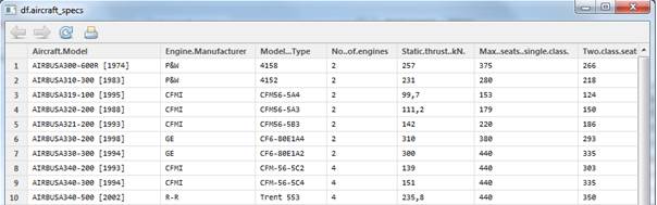
The dataset has 72 observations of 41 variables. This, translated to a T-SQL way of thinking, means that we have a table with 41 columns which contain values for 72 rows.
As we can see in the dataset, year that the aircraft was released held in the Aircraft.Model variable. The pattern is that the year is separated by [ and ]. It seems that this would be a valuable part of the data analysis, and it would be great if we could somehow extract this data into a separate variable.
In T-SQL we would use a substring() function on the Aircraft.Model column and load it with proper parameters for start and length of the substring.
In R we can use the mutate() function to create the extra variable and together with the sub() function and a regular expression to extract the release year.
|
1 |
df.aircraft_specs <- mutate(df.aircraft_specs, year=sub(".*\\[([0-9]{4})\\]","\\1",Aircraft.Model)) |
The next idea comes to mind: it would be great to extract variable which contains the decade when each aircraft was released.
|
1 2 3 4 5 6 7 8 9 10 11 12 13 14 |
df.aircraft_specs <- mutate(df.aircraft_specs, decade = as.factor( ifelse(substring(df.aircraft_specs$year,1,3)=='193','1930s', ifelse(substring(df.aircraft_specs$year,1,3)=='194','1940s', ifelse(substring(df.aircraft_specs$year,1,3)=='195','1950s', ifelse(substring(df.aircraft_specs$year,1,3)=='196','1960s', ifelse(substring(df.aircraft_specs$year,1,3)=='197','1970s', ifelse(substring(df.aircraft_specs$year,1,3)=='198','1980s', ifelse(substring(df.aircraft_specs$year,1,3)=='199','1990s', ifelse(substring(df.aircraft_specs$year,1,3)=='200','2000s', ifelse(substring(df.aircraft_specs$year,1,3)=='201','2010s',"ERROR" ))))))))) ) ) |
In T-SQL this can be done with a CASE function in a very similar manner as the code above.
Let’s see what distinct decades we have and how many aircraft per decade:
|
1 2 |
> select(df.aircraft_specs,decade) %>% group_by(decade) %>% summarise(count=n()) Source: local data frame [6 x 2] |
|
1 2 3 4 5 6 7 |
decade count 1 1950s 1 2 1960s 10 3 1970s 9 4 1980s 20 5 1990s 24 6 2000s 8 |
Now I am curious: which plane from the 50s do I have in the dataset? In T-SQL this will be done with a simple SELECT … WHERE statement, and in R this can be done with the piped select %>% filter command:
|
1 |
select(df.aircraft_specs,decade,Aircraft.Model) %>% filter(decade=="1950s") |
And the result is this:
|
1 2 |
decade Aircraft.Model 1 1950s DOUG.DC8-63 [1959] |
Explore the data
So far we have imported the data into memory, we have deduplicated the data, we have sorted out a few extra variables from the data (built year and decade) and now it is time to jump right in and see if we can get some value out of it. So far we have used the dplyr package (which covers most T-SQL operations) and now we will dive into the ggplot2 package, which corresponds to the SSRS component of SQL Server (or even Excel, if the data fits within the limitations of it).
We are looking for interesting features in the dataset: things that stand out, trends and relationships between variables. Of course, as it usually happens, the findings will certainly bring up more questions, and this is why the process of exploration is one of iterative cycles between modelling, transformation and visualization.
Let’s look at the thrust (the propulsive force of an engine) vs aircraft weight ratio first. We want to get an idea of what the distribution looks like. We can do this in a simple plot graph (in T-SQL we would write a simple SELECT statement which returns the columns we need and then feed the data to Excel or SSRS). In R this can be done with the ggplot2 package and the following code:
|
1 2 3 4 5 6 7 |
# static thrust vs weight filter(df.aircraft_specs,Max..take.off.weight.kg!=0,Static.thrust..kN.!=0) %>% ggplot( aes(x=Max..take.off.weight.kg/1000, y=as.numeric(as.character(Static.thrust..kN.)))) + geom_point(alpha=.4, size=4, color="#112277") + ggtitle("Thrust vs. weight") + labs(x="Max Takeoff weight kg*1000", y="Static Thrust") |
This returns the following graph:
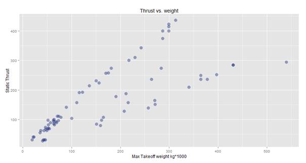
Ok, on first glance it looks good, but on a second thought there seems to be something strange: How come there are a couple relatively heavy planes that need way less thrust, compared to some relatively lighter planes? Another question comes to mind: is this true or is there a problem with the data? If it isthe data really is true, that would mean that some planes have incredibly better design than others. If so, why would anyone want a plane which has significantly poorer design; after all, the ideal case would be to lift off the heaviest plane with the least amount of thrust.
Then the solution dawns: After a closer look at the data, we establish that the Static.thrust..kN. column indicates the thrust of a single engine of the aircraft, and not the total thrust. This means that in order to get correct results, we would need to multiply the thrust by the number of engines.
|
1 2 3 4 5 6 7 |
# static thrust vs weight and number of engines filter(df.aircraft_specs,Max..take.off.weight.kg!=0,Static.thrust..kN.!=0,No..of.engines!=0) %>% ggplot( aes(x=Max..take.off.weight.kg/1000, y=Static.thrust..kN.*No..of.engines)) + geom_point(alpha=.4, size=4, color="#112277") + ggtitle("Thrust vs. weight and number of engines") + labs(x="Max Takeoff weight kg*1000", y="Static Thrust") |
After multiplying the thrust value by the number of engines (hopefully all engines are of the same kind and with the same specification!), we get the following result:
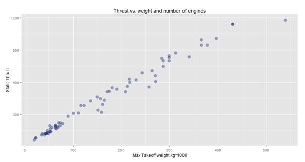
So, in this case it seems a bit more believable: the weight and thrust have an almost linear dependency. Even so, by looking at the graph we can see something quite interesting: the heaviest plane requires only little bit more thrust than the one that is next heaviest. Perhaps, we have seen the effect of some innovative design which might be worth researching.
We learned from this exercise that we should not trust the data blindly. When we plot a graph, we should look at it, and see if it seems reasonable enough for us to make decisions based on it.
Now let’s look at the top thrust vs speed:
|
1 2 3 4 5 6 7 |
# static thrust vs speed filter(df.aircraft_specs,Max.Speed..kt.!=0,Static.thrust..kN.!=0) %>% ggplot( aes(x=Static.thrust..kN.*No..of.engines, y=Max.Speed..kt.)) + geom_point(alpha=.4, size=4, color="#112277") + ggtitle("Thrust vs. speed") + labs(x="Static Thrust kN", y="Max speed kt") |
The graph we get looks like this:
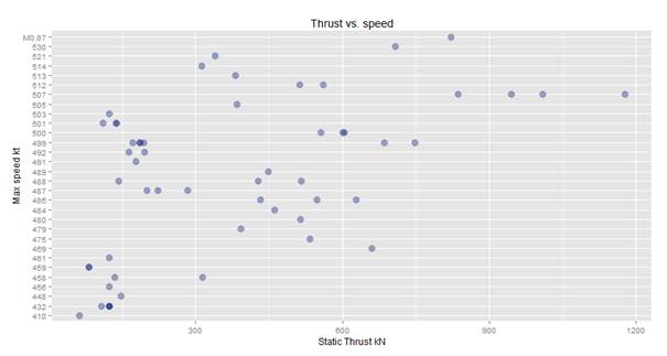
From here we can see that this data is scattered and it is great candidate for a further segmentation. We get questions like: How has the thrust developed over the decades and how does the thrust vs speed has developed over the decades?
We will look at the thrust development per decade:
|
1 2 3 4 5 6 7 |
# thrust over decades filter(df.aircraft_specs,Static.thrust..kN.!=0,No..of.engines!=0) %>% ggplot(aes(x=Static.thrust..kN.*No..of.engines)) + geom_histogram(binwidth = 30,fill="#112277") + ggtitle("Total thrust by decade") + labs(x="Thrust, kN", y="Count of Records") + facet_wrap(~decade) |
This time we will have a histogram, which looks like this:
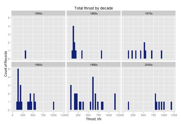
This histogram shows how many planes have what amount of thrust per decade of production. In the 90s, there were plenty with thrust about 600, and most records we have for the 2000’s have more than 750. This is not a big surprise, since plenty of planes produced in the 70s, 80s and 90s were still in operation in the 2000s, and the gap on the market was for bigger planes with more thrust.
Let’s explore how the speed and thrust developed over the decades:
|
1 2 3 4 5 6 7 8 |
# static thrust vs speed per decade filter(df.aircraft_specs,Max.Speed..kt.!=0,Static.thrust..kN.!=0) %>% ggplot(aes(x=Max.Speed..kt., y=Static.thrust..kN.*No..of.engines)) + geom_point(binwidth = 100,alpha=.9,color="#112277") + facet_wrap(~decade) + ggtitle("Speed vs thrust by decade") + labs(x="Speed, kt", y="Thrust, kN") |
The histogram looks like this:
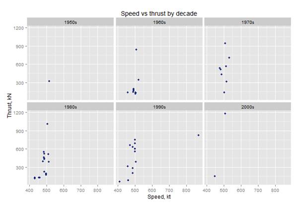
We can notice that there is one plane which has a top speed significantly greater than the rest, and we would like to remove it from the graphs, so we can see the distributions better. All we have to do is add another condition to the filter like this:
|
1 2 3 4 5 6 |
filter(df.aircraft_specs,Max.Speed..kt.!=0,Static.thrust..kN.!=0,Max.Speed..kt. < 700) %>% ggplot(aes(x=Max.Speed..kt., y=Static.thrust..kN.*No..of.engines)) + geom_point(binwidth = 100,alpha=.9,color="#112277") + facet_wrap(~decade) + ggtitle("Speed vs thrust by decade") + labs(x="Speed, kt", y="Thrust, kN") |
Then we get the following histogram:
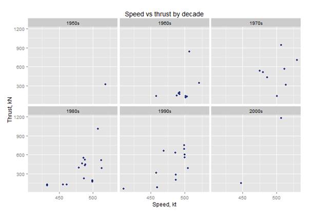
And so, in this manner, the data exploration can continue forever.
Conclusion:
In this article we have traveled a long way: from relational database design and data management, to in-memory data exploration. The article’s goal was to introduce readers familiar with T-SQL and reporting tools to the possibilities of data exploration with R. Both methods of data exploration have their pros and cons, and as long as the data explorer is paying attention to detail, a great value can be potentially extracted from the data.
Load comments