
Bootstrap 4 is here. It really took a long time, but it’s been available for a few weeks. While the core ideas and concepts are essentially the same as found in previous versions, a lot of details have changed within the entire spectrum of the library. There are plenty of new classes and, in some cases, the new classes imply a slightly different rendering philosophy. In this article, I’ll take the most natural route to explore a new library that most developers are quite familiar with. I’ll start by rewriting a basic HTML layout using the new features of Bootstrap 4. Starting from an existing layout tailor-made for Bootstrap 3, you’ll see quite a bit of renaming and a lot of small pleasant surprises.
Getting the Files
As usual with CSS and JavaScript libraries, there are many ways to get to the files you need. One option is referencing files directly from a CDN. If you’re OK with the Bootstrap CDN, then you can just use the following link.
|
1 2 3 4 |
<link rel="stylesheet" href="https://maxcdn.bootstrapcdn.com/bootstrap/4.0.0/css/bootstrap.min.css" integrity="sha384-Gn5384xqQ1aoWXA+058RXPxPg6fy4IWvTNh0E263XmFcJlSAwiGgFAW/dAiS6JXm" crossorigin="anonymous" /> |
As an alternative, you can install Bootstrap 4 via Bower in Visual Studio or through NPM. As usual, in your page layout you need to reference both the CSS file (as shown above) and a JavaScript file. Bootstrap 4, like all its predecessors, relies on jQuery (at least version 2.0) so you might want to reference the jQuery library before the Bootstrap JavaScript file.
|
1 2 3 4 |
<script src="https://maxcdn.bootstrapcdn.com/bootstrap/4.0.0/js/bootstrap.min.js" integrity="sha384-JZR6Spejh4U02d8jOt6vLEHfe/JQGiRRSQQxSfFWpi1MquVdAyjUar5+76PVCmYl" crossorigin="anonymous"> </script> |
Note that some of the Bootstrap 4 plugins have an additional dependency on a JavaScript library named popper.js. You don’t need popper.js all the time, but only if you’re using tooltips and popovers. However, if you don’t mind some extra 20 KB of download, you can just reference the full Bootstrap JavaScript bundle which includes everything you may ever need.
Let’s have a look at the size of the Bootstrap 4 library. The minified full-bundle version of the JavaScript library of Bootstrap 4 counts 67 KB. If you take popper.js out, then it’s only 48 KB. The full CSS part takes up 142 KB. As a rule of thumb, it’s some 20% increase for the CSS. The script part instead nearly doubled.
The CSS library has been rewritten using SASS (instead of LESS) and many more customization options exist through SASS variables. Bootstrap 4 is more granular than ever as both the CSS and the JavaScript parts can be combined in small modules so that everyone can get all they need. Finally, note that Bootstrap fully supports the latest releases of all major browsers and platforms. The most notable exception—but not a surprise at all—is the lack of support for old Internet Explorer versions, specifically those prior to version 10. If it’s critical to keep your pages compliant with those old browsers, then you should avoid upgrading to Bootstrap 4 and stick to Bootstrap 3.x. However, for more information about browser and device support, have a look at this document.
How Bootstrap 4 Resets the HTML Stack
Bootstrap 4 brings its own reset tool—a dedicated CSS file (typically, incorporated in the main CSS) named bootstrap-reboot.css. If you’re curious about how Bootstrap 4 resets the look-and-feel of HTML elements across browsers, you can download the full package and inspect the file. The purpose of a reset CSS is literally clearing all basic styles you apply to a page so that the HTML elements for that page look the same across all browsers. The most popular reset stylesheet is normalize.css of which Bootstrap’s reboot system is a fork.
The most interesting fact about Bootstrap 4 reboot is the following code you find at the very top of the file. It applies the border-box model to all elements under the scope of the CSS instead of the content-box model which is often the default.
|
1 2 3 4 |
*::before, *::after { box-sizing: border-box; } |
The box-sizing property determines how browsers calculate width and height of HTML elements with respect to padding and borders. The turning point is that with the border-box all over the place, when you set a width or height of X pixels, it’s going to be X pixels regardless of borders and padding. In the content-box model, instead, the set height or width applies only to content. Subsequently, if you set an element to 100% of width and then add some padding, you get into trouble.
Another relevant aspect of Bootstrap 4 reboot is the use of REM units for measures. In CSS, to size fonts or spaces you can indicate explicitly the required number of pixels or indicate a relative measurement. If you use EM, then the value you set is a percentage of the size of the direct parent. If you use REM, instead, it is relative to the HTML root. REM units are as good for accessibility and consistency as EM units are, but they make maintenance much simpler as you need to adapt sizes in just one place, and everything else automatically adjusts.
Bootstrap 4 also picks up whatever font is defaulted for the current operating system ensuring zero load time for the font, while showing users the same font they’re used to on that browser. Other smaller but still sensible changes are the removal of margin top on paragraph and text elements (i.e, H1, H2, P, UL) and basic simple styles assigned to those HTML elements (TABLE, FORM) that often need to be styled in a particular way for graphical purposes.
Layout and Grid System
Bootstrap conquered the developer’s heart by introducing a grid system and predefined responsive breakpoints. Over the years, though, the number of breakpoints proved not always appropriate for the vast majority of cases. In particular, the XS breakpoint set to 768 pixels was way too large to effectively represent content tailormade for smartphones and other smaller devices. In Bootstrap 4, a fifth breakpoint has been added at the width of 576 pixels.
|
1 2 3 4 5 6 7 8 9 10 11 12 13 14 |
// XS - Small devices (phones) @media (max-width: 575px) { ... } // SM - Small devices (mini-tablets, large smartphones) @media (min-width: 576px) { ... } // MD - Medium devices (tablets) @media (min-width: 768px) { ... } // LG Large devices (desktop computers) @media (min-width: 992px) { ... } // XL - Extra-large devices (large desktops) @media (min-width: 1200px) { ... } |
Responsive breakpoints are used to determine how many columns will fit in the available space. Also, in Bootstrap 4, columns are arranged within containers. A container is a DIV styled with an ad hoc class. A container is required only when you intend to use the default grid system.
|
1 2 3 4 5 6 |
<div class="container"> <!-- Some content here --> </div> <div class="container-fluid"> <!-- Some content here --> </div> |
The difference between container and container-fluid is the same as in previous versions of Bootstrap. Fluid containers span their content through the full width of the viewport. If your browser window is, for example, somewhere in between LG and XL (say, 1100 pixels) then a basic container will only use 992 pixels, while a fluid container will use all the available space.
Defining a Navigation Bar
To quickly figure out what’s different in Bootstrap 4, before listing some more display and style utility classes, let’s see how you change a canonical navigation bar from any code you may have that works well in earlier versions. In Bootstrap 3.x, you might have the following:
|
1 2 |
<nav class="navbar navbar-inverse navbar-fixed-top"> </nav> |
That’s just the outermost container—a NAV or a DIV element. Note that a NAV is preferable for accessibility reasons. Except for navbar, the other classes have been renamed. Renaming is common and widespread in Bootstrap 4 and, at the end of the day, the best and quickest thing you can do is just looking at what Visual Studio and ReSharper suggest is wrong with your CSS classes. I find that the approach of pouring some 3.x code into a 4.0 template and fixing what appears to be no longer supported works nicely. If, instead, you are building some completely new artifact, then looking into some snippet repository or going through the documentation is effective as well. The documentation, though, seems effective only if you know what you’re looking for.
Here’s the same navigation bar—dark-colored and fixed at the top of the viewport—as it appears in Bootstrap 4.
|
1 2 |
<nav class="navbar fixed-top navbar-expand-lg navbar-dark bg-dark"> </nav> |
As you can see, navbar-inverse has been renamed to navbar-dark and bg-dark has been added to the list of system classes for background colors. Interestingly, you need both classes because navbar-dark now only sets the foreground color while bg-dark takes care of the background. However, you should note that while the name bg-dark contains a direct reference to the tone (dark) of the color for the background, navbar-dark indirectly refers to the text color that is most appropriate—given the Bootstrap color scheme—for a dark background.
|
1 2 3 4 5 6 |
.navbar-dark .navbar-brand { color: #fff; } .navbar-dark .navbar-nav .nav-link { color: rgba(255, 255, 255, 0.5); } |
As you can see, navbar-dark alone doesn’t count but it disambiguates the foreground color settings for other classes such as navbar-brand, nav-link and the like.
To stick the navigation bar to the top of the viewport, you now use the fixed-top class instead of navbar-fixed-top. In both cases, you should manually guarantee that any other content in the body of a page with a fixed-top navigation bar doesn’t get covered. This means that you probably need to give a margin to any other content to ensure it shows just below the bar.
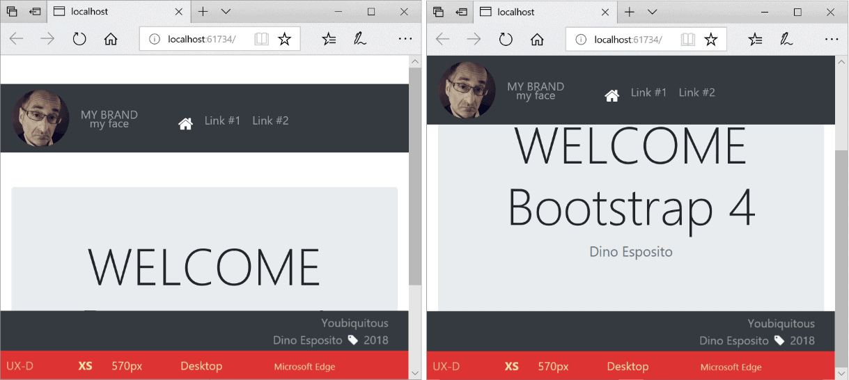
Still speaking of navbars stuck to the top, it is worth noting the difference between fixed-top and sticky-top. When the latter style is set, the bar is not initially forced to the top, but when the user scrolls up it moves with it and sticks at the top, as in the figure below.
Let’s have a look at the internal implementation of the sticky-top class.
|
1 2 3 4 5 6 |
.sticky-top { position: -webkit-sticky; position: sticky; top: 0; z-index: 1020; } |
As you can see, it leverages the attribute sticky of the position element. This attribute is not supported by all browsers? According to https://caniuse.com/#feat=css-sticky, it is not supported by any version of Internet Explorer and is partially supported by most versions of Chrome because of still pending bugs.
A navigation bar can be hidden when the size of the screen becomes too small. You control when the bar collapses by using the navbar-expand-XX class, where XX is the code of any of the supported breakpoints (SM, MD, etc). The following picture shows the effect of the markup below.
|
1 |
<nav class="navbar navbar-expand-sm navbar-dark bg-dark fixed-top"> |
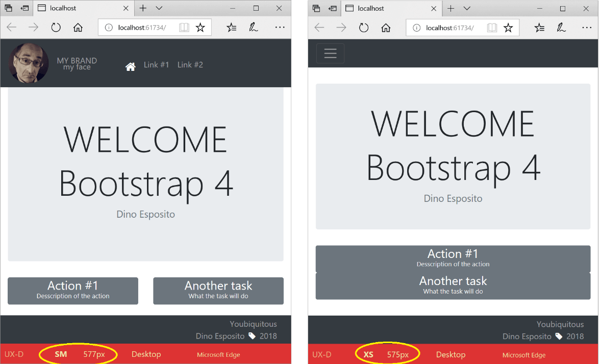
The navbar-expand-sm class used in the code snippet sets the collapse status of the navigation bar across the border of the XS/SM breakpoint. As discussed earlier, the XS/SM breakpoint is set at 576 pixels. The screenshot on the left is taken at a viewport width of 577 pixels when the Bootstrap grid is in SM mode and the navigation bar is well visible. The screenshot on the right presents the same page 575 pixels wide and the navigation bar is hidden because the Bootstrap grid system switched to XS mode. In other words, if the navigation bar is collapsible then it always shows as collapsed unless you use a navbar-expand-XX class and the XX class sets when the bar expands and shows up.
A Collapsible Navigation Bar
A NAV element is meant to be collapsible if it contains a toggler button and a collapsible container. Here’s some sample markup.
|
1 2 3 4 5 6 7 8 9 |
<nav class="navbar navbar-expand-sm navbar-dark bg-dark fixed-top"> <button class="navbar-toggler" type="button" data-toggle="collapse" data-target="#dropdownNavbar"> <span class="navbar-toggler-icon"></span> </button> <div class="collapse navbar-collapse" id="dropdownNavbar"> <!-- Content of the collapsible bar --> </div> </nav> |
The navbar-collapse class makes some content collapsible under the control of the toggler button and the parent navbar. The link between the toggler button and a specific collapse area is set via the data-target attribute.
Summary
Most pages that work nicely with Bootstrap 3.x will work with Bootstrap 4, but the switch might not be painless. More likely, instead, it will require that you spend some time to figure out how they renamed just that class you used or in which way the technique you used must be coded in the new version.
At the same time, though, you will often experience a sort of jaw-dropping experience when you find out that just the class you crafted yourself or found boring to code repeatedly with plain CSS styles is now available at a much higher level of abstraction right out of the box.
Bootstrap 4 is much more expressive and function rich than the previous version for the obvious reason that it was designed to be so. That said, I would definitely use it in any new projects but consider using it on existing projects only on small segments, even individual views, and only with a good evidence of benefits.
This document contains proprietary information and is protected by copyright law.
Copyright © 2026 Red Gate Software Limited. All rights reserved
Load comments