
Since the very beginning, Bootstrap managed to revamp and redecorate the visuals of HTML web pages. Bootstrap authors achieved that by extending the standard taxonomy of web elements in the various HTML specs with UX-oriented actionable and rendering elements as they emerged from the industry practices. The extended Bootstrap taxonomy includes elements such as modals, dropdowns, custom tooltips, navbars, tab strips, input and button groups, progress bars, carousels and more. None of these has a direct HTML match, but a smart combination of HTML templates, CSS styles and, in some cases, a pinch of JavaScript does the job.
In addition, Bootstrap resets the visual settings of pages changing the visual properties of a few native HTML elements. As a result, text input fields and buttons get rendered with color, padding and border settings different from browser’s standards. Needless to say, different Bootstrap themes apply different visual settings to the same set of native HTML elements.
Not all HTML constituent (visual) elements were originally affected by Bootstrap. Select lists, checkboxes, radio buttons, file uploads, special input fields (date/time field, range bars) were entirely left to the browser’s internal implementation. This created a visual gap between the elements touched by Bootstrap graphics and those left to the browser’s rendering. For this reason, a number of (mostly jQuery-based) plugins appeared to provide nicer graphics for select lists, checkboxes and radio buttons.
Finally, Bootstrap 4 brings the long-awaited restyling for core HTML elements. In this article, you’ll find out more.
Input Text Boxes
Let’s start with plain input text boxes. As mentioned, since the early days Bootstrap restyled input text boxes to give them a consistent look-and-feel. In version 4, an interesting new feature has been added in the form of a new CSS class.
|
1 2 3 4 |
<input readonly type="text" class="form-control-plaintext" value="Some unmodifiable text" /> |
Typically, you give input text fields the class form-control to enable the Bootstrap restyling. However, if the input field is meant to be read-only, then by adding the new class form-control-plaintext you enable a different set of CSS styles that remove the surrounding frame typical of input fields. As a result, the content of the value property is rendered as plain text. The effective result is slightly different across browsers. In Microsoft Edge, the control is rendered as plain text. In Google Chrome, instead, the text is also sensitive to clicking, and a frame appears all around as a focus outline.
Checkboxes
Bootstrap 4 introduces the form-check-input class that, combined with form-check-label, improves the layout of plain checkboxes whether they are clickable or disabled. In particular, you use the canonical disabled attribute to disable the control, and Bootstrap will automatically apply a lighter color to indicate a different state. Depending on the specific needs of the user interface, multiple checkboxes may be rendered inline or vertically stacked. Both scenarios can be achieved through HTML layout elements (e.g., DIV elements) but using native Bootstrap 4 classes specifically targeted at checkboxes helps to gain consistency. Here’s how to render multiple checkboxes inline.
|
1 2 3 4 5 6 7 8 9 10 11 12 13 14 |
<div class="form-check form-check-inline"> <input class="form-check-input" type="checkbox" id="c1" value="c1"> <label class="form-check-label" for="c1">First</label> </div> <div class="form-check form-check-inline"> <input class="form-check-input" type="checkbox" id="c2" value="c2"> <label class="form-check-label" for="c2">Second</label> </div> |
As you can see, it’s all about wrapping checkboxes in a DIV container styled with the form-check class. In addition, you add the form-check-inline class to have controls laid out horizontally. Note that, by default, multiple checkboxes wrapped in form-check elements are stacked vertically. In other words, removing form-check-inline classes in the code snippet above will stack control vertically.
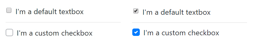
In all these cases, though, the actual user interface remains the one natively provided by the browser. A parallel set of classes also exists to modify the look-and-feel of checkboxes to make them look more modern and colorful. Here’s an example:
|
1 2 3 4 5 6 7 8 9 |
<div class="custom-control custom-checkbox"> <input type="checkbox" class="custom-control-input" id="cc1" name="cc1"> <label class="custom-control-label" for="cc1"> I'm a custom checkbox </label> </div> |
You use the classes custom-control and custom-checkbox on the surrounding DIV and custom-control-input and custom-control-label on the checkbox and the label respectively. The figure below (from Google Chrome) shows the difference between a default and a custom checkbox.
Bootstrap 4 allows making the checkbox a little bigger or a little smaller than the default by using the classes form-control-sm and form-control-lg on the surrounding DIV. Note that if you need larger checkboxes, then you’d better develop something yourself outside Bootstrap or get inspired by the tons of readymade snippets available online.
Radio Buttons
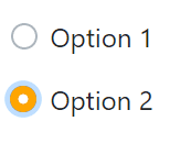
All aspects of default and custom checkboxes apply to radio buttons too. To have a radio button, you only have to change the value of the type attribute to radio. The figure below shows the user interface of Bootstrap 4 custom radio buttons.
Here’s the corresponding markup:
|
1 2 3 4 5 6 7 8 9 10 11 12 13 14 15 16 |
<div class="custom-control custom-radio"> <input type="radio" class="custom-control-input" id="r1" name="r1"> <label class="custom-control-label" for="r1">Option 1</label> </div> <div class="custom-control custom-radio"> <input type="radio" class="custom-control-input" id="r2" name="r2"> <label class="custom-control-label" for="r2">Option 2</label> </div> |
You may have noticed that the color of the checked radio button in the figure is different (orange) from the color of the checked checkbox seen earlier (blue). Blue is the default color of the Bootstrap classes, but it can be changed via CSS. Here’s how to make it orange.
|
1 2 3 4 5 6 |
.custom-radio .custom-control-input:checked~.custom-control-label::after { background-color: orange; background-image: url(...); border-radius: 50%; } |
The circle that characterizes the radio button is actually an SVG image identified by the provided URL. Here’s the SVG source of the default one.
|
1 2 3 |
<svg viewbox='-4 -4 8 8'> <circle r='3' fill='#fff'/> </svg> |
In the case of radio buttons, however, it holds the general recommendation to look elsewhere (e.g., http://bootsnipp.com) for fancier visual solutions.
Toggle Switches
Since the early days of iPhone devices, people loved the toggle switch UI element to choose between two mutually exclusive states—on/off, yes/no, true/false and the like. Conceptually, a toggle switch is not different from a single checkbox or perhaps two paired radio buttons. To make toggle switches attractive is their intuitive user interface. Many plugins and extensions to various frameworks have been created to make it easy to turn a checkbox into a toggle switch.
Since version 4.2, Bootstrap has its own class to render a custom checkbox as an iPhone-style toggle switch. Here’s the necessary markup.
|
1 2 3 4 5 6 7 |
<div class="custom-control custom-switch"> <input type="checkbox" class="custom-control-input" id="accept"> <label class="custom-control-label" for="accept">I Accept</label> </div> |
The figure below demonstrates the toggle switch in its checked and unchecked state.
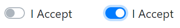
In addition to making it a custom checkbox, the only class to use is custom-switch. Again, note that you need at least Bootstrap 4.2. The latest version at the time of this writing is 4.3.
Drop-down Lists
In the newest Bootstrap version, the SELECT element got a minor restyling at last. It’s nothing comparable to multi-select, highly customizable drop-down lists you can find around. One of the most commonly used is Bootstrap Select. You can download and play with it here.
Natively from the core Bootstrap, you get the following user interface only a bit nicer than the default one rendered by browsers.
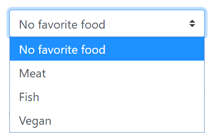
The corresponding markup is shown below. As you can see, the only change you’re required to introduce is the custom-select class.
|
1 2 3 4 5 6 |
<select name="food" class="custom-select"> <option selected>No favorite food</option> <option value="meat">Meat</option> <option value="fish">Fish</option> <option value="vegan">Vegan</option> </select> |
The drop-down fully supports the multiple selection in the usual HTML way, that is by adding the multiple attribute.
File Uploaders
The file uploader component has always been part of the HTML specification since the very early days. Lately, though, it is often hidden behind nicer user interfaces that support the drag-and-drop of files and preview of images. Some basic restyling of the classic input box with a push button that unifies the rendering across all browsers is possible.
|
1 2 3 4 5 6 7 |
<div class="custom-file"> <input type="file" class="custom-file-input" id="file1"> <label class="custom-file-label" for="file1"> Choose file </label> </div> |
The classes custom-file, custom-file-input, and custom-file-label do the job of restyling the file uploader. Bootstrap 4 also allows you to change the label that describes the purpose of the file. The Choose file description of the code snippet above can be replaced by simply editing the body of the LABEL element. Also, the text of the button can be changed or localized, but that requires recompiling the Bootstrap SASS sources.
This said, the file uploader—even restyled—doesn’t seem to be the preferred choice of developers today. Not because there’s more to improve, but because drag-and-drop and preview (and even data binding) are must-have features.
Range Inputs
Introduced by HTML5, the range input controls provide a way for users to enter a number in a closed range. The default user interface of a range control in Google Chrome is below:

As mentioned, the user interface changes with the browser. Bootstrap 4 provides additional CSS classes to give range controls a uniform interface across browsers. Here’s how to turn it on.
|
1 2 3 4 5 6 7 |
<div> <label for="customRange">Your age?</label> <input type="range" class="custom-range" id="customRange" name="range1" /> </div> |
The trick is using the class custom-range on the INPUT element of type range. The output is shown below, and it is uniform across browsers.

In this case, the highlight color (blue by default) can be changed via CSS, as shown earlier for checkboxes.
More Specific Form Control Classes
In Bootstrap 4, you also find a number of additional form-control-XXX CSS classes that apply to the rendering of a variety of INPUT elements, as listed in the table below.
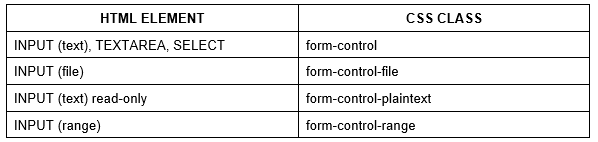
In addition, for all INPUT elements in a Bootstrap 4 form, you can set heights using classes like form-control-lg and form-control-sm.
Form Sizing
In Bootstrap 4, forms also support auto-layout for columnar content. On the foundation of flexbox grids, developers can set the width of one column using the col-N syntax and then have the sibling columns automatically adapt to the remaining width. In other words, the remaining columns (out of a total of 12 available in the grid system) are equally split on the remaining space. The flexbox grid works regardless if predefined grid classes (e.g., col-6) or inline widths are used: the remaining columns will resize accordingly. The class col indicates that the width of the column is flexibly adapted. Here’s a sample form that lays out horizontally, with the first column taking up half the width and the remaining two a quarter each.
|
1 2 3 4 5 6 7 8 9 10 11 12 13 |
<form> <div class="form-row"> <div class="col-6"> <input type="text" class="form-control"> </div> <div class="col"> <input type="text" class="form-control"> </div> <div class="col"> <input type="text" class="form-control"> </div> </div> </form> |
Summary
An interesting trend is going on in the web industry and revolves around the use of custom components in web pages. In this context, a custom component is a reusable set of HTML tags encapsulated in a single container. As a result, the new component can be used within web pages as if it were a native part of the markup language. Whether part of an Angular, React, or a Blazor solution, web components extend the taxonomy of a web page.
Bootstrap attempted to do the same since the first version. Unlike web components, though, Bootstrap didn’t introduce any new top-level syntax element in the HTML markup but provided a number of HTML snippets that altogether worked as a new component.
Until version 4, Bootstrap disregarded a number of fundamental HTML elements (e.g., checkboxes, radio buttons, select menus) that only now are styled in a modern and consistent, non-browser-based way. This article just covered custom forms as they’re supported in Bootstrap 4.
This document contains proprietary information and is protected by copyright law.
Copyright © 2026 Red Gate Software Limited. All rights reserved
Load comments