
A clear feeling that pervaded me since the first contact with an alpha version of Bootstrap 4 is that the team made every reasonable effort to enable developers to perform the usual CSS tasks in a far simpler and more intuitive way. Once you get used to Bootstrap styles, you inevitably wish to do everything in the same way. Bootstrap is designed to be pervasive and to define a new and broader taxonomy of web elements, whether those are HTML elements (such as tab-strips, modals, nav-bars, drop-down panels) or common styles (colors, alignments, positioning, grids).
Many times while using Bootstrap 3.x, I eagerly longed for some styles to define margins, hide or display blocks, size or space containers, or color text and backgrounds. Some such styles were supported in Bootstrap 3.x, but many were not. The good news is that nearly all those operational styles you may have wished for in the past are now officially part of the library.
In this article, I’ll investigate four areas of Bootstrap 4 that present new styles that, overall, make the need of pure inline CSS a bad memory of the past. In particular, I’ll cover the media object, display utilities, spacing, and coloring.
Media Objects
The media object is nothing new in Bootstrap, as it was part of the library since the early days. The purpose of the object is the same; the CSS classes involved, however, are slightly different, and the overall coding is more understandable and immediate.
In Bootstrap, a media object is an HTML component that can be highly repetitive (for example, it is part of a data-bound template) and includes a picture or, in general, an object such as a video or a sound file. A media object, though, is neither a single element nor it is an array of homogeneous elements. A media object is typically the combination of one media element and one or two lines of text plus some alignment options. Here’s some Bootstrap-based markup. The output is shown in the figure below.
|
1 2 3 4 5 6 7 8 9 10 |
<div class="container bg-light"> <div class="media border border-dark"> <img class="img-fluid" style="width: 120px;" src="~/content/images/poppies.jpg" alt="Poppy field"> <div class="media-body"> One of my favorite<br />spring pics </div> </div> </div> |

The primary scenario for using media objects is when you have a list of items to display, such as a series of blog posts. Hence, the surrounding DIV is just the outermost container. The bg-light class is a new Bootstrap 4 class to set a background color. As you’ll see later in the article, Bootstrap 4 defines a bunch of new styles for foreground and background colors using context-sensitive codes (primary, warning, etc.) as well as a couple of generic tints, light and dark specifically defined by the theme being used. In the default theme, the bg-light color evaluates to a light gray.
A media object is surrounded by a DIV of class media. At your leisure, you can give it a border and/or a background color. New classes are available in Bootstrap 4 to reduce the use of inline styles as much as possible. The classes border and border-dark are responsible for a thin dark border around the entire area of the media object.
A media object is made of two core parts—an image and a body. The body itself can be made of a heading and some plain text. The content is laid out horizontally and positioning the image on the left or the right is a simple matter of order. This example shows that swapping the positions of the IMG and media body elements will cause the text to appear on the left.
|
1 2 3 4 5 6 7 8 9 10 |
<div class="container bg-light"> <div class="media border border-dark"> <div class="media-body"> Tracks<br />of my train station </div> <img class="img-fluid" style="width: 120px;" src="~/content/images/poppies.jpg" alt="Poppy field"> </div> </div> |
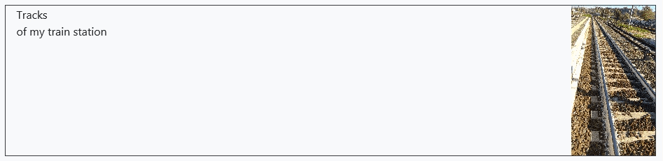
The media body is a child DIV marked with the media-body class. Inside of it, you can use any combination of HTML elements that suits your needs. As the two figures show, by default the text is justified to the top-leftmost available corner. There are plenty of alignment options, however.
Also, the appearance of the image can be largely customized in terms of width and height. You can either use explicit inline styles via the style attribute
|
1 2 3 |
<img class="img-fluid" style="width: 120px;" src="~/content/images/poppies.jpg" alt="Poppy field"> |
or some of the predefined percentage-based classes such as w-25, w-50, w-75 and w-100 that set a width to the corresponding percentage.
|
1 2 |
<img class="img-fluid w-75" src="~/content/images/poppies.jpg" alt="Poppy field"> |
Note that similar classes exist also for height: as h-25, h-50, h-75 and h-100. Finally, you also have facilities for some settings of the max-width property. The mw-100 and mh-100 classes set maximum width or height to 100% of the container.
|
1 2 |
<img class="img-fluid mw-100" src="~/content/images/poppies.jpg" alt="Poppy field"> |
If you look at first figure, you may notice that some margin exists between the first figure and the text. In the second figure, instead, the margin exists between the left edge of the container and the text. That margin is not there by default or by magic. The actual markup that produces the two figures uses some additional Bootstrap 4 CSS classes not shown in the example for simplicity. In particular, the mr-N and ml-N classes set the margin-right and margin-left properties to a proportional value. N ranges from 1 to 5. In the first figure the img element had a mr-3 class. In the second figure the media body had a ml-3 class.
|
1 2 |
<img class="img-fluid w-100 mr-3" src="~/content/images/poppies.jpg" alt="Poppy field"> |
Vertical alignment of the content in a media object can be controlled, too. Image and media body are distinct elements justified within the parent container. The align-self-center class vertically aligns the selected element within the container. Other classes such as align-self-auto and align-self-end align vertically to the top or the bottom. If you want to have multiple lines of text rendered with less space than usual, in the media body, you can only use the line-height CSS property to achieve the desired effect.
Finally, note that in Bootstrap 4, the img-responsive class has been renamed to img-fluid. A fluid image scales nicely with its parent container by setting max-width to 100% and auto-calculated height.
Display Utilities
One of the few issues I always had with Bootstrap when used along with jQuery is some sort of conflict arising when the hidden class was used to initially hide an element. I would have expected to be able to bring it back into view by simply calling jQuery’s show method, but that just won’t happen. The only workaround I found was using the CSS display property directly. Another common workaround that people used was to also call removeClass after displaying the element.
|
1 |
$("#button1").show().removeClass("hidden"); |
In Bootstrap 4, the entire set of display classes has been rewritten and the old familiar hidden-XX and visible-XX classes are gone. However, the conflict with jQuery has not been completely solved. An element initially hidden via Bootstrap can’t be made visible via jQuery until the Bootstrap visibility class is removed. So, the general rule is that you can control visibility either through jQuery or through Bootstrap classes. CSS manipulation performed by Bootstrap in some way takes precedence and the only way out is by removing Bootstrap visibility style to gain programmatic control. Or, as an alternative, you can manipulate visibility via jQuery but not through canonical show and hide methods. Instead, you use addClass and removeClass to add and remove new Bootstrap visibility classes.
The display utilities in Bootstrap 4 come in two forms: d-XX and d-NN-XX. The XX placeholder refers to the type of display requested. Feasible values are in the table below.
|
Display attribute |
Description |
|
none |
The element is hidden from view. |
|
inline |
The element is displayed inline with the adjacent content. |
|
block |
The element is a block (DIV) element. |
|
inline-block |
The element is displayed on the same line as the adjacent content, but it behaves as a block (DIV) element. |
|
table |
The element is displayed as an inline table. |
|
table-cell |
The element is displayed as an inline table-cell. |
|
flex |
The element is a flexbox container. |
|
inline-flex |
The element is an inline flexbox container. |
The NN placeholder refers to all supported Bootstrap breakpoints: XS, SM, MD, LG and XL. Any display attributes in the table can be combined with any supported breakpoint. As a result, you can have the same element display in different ways as the screen size changes. Here’s an example.
|
1 2 3 |
<div class="d-none d-lg-block d-sm-inline"> My content </div> |
The sample DIV is hidden by default, but its content gets rendered as inline text (i.e., a SPAN element) in SM and MD screen sizes. Instead, for LG and XL screen sizes, its rendering turns to that of a block (i.e., a DIV element). Yet another level of distinction comes with support for printing. By adding the print qualifier to the d class, you can specify how the element is expected to behave in print.
|
1 2 3 |
<div class="d-none d-lg-block d-sm-inline d-print-block"> My content </div> |
For example, the DIV above will always render out as a block in printing.
In CSS, display and visibility are distinct things. Display refers to the physical real estate actually taken up by the element. If an element is not displayed, the final output will treat it as if it weren’t part of the source markup. This means that all surrounding elements shift accordingly to their styles. Visibility, instead, never ignores the fact that the element is part of the markup. When visibility is turned off, the space necessary element is left blank as if the element were displayed. Bootstrap 4 offers two ad hoc classes for this scenario: visible and invisible. Note that, in light of this, the visible class has a different meaning in Bootstrap 4 than in previous versions.
Spacing Utilities
In Bootstrap 4, you can set margins and padding via a set of easy to use classes. The names of those classes follow a common pattern and are functions of four elements: {property}{side}-{breakpoint}-{virtual size}.
The {property} placeholder refers to margin or padding and is m for margin and p for padding. The {side} placeholder refers to the side where margin or padding must be applied. Feasible values are t (top), b (bottom), l (left), r (right). Plus, you have x for both horizontal sides and y for both vertical sides. You can use just m or p to have margin and padding applied all around the element. As expected, the {breakpoint} placeholder refers to the supported Bootstrap 4 screen breakpoints. Here’s an example of a margin set via the new set of classes.
|
1 2 3 |
<div class="media-body align-self-end ml-3"> One of my favorite<br />spring pics </div> |
For example, the ml-3 class sets the margin-left CSS property in the selected DIV. In the 3 refers to one of the supported virtual sizes optionally appearing in the name of the class. Virtual sizes range from 1 to 5, but additional values of 0 and auto are also acceptable. If the value is 0, then no margin or padding is applied. If the value is auto, then, as expected, the margin or the padding is set to auto. Values in the 1 to 5 range indicate a numeric value that is a linear function of the $spacer Sass map variable. The margin you see in both figures was obtained with a virtual size of 3. The default value of the $spacer variable is 1rem.
Font Styles and Colors
Font styles and even more colors are the nightmare of many UX designers who are constantly trying to catch up with quick fixes that developers sometimes add in the form of inline properties. Bootstrap 4 defines colors as classes for both the foreground and the background. You’ll find text-{context} classes and bg-{context} classes where the {context} placeholder refers to scenarios such as success, warning, danger, primary and info. Bootstrap 4 removes the default scenario and adds the secondary scenario. As far text is concerned, you’ll also find the muted attribute and the light and dark attributes. For background color classes, the muted attribute is replaced by the white attribute. Everything else works just the same: bg-primary, bg-info, bg-secondary and the like.
When it comes to text and fonts, Bootstrap 4 introduces explicit classes for bold and italic styles (font-weight-bold and font-weight-italic) and the text-truncate transformation class to cut overflowing text in a tiny container and terminating it with an ellipsis. Finally, justification classes (text-center and the like) have been extended to also support breakpoints so that it is now easy to indicate that a given text should be left-justified on small screens and centered on larger screens, or the other way around.
Summary
When the newest version of a product offers a bunch of the tricks and workarounds you implemented in the older versions supports the features you were dreaming of right out-of-the-box, you know the team definitely did a good job. Who knows whether it happened by listening to you or just eating their own dogfood and finding out the same things you found out the hard way. With Bootstrap 4, even limited to the topics covered in this article, I had the same feelings and I’m sure that my Bootstrap 4 code will look nicer and cleaner, at least until a new set of bad habits come up that Bootstrap 5 will surely fix!
This document contains proprietary information and is protected by copyright law.
Copyright © 2026 Red Gate Software Limited. All rights reserved
Load comments