
The FORM element has been part of the HTML standard since the early days of the standard, and for this reason any online forms built, say, in the late 1990s still work today. However, no user would be happy to use a twenty-year-old HTML form. Why? Because of the whistles and bells that modern input forms are expected to have. In a recent article for Simple Talk touched on the problem of simplifying input when there’s a large amount of data to provide. Multi-page, stepped forms are definitely a must in similar situations. However, just by using stepped forms on a recent project I learned a number of other things that, taken individually, are minor aspects of HTML input, but all together can provide a critical mass of tips for better HTML input.
For this article, I collected a few of these tips that, with a very limited effort on your end, can make HTML forms look much nicer, and can guide users to entering data more comfortably.
Going beyond hidden-xs in Bootstrap
Like many of you, I do use Bootstrap nearly everywhere when constructing websites. Bootstrap has many merits and it’s not perfect—not even in upcoming version 4. Yet, I don’t know anything better, and anyway it works well enough for my needs. With one notable exception—the hidden-xs class.
According to Bootstrap’s syntax, hidden-xs is a responsive utility exposed as a CSS class that developers use to hide HTML elements when the viewport is less than 768 pixels wide. The Bootstrap folks call this size as “extra-small”. Doubtless this is too big to be the smallest point of control you can have on a responsive layout. Personally I’d love to have a breakpoint around 480 pixels and judging from the comments on the Github repository of Bootstrap I’m not the only one. The good news is that Bootstrap 4—at the moment only in the alpha stage – will add a fifth breakpoint and resize the XS breakpoint to 544 pixels.
The reason why many people wish to have a breakpoint around 500 pixels is to have more control over the markup rendered on really small screens. But the small screens that people are really concerned about are not the windows of desktop windows resized to the dimensions of a stamp. More realistically, if you’re concerned about small screens, it is because of mobile devices, specifically smartphones. When it comes to smartphones you sometimes want to do certain things differently than in equivalent XS screens of a desktop. Let me give you a concrete example. The figure below shows a classic login form. The fancy thing about the form is that the page contains some JavaScript that hooks up a particular keyboard combination and completes the email address.
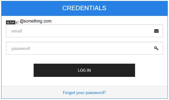
To be distinct from regular typing, the keyboard hotkey must necessarily include special key such as CTRL or ALT. Those keys are not available on smartphone and tablets. This is no big deal from a purely functional point of view because the hotkey will never fire. However, it would be nice if there were a way to hide that small piece of informative markup when the page is viewed on mobile devices. Unfortunately, hidden-xs was not designed for that. More, it’s the entire Bootstrap framework that was designed to follow the principles of Responsive Web Design which makes a point of just ignoring any user agent strings.
From hidden-xs to hidden-mobile
In my Razor files, I wish I could write a piece of HTML markup like below:
|
1 2 3 4 5 |
<div class="hidden-mobile"> <kbd>ALT+P</kbd> <i class="fa fa-hand-o-right"></i> @MyApplication.AppSettings.DefaultEmailCompletion </div> |
The weird thing is the hidden-mobile CSS class. In spite of the Bootstrap-friendly name, it is not a new class of the framework and not even part of any add-ons. However, by combining together a small piece of JavaScript with a reliable client-side framework for device detection even a class like “hidden-mobile” can become a reality. Here’s my trick.
First and foremost, the CSS class is just a marker and it’s not defined anywhere. All elements styled with the class will be hidden programmatically. In other words, the class is used only as a jQuery selector to locate all the elements to hide. The crucial thing is in identifying the JavaScript framework that will do the device-detection. The only possible candidate for the role that I can recommend is WURFL.JS. The framework is free to use, even though the vendor also offers a commercial license with many more features and a service-level agreement. For our purposes, though, the free basic version is more than enough. WURFL.JS is not a JavaScript file with logic inside. It is simply the JavaScript-like endpoint of a remote web service. You use the library by simply adding a SCRIPT tag.
|
1 |
<script type="text/javascript" src="//wurfl.io/wurfl.js"></script> |
You can do that in the _Layout.cshtml file or in individual views. The net effect of the linking of the SCRIPT element is to have a JavaScript object dynamically injected in the page DOM. The name of the object is WURFL and here’s its prototype.
|
1 2 3 4 5 |
{ "is_mobile": false, "complete_device_name": Microsoft Internet Explorer, "form_factor": Desktop } |
Needless to say, the values are what it returns when you view a page with Internet Explorer. The magic behind WURFL.JS is that it detects the user agent string that the browser sends while it is requesting what it believes is a plain JavaScript file. Based on that, the remote endpoint performs a sophisticated (and entirely server-side) analysis of the user agent string and packs any information available in the aforementioned JavaScript object. As a result, you have a brand new WURFL JavaScript object to check to make device-specific arrangements to the markup. At this point, all that remains to do is adding some custom JavaScript that checks WURFL information and finds a way to react.
|
1 2 3 4 5 6 7 8 |
(function() { try { var mobi = WURFL.is_mobile; if (mobi) { $(".hidden-mobile").hide(); } } catch(e) { })(); |
The form_factor property of the WURFL object contains detailed information about the class of the device, whether smartphone, tablet, webview within a native app, plain cell phone, smart-TV and a few more.
Bootstrap Button Drop-downs
It’s really easy to take a Bootstrap button and turn it into the trigger of a drop-down menu. All it takes is a BUTTON and UL elements surrounded by a DIV.
|
1 2 3 4 5 6 7 8 9 10 11 12 |
<div class="btn-group"> <button type="button" class="btn btn-default dropdown-toggle" data-toggle="dropdown"> Open </button> <ul class="dropdown-menu"> <li><a href="#">One</a></li> <li><a href="#">Two</a></li> <li><a href="#">Three</li> </ul> </div> |
If you ever used Bootstrap, you are certainly familiar with this markup. It works just fine as long as you have a menu to display. The Bootstrap documentation doesn’t provide any examples different from a drop-down menu and it’s not unusual for me to meet developers that believe all they can drop-down is a menu-style list of hyperlinks. That’s absolutely not the case. A drop-down is a drop-down, we could say, so you can replace the UL element with any other element you wish to drop-down when the user clicks the button.
|
1 2 3 4 5 6 7 8 9 10 |
<div class="btn-group"> <button type="button" class="btn btn-default dropdown-toggle" data-toggle="dropdown"> Open </button> <div class="dropdown-menu"> <!-- Your content here --> </div> </div> |
The most common and flexible thing you can do is replacing the UL element with a DIV element and place in the body of the DIV whatever content you wish. You’re not even limited to read-only content. You can host an entire form and accept user’s clicking. The figure below shows drop-down input form that illustrates a common scenario—register as a user of the system from the same view you use to sign in.
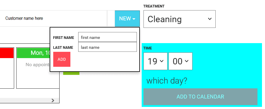
The form schedule an appointment in the calendar for a client. The text input field on left will use auto-completion to find the client but if it’s a new client, only minimal information can be entered through the NEW button drop-down.
When you replace the UL with a DIV, you might want to overwrite the dropdown-menu CSS class. The most important change—a necessary change I’d say—is to add a bit of padding because the default style sets rendering to start at 0,0 pixels in the top-left corner of the drop-down block.
SELECT and tabs
From a purely graphical perspective, I don’t much like drop-down lists—the SELECT element of HTML. When you give your views a Bootstrap refresh, the only elements that seem out of place are drop-down lists. However, if you use the form-control style on the SELECT element you get an acceptable result as far as pure display is concerned.
|
1 2 3 |
<SELECT class="form-control"> <OPTION> ... </OPTION> </SELECT> |
The form-control style works by padding the container element of the displayed text and styling the border. When you move the focus to the list or when you click to change the current selection, the effect is quite ugly. Browsers typically emphasize only the background of the text which appears a thin line in a far larger container. On the other hand, if you don’t just use the form-control Bootstrap style, then the native look of the SELECT element clashes brutally with the rest of the styled page.
Frankly, there’s not much you can do, other than reskinning the SELECT element entirely as quite a few jQuery plugins do out there. What I do sometimes is to capture the change event of the SELECT element and move the focus away.
|
1 2 3 |
$("select").change(function (e) { this.blur(); }); |
This trick is just a trick and, as with many other tricks, it fixes one thing and breaks another. With the code in place, every time you make a selection the new item is selected with no visible clue of the focus. However, just because of that, if the user next starts tabbing through the input fields, well, the focus is not there anymore. To try repairing what I broke myself with the blur() call in the change event, I played with the tabIndex property. In HTML the tabIndex property indicates the order in which input fields are tabbed. By assigning the tabIndex to any field, you can take programmatic control of the order of tabs. In this way, here’s how I rewrote the change event handler of SELECT elements.
|
1 2 3 4 5 6 7 |
$("select").change(function (e) { this.blur(); // Move the focus to the next input field var index = parseInt($(this).attr('tabIndex')) + 1; $(':input[tabindex=' + index + ']')[0].focus(); }); |
After moving the focus away from the clicked SELECT element, the code reads the tabIndex of the SELECT and increases by one. Next, the code finds the INPUT element with the matching tab index. As long as tabIndex attributes are set through all the form, the effect is selecting the next input element. Not really a bad effect, all considered.
Changing colors on selection
Bootstrap doesn’t offer classes or plugins to completely restructure a drop-down list. If you don’t want to use the native SELECT element, you can choose one of the many jQuery plugins available. My favorite is https://developer.snapappointments.com/bootstrap-select/. The reason I like it is that it just works as Bootstrap would have done: You set a CSS class, import a JavaScript file and go. The markup is the same and some visual facilities for multiple selections are worth the choice.
Frankly I have no idea of the reason why Bootstrap developers didn’t even attempt to restyle or rewrite the SELECT element. However, I must mention that SELECT is one of those input elements that you don’t want to modify at all on mobile devices. Mobile browsers provide a specific experience for SELECT elements and it would make no sense to change it to make it work better on desktop browsers.
Remaining in the realm of the native SELECT element, I’d like to mention a tip that is much appreciated by users although fairly simple to code. Sometimes, you use a drop-down list to select one of a few states, such as Active, Inactive, Locked and so forth. In this case, it might nice to show different colors depending on the selection, as in the figure below.
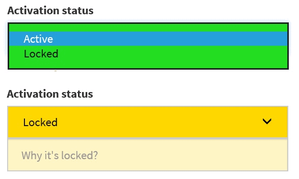
To obtain the effect, all you do is to intercept the change event and change the background color. In this case, when the user next clicks to change again, the background color is the same as was set last time. There’s no way, in fact, to intercept the “open” event and change to a neutral color. As you can guess from the figure, it is immensely helpful for a user to see the status of an item from a color.
Summary
Any web sites today that collect information from users are obliged to do as much as possible to minimize the pain and improve the experience. Whether it’s a matter of checking registration data on the server, validating email addresses or complaining about empty fields, even the scantiest login form nowadays is full of JavaScript and colorful effects. This article presented a few simple tips that, especially on top of a Bootstrap view, deliver benefit to users. Enjoy!
Load comments