
First released as an “add-on” in SQL Server 2000, and fully integrated into SQL Server since version 2005, SQL Server Reporting Services (SSRS) is now a well-established web-based, self-service, reporting solution. In 2007, Microsoft acquired a set of reporting components from Dundas, a company specializing in data visualization and dashboard software and solutions, and the 2008R2 release of SSRS incorporated these and many other impressive additions to our graphical reporting and data visualization capabilities.
These new data visualization tools are not just for the BI specialist. They can help any DBA produce reports that allow users to go beyond the numbers, and quickly spot trends, anomalies and issues. In this article, I will explain, with examples, how any DBA can start to use these new tools, covering:
- Indicators – providing an instant visual indication of the current state of key business data, compared to a set of criteria values
- Embedded Charts – how to embed charts within a tablix or table; a very effective technique for visually breaking out data according to various criteria (such as sales by region, year, and so on)
- Sparklines and Databars – small charts that we can also embed within textboxes to show trends and changes in data over time, especially over many different periods
- Chart overlays – a few nice overlay techniques, incorporating use of range charts and the chart’s secondary axis
Along the way, I hope to teach a few new reporting and charting tricks and techniques, such as the judicious use of tooltips to convey information quickly and intuitively.
Why should DBAs care about Eye Candy?
I know there may be a few DBAs reading this, who are skeptical about the need for them to take the time to learn data visualization techniques. Since, you made it to the second page, at least, I’ll explain why I believe most DBAs will benefit from these charting techniques. While working through their daily list of tasks, many DBAs need to respond to questions from their managers and supervisors, such as:
- How many servers do we support?
- What is the trend in the number of support calls over the past few years?
- Are there periods where the existing DBA support tickets exceed our capacity to meet our Service Level Agreements (SLAs)?
- Can I see the support call aggregates broken up by region and priority?
With a bit of effort, most DBAs could conjure up a query to return the required data, and dump it into Excel, but the results are likely to be messy and the important trends far from obvious to the report reader. In addition, it’s likely your supervisor would much prefer to see the questions answered visually and in a self-service form.
You can create a much more powerful message by showing the information in graphical manner. If you’re overworked trying to stay afloat on the sea of support tickets, and the trend is getting worse, you don’t want there to be any chance that your managers will miss this fact.
SSRS charts allow us to present a dramatic picture of the results, no matter if we are showing trending data, percentage of the total data, or any other comparison of data points.
Getting Started
I developed and tested the reports in this article using SQL Server Data Tools 2012; a similar set of reports could be created in Report Builder 3 although the process of creating the various objects, such as a dataset, would be somewhat different
The examples all use the AdventureWorksDW2012 database, freely available on CodePlex, which provides sales data that we can typically break out into various categories and groups, such as sales regions and financial year. For our purposes, we’ll imagine that this database contains our Support Call data and apply charting techniques to break it out, visually, into categories and groups such as country, priority, server model, and so on.
All the examples use the same shared data source, and shared data set, so to build any of the charts in this article, you’ll need to complete some initial setup:
- Create a blank report– the code download bundle for this article provides a base report (
TribalSQL_Base_Report) upon which you can build as you work through the examples - Create a shared data source – to the
AdventureWorksDW2012database - Create a shared data set with the following query:
|
1 2 3 4 5 6 7 8 9 10 11 |
SELECT TimeIndex , Amount , CalendarYear , Month , ReportingDate , Region , Priority , ServerTerritoryGroup , ServerTerritoryCountry , ServerRegion FROM vTimeSeries_SupportCalls |
Listing 1: Query to define the shared data set
The view, vTimeSeries_SupportCalls, is a custom view, built on a slightly modified version of the underlying vDMPrep view. The code download bundle includes the scripts to modify vDMPrep (don’t forget to back up the database first) and create vTimeSeries_SupportCalls.
Finally, the code bundle also includes a copy of the completed report (TribalSQL_Final_Report).
Indicators
Indicators offer a very quick, visual gauge of the “state” of a specific data value, when compared to another distinct value, a parameter, or potentially a budget or service level agreement threshold. For example, a green arrow indicator could show you are beating your service level times, a yellow circle that you are just meeting them, and a big red X that you are failing to meet them. Figure 1 displays the indicators currently available in Report Services.
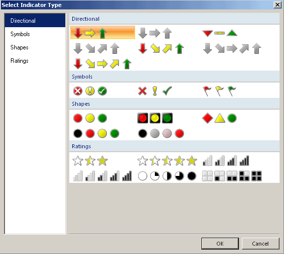
Figure 1: Indicator types in SSRS
For the first example, we will use red, yellow, and green circle indicators to show the number of support calls solved per calendar year; red indicates 10,000 or less cases solved; yellow indicates between 10,001 and 75,000 cases solved, while a green light signifies over 75,000 cases solved. Of course, the business users and management will need to help define the indicator thresholds and change the colors as needed.
Our first step (assuming you’ve completed the prelims, described previously) is to add a tablix to the body region of the report.
Matrix vs. table vs. tablix
A point of confusion is that in the toolbox you’ll see a table and a matrix but tablix is notable by its absence. However once you drag either the table or matrix onto the report body, the “object” becomes a tablix and the name of the object, or the properties, will report that the object is a tablix. To be consistent, I use tablix throughout this article, but it is called a matrix or table in the toolbox.
Next, drag onto the tablix the ServerRegion and Priority columns, as row groups, and CalendarYear as a column group. To complete the tablix, add the Amount field (number of support calls) to the data region and finally add an indicator as a second column on the data area of the tablix. Finally, run the report.
Without even looking at the raw figures, the indicator lights quickly reveal the regions and years that originated the most support tickets. As shown in Figure 2, though, unfortunately SSRS will stretch the aspect ratios of the indicators when other columns, the ServerRegion and Priority for this example, in the tablix use multiple rows of text to display a single data item.
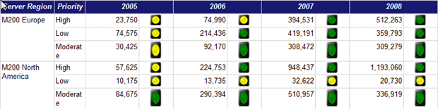
Figure 2: Using indicators in a tablix data region
Although the indicators are correct, their sizing and spacing look wrong, aesthetically and proportionally. In order to prevent “the stretch,” we can embed the indicator within a rectangle object of fixed dimensions, as shown in the top graphic of Figure 3. The bottom graphic shows the results, with the indicators in the left columns contained within the rectangle object and those in the right allowed to stretch.
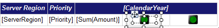
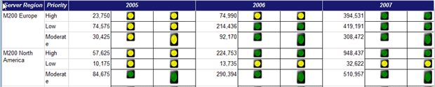
Figure 3: Preventing indicator “stretch”
We can use the same technique with other objects, such as pictures.
In addition, we may want to add a data label that will overlay the indicator used and display the indicator’s related value as a numeric label. In order for these figures to display at a size large enough for a report consumer to see, the size of the rectangle and inserted indicators must be expanded to accomodate both the indicator and its related data label, as shown in Figure 4. To achieve this result, we first need to increase the size of our rectangle and the indicator within the rectagle from the previous step. Then, the indicator properties can be modified to show data labels, and finally, we neede to increase the font of the data labels to display these values clearly to the report consumer.
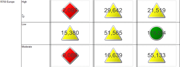
Figure 4: Overlaying the value of an indicator
As an alternative to using a numeric label to display the indicator’s value, use of a tooltip to display interactive values also works well. The tooltip in Figure 5 displays the value related to the indicator. Going back to our original example, we can add the tooltip by selecting the indicator and then right clicking and selecting properties. In the ToolTip property, we add in summation for the Amount field: SUM(Fields!Amount.Value). In figure 5, I also formated the value to display as a number with two places beyond the decimal.
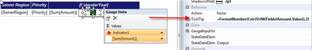
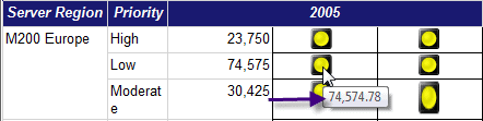
Figure 5: Using tooltips to display indicator values
Indicators make it easy and quick to compare two data points; for example, a red stop light standouts when pictured against a group of green indicators. Making the same comparison with just the discrete values requires a must more detailed review of each figure.
In this example, we embedded our indicators within a tablix. Next, we will explore the various methods a report designer can use to embed different report objects within a table, tablix, or tablix.
Embedded Charts
Embedding charts within a tablix might seem counter-intuitive, but it means that instead of displaying numbers in the data area of the control, we can display a chart. This method allows a report developer to present many charts with minimal effort.
For example, say your supervisor wants to see the support calls broken out by country, for each support region and for each calendar year. One solution would be to create one chart for each region and year combination, but this could quickly add up to many charts.
By embedding the chart within a tablix, we automatically get a chart for each group in the table. In our example, shown in Figure 6, we embed within the data area of the tablix a pie chart to show the number of support calls solved by country, by region, and by year. To complete this chart, first we will want to add a tablix to our report body area. Next, we add ServerTerritoryGroup as a row group and CalendarYear as a column group. Subsequently, we drag a pie chart onto the data area of the tablix; we use the Country field for the series grouping, and the Amount field for the values of the pie segments.
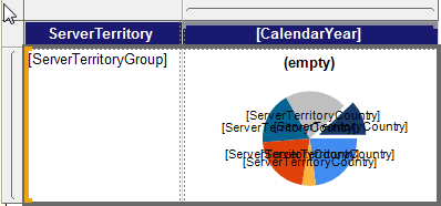
Figure 6: Embedding a pie chart in the data area of a tablix
The report users would see a pie chart for each server territory group and calendar year, similar to Figure 7. Such an embedded chart provides both a details component and trending component. The detail component is revealed by showing the country breakout on each chart and the trend is revealed by comparing the pie charts from year to year.
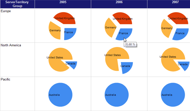
Figure 7: Pie Chart Embedded within a Tablix-Report view
This method can also be very useful on a KPI Report or other Dashboard page. Also, notice that the pie chart makes use of the tooltips functionality to display the exact percentage of the total each slice contributes to the pie.
We can embed within both row and column groupings of a tablix many types of charts and graphs, including sparklines and databars, which we discuss next.
Sparklines and Databars
Sparklines and databars are great for showing trends and changes in data over time, especially over many periods. A sparkline is similar to a regular line chart, while a databar is comparable to a column or bar chart. However, we generally embed both sparklines and databars within a textbox within a tablix. For best effect, report designers must keep the display on these charts as simple as possible, eschewing detailed legends, titles, tick marks, and even x and y axes, unless absolutely necessary.
Furthermore, we can embed, or nest, each sparkline or databar into multiple row or column groups within a tablix. Nested sparklines and databars display the related graphic for each intersection of the column groups and row groups included in a tablix. However, the report designer must understand how such a drill down affects the resulting databars or sparklines.
In this example, we’re going to nest a sparkline within the Country (i.e. ServerTerritoryCountry) row group. This nested sparkline will display the numbe rod support calls (Amount field) by Year and then Month. Nested graphics lend themselves perfectly to analyzing trends in data.
To create this simple nested sparkline, first add a tablix to the report body and then drag ServerTerritoryCountry to the row group. Next, add a new column group by clicking on the column group area (lower right of the window) and selecting Add Column Group.
Pull up the properties of the column group and use a value of 1 for the column “group on” value. This may seem confusing, but the fact is that all tablixes must have at least one column and one row group. In our example, we do not want to group on any column value so we use the dummy value of 1 for the column group, meaning we will group together all the values into a single column.
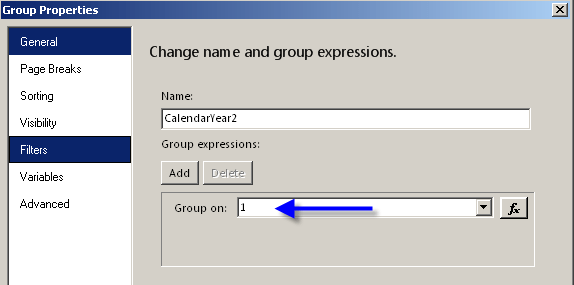
Figure 8: Grouping a Column Group under a Single “Dummy” Value
Finally, add the sparkline based on the Amount field and using the CalendarYear and CalendarMonth as the series for the sparkline. Figure 9 shows the results.
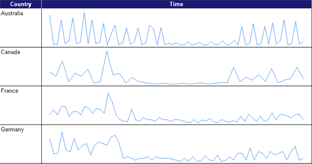
Figure 9: Sparkline Embedded within a Tablix
It is just as easy to add a databar, for example to show each country’s support calls by priority. In Figure 10, we use a databar instead of a sparkline and instead of using the CalendarYear and CalendarMonth as the series, we use Priority. In the resulting chart, the color of the bar distinguishes the priority of the call, while the bars added together show the total support cases.
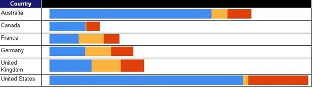
Figure 10: Nested Databar by Country
We can also create a trended databar graph using a technique similar to the one we used for the previous sparkline example. Instead of seeing a line graph for the Amount field, we will use databars to display each month’s values, as shown in Figure 11. In this example, I also added a second column group for the ServerRegion.
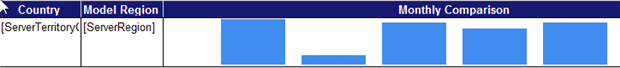
Figure 11: Databar by Year and Month
Horizontal and Vertical Scaling Issues with Databars
One issue that surfaces is that NULL values do not appear within a sparkline or databar. This situation causes spacing, alignment, and proportionality problems for each databar or sparkline on the chart.
In Figure 12, each databar represents 1 month, but there is clearly a horizontal scaling problem with the T1000 Pacific Server region, which displays fewer, wider databars. As a result, we do not know to which period each bar belongs, making it very hard to compare between groups.
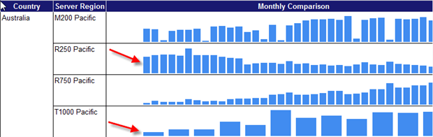
Figure 12: Nested databar with misaligned periods
To fix this problem, we can adjust a horizontal axis property on the databar, accessed by right clicking on the databars and then selecting the Horizontal AxisProperties. We need to enable the Align Axis option, as shown in Figure 13.
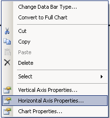
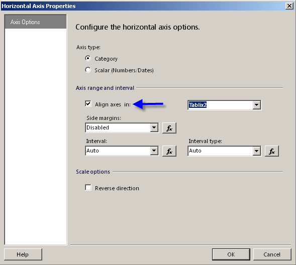
Figure 13: Horizontal Axis Properties Alignment Option
Having done this, the databars will have the correct spacing and alignment from period to period, even if a period has no data, as shown in Figure 14. We can now reliably compare support calls across periods and regions.
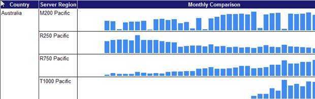
Figure 14: Databar Example with Horizontally Aligned Axis
Note, however, that this graph is still visually misleading in that it looks as if the number of support calls (height of the data bars) are roughly comparable between, for example, the R750 and T1000 Pacific regions. In fact, in Figure 14, the vertical scale is set within each individual Server Region so we can’t directly compare visually between server regions.
Just as we did for the horizontal axis, we can fix this simply by setting the Align Axis option for the vertical axis. Now, in Figure 15, we can compare individual months both within a Server Region and also between Server Regions.
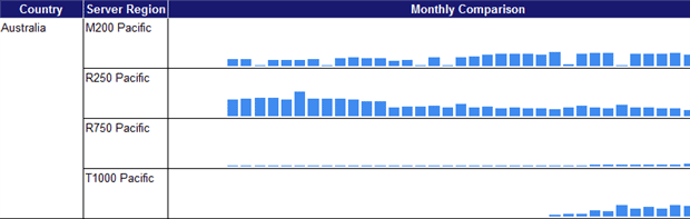
Figure 15: Databar with both Horizontal and Vertical Alignment
Sparklines and databars generally do not include axis labels or titles so, once again, it is useful to add tooltips to display the appropriate month on our databar. Simply right-click on the databar, select the Series Properties option, and enter the appropriate values for the tooltip expression. In Figure 16, we concatenate month and year in the tooltip expression property.
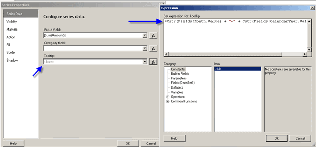
Figure 16: Adding Year and Month Tooltip to Databar
Now the report consumer has an easy way of gaining time period perspective without having to display the month and year on the x axis, and at the same time making our chart interactive.
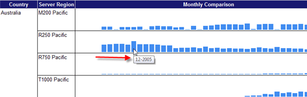
Figure 17: Year and Month Tooltip on a databar
Handling Line Breaks in Sparklines
For sparklines, we can use the same horizontal and vertical alignment settings as described for databars. However, the NULL values cause a third issue, namely line breaks in the sparklines. Notice how, in Figure 18; the R750 North America Server Region shows breaks in the line graph.
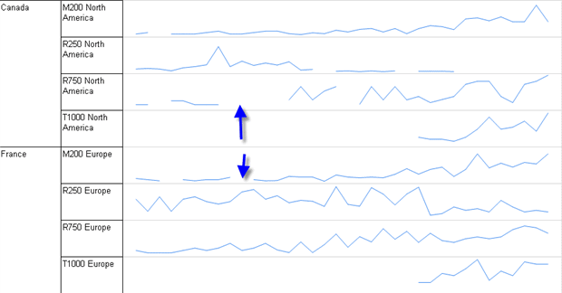
Figure 18: Sparkline with Breaks in Line Graphs caused by Null Values
To fix this problem, the report designer needs to adjust the way SSRS displays Empty Points. The EmptyPointValue property allows a report writer to “fill in” breaks in the line using either an average or zero value for the missing values.
To fill in the line, select the sparkline in the tablix, right click and select properties, and then open the Empty Point settings in the sparkline properties dialog box by clicking the + sign.
We set the EmptyPointValue property to Average meaning that the empty point value will be replaced by the average of the values immediately before and after the empty point. Note that we also set the Color property to match the color of the existing lines, DarkBlue in our example.
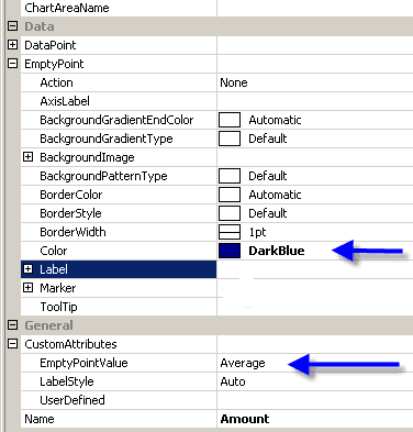
Figure 19: Empty Point Properties
Figure 20 displays the final sparkline report. Notice how the R750 Server Region now has a solid line, with the empty points set to the average of the previous and successive points.
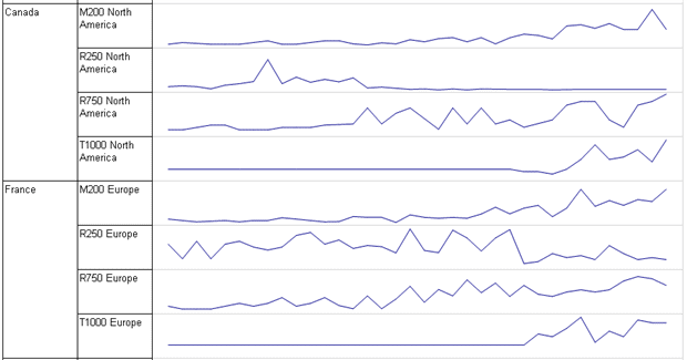
Figure 20: Sparkline with EmptyPoints Property set to Average
Multiple Data Perspectives: Overlays and Secondary Axes
Secondary axis and chart overlays allow the report designer to present multiple “perspectives” on the data in a single chart, often providing either summary level data, budget thresholds, or average values for the data being displayed in the primary area of the chart.
For our support calls example, we could design a column chart to display the support calls solved by country, and broken out by priority. Next, we could overlay a column chart to display the total support calls per country. Finally, on the original chart, a secondary axis could display as a line chart the average number of support calls.
The first step in this process is to drag a Bar Chart onto the report body area, then add ServerTerritoryCountry as the category, Priority as the series, and Amount as the Values. Figure 21 shows the result.
 Figure 21: Simple Bar Chart by Country and Priority
Next, we’re going to overlay a second set of data, which will summarize the number of total calls for each country across all priorities (a rollup of the priorities). To add this second data series, click on the chart, and then click on the green plus button in the Values area. We need to create an expression that will aggregate support calls by country, across all priorities, so we scope the SUM aggregate expression by the Country category group name, Chart3_CategoryGroup2, as shown in Figure 22. We’re simply instructing SSRS to sum the amount field again, but instead of summing the amounts by priority, sum the amounts at one grouping higher, at the country level.
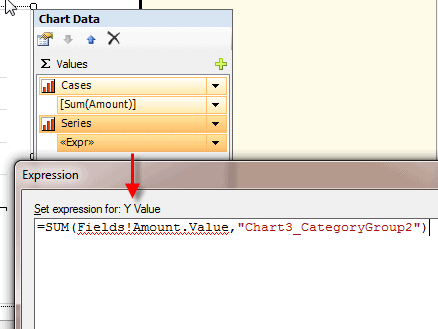
Figure 22: Second Chart Value Totaled for Each Country
Now, we have two sets of data for the chart. In order for both sets of values to display properly, we need to make two changes to the display of the “rollup” series. First, we need to change the chart type for the rollup series to a range column, so right click on the rollup series and select Change Chart Type, and select the Range Column type, as shown in Figure 23.
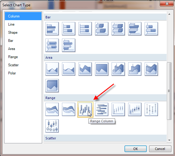
Figure 23: Choosing a Range Column chart type for the Rollup Series
Second, we need to set the fill color for the range column overlay chart such that it does not conflict with any of the colors used by the individual priority bars. It also needs to display, transparently but overtly, when contrasted with the colors used for each individual priority. Right click on the rollup series again, then select Series Properties and then click on the Fill option from the left hand menu. For this example, I used a fill color of Khaki. Depending on your needs, it also may beneficial to turn off the legend for the Rollup series.
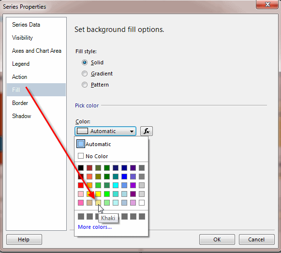
Figure 24: Rollup Series Fill Color
Figure 25 shows our new overlaid series so we can now compare not only support call volume per priority, for each country, but also the total support calls for each country.
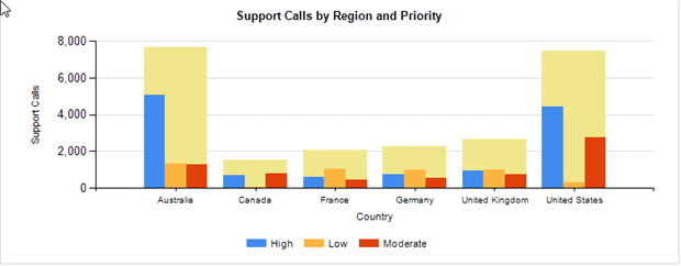
Figure 25: Bar Chart with Range Chart Overlay
Finally, we can add a secondary axis, comprising a third series of values that will display the average number of support calls per country. Click on the chart, and then click on the green plus button in the Values area. Next, add a new set of values that will be based on the following formula: AVG(Fields!Amount.Values, "Chart3_CategoryGroup 2");
Figure 26 shows the average expression (Expression) and ultimately the three sets of values to be included on the chart (Chart Data). These sets of values represent the three pieces of our Chart: 1) the “rollup” total bar chart overlay for each country, named Series 2) the original bar chart data, named Cases and 3) the average number of support calls, named Average.
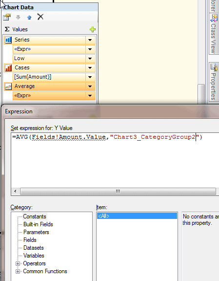
Figure 26: Chart Series Values for Average Number of Support Calls
To add this Average Series as a secondary axis, right click on it, and in the properties area select the Axes and Chart Area option from the left hand menu and select the Secondary option for the vertical axis, as shown in Figure 27.
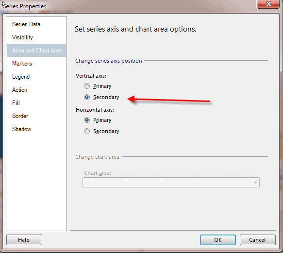
Figure 27: Setting Average Series to Use Secondary Vertical Axis
Finally, we need to adjust the Average series chart type to a line chart, so right click on the average values series, select change chart type and select line chart as the Chart type, as illustrated in Figure 28.
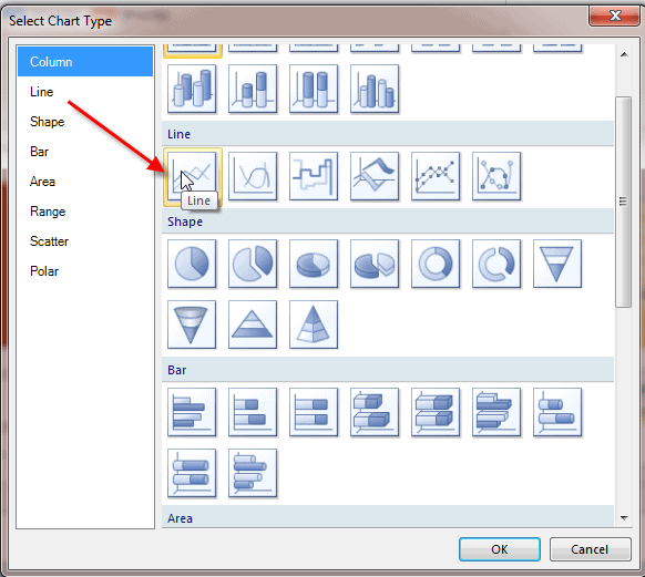
Figure 28: Set Chart Type for Average Series to Line Chart
Figure 29 shows the final version of Overlay and Secondary Axis Chart. It provides three distinct views of the data all in a single chart. Most managers like to see multiple data points in one place, and this type of chart fits that bill.
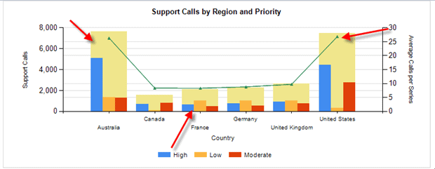 Figure 29: Final Chart with Overlay and Secondary Axis
Final Report
Finally, Figure 30 displays a report summarizing all of our support call information (see TribalSQL_Final_Report in the code bundle). This report contains:
- An indicator tablix which quickly shows the breakout of support calls by region, priority, and year
- An indicator tablix with large data labels
- A pie chart tablix which shows support calls by country, region, and year
- Databar and sparkline tablixes which show support calls by country and server region
- A column chart which includes a summarized country rollup of support calls and a secondary axis which displays the average support calls for each country.
These various charts, when pulled together, create a good starting or even ending point for a dashboard front end.
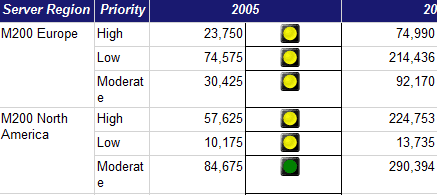
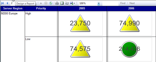
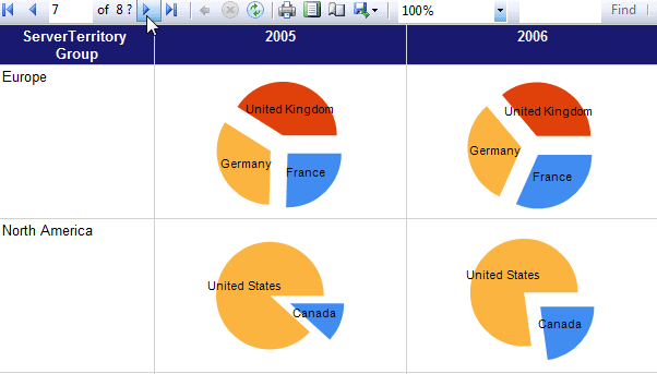
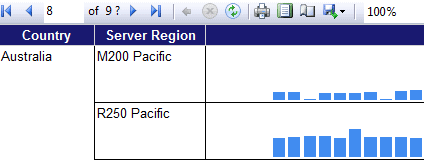
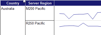
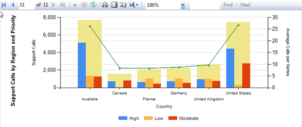
Figure 30: Final Dashboard Report
Conclusion
In this article, we reviewed some of the advanced charting techniques available in SSRS. Using the graphing functionality greatly expands the visual “eye candy” available to DBAs and report designers. We’ve covered how to:
- Use rectangles to control the sizing of inserted indicator objects
- Embed or nest charts–including pie charts, databar and sparkline within a tablix
- Utilize horizontal and vertical axis alignment within databars and sparklines to adjust for missing or
NULLvalues - Set empty point assignment to create a smooth and consistent chart, which ensures period relevancy
- Use chart overlays and secondary axes to convey many pieces of information in a single chart.
Wield these charting techniques with care, and a proper appreciation of the chart detail properties, and you can give your managers and supervisors accurate information, in an easily-understood, visually appealing report.
For additional charting tips and tricks, I recommend both MSSQLTips.com (http://www.mssqltips.com/sql-server-tip-category/175/ssrs-charts/) and SQLServerCentral.com (https://www.sqlservercentral.com/categories/Reporting-Services-SSRS).
Happy charting!
This document contains proprietary information and is protected by copyright law.
Copyright © 2026 Red Gate Software Limited. All rights reserved
Load comments