
The series so far:
- SQL Server R Services: The Basics
- SQL Server R Services: Digging into the R Language
- SQL Server R Services: Working with ggplot2 Statistical Graphics
- SQL Server R Services: Working with Data Frames
- SQL Server R Services: Generating Sparklines and Other Types of Spark Graphs
- SQL Server R Services: Working with Multiple Data Sets
SQL Server 2016 ships with SQL Server R Services, a new component that incorporates the analytic and visualization capabilities of the R language into the SQL Server environment. An important feature of the R language is the ability to import R packages into a script, making a wide range of functions available for working with SQL Server data.
One of these packages is ggplot2, which I introduced in the second article in this series. The ggplot2 package includes an extensive set of functions for generating statistical visualizations. The package’s functions let you create layered graphics using data from a data frame. This layered approach is an important concept in ggplot2 because that is how you build a graphic—one layer at a time. We used the package in conjunction with SQL Server R Services to generate a bar chart based on SQL Server data.
Given that the ggplot2 package is so widely used to visualize data, I thought it worthwhile to spend more time looking at various ggplot2 concepts. To that end, this article walks through the process of building a scatter plot graphic, using a series of R scripts to add each layer. I follow these with a few examples of other graphic types, based on the same core data.
To run an R script in R Services, you must call the sp_execute_external_script stored procedure, passing in the necessary parameter values, one of which is the R script itself. To use the ggplot2 package in a script, you must first install the package into the SQL Server library and then import it into the script. The first two articles in this series describe how to carry out these steps. In this article, we focus primarily on the graphic definitions themselves.
Creating the initial scatter plot
We’ll start by creating the initial scatter plot structure, based on data from the AdventureWorks2014 database. The following example defines an R script and T-SQL script, assigns them to variables, and uses those variables when calling the sp_execute_external_script stored procedure:
|
1 2 3 4 5 6 7 8 9 10 11 12 13 14 15 16 17 18 19 20 21 22 23 24 25 26 27 28 29 30 31 32 |
USE AdventureWorks2014; GO DECLARE @rscript NVARCHAR(MAX); SET @rscript = N' # import scales package library(ggplot2) # set up report file for chart chartfile <- "C:\\DataFiles\\Chart01.png" png(filename=chartfile, width=1000, height=600) # construct data frame df <- InputDataSet # generate chart chart <- ggplot(data=df, aes(x=Subcategory, y=AvgListPrice)) + geom_point() print(chart) dev.off()'; DECLARE @sqlscript NVARCHAR(MAX); SET @sqlscript = N' SELECT s.Name Subcategory, c.Name Category, COUNT(p.ProductID) NumberProducts, AVG(p.ListPrice) AvgListPrice FROM Production.Product p INNER JOIN Production.ProductSubcategory s ON p.ProductSubcategoryID = s.ProductSubcategoryID INNER JOIN Production.ProductCategory c ON s.ProductCategoryID = c.ProductCategoryID WHERE c.Name <> ''Clothing'' GROUP BY s.Name, c.Name;'; EXEC sp_execute_external_script @language = N'R', @script = @rscript, @input_data_1 = @sqlscript WITH RESULT SETS NONE; GO |
The T-SQL script retrieves data from the Product table and ProductSubcategory table, giving us the following data set:
|
Subcategory |
Category |
NumberProducts |
AvgListPrice |
|
Bike Racks |
Accessories |
1 |
120.00 |
|
Bike Stands |
Accessories |
1 |
159.00 |
|
Bottles and Cages |
Accessories |
3 |
7.99 |
|
Cleaners |
Accessories |
1 |
7.95 |
|
Fenders |
Accessories |
1 |
21.98 |
|
Helmets |
Accessories |
3 |
34.99 |
|
Hydration Packs |
Accessories |
1 |
54.99 |
|
Lights |
Accessories |
3 |
31.3233 |
|
Locks |
Accessories |
1 |
25.00 |
|
Panniers |
Accessories |
1 |
125.00 |
|
Pumps |
Accessories |
2 |
22.49 |
|
Tires and Tubes |
Accessories |
11 |
19.4827 |
|
Mountain Bikes |
Bikes |
32 |
1683.365 |
|
Road Bikes |
Bikes |
43 |
1597.45 |
|
Touring Bikes |
Bikes |
22 |
1425.2481 |
|
Bottom Brackets |
Components |
3 |
92.24 |
|
Brakes |
Components |
2 |
106.50 |
|
Chains |
Components |
1 |
20.24 |
|
Cranksets |
Components |
3 |
278.99 |
|
Derailleurs |
Components |
2 |
106.475 |
|
Forks |
Components |
3 |
184.40 |
|
Handlebars |
Components |
8 |
73.89 |
|
Headsets |
Components |
3 |
87.0733 |
|
Mountain Frames |
Components |
28 |
678.2535 |
|
Pedals |
Components |
7 |
64.0185 |
|
Road Frames |
Components |
33 |
780.0436 |
|
Saddles |
Components |
9 |
39.6333 |
|
Touring Frames |
Components |
18 |
631.4155 |
|
Wheels |
Components |
14 |
220.9292 |
The R script imports the ggplot2 package, creates the Chart01.png graphic file for the visualization, constructs the df data frame based on the above data set, and generates the initial scatter plot. We assign the R script to the @rscript variable and the T-SQL script to the @sqlscript variable, and then use those variables when calling the sp_execute_external_script stored procedure.
Most of what we’re doing here is covered in the preceding articles, so refer to them as necessary. Our primary concern for this article is the part of the R script that defines the graphic (the section that starts with the generate chart comment):
|
1 2 3 4 5 |
# generate chart chart <- ggplot(data=df, aes(x=Subcategory, y=AvgListPrice)) + geom_point() print(chart) dev.off()'; |
For all the examples in this article, we’ll use the same SQL Server data and df data frame (or a derivative of the data frame), changing only the chart definition as we progress through the article.
To create the first layer of a ggplot2 visualization, we use the ggplot function, which establishes the initial graphic structure. When calling the function, we must provide the source data frame and specify the visualization’s initial aesthetics, the properties that define the graphic’s visual aspects.
Often when defining the aesthetics, we use the aes function, which maps variables to the aesthetics. Variables, in this case, can include the columns in the source data frame. (The R language essentially treats a column as a variable.) In this case, we’re assigning the Subcategory column in the df data frame to the x property (X-axis), and the AvgListPrice column to the y property (Y-axis). Any aesthetics we define in the initial layer apply to all subsequent layers, unless we specifically override them in another layer.
After calling the ggplot function, we can then define the other layers in the graphic, adding a plus sign for each layer we want to include. Normally, a good place to start is by specifying the graphic type, or geom. To define a scatter plot geom, we use the geom_point function, in this case, without any arguments, but as you’ll see later in the article, we can add arguments that further define the graphic.
The geom_point function represents the second layer in our graphic. Notice that we assign the graphic definition to the chart variable. We can then use the print function to call the variable. This will print the graphic to the Chart01.png file we defined earlier.
The last step we take in this part of the R script is to call the dev.off function in order to close the png device. If we now run the sp_execute_external_script stored procedure, the R engine would generate a graphic similar to the one in the following figure.
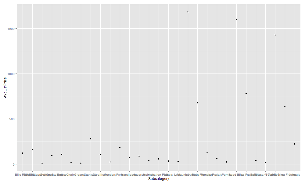
As you can see, the chart plots the average list price for each product subcategory. Unfortunately, the information is not very readable, especially the subcategory names, but we can define additional layers to fix those.
Flipping the chart’s axis points
Each layer in the graphic definition defines a specific element of that graphic. Together, the layers create the entire picture. In the previous example, we defined two layers, the initial ggplot layer and the second geom_point layer. We’ll now add two more layers that switch the X-axis and Y-axis and make the chart more readable:
|
1 2 3 4 5 6 |
chart <- ggplot(data=df, aes(x=Subcategory, y=AvgListPrice)) + geom_point() + coord_flip() + xlim(rev(levels(df$Subcategory))) print(chart) dev.off()'; |
If you reviewed the last article in this series, you might recognize what we’re doing here. First, we use the coord_flip function to switch the X-axis and Y-axis. Next, we use the xlim function to modify the order of the subcategory names so they’re listed alphabetically, starting at the top.
The xlim function defines our data range, based on the values in the Subcategory column. When referencing that column, the function calls two additional functions. The levels function retrieves the list of values (levels) from the Subcategory column, and the rev function reverses the order of those levels. We need to reverse the order because flipping the chart causes the subcategories to be listed from bottom to top.
That’s all there is to flipping the chart and listing the subcategory names in the correct order. The R script now produces the results shown in the following figure.
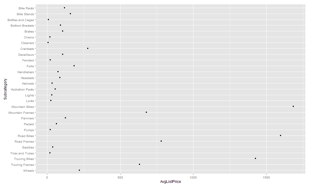
Although the subcategory labels are now easier to read, there is still much more we can do with our graphic to make it more presentable, so let’s forge ahead.
Configuring the plot points
Our next step is to change the color and size of the individual plot points so they’re easier to pick out in the chart. In this case, however, we’re not going to add a layer, but will instead update the geom_point layer by specifying values for the color and size properties:
|
1 2 3 4 5 6 |
chart <- ggplot(data=df, aes(x=Subcategory, y=AvgListPrice)) + geom_point(color="slateblue2", size=5) + coord_flip() + xlim(rev(levels(df$Subcategory))) print(chart) dev.off()'; |
The geom functions support numerous properties (aesthetics) that let you better define your graphics. In this case, we’re assigning the value slateblue2 to the color property and the value 5 (for points) to the size property. You can find lists of colors in various resources online, such as the one on the Columbia University website.
With these small changes, our R script now produces the following graphic.
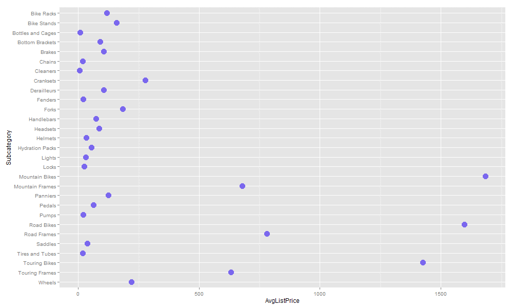
The new settings make it easier to pick out the plot points than the original black pinpoints, although you might prefer different color and size values. Your choices will depend in part on the nature and amount of the data you’re displaying. Feel free to play around with various settings until you come up with the combination that works best for your circumstances.
Mapping the plot points to categories
When defining a graphic’s aesthetics, we can use other data in the data frame to control how those aesthetics are applied. For example, suppose we want to color-code the plot points based on product categories. We can achieve this by assigning the Category column to the color property, rather than an actual color:
|
1 2 3 4 5 6 |
chart <- ggplot(data=df, aes(x=Subcategory, y=AvgListPrice)) + geom_point(aes(color=Category), size=5) + coord_flip() + xlim(rev(levels(df$Subcategory))) print(chart) dev.off()'; |
Notice that we must use the aes function when setting the color property. The R engine can then use the values in the Category column as the basis for applying colors to the plot points. In this situation, the column includes only three values, giving us three different colors, as shown in the following figure.
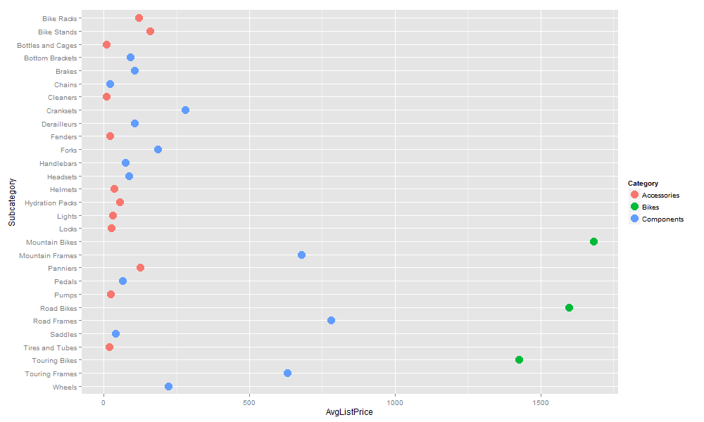
Notice that the R engine also adds the Category legend to the graphic to make it easier to identify the categories and their associated colors. The ggplot2 package also provides additional methods for controlling the colors assigned to the categories, but we’ll leave it at this for now.
Configuring the chart’s labels
Now that we’ve gotten the chart itself in order, it’s time to focus on the labels, which are currently based on default values. To display more useful labels, we’ll add several layers to our graphic definition:
|
1 2 3 4 5 6 7 8 9 |
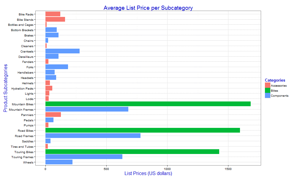
chart <- ggplot(data=df, aes(x=Subcategory, y=AvgListPrice)) + geom_point(aes(color=Category), size=5) + coord_flip() + xlim(rev(levels(df$Subcategory))) + ggtitle("Average List Price per Subcategory") + labs(x="Product Subcategories", y="List Prices (US dollars)") + guides(color=guide_legend("Categories")) print(chart) dev.off()'; |
We start by using the ggtitle function to define the graphic’s title—Average List Price per Subcategory—passing in the title as an argument. We then follow with the labs function to define the X-axis and Y-axis labels, Product Subcategories and List Prices (US dollars), respectively. We could have used the labs function to define the title as well, but I wanted to demonstrate that there are different ways to do things in R, and using ggtitle makes it easier to pick the title out of the script.
The next step is to change the title for the Category legend so it is plural. For that, we use the guides function, which lets you configure or remove a legend. In this case, we’re setting the color property to Categories, using the guide_legend function to specify the new name. The guide_legend function lets us control a number of settings associated with the legend, such as color, size, shape, and transparency. Our graphic should now look like the one shown in the following figure.
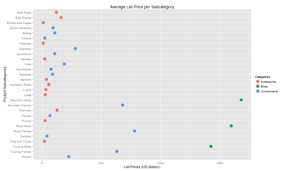
There are, of course, a wide range of changes we can make to how the labels and other elements are displayed, but this should give you a sense of types of steps we can take to control the various elements.
Applying a pre-built theme
The basic implementation of the R language in SQL Server supports several predefined themes, which specify the graphic’s overall property settings, such as borders, margins, grid lines, and background colors. A theme is essentially a function that defines the various settings, allowing you to apply those settings by calling the function. For example, we can apply the theme_bw theme to our graphic by calling it in a new layer:
|
1 2 3 4 5 6 7 8 9 10 |
chart <- ggplot(data=df, aes(x=Subcategory, y=AvgListPrice)) + geom_point(aes(color=Category), size=5) + coord_flip() + xlim(rev(levels(df$Subcategory))) + ggtitle("Average List Price per Subcategory") + labs(x="Product Subcategories", y="List Prices (US dollars)") + guides(color=guide_legend("Categories")) + theme_bw() print(chart) dev.off()'; |
All we’re doing is adding a layer that calls the theme_bw function, which changes the look of our scatter plot to the following chart:
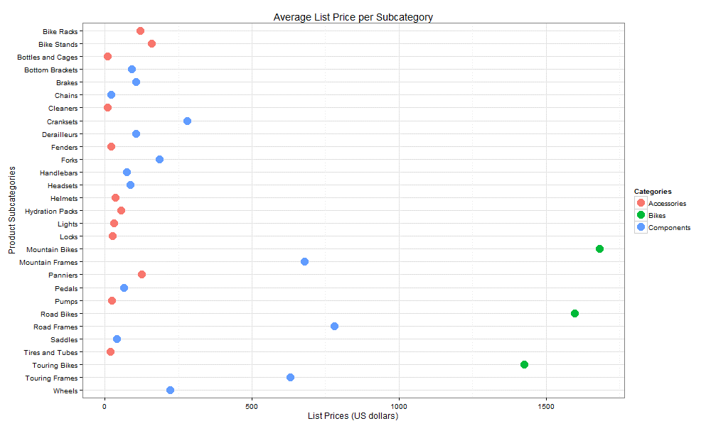
The most obvious difference is that there is no longer a gray background, but other elements have changed as well, such as the weight of the grid lines.
The basic R language includes only a few pre-built themes, but you can find plenty of other themes out there. You just need only to install the applicable R package. In some cases, however, you might want to update individual theme-related properties, rather than all settings. For that, we need to take a different approach.
Configuring theme elements
The ggplot2 package supports a wide range of theme-related graphic properties that you can update by using the theme function. For example, we can change the size and color of the various titles:
|
1 2 3 4 5 6 7 8 9 10 11 |
chart <- ggplot(data=df, aes(x=Subcategory, y=AvgListPrice)) + geom_point(aes(color=Category), size=5) + coord_flip() + xlim(rev(levels(df$Subcategory))) + ggtitle("Average List Price per Subcategory") + labs(x="Product Subcategories", y="List Prices (US dollars)") + guides(color=guide_legend("Categories")) + theme_bw() + theme(title=element_text(size=16, color="blue3")) print(chart) dev.off()'; |
In this case, when calling the theme function, we’re specifying a value for the title property, using the element_text function to set the size value to 16 points and the color value to blue3, giving us the results shown in the following figure.
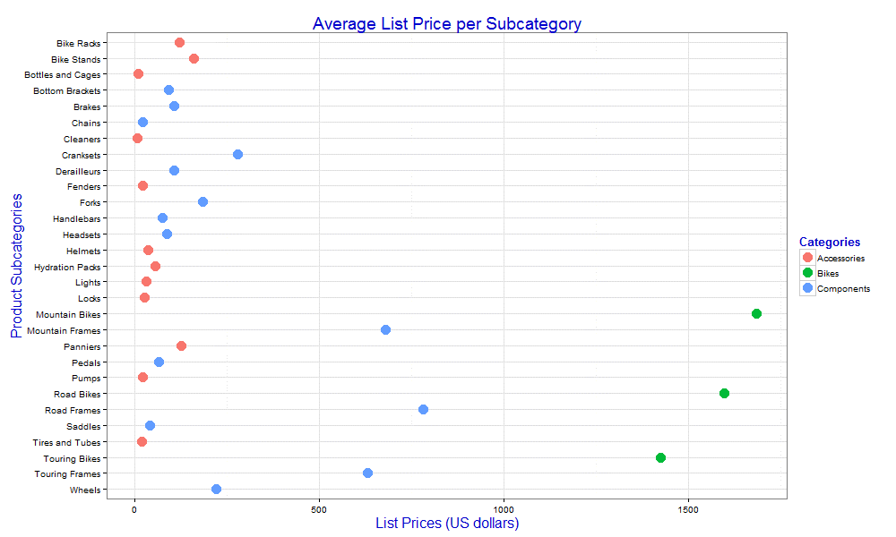
By using the theme function, we can control dozens of settings, ranging from line sizes to legend margins to background colors. We can even control individual axis labels. For information about the type of settings you can control, see the RDocumentation topic theme.
Faceting the chart based on categories
Another fun thing we can do with ggplot2 is to split a graphic into multiple small graphics by faceting the data based on values in one of the data frame’s columns. For this, we call the facet_wrap function and specify the column on which the faceting is based:
|
1 2 3 4 5 6 7 8 9 10 11 12 |
chart <- ggplot(data=df, aes(x=Subcategory, y=AvgListPrice)) + geom_point(aes(color=Category), size=5) + coord_flip() + xlim(rev(levels(df$Subcategory))) + ggtitle("Average List Price per Subcategory") + labs(x="Product Subcategories", y="List Prices (US dollars)") + guides(color=guide_legend("Categories")) + theme_bw() + theme(title=element_text(size=16, color="blue3")) + facet_wrap(~Category) print(chart) dev.off()'; |
To implement faceting, we add the facet_wrap function as a new layer and include the Category column as an argument. Notice that we must precede the column name with a tilde (~) operator. This is because the function expects a formula as an argument, and the R language uses the tilde operator to define formulas. In this case, however, we’re providing only the right side of the formula, which is the column name. (The topic of R formulas and the use of the tilde argument is beyond the scope of this article. For now, just know that you need to precede the column name with the operator so the R engine doesn’t baulk.)
When we add the facet_wrap function, specifying the Category column, the R script returns the graphic shown in the following figure.
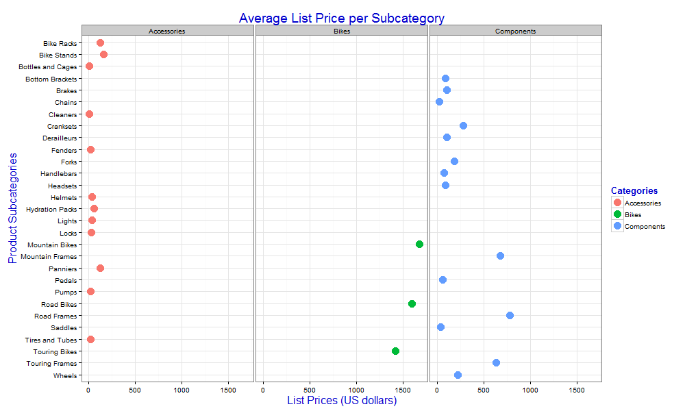
We now have one chart for each product category. Although this is a relatively simple example, it shows how easy it is to create individual charts based on a specific set of values. For complex data, this can provide a valuable resource to help display data more clearly.
Creating a bar chart
Our focus to this point has been on adding layers to our scatter plot graphic, but the same principles also apply to other geom types. For example, the following graphic definition defines a bar chart:
|
1 2 3 4 5 6 7 8 9 10 |
chart <- ggplot(data=df, aes(x=Subcategory, y=AvgListPrice)) + geom_bar(stat="identity", aes(fill=Category)) + coord_flip() + xlim(rev(levels(df$Subcategory))) + ggtitle("Average List Price per Subcategory") + labs(x="Product Subcategories", y="List Prices (US dollars)", fill="Categories") + theme_bw() + theme(title=element_text(size=16, color="blue3")) print(chart) dev.off()'; |
Notice that many of the layers are similar the scatter plot. We flip the X-axis and Y-axis, reverse the list of subcategories, format the labels, and apply theme settings. However, there are also several differences.
To begin with, we specify the geom_bar function, rather than the geom_point function, and pass in the stat and fill arguments. The stat argument and its value, identity, ensure that the data values map correctly to the plot points. The fill argument specifies the bar fill colors. Because we want to color-code the bars based on product categories, we specify the Category column, wrapping the argument and value in the aes function.
Another difference from previous examples is that we do not use the guides function to set the legend title. Instead, we include the fill property when calling the labs function, but we still set the value to Categories.
You’ll find many small differences like this from one geom to the next, but the general concept of adding layers remains the same. The graphic definition now generates the bar chart shown in the following figure.
That’s all there is to creating a bar chart. If you reviewed the second article in this series, most of the script components should look familiar to you. Even if you have not, the approach to creating a bar chart is the same as creating a scatter plot or any other geom.
Adding labels to the chart’s bars
We can also add labels to the graphic itself. As a quick example, let’s add the number of products per subcategory by defining an additional layer:
|
1 2 3 4 5 6 7 8 9 10 11 |
chart <- ggplot(data=df, aes(x=Subcategory, y=AvgListPrice)) + geom_bar(stat="identity", aes(fill=Category)) + coord_flip() + xlim(rev(levels(df$Subcategory))) + ggtitle("Average List Price per Subcategory") + labs(x="Product Subcategories", y="List Prices (US dollars)", fill="Categories") + theme_bw() + theme(title=element_text(size=16, color="blue3")) + geom_text(aes(label=NumberProducts), size=4, hjust=-0.2) print(chart) dev.off()'; |
In this case, we’re using the geom_text function to specify that the values in the NumberProducts column be used as bar labels. We do this by assigning the column to the label property. Notice that we must use the aes function to set the property value because we’re specifying a column (variable), rather than a literal value.
Next, we set the size value to 4 points and the hjust value to -0.2 points to provide a bit of space between the bar and the label, as shown in the following figure.

This is just a small addition to our graphic, but it shows how we can keep adding layers to provide us with exactly the information we need, based on the available data. In fact, we can even incorporate different geoms, treating each one as an additional layer.
Creating a stacked bar chart
The ggplot2 package also allows us to create a stacked bar chart, in which each bar is broken into segments, based on a set of data values. For example, we can create a stacked bar chart broken down by product category and then by subcategory, as shown in the following graphic definition:
|
1 2 3 4 5 6 7 8 9 |
df2 <- df[df$NumberProducts > 3, ] chart <- ggplot(data=df2, aes(x=Category, fill=Subcategory)) + geom_bar() + ggtitle("Categories and Subcategories") + labs(x="Product Categories", y="Number of Subcategories per Category", fill="Subcategories") + theme_bw() + theme(title=element_text(size=16, color="blue3")) print(chart) dev.off()'; |
You’ve seen all these elements before, but notice that that the ggplot function now specifies the Category column as the X-axis and includes the fill property, with the Subcategory column as its value.
Also note that, before defining the graphic, we filter the df data frame so it includes only subcategories with more than three products. We then assign the filtered data frame to the df2 variable, which we then use in the ggplot function. The R script now generates the graphic shown in the following figure.
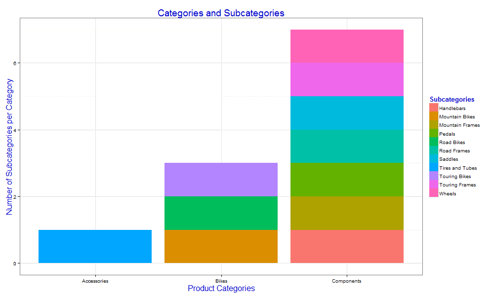
That’s all there is to creating a simple stacked bar chart. We need only assign the column name to the fill argument, using the aes function to wrap the argument and value. You might have also noticed here and elsewhere that we are able to include multiple arguments in a single aes call, in this case, x and fill. You can specify multiple aesthetics whenever calling the aes function.
Creating a density plot
Let’s look at one more example that demonstrates a few additional concepts. This time we’ll create a density plot, which shows how data values are distributed across a specified interval. For this example, we’ll plot the AvgListPrice values for each product subcategory, as they’re distributed across the three product categories:
|
1 2 3 4 5 6 7 8 |
chart <- ggplot(data=df, aes(x=AvgListPrice, fill=Category)) + geom_density(alpha=0.4) + ggtitle("Product Density Plot Chart") + labs(x="Average List Prices", y="Density", fill="Categories") + theme_bw() + theme(title=element_text(size=16, color="blue3")) print(chart) dev.off()'; |
To create a density plot, we start by defining the aesthetics when calling the ggplot function, setting the x property to the AvgListPrice column and the fill property to the Category column. Next, we call the geom_density function, passing in the alpha argument, which defines the percentage of transparency for the charted data (40% in this case).
All other layers are similar to what you’ve seen in earlier examples. This time, however, the R script returns the following graphic.
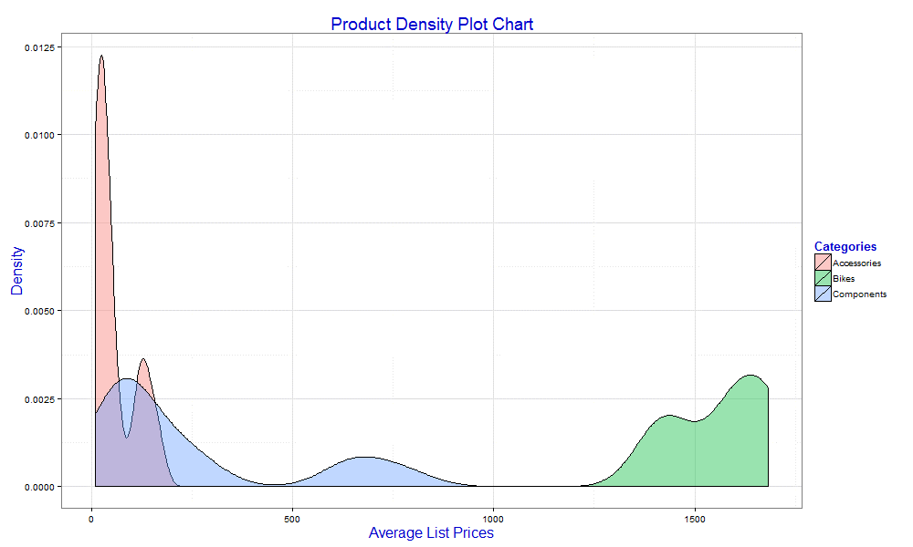
The chart shows the value densities across the categories, with the highest rate in the Accessories category. Because we set the alpha property to 40%, the colors are transparent, which makes it easier to view overlapping categories.
Working with ggplot2 R package
There is a great deal more we can do with the ggplot2 package when it comes to visualizing data, but what we’ve covered here should give you a good idea of the package’s capabilities. As we move on to the analytics side of the R language, keep the ggplot2 package in mind for a quick way to render the analyzed data as graphics. The key is to get the data you need into a data frame and then use that data frame to visualize the data.
In the meantime, play around with the ggplot2 functions against various types of data so you can get a sense of the many options you have for visualizing data. Even if you rely solely on SQL Server data for now, as we have done here, you can still benefit from the extensive visualization capabilities at your fingertips (and impress the powers-that-be along the way). Then, as you dig deeper into other aspects of the R language, you’ll be ready to turn those analytics into meaningful visualizations, using the large arsenal of tools already at your disposal.
This document contains proprietary information and is protected by copyright law.
Copyright © 2026 Red Gate Software Limited. All rights reserved


Load comments