
The series so far:
- SQL Server Machine Learning Services – Part 1: Python Basics
- SQL Server Machine Learning Services – Part 2: Python Data Frames
- SQL Server Machine Learning Services – Part 3: Plotting Data with Python
- SQL Server Machine Learning Services – Part 4: Finding Data Anomalies with Python
- SQL Server Machine Learning Services – Part 5: Generating multiple plots in Python
- SQL Server Machine Learning Services – Part 6: Merging Data Frames in Python
The first three articles in this series focused on the fundamentals of working with Python in SQL Server Machine Learning Services (MLS). The articles demonstrated how to run Python scripts within the context of a SQL Server database, using data from that database. If you reviewed these article, you should have a basic understanding how to create Python scripts in SQL Server, generate and manage data frames within the scripts, and plot data within those data frames to create different types of visualizations.
As important as these concepts are to working Python and MLS, the purpose in covering them was meant only to provide you with a foundation for doing what’s really important in MLS, that is, using Python (or the R language) to analyze data and present the results in a meaningful way. In this article, we start digging into the analytics side of Python by stepping through a script that identifies anomalies in a data set, which can occur as a result of fraud, demographic irregularities, network or system intrusion, or any number of other reasons.
The article uses a single example to demonstrate how to generate training and test data, create a support vector machine (SVM) data model based on the training data, score the test data using the SVM model, and create a scatter plot that shows the scoring results. Before running the script, make sure that the path, C:\DataFiles\ exists. For this example, you won’t be using SQL Server data, but the principles are the same: you start with a data frame, end with a data frame, and use the data frame to generate the scatter plot, as shown in the following script:
|
1 2 3 4 5 6 7 8 9 10 11 12 13 14 15 16 17 18 19 20 21 22 23 24 25 26 27 28 29 30 31 32 33 34 35 36 37 38 39 40 41 42 43 44 45 46 |
DECLARE @pscript NVARCHAR(MAX); SET @pscript = N' # import Python modules import matplotlib matplotlib.use("PDF") import matplotlib.pyplot as plt import pandas as pd from sklearn.datasets import load_iris from sklearn.model_selection import train_test_split from microsoftml import rx_oneclass_svm, rx_predict # create data frame iris = load_iris() df = pd.DataFrame(iris.data) df.reset_index(inplace=True) df.columns = ["Plant", "SepalLength", "SepalWidth", "PetalLength", "PetalWidth"] # split data frame into training and test data train, test = train_test_split(df, test_size=.06) # generate model svm = rx_oneclass_svm( formula="~ SepalLength + SepalWidth + PetalLength + PetalWidth", data=train) # add anomalies to test data test2 = pd.DataFrame(data=dict( Plant = [175, 200], SepalLength = [2.9, 3.1], SepalWidth = [.85, 1.1], PetalLength = [2.6, 2.5], PetalWidth = [2.7, 3.2])) test = test.append(test2) # score test data scores = rx_predict(svm, data=test, extra_vars_to_write="Plant") # create scatter plot pt = scores.plot.scatter(x="Plant", y="Score", c="navy", s=35, alpha=.8) # configure scatter plot title and grid pt.set_title(label=" Identifying Iris Anomalies", y=1.04, fontsize=14, weight=500, color="navy") pt.grid(color="slategray", alpha=.5, linestyle="dotted", linewidth=.5) # configure scatter plot Y-axis and X-axis labels pt.set_ylabel("Species Scoring", labelpad=20, fontsize=12, color="navy") pt.set_xlabel("Iris Species (by ID)", labelpad=20, fontsize=12, color="navy") # save scatter plot to .pdf file plt.savefig("c:\\datafiles\\IrisAnomalies.pdf", bbox_inches="tight", pad_inches=.8)'; EXEC sp_execute_external_script @language = N'Python', @script = @pscript; GO |
When running a Python script in MLS, you must pass it in as a parameter value to the sp_execute_external_script stored procedure. If you’re not familiar with how this works, refer to the first article in this series. In this article, we focus exclusively on the Python script, taking each section one step at a time, starting with importing the Python modules.
Importing Python modules
For most Python scripts, you will likely need to import one or more Python modules, packages that contain tools for carrying out various tasks and working with data in different ways. You were introduced to the first set of import statements in the previous article:
|
1 2 3 |
import matplotlib matplotlib.use("PDF") import matplotlib.pyplot as plt |
As you’ll recall, the matplotlib module provides a set of tools for creating visualizations and saving them to files. The first import statement calls the module, and the second statement uses the module to call the use function, which sets the backend to PDF. The third statement imports the pyplot plotting framework included in the matplotlib package. Together these three statements make it possible to create a scatter plot and output it to a .pdf file.
The next step is to import the pandas module, which includes the tools necessary to create and work with data frames:
|
1 |
import pandas as pd |
The examples in the previous articles did not require you to import the pandas module because the InputDataSet variable pulled in the necessary DataFrame structure, along with the various functions it supports. However, because this example does not import SQL Server data into the script, and consequently does not use the InputDataSet variable, you must specifically import the pandas module to access its tools.
The next two import statements retrieve specific functions from the sklearn module, which contains a variety of machine learning, cross-validation, and visualization algorithms:
|
1 2 |
from sklearn.datasets import load_iris from sklearn.model_selection import train_test_split |
In this case, you need to import only the load_iris function in sklearn.datasets and the train_test_split function in sklearn.model_selection, both of which are discussed in more detail below.
The final import statement retrieves two functions from the microsoftml module, a collection of Python functions specific to MLS:
|
1 |
from microsoftml import rx_oneclass_svm, rx_predict |
As with the sklearn functions, we’ll be digging into the rx_oneclass_svm and rx_predict functions shortly, but know that the microsoftml module includes a number of functions for training and scoring data and carrying out other analytical tasks.
The microsoftml module is also tightly coupled with the revoscalepy module, another Microsoft package included with MLS. The revoscalepy module contains a collection of functions that you can use to import, transform, and analyze data at scale. The module also supports classifications, regression trees, descriptive statistics, and other data models. Data sources used in the microsoftml module are defined as revoscalepy objects.
Generating the iris data frame
After you’ve imported the necessary components, you will create a data frame that provides the initial data structure necessary to perform the analytics. You can pull the data from a SQL Server database or from another source. In this case, you’ll take the latter approach, creating a data frame based on the well-known Iris data set.
The Iris data set is commonly used for demonstrating and trying out coding constructs. The data set originated in the 1930s and is considered one of the first modern examples of statistical classification. The data contains measurement data for 150 species of iris flowers. For each species, the set includes the sepal length and width and the petal length and width.
To pull the Iris data set into you script, you need only call the load_iris function available in the sklearn module:
|
1 |
iris = load_iris() |
The load_iris function returns the data as an sklearn.utils.Bunch object that includes the iris data. For this reason, the next step you should perform is to retrieve the data from the object and convert it to a pandas data frame:
|
1 |
df = pd.DataFrame(iris.data) |
If you were retrieving SQL Server data, you would not need to take this step because the data would be imported into the Python script as a data frame. Because that is not the case in this situation, you must explicitly convert the data. The important point to take from all this is that, regardless of where the data originates, you must end up with a data frame. From there, you can take whatever steps necessary to prepare the data frame for analysis. In this particular situation, you should convert the data frame’s index to a column:
|
1 |
df.reset_index(inplace=True) |
If you reviewed the second article in this series, the reset_index function should be familiar to you. The function transforms the existing index into a column and generates a new index. As you’ll see later in the article, this will provide you with a way to identify the individual species after scoring the data.
Next, you should assign a name to each column, starting with the index column:
|
1 |
df.columns = ["Plant", "SepalLength", "SepalWidth", "PetalLength", "PetalWidth"] |
When you run the reset_index function, the new column is added at the beginning of the data set, so be sure to start with that column name first. You can then follow with the names for the four columns that contain the iris size data, specifying the names in the same order as in the original data set. For any of these columns, you can use whatever names you like. Just be sure to update the script accordingly.
If you want to view the data at this point, you can add a print command to your Python script, passing in the df data set as the function’s argument:
|
1 |
print(df) |
The following figure shows the first 14 rows returned by the print command when I ran it on my system in SQL Server Management Studio.
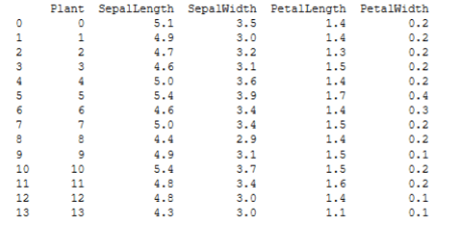
As expected, the Plant column contains the same values as the newly generated index, following by the four columns that contain the iris size data. With the data frame in place, you’re ready to generate the sample training and test data.
Preparing the model and sample data
When analyzing data for anomalies (outliers), you will need data to train the analytics model and data to test for outliers. One way you can get this data is to split the df data frame into two data sets: a larger one for training and a smaller one for testing. An easy way to create the two data sets is to use the train_test_split function included with the sklearn module:
|
1 |
train, test = train_test_split(df, test_size=.06) |
The train_test_split function generates two random sets of data from the specified array or matrix, which in this case is the df data frame. By default, the function uses 75% of the data set for the training data and 25% for the test data. (It appears that these proportions will be changing to a 79/21 split at some point in the future.) For this example, I wanted an even smaller set of test data, so I included the test_size parameter and specified that only 6% of the data set be used. (You can specify any float between 0.0 and 1.0.)
When you run the train_test_split function, it will assign the training data to the train variable and the test data to the test variable, resulting in two new data frames.
The next step is to generate and train a one-class SVM data model that identifies outliers that do not belong to the target class. In this case, you want the model to identify iris-related data that is outside the normal size ranges. To create the trained model, you can use the rx_oneclass_svm function in the microsoftml module:
|
1 2 |
svm = rx_oneclass_svm( formula="~ SepalLength + SepalWidth + PetalLength + PetalWidth", data=train) |
When you call the function, you need to specify the formula and data to use for training the model. When defining the formula, you will typically specify one or more variables (in this case, columns). For multiple columns, precede the list with the cbind (~) operator and use the concatenate (+) operator to separate the columns. The model will be based on all four size columns from the train data set.
At this point, you’re ready to run the svm model against the test data. But before you do that, you should add a couple of rows of outlier data to the test data set to ensure that it contains observable anomalies. One way to add the data is to create a second data frame and then append it to the test data frame:
|
1 2 3 4 5 6 7 |
test2 = pd.DataFrame(data=dict( Plant = [175, 200], SepalLength = [2.9, 3.1], SepalWidth = [.85, 1.1], PetalLength = [2.6, 2.5], PetalWidth = [2.7, 3.2])) test = test.append(test2) |
To add the rows, first create a dict object that contains the set of new values, and then use the DataFrame function to convert the dict object to a DataFrame object and assign it to the test2 variable. Next, use the append function on the test variable to add the test2 data.
You can use whatever values you like for the test2 data (within reason). I came up with these amounts by looking at the mean values included with the original Iris data set:
- Sepal length: 5.84
- Sepal width: 3.05
- Petal length: 3.76
- Petal width: 1.20
Notice that I also specified 175 and 200 for the Plant values in the test2 data frame. The original Iris data set includes only 150 rows, so these two values will make it easier to verify that the outliers are indeed the rows you just added. This also points to why it was useful to turn the original index into a column. It is an easy way to identify the individual species. Of course, this implies that the index has meaning in terms of identifying species, which is not very likely, but for our purposes here, it’s a useful enough strategy.
Scoring the data
The final step is to score the test data, using the svm model. For this, you can use the rx_predict function in the microsoftml module:
|
1 |
scores = rx_predict(svm, data=test, extra_vars_to_write="Plant") |
The function runs an advanced algorithm that calculates a relative score for each species, based on the four size columns. When calling the function, you must specify the svm model and test data frame. You should also include the extra_vars_to_write parameter and specify Plant as its value so the column is included in the results. Otherwise, you would end up with only the scores, one for each species, without being able to tie them back to the individual plants.
The rx_predict function returns the results as a DataFrame object, which is assigned to the scores variable. If you run the print function against the variable, you should see results similar to those shown in the following figure.
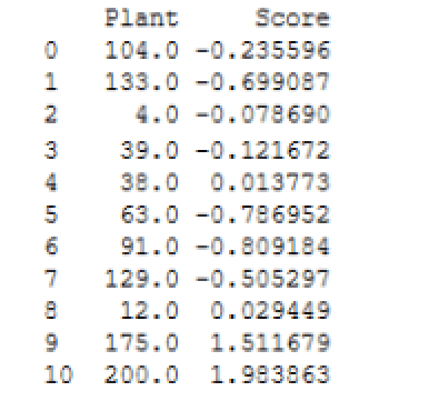
Notice that the Plant values are turned into floats. You can convert those to integers if you like, but for our purposes here, it’s not necessary. The important point is that plants 175 and 200 clearly fall outside the range of the other scores.
When running your Python script, keep in mind that you’re generating random test and training data, so your results will likely vary from what are shown here and from what you see each time you run the script. Even so, plants 175 and 200 should always show up as outliers.
Plotting the data scores
The rest of the Python script should be familiar to you if you reviewed the third article in this series. You start by creating a scatter plot chart based on the scores data frame, specifying the Plant column for the X-axis and the Score column for the Y-axis:
|
1 |
pt = scores.plot.scatter(x="Plant", y="Score", c="navy", s=35, alpha=.8) |
The c parameter sets the color. The s parameter sets the size in points, raised to the power of 2 (points^2). The alpha parameter sets the transparency based on a percentage.
The next step is to add a title, providing its text, location, font size, weight, and color:
|
1 2 |
pt.set_title(label=" Identifying Iris Anomalies ", y=1.04, fontsize=14, weight=500, color="navy") |
You can also add a background grid, setting its color, transparency, line type, and line width:
|
1 |
pt.grid(color="slategray", alpha=.5, linestyle="dotted", linewidth=.5) |
You can follow this by configuring labels for the X-axis and Y-axis:
|
1 2 |
pt.set_ylabel("Species Scoring", labelpad=20, fontsize=12, color="navy") pt.set_xlabel("Iris Species (by ID)", labelpad=20, fontsize=12, color="navy") |
The final step is to use the savefig function from the matplotlib module to save the scatter plot to a .pdf file. You can use the following statement for this, but be sure to specify the correct path and file name:
|
1 2 |
plt.savefig("c:\\datafiles\\IrisAnomalies.pdf", bbox_inches="tight", pad_inches=.8) |
We’ve skimmed over this part of the Python script because most of these concepts are covered in detail in the previous article. If you have any questions about these statements, refer to that article or to the matplotlib documentation.
Reviewing the results
When you run the script, the Python engine generates results similar to the following:
|
1 2 3 4 5 6 7 8 9 10 11 12 13 14 15 16 17 18 19 20 21 22 |
STDOUT message(s) from external script: Automatically adding a MinMax normalization transform, use 'norm=Warn' or 'norm=No' to turn this behavior off. Beginning processing data. Rows Read: 141, Read Time: 0.001, Transform Time: 0 Beginning processing data. Beginning processing data. Rows Read: 141, Read Time: 0, Transform Time: 0 Beginning processing data. Using these libsvm parameters: svm_type=2, nu=0.1, cache_size=100, eps=0.001, shrinking=1, kernel_type=2, gamma=0.25, degree=0, coef0=0 Reconstructed gradient. optimization finished, #iter = 21 obj = 83.959314, rho = 11.983749 nSV = 15, nBSV = 13 Not training a calibrator because it is not needed. Elapsed time: 00:00:01.1979236 Elapsed time: 00:00:00.2649242 Beginning processing data. Rows Read: 11, Read Time: 0, Transform Time: 0 Beginning processing data. Elapsed time: 00:00:00.2414419 Finished writing 11 rows. Writing completed. |
The rx_oneclass_svm function outputs the majority of these results. The last six lines are generated by the rx_predict function. Mostly what you’re looking for are error and warning messages. Fortunately, everything here is informational, which you can review at your own leisure.
You’ll likely be more interested in the scatter plot that you saved to the .pdf file. The following figure shows the one I generated on my system.
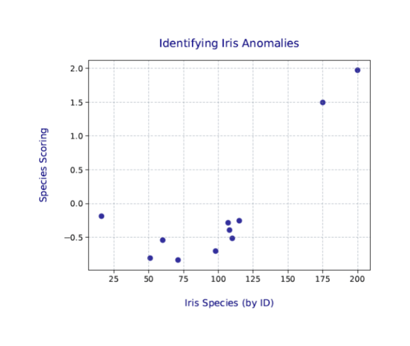
Again, your results will likely be a bit different from those shown here and different each time you run the Python script. Even so, the two outliers (plants 175 and 200) should still be clearly visible.
The world of SQL Server analytics
MLS includes both the microsoftml and revoscalepy modules as part of its installation. Together they provide a range of machine learning tools for transforming and analyzing data. The more you use Python to work with data in a SQL Server database, the more likely you’ll run up against these modules.
Python supports other data science modules as well, such as NumPy and SciPy, both of which are included in Anaconda, the Python distribution used by MLS. Anaconda also includes a number of other Python packages for working with SQL Server data. What we’ve looked at so far in this series barely scratches the surface of what’s available. The more you dig into Python for machine learning and analytics, the more you’ll realize how much you can do, and all within the context of a SQL Server database.
This document contains proprietary information and is protected by copyright law.
Copyright © 2026 Red Gate Software Limited. All rights reserved


Load comments