
In the first three articles of the Report Builder 3.0 series (article 1 | article 2 | article 3), you learned how to add tables and charts to a report and configure their properties. In this article, you’ll learn how to add a map, one of the most interesting visualizations available in Report Builder.
A map is made up of one or more layers that display spatial and analytical data. The spatial data is what you’d normally think of as the map itself, such as a country’s outline or the outline of the states or provinces within that country. The analytical data provides meaning to the spatial data. For example, you might have a map whose spatial data provides an outline of Canada and its provinces and whose analytical data breaks down the population demographics for each province.
In this article, we’ll create a map of the United States that includes the locations and sales totals for sales representatives in the AdventureWorks bicycle company (Microsoft’s fictitious company used to provide sample SQL Server data). If you want to create this map on your own system, you’ll need to create a Report Builder report and add a data source and dataset to the report that retrieve AdventureWorks data.
On my system, I created a data source that connects to the AdventureWorks2012 database on a local instance of SQL Server 2012. I named the data source AdventureWorks. I then created a dataset that uses the AdventureWorks data source to retrieve the necessary sales data. I named the dataset SalesData. Finally, I configured the dataset with the following T-SQL query:
|
1 2 3 4 5 6 7 8 9 10 11 12 13 14 15 16 17 18 |
SELECT p.FirstName, p.LastName, p.City, RTRIM(sp.StateProvinceCode) AS StateCode, p.SalesLastYear, a.SpatialLocation FROM Sales.vSalesPerson p INNER JOIN Person.BusinessEntityAddress ea ON p.BusinessEntityID = ea.BusinessEntityID INNER JOIN Person.Address a ON ea.AddressID = a.AddressID INNER JOIN Person.StateProvince sp ON a.StateProvinceID = sp.StateProvinceID WHERE CountryRegionName = 'United States' AND SalesLastYear > 0; |
The SELECT statement retrieves sales and location data for each sales representative. Notice that I use the RTRIM function to remove trailing spaces from the state codes. We’ll be using the state codes to map our analytical data to spatial data, which has its own state codes associated with it. The codes must match exactly. How we use the data will become clearer as we work though the exercise.
After you’ve set up your environment, you’re ready to add the map. As mentioned above, a map is made up of one or more layers. Each layer is configured as one of the following types:
- Polygon: Outlines of regions such as cities, states, provinces, and countries. For our example report, we’ll include a polygon layer that shows each state in the continental U.S.
- Point: Specific points on a map. We’ll include one of these layers as well to identify the cities where the sales representatives reside.
- Tile: A Bing map that often serves as a backdrop for other layers in the map. We’ll include one of these layers as well to provide an aerial image that sits behind the state and country outlines in the polygon layer.
- Line: Path or route between two points. Our map will not include a line layer.
Together, the three layers that we’ll be adding to our map-polygon, point, and tile-will provide a single view of the spatial and analytical data. We’ll add and configure the layers one at a time, in the order specified above.
To demonstrate how to create the map, we’ll use a combination of wizards and other interface elements when adding the layers. I take this approach because Report Builder can be a bit quirky when working with maps, and some features seem to be more efficient than others. At the same time, I want to demonstrate how to work with each layer individually and how they fit together. That’s not to say you can’t do things differently, but if you follow along with what I’ve done, you should come out with a better conceptual understanding of how Report Builder works when it comes to maps. From there, you can fiddle around all you like to better familiarize yourself with how to use the various features.
Adding a Polygon Layer
There are a couple ways you can get started with adding a map to your report. You can go the wizard route, which adds the map surface and your first layer, or you can go the manual route, in which you first add the map surface and then add your first layer. We’ll go the latter so you can better see how each layer is incorporated into your map.
The first step, then, is to go to the Insert ribbon, click the Map button, and then click InsertMap. Next, go to your design surface and drag your cursor from the top-left corner to the bottom-right of where you want to position your map, as you’ve done when adding a table or chart. When you release your mouse, your design surface should look similar to the one shown in Figure 1 (click to enlarge). You might need to resize or move items around, but basically you want a map surface that will display the continental U.S. in the correct proportions.
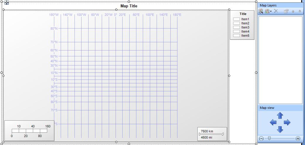
Figure 1: Adding a map to your report
When you click the map surface, the MapLayers windows appears to the right of the map, as shown in Figure 1. The MapLayers window displays each layer that you add to your map and let’s you access configurable properties associated with each layer.
To add a polygon layer, click the Newlayerwizard button at the top of the MapLayers window. This launches the NewMapLayer wizard. On the first page of the wizard (Chooseasourceofspecialdata), you select the source type and a map gallery, as shown in Figure 2 (click to enlarge).
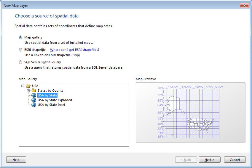
Figure 2: Adding a new layer to your map
Report Builder lets you choose one of the following three source types when defining a map layer:
- Map gallery: A collection of maps that is installed when you install Report Builder. The maps are actually SQL Server reporting .rdl files that you embed in your own report. Initially, the gallery includes only maps of the United States and its individual states, which is why I chose the U.S. for our sample map. Selecting this option automatically creates a polygon layer.
- ESRI shapefile: A set of files containing spatial data that complies with the Environmental Systems Research Institute (ESRI) standards. An .shp file specifies the geometrical or geographical shape. A .dbf file specifies attributes for the shapes. When you use a shapefile, the spatial data is embedded in your report.
- SQL Server spatial data: Spatial data that comes from a SQL Server database.
For our polygon layer, select (or retain) the default option, Mapgallery. Then, in the MapGallery pane, select USA by State. A map preview will be displayed on the right side of the page. Click Next.
For the rest of the wizard, stick with the default settings and click your way to the end. When you’re finished, you should end up with a polygon layer that looks similar to the one shown in Figure 3 (click to enlarge). Notice that the layer is also listed in the MapLayers window.
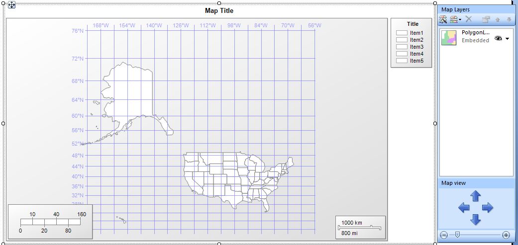
Figure 3: A polygon layer of the United States, including Alaska and Hawaii
Because we’re dealing only with the continental U.S. for our report, we can remove Alaska and Hawaii. To remove a state, right-click it and then click DeletePolygon. After you delete the states, Report Builder will automatically resize the remaining states to fit the map surface, as shown in Figure 4 (click to enlarge).
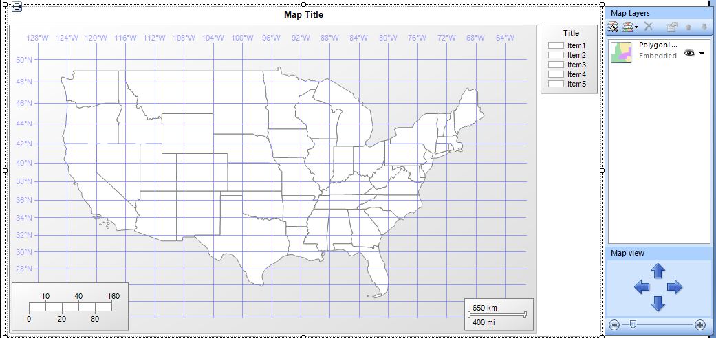
Figure 4: A polygon layer of the United States, excluding Alaska and Hawaii
Now we need to configure several of the polygon layer’s properties to display the analytical data. In the MapLayers window, click the down arrow next to the polygon layer, and then click LayerData. When the MapPolygonLayerProperties dialog box appears, go to the Analyticaldata page, where you map your spatial data to your analytical data, as shown in Figure 5.
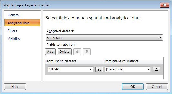
Figure 5: Mapping analytical and special data
In the Analyticaldataset dropdown list, select the dataset you created for the report. (My dataset is named SalesData.) Then click the Add button to add a mapping. In the Fromspatialdataset drop-down list, select STUSPS. These are the state codes generated by the U.S. Postal Service, and they’re the codes associated with the spatial data. In the Fromanalyticaldataset drop-down list, select [StateCode], which is the field in the SalesData dataset that contains the state codes. That’s all there is to mapping the spatial and analytical data and associating the data in your dataset to the map layer. Click OK to close the MapPolygonLayerProperties dialog box.
Next, we want to specify that the states contain no fill color. The reason we do this is because we want only the states with sales representatives to have color. But we must first get rid of all color and then add in the specific state settings. So go to the MapLayers window, click the down-arrow next to the polygon layer, and then click PolygonProperties. When the MapPolygonProperties dialog box appears, go to the Fill page and, in the Color drop-down list, select NoColor, as shown in Figure 6. When you’re finished, click OK to close the dialog box.
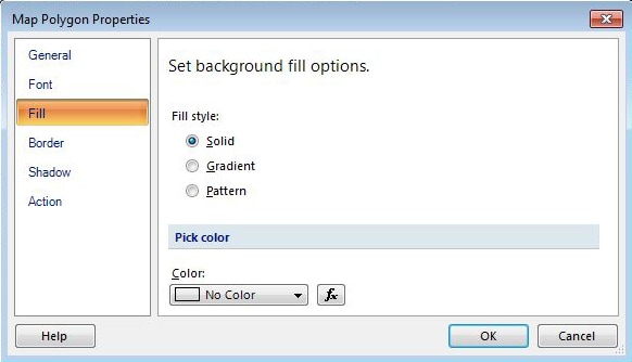
Figure 6: Removing the fill color from your polygon layer
The final settings to modify in the polygon layer are the color rules. This is where we set the colors to appear in those states that contain a sales representative. So return to the MapLayers window, click the down-arrow next to the polygon layer, and then click PolygonColorRule. When the MapColorRulesProperties dialog box appears, click the option Visualizedatabyusingcolorranges, as shown in Figure 7.
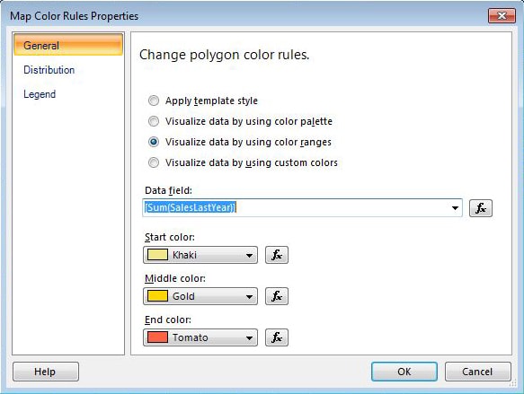
Figure 7: Setting up color rules for your polygon layer
Next, in the Datafield drop-down list, select [Sum(SalesLastYear)]. This means that the total amount in the SalesLastYear column will be used to define a range of values and the colors associated with them. As a result, the states with sales representatives will be colored based on the amount of sales, relative to the total. (This will become clearer when you see it in action.)
After you’ve select a value from the Datafield drop-down list, select your range of colors. As you can see in Figure 7, I selected Khaki, Gold, and Tomato, mostly because I liked the names.
Next, go to the Legend page to modify how the data is displayed in the legend. By default, the data is displayed numerically, but we want to change it to currency. To do so, modify the expression in the Legendtext drop-down list by changing the N in {N0} to C for both instances. Your equation should now look like the one shown in Figure 8. When you’re finished, click OK to close the dialog box.
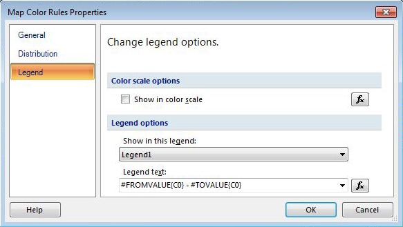
Figure 8: Configuring the legend for your polygon layer
You’re just about finished configuring the polygon layer. But first, change the map title and the legend title. To do so, double-click the title and make your change. When you’re finished, your polygon layer should look similar to the one shown in Figure 9 (click to enlarge).
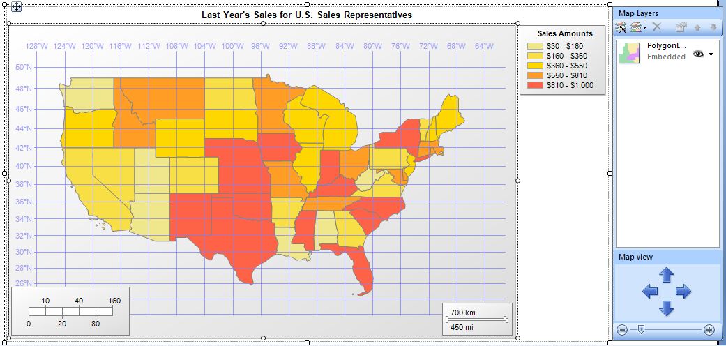
Figure 9: Viewing your polygon layer in design mode
Notice that the legend uses the colors we selected and that the amounts are listed as currency. Also notice that all the states are colored to match the figures in the legend. Report Builder uses sample data when rendering a map in design mode. The actual coloring and legend figures will not be visible until you run the report. So the next step is to click the Run button. The report and its map are displayed in preview mode, similar to what’s shown in figure 10 (click to enlarge).
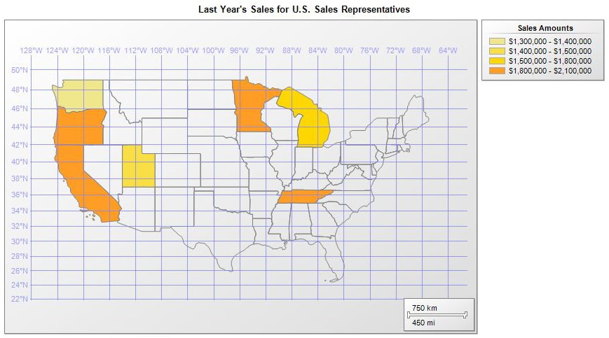
Figure 10: Viewing your polygon layer in preview mode
As you can see, only a few states now have color. If you were to view the data returned by our dataset’s query, you would see that these are the states in which sales representatives reside. Because we mapped our dataset to our spatial data, Report Builder is able to color only specific states. What we’ve done here represents our first step in displaying both spatial and analytical data. However, as good of a start as this is, clearly our map does not include enough information to make it particularly useful. For that, we need to add a point layer.
Adding a Point Layer
The point layer will add specific locations to our map, in this case, the cities in which our sales representatives reside. To add the layer, go to the MapLayers window and click the Newlayerwizard button. The following steps walk you through the process of creating your point layer:
- When the NewMapLayer wizard appears, select the SQLServerspatialquery option, and then click Next.
- On the ChooseadatasetwithSQLServerspatialdata page, select your dataset, and then click Next.
- On the Choosespatialdataandmapviewoptions page, select SpatialLocation in the Spatialfield drop-down list and Point in the Layertype drop-down list. These should have been your default settings.
- Step through the rest of the wizard, using the default values.
When you’re finished, a new layer is added to your map. However, all you’ll see are several circles that mark the cities where your sales representatives reside.
As you can see, adding the point layer is simple enough, but now we need to configure several of the layer’s properties. In the MapLayers window, click the down-arrows next to the point layer, and then click PointProperties to launch the MapPointProperties dialog box, shown in Figure 11.
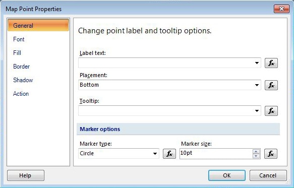
Figure 11: Configuring the point layer on your map
First, we need to define an expression for the Labeltext property, which determines what labels to assign to our points on our maps. The SpatialLocation field in our dataset determines where those points are located; however, we’ll use the City and StateCode values to specify how the labels will appear on the map. So click the expression button to the right of that property to launch the Expression dialog box, shown in Figure 12.
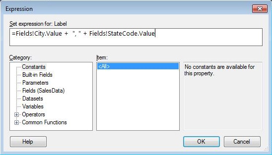
Figure 12: Defining an expression for the Label property
Our expression concatenates the city names and state codes, as you can see in Figure 12. I’ve also included the expression here for easy reading and copying:
|
1 |
=Fields!City.Value + ", " + Fields!StateCode.Value |
Once you’ve added the expression, click OK to close the Expression dialog box. Next, we will define an expression on the Tooltip property. So click the expression button next to that property and enter the following expression in the Expression dialog box:
|
1 |
=Fields!FirstName.Value + " " + Fields!LastName.Value + " - " + FormatCurrency(Fields!SalesLastYear.Value) |
In this expression, we’re concatenating the first and last names, along with the total sales for that individual. Notice that I’m using the FormatCurrency method to display the sales value as a currency. This full name and total sales will be displayed as a tooltip when a user hovers over a point.
Finally, we want to change the marker that designates each point on the map. By default, the marker is a circle, but we’re going to use a wedge (triangle) instead. In the Markertype drop-down list, select Wedge, and then, in the Markersize drop-down list, select 7pt. Your MapPointProperties dialog box should now look like what is shown in Figure 13. Click OK to close the dialog box.
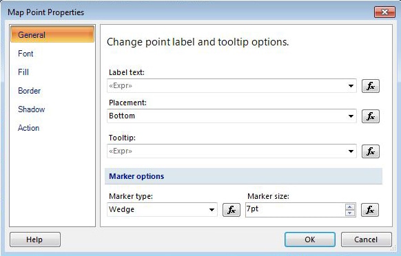
Figure 13: Configuring the properties of your point layer
You’re then returned to the design surface, which should now reflect the updated point layer. In place of the circles you saw earlier, you should see small wedges, and beneath each of those wedges, the <<Expr>> placeholder, as shown in Figure 14. The placeholders mark where the names of the cities will appear.
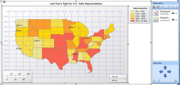
Figure 14: Viewing your point and polygon layers in design mode
Now’s a good time to run your report again. When you view your map in preview mode, it should include labels for each city and wedges to mark those cities’ locations, as shown in Figure 15.
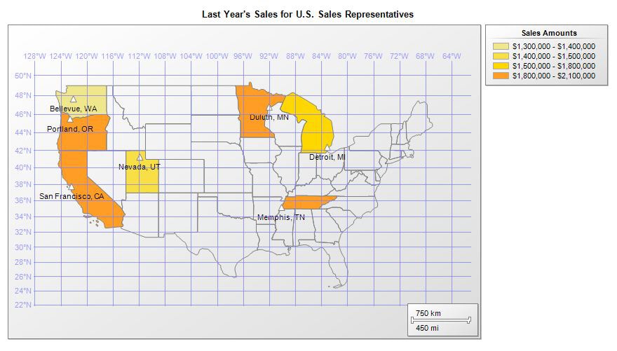
Figure 15: Viewing your point and polygon layers in preview mode
If you were to point to one of the cities, it would display the name and total sales for that particular sales rep. Now let’s see if we can make the map more interesting.
Adding a Tile Layer
Our final layer is a tile. To add the layer, go to the MapLayers window, click the AddLayer button, and then click TileLayer. This adds the new layer to your map surface. (You can tell that the layer has been added by the topography that now shows in Canada and Mexico.)
Next, in the MapLayers window, click the down-arrow next to the tile layer, and then click TileProperties. In the MapTileLayerProperties dialog box, select Aerial from the Type drop-down list, as shown in Figure 16. (The default type is Road, but in this case, Aerial works better.)
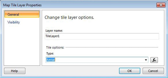
Figure 16: Changing the type of your tile layer
Click OK to close the dialog box. Your background should now look much richer and darker, similar to a Google Earth shot.
To adjust for the darker tile layer, we need to make a couple changes to the other layers. First, let’s change the font used to show locations in our point layer. In the MapLayers window, click the down-arrow next to the point layer and then click PointProperties. When the MapPointProperties dialog box appears, go to the Font page, shown in Figure 17.
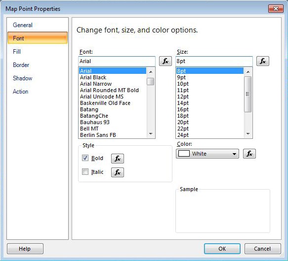
Figure 17: Configuring the font used for your point layer
In the Style section, select the Bold checkbox, and in the Color drop-down list, select White. Then click OK to close the dialog box. The labels on your map should now be bold and in white.
Next, in the MapLayers window, click the down-arrow next to the polygon layer and then click LayerData. When the MapPolygonLayerProperties dialog box appears, go to the Visibility tab. In the Transparency(percent) drop-down list, change the percentage to 50, as shown in Figure 18. The transparency level will make the states with color look a bit better against the dark backdrop of the tile layer.
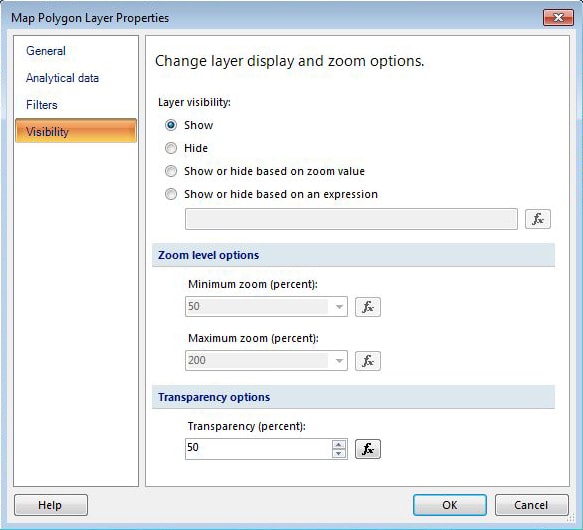
Figure 18: Changing the transparency of your polygon layer
Once you’ve configured the transparency, click OK to close the dialog box.
The last step you might want to take is to remove the parallels and meridians from your map. To do so, right-click the map surface and clear the checkmarks before the ShowParallels and ShowMeridians options. When you’re finished, your map surface should look similar to the one shown in Figure 19 (click to enlarge).
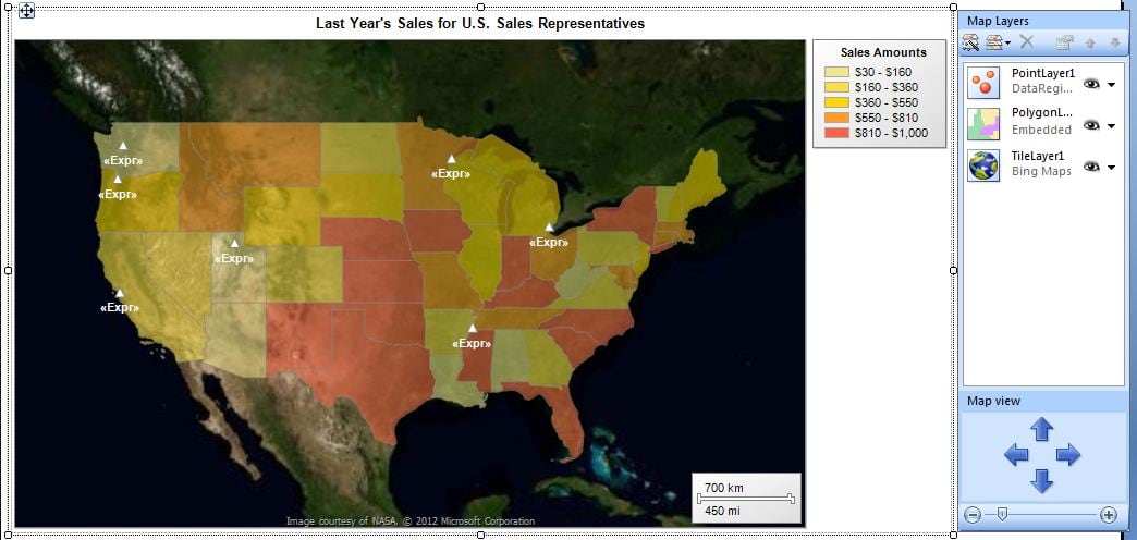
Figure 19: Viewing the tile, point, and polygon layers in design mode
That’s all you need to do to configure you map. Your three layers should be complete, at least for now. Run the map once again. When you view it in preview mode, it should now look like the map shown in Figure 20 (click to enlarge).
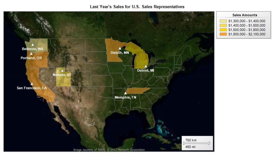
Figure 20: Viewing the tile, point, and polygon layers in preview mode
As you can see, all three layers are displayed as one. And with the addition of the tile layer, you map looks richer and more interesting. Notice that the labels are now white and printed in bold. And the states in which the sales representatives reside are more transparent so that some of the background comes through.
Of course, there is much more you can do with maps in Report Builder, but this introduction to the map features should provide you with a good idea of their potential. I encourage you to experiment with the various property settings and try out different ways to put together layers.
This document contains proprietary information and is protected by copyright law.
Copyright © 2026 Red Gate Software Limited. All rights reserved


Load comments