
I remember the first time I used a Matrix component in SQL Server Reporting Services (SSRS). I right-clicked the detail row, selected Subtotal and was amazed that RS “knew” that I wanted to sum the values of the rows. Without any need to specify a formula, I had aggregates with a simple mouse click. That amazement soon wore off after I realized just how difficult it might be to generate aggregates based on values other than a standard SUM.
Matrix components are great for visualizing data that might normally be exported to Excel, or in a Pivot Table. Year over year analysis is a good example. But if an analyst wants to view monthly sales, year over year, then he’d need to add some custom sorting so the months line up as expected. Additionally, we don’t want to add the values between years, we instead need to display a difference in the totals, and perhaps in percentage growth (or decline).
This article will show you how to get these custom aggregates on a matrix report and will cover a few interesting reporting techniques along the way. All steps are included to build a fully functional report that illustrates key concepts for:
- Dynamic dataset creation – Rather than provide a simple select statement or reference to a stored procedure, you’ll be able to dynamically modify the dataset source code at runtime.
- Query-based dynamic grouping – My last article showed you how to dynamically change grouping levels on your report output (the layout tab). But those were based upon a static list of values in the Parameters collection. This time, we’ll use a query to illustrate that you can provide dynamic grouping based upon a dynamically changing dataset.
- Dynamic column names – Keeping in spirit with the whole dynamic nature of this article, we’ll change the actual column headings depending upon the type of data our user has selected.
- The cells-in-cells technique – Otherwise known as the “rectangle inside a textbox” technique, this helps us achieve a bit more usability with the somewhat limited framework of the SSRS Matrix control by allowing us to add as many subcolumns within a column as we’d like
- Custom matrix aggregates – The heart of this article, and probably the very reason you are still reading. Going beyond the standard SUM, we’ll use the powerful inspection expression InScope() to provide nearly limitless calculations.
- Custom chart coloring – We’ll add some data visualization to the report, but we’ll modify the chart coloring at runtime.
Using these techniques, you’ll be able to build more-robust Matrix style reports in SQL Server Reporting Services.
The Business Scenario
The head of sales for AdventureWorks Corp would like to analyze his business for any selected year versus the year prior. Additionally, he’d like to see an analysis of month over month variances. So, for example, for the first quarter of 2007 he’d like to see a report detailing the rise (or decline) in business for January, February and March, with percentage change. He then needs to be able to drill into the detail to see the actual aggregate of sales data.
As an added wrinkle, our sales executive wants to group those sales by territory, then salesperson. No wait, Products, then Customers…no wait…well, hopefully you get the point. Since this isn’t an unreasonable request we should provide flexibility in the attributes we allow for reporting.
Technique 1: Dynamic Dataset Creation
We’ll start with a new report based on AdventureWorks that will display sales data, based on some flexible user inputs.
The sample report can be downloaded by clicking on the Code Download link at the bottom of the article. You will need to open Business Intelligence Development Studio, create a new Report Designer project, and add the file to it. Then you will need to change the ‘AdventureWorks’ Data Source to point to your server and its AdventureWorks database
For the new dataset, named AW_Sales, I’ve joined several tables using the graphical query builder in SSRS. In this example I am going to allow the user to select a date filter based on any of the following fields: DueDate, OrderDate or ShipDate. I’ve called this input parameter TimeSlicer, and the RDL fragment is shown in Listing 1.
Listing 1
<ReportParameterName=”TimeSlicer”>
<DataType>String</DataType>
<DefaultValue>
<Values>
<Value>ShipDate</Value>
</Values>
</DefaultValue>
<AllowBlank>true</AllowBlank>
<Prompt>Slicer:</Prompt>
<ValidValues>
<ParameterValues>
<ParameterValue>
<Value>OrderDate</Value>
<Label>Order Date</Label>
</ParameterValue>
<ParameterValue>
<Value>DueDate</Value>
<Label>Due Date</Label>
</ParameterValue>
<ParameterValue>
<Value>ShipDate</Value>
<Label>Ship Date</Label>
</ParameterValue>
</ParameterValues>
</ValidValues>
</ReportParameter>
In addition to selecting the WHERE clause field for our filter, two additional parameters, for Month and Year, are available for user selection. Month has static values (1 for January, 2 for February, etc.) but will allow for multiple selection. Year is a list of the years 2002, 2003, and 2004.
Books Online cautions on the use of dynamic queries in “Walkthrough – Using a Dynamic Query in a Report”, which you can read separately. However, the salient points are that you need to:
- Create your query first without the dynamic components, using the query designer in SSRS
- Refresh your field list
- Switch to the Generic Query Designer and modify your SQL as needed.
- Remove any carriage returns or formatting created by the query designer so the SQL statement appears as one continuous string.
Finally, do not refresh your field list for this dataset! If you do, SSRS will not be able to parse your query and you will lose the field definitions created previously. If this happens to you, you’ll either have to manually create the field list again or revert back to your standard query to refresh those fields.
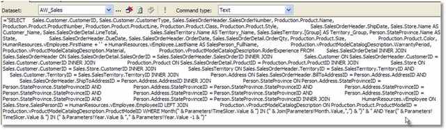
Figure 1 shows the SQL Query in all its unformatted glory.
Figure 1
The more human readable dynamic dataset used is found in Listing 2:
Listing 2
=”SELECT
Sales.Customer.CustomerID,
Sales.Customer.CustomerType,
Sales.SalesOrderHeader.SalesOrderNumber,
Production.Product.Name,
Production.Product.ProductNumber,
Production.Product.ProductLine,
Production.Product.Class,
Production.Product.Style,
Sales.SalesOrderHeader.ShipDate,
Sales.Store.Name AS Customer_Name,
Sales.SalesOrderDetail.LineTotal,
Sales.SalesTerritory.Name AS Territory_Name,
Sales.SalesTerritory.[Group] AS Territory_Group,
Person.StateProvince.Name AS State,
Sales.SalesOrderHeader.DueDate,
Sales.SalesOrderHeader.OrderDate,
Sales.SalesOrderDetail.OrderQty,
Production.Product.Size,
Production.Product.Color,
HumanResources.vEmployee.FirstName + ‘ ‘ + HumanResources.vEmployee.LastName
AS SalesPerson_FullName,
Production.vProductModelCatalogDescription.WarrantyPeriod,
Production.vProductModelCatalogDescription.Material,
Production.vProductModelCatalogDescription.RiderExperience
FROM Sales.SalesOrderDetail
INNER JOIN Sales.SalesOrderHeader
ON Sales.SalesOrderDetail.SalesOrderID = Sales.SalesOrderHeader.SalesOrderID
INNER JOIN Sales.Customer
ON Sales.SalesOrderHeader.CustomerID = Sales.Customer.CustomerID
INNER JOIN Production.Product
ON Sales.SalesOrderDetail.ProductID = Production.Product.ProductID
INNER JOIN Sales.Store
ON Sales.Customer.CustomerID = Sales.Store.CustomerID
INNER JOIN Sales.SalesTerritory
ON Sales.SalesOrderHeader.TerritoryID = Sales.SalesTerritory.TerritoryID
AND
Sales.Customer.TerritoryID = Sales.SalesTerritory.TerritoryID
INNER JOIN Person.Address
ON Sales.SalesOrderHeader.BillToAddressID = Person.Address.AddressID
AND
Sales.SalesOrderHeader.ShipToAddressID = Person.Address.AddressID
INNER JOIN Person.StateProvince
ON Person.Address.StateProvinceID = Person.StateProvince.StateProvinceID
INNER JOIN HumanResources.vEmployee
ON Sales.Store.SalesPersonID = HumanResources.vEmployee.EmployeeID
LEFT JOIN Production.vProductModelCatalogDescription
ON Production.Product.ProductModelID =
Production.vProductModelCatalogDescription.ProductModelID
WHERE
MONTH(" & Parameters!TimeSlicer.Value &a
The relevant portion is the WHERE clause:
|
1 2 3 4 5 |
WHERE MONTH(" & Parameters!TimeSlicer.Value & " IN (" & Join(Parameters!Month.Value,"," ) & "" & " AND YEAR(" & Parameters!TimeSlicer.Value & " IN (" & Parameters!Year.Value & "" & Parameters!Year.Value -1 & "" |
You’ll notice the dynamic component of this query is in the WHERE clause. We never know what type of time value we’ll be inspecting (an Order Date or a Ship Date, for example) and we pass in a set of values for the months and years. Could this have been a really long conditional SELECT instead where we’d test 3 different types of dates depending upon what the user chose? Of course. But that statement would have been three times the size, and won’t scale if we want to test another time value easily in the future. Sometimes you’ll use dynamic datasets to access truly disparate pieces of information on the fly.
For the TimeSlicer selected by the user (ShipDate, for example), we investigate the Month and Year. Records will only be returned if they are in the multiselect parameter for Month selection and in the Year chosen, or in the year prior. This is a comparison report, remember?
One last point. You’ll notice that I wrapped the Month parameter input in a Join statement. Month, as we defined earlier, is a multi-valued parameter. Our user will be able to select anywhere from 1 to 12 months. Ideally, we’d like to pass that to an IN ( x,y,z) construct. The problem is we have a different data type passed to us from SSRS, similar to an array. The native Join() function will take each value and separate it by any delimiter we choose. In this case I have made certain it is a comma. When our user selects January and February from the multi-select dropdown we’ll see (1,2) passed to our SQL statement.
Technique 2: Query Based Dynamic Grouping
In this report, we’ll allow the users to select two levels of grouping so that the matrix behaves in a similar fashion to a Pivot Table in Excel. Users can group their analysis by Color then Size, or SalesPerson and State, and vice versa, or by any combination of fields we allow.
To provide this functionality we could simply create a list of field values in a new parameter, as I showed in “Reporting at the Top.” For this example, however, I’ll illustrate using a query. It’s partly because I am lazy and don’t want to enter the same value list twice and it’s partly to illustrate that the dynamic grouping can be served up from a query or stored procedure. OK, it’s mostly because I’m a geek. Like any developer, I’d rather code than copy and paste. Anyway, I’ve used a simple UNION query (Listing 3) to list the fields I want to provide, but you can build on this example by storing the values in a table for a truly scalable solution.
Listing 3SELECT 'Sales Person' AS Label , 'SalesPerson_FullName' AS Value
UNION
SELECT 'Size' AS Label , 'Size' AS Value
UNION
SELECT 'Color' AS Label , 'Color' AS Value
UNION
SELECT 'State' AS Label , 'State' AS Value
UNION
SELECT 'Territory' AS Label , 'Territory_Name' AS Value
UNION
SELECT 'Customer' AS Label , 'Customer_Name' AS Value
UNION
SELECT 'Warranty Period' AS Label , 'WarrantyPeriod' AS Value
UNION
SELECT 'Rider Experience' AS Label , 'RiderExperience' AS Value
UNION
SELECT 'Material' AS Label , 'Material' AS Value
ORDER BY Label
Two parameters are then created, appropriately called Grouper 1 and Grouper2, with this dataset (named what else? …. Groupers) as their source for valid values.
On the Layout tab, add a new matrix component and tie it to the AW_Sales dataset. Access the Matrix Properties dialog and you’ll see that a Row Group and a Column Group have been created by default. Rename the default RowGroup to matrix1_Grouper1, and set the Group On Expression to:
|
1 |
=Fields(Parameters!Grouper1.Value).Value |
Then, click the Sorting tab and use the same expression for sorting.
Create a new RowGroup, called matrix1_Grouper2 and set the Group On Expression and Sorting to:
|
1 |
=Fields(Parameters!Grouper2.Value).Value |
Technique 3: Dynamic Column Names
Dynamic column names make our report truly scalable. We have our rows covered by the Grouping selected by our user, but sometimes you’ll need to change column heads to change with your data points. In this reporting example, all of our grouping of dates (Order Date, Ship Date, etc.), will be combined to Months and Years using the Month() and Year() functions. We will then dynamically display the appropriate Month or Year on our column heads directly above the data in our Matrix.
First, let’s set the grouping. Right click the Matrix control and select Properties. From the Groups tab, you’ll see matrix1_ColumnGroup1 in the Columns window. Click that and tap the Edit button. For the default ColumnGroup, set the Group On Expression and Sorting to:
|
1 |
=Month(Fields(Parameters!TimeSlicer.Value).Value) |
Click OK, then back on the Groups tab of the Matrix Properties window select the Add button in the Columns section. Make this new ColumnGroup called matrix1_SLICER with the following values for Group On Expression and Sorting:
|
1 |
=Year(Fields(Parameters!TimeSlicer.Value).Value) |
Back on the Report Layout tab, you’ll see a fairly simple matrix that should look like Figure 2.
Figure 2
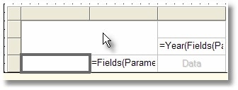
In the cell I have highlighted, change the name to GROUPER1. Then enter the expression:
|
1 |
=Fields(Parameters!Grouper1.Value).Value |
so our grouping value is shown. Then right click each cell other than “Data” and select Subtotal.
Right click the Data cell and select ‘Add Column’. Above the cell that displays the Year() calculation (shown in Figure 2) add the following expression:
|
1 |
=MonthName(Month(Fields(Parameters!TimeSlicer.Value).Value)) |
This will dynamically display a user friendly name for Month, rather than just the number.
For the cells directly below the Year() calculation, we want to show the quantity sold as well as the amount (LineTotal). For the individual months totals will suffice, but on the summary columns we want to show the variance, or difference in sales between the two years. We’ll need to dynamically change the column head so users understand what to expect in the data displayed beneath. In the cell on the left use the expression:
|
1 |
=IIF((Inscope("matrix1_SLICER") AND InScope("matrix1_ColumnGroup1")),"Order Qty","Qty Variance") |
.
…and the cell on the right gets…
|
1 |
=IIF((Inscope("matrix1_SLICER") AND InScope("matrix1_ColumnGroup1")),"Line Total","Line Variance"). |
The SSRS function, InScope(), will check for the relative positioning of our data as it is rendered. We’re interested in using standard column names like “Order Qty” or “Line Total” unless the summary groups are not in scope, meaning this is an aggregate column being rendered. In this case, we’ll display the verbiage “Variance.”
Technique 4: Cells in Cells
This technique will allow you to display more summary columns than detail columns. Specifically, we have one column each for quantity and dollar amount sold. But on the aggregate columns we want to render a column for the difference and the percentage respectively. To display two columns of data in the space provided for just one, we’ll add a textbox inside each of the two data level textboxes and conditionally display no data in them.
Select your first data cell, and drop a Rectangle control into it. You’ll notice the background change from solid white to the transparent grid pattern. Next, select a textbox control and drop this into the rectangle. You have to get it perfect, and sometimes it’s a bit annoying when you don’t land exactly on the control. However, if you do this correctly, you should have a display similar to Figure 3 at this point.
Figure 3
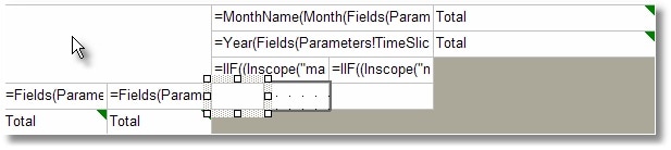
Next, drop in another textbox so that it rests directly beside your first one. Repeat this process for the second data cell and it will now appear as though you have 4 data cells with which to work. Be aware that when you want to set properties for these cells, your familiar point-click-edit routine will leave you within the context of the Rectangle surrounding your cells. You will need to click twice in order to access the textboxes within the Rectangle. You may need to play with their sizing a bit depending upon the width of data contained. I named the left textbox in the first rectangle QTY_COL and the left textbox in the second rectangle LINETOT_COL, so I can access their values later for percentage calculation.
Technique 5: Custom Matrix Aggregates
As mentioned in the beginning of the article, if we merely dropped a field definition into one of our matrix data cells (like QTY Sold), RS would automatically render the detail in the center and then sum the total on the far right (by default it renders totals on the right most column). But we want this report to behave a little differently. We want to display summary for each month detail. Our aggregate will be custom, and should display the difference (net) of the two years compared. From left to right, each of the cells should have the following expressions listed in order in Listing 4.
Listing 4=IIF (Inscope (“matrix1_SLICER”) AND InScope(“matrix1_ColumnGroup1”), Sum (Fields!OrderQty.Value), Sum (IIF (Year (Fields (Parameters!TimeSlicer.Value).Value) = Parameters!Year.Value, CDbl(Fields!OrderQty.Value) ,CDbl(Fields!OrderQty.Value) * -1 )))
=IIF(Inscope(“matrix1_SLICER”) AND InScope(“matrix1_ColumnGroup1″),””,IIF (SUM (IIF(Year(Fields(Parameters!TimeSlicer.Value).Value) = Parameters!Year.Value, cdbl(0), cdbl (Fields!OrderQty.Value) ) )=0,0,cdbl (ReportItems!QTY_COL.Value) / SUM (IIF (Year (Fields (Parameters!TimeSlicer.Value).Value) = Parameters!Year.Value, cdbl(0), cdbl(Fields!OrderQty.Value)))))
=IIF(Inscope(“matrix1_SLICER”) AND InScope(“matrix1_ColumnGroup1”), Sum (Fields!LineTotal.Value), Sum (IIF (Year(Fields (Parameters!TimeSlicer.Value).Value) = Parameters!Year.Value, Fields!LineTotal.Value, Fields!LineTotal.Value * -1))) =IIF(Inscope(“matrix1_SLICER”) AND InScope(“matrix1_ColumnGroup1″),””,IIF(SUM(IIF (Year (Fields (Parameters!TimeSlicer.Value).Value) = Parameters!Year.Value, cdbl(0), cdbl(Fields!LineTotal.Value)))=0,0,cdbl(ReportItems!LINETOT_COL.Value) / SUM(IIF (Year (Fields (Parameters!TimeSlicer.Value).Value) = Parameters!Year.Value, cdbl(0), cdbl(Fields!LineTotal.Value)))))
Using the InScope() function, we conditionally display either a simple sum or a custom calculation. In the first textbox you’ll notice the custom Sum includes a conditional IIF() statement.
|
1 |
Sum(IIF(Year(Fields(Parameters!TimeSlicer.Value).Value)=Parameters!Year.Value, CDbl(Fields!OrderQty.Value) ,CDbl(Fields!OrderQty.Value) * -1 ))) |
Rather than display a blind total of all values in the row, we compare the Year. If it is the Year selected the value will be aggregated with a positive value. If however the value is from the set that belongs to the prior year (Year-1), we aggregate with a negative by multiplying by -1. Our end result is a summary that is the net effect of the two figures. Similar logic is used for the variance, supplied as a percentage difference, in the cells to the right of our field totals.
Since there will be no variance to offer for an individual month, we simply supply a double quote “” blank value when the column is not an aggregate.
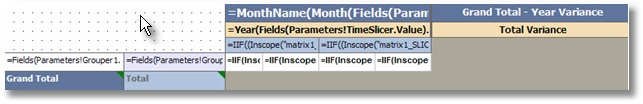
To add some visual flair to the report I have added conditional Color formatting in the aggregates with:
|
1 |
=IIF((Inscope("matrix1_SLICER") AND InScope("matrix1_ColumnGroup1")),"Black" ,IIF(Me.Value < 0, "Red","Green")) |
Now, on a standard column the font will be black, but we’ll display positive movement in green and a decrease in sales with red. You can do the same with fonts, styles and shading. Special note: to set behavior (fonts, colors, etc.) on subtotal items you will need to first click the little green triangle in the upper right corner of your subtotal grouping cells to access their properties. It is my understanding that this annoyance will be going away in SQL Server 2008. After some additional formatting, my matrix looks like Figure 4.
Figure 4.
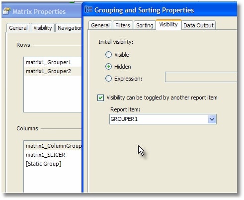
As a last touch, go to Matrix properties again and select the matrix1_Grouper2 row properties. On the Visibility tab, set Initial Visibility to hidden and allow the toggle based upon GROUPER1 (Figure 5).
Figure 5
We’ve just added a little interactivity to the display of the matrix which is important when real estate on the screen is at a premium. As an added benefit, the rendered output will behave much like an Excel PivotTable.
Technique 6: Custom Graph Colors
To add some additional splash, we’ll add a chart to display the variance of sales year over year. This will require the same grouping that we used on the matrix component. Add the chart above the matrix and set it to Simple Column, with the same dataset as our matrix (AW_Sales).
On the Data tab, create a new Value. Then, on the Values tab use the following expression:
|
1 |
=Sum(Fields!LineTotal.Value) |
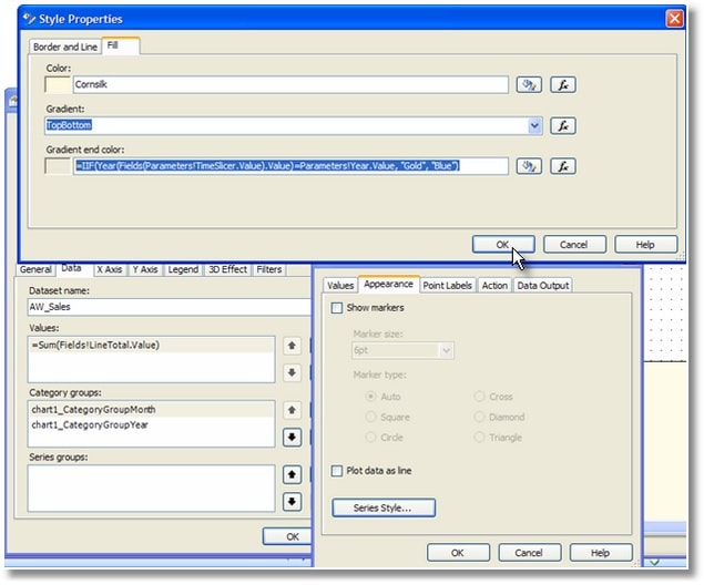
This will display the total dollar amount of sales. Use the same expression on the Point Labels tab in the Data Label field. Be sure to check ‘Show Point Labels’ and format for currency (C0) so that we can see the actual totals on the chart. On the Appearance tab, click the Fill tab. Set the first Color to CornSilk (where do they get these color names?) and for the second color (since I am a gradient fiend) use the following conditional expression:
|
1 |
=IIF(Year(Fields(Parameters!TimeSlicer.Value).Value)=Parameters!Year.Value, "Gold", "Blue") |
This will provide distinct colors on our report for each year (Gold for the current year, and Blue for the prior year) which will make the bars much easier to differentiate (see Figure 6):
Figure 6.
Next, create two Category Groups: one for the Month and the second for the Year. The Month will have the Group On and Sort Expression set to:
|
1 |
=Month(Fields(Parameters!TimeSlicer.Value).Value) |
However, our label will wrap that expression in MonthName(), which is more user-friendly.
The Category Group for Year also uses the same expressions we used earlier in the matrix component grouping. The Group On, Sort and Label expression will be set to:
|
1 |
=Year(Fields(Parameters!TimeSlicer.Value).Value) |
Final Output
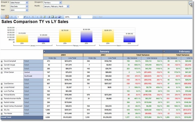
When you Preview the report, you’ll seee that our parameters allow for a great deal of flexibility. Figure 7 shows the various groupings we can select, along with multiple months and a dynamic date criteria.
Figure 7.
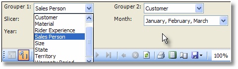
Figure 8 shows a summarized view of variances only and
Figure 8.
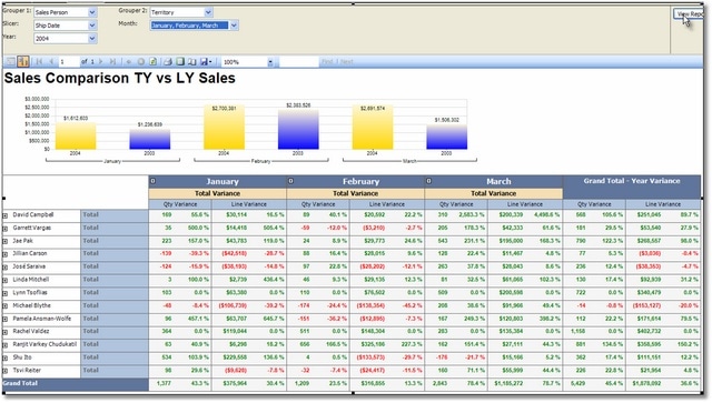
Figure 9 illustrates what the detail looks like when exposed.
Figure 9.
The end result is a report that behaves very much like a Pivot Table in Excel. You can extend this with additional conditional formatting or provide additional value to reports that use Analysis Services as the source for more cube-like browsing experience in SSRS. Hopefully this example has armed you with some new skills so you can tackle those tougher matrix reporting challenges in the future.
This document contains proprietary information and is protected by copyright law.
Copyright © 2026 Red Gate Software Limited. All rights reserved
Load comments