
Websites would not be the same without images or, better yet, without crisp and clear images. Albeit necessary, images are often the primary source of trouble for site visitors. If a page is slow to load and is perceived as ‘bloated’, then 99% of the time it’s because of large and heavy images. There are many ways to reduce the impact of large and heavy images on web pages. In this article, I’ll explore and describe a couple of approaches, ranging from simple offline manipulation and downsizing of images to server-side resampling through ad hoc frameworks. The latter approach is particularly suited when you need to optimize the use of images in mobile-friendly websites.
A few days ago, I logged into my PayPal account after a very long absence. I had no memories of the site home page and noticed that it currently looks like the image shown below. As you can see, the PayPal home page features a full-page, colorful image of very good quality. I had to assume that the image was also fairly large in terms of size. Yet the page was very quick to load.

That immediately brought to mind an experience I had years ago with the home page of a website I was working on. The layout of that home page was very close to the PayPal home page in the figure, and, to achieve an astonishing effect, I initially used a high-quality image, 3264×1824 in dimensions. The actual weight of the image was in the order of 2 MB. As you might expect, it worked acceptably well on desktop browsers, but it was decidedly too slow for other devices. However, even on desktop browsers it never felt quick. Images are nice to have, but they are even better if the user just sees them immediately. A pleasant and appropriate image reaches its communication goals especially if the user perceives it as just-being-there, like plain text. I know that someone else took care of fixing the large image I had on the home page, and the site went live without issues. I didn’t ever manage, though, to find out what the UI guys did to make the home page enjoyable. Even if you are a developer, no excuses: here are some tips to keep background images high quality but still quick to load.
Offline Downsizing of Images
The first tip is to reduce the quality of the image through a technique known as downsampling. The dimensions of the image remain the same, but the number of pixels stored in the image is reduced. Subsequently, the size of the image file diminishes significantly. Downsampling is the core technique behind functions like Save for Web that you find in many image processing products and primarily in Adobe Photoshop. A JPEG image, for example, is obtained through a lossy form of compression from the matrix of pixels originally captured by the lenses of the camera. Downsampling just reworks the color of stored pixels giving some of them the same color of their neighbor pixels. To exemplify, let’s consider a photo I took this summer on vacation with my smartphone.
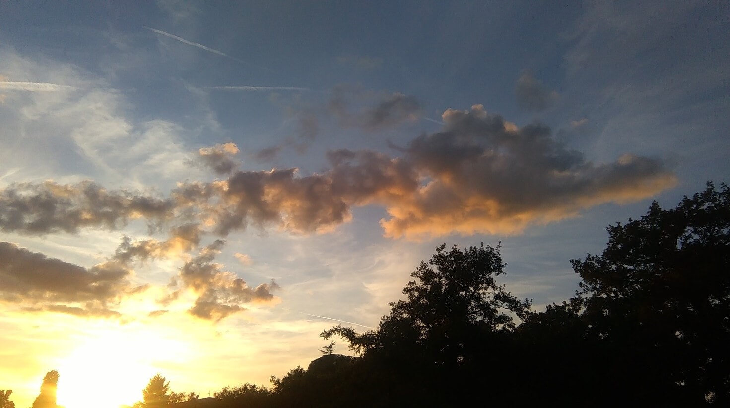
The dimensions of the original image are 3264×1824 pixels and the size of the file is about 1.4 MB. This is too much for an image to be used on a website open to any device. (You can find the original unmodified image here if you wish to follow along.) I then uploaded the original file to http://optimizilla.com and had it downsampled. (Except for the configuration of the algorithms, it is the same as using the Save for Web function of Photoshop.)
The image I received back had the same dimensions as the original image, and the human eye won’t likely notice any difference or, at least, no differences that are relevant for the use case. The size of the second image file, though, is about one third of the original.
At this point, you can proceed with a classic resizing step. A 3000×2000 image is definitely too large for the vast majority of web scenarios. A width of 1600 pixel is considered sufficient today for most cases and, not coincidentally, that’s exactly the width of the PayPal home image I referred to earlier. The height of the image, instead, depends on the layout of the page. A height somewhere in between 500 and 1000 pixels is reasonable. (PayPal’s image is 1600×600.) Resizing the sample image to 1600 pixels wide leads to a file size of 257 KB. If you take a look a the final image, you will see that it looks identical to the original despite the much smaller file size.
In the end, I started with a 1.4 MB image and ended up, through a couple of simple offline steps, to a 257 KB image that looks nearly the same and, more importantly, loads instantly. By the way, the size of the PayPal home page image is 370 KB.
Optimizing Images for Smaller Devices
Sometimes you just don’t want, or can’t afford, to have a single version of the image serving all possible devices visiting your site. For a good service, the image size should be appropriate for the computing power of the device, to say nothing of the network. Because of the different screen sizes of smaller devices (e.g., smartphones versus large HD screens), sometimes the image must be cropped and not just resized. Cropping is a delicate art as it involves removing details yet must leave the meaning and the context of the image intact. In other words, when it comes to devices, serving an appropriate image is both a matter of quantity (of bytes) and quality (art direction). How can you specify multiple versions of the same ‘logical’ image?
At the moment, there are two main approaches to serving the most appropriate version of an image to each requesting device. The official solution, being pursued by the W3C, is using a new HTML element—the PICTURE element. You can think of the PICTURE element as a superset of the IMG element. The element doesn’t directly cause any rendering, but it instructs the browser on which image to select based on detected conditions. At present, conditions you can express within the PICTURE element are media query expressions. Media queries are expected to improve the range of conditions they can check, but currently media queries can’t really tell whether the device is a true mobile device or a desktop browser resized to a small window. The second approach is to serve the most appropriate version of an image to a requesting device through a server-side endpoint that automatically resizes or crops the image before serving it. Let’s find out more about the two approaches.
The PICTURE Element
The purpose of the PICTURE element is to avoid the automatic browser scaling of images. The IMG element—the old familiar way of displaying images in HTML—points to a given image and the image is downloaded as-is. It’s then resized on the client, for display purposes, to the dimensions set via CSS. The IMG element can be bound to a single endpoint that returns an image stream.
The first issue with this approach is that you need a single image that fits all possible requesting devices. Unless the website (or a specific page) is primarily designed for mobile devices, the size of the image has to be the largest that could possibly be a good compromise between quality and speed. If you’re going to use a single image, then all tips outlined above on how to gracefully reduce quality and size should be applied. When a large image is shrunken down to fit in a small viewport, though, the resulting picture might not be easy to see. Imagine a large picture with a relatively static and flat background (e.g., meadows, a blue sky, ocean) and a small detail such as a sailing boat or a flower. When reduced to a small size, the small detail can become incredibly small. This is because a blind resize (without cropping) uniformly cuts rows of pixels throughout the image matrix.
The PICTURE element, instead, allows you to link multiple images each associated to a given media query expression. The browser will then intelligently select the first image that fits. Here’s the syntax.
|
1 2 3 4 5 6 7 8 9 |
<picture> <source media="(min-width: 541px)" srcset="~/content/images/ocean_md.jpg" class="img-responsive"> <source media="(max-width: 360px)" srcset="~/content/images/ocean_xs.jpg" class="img-responsive"> <source media="(max-width: 540px)" srcset="~/content/images/ocean_sm.jpg" class="img-responsive"> <img src="~/content/images/ocean.jpg" class="img-responsive"> </picture> |
You use the media attribute to set the breakpoint where the browser must switch the image. If the viewport is within 360 pixels, then the ocean_xs picture is served. If it’s between 361 and 540 pixels, the browser will serve ocean_sm. Finally, for larger screens, the browser will serve ocean_md. If the browser doesn’t support the PICTURE element, the embedded IMG element will be processed.
Resizing Images Dynamically
An alternative to using the PICTURE element is having images automatically resized on the server before use. You can arrange your own infrastructure or use a commercially available imaging resizing service. The primary purpose of an image resizing service is operating as a smart Content Delivery Network (CDN) and acting to reduce the image payload of pages and subsequently the load time. Such a smart CDN is particularly useful to improve the service on mobile devices.
As an example, let’s consider ImageEngine. ImageEngine is a web service that provides device-specific resized images. ImageEngine doesn’t just save valuable time and bandwidth while downloading images, but it also saves you from the burden of maintaining multiple versions of the same image tailor-made for various screen sizes. To get started, request a test account that you can use for 30 days. You will be given a token to add to your image URL which runs the image through the service. Let’s say you need to display the following images from within a web page.
|
1 |
<img src="/images/ocean.jpg"> |
The image can’t be referenced through a relative URL, so its fully qualified name is passed as an argument to the ImageEngine endpoint. When using ImageEngine, instead of the original code you use the following:
|
1 |
<img src="//{account}.imgeng.in/http://contoso.com/images/ocean.jpg"> |
If your account is contoso, then the IMG element will be:
|
1 |
<img src="//contoso.imgeng.in/http://contoso.com/images/ocean.jpg"> |
The ImageEngine framework silently downloads and caches the original image. When the image is requested, ImageEngine can do some handling before returning it to the device. For example, ImageEngine has the ability to resize the image appropriately but also to crop it. By default, the framework scales down the image to the size it reckons ideal for the device. This is only the default behavior though. You can specify additional parameters, called Directives, to request some ad hoc behavior. The table below lists the options available.
|
Parameter |
Description |
Sample URL |
|
w_NNN |
Desired width of the image |
//contoso.imgeng.in/w_200/IMAGE_URL |
|
h_NNN |
Desired height of the image |
//contoso.imgeng.in/h_200/IMAGE_URL |
|
pc_NN |
Percentage of reduction |
//contoso.imgeng.in/pc_50/IMAGE_URL |
|
m_XXX |
Resize mode. Accepted values: box, cropbox, letterbox, stretch |
//contoso.imgeng.in/ m_cropbox/w_200/h_200/IMAGE_URL |
|
f_XXX |
Output format. Accepted values: png, jpg, webp, gif, bmp, jp2, jpegxr. |
//contoso.imgeng.in/f_png/IMAGE_URL |
Multiple parameters can be combined together as different segments of the URL. The order of parameters is unimportant.
Comparing the Options
The PICTURE element is gaining a lot of traction and is widely supported by browsers (at least in their newest versions) with the only significant exception of Internet Explorer, Opera Mini and old Android browsers. Its main drawback is that site administrators must maintaining multiple copies of the same image, one for each screen size (or media query) supported. It is effective but, for a site with many images and frequent updates, it can be a real pain.
Compared to the PICTURE element, a framework like ImageEngine is preferable because it doesn’t force site administrators to deal with different images, properly resized. At the same time, a framework like ImageEngine doesn’t easily support art direction. The image is automatically resized or cropped but only through hard-coded algorithms—no human eye control.
In a nutshell, none of the two solutions is free of issues, but each can mitigate the problem of serving optimized images effectively. In my opinion, the ideal solution is a further enhanced PICTURE element where the media attribute can recognize truly mobile devices. The ability to detect mobile devices is not currently backed in media queries but it may arrive in the future, although a future that is farther away than CSS Media Queries 4.
This document contains proprietary information and is protected by copyright law.
Copyright © 2026 Red Gate Software Limited. All rights reserved
Load comments