
Earlier versions of Bootstrap had a couple of components doing nearly the same job—flexible containers for markup offering a few predefined elements such as headers and footers. One of those components was implemented through the well class; another was created through the panel class. In Bootstrap 4, both have disappeared and are replaced by a single component that provides the same capabilities and possibly more. This new component is the card. The card component, however, supplies some modifier classes to deliver nearly the same behavior that you could achieve in earlier versions with wells and panels.
The HelloCard Example
The key statement to keep in mind is that a card is a markup container—a sort of static web component that you use to compose the overall view. Here’s the basic markup you need to arrange.
|
1 2 3 4 5 6 7 8 9 |
<div class="container"> <div class="row"> <div class="card"> <div class="card-body"> <h3>I am the body of a very basic card</h3> </div> </div> </div> </div> |
And here’s a slightly more sophisticated card in which the top content is an image and the body contains title, subtitle and plain text. The output of both cards is shown in Figure 1.
|
1 2 3 4 5 6 7 8 9 10 11 12 13 14 15 16 17 |
<div class="row"> <div class="card"> <img class="card-img-top" src="~/content/images/poppies.jpg"> <div class="card-body"> <h3 class="card-title"> I am the body of a not-so-simple card </h3> <h4 class="card-subtitle"> I am the subtitle </h4> <p class="card-text"> I am plain text </p> </div> </div> </div> |
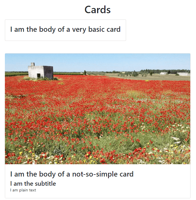
FIGURE 1. Two sample Bootstrap 4 cards in action.
As you can see, the card takes all the horizontal space it needs and automatically expands to cover the entire width of its container element. Any image embedded in a card, if properly styled as a card image, is resized to fit the container and maintains the proper aspect ratio across as the viewport resizes. The critical style assignment associated with the card-img-top class is:
|
1 |
style="width: 100%;" |
This ensures that the image will always fit in the container card with the original aspect ratio. In addition to that, the card-img-top class sets the border radius and line and vertical alignment. The image is not the sole markup element that enjoys a special treatment in Bootstrap 4 when made part of a card. For example, title and subtitle are automatically aligned if both are contained in a card body. In the body, anchor elements (the A element) are automatically aligned horizontally if decorated with the card-link class.
|
1 2 3 4 5 6 7 8 9 10 11 12 13 14 15 16 |
<div class="card"> <div class="card-body"> <h3 class="card-title"> I am the body of a not-so-simple card </h3> <h4 class="card-subtitle">I am the subtitle</h4> <p class="card-text"> I am plain text </p> <a href="#" class="card-link">First link</a> <a href="#" class="card-link">Second link</a> <a href="#" class="card-link">Third link</a> </div> <img class="card-img-bottom" src="~/content/images/eveningsea.jpg"> </div> |
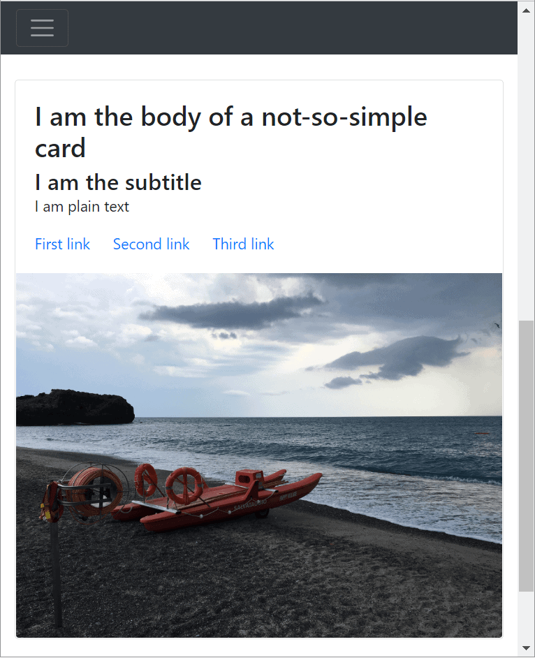
FIGURE 2. A richer card with a bottom image.
As you can see in the figure, the image is now placed at the bottom of the card. However, the true reason why it appears there is the fact that it’s placed after the body, not the class named card-img-bottom. The card style, in fact, doesn’t affect the position in the DOM but only the corners of the image that will be affected by the custom value of the border-radius property.
Image Overlays on Cards
Images in a card appear exactly where they’re placed in the markup and go inline with the text. An exception is when the image is used as an overlay. In this case, the image ends up rendering as the background of the card (or of a section of it) and some text is rendered on top of that. Here’s an example:
|
1 2 3 4 5 6 7 8 9 10 11 12 13 14 15 16 17 |
<div class="card"> <img class="card-img" src="~/content/images/poppies-xs.jpg"> <div class="card-body"> <h3 class="card-title"> I am the body of a not-so-simple card </h3> <div class="card-img-overlay"> <h4 class="card-subtitle"> I am the subtitle </h4> <p class="card-text"> I am plain text </p> </div> </div> </div> |
In the sample markup, the card contains an IMG element styled with the card-img class. Note that the image element is placed outside the body. The rendering of the card follows the order of elements and covers the top half of the card followed by the H3 element in the code above. It’s interesting what is being made of the DIV element style as an overlay with the class card-img-overlay. To be precise, the class has no direct reference to any image file. Here’s the actual styles in the class:
|
1 2 3 4 5 6 7 8 9 |
.card-img-overlay { position: absolute; top: 0; right: 0; bottom: 0; left: 0; padding: 1.25rem; } |
As you can see, the card-img-overlay class simply moves the content of the element to the absolute position rooted in the top-left corner of the container. As the image takes up the top half of the container, then the effect is that the content of the element is placed on top of the image, as in the figure.
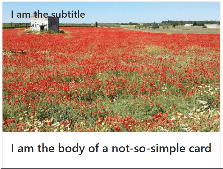
FIGURE 3. Card text overlaying an image.
Interestingly, if you move the image reference past the DIV element styled as card-img-overlay, then the image appears in the bottom half of the card just where you expect it to be, but the overlay content is still placed at the 0,0 corner of the container in an absolute position. So, it may happen that the overlay content renders on top of other text.
Header and Footer
Cards are graphical variations of a DIV container and are designed to replace ad hoc components available in earlier versions of Bootstrap such as the panel component. Hence, not just the card has a body, but it can also have header and footer elements.
|
1 2 3 4 5 6 7 |
<div class="card"> <div class="card-header">Header</div> <div class="card-body"> ... </div> <div class="card-footer">Footer</div> </div> |
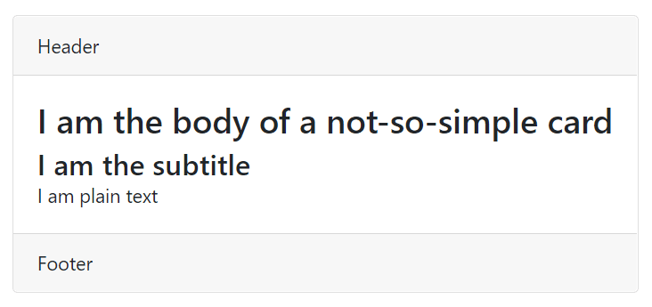
FIGURE 4. A card with header and footer
Header and footer are styled differently from the rest of the card. Needless to say, headers and footers are optional. Note that card-header and card-footer are simply decorative styles meaning that they just define the appearance of elements styled that way and not the role or the position. In other words, you can have a card with multiple headers and/or footers and even can have an element placed at the bottom (where a footer would reasonably fit) styled as a header.
In addition, cards can be given borders, text colors, alignment and backgrounds. You can use any of the predefined utility styles such as border-success, bg-primary and text-white. Note also that a card can be styled in total freedom resorting to any sort of combination of decorative styles. Even the width of a card can be controlled. So far, I assumed the card would take either the full width of the container or just the space it needs. You can control the width of a card in any other allowed way, whether through an explicit measure or via the grid.
|
1 |
<div class="card" style="width: 50rem;"> |
The content of a card is as rich as HTML can allow. Let’s see how to embed a tabstrip in a card.
Embedding Tabs in a Card
In Bootstrap 4, a tabstrip is the same as it was in earlier versions and can be obtained through exactly the same markup. To have a standard tabstrip in the body of a card all you do is add the regular tabstrip markup in the body section of the card.
|
1 2 3 4 5 6 7 8 9 10 11 12 13 14 15 16 17 18 19 20 |
<div class="card-body"> <ul class="nav nav-tabs"> <li class="nav-item"> <a class="nav-link active" id="home-tab" data-toggle="tab" href="#home">First</a> </li> <li class="nav-item"> <a class="nav-link" id="profile-tab" data-toggle="tab" href="#profile">Second</a> </li> </ul> <div class="tab-content" id="myTabContent"> <div class="tab-pane show active" id="home"> One </div> <div class="tab-pane" id="profile"> Two </div> </div> </div> |
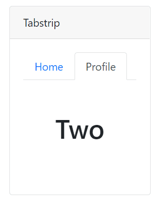
FIGURE 5. A tabstrip embedded in a card
Technically, you can have a tabstrip everywhere in a card, even in the header or the footer. If that helps, you can even have a list of hyperlinks in the header and have them rendered as a tabstrip. In this case, though, one tab shows the content and all other tabs are plain links connecting to other views.
|
1 2 3 4 5 6 7 8 9 10 11 12 13 14 15 16 17 18 |
<div class="card-header"> <ul class="nav nav-tabs card-header-tabs"> <li class="nav-item"> <a class="nav-link active" href="#">Actual content</a> </li> <li class="nav-item"> <a class="nav-link" href="#">Just a link</a> </li> <li class="nav-item"> <a class="nav-link disabled" href="#">Disabled</a> </li> </ul> </div> <div class="card-body"> <h5 class="card-title"> Fake tabstrip in the header </h5> </div> |
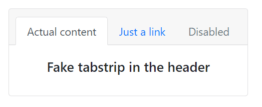
FIGURE 6. A simulated tabstrip in the header of a card
The card-header-tabs class turns the children of a UL element into tabs, except that only the active tab shows real content—the card’s content—and all others are plain links to some external content.
Layouts of a Card
Cards are ultimately panels and panels sometimes look nice if laid out horizontally. To achieve that you can use the classic Bootstrap grid or you can use a few native options of cards. Note, though, that layout options in Bootstrap 4.1 are not fully responsive.
The simplest way to group together cards is using the card-group class. Quite simply, a DIV styled with the class acts as the container of one or more cards.
|
1 2 3 4 5 6 7 8 9 10 11 |
<div class="card-group"> <div class="card"> ... </div> <div class="card"> ... </div> <div class="card"> ... </div> </div> |
As mentioned, all cards are laid out horizontally, one next to the other, equally sharing the available space. No additional row is created when the number of cards (and their size) is too large or the viewport too narrow.
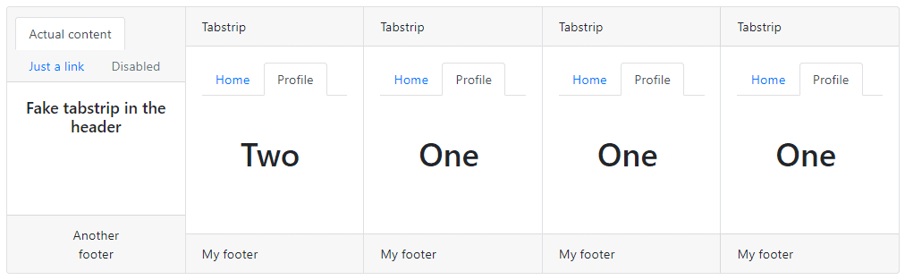
FIGURE 7. A sample card group.
There are a few things to say about card groups. First, headers and footers are automatically aligned, when defined. As in the figure, headers are aligned to the top across the list of cards and footers are aligned to the bottom. Different heights of headers and footers are managed accordingly. Bootstrap 4 achieves the effect through a CSS flexbox container. There are two more effects achievable with card layouts and both are technically implemented using CSS flexbox containers. They are card decks and card columns.
A card deck is similar to a card group except that cards are equally spaced. The final effect is nearly the same as in Figure 7 except that cards are divided by some empty space. Headers and footers are aligned to the top and the bottom respectively in the same way. Card columns are more interesting instead.
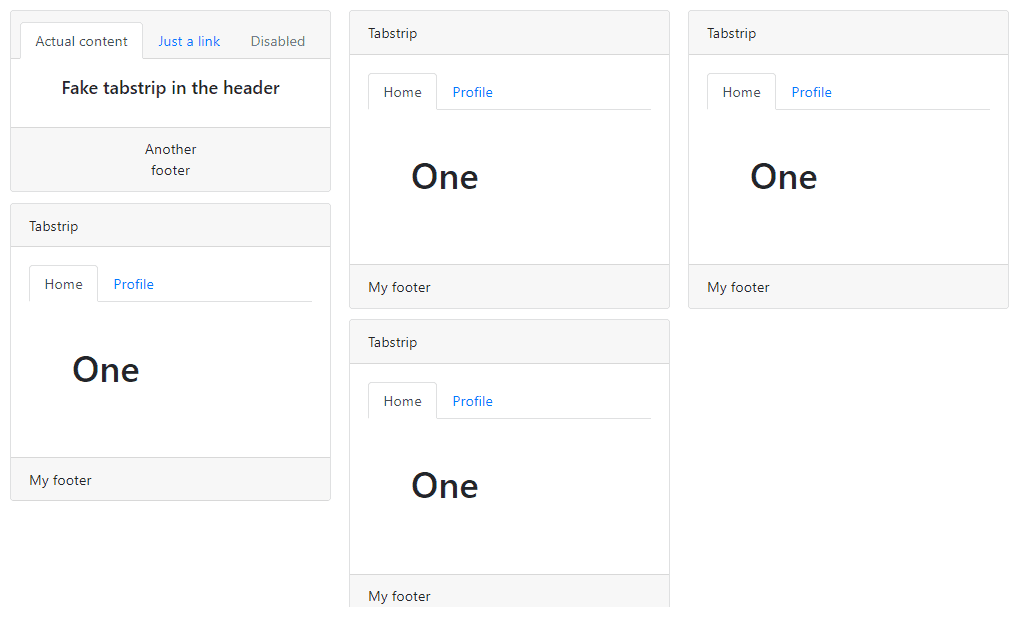
FIGURE 8. Card columns.
As in the figure, once organized in columns cards are rendered on a new row every time that horizontal space is not enough. Vertical alignment, however, is based on the available space in the column where the card dynamically happens to belong. In other words, when colum cards are used horizontal rows may not have the same height.
The number of columns tends to be three, but on XS screens it’s just one. There’s no way to change the number of columns in pure native CSS. As documented, though, you can use SASS mixins to alter the behavior and then recompile the Bootstrap 4.x source code to CSS. In particular, the number of columns displayed can be set via the media-breakpoint-only mixin.
|
1 2 3 |
@include media-breakpoint-only(lg) { column-count: ...; } |
Summary
Cards are a new graphical element in Bootstrap 4 designed to unify in a single component a few similar components available in earlier versions. There are no more panels, thumbnails, or wells in Bootstrap, but the same features can be easily obtained through cards. Hence, a card is a highly customizable and rich box that supports all sort of graphical enhancement including borders, padding, background and foreground colors and specific areas such as header, footer, and general content.
Card are an excellent shortcut when all you need is wrapping up together heterogeneous information such as a few distinct pieces of text and images. The term ‘card’ ultimately explains it all. You can pretty much shape a card the way you want, adding styles and colors and laying them out vertically (on small XS screens) and in horizontal sequence with various options (continuous, spaced, a là Pinterest) on larger screens. This particular aspect, though, affects the overall responsiveness of cards and might be improved in future versions of Bootstrap 4.
Load comments