
Embedded user assistance usability study
Introduction
Users of a computer application will make use of help that:
- is intuitive to use
- is located where they need it
- does not take them away from their current task.
The design of the user-interface component can make all the difference to determining whether help is used or not.
Even when you provide conventional Help text within your application, many people will be reluctant to use it, even after making several mistakes (De Loach 2007). So often, they are intent on getting the task competed rather than taking the time to learn the skills to do the task (Aleven, McLaren, & Koedinger 2006). They do not want to pause from their current task to read a traditional help topic because it interrupts the flow of their work. The users believe that the ‘cost’ of leaving the task in order to get help, in terms of time spent, and effort, is too high (Pirolli 2007).
The aim of embedded user assistance (UA) is to get around this problem by providing help where it is needed, so that users do not have to interrupt the task in order to search for the Help option in a menu system or on a toolbar. The help is delivered as an integral part of the software program, which means that users do not have to leave the current program and start dealing with a Help program or Web pages.
Embedded UA at Red Gate
With this in mind, our Technical Communications and User Experience teams decided to incorporate more embedded user assistance in Red Gate Software’s products.
We began by changing the text labels within our graphical user interfaces to make them more explanatory wherever possible. For example, in our database comparison tool, we had a button labelled Synchronize. This button launched a wizard to guide the user through the final setup and checks before synchronising two databases. Our users were nervous of clicking the button because they thought it would synchronise the databases immediately. Simply by changing the button name to Synchronization Wizard, we were able to allay these fears; our users now knew what to expect when they clicked the button.
This was an improvement, but it was only possible to fit the necessary amount of text in the label where the function could be described simply: Otherwise it would clutter up the user interface. In addition, some areas of our user interfaces are graphical, using grids or timelines to present information, so the text label solution was not going to work in these cases.
We next tried adding an ‘Interactive Help banner’ to the main window of one of our products, just below the toolbar (Figure 1).
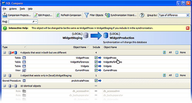
Figure 1: The interactive Help banner
The text in the banner changed as the user moved their mouse over the grid below. The user could close the banner once they were familiar with the interface. This was a partial success; users found it helpful when they first used the product. However, when the mouse pointer was far away from the banner, users tended not to notice or use the help. Also, the banner took up precious screen space and users generally didn’t think to close it.
In the same product, we incorporated ‘changeable text’ in an options dialog box (Figure 2).
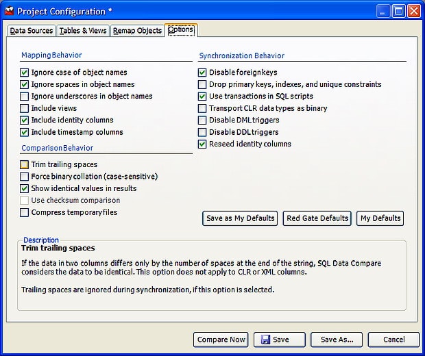
Figure 2: Changeable text at the bottom of an options dialog box
The dialog box comprised a list of check boxes to switch options for synchronising databases on or off. Many of the options were technically complex, or needed further guidance as to their use. We incorporated a panel into the dialog box; when the user moved the mouse pointer over an option, the text in the panel changed to provide help on that particular option. This was ideal because we could add the necessary text for each option by reusing the available space.
In a different product, we added mini Help buttons  next to individual user interface elements. When clicked, a small popup window was displayed next to the button (Figure 3).
Figure 3: Popup window launched by a mouse-click
The text in the popup provided information only on the user interface element from which it was launched. In this way, we kept the size of the window small and unobtrusive, and the help was displayed at the point where it was needed.
As the idea gathered momentum, even more ways of presenting embedded UA crept into our products.
So, after a while, we had a number of different ways of presenting embedded user assistance, but aside from a small amount of data gleaned from general product usability testing, we had no real way of knowing how it was being received, whether it was used, or which was the best way of presenting the information. It was at this point that we decided to run a usability study.
The Usability Study
The aims of the study were:
· to find out whether users use our embedded UA
- to test how users respond to different ways of presenting the embedded UA
- to trial some new display mechanisms.
What did we test?
Our products have such a wide range of user interface elements that we had to limit the areas that we would test to keep the project to a reasonable timescale.
After a process of elimination, we decided to test some of our existing display mechanisms and some new ones too.
For the dialog boxes:
- Changeable text in an area at the bottom of the dialog box (as in Figure 2).
- Changeable text in an area to the right of the dialog box (Figure 4).
- Popup windows launched from a button by mouse click, and closed with a click outside the window or on a close button (as in Figure 3).
- Popup windows launched from an information icon
 by moving the mouse over the icon (no click), and closed automatically after a set time (Figure 5).
Figure 4: Changeable text in an area to the right of the dialog box
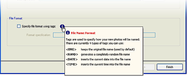
Figure 5: Popup windows launched by mouseover
For the graphical elements (grids and timelines):
- A sidebar that is opened by clicking a button, and expands into a large panel that overlays the interface (Figure 6)
- A sidebar that is opened by clicking a button and expands into a small pane that is integral with the interface (Figure 7)
- Enhanced tooltips – similar to standard tooltips, but with the ability to include text formatting and graphics (Figure 8).
Figure 6: Sidebar opens up via button into a large panel that overlays the interface
Figure 7: Sidebar opens up via button into an integral small pane
Figure 8 : Enhanced tooltips
We decided not to test the Interactive Help banner, as we already had some usability test data on this.
The usability test sessions
Ten people participated in the test. The participants were all from a similar background to our target user base. We did not tell the participants that we were testing the embedded UA.
We created a different scenario for each of the mechanisms to be tested. Each scenario was written as a task that required the participant to use a mocked up graphical user interface. We designed the interface to be ambiguous or misleading at times, so that the participants would have to read the embedded UA to complete the task. For example, we used unintelligible acronyms in a slider bar (Figure 9), and asked the participants to select the quickest scan type. This, of course, could not be deduced from the text labels, so the participant was forced either to guess or to look at the embedded UA.
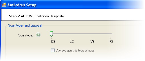
Figure 9: Unintelligible acronyms in a slider bar for test purposes
We asked each participant to complete all 12 tasks. The order in which we asked participants to complete the tasks was randomised in an attempt to eliminate bias resulting from increasing familiarity.
One of our usability experts facilitated the sessions, encouraging the participants to think aloud while they completed the tasks. We observed the participants, noting their behaviours and comments, and we also recorded the sessions using Camtasia Studio®. We did not prompt the participants, unless they were unable to proceed, and we noted this when it happened.
Evaluation
We performed a qualitative analysis of all the data collected. The starting point was ISO 9241-11:
‘Extent to which a product can be used by specified users to achieve specified goals with effectiveness, efficiency and satisfaction in a specified context of use.’
More specifically, we considered the following questions:
- Did the participant complete all the tasks?
- Did the participant use the help?
- Did they find the help easily?
- If the help was used, did the participant find the information required?
- Did the participant find the help intrusive?
- Did the facilitator have to prompt the user? If so when, how, and how many times?
The results
The in-depth results are too lengthy to share, but some of the main points are summarised below.
Changeable text
The changeable text (Figures 2 and 4) proved popular for the dialog boxes that contained lists of options. Participants were much quicker to find the text when it was displayed on the right-hand side, rather than the bottom of the dialog box. They also expressed a preference for scanning from left to right (from options to text) rather than top to bottom.
Popup windows
It was clear that the popup windows for dialog box controls were a success. To quote one of the participants:
‘It behaved exactly as I wanted it to, or at least as I hoped it would.’
The other participants gave similar views, and demonstrated this by quickly finding and using the buttons when appropriate. This was great feedback and demonstrated clearly that we were on the right track with this mechanism.
However, while the participants liked the popup windows, we discovered some refinements that we could make. None of the participants moved or resized the popup window, even though they commented that it obscured the interface in some cases. This, again, was great feedback, and was something we could address by redesigning the window to provide better visual cues.
Mouseover information popups
Participants experienced a number of problems with the popup help. This popup displayed automatically on mouseover, but the participants often tried to click the icon, even when they hadn’t seen the mechanism first. The automatic closure of the window meant that they hadn’t always finished reading the text before it closed.
Sidebars
None of the participants opened the sidebars (Figures 5 and 6) without being prompted. Most participants did not even notice the sidebar. In one case a participant who was stuck hovered his mouse pointer over the help button saying “I wonder what this does”, but still didn’t click the button! Clearly, the participants did not expect to look for help in a sidebar to obtain the information they needed to use the interface.
Enhanced tooltips
For the graphical components, the enhanced tooltips (Figure 7) were the most popular solution. Participants found them easily, and did not think they were intrusive.
The outcome
As a result of the study, we were able to identify the display mechanisms that users would be unlikely to find, or would find intrusive or difficult to use. We could then recommend that these mechanisms are phased out from our products. This will provide a more consistent approach so that our users will know what to expect in our products, and it will reduce the number of mechanisms that we have to support technically.
We redesigned the popup window in line with the recommendations from the study; for example, we made the resize grip more visible and added a title bar (Figure 10).
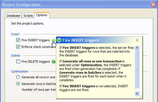
Figure 10: The popup window with the more visible resize grip, and a title bar
We were also able to produce a set of guidelines so that we consistently use the most appropriate mechanism for displaying embedded user assistance in our products in the future.
Conclusion
The study clearly demonstrated that users are willing to access help that is available immediately at point-of-need and does not take them away from their current task. It also showed that the way in which we present our embedded UA has an impact on how quickly our users find the help and whether they use it.
We were able use the information gained to select the most appropriate mechanisms for various user interface components, and to refine those mechanisms further to improve the ease of use.
The usability study has been a worthwhile investment in both time and resources. Many thanks to Stephen Chambers, who designed and ran the test sessions.
References
De Loach, S (2007) Best Practices for Embedded UA. Writers UA Conference for Software User Assistance 2007.
Alevan L, McLaren B M, & Koedinger K R (2006). Towards computer-based tutoring of help-seeking skills in Help-seeking in Academic Settings: Goals, Groups, and Contexts. Laurence Erlbaum, San Franscisco.
Pirolli P (2007). Information Foraging Theory: Adaptive Interaction with Interaction with Information. Oxford University Press Inc, USA
Load comments