Gnuplot is a free, command-line plotting tool that excels at generating automated charts from SQL Server data via PowerShell. Unlike GUI-based tools, Gnuplot separates script from data – write a plotting script once, feed it different datasets from SQL queries, and generate consistent charts automatically. This article shows how to set up the PowerShell-to-Gnuplot pipeline and automate chart generation for recurring reports.
There are many excellent ways of plotting data from SQL Server databases. There are many R libraries for example, there is Reporting Services, Plotly or PowerBI. I’ve even used Excel and JpGraph. If I had to learn just one though, I’d use GnuPlot because it is so versatile. If you haven’t heard of Gnuplot, it is the standard way of plotting scientific data which works via the command-line and uses a domain-specific scripting language (DSL) , and there are two books, along with countless samples, tutorials and articles about using it.
So what is Gnuplot?
GnuPlot, which runs under a free software license, has its origins in the nineteen eighties. You’d have thought that these were primitive times for graphs, but no, they weren’t. If anything, the standard of graphs have deteriorated since then as the tools have become more commoditised. GnuPlot has been cherished and developed mainly for scientific graphs, but it is very versatile. It covers a vast range of graph types and there are a large number of samples and tutorials around. It is a tool for the professional, and isn’t really suitable for fancy graphs in PowerPoint presentations.
GnuPlot is one of the last of the applications that can use a classic vector-based pen plotter as easily as a laser printer. It can draw plots onscreen, even in ASCII. Most of us nowadays want graphs as bitmapped graphics to display within a webpage or embed in a document. It does that as well, but also in vector graphics or as a Pdf. The list is endless. It can even do animated graphs. So many impoverished scientists, with antique output devices, have been accommodated over the years and have blessed Gnuplot’s ability to produce graphs on just about any printer. Python, Java, Ruby, Haskell Fortran 95 and Smalltalk all have libraries for accessing Gnuplot.
Another great advantage of GnuPlot is that allows the separation of script from data. GnuPlot runs a script, and generally the data is read from a data file specified by the script in the plot command. It likes columnar or tab-separated data, which suits SQL Server.
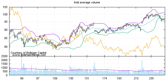
Although GnuPlot is best known for plotting scientific data and mathematical expressions, it is excellent in business, particularly for financial data. Here is an example
The existing teaching material on GnuPlot is so good that it would be silly to attempt to add to it. Instead, I’ll start by showing a basic PowerShell-integration.
Hello Plot
Gnuplot can be installed via Chocolatey, or done the old-fashioned way via Sourceforge.
There is a windows GUI version of Gnuplot, which is handy for creating scripts. With a script you can use the many ‘set’ commands to specify how the image is to be formatted and presented, including such things as the type of output, size of the graph, the fonts and colors to be used, the scale, x,y coordinates, and the output image name. The ‘plot’ command is then used to actually generate the image. The process has sensible defaults. There are a whole host of other commands, of course. Although you can execute commands interactively via the GUI or the command interface, it is usually best to end up with a script file that can be rendered reusable by means of variables in the script file. If the script contains any errors, these will be displayed during this process, highlighting where the error is.
Once you have the design roughed out, you can run it in PowerShell, or whatever other scripting language you choose.
I use Gnuplot mainly for SQL Server performance testing, because it can be done entirely automated as part of a rapid integration. Without twitching a muscle, if all goes well, you end up with a cute website stocked with all the graphs you’d possibly need for checking that your processes scale properly. However, as I can’t really show that for a general introduction, I’ll get some Open Data and do a bit of analysis on that.
As an example, I’ve taken the data for the annual consumption of Petroleum since 1980. I’ve imported it into SQL Server, created a normalised version and started generating reports. Although it is trivial for Gnuplot to get data from a tab delimited or column delimited file, we’ll, for the first two examples, just use SSMS to get the data. In SSMS, I’ve set the query to text. (Query -> Results to…->Results to Text) and set the query options (query->Query Options->Results-Text) to Output Format:tab delimited and ‘Include Column headers in the result set’ to ‘no’. With these settings we can simply cut and paste the results from SSMS into GnuPlot via PowerShell. Firstly we just sum the petroleum consumption for the whole world aggregated per year.
You may also be interested in:
PowerShell and SQL Server automation
|
1 2 3 4 5 6 7 8 9 10 11 12 13 14 15 16 17 18 19 20 21 22 23 24 25 26 27 28 29 30 31 32 33 34 35 36 37 38 39 40 41 42 43 44 45 46 47 48 49 50 51 52 53 54 55 56 57 58 59 60 61 62 63 64 65 |
#first set an alias for gnuplot. I've installed this in the default place Set-Alias GnuPlot 'C:\Program Files\gnuplot\bin\gnuplot.exe' -Scope Script #now we just define where we want to put the files $gpscriptsPath='PathToMyGnuPlotScripts' $ScriptName='currentScript.gp' $PlotPath='PathToMyPlots' $PlotFilename="$gpscriptsPath\Total.gif" #here is the gnuplot script. note that a dollars sign in the script #has to be escaped because we want to add PowerShell variables $TheScript=@" set termoption enhanced set terminal gif font 'Calibri' 12 size 800,600 set output '$PlotFilename' save_encoding = GPVAL_ENCODING set encoding utf8 set title 'petroleum (annual) consumption' font ',18' set xlabel 'Year' font ',12' set ylabel '1000 bbl/d' font 'arial,12' set yrange [ 0 : 100000 ] `$grid << EOD 1980 62781.10 1981 60953.22 1982 59553.92 1983 58784.42 1984 59796.52 1985 60083.74 1986 61819.74 1987 63107.96 1988 64974.76 1989 66090.26 1990 66525.76 1991 67186.54 1992 67350.04 1993 67557.56 1994 68897.56 1995 70090.65 1996 71672.55 1997 73421.55 1998 74077.26 1999 75843.76 2000 77063.05 2001 77727.37 2002 78418.88 2003 80074.61 2004 83210.17 2005 84627.08 2006 85701.29 2007 86493.46 2008 85642.56 2009 85580.92 2010 89173.90 2011 89882.73 2012 91091.43 2013 92314.09 2014 93599.79 EOD plot '`$grid' using 1:2 with boxes title '' "@ #we are using UTF8- usually a good idea with these applications. [System.IO.File]::WriteAllLines("$gpscriptsPath\$ScriptName",$TheScript, (New-Object System.Text.UTF8Encoding $False)) #now we simply execute it and admire the gif file containing the plot gnuplot "$gpscriptsPath\$ScriptName" "@ [System.IO.File]::WriteAllLines("$gpscriptsPath\$ScriptName",$TheScript, (New-Object System.Text.UTF8Encoding $False)) |
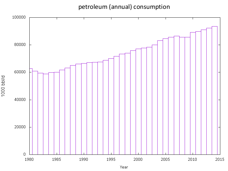
This seems a startling rise when we are all trying to prevent global pollution and climate change. Is this consistent, or are there some nations guzzling petroleum? We therefore go back to our SQL and produce a column for each continent which we can then plot as separate lines to see what is going on. We’ll change to a line graph as well.
|
1 2 3 4 5 6 7 8 9 10 11 12 13 14 15 16 17 18 19 20 21 22 23 24 25 26 27 28 29 30 31 32 33 34 35 36 37 38 39 40 41 42 43 44 45 46 47 48 49 50 51 52 53 54 55 56 57 58 59 60 61 62 63 |
Set-Alias GnuPlot 'C:\Program Files\gnuplot\bin\gnuplot.exe' -Scope Script $gpscriptsPath='PathToMyGnuPlotScripts' $ScriptName='currentScript.gp' $PlotPath='PathToMyPlots' $PlotFilename="$PlotPath\ByContinent.gif" $TheScript=@" set termoption enhanced set terminal gif font 'Calibri' 12 size 800,600 set output '$PlotFilename' save_encoding = GPVAL_ENCODING set encoding utf8 set title 'petroleum (annual) consumption' font ',18' set yrange [0:60000] set xlabel 'Year' font ',12' set ylabel '1000 bbl/d' font 'arial,12' `$grid << EOD 1980 1662.10 1.00 12656.80 24547.90 20908.30 724.90 2633.20 1981 1796.62 1.00 12664.50 23273.20 20233.10 746.42 2592.38 1982 1895.92 1.00 12597.40 22846.50 19264.50 767.62 2548.08 1983 1920.42 1.00 12806.00 22355.40 18901.80 740.02 2414.68 1984 1991.92 1.30 13224.10 22141.80 19501.20 772.42 2438.28 1985 2074.42 1.40 13414.50 22120.00 19557.80 767.02 2434.40 1986 2054.32 1.30 13935.30 22543.50 20164.10 779.42 2666.30 1987 2083.04 1.30 14501.50 22643.60 20709.70 802.42 2745.90 1988 2166.34 1.40 15406.70 22720.00 21413.70 838.42 2811.20 1989 2248.94 1.30 16297.50 22608.10 21691.10 874.92 2784.30 1990 2343.14 1.40 17219.30 22360.00 21223.60 907.42 2927.10 1991 2405.82 1.40 17793.40 22498.00 21048.80 886.62 2979.00 1992 2445.22 1.40 19750.60 20486.00 21420.00 903.72 3107.30 1993 2471.44 1.40 20629.80 19291.00 21703.00 941.92 3234.30 1994 2461.64 1.40 21672.70 18719.00 22366.60 986.62 3369.10 1995 2558.14 1.50 22632.30 18745.20 22347.29 1007.52 3527.30 1996 2614.74 1.50 23474.80 18599.30 23019.19 1026.02 3729.50 1997 2672.64 1.50 24401.20 18695.40 23541.39 1050.02 3903.60 1998 2689.14 1.50 24237.90 18896.40 23986.30 1048.92 4018.70 1999 2733.24 1.50 25228.60 18689.20 24794.70 1076.72 4085.30 2000 2838.51 1.50 26186.26 18543.10 25009.60 1075.22 4199.00 2001 2971.40 1.50 26528.65 18866.50 25035.90 1078.12 4155.82 2002 3075.38 1.50 27172.05 18828.50 25111.98 1109.72 4053.65 2003 3112.97 1.50 28156.52 19037.50 25535.98 1157.72 3980.22 2004 3209.04 1.50 29916.38 19222.60 26413.78 1177.92 4178.91 2005 3353.84 1.60 30727.55 19188.60 26545.48 1205.73 4373.66 2006 3355.07 1.60 31521.53 19325.80 26466.88 1221.23 4540.30 2007 3365.11 1.60 32322.05 19025.90 26537.20 1238.03 4711.59 2008 3559.53 1.80 32607.75 19136.60 25202.60 1233.12 4696.16 2009 3705.04 1.60 33739.84 18322.70 24316.30 1214.12 5017.45 2010 3922.55 1.60 35840.87 18524.00 24934.20 1272.62 5443.19 2011 3826.26 0.09 36884.88 18356.10 24735.30 1297.22 5534.51 2012 4026.77 0.09 38448.34 17808.80 24412.20 1325.22 5827.02 2013 4205.69 0.09 39172.13 17582.00 24846.60 1375.56 5887.85 2014 4406.60 0.09 39917.67 17730.40 24907.50 1377.16 6043.18 EOD plot '`$grid' using 1:2 with lines title 'Africa',\ '`$grid' using 1:4 with lines title 'Asia', \ '`$grid' using 1:5 with lines title 'Europe', \ '`$grid' using 1:6 with lines title 'North America', \ '`$grid' using 1:7 with lines title 'Australia', \ '`$grid' using 1:8 with lines title 'South America' "@ [System.IO.File]::WriteAllLines("$gpscriptsPath\$ScriptName",$TheScript, (New-Object System.Text.UTF8Encoding $False)) gnuplot "$gpscriptsPath\$ScriptName" |
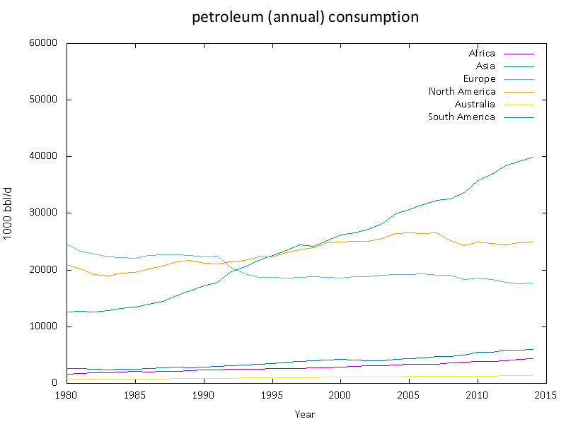
Basically, the plots seem to illustrate that, while Europe and North America has got its petroleum consumption under control, Asia hasn’t. Our figures aren’t particularly accurate because asia is a very broad grouping, and Russia is considered to be in Europe in the data. (the Urals actually separate the Asian and European sides). As a side-note, petroleum consumption is also considered a sign of industrial economic activity.
At this point, we’d want to investigate the details of the main petroleum consumers to home in on the countries that are increasing their usage fastest. For this, we really need a way of finding the countries who are affecting the overall figurs the most.
If we assume that all countries are increasing, or decreasing their consumption in a linear fashion, then we can filter out the countries with the greatest rise as well as the highest consumers, simply by doing a linear regression in SQL Server.
Our data table is very simple.
|
1 2 3 4 5 6 7 |
CREATE TABLE petroleumAnnualConsumption ( country VARCHAR(40) NOT NULL, AnnualConsumption NUMERIC(18, 2) NOT NULL, year INT NOT NULL, CONSTRAINT CountryYear PRIMARY KEY(country, year) ) |
..and our first plot data was created by executing ….
|
1 2 3 4 5 6 7 |
SELECT [year], SUM(AnnualConsumption) FROM dbo.petroleumAnnualConsumption WHERE [year] < 2015 GROUP BY [year] ORDER BY [year] |
We can get the intercept, slope, and predicted petroleum consumption for a particular year from a slightly more complicated query that calculates the linear regression. Here we list the predicted top twenty consumers from the data (which is only as far as 2014)
|
1 2 3 4 5 6 7 8 9 10 11 12 13 14 15 16 17 18 19 20 21 22 23 24 25 26 |
SELECT TOP 20 country, slope, (2016 * regression.Slope) + regression.intercept AS prediction FROM ( SELECT CONVERT(NUMERIC(18, 2), (SumY - (slope * SumX)) / readings) AS intercept, CONVERT(NUMERIC(18, 2), slope) AS Slope, Country FROM ( SELECT country, ((tb.readings * tb.SumXY) - (tb.SumX * tb.SumY)) / (tb.readings * tb.SumX2 - POWER(tb.SumX, 2)) AS slope, tb.SumX, tb.SumY, tb.readings FROM ( SELECT country, COUNT(*) AS readings, --readings CONVERT(NUMERIC(18, 2), SUM(Year)) AS SumX, CONVERT(NUMERIC(18, 2), SUM(AnnualConsumption)) AS SumY, CONVERT(NUMERIC(18, 2), SUM(AnnualConsumption * year)) AS SumXy, CONVERT(NUMERIC(18, 2), SUM(POWER(year, 2))) AS SumX2 FROM dbo.petroleumAnnualConsumption WHERE AnnualConsumption IS NOT NULL GROUP BY country ) tb(country, readings, SumX, SumY, SumXY, SumX2) )SlopeAndIntercept ) regression ORDER BY prediction DESC; |
Now that we know who is increasing their consumption most rapidly, and who the most prolific consumers are, we simply generate plots for the most significant fifty petrol consumers. This would be somewhat a trial by the dreaded ‘point-and-click’ With GnuPlot it is the work of a moment.
|
1 2 3 4 5 6 7 8 9 10 11 12 13 14 15 16 17 18 19 20 21 22 23 24 25 26 27 28 29 30 31 32 33 34 35 36 37 38 39 40 41 42 43 44 45 46 47 48 49 50 51 52 53 54 55 56 57 58 59 60 61 62 63 64 65 66 67 68 69 70 71 72 73 74 75 76 |
#first set an alias for gnuplot. I've installed this in the default place Set-Alias GnuPlot 'C:\Program Files\gnuplot\bin\gnuplot.exe' -Scope Script $Sourceinstance = 'MyServer\Dancy' $Sourcedatabase = 'PetroleumConsumption' #now we just define where we want to put the files $PlotPath = 'PathToMyPlots' $ScriptName = 'currentScript.gp' #we now read in a list of nations that are increasing their petroleum consumption rapidly #or are high consumers of Petroleum Get-Content "$PlotPath\nations.dat" | foreach { #for each of these nations, we query the database, get their data onto file and plot it $nation = $_ $PlotFilename = "$PlotPath\$nation.gif" try #connecting to the database { $SourceConnectionString = "Data Source=$Sourceinstance;Initial Catalog=$Sourcedatabase;Integrated Security=True" $SqlConnection = new-object System.Data.SqlClient.SqlConnection $SqlConnection.ConnectionString = $SourceConnectionString $SqlCommand = $SqlConnection.CreateCommand() #now we query the database $SqlCommand.CommandText = @" SELECT petroleumAnnualConsumption.[year], SUM(dbo.petroleumAnnualConsumption.AnnualConsumption) FROM dbo.petroleumAnnualConsumption LEFT OUTER JOIN CountryMapping ON CountryMapping.countryNameThen = petroleumAnnualConsumption.country LEFT OUTER JOIN CountryContinent ON CountryContinent.country = COALESCE(CountryMapping.CurrentName, petroleumAnnualConsumption.country) WHERE COALESCE(CountryMapping.CurrentName, petroleumAnnualConsumption.country)='$nation' GROUP BY [year] ORDER BY [year] "@ # We then simply write out the query as a tab-delimited file in UTF $DataAdapter = new-object System.Data.SqlClient.SqlDataAdapter $SqlCommand $dataset = new-object System.Data.Dataset if ($DataAdapter.Fill($dataset) -gt 0) { $output = $dataSet.Tables.Rows | foreach { [string]::Join("`t", $_.ItemArray) } } else { $output = ''; write-warning 'The query returned no data.' } # here we write out the file [System.IO.File]::WriteAllLines("$PlotPath\Data.dat", $output, (New-Object System.Text.UTF8Encoding $False)) } catch { $ex = $_.Exception Write-Error "whilst opening source $Sourceinstance . $Sourcedatabase . $SourceTable : Error'$($_)' in script $($_.InvocationInfo.ScriptName) $($_.InvocationInfo.Line.Trim()) (line $($_.InvocationInfo.ScriptLineNumber)) char $($_.InvocationInfo.OffsetInLine)" } # here is the gnuplot script. note that a dollars sign in the script # has to be escaped because we want to add PowerShell variables $TheScript =@" set termoption enhanced set terminal gif font 'Calibri' 12 size 800,600 set output '$PlotFilename' save_encoding = GPVAL_ENCODING set encoding utf8 set title 'petroleum (annual) consumption of $nation' font ',18' set xlabel 'Year' font ',12' set yrange [0:] set ylabel '1000 bbl/d' font 'arial,12' plot '$PlotPath\Data.dat' using 1:2 with lines title '' "@ #we are using UTF8- usually a good idea with these applications. [System.IO.File]::WriteAllLines("$gpscriptsPath\$ScriptName", $TheScript, (New-Object System.Text.UTF8Encoding $False)) #now we simply execute it and admire the gif file containing the plot gnuplot "$gpscriptsPath\$ScriptName" } |
We can now inspect these graphs either by referencing them from a webpage or via a file-viewing application such as Directory Opus. You can also embed them in Word files.
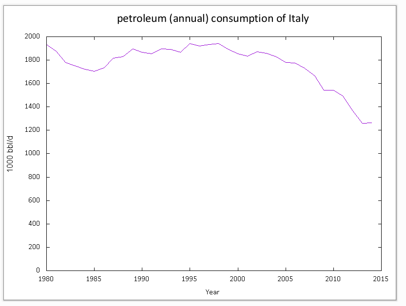
Here is an example of the many plots generated by this routine
Conclusion
I’ve been as guilty as anyone in the past of clinging to Excel as the only way of doing any sort of graph plotting. It is good for one-off work but if you are doing lots of graphs, and automating their production and update, then the old classic, Gnuplot, is definitely worth considering. I know of nothing else that is so sympathetic with the way that SQL Server exports data, and which runs on the command line, generating bitmap or vector graphics directly, as well as most other formats that you’d want. I recommend it for those occasions such as data-science, performance testing and monitoring, where you need information more than you need fancy presentation. It is valuable for reporting on any automation tasks, and very good for integration tests and other aspects of continuous integration and deployment.
You may also be interested in:
Documenting SQL Server tables
Further Reading
- Gnuplot in Action by Philipp K. Janert (2009). ISBN 978-1933988399.
- gnuplot Cookbook by Lee Phillips (2012). ISBN 978-1849517249.
- Gnuplot 5.0. by Thomas Williams and Colin Kelley (2015). ISBN 978-988-14436-4-9.
- Gnuplot on Wikipedia
- Gnuplot introduction on Wikimedia
- Gnuplot examples on Wikimedia commons
- Gnuplot Reference Card
- Images of plots with Gnuplot source code
- Official Gnuplot Documentation
FAQs: Generating Plots Automatically From PowerShell and SQL Server Using Gnuplot
1. What is Gnuplot and why use it with SQL Server?
Gnuplot is a free, open-source command-line plotting tool for scientific data visualization. Works well with SQL Server because it reads columnar/tab-separated data directly. Combined with PowerShell, you automate the pipeline: query SQL Server, export results, generate charts without manual intervention.
2. How do you automate chart generation from SQL Server with PowerShell?
Execute a SQL query via PowerShell, export results as tab-separated file, call Gnuplot with a script that reads it and generates a chart image (PNG, PDF, SVG). Script-from-data separation means one script reused across datasets. Schedule the PowerShell script for recurring reports.
This document contains proprietary information and is protected by copyright law.
Copyright © 2026 Red Gate Software Limited. All rights reserved


Load comments