
Create Better, Faster, and Cheaper Prototypes with SketchFlow (a WPF design tool)
Typical prototypes take too long, cost too much, or achieve too little (or some combination of those). Think back to when you were designing and writing code before Visual Studio. And then, one day, you discovered the capabilities that Visual Studio provides. You could create WinForm applications by dragging and dropping controls from a toolbox and editing their properties! You could create and connect data sources; develop class diagrams; etc. Visual Studio was an earthshaking paradigm shift in design and development.
With the advent of SketchFlow the landscape for creating prototypes has changed. SketchFlow is new, not very well known, not even a standalone product. But it is earthshaking. To paraphrase the tag line from the iconic Apple commercial, “you’ll see why [prototyping with SketchFlow] won’t be like anything else.”
This is my third jaunt into exploring interesting aspects of Windows Presentation Foundation (WPF). See also Essential Tools for the WPF Novice and From WinForm to WPF: A Quick Reference Guide. My main goal is to convince you that the SketchFlow’s benefits far outweigh the costs not just of acquisition and training, but also of missed opportunities. Though my principal target is the .NET developer, the benefit-analysis I present should be useful to technical managers as well. Furthermore, I assume you are fluent in WinForms but not so much in WPF. WPF, as you probably know, takes a long time to learn so to get right to the first question: Do you need to be a WPF expert to use SketchFlow? No, you do not, but a modest amount of WPF familiarity will make you more effective and efficient in creating prototypes. I will go so far as to say you can create SketchFlow prototypes with no WPF knowledge, but you will reach limits of what you can do.
This is a tutorial on SketchFlow but not a traditional one covering the basics. Instead, I cover the key capabilities-how to use them, how they relate to the whole, and why they are important. I have scoured a host of sources-including the user manual, tutorials, videos, white papers, and conference presentations-to synthesize the material you are now reading and make it as useful as possible. Different people have different learning styles, however. If you are more comfortable starting with conventional tutorials before tackling this article, take a look at the Blend Essentials video tutorials from Joshua Ekland of IT Mentors. I would be remiss not to provide the address for getting your general questions answered-see the official Blend/SketchFlow forum.
Expression Studio, Visual Studio, Blend, and SketchFlow: Understanding the Context
SketchFlow is not a traditional product offering. You will not find it packaged on either Microsoft.com or MSDN for download or purchase. Rather, it is actually a specialized editor integrated into Microsoft Blend. To enter the SketchFlow editor simply create or open a SketchFlow project in Blend. This is analogous to the many specialized editors in Visual Studio (e.g. the XML Schema editor). Each is a first-class tool in its own right but cannot be separated from its host environment. Calling SketchFlow just an “editor” is almost an injustice, though-it is more appropriate to call it a development environment nested inside Blend’s development environment. Microsoft Blend is itself one of the four components comprising Expression Studio. Figure 1 shows the context of tools within both Expression Studio and Visual Studio.
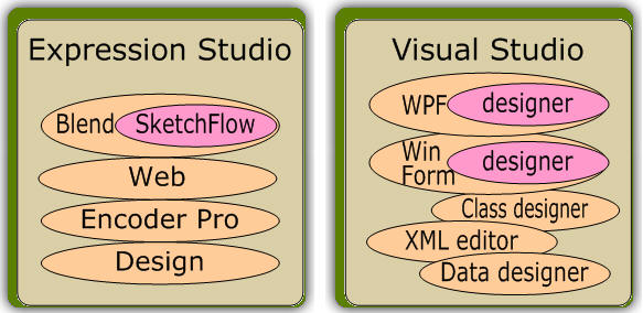
Figure 1 Parallelism of Expression Studio and Visual Studio
This article coincides with the completion of Expression Studio 4, just released on June 7, 2010. This new version of Expression Studio apparently comes in an Ultimate edition and a more modest Premium edition. (I say “apparently” because at the time I am writing this-just hours after release-only Ultimate is available for purchase at the retail level, though both Ultimate and Premium are available to MSDN subscribers.) Though SketchFlow was available with all versions of Blend in version 3, Microsoft surprisingly chose to include SketchFlow only with the Ultimate edition, not the Premium (see the Expression Studio FAQ), a decision which has garnered criticism from MSDN subscribers who are eligible only for the Premium level product.
The new features available in Blend 4-some of which are applicable to SketchFlow are summarized on Silverlight program manager Tim Heuer’s blog. For the most in-depth coverage, though, see Expression evangelist Adam Kinney’s Expression Blend 4 Technical Feature Overview.
Do you, as a Visual Studio developer, need Blend let alone SketchFlow? I think this article will easily persuade you that you do need SketchFlow (and hence, Blend) for any serious prototype work. But even without SketchFlow, with release 4 Blend is now a vital tool for any Silverlight/WPF developer. Silverlight evangelist Jesse Liberty puts it not too mildly: “Let me be clear. You do not need Blend to program in Silverlight [or WPF!]. You can use Visual Studio (or Notepad, if you like). As [his] friend David Platt said once ‘You can also do an appendectomy through your throat, it just takes longer and hurts more.’ “
How To…
While I enjoy a good article that presents an overview of an exciting, new technology, I can absorb it much more effectively with some “hands on” details of how to actually do things with it. This sidebar provides the key techniques for effective SketchFlow use, information gathered from a variety of source material and condensed to a useful “SketchFlow in a Nutshell” reference.
Create Screens and Pathways
In the map panel, hover over an existing screen, then click and drag the leftmost icon that materializes to create a connected screen.
Add Sketchy Controls to a Screen
-
For standard WPF controls (buttons, check boxes, list boxes, labels, etc.) drag assets from Assets >> SketchFlow >> Styles >> Sketch Styles onto the artboard.
-
For other WPF controls not available as sketchy controls (e.g. MenuItems), drag from Assets >> Controls and change the font to the standard “sketchy “font, Buxton Sketch.
-
For compound controls from the Mockup library, install the Mockup library (see Power Drawing) then drag a control from Assets >> SketchFlow >> Mockups onto the artboard.
Add Sketchy Basic Shapes
Drag assets from Assets >> SketchFlow >> Sketch Shapes onto the artboard (see Power Drawing).
Create Compound Elements
-
To put several controls into a container (e.g. a StackPanel), select the controls on your artboard then choose Group Into from the context menu.
-
To encapsulate multiple controls into one composite control select them then choose Make Into UserControl or Make Into Component Screen from the context menu. (The only distinction between these is that a component screen is a user control that appears in the SketchFlow map for easy use in other screens.) For the distinction between control and user control take a look at the clear and succinct description here (Custom VS User Control).
Add Stub Data
Open the Create Sample Data dropdown in the Data panel. See Stubby Data.
Test a Prototype
Use the Project >> Run Project menu item.
Generate Word Documentation
Use the File >> Export to Microsoft Word menu item.
Navigate
In SketchFlow, double-click on screens in the map or in the Project panel. In SketchFlow Player, single-click on screens in the map or the navigation panel for random access navigation, or use the prototype buttons and controls for in-context navigation. See Navigating Your Prototype.
Provide Notes to Reviewers
-
To add permanent notes on-screen, add a Note control (Assets >> SketchFlow >> Styles >> Sketch Styles >> Note-Sketch) onto the artboard. That creates what appears to be a floating “sticky” note.
-
For less obtrusive notes, use an annotation (Tools >> Create Annotation) that provides a collapsible note. Collapsed notes show only the name of the user who added them. When expanded, it shows the user, the creation date, and the note text. Also, you can globally hide all annotations in development (View >> Show Annotations) or in the player (My Feedback tab >> Show or hide annotations button).
Deliver a Prototype to Reviewers
Use the File >> Package SketchFlow Project menu item. This prompts you for a directory then populates it with the files needed for the SketchFlow Player. You could then put that on your network or package it into a zip file and deliver to your reviewers. To run the player, your reviewers just need to double-click the TestPage.html file (if you created a Silverlight project) or <project-name>.exe (if you created a WPF project). Alternately, for Silverlight prototypes only, publish to SharePoint (File >> Publish to SharePoint) so reviewers may see each other’s feedback as well. See Managing Feedback.
Integrate Reviewer’s Feedback
Click the Add icon on the Feedback panel (Windows >> SketchFlow Feedback) and select the appropriate .feedback file sent to you from a reviewer. Repeat for multiple reviewers. Look for the light bulb icons on the map to find screens with feedback. See Managing Feedback.
Transfer Project to Visual Studio
To maintain the SketchFlow Player environment, do nothing: simply open it in Visual Studio. If, on the other hand, you want to strip the player off the application (as in “Remove this Frame” on some web sites) there are several simple steps you need to perform. Whether you should do this, however, is a completely separate-and important-question. There are strong opinions advising against trying to shoehorn your prototype into becoming the production application and I side with them. See How to Convert a SketchFlow Prototype into a Production Application…And why you shouldn’t!
Benefits of SketchFlow Prototyping
Start with the Right Requirements
That sounds like a “given”, but too often a project reaches a nearly-finished stage before your business users see it in action-perhaps during final testing(!)-and remark “Oh, that won’t work. It needs to do this…”. A good prototype very early in the product lifecycle will help clarify and solidify requirements to move those major requirement shifts from late in the development cycle to the very beginning. Also, it can reveal requirements that are missing as well as those that introduce needless complexity.
With SketchFlow, the deliverable is an interactive model, not just screen images. A business user can operate the prototype instead of just looking at static screen shots. Additionally, a prototype can be easily done in stages and sent out for review anywhere along the way: start with creating screens and their connections almost instantly. Later add controls, data, styling, etc., and get feedback at any or all steps along the way. See Understanding the Workflow for more.
Get Feedback Faster and More Accurately
Reviewers can provide feedback right in the prototype making the feedback much richer, effective, and accurate. SketchFlow provides an area to type notes as well as drawing tools so a reviewer can literally markup any page in the prototype. These feedback notes are sent back to the development team in electronic form and can then be overlaid on top of the project screens to make fast and accurate modifications. See Managing Feedback for more.
Make Reviewers More Effective in Less Time
The prototype looks like a sketch, so the reviewer will focus on the concepts rather than the details that are largely irrelevant and distracting. SketchFlow comes complete with a whole range of sketch-styled controls and a custom sketch-styled font. Though not all controls are “sketchable” by this definition, you can often massage them a bit to look just as sketchable. For example, menus do not have a sketchable version. But just add a standard menu then change the font to the sketch-styled font to make it look like a native sketchable component.
Some reviewers work more effectively in-context (using the controls, sliders, and buttons of the prototype application) while others would much prefer random access (where you could shuffle through the screens in any order you please). With random access, you could jump from the first screen to the fifth to the last then back to the first if, for example, you wanted to see all the screens that use a particular graphic to ensure consistent sizing and placement. Running in-context, on the other hand, constrains you to navigating only within the bounds of the prototype. So if the only way to get from the first screen to the fifth screen is to touch the second, third, and fourth, then that is what you do. See Navigating Your Prototype for more.
Eliminate Developer Effort Documenting the User Interface
Developers typically dread the “D” word: documentation. It takes time away from “useful” work (so the argument goes). But it serves a vital purpose. During the design phase, good documentation supplements a good prototype for presentations, paper reviews, or other offline uses. Later, it serves as a record of how the system was designed. SketchFlow can virtually eliminate the effort to create initial documentation: it generates a Word document illustrating every screen and state, complete with a table of contents, in a single click. Note that the screen shots are put in alphabetical order rather than any tree-walking order. Here is a trick to rearrange the screens to the order of your choosing: When you name screens, rather than calling them “Login”, “Order”, “Checkout”, etc., prefix each with a numerical index, as in “1-Login”, “2-Order”, “3-Checkout”. The former group will be sorted to “Checkout”, “Login”, “Order” while the latter will retain the ordering specified by the indices.
Align Expectations with the Technology
Prototypes in SketchFlow are genuine .NET WPF applications; all the components and power of WPF may be used in creating a prototype. If you want the functionality of a ListBox, use a ListBox. If you create a prototype with PowerPoint or other application where you essentially just draw screens, you can easily draw an arrow and say “this widget will do x”. But there may not be an existing widget that can do x and the effort to create such a widget may be a lot larger than expected. When using SketchFlow, if you have a control in the toolbox that you can use in your prototype, then by definition you have it available when you go to create your production code. You still may need to create other widgets for production but you in SketchFlow you will explicitly document this: every arrow with the notation “this widget will do x” is now, by definition, a widget you do not have.
Make Your Prototype More Realistic in Less Time with Stubby Data
A prototype with buttons, checkboxes, text fields, etc. is nice. But one with simulated database interactions is better! SketchFlow provides stub data sources that behave analogous to stubs in your code: you can connect to these throwaway components and interact with them without the effort of putting the “real thing” in place. And unlike stub code, which may still take some reasonable effort to put in place, stubby data in SketchFlow takes almost no effort-you can wire up and configure stubby data with just a few clicks. See Stubby Data for more.
Maintain Focus by Minimizing Tools and Training
A developer has a lot more tools and applications on a workstation compared to the average PC user. Perhaps you create both web applications and client applications, so that you may need to develop prototypes for either technology. Or perhaps you want the flexibility to deliver your prototype in a browser or as a standalone application. Does that mean you need two prototyping tools? The answer with SketchFlow is “No”. Silverlight is a respectable subset of WPF that is designed for web applications. Just as with Visual Studio you have the option of creating a WinForm application or a WPF application, with SketchFlow you can create either a Silverlight SketchFlow app or a WPF SketchFlow app. They look virtually identical when you are in SketchFlow (Blend, really). When you execute the prototype, however, a Silverlight app opens in your browser while a WPF app opens in its own client window. So you need only a single tool to generate either web or desktop prototypes. Furthermore, the SketchFlow workspace is similar to Visual Studio’s workspace. So your Visual Studio familiarity will substantially reduce your training effort for Expression Studio (of which Blend and SketchFlow are a part). And-SketchFlow projects are solution-compatible with Visual Studio. See Workspace Details for more.
Understanding the Workflow
When you create a SketchFlow project, you create it as either a WPF project (which runs as a desktop application) or a Silverlight project (which runs in a browser). With the project created, layout your screens and their interconnections, then sketch out components on each screen to round out your prototype. Once your project is completed, you build and execute it just like you would a Visual Studio project. SketchFlow does not directly launch your project, however; rather it launches the SketchFlow player. You distribute this player to your reviewers who can then operate your prototype and provide feedback directly in the player.
If you created a WPF project, the player is a desktop application that then opens your prototype. If, on the other hand you created a Silverlight project, SketchFlow launches a development web server and your default web browser. Here is a sample shot of the player running in a browser. I have outlined the feedback, navigation, and screens areas of the player, which you will learn more about later. Also note the highlighted branding line, where you may provide either a company or a project designation, as you see fit.
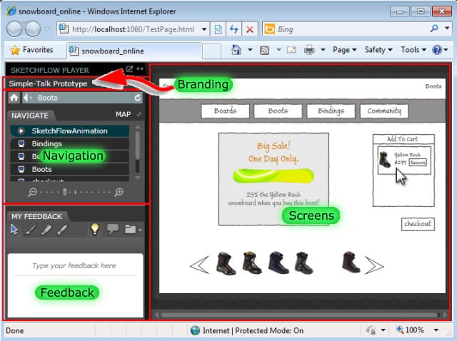
Figure 2 The SketchFlow Player
Silverlight SketchFlow projects run in the browser while WPF SketchFlow projects run as a desktop application.
The web server for Silverlight project launches in the background, but you should find an icon in your system tray that lets you open it up for details. Note the web address in the browser corresponding to the server.
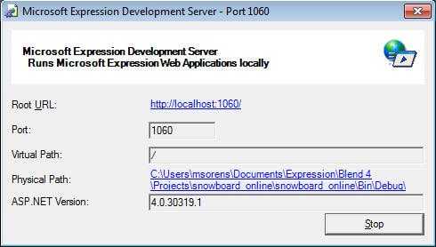
Figure 3 The SketchFlow Server
Silverlight SketchFlow projects automatically launch and connect to a development server on your local machine.
With SketchFlow it is very easy to send out prototypes incrementally. That is, you can start with the most basic skeleton, containing just the named screens but no content. The first steps in prototyping with SketchFlow are done in the map panel. With clicking, dragging, and entering appropriate names, you can set up the navigation of your prototype in minutes. With no further instrumentation, you can build and publish your prototype and send it out to reviewers. Then start adding content. Add text boxes describing what each page does. Send it out. Add images, buttons, and controls on one or more screens. Send it out. Hook up some dummy data. Send it out. You get the idea.
At each iteration, reviewers can incorporate feedback into the prototype, on a page-by-page basis, directly in the SketchFlow player. Feedback may be typed-in notes, or it may be actually drawing on a screen. Each reviewer does this independently then sends the feedback back to you, the developer. Within SketchFlow you integrate all the feedback files into the project where you can see them all individually or together. It is much faster for you to make required changes with the information right in front of you rather than getting separate emailed notes, or juggling multiple paper copies returned to you marked up with notes. Make the changes, then start your next iteration and repeat until you have reached the level of refinement deemed necessary by your stakeholders. See Managing Feedback for details on feedback integration.
Workspace Details
SketchFlow, as mentioned is not technically a standalone product; rather it is a class of projects available in Microsoft Blend. At first glance, the workspace of Blend/SketchFlow appears somewhat foreign to developers used to working in Visual Studio. But it is much more similar than you might think. Figure 4 shows a typical workspace with a SketchFlow project opened. The center of the workspace contains the artboard, analogous to the designer surface in Visual Studio. Unlike Visual Studio, there are two additional panels intimately tied to the artboard, the animation panel above, and the map below. On either side of the artboard SketchFlow has supplemental panels just like Visual Studio. Here are the primary panels with their corresponding Visual Studio equivalents. All but the last two are in the default workspace in Expression Blend: display the Results panel by selecting it in the Window menu just as with Visual Studio you reveal additional panels with the View >> Toolbars menu.
|
Screen area |
Expression Blend |
Visual Studio |
Purpose |
|
Top-left |
Projects panel |
Solution Explorer panel |
Lists solutions, projects, and files |
|
Assets panel |
Toolbox |
Drag-and-drop controls |
|
|
States panel |
— |
Record layout changes and animations |
|
|
Triggers panel |
Events tab of Properties panel |
Manage events and triggers (only appears for WPF projects, not Silverlight projects) |
|
|
Bottom-left |
Objects and Timelines panel |
Document Outline panel |
Shows hierarchical structure of visual layout |
|
Extreme left edge |
Tools panel |
— |
Drawing tools menu (click to select or click-and-hold to expose tool variations) |
|
Right |
Properties panel |
Properties panel |
Set or view properties of the selected object |
|
Resources panel |
Resources tab of the Project Properties page |
Lists reusable resources in the project, including brushes, colors, controls, etc. (Note that the Resource View panel in VS is different-it displays Win32 resources.) |
|
|
Data panel |
Data Sources panel |
Data source definitions (for SketchFlow these are sample data; for VS, real DB connections) |
|
|
Bottom-center |
Output tab of Results panel |
Output panel |
Displays build and other messages |
|
Error tab of Results panel |
Error List panel |
Displays build warnings and errors |
See the Expression Blend User Interface Reference for more details on these panels.
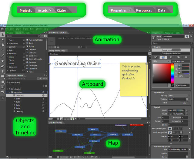
Figure 4 The SketchFlow Workspace
The layout is reminiscent of Visual Studio’s WinForms and WPF design environments.
It is important to appreciate the similarities and differences between workspaces in Visual Studio and Expression Blend, because Blend projects are designed to be interoperable with Visual Studio! Work with your SketchFlow project in Blend when you want to work primarily with visual effects: animations, states, and layout. Bring it over to Visual Studio for code customization. SketchFlow generates a standard WPF project, as you might surmise from the graphics-rich interface shown in the figure. Experienced WPF users in Visual Studio, however, are used to having both the artboard (designer) and the code-behind (XAML) windows, so you could tweak the UI if code as the need arose. SketchFlow has a richer interface to the properties panel, as Figure 4 intimates, so there is less need to tweak the XAML. Nonetheless, the XAML is readily available; it is just not shown by default due to limited real estate. In the upper corner of the artboard are buttons to show the artboard, the XAML, or both.
You can open Blend 3 projects directly in Visual Studio 2008, or Blend 4 projects directly in Visual Studio 2010. This pathway is bidirectional: if you make changes in Visual Studio you can still re-open the solution back in Blend, as needed. These pathways are represented by the horizontal arrows in Figure 5. Moving between versions-the vertical pathways-is unidirectional. As you probably know, when you attempt to open a Visual Studio 2008 solution in Visual Studio 2010, the project conversion wizard automatically appears and converts your project, typically only making minor adjustments in your solution and project files. Exactly analogous, attempting to open an Expression Blend 3 solution in Expression Blend 4 brings up the project conversion wizard that makes similar small changes. You can even open an Expression Blend 3 project in Visual Studio 2010 (the diagonal arrow).
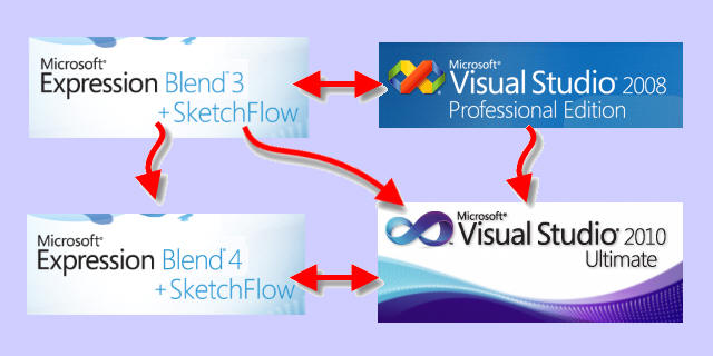
Figure 5 Moving Between Expression Studio and Visual Studio
Projects are interoperable at the same revision (Blend 3 with VS2008, Blend 4 with VS2010). You can migrate a Blend 3 project to either Blend 4 or VS2010.
To work with a solution in both Expression Blend and Visual Studio, it helps for similar entities to look and act similar. The key entity is the Projects panel that lists all files associated with your solution in tree format, almost identically to the Solution Explorer in Visual Studio. One notable difference, as shown in Figure 6, is that SketchFlow associates display names with your screens. Each file shows both the display name and the XAML file name. I highlighted the Start screen in the figure; observe that its file name is Screen1.xaml. The corresponding file in Visual Studio reveals just the file name. Another difference is that Visual Studio alphabetizes your files while Blend inexplicably does not.
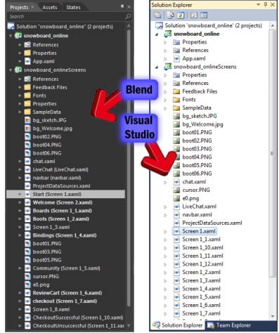
Figure 6 The Project Panel of Blend compared to the Solution Explorer of Visual Studio
Managing Feedback
A prototype is the vessel for conveying concepts from designers and developers to stakeholders. Feedback conveys information in the other direction and is no less important. SketchFlow’s feedback system is versatile and elegant for both the designer and the reviewer. You start with delivering the first iteration of a prototype to your reviewers in the form of a SketchFlow Player application (see Figure 2). Using the feedback panel (lower left corner of the player) a reviewer types notes for each screen, or draws on the screen (with either a brush or a highlighter), or both. SketchFlow refers to drawing on the screen as ink feedback. The feedback toolbar also provides a button to show or hide the ink feedback, so the reviewer can see the screen without distraction or with their notes.
Similarly, there is a button to show or hide annotations, collapsible notes from the designer to the reviewer. When expanded, an annotation shows the name of the person who wrote it along with its creation date, and the body of the note. When collapsed, it displays only the name. So though quite unobtrusive when collapsed, annotations may be completely hidden to reduce clutter even further.
The feedback process involves one or more reviewers independently evaluating the prototype, and adding text or graphical notes to one or more screens in the SketchFlow Player. When a reviewer is ready to send feedback to you, the developer, the feedback toolbar has a button to export it to a file. A standard save file dialog lets the reviewer save the feedback to a file with the .feedback extension, which would then be delivered back to you for integration into the SketchFlow project.
Once you receive a feedback file, you simply open it in SketchFlow using the Add button on the feedback toolbar in the Feedback panel (Window >> View Feedback). The feedback mechanism aptly handles feedback from multiple reviewers. After you add each feedback file, SketchFlow lists feedback for each page from each reviewer in the Feedback panel. In Blend 3 you could only see one reviewer’s feedback at a time: all the contributors are shown in a drop-down in the Feedback panel and you would select the one you wish to see. Blend 4 has improved the interface on this by showing all contributors in a list, letting you see all the text notes simultaneously. Furthermore, all the graphical notes are displayed simultaneously but to avoid too much noise, the graphical notes for the currently selected reviewer are shown solid. Graphical notes from all other reviewers are faded out, faint but still visible-see Figure 7. Finally, just as with the player, you have a button to show or hide ink feedback completely.
Your prototype may have quite a large number of screens but feedback on only a few. So that you know where reviewers have submitted feedback, SketchFlow highlights these on the map by adorning any pages containing feedback with a small light bulb icon.
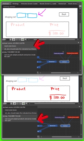
Figure 7 Reviewing Feedback from Multiple Users
The feedback panel in Blend 4 lists all reviewers; just click on the one you want to focus on. Here, the top frame shows feedback from one reviewer and the bottom frame from another. Notes drawn on the screen are shown solid for the currently selected reviewer and shown faintly for other reviewers. Also, you can (almost) see the tiny light bulb icons in the map, indicating the screens containing feedback.
 This feedback process follows the hub-and-spoke model: you as the designer disseminate a prototype to multiple reviewers and all feedback is funneled back to you. According to Christian Schormann, one of the masterful gurus on the Expression Studio team, users were pining for the ability to allow reviewers to see each other’s feedback as well. With Blend 4, this is now possible for Silverlight prototypes (but not for WPF prototypes) using SharePoint. According to Christian’s recent post (Collaborative SketchFlow Feedback with SharePoint) you can publish a prototype to a SharePoint document library by simply choosing File >> Publish to SharePoint. This provides several powerful advantages:
- Each revision of your prototype is available, so you have history.
- Reviewers send feedback with a click; no need to save the feedback then email the file.
- Reviewers can see each other’s feedback on the new shared feedback pane in the player.
Navigating Your Prototype
Some reviewers work more effectively in-context (using the controls, sliders, and buttons of the prototype application) while others would much prefer random access (where you could shuffle through the screens in any order you please). In-context navigation, of course, gives a much more accurate gauge of the user experience. It would be rare, however, when any reviewer would find either in-context or random access navigation sufficient. Say, for example, that at screen twelve you have a choice to go down branch A containing another four screens or branch B containing another two screens. With in-context navigation you would walk through to screen twelve, then follow branch A through its four screens. Now you want to return to screen twelve and follow branch B. With in-context navigation you may not even be able to return to screen twelve-unless you restart the application! But applying random-access navigation, just jump from the end of branch A back to screen twelve and then follow branch B. SketchFlow, as you have probably surmised, provides both in-context and random access navigation. Prototypes are easier and faster to review because a reviewer can use either on demand.
In-Context Navigation
In-context navigation is immediately available because all the controls on each screen are real: the Checkout button you create takes you to the order processing screen, the list boxes and radio buttons perform their preset actions, etc. If you want to go back to the previous screen, your prototype must have a Back button.
Random Access Navigation
SketchFlow provides two ways to perform random access navigation, subcategories I designate contextual random access and true random access.
While in-context navigation restricted navigation to states or elements reachable by using your prototype’s on-screen controls, and random access lets you navigate to any screen at all, contextual random access lets you navigate to any element as long as it is connected to the current screen.
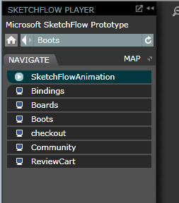
Figure 8: Navigation Controls
The navigation pane on the left side of the SketchFlow player lists all the other elements that the current screen can reach, as you defined in the underlying project. This includes not just other screens but also states and animations. Clicking on a screen takes you to that screen. Clicking on an animation plays that animation. Clicking on a state reveals that state. (You may or may not be able to do any of these with in-context navigation; that depends on how you designed the prototype.)
The Navigate tab lists all the elements reachable with contextual random access. Just above that are additional browser-like buttons for home, previous, and next screens.
Immediately above the navigation pane there are additional navigation controls: The home button takes you directly to the first screen in your prototype. (Unless your current screen can navigate to the first screen, the home button actually falls under the true random access model, which you will see next.) The next two buttons are exactly analogous to your browser’s back and forward buttons: the larger left-pointing button returns you to the prior screen while the smaller right-pointing button advances you to the next screen, if available. Just to the right of these buttons is the name of the current screen and to the right of that is the refresh button. The refresh button will, for example, rerun an animation triggered off a page-load event.
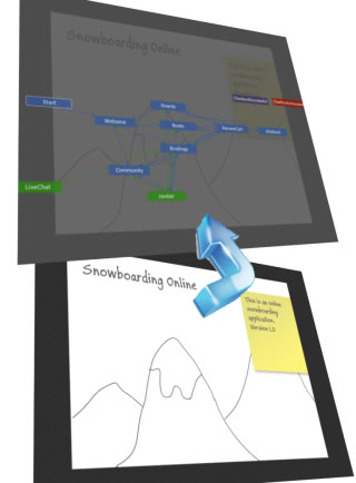
Figure 9 Overlaying the Navigation Map
The bottom frame shows the actual screen in the SketchFlow Player. The top frame shows the same screen with the map overlay turned on. You can click on any node in the map to switch to that screen.
You perform true random access using the navigation map in the SketchFlow player. This is essentially the same site map you used to create the prototype where it was both a navigation tool and a design tool; here it is strictly a navigation tool.
In Blend 3, the map is located in a map panel at the bottom left corner, in a tab adjacent to the Feedback tab. Clicking on the Map tab shows the map in a tiny area in that corner of the screen. You will probably only see one node in your map, perhaps two. There is a zoom slider that will let you see a wider or narrower area of the map. Immediately adjacent to this zoom control is a button to show or hide the full-screen version of the map, which is a lot more usable. Activating the full-screen map overlays a semi-transparent version of the map on top of your entire main window. You can then click on any screen node to navigate to that screen. You can also click and drag the map to reach areas outside the window or to move it out of the way.
Blend 4 improves and simplifies the interface to the navigation map. The map panel is gone. You have only the button to show or hide the full-screen map, now located next to the tab of the navigation panel. Activating the full-screen map in Blend 4 opens the semi-transparent map in your main window but obscuring only the top third or so, with a button to expand it to full-screen when needed. You still have zoom and drag capability, and again clicking on a screen node opens the corresponding screen.
Stubby Data
SketchFlow prototypes can include stub data sources: they are fast and simple to create with either auto-generated data or you may provide custom-tailored data values. The Boards page of the Snowboard project shows a ListBox on the artboard containing an image and a description for each board, as shown. In the Data panel observe that there is a data source called snowboardData containing a Collection. Under the Collection there are two corresponding fields: images and text. On the far right of each field line is a dropdown; the text field’s dropdown is open in the illustration, revealing four parameters:
-
Type – This may be either string, number, Boolean, or image.
-
Format – For a string, this is a nested dropdown containing the choices shown. Lorem ipsum is the designation commonly used for placeholder text in graphic design. It is typically “a nonsensical list of semi-Latin words” (see the Wikipedia entry for more). The reason it is used is the same reason SketchFlow looks “sketchy” – so the reviewer does focuses on the concept or layout, not the details. But SketchFlow goes beyond just lorem ipsum phrases. If you select Company Name in the dropdown, you will get a list of random strings that resemble names of corporations. The format choices here give your sketch a little bit more realistic, though still sketchy, look and feel.
-
Max word count – Here you specify how many words the dummy data may have. If you selected names in the format choice, for example, but your field is supposed to only show first names, you could specify a value of one here.
-
Max word length – Here you specify the maximum length of any word. If you only want five-character words or less, specify a value of 5 here.
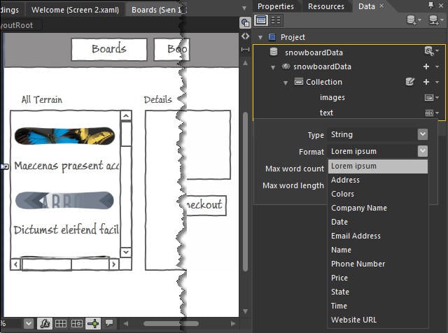
Figure 10 Adding Sample Data
This data collection consists of an image field and a text field, itemized in the upper right. The remainder of the right-hand column shows the text field expanded to show its properties. The Format property dropdown is opened, showing the variety of predefined types of strings available. Once you drag the collection from the Data panel onto a container on the artboard, it populates the container with the data; here you see alternating images and text bits in the ListBox on the left.
The image field in the collection is populated from a collection of images; you just specify the path to a folder containing your images. Blend includes just a small collection of chairs for its default image set, so usually you will want to provide your own set of images. Note that you do not have to worry about not having enough: if your screen needs more images then are present in your folder, it recycles them.
Further tailoring may be done:
- To add another field, click the “+” at the end of the Collection line in the Data panel.
- To remove a field, right click and select Remove.
- To limit the number of records, click the Edit Sample Values button (the writable disk icon just to the left of the “+” on the Collection line) then specify the number of records you want.
Setting up dummy data, and tailoring it to your needs, then, is literally just a few clicks. But SketchFlow provides more flexibility yet-four ways to add customization to your dummy data, which I designate in-place editing, template supplementation, data importing, and data generation. (Blend 3 did not have data generation.)
- In-place editing lets you edit individual values once you specify the type and format. Click the Edit Sample Values button, and SketchFlow provides an editable table of values matching the type and format you specified. You can click on a text cell and modify its value directly.
- Template supplementation lets you add different format choices. For example, in the previous illustration I added the State category. Selecting that format gives a random list of two-character US state abbreviations. To do this customization you edit the “database” containing the dummy data repository, which is just a CSV file stored at
C:\Program Files\Microsoft Expression\Blend 4\SampleDataResources\en\Data\SampleStrings.csv
(Substitute a 3 for the 4 if you are using Blend/SketchFlow 3.) Once you edit and save that file, you must restart Blend for it to pick up your changes. - With data importing you have complete flexibility over the sample data. Define what you want in XML then import that as a data source into SketchFlow. Use the Import Sample Data From XML command on the Data panel.
- With Blend 4, you have one more choice: you can now generate sample data from your own common language runtime (CLR) classes. Use the Create Sample Data From Class command on the Data panel.
Deciding what data to use is your first hurdle. Next you need to bind the data to your controls and lay out the fields the way you need.
To bind a data set to a control drag a collection from the Data panel onto a control that can accept a collection-a ListBox, for example. As soon as you release the mouse, SketchFlow populates the ListBox with records. If you had one image field and one text field, as in Figure 10, each record shows the image and the text stacked vertically, and subsequent records stacked vertically. The overall effect, then, is simply image on top of text, image, text, image, text, etc. Chances are the default arrangement is not precisely what you want, but it is easy to change. Right-click on the ListBox and select Edit Additional Templates >> Edit Generated Items >> Edit Current. Look in the Objects and Timeline panel and you should now see the Item Template for a record from your data set, consisting of a standard WPF StackPanel with orientation set to vertical (hence the fields are on top of each other). The StackPanel in turn contains a control for each field. In this example, there would be an Image and a TextBlock. You can now select one of these controls representing a field and manipulate its properties. (You can click either in the Objects and Timeline panel or on the artboard; in either case, you should see a selection rectangle and handles appear on the element in the first record on the artboard.) For example, if you want to resize the image, click on the Image then drag one of its handles on the artboard. If you want the fields stacked horizontally instead of vertically, select the StackPanel in the ItemTemplate, then change the Orientation property in the Properties panel. Once you are satisfied, you can close out of the template editor either by double-clicking outside the ListBox on the artboard, or by clicking the Return scope to… button at the top of the ItemTemplate in the Objects and Timeline panel.
This detailed tutorial on sample data usage will help you get started.
Power Drawing
Mockup controls provide a huge productivity boost, providing a variety of common “prefab” controls including a three-button dialog and a logon control. It even has sketch mockups of Windows Explorer and the Windows desktop (shown in Figure 11). This is available only in Blend 4. You can see the mockups in action immediately by opening the sample project Mockup Demonstration (via the Samples tab on the opening splash panel). If you want to actually use the mockup assets in your own project though(!) you must copy the libraries from the sample project to Blend’s library location (see the instructions here for installation details).
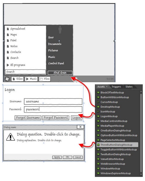
Figure 11 Mockup (Compound) Controls
Once you load the Mockup library (by copying it from a supplied sample project), you then have a variety of time-saving controls to use.
For dealing with graphic primitives there is a new top-level Shapes category in the Assets pane and, in the SketchFlow category, a sketchy version called Sketch Shapes. This lets you draw block arrows, callout clouds, pentagons, pies, stars, triangles, and more in the same sketch style as all the other SketchFlow components.
Yet another important productivity booster for SketchFlow-as if it did not have enough already-is called Sketchables. At the time of writing the only thing available is a video demo but, this demo is extraordinary! Philipp Sumi, the author of Sketchables, reports modestly that it is “… a set of controls that render common UI elements.” But it does this using simple, concise markup to customize and tailor a control to display sophisticated output. You can, for example, specify a set of check boxes, disable a couple of them, check several of them, add labels to each, and arrange them horizontally or vertically, by typing a couple lines of text into a SketchableCheckBoxGroup. Figure 12 shows a much more complex example to populate a SketchableDataGrid with a variety of different content.
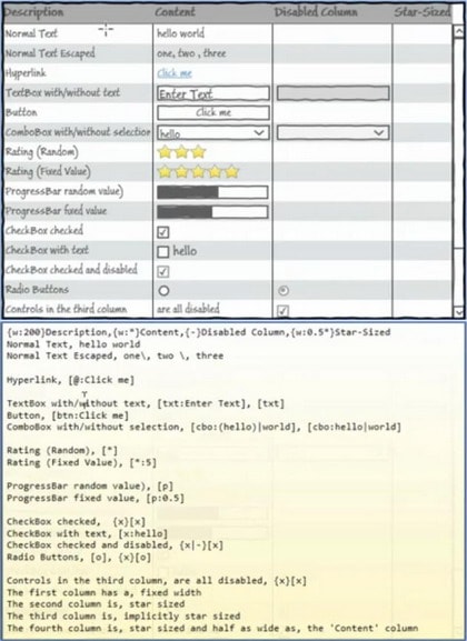
Figure 12 A SketchableDataGrid
The DataGrid rendered at the top is created from the markup at the bottom. Compare the two line-by-line to see the time-saving features available from Sketchables.
The demo Sketchables video is available here. And the best part: by the time you read this Sketchables should be available for download!
Power Designing: Behaviors, States, Animations, and Transitions
The previous section described several possibilities for increasing productivity when laying down elements on a screen. This section analogously describes some techniques available for increasing the interactivity and visual impact of your prototype. This is not comprehensive, but rather is more aimed at whetting your appetite!
Behaviors
Behaviors allow you to turn mostly static displays into interactive applications. I say “mostly static” because controls typically already have some innate interactive capabilities: if you mouse over a button, for example, it highlights. But clicking it does not do anything until you wire up a behavior. A typical use for a button, of course, is to navigate to another screen. To do this, right-click on your button on the artboard. Select Navigate to then, on its submenu, the name of the screen to go to. This navigate to behavior is one of the two most common behaviors (activate state is the other, discussed next) and is perhaps the simplest example of connecting a behavior to make a control perform an action. Besides the names of all your screens, the Navigate to submenu item also includes two generic choices, Back and Forward. Selecting the Back choice, for example, works just like the Back button in a browser, returning your user to the previous screen.
New with SketchFlow 4 are conditional behaviors: you can now build conditional expressions into your prototype without writing code! Any action can be associated with a set of conditions that must be met before the action is run.
States
States let you provide interaction within a screen. For example, say you want a dialog to appear when the user presses a button. One way to do this is first to create the dialog on the page, then set its opacity to zero to make it invisible. This is your default state, because you only want it to appear when the user initiates some action (in this case pressing a button). In the States panel you first add a state group that will contain this set of related states. Now that the screen is setup for our default condition, you then add a state to the state group to capture all the current properties of the objects on the screen. Name that state something like “dialog off”. Now change the opacity to 100% on the dialog to make it visible. Add another state (“dialog on”) to capture this set of properties. In SketchFlow, you can switch the context to a state by clicking on it in the States panel. This way you can see either state at will. You have the same capability in the SketchFlow player. However, the goal is not to have to cause behaviors with external controls but rather by clicking a button on a screen in a prototype. Right-click on a button on your artboard to open the context menu. Select Activate State then, on its submenu, the name of the state to transition to, in this case “dialog on”. (This activate state behavior and the navigate to behavior mentioned above are the most common behaviors.)
By default, the state transition is instantaneous, so the dialog will appear very quickly. Often you want a slight delay to simulate more real-life conditions, so you can add a transition time between states at the top of the States panel.
Finally, be aware that while states are crucial to building a rich prototype their functionality does not carry over if you convert your prototype to a production application (i.e. strip off the SketchFlow Player shell). However, as mentioned in the How To sidebar, I do not advocate doing that.
Animations
Animations provide an important foundation for a dynamic visual experience by simulating user actions, such as dragging an item into a shopping cart. Just as with states, you can set the stage for an animation by placing elements on your artboard and setting their opacity to 0 to make them initially invisible. Once you have all the elements at hand, you add a new animation by clicking on the add button in the Animation panel. The secret to understanding animations is to realize that an animation frame is really just a set of property changes to one or more objects. You may make these property changes in the Properties panel or on the artboard.
Let me digress for just a moment before continuing: the most common action you might animate is to display and move the cursor. There is no built-in rendered cursor for this (though there should be!) but it is simple to do: import a cursor graphic of your choice (Projects >> Add Existing Item) then simply move that “cursor” around to simulate the user moving the mouse.
So assume you have added a cursor to your artboard and have now opened your first animation frame. Select the “cursor” on the artboard and move it from point A to point B. That movement is exactly equivalent to changing the values of the Margin property in the Properties panel. Note the subtle implication of this: the path you took to drag the object is irrelevant! The animation will move the object on the shortest path from your starting point to your ending point. A single animation frame may contain as many property changes as you wish. Above you may have added a couple objects and set their opacity to 0. Now change the opacity to 100% to make them materialize. (There is no artboard equivalent; that is just an update in the Properties panel.)
When you run the animation, all the changes for a given animation frame will appear simultaneously. To do another step, add the next animation frame. After the first frame, you add additional frames by right-clicking the previous frame and choosing Insert New. This lets you add either to the end of the sequence or in the middle!
Just like states, you can adjust the transition time between animation frames: click on a time value between frames in the Animation panel and enter a different value. You can also adjust the duration of a frame. Hover over an animation frame to expose a duration value; click on that and edit it as desired.
Note that states are ignored by animations. There are a variety of ways to fade in or fade out. One I tried that did not work was setting up a state group to fade in, then creating an animation with two frames, one for the initial state with an invisible control and a second for the state where the control is visible. But this state change is not seen by the animation engine.
I have briefly covered the key tips needed for animation, but nothing replaces seeing it in action. To see a concise video showing how to construct a simple animation, take a look at Working with the SketchFlow Animation Panel video tutorial.
Transitions
Transitions between states and transitions between animation frames both have, as described above, durations that may be adjusted. This is present in both SketchFlow 3 and SketchFlow 4.
New with SketchFlow 4, however, is a powerful new feature: transition effects. There is a tiny fx logo in the toolbar of the States panel, as well as between each pair of frames in the Animation panel. Click on that to display the current transition effect-the default is none. Open the dropdown to select a different transition effect. Some are adjustable and some are not. Those that may be configured will immediately show the properties below the current effect as soon as the dropdown closes. The set of effects are similar to those you find in PowerPoint: blinds, circle reveal, cloud reveal, fade, pixelate, radial blur, ripple, slide in, smooth swirl grid, wave, and wipe (see Figure 13). To experiment with these, use animation transitions rather than state transitions: you can run animations in the Animation panel of SketchFlow directly; state transitions can only be observed after building and running SketchFlow player.
Layout properties are, by their nature, discrete values. Adjusting inter-frame and intra-frame durations in animations are one tool for making transitions appear smoother. To create smooth transitions in general, though, Microsoft recommends using fluid layout, which you enable with a button on the toolbar in the Animation panel. This is available in both SketchFlow 3 and SketchFlow 4. See a good reference on smooth transitions (here).
Yet a further aid in more realistic transitions is to use easing functions, available for both state transitions and animation transitions-look for the button containing a diagonal line inside a square. According to Pete Brown: “Easing functions provide a way to liven up what would otherwise be pretty flat and boring animation. They provide acceleration/deceleration, and even bounce or spring to the approach into or departure from a key frame in an animation. (See Pete’s blog post Easing Functions in WPF 4 and Silverlight). Figure 13 illustrates the full range of available easing functions in the dropdown menu.
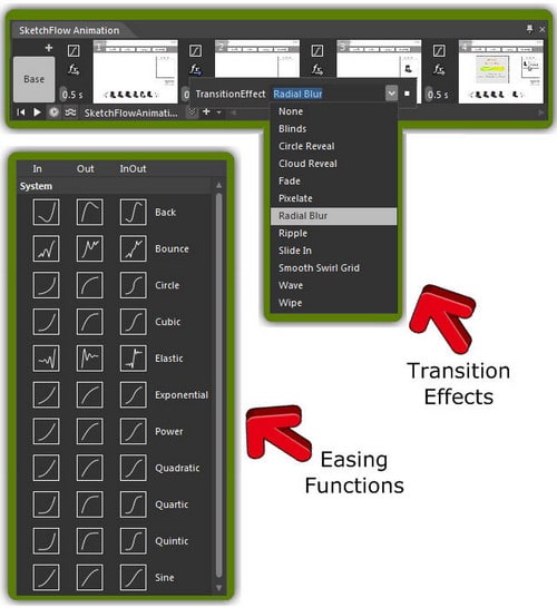
Figure 13 Transition Effects and Easing Functions
These new SketchFlow 4 features let you add more flexibility and more realism to transitions.
Finally, you can also customize transitions that occur as you navigate from one screen to another for both SketchFlow 3 and SketchFlow 4. Just right-click on an arrow in the SketchFlow map that creates the pathway of interest and select the type of transition from the context menu. The choices are similar to those in Figure 13 for transition effects.
Conclusion
SketchFlow is a unique and powerful tool for prototyping. I have tried to show both why it is amazingly useful and to show how to use its main features most effectively. Enjoy!
Load comments