
This article provides a reusable PowerShell and dynamic SQL solution for visualizing SQL Server graph tables. It exports node and edge data to Trivial Graph Format (TGF), a simple text-based format that graph visualization tools like yEd can render as interactive diagrams. The code uses the JSON metadata stored in SQL Server’s $node_id, $from_id, and $to_id columns to map relationships dynamically – you specify which node and edge tables to include, and the tool generates the graph. This works with any SQL Server 2017+ graph database.
Introduction
In my last blog, I built some PowerShell to take a graph that I had modelled and bring that into SQL Server in a format that could be imported into SQL Server node and edge tables. I have started on a tool to take that imported data and create a set of graph tables to test with, but to test that process, I found it kind of important to be able to visualize a graph to make sure it worked!
I considered using a rich format like Arvind Shyamsundar did in his blog by outputting GraphML, but that was kind of overkill since every time I import a set of nodes, I will have to reformat anyhow. It turned out to be much easier to build generic code using TGF (Trivial Graph Format) just like in my export example.
Another goal of mine is to make this tool to work with any graph in SQL Server (I am currently building an some code to do just that to categorize geographies, so this is a double win) so I used dynamic SQL as the basis, so I could pick and choose the node and edge tables, plus dynamically set a column for the nodes to display. (A future enhancement will be to include a filter on the node value so you can just see how a few nodes are related.)
I did some searching for some sample graph data in SQL Server objects, and I found this example on the docs.microsoft.com site. It contains a complete database with 3 nodes and 3 edges that gave me something to output. This code should work on 2017 or 2019 equally well.
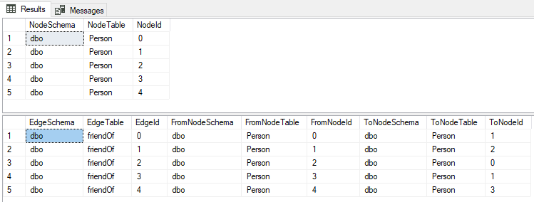
It is a quite a bit of code, none of it super interesting for including directly in the blog, except the base of the code using the JSON metadata values that is a part of the structure of the SQL Server objects. Since an edge can connect any number of nodes, you use these values to know what you can join to and from:
|
1 2 3 4 5 6 7 8 9 10 11 12 13 14 15 16 17 |
SELECT JSON_VALUE(CAST($node_id AS nvarchar(1000)),'$.schema') AS NodeSchema, JSON_VALUE(CAST($node_id AS nvarchar(1000)),'$.table') AS NodeTable, JSON_VALUE(CAST($node_id AS nvarchar(1000)),'$.id') AS NodeId FROM dbo.Person; --A node SELECT JSON_VALUE(CAST($edge_id AS nvarchar(1000)),'$.schema') AS EdgeSchema, JSON_VALUE(CAST($edge_id AS nvarchar(1000)),'$.table') AS EdgeTable, JSON_VALUE(CAST($edge_id AS nvarchar(1000)),'$.id') AS EdgeId, JSON_VALUE(CAST($from_id AS nvarchar(1000)),'$.schema') AS FromNodeSchema, JSON_VALUE(CAST($from_id AS nvarchar(1000)),'$.table') AS FromNodeTable, JSON_VALUE(CAST($from_id AS nvarchar(1000)),'$.id') AS FromNodeId, JSON_VALUE(CAST($To_id AS nvarchar(1000)),'$.schema') AS ToNodeSchema, JSON_VALUE(CAST($to_id AS nvarchar(1000)),'$.table') AS ToNodeTable, JSON_VALUE(CAST($to_id AS nvarchar(1000)),'$.id') AS ToNodeId FROM dbo.friendOf; --An edge |
The output of this query is:
Each node object has its own surrogate key values that start at 0, so if you are going to use the code for more than one node at a time, you have to make the surrogate values unique for the TGF file (see the last blog on importing for more details on that). In the code I make a temp table to stage the objects, so if you have > 1 node, the second set of keys need to start off where the previous ones left off. So the code uses an identity column, and joins to that identity column by schema, table, and edgeId, outputting the unique key:
The code has a few things to choose in the header. The database, a list of nodes and edges you want in the output (for example, you might wish to graph just persons through the friendOf edge (example later)). There are a few default node and edge type values that control if matching labels or node types are appended to the graph.
|
1 2 3 4 5 6 7 8 9 10 11 12 13 14 15 |
USE GraphDemo GO --parameters values for this database: https://docs.microsoft.com/en-us/sql/relational-databases/graphs/sql-graph-sample?view=sql-server-ver15 --list of nodes in format schema.nodetable.nameForLabel;schema.nodetable.nameForLabel; --done this way because it is a lot easier to manually edit DECLARE @NodeList nvarchar(4000) = 'dbo.person.name;dbo.Restaurant.name;dbo.City.name'; --list of edges in format schema.edgeTable DECLARE @EdgeList nvarchar(4000) = 'dbo.likes;dbo.friendOf;dbo.locatedIn;dbo.livesIn'; --used to determine formatting of name in output DECLARE @DefaultNodeType nvarchar(100) = '?'; --I want them all to have the node type appended in parens DECLARE @DefaultEdgeType nvarchar(100) = '?'; DECLARE @LabelNonDefaultEdgeFlag bit = 1; |
You can find the actual code here from my github repository: https://github.com/drsqlgithub/TGFImport/blob/main/OutputToTGF.sql.
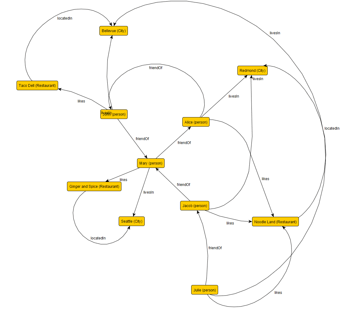
Using the parameters above (and the ones that are in the file), the output of my code from the database from the Microsoft demo script is:
|
1 2 3 4 5 6 7 8 9 10 11 12 13 14 15 16 17 18 19 20 21 22 23 24 25 26 27 28 29 30 31 32 |
outputValue ----------------------------------- 1 Bellevue (City) 2 Seattle (City) 3 Redmond (City) 4 John (person) 5 Mary (person) 6 Alice (person) 7 Jacob (person) 8 Julie (person) 9 Taco Dell (Restaurant) 10 Ginger and Spice (Restaurant) 11 Noodle Land (Restaurant) # 4 5 friendOf 5 6 friendOf 6 4 friendOf 7 5 friendOf 8 7 friendOf 4 9 likes 5 10 likes 6 11 likes 7 11 likes 8 11 likes 4 1 livesIn 5 2 livesIn 6 3 livesIn 7 3 livesIn 8 1 livesIn 9 1 locatedIn 10 2 locatedIn 11 3 locatedIn |
I chose to label all of the node types, and all of the edges. Saving this output (without the header) as a text file with a TGF extension, you can open and then importing into yEd (a free tool), you see this:

TGF files have no formatting (and how would you include formatting from a set of SQL Server objects anyhow), so you need to use the tools to format the diagram. There are two steps to make a good looking diagram reasonably quick.
Use the Tools\Fit Node to Label menu. This will make the nodes sized so that the text is not hanging over the edge.

Then use one of tools in the Layout menu to output your diagram. I find the radial format works pretty good for semi complex, highly connected data. Keep in mind that any model is going to get complex to render (or even hand draw) fast. Radial put out a model that looks like:
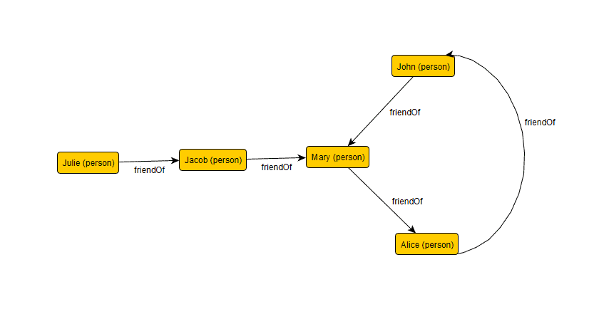
If you only want a single node and edge, you can just set a couple of nodes, like here the subgraph of person and friendOf:
|
1 2 |
DECLARE @NodeList nvarchar(4000) = 'dbo.person.name'; DECLARE @EdgeList nvarchar(4000) = 'dbo.friendOf'; |
The output is lets you see the following subgraph showing you who is friends with whom without the other noise::
It does kind of make me think about the name “friendOf”. Is friendOf a good name for a relationship that can be onesided? Not sure, but I did compare the data and this query:
|
1 2 3 |
SELECT Person.Name, 'FriendOf', Friend.Name AS FriendName FROM Person, dbo.friendOf, Person AS Friend WHERE MATCH(Person - (friendOf) -> Friend); |
Outputs the following:
|
1 2 3 4 5 6 7 |
Name FriendName --------- -------- -------------- John FriendOf Mary Mary FriendOf Alice Alice FriendOf John Jacob FriendOf Mary Julie FriendOf Jacob |
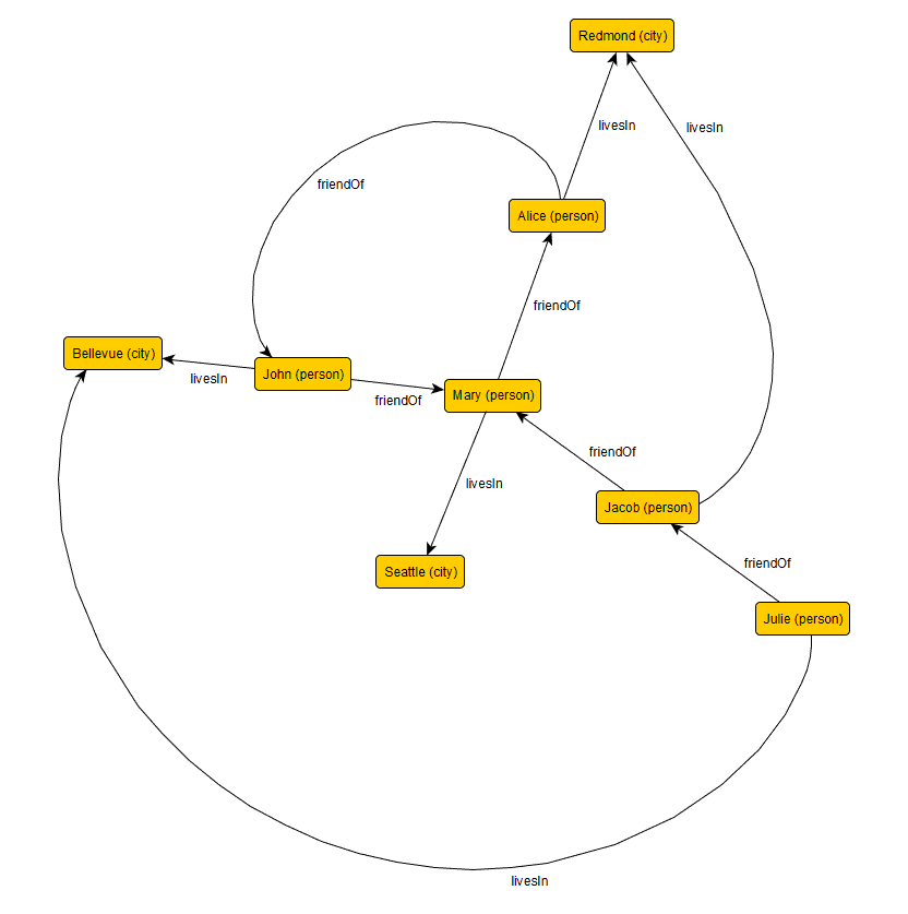
Or you might want to see person and city, with just the edges friendOf and livesIn. Note that you will only see edges that go from person to person, city to city, or city to person (or person to city):
|
1 2 |
DECLARE @NodeList nvarchar(4000) = 'dbo.person.name;dbo.city.name'; DECLARE @EdgeList nvarchar(4000) = 'dbo.friendOf;dbo.livesIn'; |
This outputs the following graph diagram:
Hopefully this will help you if you are trying to draw up some sample data and you want to check to see the relationships graphically.
Read also:
SQL Server Graph Databases introduction
JSON handling in SQL Server
UML database diagrams for SQL Server
Fast, reliable and consistent SQL Server development…
FAQs: SQL Server graph tables
1. How do you visualize SQL Server graph tables?
Export graph data to a visualization format like TGF (Trivial Graph Format) or GraphML, then open the file in a graph visualization tool like yEd, Gephi, or Cytoscape. SQL Server doesn’t include built-in graph visualization – SSMS shows graph tables as regular tables. To export, query the $node_id and $from_id/$to_id JSON metadata from node and edge tables to build the graph structure programmatically.
2. What is TGF format and how does it work with SQL Server graphs?
TGF (Trivial Graph Format) is a simple text format: each line is either a node (ID followed by label) or an edge (from-ID followed by to-ID). A # separator divides the node section from the edge section. It’s easy to generate from SQL queries and can be opened in yEd Graph Editor, which renders the graph with automatic layout algorithms.
This document contains proprietary information and is protected by copyright law.
Copyright © 2026 Red Gate Software Limited. All rights reserved


Load comments