
When it comes to trading stocks, there are two general approaches to deciding what, and when, to buy or sell. One approach is to analyze the company itself. This approach looks at such things as profit and loss statements, sales and earnings numbers, balance sheets, competitors, industry outlook, and inventory numbers. This approach considers the fundamental statistics on the company, trying to decide if the evaluation of these statistics can give an indication of whether the company is a good buy or sell. This process is referred to as the fundamental approach to analyzing the stock market.
The second approach is to just analyze the company’s price and volume history to try to decide what, and when, to buy or sell. This process of decision making is referred to as the technical approach. It is this approach that we will look at further in this article. In reality, there are very few pure technicians (people who use the technical approach). Most investors who use technical analysis will also consider fundamental statistics in their buy/sell decisions.
Rationale
Technical analysis uses price and volume information to try to pinpoint the proper time to buy or sell stocks. What is the rationale behind this process? Why would you expect it to work? On the surface, fundamental analysis makes sense as an approach to buy/sell decision making, but does technical analysis also make sense? The rationale behind technical analysis is crowd behavior. The technician believes when a crowd is repeatedly presented with similar events, it will respond similarly. If you are in a crowded park, and gunfire opens up to your left, you will duck and run to your right. In that crowded park, if someone on your left yells “Free gold”, then you will move to your left. The premise for technical analysis is that if, over time, the crowd is presented with similar stimuli their responses to these stimuli will be similar.
In the discussion that follows, the term ‘market’ will refer to the population that may buy or sell stocks, known as the trading population. The market is the crowd. The technician believes that all the information on whether stocks are a good buy or sell is reflected in its share price and trading volume. Let’s consider, for example, a generic buy/sell process. If a stock is considered to be a good buy for whatever reason, you would expect its price and volume to increase as the market realizes that the stock is a good buy. Then as the perception of the profitability diminishes, the trading volume will decrease and its share price will lose momentum. Then, at some point, the market perceives that it is a good time to sell this stock for whatever reason, and the share price will start to drop on higher volume as more and more people sell. So if you look at a chart of the share price and trading volume over time, you should see a reflection of this buy/sell process with higher prices and volumes, followed by dwindling volume, and then by falling prices and rising volume. According to our crowd behavior premise, when the market is presented with the stimuli that produces these buy sell decisions, the crowd behavior will be similar: So, over time, a technician would look for patterns in the price and volume chart that reflect this crowd response to similar stimuli. Once such a pattern is identified, the technician uses it to base future buy/sell decisions by trying to identify where the most recent price and volume is located in this identified pattern. This, in a nutshell, is technical analysis. It is the study of price and volume charts with the goal of identifying patterns and using these patterns as a basis for buy/sell decisions.
History
Modern technical analysis dates back to Charles Dow in the late 1800s. Charles Dow was a founder, along with Edward Jones, of Dow Jones & Co, the publishers of the Wall Street Journal: Additionally, his legacy includes the Dow Jones Average, the Dow Theory, and Point and Figure charts. The Dow Theory is the basis of modern technical analysis. Dow presented what would later become known as the Dow Theory in a series of editorials in the Wall Street Journal around the turn of the century. Our previous discussion of the crowd theory and its reaction to the buy/sell process is the basic tenet of the Dow Theory (in a very simplistic interpretation). Technical analysis was alive and well all through the first half of the twentieth century, but it was in the 1970s with the advent of personal computers that technical analysis became a powerful tool available to the general trading population. Before the personal computer, technicians drew by hand the stock charts that they studied for patterns. It was a tedious process that often had to be redone from scratch when something changed, such as a stock split. In 1981, Dow Jones & Co. released its Dow Jones Market Analyzer for the Apple II computer which allowed anyone with a personal computer to use technical analysis without the tedious work of hand drawing charts. In the years since, computer technology and innovative software have made more and more complex technical tools available to anyone in simple-to-use software. Nowadays, the work in technical analysis is the actual study and manipulation of technical indicators, and not the tedious effort of producing charts since these are now available with the touch of a key.
Price Studies and Indicators
The basic chart that most technicians use is a price bar chart: For each day, a vertical line connects the high and low prices for the day with a tic mark on the right side of the bar, showing where the last price (the close) of the day occurred, and a tic mark to the left of the bar, indicating the first price (the open) of the day. A series of such bars plotted over many days is known as a bar chart. Figure 1, shows a price bar chart over a volume bar chart.
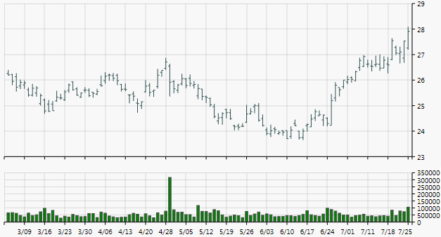
Figure 1. High-Low-Open-Close bar chart displayed with a volume chart under it.
In working towards identifying patterns, one of the things a technician does is plot a moving average over the price bar chart. This allows the technician to identify trends such as being above or below the moving average price. Line charts that are overlaid on the price bar chart are known as price studies because their values are related to, and can be seen on, the same scale as the price. Figure 2 shows two averages as lines on the same bar chart.
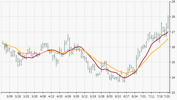
Figure 2. Bar chart with both a simple average (red) and an exponential average (orange) overlaid.
Line charts whose values are not of the same scale as a bar chart are indicators. Indicators are generally drawn under a bar chart sharing the same time scale but different ordinate scales as seen in Figure 3.
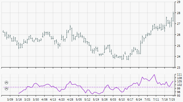
Figure 3. The Momentum indicator is shown in purple. It is the ratio of a shorter term average and a longer term average. The dotted line at 100 is the bullish break point. Values above 100 indicate that the short term average is rising faster than the long term average.
Here is another comment on the effect of computers on technical analysis. Consider the technician in the 1970’s who was drawing charts by hand and tracking a 50 day and 150 day average on such charts. The first complexity in regard to the averages is that if he or she wanted to chart a simple running average of 150 days, the calculation would involve 150 days of closing prices in some manner. This alone would be enough to make a technician decide not to track such an average. What they did instead of using a simple average, was use what is known as an exponential average which can be computed just by knowing yesterday’s average and today’s price. This is the type of adjustment that technicians used before computers were around in order to make their work possible. But, if the stock split, they still had to do it all again, even with exponential averages. Now with computers you can choose simple averages, exponential averages or weighted averages; it does not matter: All of them can be done with the stroke of a key.
An example of an indicator would be the ratio of two averages, a short term average and a long term average, generally known as a momentum indicator. For example, say you plot the ratio of a short-term average over a long term average. If the chart is rising, this means that the short-term average is gaining more than the long-term average. This means that the price is increasing in the short-term more than its long-term average, indicating that the price is kicking up. Momentum is a ratio whose values do not match the actual price values, so it does not make sense to try to draw the momentum line on a bar chart. Instead, momentum is drawn under the chart and is referred to as an indicator.
What follows is a list of a few of the price studies and indicators you can find in software packages today. All these price studies and indicators are available in a .NET software library available from Syncfusion, Inc. This library can be used by developers to include technical analysis tools in their software.
Price Studies
Simple Average – To compute an n-day simple average, you add up the most recent n day’s closing prices and then divide this sum by n, Commonly used values of n are 50 and 200. If the price is higher than its average, it is generally considered a bullish (positive) signal. When the price is below its average, then this is considered bearish. Additionally, rising averages are bullish and falling averages are bearish. If you plot two averages on a bar chart with one short term and the other long term, then the short term average crossing above the long term average is considered bullish and the opposite cross is considered bearish. The red line in Figure 2 shows a simple average. Note that it does not start at the first day of the chart as it requires some initial data to calculate.
Exponential Average – To compute an n-day exponential average, you compute a multiplier parameter para = 2 / (n + 1)
On the first known day, the exponential average is the close for that day. On subsequent days, you use this formula to compute the value: para * close + (1-para) * yesterday's exponential value
The interpretations are the same as the simple average. The orange line in Figure 2 shows an exponential average. Note that, unlike the simple average, it starts plotting at the last price of the first day of the chart.
Triangular Average – This average is really just a simple average of the simple average of the closing prices. This has the effect of computing what is known as a weighted average. The effect of this being that the weights in the middle of the assessed time period have higher values. Hence the name triangular average as a chart of the weight values for an isosceles triangle. The interpretation of this average is the same as a simple average.
Bollinger Bands – (attributed to John Bollinger) Here is the idea behind the bands. See the chart in Figure 4. You first draw an average on the bar chart. Bollinger Bands are two line charts, one drawn above the average and the other drawn below the average to form a ‘band’. The distance between the average and the bands is two times the standard deviation of the price. The idea here is that if the prices form a normal distribution about their average, you would expect 95% of those prices to fall within this band. So, if you see prices outside the band, this would be unusual and you might expect to see a price reversal in a short time. This is certainly a price study that was created after computers as doing such a study earlier would not have been possible except for very few people whereas now, this price study is available at the stroke of a key.
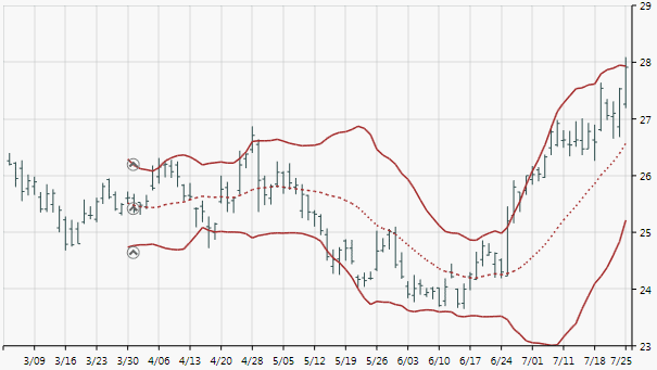
Figure 4. Here is a bar chart with Bollinger Bands overlaid. The dotted line is a simple average. The top and bottom bands are plus and minus two standard deviations of closing prices above and below the dotted average line. Prices outside these bands will generally move back into them.
Indicators
Momentum – This indicator is the ratio of two averages, one short term and one long term. If the chart is rising, this means that the short term average is gaining more than the long term average. This means that the price is increasing more in the short term than its long term average, indicating the price is kicking up. Figure 3 shows a momentum chart.
Accumulation Distributions (attributed to Marc Chaikin) – This indicator is a weighted sum of the volume values, with the weight determined by where the closing price is in relation to the day’s high and low prices. If the closing price is closer to the day’s high, then the weight is positive. If the closing price is closer to the day’s low, then the weight is negative. Thus, this indicator is a running sum of volume weighted positively and negatively based on price. A rising indicator chart means money is flowing into the stock, and a falling chart means money is leaving the stock. See Figure 5.
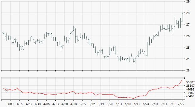
Figure 5. Accumulation/Distribution indicator is shown in red. This indicator tracks the amount of money that flows in and out of the stock. It does this by combining price and volume in a weighted running sum.
MACD (attributed to Gerald Appel) – This indicator is a momentum variation that compares two moving averages by subtracting them instead of dividing them. In addition, an average of this difference line is also displayed. This is an example of an oscillator type chart that oscillates above and below zero. The difference line crossing the zero line can be used as a signal. When the average line is above the difference line, this is a further bullish signal. Both the difference line and the average line can be seen in Figure 6.
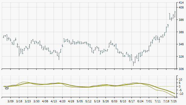
Figure 6. These two lines show the MACD indicator which consists of the difference of two moving averages and the average of this difference. The bolder line is the average of the difference and crosses of these two lines can be used as signal points.
Stochastics (attributed to George Lane) – Stochastics are based on a position of the closing price in trading range for the day. The averages of this calculation are charted to display the actual stochastics. The line charts oscillate between 0 and 100 with 0 representing the bottom of the range and 100 the top of the range. The expected values of the stochastics are between 20 and 80, so values outside this range are of interest. See Figure 7.
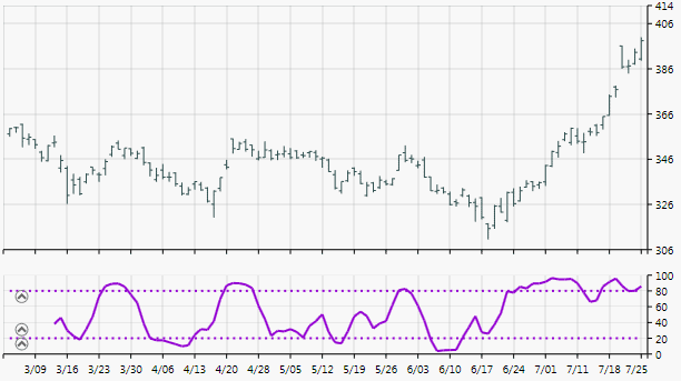
Figure 7. This chart shows the Stochastics indicator. Values above 80 are said to be overbought, and values below 20 are said to be oversold.
Relative Strength Index (attributed to Welles Wilder) – This is another indicator that ranges between 0 and 100 with values outside the 30 and 70 range being of interest. This indicator is a measure of the percentage of the price move that is up compared to the total price movement. High values (above 70) indicate strong upward price movement that may not be sustainable. See Figure 8.
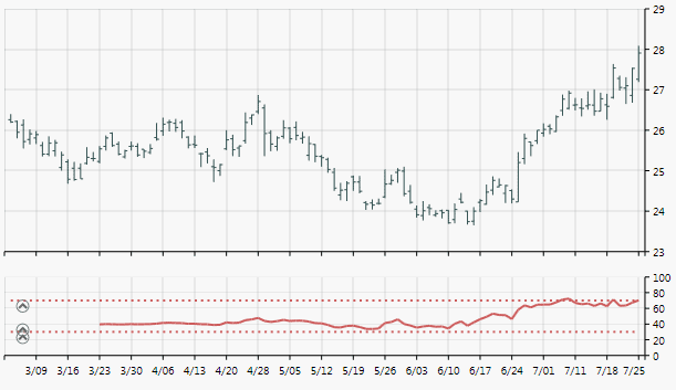
Figure 8. The red line is a chart of the Relative Strength indicator. The values or 30 and 70 are of interest. Values above 70 are overbought, while values under 30 considered oversold.
Conclusion
Regarding investing decisions, the only absolute is that there is no magic tool that guarantees you a profit. If someone promises you this, then you need to immediately place your hand on your wallet and head for the door, in that order. Doing anything else will cost you money.
The following comments are only for those who want to actively trade individual stocks. (They are not for 401K investors who have a 40 year outlook). The goal of successful trading is to make more good decisions than bad decisions. Technical analysis can play a role in attaining this goal. It has become more accessible and more popular because of computers and the Web. Serious technicians use it to time their buy/sell decisions. Even fundamental investors can make use of technical analysis to time decisions that have been made through fundamental considerations.
For 401K investors with a long outlook, the best investment decision is to place as much money as you can as soon you can into a few no-load stock mutual funds with low fees in a ‘diversified’ manner, and then more or less forget about it. You should continue your contributions, and every year or so, you can visit your allocations to make sure your diversification is being maintained, and make adjustments as necessary. In 40 years, you will be pleasantly surprised. It literally is a no-brainer. There is no need for technical analysis for such investors.
Syncfusion’s Chart library was used to create the figures shown in this Technical Indicators article.
Load comments