
Introduction to the concepts of accessibility in designs
We live in the height of the digital age, where the digital space has become a thriving community, with every person craving a great yet personalized experience. In this era, there is one centralized truth with undeniable clarity: Accessibility is no longer a mere option; it is the cornerstone that will lead to the creation of a truly welcoming community.
In this second part of our series on accessibility design, we will discuss essential topics that lie at the heart of crafting accessible digital environments. We’ll begin by throwing more light on three of the five fundamental visual patterns vital to your designs:
- Color Contrasting
- Font Sizing
- Labelling and Iconography
As we explore accessibility, it’s essential to recognize that it isn’t limited to addressing the needs of individuals with disabilities; it’s about shaping a digital terrain where everyone thrives. It’s about breaking barriers and creating an online environment that empowers and enriches the lives of all individuals.
It’s important to note that certain sections of our discussion may pose a challenge, as we discuss the intricate process of creating accessible web pages and applications. While there may not be actual lines of code within the document, our primary focus is on unraveling the fundamental concepts that drive web development.
So, whether you’re here to satisfy your curiosity, deepen your tech knowledge, or champion digital inclusivity, you’re in the right place.
Exploring Some of the Basics of Accessibility about Visual Patterns of Accessibility
In our previous article, we provided a brief introduction to these concepts. In this section, we will delve deeper into each aspect, gaining a comprehensive understanding of the specific WCAG 2 standards that must be met for each of these criteria.
Color Contrasting
For color contrasting, the minimum conformance level to be met is AA. (As noted in the previous entry, the scale goes from A to AAA.) Web design at this conformance level should have text or images of text with a contrast ratio of at least 4.5:1 and/or 3.0:1 for larger texts. The second conformance level to be met is AAA, which is a higher level compared to level AA. At AAA, texts or images of text should have a contrast ratio of at least 7.0:1 and/or 4.5:1 for larger texts. Larger texts are usually classified as fonts with font-weight greater than 24 pixels (regular) and 18 pixels (for bold texts).
These conformance levels when used during design, ensure that there is adequate differentiation in the visual elements (i.e., foreground text and background).
During design and building, you should endeavor to test for the conformance level and optimize your work accordingly. Here are some practical ways to measure and ensure color contrast:
- Online Contrast Checkers: There are many online tools and contrast checkers that can help you evaluate the contrast between two colors. These tools often provide a pass/fail assessment based on WCAG guidelines. Some popular ones include:
- Browser Extensions: Some browser extensions can analyze color contrast on web pages. These extensions can provide accessibility assessments, including color contrast checks. Some common ones are:
- Color Pickers with Contrast Info: Some color picker tools, like the one in Adobe Photoshop or online color pickers, provide contrast information between selected colors. This can be helpful for designers and developers.
- Contrast Ratio Color Grids: Some design systems and frameworks offer predefined color palettes with contrast ratios already calculated. For example, the Material Design system provides such color palettes to ensure accessibility.
- Design Tools: Graphic design software like Adobe XD and Figma often have built-in accessibility features and plugins that can help you check color contrast as you design.
- Note: For Figma users, some free plugins to use are:
- Manual Calculation: If you want to calculate the contrast ratio manually, you can use the formula provided by WCAG. The formula is:
(L1 + 0.05) / (L2 + 0.05)
In the next section, I will demonstrate how this is done manually, which is great to at least have some idea of what the tools do.
Calculating color contrasting manually
The formula is as stated:
|
1 |
Contrast Ratio = (L1 + 0.05) / (L2 + 0.05). |
Let’s break down each component of this formula:
- Contrast Ratio: This is the final result you’re trying to calculate. The contrast ratio represents the difference in luminance between two colors. It is often used in web design and graphic design to ensure text and content are easily readable against background colors.
- L1 (Relative Luminance of the Lighter Color): L1 represents the relative luminance of the lighter of the two colors in the comparison. It’s the luminance value for the color you want to ensure is readable.
- L2 (Relative Luminance of the Darker Color): L2 represents the relative luminance of the darker of the two colors in the comparison. It’s the luminance value for the background or surrounding color.
- 0.05 (Constant Value): This is a constant value (0.05) added to both L1 and L2 in the formula. It’s a small constant that’s used to prevent the contrast ratio from reaching zero in cases where one of the colors has very low luminance. It ensures that even in cases of low luminance, there’s still some level of contrast. By adding 0.05 to both L1 and L2, you ensure that even if one color has a luminance of 0 (absolute black) or is very close to 0, the contrast ratio doesn’t become undefined, which is important for accessibility considerations.
As stated earlier, based on the WCAG 2 guidelines for color contrasting, the minimum level of conformance to be met is AA. Web design at this conformance level should have text or images of text with a contrast ratio of at least 4.5:1 and/or 3.0:1 for larger texts. The second conformance level to be met is AAA, which is a higher level compared to level AA. At AAA, texts or images of text should have a contrast ratio of at least 7.0:1 and/or 4.5:1 for larger texts. Larger texts are usually classified as fonts with font-weight greater than 24 pixels (regular) and 18 pixels (for bold texts).
Calculation of Luminance (L1 and L2)
Luminance is a measure of the perceived brightness of a color. There are various ways to calculate luminance, but one commonly used formula is the relative luminance formula, which is part of the Web Content Accessibility Guidelines (WCAG) for web design. This formula converts a color to a grayscale value based on the sRGB color space. The relative luminance (Y) of a color in the sRGB color space can be calculated using the following formula:
- Y = 0.2126 * R + 0.7152 * G + 0.0722 * B
This formula calculates the luminance of a color by considering its red, green, and blue components, taking into account the varying sensitivity of the human eye to different colors.
- Y is the relative luminance.
- R (Red Component): R represents the red component of the color. In the formula, R should be a normalized value between 0 and 1, where 0 means no red, and 1 means full intensity red.
- G (Green Component): G represents the green component of the color. Similar to R, G should be a normalized value between 0 and 1, where 0 means no green, and 1 means full intensity green.
- B (Blue Component): B represents the blue component of the color. Again, B should be a normalized value between 0 and 1, where 0 means no blue, and 1 means full intensity blue.
- The coefficients (0.2126, 0.7152, and 0.0722) are specific weights assigned to each color component to simulate the human eye’s sensitivity to different colors. These weights are derived from the CIE 1931 standard, which is a mathematical model of human color vision. The human eye is more sensitive to green light, moderately sensitive to red light, and less sensitive to blue light, which is why these coefficients are used to approximate the perceived luminance.
Worth Noting:
To calculate the luminance of a color in this manner, you’ll need to ensure that the RGB values are in the sRGB color space and are normalized to a range of 0 to 1.
So, for example, pure white (255, 255, 255) should be divided by 255 to get the normalized RGB values (1, 1, 1), while pure black (0, 0, 0) would be (0, 0, 0).
Examples of Colors with Good Contrast Ratio:
- White Text (RGB: 255, 255, 255) on Black Background (RGB: 0, 0, 0):
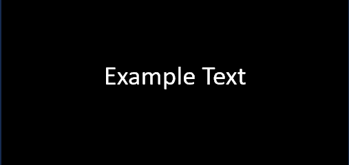
- L1 (White Text) = 1
- L2 (Black Background) = 0
- Contrast Ratio = (1 + 0.05) / (0 + 0.05) = 1.05 / 0.05 = 21
- White text on a black background meets the WCAG standard with a contrast ratio of 21.
- White Text (RGB: 255, 255, 255) on Crimson Background (RGB: 255, 8, 74):
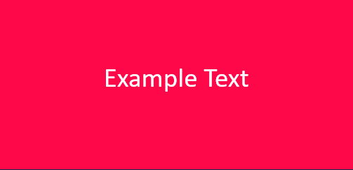
- L1 (White Text) = 1
- L2 (Crimson Background) = 0.2126 * 255/255 + 0.7152 * 8/255 + 0.0722 * 74/255 ≈ 0.1587
- Contrast Ratio = (1 + 0.05) / (0.1587 + 0.05) ≈ 1.05 / 0.2087 ≈ 5.03
- White text on a crimson background meets the WCAG standard with a contrast ratio of 5.03.
- Cream Text (RGB: 255, 253, 208) on Dark Red Background (RGB: 139, 0, 0):

- L1 (Cream Text) = 0.2126 * 255/255 + 0.7152 * 253/255 + 0.0722 * 208/255 ≈ 0.8911
- L2 (Dark Red Background) = 0.2126 * 139/255 + 0.7152 * 0/255 + 0.0722 * 0/255 ≈ 0.0881
- Contrast Ratio = (0.8911 + 0.05) / (0.0881 + 0.05) ≈ 0.9411 / 0.1381 ≈ 6.81
- Cream text on a dark red background meets the WCAG standard with a contrast ratio of 6.81.
Examples of Colors with Bad Contrast Ratio
- Light Gray Text (RGB: 200, 200, 200) on a White Background (RGB: 255, 255, 255):

- L1 (Light Gray Text) = 0.7152 * 200/255 + 0.2126 * 200/255 + 0.0722 * 200/255 ≈ 0.7376
- L2 (White Background) = 1
- Contrast Ratio = (0.7376 + 0.05) / (1 + 0.05) ≈ 0.7876 / 1.05 ≈ 0.75
- The contrast ratio of 0.75 is significantly lower than the WCAG requirement of 4.5:1, indicating that light gray text on a white background does not meet the accessibility standard.
- Dark Blue Text (RGB: 0, 0, 128) on a Black Background (RGB: 0, 0, 0):
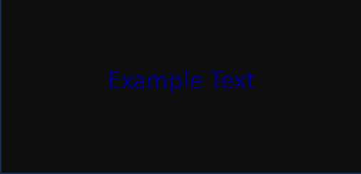
- L1 (Dark Blue Text) = 0.7152 * 0/255 + 0.2126 * 0/255 + 0.0722 * 128/255 ≈ 0.1804
- L2 (Black Background) = 0
- Contrast Ratio = (0.1804 + 0.05) / (0 + 0.05) ≈ 0.2304 / 0.05 ≈ 4.608
- While this combination barely meets the WCAG minimum requirement of 4.5:1, it is considered barely acceptable. It is not a color combination that you should generally choose to use, which is why I included it in the not acceptable section.
- Light Yellow Text (RGB: 255, 255, 128) on a Pale Yellow Background (RGB: 255, 255, 192):

- L1 (Light Yellow Text) = 0.7152 * 255/255 + 0.2126 * 255/255 + 0.0722 * 128/255 ≈ 0.9279
- L2 (Pale Yellow Background) = 0.7152 * 255/255 + 0.2126 * 255/255 + 0.0722 * 192/255 ≈ 0.8632
- Contrast Ratio = (0.9279 + 0.05) / (0.8632 + 0.05) ≈ 0.9779 / 0.9132 ≈ 1.068
- The contrast ratio of 1.068 is lower than the WCAG requirement of 4.5:1, indicating that light yellow text on a pale yellow background does not meet the accessibility standard.
- Red Text (RGB: 255, 0, 0) on Blue Background (RGB: 0, 0, 255):
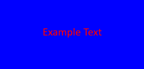
- L1 (Red Text) = 0.2126 * 255/255 + 0.7152 * 0/255 + 0.0722 * 0/255 ≈ 0.2126
- L2 (Blue Background) = 0.2126 * 0/255 + 0.7152 * 0/255 + 0.0722 * 255/255 ≈ 0.0722
- Contrast Ratio = (0.2126 + 0.05) / (0.0722 + 0.05) ≈ 0.2626 / 0.1222 ≈ 2.15
- Red text on a blue background does not meet the WCAG standard with a contrast ratio of 2.15, as it falls below the minimum requirement.
Font Sizing
Unlike color contrasting, there is no formula, specific font size or weight that has been given. However, it is generally recommended not to use small fonts. Generally, small fonts are fonts less than 24px (when regular) and 18px (when bold).
Ideally you should not go beyond 8px and your hierarchy of pixels should be in increments of 8 (i.e., 8px, 16px, 24px, 32px, 40px, 48px, etc.). This allows for variation in text sizes and allows for a proper hierarchy to be achieved, which is encouraged by the guidelines. It is also pertinent to know that body text should not be smaller than 16px and 8px should be used sparingly. Most people will go for 12px instead of 8px, which is acceptable since smaller sizes than 12px are illegible on some smaller devices.
To fix the issue of illegibility, the guidelines have an AA level of conformance to be met. This conformance requires that, except for captions and images of text, the text should be resizable without the need for assistive technology, up to a 200 percent increase in size. Despite this increase in size, the text should also be able to maintain its content and functionality. A liquid layout, that adapts the text by resizing and reflowing it as necessary to fit the on-screen display, is also recommended.
Furthermore, concerning the scalability of text, the guidelines recommend that text be sized in percentages, em units, or with named fonts (e.g., larger, smaller). This allows for the adaptability of text (Understanding Success Criterion 1.4.4 | Understanding WCAG 2.0, 2008).
Visual Presentation of Text
Based on the AAA conformance level, text blocks should be made visually pleasant, with the aid of certain available mechanisms, aimed at enhancing user customization and readability.
These mechanisms adhere to specific guidelines:
- User Customization: Users should have the option to choose their preferred foreground and background colors, allowing for the personalization of the reading experience.
- Optimal Width: The width of the text blocks should be limited to 80 characters or glyphs (40 if using CJK characters) per line. This restriction prevents long lines of text, which present a challenge when being read, especially on wide screens.
- Text Alignment: Text should not be justified. Justification sometimes creates uneven spacing between words, negatively impacting readability.
- Line and Paragraph Spacing: Within paragraphs, the leading line spacing should be set to at least space-and-a-half, providing enough vertical space between lines for better readability. Furthermore, the spacing between paragraphs should be at least 1.5 times larger than the line spacing, further enhancing the visual separation between paragraphs.
- Horizontal Scrolling Prevention: When resizing the text to 200 percent, users should not need to scroll horizontally to read a line of text on a full-screen window. This is aimed at preventing the inconvenience of having to move horizontally to read complete lines.
Text Spacing
The conformance level to be met for text spacing is level AA. In content created using markup languages, an optimal visual presentation of text should be ensured by the implementation of specific text style properties. By incorporating the following guidelines, content can maintain its integrity and functionality while allowing users to customize their reading experience:
- Line Height: The line spacing (line height) should be at least 1.5 times the font size. This provides sufficient vertical space between lines and enhances readability.
- Spacing after Paragraphs: The spacing after paragraphs should be at least 2 times the font size. This allows for clear visual separation between paragraphs, making navigation and comprehension easier.
- Letter Spacing: The letter spacing, also known as tracking, should be at least 0.12 times the font size. Proper letter spacing enhances legibility and readability, especially for persons with visual impairments or reading difficulties.
- Word Spacing: This should be set to at least 0.16 times the font size. This improves the flow and readability of the text.
There are some exceptions, which apply to human languages and scripts that do not use one or more of these text style properties in their written form. In such cases, adherence to the properties applicable to the specific language and script combination is sufficient to meet the requirements of the conformance level (Understanding Success Criterion 1.4.12: Text Spacing | WAI | W3C, 2008).
Labelling and Iconography
Concerning labelling and iconography, the guide first speaks about 2 things that meet the level of conformance AA (Understanding Success Criterion 2.4.6: Headings and Labels | WAI | W3C, 2023). These are:
- The Importance of Clear and Descriptive Headings and Labels: Clear and descriptive headings and labels, help users easily find the information they are looking for and understand the relationships between different parts of the content. Descriptive labels give users more information about the content, which helps users identify specific components within the content. This provides a user-friendly and accessible experience.
- Length of Labels and Headings: Although labels and headings are required, the guide does not necessarily require them to be lengthy. If a suitable cue for finding and navigating the content effectively can be provided by a single word or character, then it can suffice.
Furthermore, all components of the user interface websites – such as form elements, links, and components generated by scripts, should be programmatically accessible. This complies with conformance level A. The aim of this is to make sure that user interface elements such as the name, role, states, properties, and values can be programmatically determined and set. This allows assistive technologies and user agents to understand and communicate these components effectively to users with disabilities. However, already existing HTML controls meet this level of conformance. Thus, this applies mostly to custom user interface components, ensuring that they are inclusively accessible (Understanding Success Criterion 4.1.2: Name, Role, Value | WAI | W3C, 2008).
Placeholder Text Vs Helper Text
Placeholder text serves as a temporary guide, often faint or italicized, within a form field, offering an example of the expected user input. It’s a space-efficient way to prompt users without permanently occupying the field. Once users begin typing or interacting, the placeholder text usually disappears. While suitable for brief hints, it isn’t a substitute for explicit instructions and may have limitations in accessibility and user understanding.
In contrast, helper text provides additional information or instructions displayed above, alongside, or below a form field. Unlike placeholder text, helper text remains visible after user engagement, offering detailed guidance and ensuring clarity throughout the interaction. It is valuable for comprehensive information, preventing user confusion, and meeting accessibility standards by providing explicit instructions about required input.
With the rise of minimalism, form labelling faces challenges. Some designers favour placeholder texts over helper texts for aesthetic reasons, but this may compromise accessibility. Placeholder texts, while visually appealing, can create difficulties for users who forget the required information once the example disappears.
To navigate the challenges posed by minimalism in form labelling, adhering to the Web Content Accessibility Guidelines (WCAG) 2 is paramount. Let’s explore the essential criteria and best practices for achieving conformance at different levels, emphasizing the importance and reasons for each:
- 1. Conformance to Level A – Criteria 1.3.1 (Info and Relationships): At the foundational Level A, the goal is to make information, structural elements, and relationships programmatically accessible or available in text format. This is crucial because:
- Accessibility: By utilizing proper semantic HTML elements and ensuring tables are appropriately labelled, you enhance the accessibility of your content, allowing assistive technologies to interpret and present information effectively.
- User Understanding: Incorporating ARIA roles and attributes provides additional context to users, improving their understanding of the content and its structure.
- Conformance to Level AA – Criteria 2.4.6 (Headings and Labels): Elevating the standard to Level AA emphasizes the clarity of headings and labels within the content. The reasons for this emphasis include:
- Enhanced User Experience: Descriptive and informative headings facilitate an enhanced user experience by providing clear navigation cues. Users can easily understand the content and navigate through it.
- Usability: Explicit associations between label elements and input fields improve usability, especially for users relying on assistive technologies. It ensures a seamless and intuitive interaction.
- Conformance Level A – Criteria 3.3.2 (Labels or Instructions): At the foundational Level A, clear labels or instructions are imperative when user input is required. The importance of this lies in:
- User Guidance: Clear and concise labels offer users guidance, reducing the likelihood of errors and enhancing the overall user experience.
- Accessibility: Helpful instructions or cues during form completion make the interaction more accessible, particularly for users who may require additional guidance.
- Conformance Level A – Criteria 4.1.2 (Name, Role, Value): Effective communication at Level A involves ensuring user interface components have identifiable names and roles that can be programmatically determined. The significance of this includes:
- Programmatic Accessibility: Proper identification and labelling with semantic HTML elements and ARIA roles ensure programmatic accessibility. This is crucial for assistive technologies to convey information effectively to users.
- User Understanding: Assigning appropriate attributes like “name” and “value” ensures that users can understand and interact with interface components, contributing to a more inclusive user experience.
- Programmable Setability of States, Properties, and Values: This is also in conformance to Level A of Criteria 4.1.2 (Name, Role, Value). Based on this, it is important that if users can change certain things like settings, features, or values, they should be able to do it using a program or tool.
The importance of these criteria is underscored by:
- Programmatic Control: Allowing users to modify states, properties, and values programmatically ensures that individuals who rely on assistive technologies have full control over the interactive elements on the website. This is fundamental for a diverse user base with varying needs.
- Real-Time Feedback: By notifying user agents and assistive technologies of any changes made to these components, the web environment becomes more dynamic and responsive. Users, including those with disabilities, receive real-time feedback, fostering a more engaging and accessible interaction.
- Enhanced User Autonomy: Programmatically settable components empower users, enabling them to customize their experience based on personal preferences and accessibility requirements. This contributes to a sense of autonomy and inclusivity.
Achieving optimal accessibility involves a thoughtful balance between placeholder texts and helper texts in form design. While placeholder texts offer a temporary guide for user input, their exclusive use can pose challenges in meeting crucial accessibility criteria. Adhering to Web Content Accessibility Guidelines (WCAG) 2 underscores the importance of making information programmatically accessible and providing clear guidance. Helper texts, with their permanent visibility, play a vital role in meeting these criteria, and ensuring users receive comprehensive information. Therefore, the collaborative use of placeholder and helper texts emerges as a best practice, combining the benefits of guidance during input and persistent labelling for a more inclusive and user-centric digital environment.
Conclusion
In conclusion, our exploration of accessibility in digital design has unveiled the intricate yet indispensable aspects of color contrasting, font sizing, and the nuanced world of text presentation and spacing. As we’ve delved into the specifics of these visual patterns, we’ve demystified the technicalities and emphasized their critical role in creating an inclusive digital space for all.
It’s crucial to remember that accessibility is not merely a checkbox to be ticked; it’s a commitment to fostering a digital landscape where everyone, regardless of ability, can navigate, engage, and thrive. Our journey through the visual patterns of accessibility has provided insights into the meticulous considerations that go into making websites and applications truly welcoming and usable for a diverse audience.
As we eagerly anticipate Part 3 of our series, where we will unravel the complexities of navigation and flow, and delve into the importance of regular testing, we invite you to continue this journey with us. Navigation is the lifeline of user experience, and in our next instalment, we’ll guide you through the principles that ensure seamless movement and interaction within digital spaces. Moreover, we’ll underscore the significance of continuous testing in maintaining accessibility standards, adapting to evolving technologies, and addressing emerging challenges.
Whether you’re a designer, developer, or an advocate for digital inclusivity, our commitment remains unwavering — to empower you with the knowledge and tools to shape a digital world where no one is left behind. So, stay tuned for the next chapter in our series, where we unravel the secrets of navigation, flow, and the indispensable role of regular testing in the pursuit of digital accessibility excellence. Together, let’s build a digital future that truly belongs to everyone.
References
Understanding Success Criterion 1.4.12: Text Spacing | WAI | W3C. (2008, December 11). Retrieved July 17, 2023, from https://www.w3.org/WAI/WCAG22/Understanding/text-spacing.html
Understanding Success Criterion 1.4.4 | Understanding WCAG 2.0. (2008, December 11). Retrieved July 17, 2023, from https://www.w3.org/TR/UNDERSTANDING-WCAG20/visual-audio-contrast-scale.html
Understanding Success Criterion 1.4.8: Visual Presentation | WAI | W3C. (2008, December 11). Web Accessibility Initiative. Retrieved July 17, 2023, from https://www.w3.org/WAI/WCAG22/Understanding/visual-presentation.html
Web Content Accessibility Guidelines (WCAG) 2.2. (2023, May 17). https://www.w3.org/TR/WCAG22/
Load comments