
Visualizing Data with R
Microsoft’s acquisition of Revolution R has been followed quickly by several exciting announcements. SQLServer 2016 will include R placing it at the finger-tips of developers and DBAs. A Microsoft Online Course through EDX introducing R is also now available. Microsoft is already known for its proprietary .NET programming languages including Visual Basic and C# as well as its use of SQL and T-SQL in the SQLServer database. With all of these options already available, why would Microsoft be expending resources on promoting the use of R?
There are a number of compelling answers to this question, including the community that has grown up around R and the availability of over 7000 special purpose packages. In R Basics, we mentioned these strengths and demonstrated how succinct and expressive R can be at data intensive tasks. Another appeal of R is its graphical capabilities. There are a number of packages available for creating charts, plots and visualizations in R. In this article, we will look at the three established foundational graphics systems available in R.
Data for the Examples
For the examples below we will work with two different data structures. The first is a vector, which is a list of ordered values. It is analogous to an array in other programming languages. The second is a data frame. A data frame is a two dimensional data structure containing a set of rows each of which contains a “record” with a set of values. All rows have the same structure in a data frame. It is much like a database table or SQL results set in structure.
A vector containing a list of temperatures is constructed using the c (or “combine”) function.
|
1 |
> temperature <- c(82,84,86,82,81) |
A second vector contains abbreviations for the days of the week for the temperatures listed above respectively.
|
1 |
> days <- c('Sat', 'Sun', 'Mon', 'Tues','Wed') |
A data frame combining these two vectors is created using the command below. The factor method call is used to convert the day abbreviations which are character data to the factor data type. The reason for doing this is to prevent the days of the week from being re-ordered alphabetically in subsequent function calls. The function call here will allow them to remain chronological.
|
1 2 3 |
> dailyTemps <- data.frame(day = factor(days, level=days, order=TRUE), degrees = temperature) |
If you have been following along in RStudio to this point, you can view the new data frame using the View function.
|
1 |
> View(dailyTemps) |
An R session in RStudio consisting of the full set of commands to this point is show below.
The relatively simple data set now available in R can be visualized many different ways. But it is simple, consisting of only two dimensions. To expand upon this example, we will also use the iris data set included with R by default to explore the possibilities available with multivariate data. The first few rows of this data frame can be viewed using the head function.
|
1 2 3 4 5 6 7 8 |
> head(iris) Sepal.Length Sepal.Width Petal.Length Petal.Width Species 1 5.1 3.5 1.4 0.2 setosa 2 4.9 3.0 1.4 0.2 setosa 3 4.7 3.2 1.3 0.2 setosa 4 4.6 3.1 1.5 0.2 setosa 5 5.0 3.6 1.4 0.2 setosa 6 5.4 3.9 1.7 0.4 setosa |
These three small data sets are used throughout the following examples to create graphical plots using three major available systems.
Base Graphics
Base graphics comes installed by default in R. No special package installation is required. Base graphics is the quickest way to create a visualization of your data, even if are not sure exactly what kind of visualization your are hoping to produce or the “shape” of the data in use. Regardless of the data structure passed to it, the basic plot function will generally produce output that will help you refine a chart into a final product that is more aesthetically pleasing and useful for your purposes. Its flexibility is evident as we can pass either of the two data structures previously created to it (as well as many others), and it will render a serviceable plot that can be further refined using additional options.
|
1 |
> plot(temperature) |
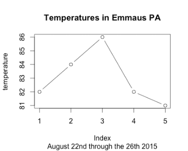
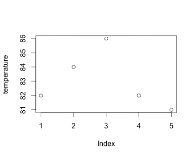 These simple plots can be greatly expanded upon and modified using a myriad of options and additional function calls. The above graph can be enhanced with lines connecting the dots and a title and subtitle.
|
1 2 3 |
> plot(temperature, type="b", main="Temperatures in Emmaus PA", sub="August 22nd through the 26th 2015") |
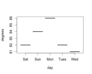
The plot function is “smart” in that it adapts the plot returned based not only the data, but the data structure passed to it. The data frame with the days of the week automatically includes them in a plot with the x axis containing the days of the week by name.
|
1 |
> plot(dailyTemps) |
 In most programming languages, specific decisions need to be made about the size of the graph, where the data is to be plotted, the scale in use, font sizes and colors among other decisions. Frequently, a good deal of time is required to get the data represented at all, and additional time is required to prevent overlapping of data or data being lost outside the bounds of the chart. R’s declarative syntax emphasizes asking the user “what” they would like to render rather than the details of the specific set of steps required. It uses a set of defaults that – while not perfect – are certainly serviceable and understandable due to conventions used by statisticians throughout the history of R’s development.
To view documentation that provides an overview of the base graphics package and its functions, enter the following command at an R prompt.
|
1 |
> library(help = "graphics") |
For specific information related to the plot function (or any other function), precede the function name with a question mark at the R prompt.
|
1 |
> ?plot |
Similar patterns apply for obtaining help on the lattice and ggplot2 packages and function calls listed below.
The lattice Package
The lattice package implements Trellis graphics for R with a focus on multivariate data. The package is not included by default with R and must be installed.
|
1 |
> install.packages("lattice") |
To use lattice in the current R Session, it needs to be included prior to use.
|
1 |
> library(lattice) |
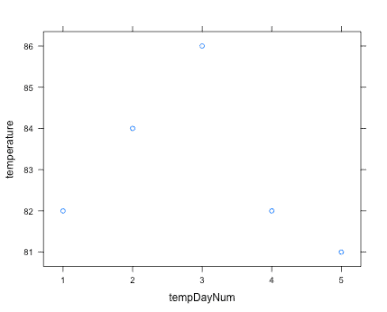
The lattice package uses a formula interface to determine what variables are to be plotted. For example, the xyplot function takes a formula in the form “y ~ x” which indicates that the vector represented by y should be plotted in terms of the vector plotted by x. To accomplish this with our temperature vector, we first create a sequence consisting of the positions of each element.
|
1 |
> tempDayNum <- seq(1, length(temperature)) |
The tempDayNum variable references a vector consisting of the numbers one through five. The lattice package’s xyplot can be called using the formula interface to produce an plot similar to the example from the base graphics package.
|
1 |
> xyplot(temperature ~ tempDayNum) |
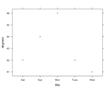
To plot the data frame, you specify it by the named data argument to the function and include the two columns in the data frame in the formula.
|
1 |
xyplot(data=dailyTemps, degrees ~ day) |
 The style might be preferable to base plots, but it is not immediately clear why one would opt for using the lattice package. Its strength is more evident when plotting multivariate relationships, which requires a data frame with a more than two columns. The iris data set referenced earlier satisfies this requirement.
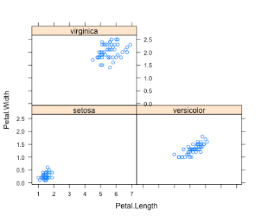
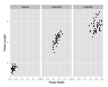
The lattice formula function can be expanded to plot y ~ x | p, where p represents the variable used for creating a panel for each value. This breaks up the chart up into separate subplots. The iris dataset can be used in a call to lattice to create three different charts displaying petal width in terms of length, one for each species.
|
1 |
> xyplot(data=iris, Petal.Width ~ Petal.Length | Species ) |
The ggplot2 Package
The ggplot2 or “Grammar of Graphics” package is the most recent addition to the basic graphics systems available in R. It features a nice set of default display options and a well articulated API for constructing graphics in terms of a grammar. Like the lattice package, it is not included by default with R, it needs to be installed and loaded into the current session.
|
1 |
> install.packages("ggplot2") |
To use lattice in the current R Session, it needs to be included prior to use.
|
1 |
> library(ggplot2) |
The ggplot2 library requires data to be in the form of a data frame. Other data structures like our temperature vector are not supported. They must be translated into or included in a data frame to be plotted by ggplot2.
|
1 |
> ggplot(dailyTemps, aes(x=day, y=degrees)) + geom_point() |
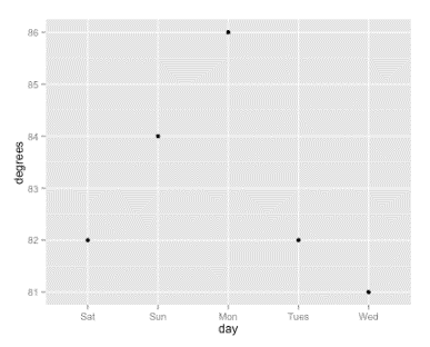 The aes function is used to define “aesthetics” of the chart, meaning the mapping of specific items of data to aspects of the chart, such as x coordinate, y coordinate, color, shape of the point, or other characteristic relevant to a particular type of graph. The geom_point() call indicates that the intention is to plot points on a graph, rather than lines or other chart style.
Ggplot uses functionality called “faceting” to break data into panels like the example from lattice.
|
1 2 3 |
> ggplot(iris, aes(x=Petal.Width, y=Petal.Length)) + geom_point() + facet_wrap(~ Species) |
 The choice to break up a chart into separate facets is not always the best one. There are times when the intention is to see the distinctions between different variables. In such cases it is better to have them represented in a single chart. The ggplot2 function design makes it easy to reason and experiment with alternatives of this nature. For instance, if we want all points on the same chart, but each species a different color, it can be accomplished with a modification to the aes call to include color and removing the facet_wrap call to use a single integrated chart.
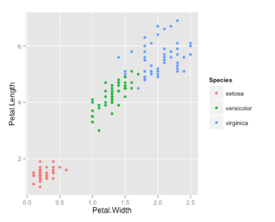 This makes it more evident that there is some overlap between data points in the versicolor and virginica species. It is at this point where the sensibilities and purposes of the person creating a plot are essential for creating a visualization that will communicate the desired information to the intended audience. A final product usually requires manual experimenting with available options. It also involves areas that are more subjective and require additional information and so cannot be included automatically with a simple default call to a function.
Challenges
Although I would contend that R is the easiest single programming environment for creating good looking charts and plots, I would be remiss if I did not point out the challenges involved, and suggest a course of action as these are encountered.
Each of the three graphics systems has a very different underlying design and approach to creating graphics. Each require you to think differently about how to construct a visualization. Base graphics involves a thought process used to draw a graph physically – using a paper and pencil. Layer upon layer are added, with each layer having no specific awareness of what has been previously drawn. Lattice emphasizes a formula interface, which is somewhat more familiar to mathematicians and statisticians. The ggplot2 package provides a sophisticated “Grammar of Graphics.” While comprehensive, it can appear a bit foreign to newcomers and take a while to understand. Each of these systems has its value. While all can accomplish simple tasks easily, each excels in different areas with more complicated cases.
Besides the underlying design, the syntax for each system is significantly different. Learning each of these and other packages in R is best thought of as learning a “little language” or domain specific language (DSL). Without delving into the details, this is essentially because of the way R is designed and its programming language influences. Certain programming languages are uniquely well suited for “building up” into specialized little languages – and R is one of them. To be effective at any of the three graphics systems introduced, be prepared to spend a bit of time understanding them, and don’t expect that what you learn in one will directly translate to another. But because these are languages, scripts tend to be much shorter than ones written in a more general purpose language.
The phrase “garbage in, garbage out” applies to graphics in a unique way. To be really effective at charting data, it is often important simply to pre-process, filter, summarize, and reshape a dataset prior to using it to create a visual representation. It is easy to try and jump to a final product without investing the necessary time in preparation. There is no substitute for the somewhat mundane data preparation tasks that accompany any significant data analysis project.
Even with these challenges, the time required to master enough of R and these packages and to be effective is small relative to the effort required to create graphics in many other languages and environments.
Beyond Basic Graphics
The three graphics systems described are not the limits of graphics in R. There are a number of add-on libraries that extend the capabilities and plots available. There are packages that create visual output not specific to charts such as cartography and mapping applications. There are packages that support interactive graphics and web-based frameworks including the latest JavaScript visualization libraries. In many cases, these packages draw upon the conventions introduced by the systems described in this article.
Conclusion
R’s capabilities in creating publication quality graphics with minimal effort are unparalleled. The ability to communicate a large amount of information using a visualization can mean the difference in adequately communicating to a target audience. Creating charts using R is easy enough that you can find yourself creating plots, not because you are specifically assigned to do so, but because they are the best way to present a large amount a data in a digestible and compelling format. The availability of R on new platforms is going to raise the bar on data communication as pages of traditional reports are replaced with graphic summarizations that exceed their capacity for succinct effective summarization and communication of complex topics.
Load comments