
The Data Wrangler is as interesting as hidden inside Microsoft Fabric. It’s not easy to find and activate it, but it is worth the trouble.
Before digging into the Data Wrangler, let’s analyze the data features in the query environment.
Data Features in Query Environment
The new query environment, which allow us to make data exploration with visual queries and SQL queries, is available with many Power BI features:
- Datamarts
- lake house
- Data Warehouse
And probably more to come if I’m not missing some of them already.
Why are we starting on the Query Environment? Because the Query Environment has some similar features to the Data Wrangler. Let’s discover them first and compare with the features on the Data Wrangler.
This example starts on a SQL Endpoint of a lake house.
- Create a Visual Query.

- Drop the table Fact_Sales to the Visual Query
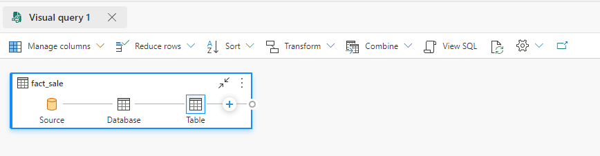
- On the top menu, on the Settings button, the Data View item has some interesting features for us to investigate. Let’s analyze them one by one. Description automatically generated”
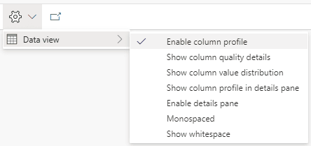
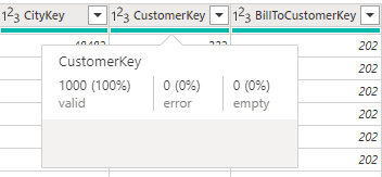
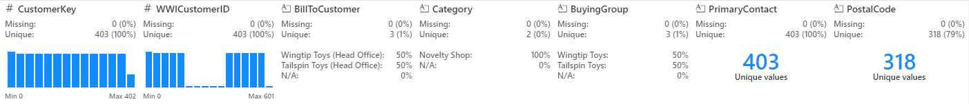
Enable Column Profile
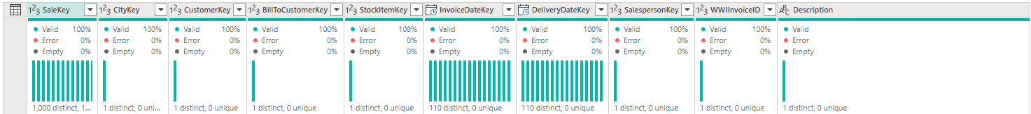
When we enable this option, a subtle green line appears on the Display Area, just below the title. If we hover this green line on a specific column, we find information about the data quality of the rows on that column.
The information tells us how many rows have valid values, error values and empty values for the column.
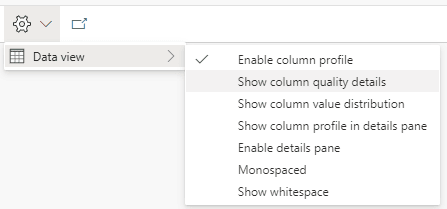
Show Column Quality Details
Enabling this option expands the green line. The information about data quality which was only visible when hovering a column becomes visible in the expanded panel.

Show Value Distribution
This option adds to the panel information about the distribution of unique values in the column. It points to us how many distinct and unique values each column has.
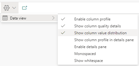
This information may be very useful to identify primary keys in sets of data you don’t know.
Data Wrangler
The Data Wrangler has similar information to the ones we just found on the Query Environment. However, while the query environment works in a visual environment, the data wrangler works on python notebooks.
Two additional details it worth mentioning: The Data Wrangler has more features, linked to spark notebooks and it’s difficult to locate if you don’t know exactly where to look.
Opening the Data Wrangler
The secret to opening the data wrangler is simple after you discover it: The Data Wrangler requires a Pandas data frame. Once we have a notebook opened and a Pandas dataframe loaded into a variable, the Data Wrangler becomes available.
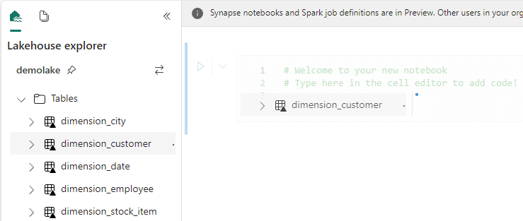
As an example, we will use the same lake house as the previous example.
Let’s follow these steps:
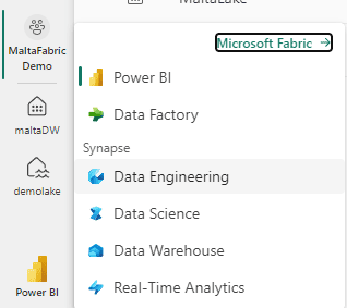
- Click the Experience button and select the Data Engineering experience.
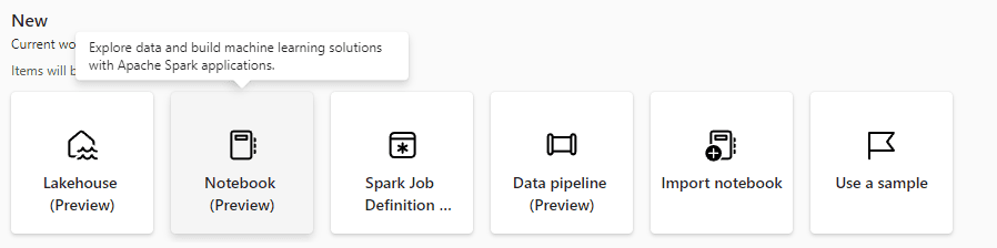
- Click the button New Notebook on the Data Engineering experience.
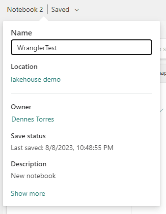
- On the top left, change the notebook name to WranglerTest
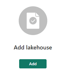
- On the left, click the Add button to link the notebook with the lake house.
- On the Add lakehouse window, select the Existing lakehouse option.
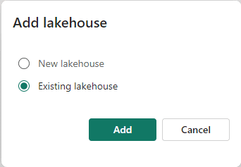
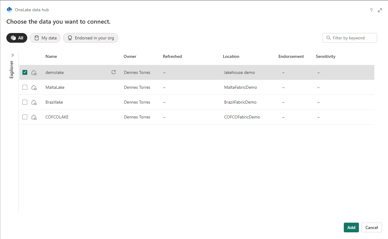
- Choose your lakehouse and click the Add button.
- Drag and drop the dimension_customer table to the code block in the notebook.
The code to load the table is automatically created. Did you know this one?
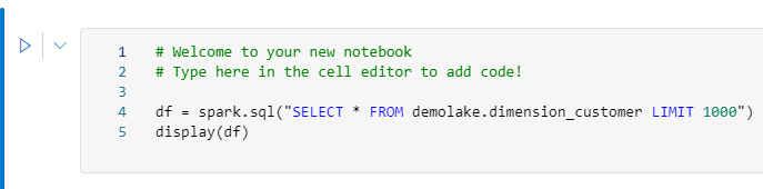
- Remove the Display line in the code. It’s not needed.
- Add toPandas() at the end of Spark.sql
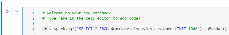
- Execute the code block.
We will receive an error message and it explains the problem. Pandas, in the lake house environment, always try to make an optimization called Arrow optimization by default. This optimization may not work well with some fields, so we need to disable it.

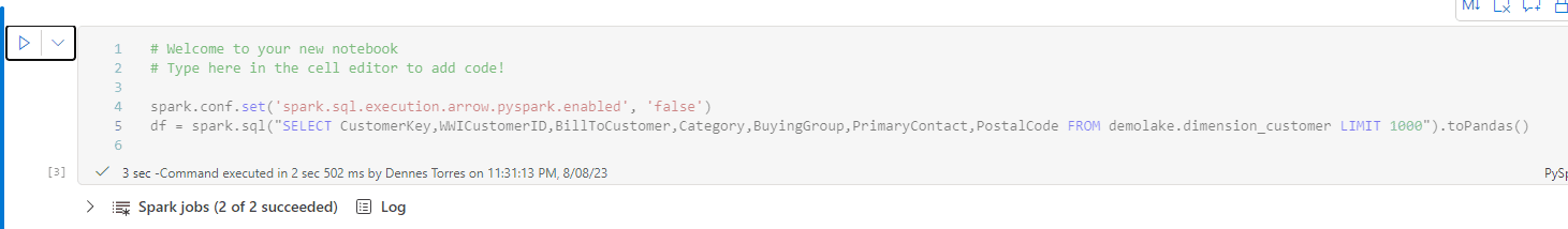
- Add the following line to the start of the code:
spark.conf.set('spark.sql.execution.arrow.pyspark.enabled', 'false')
- Run the code block again.
The Arrow optimization is disabled but the datetime field still causes problems. To make it easier, let’s remove the datetime field from the query.

- Change the SQL query in the code to the following:
wwicustomerid,
billtocustomer,
category,
buyinggroup,
primarycontact,
postalcode
FROM demolake.dimension_customer
LIMIT 1000
- Execute the code block again.
- On the top menu, click Data menu item.
- Click the Launch Data Wrangler button.
The variable created on the code block is identified and appears on the menu.
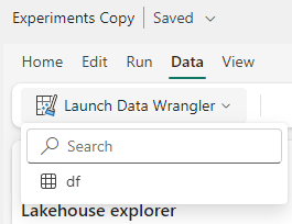
- Click the variable name on the menu. The Data Wrangler will appear.
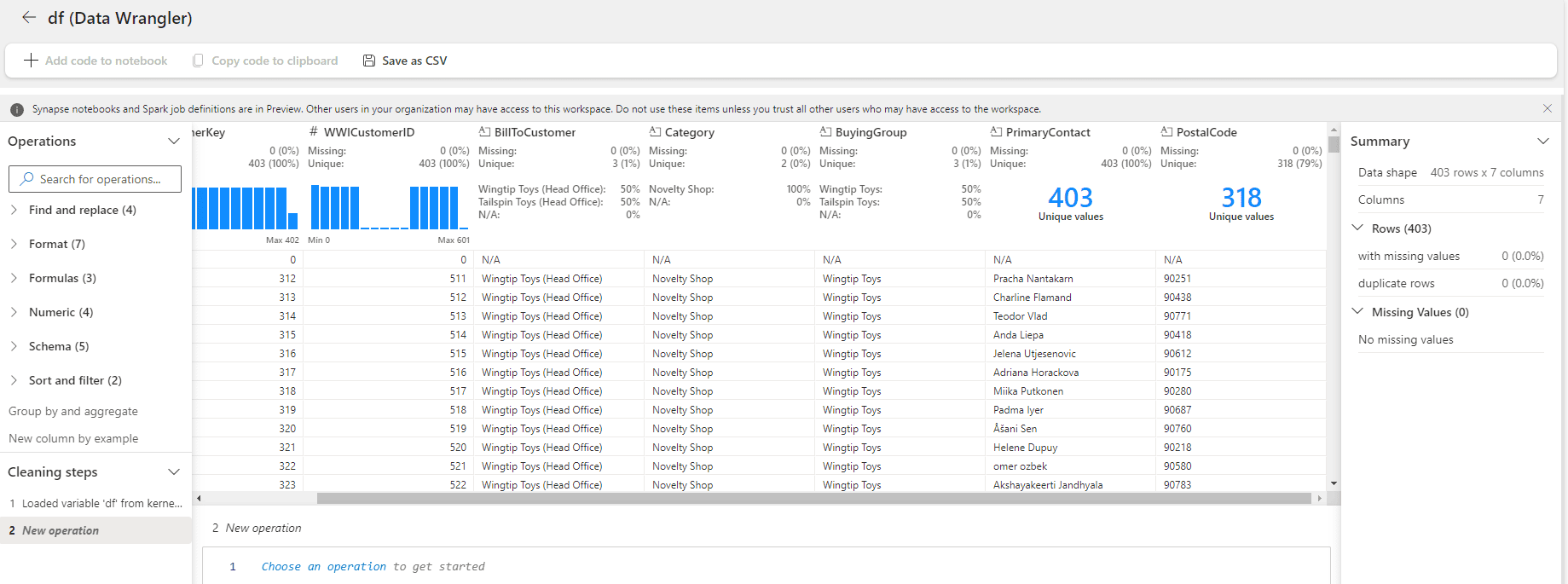
Data Wrangler: First Impressions
The initial Data Wrangler window seems like the information we have in the query environment. It seems to have some additional details about the data distribution, in some cases, making it more visible when there are only a few unique values.
If your purpose is only to see this additional information about the columns, both Data Wrangler and the query environment, work. It becomes a matter of preference which one you should use and for sure you will choose according to your preferred environment: If you prefer to work visually, the query environment will be better, if you prefer to work with spark, Data Wrangler will be better.
However, Data Wrangler can achieve much more. It can accept transformations over the data frame and implement these transformations as pyspark code.
In fact, the UI is slightly like Power Query.
Transformations with Data Wrangler
Let’s implement some transformations over the data frame and check the result.
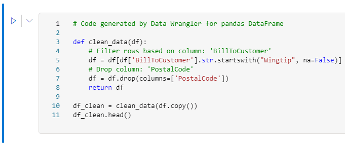
- Click the Expand button (“…”) beside the BillToCustomer field.
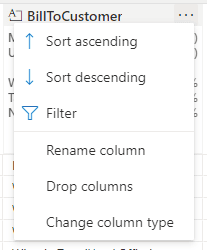
- Select the Filter option on the menu.
- On the left side, on the dropdown Select a Condition, select the option Starts With
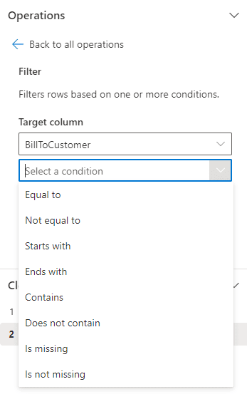
- On the 3rd textbox, type WingTip
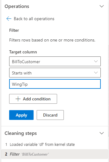
- Click the Apply button.
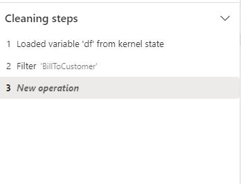
Mind the Cleaning steps, registering the transformations.
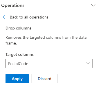
- Click the Expand button (“…”) beside the PostalCode field.
- Select the Drop Columns option on the menu.
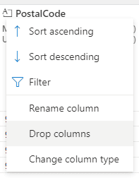
- Click the Apply button.
- On the top menu, click the Add code to notebook button.
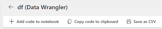
The transformations created visually are included in the notebook as part of the code.
Summary
The Data Wrangler is a powerful tool not only to help data exploration but also to help building pyspark code using visual methods.
This document contains proprietary information and is protected by copyright law.
Copyright © 2026 Red Gate Software Limited. All rights reserved


Load comments