Red Gate is all about ingeniously simple tools.
What does all this mean to those of us involved in making sure our users have all the information they need to be able to use these tools?
To begin with, what it definitely doesn’t mean is that we expect our users to read a manual or attend a training course before they can get started. We prefer it if our users don’t need to go and look for extra information, and we design our “help system” to support this.
Getting the words right
We start where most of our users start: in the user interface. There are user experience designers working here too, so we partner up with them so that the UI is as easy to use as possible. This means getting terminology right (there’s an interesting article about this here: http://www.simple-talk.com/sql/sql-tools/sql-response-choosing-our-words-carefully/) and putting helpful information right in the UI: fully visible where users need it.
UI example, showing carefully named buttons and options, along with additional explanatory text (from SQL Prompt 4.0 designs)
Helpful hints and extra detail
Sometimes, though, we find that users need a bit more detailed information, or the amount of information that we want to give is too much for the screen real estate (useful information stops becoming useful when you can’t find it or it gets in the way of what you’re trying to do). There are also some kinds of information that users really need . but only once, and then they don’t need to see it again.
We also use here are mechanisms that only show up when the user asks for them or show up only briefly, so they don’t get in the way of using the tool.
We use tooltips a lot for this:
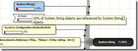
- to help users interpret graphical displays
Tooltip explaining what the graph is showing (from ANTS Memory Profiler early access )
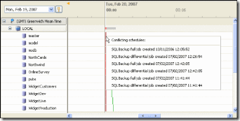
· to give more detailed information than we can show in the UI
Tooltip containing supplementary information (from SQL Backup)
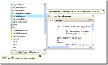
· to make users aware of functionality that they might otherwise miss
Tooltip to highlight functionality on first use (from SQL Prompt 4.0 designs)
· as a crib to remind users about what an icon means
Tooltip on an icon (from ANTS Memory Profiler early access build)
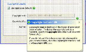
We also use little green question marks ![]() that the user can click on to open up a box with information that helps them decide whether to check a box, which value to set for an option, or where to start on a UI.
that the user can click on to open up a box with information that helps them decide whether to check a box, which value to set for an option, or where to start on a UI.
Embedded UA example (from SQL Doc 2.0)
All this is called embedded user assistance (embedded UA for short), and it’s right at the heart of our “help system” – we use it as much as possible because it’s a great way to make information accessible without disrupting the user trying to complete a task. (In fact, if we ask people about their experience with this sort of “help”, they get really confused: from their point of view they’re not aware that they’ve been using help at all.)
There’s an article with more about ways of doing this here: http://www.simple-talk.com/dotnet/.net-framework/embedding-help-so-it-will-be-used/
Context-sensitive “traditional” help
Embedded UA doesn’t always offer the space to give the detailed information that’s needed. Sometimes also, the user needs to compare features or options, rather than finding out about them individually. This needs more screen real-estate, richer formatting possibilities, and so on: i.e. the sort of thing that’s more traditionally referred to as “help” (we do ours on the web primarily, so I’m going to refer to it as “web help”).
For people who just want a bit more general information about the window or dialog box they’re currently looking at, we use a help button or F1 link to the relevant topic. If we’re expanding on something covered in the UI or in the embedded UA, we use hyperlinks to let users know there’s a topic with the information they might need.
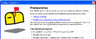
Hyperlink to web help directly from UI (from Exchange Server Archiver beta)
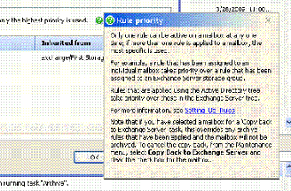
Hyperlink to web help from within embedded UA (from Exchange Server Archiver beta)
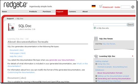
Example landing page from context-sensitive links: web help on Red Gate website (from SQL Doc 2.0 help)
The bigger picture
Once the user has arrived at the web help it’s possible that what they read might lead them to read more background information about a different area or functionality, or get more detail about the same area. So we have more in the help than just the pages you get at from the UI; and we do lots of linking between the web-help topics.
Beyond help
Help isn’t just steps and procedures or descriptions of the UI: it’s whatever we think is useful to the user, so we try to make sure that we make all the information that users need available to them, including background or domain knowledge that will help them to use our software. Sometimes we put this information in the web help, but often it’s already written and published somewhere else.
For example, introductory videos and articles about specific use-cases that live elsewhere on the Red Gate website, domain information (e.g. details of how to use SQL Server), and real-life case-studies can all be really useful to a user. There all kinds of good reasons for not duplicating all this content in the web help. But we still treat these external resources as part of our “help system”, and link to them from our pages.
Summary: the complete help system
Our idea of a “help system” starts with the words on the UI and extends beyond our own content, as far as web content written by people we’ve never met.
Red Gate help design from the inside out: starting in the UI and extending to 3rd party web pages
The big challenge is making it easy to find whatever users need to know – sometimes even when users don’t know that they need to know it! As you’ll have gathered from this article, hopefully, we rarely start to work on a product’s help system with a strong idea of what the end-result will look like.
Post script
This article just looks at the help system from the inside out: supporting the needs of the user installs the product and has a go at using it. We recognise that not all users like to work this way: some like to read first, and then install; some types of information prompt users to Google rather than press the “help” button. Perhaps I’ll cover what the help system looks like from this direction in a future post.





Load comments